
For every professional, tables are often used when making report PPT. But the form that most people make is like this:
Because the table needs to carry a large amount of data information, it is rare to take into account the beauty of the table.
Today, I will share with you how to make an easy-to-understand and beautiful form from two aspects.
Information processing
The first is to optimize the processing from the information in the form.
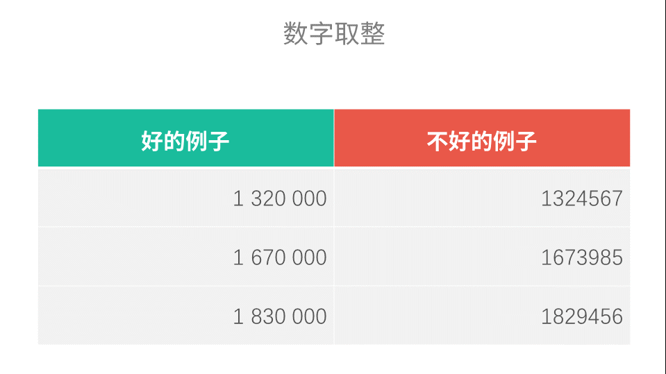
1. Number rounding
If the accuracy of the data is not very pursued, the numbers can be rounded, which will greatly reduce the difficulty of reading the data and make it easier for people to understand.
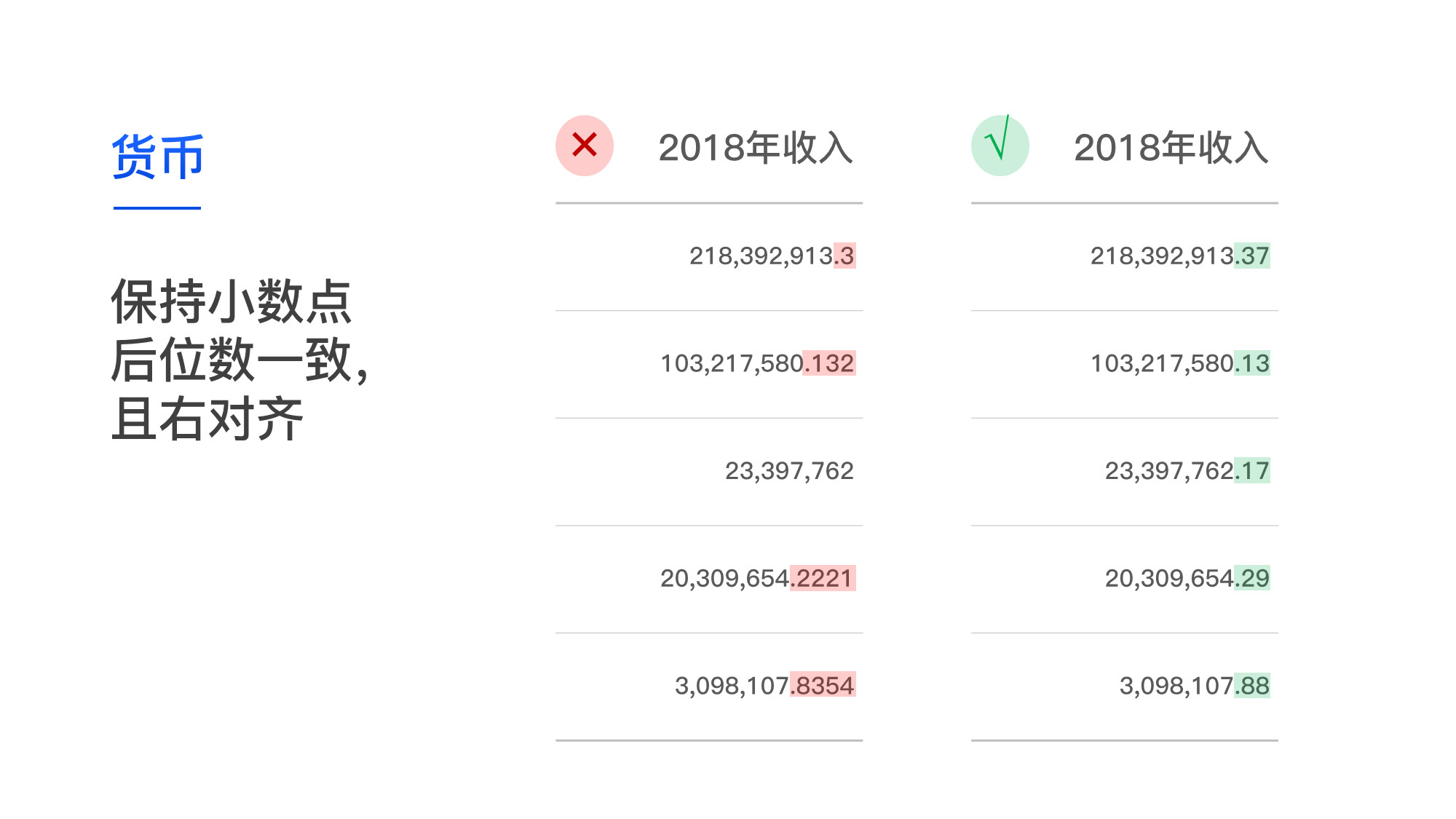
2. The number of decimal places is unified
If the pursuit of data accuracy, and some data contains decimal points, then the data can use a uniform number of decimal points to facilitate data comparison.
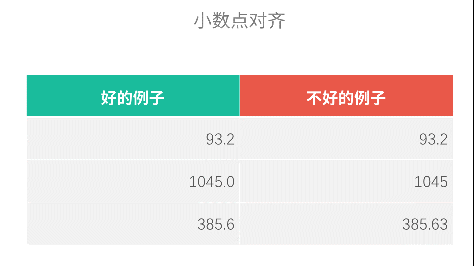
As shown in the picture, replace 1045 with 1045.0, it makes sense, right?
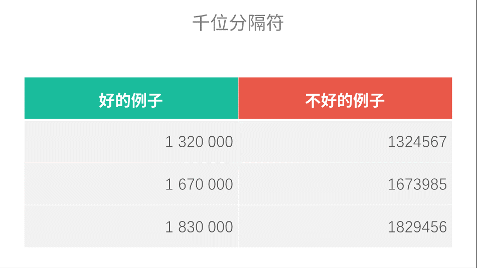
3. Use thousands separator
In tables, spaces can be used instead of thousands separators to avoid the difficulty of seeing its value due to too many digits, and it also looks more advanced.
The above is about the optimization of information processing. Then, it is visually optimized to make the form more beautiful.
Form processing
Tables are for data, to display data and make data more readable. Therefore, the simpler the better.
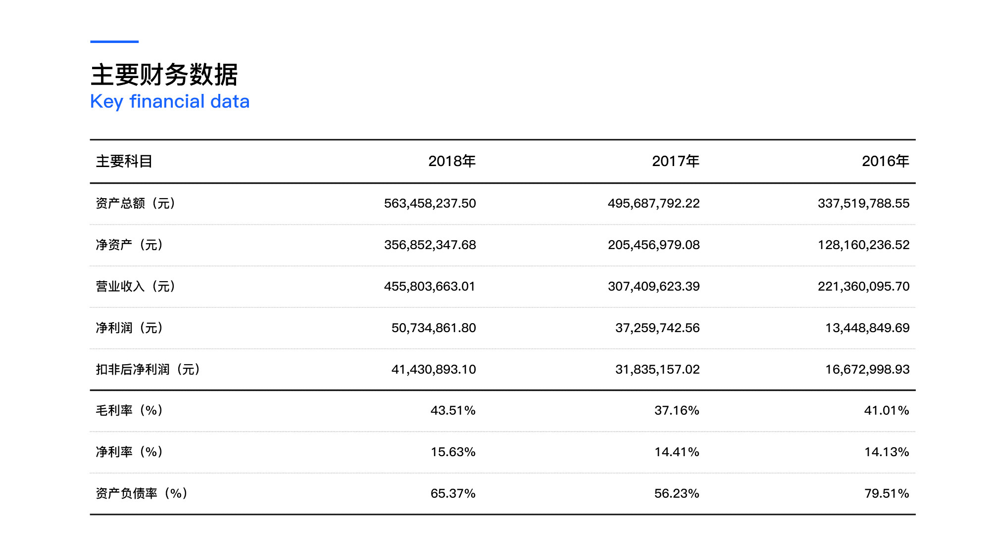
1. Alignment
Different information has different alignment.
For text or numbers, if the comparison between information is not involved, it is generally left-aligned or center-aligned:
For data with decimal points, in order to facilitate the comparison of the values of each data, right alignment is generally used:
For date-type information, try to use a 24-hour format and use a unified format:

2. Line thickness comparison
Generally, thicker lines are used in the header to emphasize the effect; while thinner lines are used in the content to ensure that the expression of the main content is not disturbed.
like this:
3. Highlight key points
If you want to highlight a key content in the table, you can use a lighter color to fill it, so that the page will not appear cluttered while highlighting the key points.
After learning this, let's practice with a real case.
Practical case
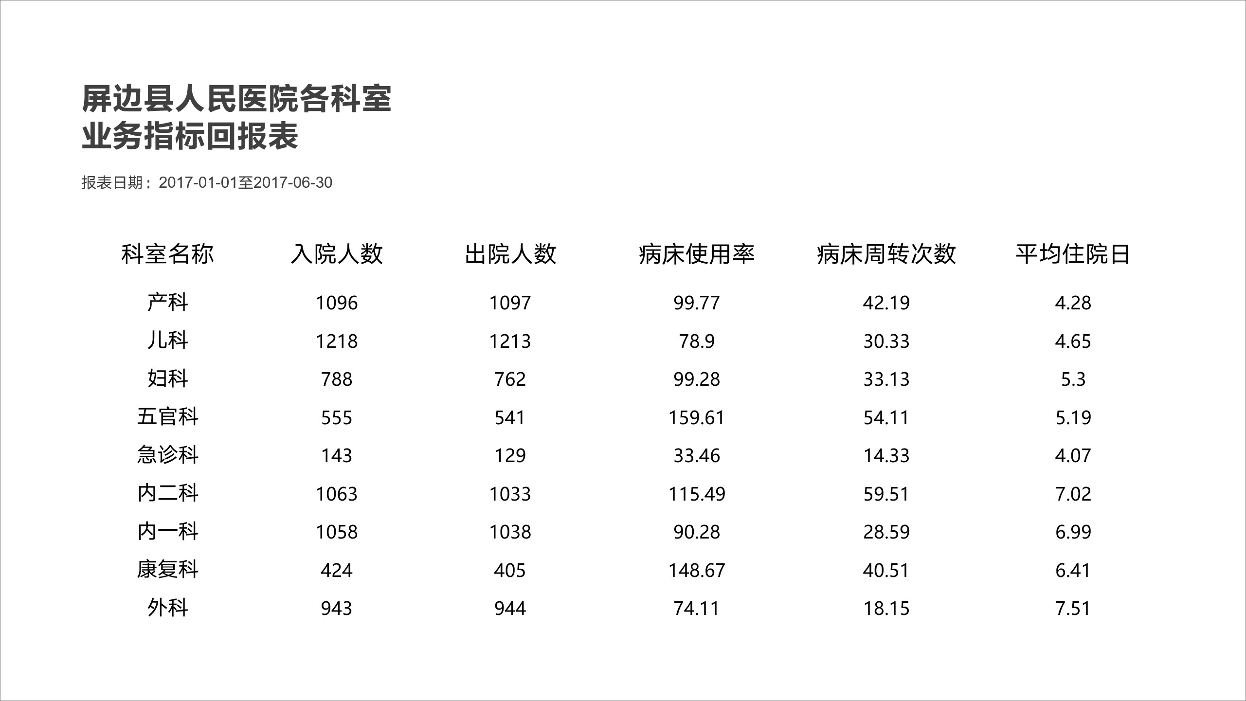
Take this PPT as an example:
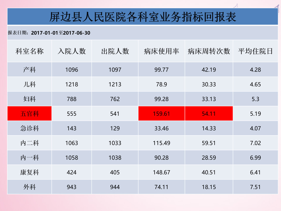
First extract the data:
Next, keep the data of [bed occupancy rate] and [average hospitalization days] consistent with the number of digits after the decimal point:
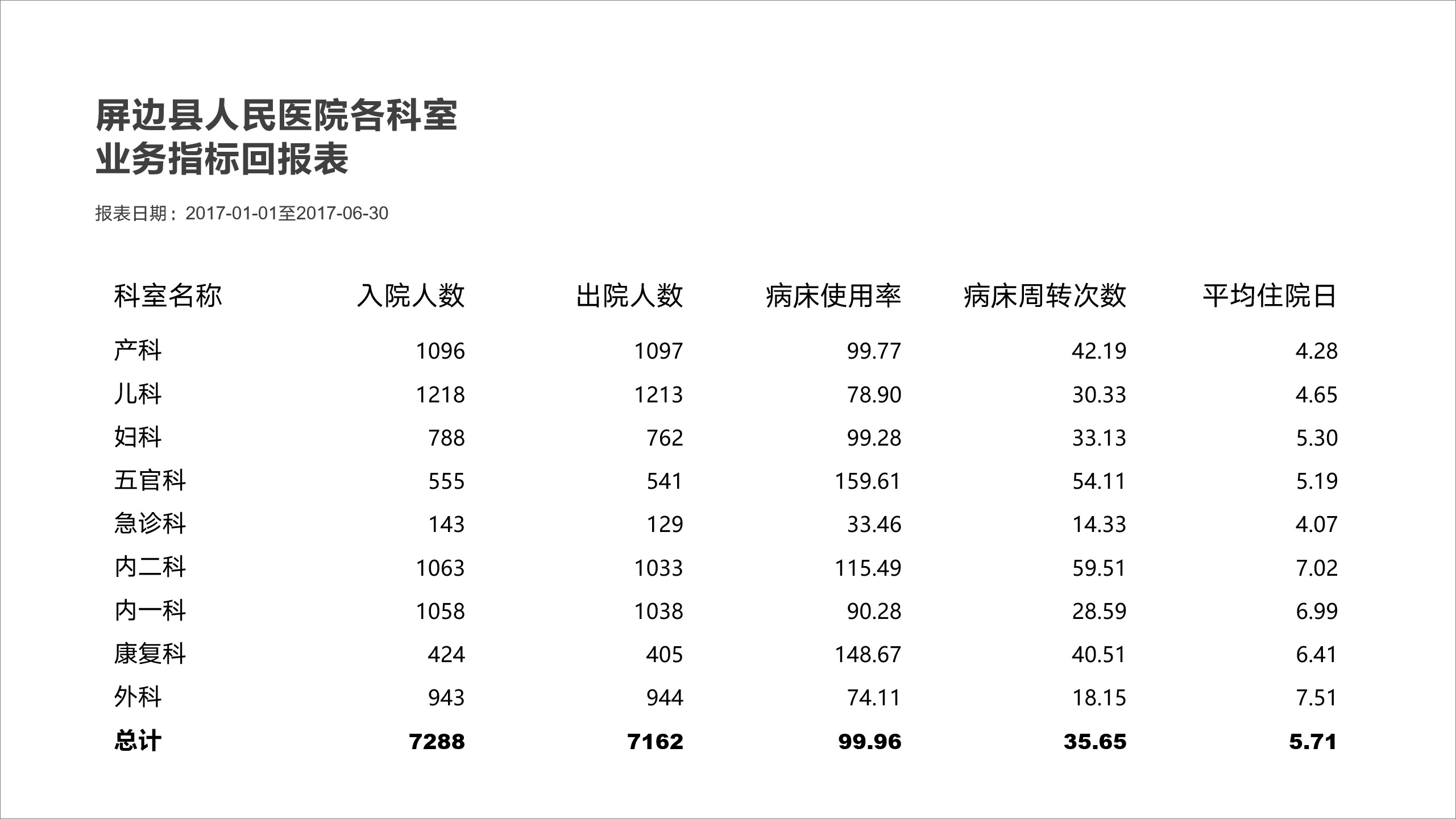
Then, adjust the thickness of the table lines to make it more layered:
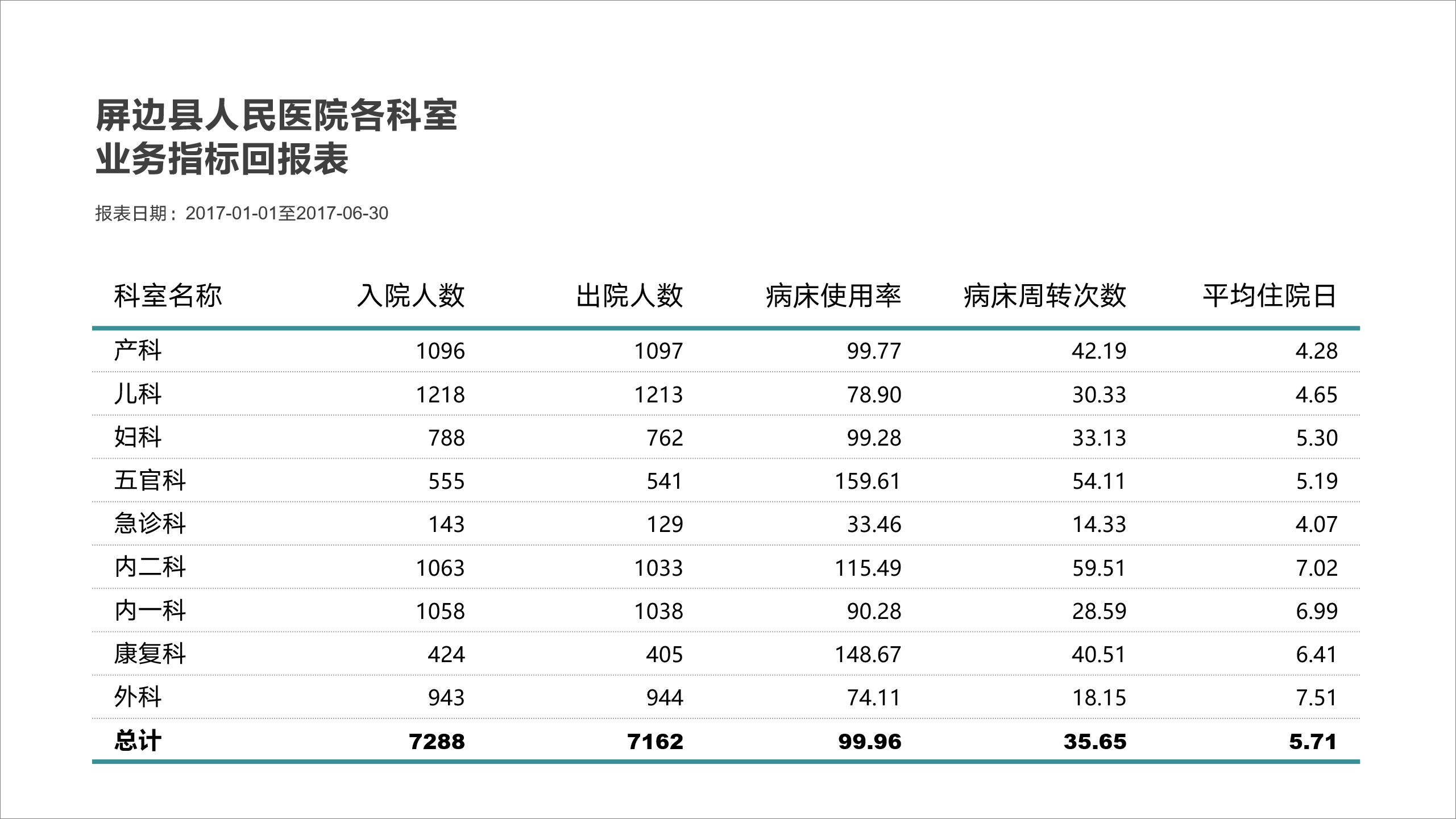
Finally, add a substrate, fill the key data with color, and highlight it:
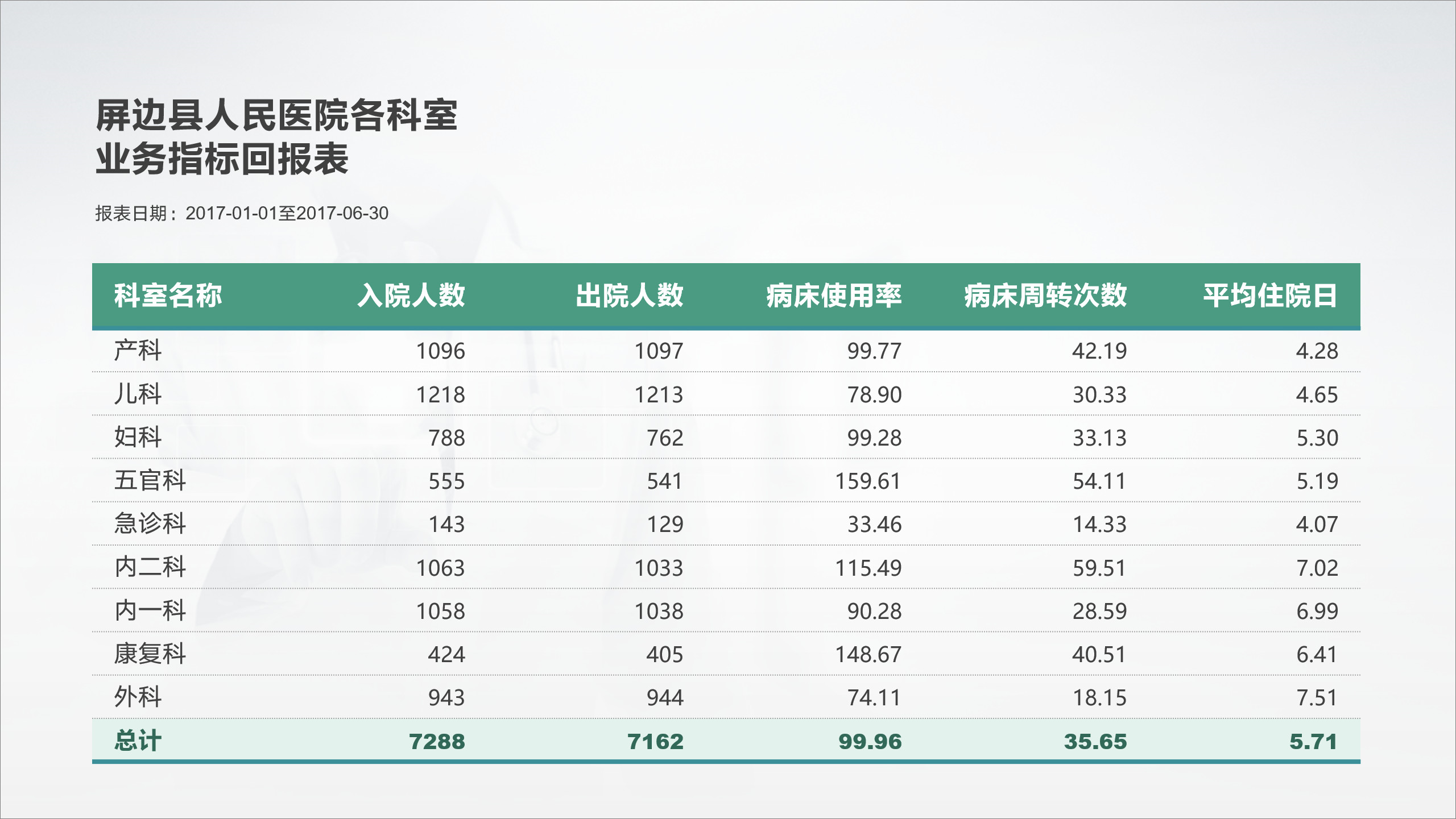
In this way, a data form is ready, not difficult, right?
Finally, send everyone a 147P custom chart, just forward + follow, see the picture below to get it~


Articles are uploaded by users and are for non-commercial browsing only. Posted by: Lomu, please indicate the source: https://www.daogebangong.com/en/articles/detail/How%20to%20do%20the%20PPT%20table%20on%20the%20high%20school%20Learn%20these%202%20tricks%20to%20make%20your%20slides%20become%20advanced%20in%20seconds.html
 支付宝扫一扫
评论列表(196条)
测试