
LOGO master editor (ID: logods)
Image Network
Introduction:In graphic design, in addition to graphics, fonts are also very important factors. Today, Dajun will share this article with you and talk about several common ways of font design.
Every development and change of Chinese characters from the original oracle bone inscriptions to official script, regular script, and simplified characters is a constant iteration and upgrade in terms of functionality and aesthetics, just like the Chinese character "horse" has undergone several adjustments .
(image source network)
In modern graphic design, designers often use font design to enhance the beauty of the design. By reshaping the font, enhancetype designlivenessand< /span>Richness can enhance the design's infection , so as to optimize the effect of graphic design.
There are several ideas for common font design changes:
1
Make changes to glyphs
Chinese characters are commonly known as square characters, and their external outlines are basically square. When designers want to express different information, they can transform the glyphs. According to the industry attributes, use the glyph changes themselves to produce amazing effects, thereby enhancing the attractiveness of the design.
Slope
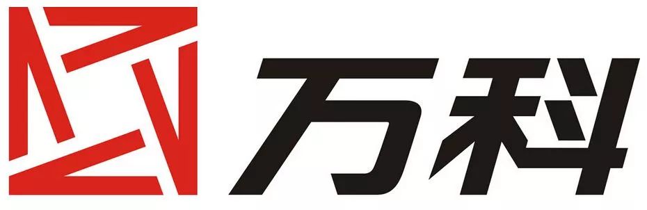
For example, in the real estate LOGO, the font of the word "Vanke" in the early Vanke logo leans to the right as a whole. Compared with other square fonts, it can give people a sense of visual impact and stand out among many square characters.
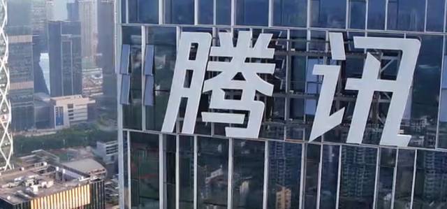
Basically, this type of slanted font will be used in some groups or Internet companies, just like Tencent has a soft spot for slanted fonts, because this kind of italic has a forward feeling, and italics are dynamic And the sense of speed can reflect the property of the Internet's rapid response to industry information changes.
irregular shape
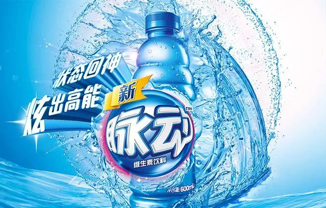
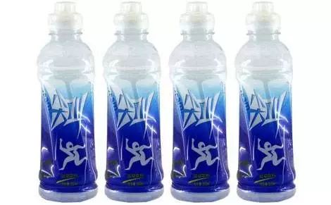
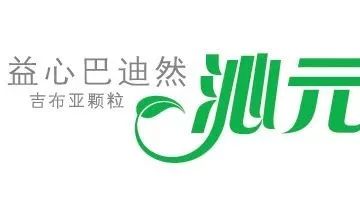
We have seen that most of the font LOGOs with irregular graphics appear on the packaging of beverage brands, because some fonts not only give people the illusion of sound diffusion, but also can make more exaggerated changes to the shape of the font, so that the product Among the dazzling array of shelves, it can be recognized at a glance.
For example, your most common pulse
scream
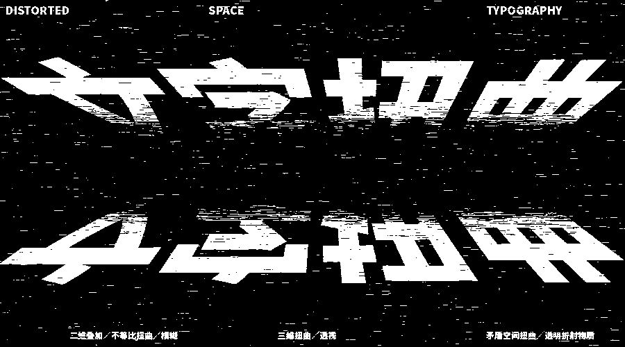
Distortion
Distorted fonts are generally used in posters to create a dynamic effect, bring a strong visual effect, and highlight the multi-dimensional space in the flat two-dimensional spaceThree-dimensionalThree-dimensional strong>. Most of the LOGOs of trendy brands also use this font to show the personality of the brand.
Perspective
The perspective font is to enhance the sense of space through the three-dimensional visual effect. This kind of LOGO design is generally used in large-scale exhibitions, catering brands and relatively small clothing brands.

Graphical
Graphics the glyph. Enrich the structure and fullness of the glyphs through a variety of elements, and combine some related elements to achieve a logo that is more intuitive and has a stronger cultural heritage. For example, the logo design of the Palace Museum in Beijing is the "Palace "The characters are graphically transformed into the shape of jade and the layout of the Forbidden City.
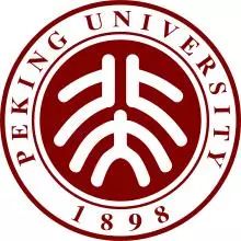
Another example is the logo design of Peking University.The two seal characters of "Peking University" are arranged up and down. Standing portrait.
2
Make changes to the pen shape
Chinese characters are composed of strokes, and most Chinese characters are composed of strokes such as horizontal, vertical, vertical, right, and dot. Each stroke has a relatively fixed basic shape, and generally only changes in length, thickness and other aspects. However, artistic fonts can transform all stroke shapes of a specific Chinese character, or transform some strokes of a specific Chinese character.
This type of font is suitable for more personalized tea shops and creative posters!
Finishing touch
It is regarded as a kind of stretching method, find a point or line in the logo as the key point to stretch it, so that it can be handled well The font, plus a stroke is the finishing touch.
Simplified strokes
In order to differentiate, many font logos cut strokes on the basis of balancing personality and recognition, making the font personality more prominent.
In fact, it ispersonalizing the font. By adding or subtracting the strokes of the font to highlight the emotion of the characters, it is more suitable for Individual poster design and layout design.
Change font weight
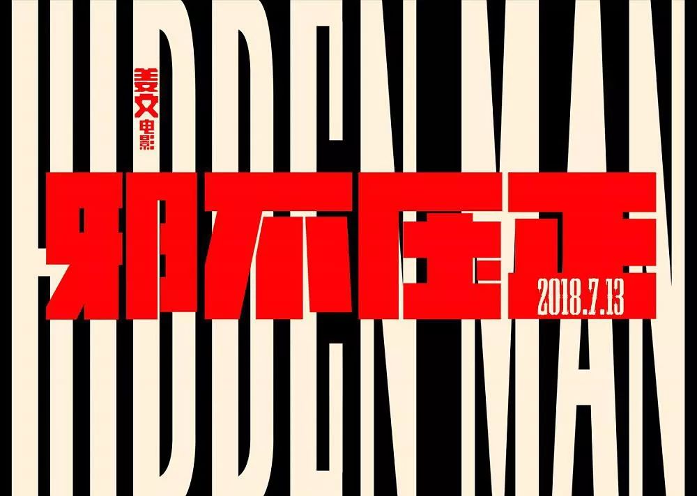
Change the aspect ratio of the original font. For example, the "Hidden Man" posters that have been screened recently, all fonts and strokes are bold, the overall is thick and powerful, and the righteous breath of evil man blows over us.

Of course, there are many design methods, and I won’t write them here due to the length of the article, because you hope that the article and experience will give you a way to diverge your thinking, rather than fix the boundaries of your creativity, so I think about Font LOGO design, the most important points are nothing more than:
First, recognition:No matter how you design, no matter whether your font is trendy or stable, first of all, as a commercial circulation The font logo must make readers feel and resonate;
Second, memory points: We receive so many signals every day, we must learn to find our own differences and learn to create memories point, so that the retention time of the brand will be longer and let our design value be more exerted;
Third, communication power: This is actually the most difficult thing to do, it is to make people who see it arouse positive emotions Discussion and sharing, this requires a bit of global thinking, strong knowledge and vision, so that a design can lead a new creative way, and can continue.
Today's topic
Do you think font LOGO is more difficult than icon LOGO?
Welcome to leave a comment~
"Everything needs to be studied to understand"
[Click the link for some cases: Sikang,China Travel 90th Anniversary LOGO,Congee porridge to, Aibida, Coconut chicken in summer , Dehua Building, Zhigan, Beaver homesick, Liu Ji Roast Meat, Qiao Xiguan, By-Health Hirun, < /span>Sanlishi, Le Island, three peppers, And wood, Nolanka, Shu Chong, Panda Rabbit, Erhai Minor , more works reply to "case"]
【Cooperation WeChat: logodashi/logodashi666】
Articles are uploaded by users and are for non-commercial browsing only. Posted by: Lomu, please indicate the source: https://www.daogebangong.com/en/articles/detail/How%20to%20do%20LOGO%20font%20design%20Just%20read%20this%20article.html
 支付宝扫一扫
评论列表(196条)
测试