
Source: AbleSlide Slideshow Design Studio
Author: Liu Ergou
PPT designers: @木白、@一城
The PPT live effect is amazing! Everyone in our company thinks it's great!
This is what the "Euro Brand Director" said to us at the "Euro Innovators Annual Conference 2017". That's right, AbleSlide contracted another press conference PPT.
However, today I am not going to speak on stage, I would like to talk about "The story behind a well-designed press conference PPT".
John Dryden said: To create true beauty, you must have the skills of a master.
As a top conference PPT design company, we do not blindly pursue the improvement of skills, but on this basis, we also deeply understand each of our customers and each event, and use visualization for them from the perspective of customers Design in a way that conveys ideas and emotions to the audience.
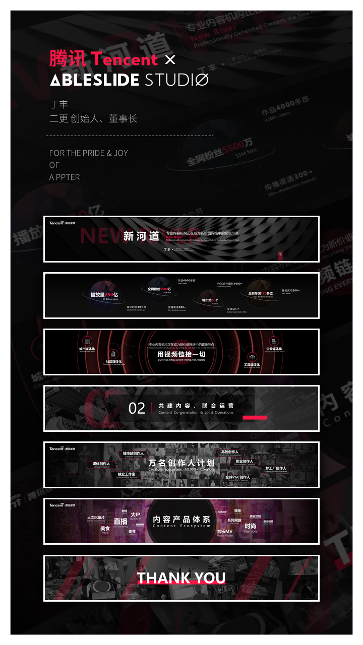
"2017 Yiou Innovators Annual Conference and the 3rd Innovation Award Ceremony" - this event is particularly important to Yiou. The annual year-end conference has more than 4,000 audiences and nearly 300 media reports on the conference.
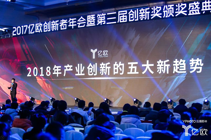
Therefore, Yiou invited AbleSlide to customize the PPT for this conference, and today we are going to talk about the process of customizing the PPT for Wang Bin, the co-founder and president of Yiou Company.
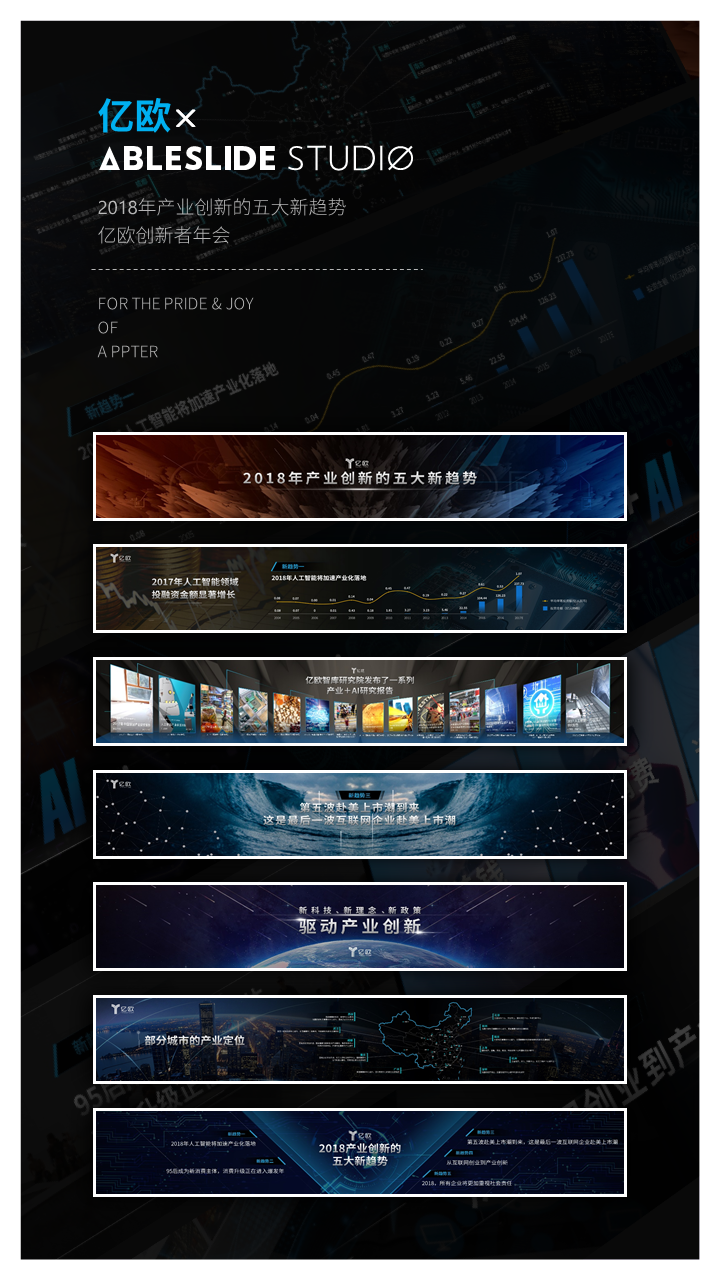
Don't be wordy, look at things first. (The following are only some pages)
The process of making this PPT can be said to be full of twists and turns, with no less than 5 iterations and revisions. Every choice between going and staying has been carefully considered, where a sense of space is needed, what method can better show the "trend", and where needs to shock the audience's attention...
Here are the stories about design from our back garden:
Before designing, we had a detailed understanding of the customer's content requirements and the site conditions of the conference.
Customer Content Requirements Section:
1/ The meaning of the content of the manuscript on each page
2/ Requirements for the way content is presented on each page
3/ Background of Yiou Company
4/ Activities of Yiou Innovators Annual Conference
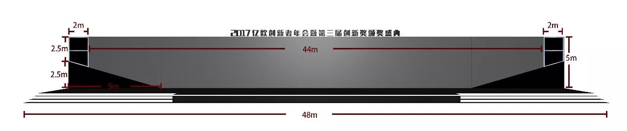
Part of the site conditions of the conference:
1/ Is the live screen a projection or a led screen?
2/ On-site screen type and size?
3/ Are there any restrictions on split screen?
4/ The extensibility of the main vision?
5/ What is the resolution requirement?
6/ What is the height above the ground?
7/ Are there decorations around the screen?
8/ Is there a live broadcast on site?
Due to space reasons, we will not describe them one by one here, but each of the above factors will have a certain impact on the effect. After we understand the customer's content needs and the site conditions of the conference, we then sort out the logic and structure of each page through internal meetings and start creating a PPT for the press conference.
Next, I will deduce the mental journey of our creative process in the form of questions and plate design.
1/
How to make the conference PPT have a sense of space?
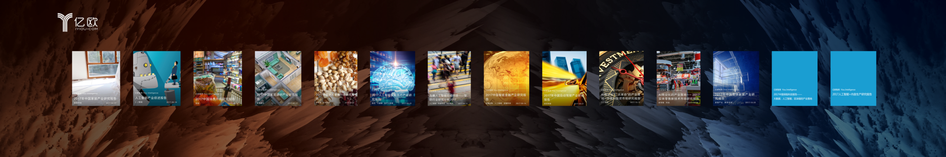
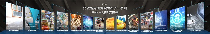
When making this page, we first determined that the speaker on this page wanted to talk about a series of industry + AI research reports released by the EO Think Tank Research Institute in the past, and the names of several reports will be named during the speech , so the design of multiple pictures on this page cannot use the picture wall, but the pictures need to be clearly arranged.
However, meeting in line is very cold. We want to make full use of the ultra-widescreen feature and try to create a stronger immersion for the audience.
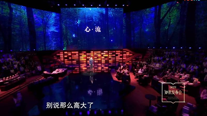
What is immersion?
In Luo Zhenyu's words: "I believe that everyone has had this experience. At a certain moment, one's attention is particularly concentrated, inspiration bursts out, and no matter how you play. Being able to play at a level that is much beyond your usual, this kind of momentary psychology There is a word in academia called heart flow. Artists will have flow when they create, let alone being so tall, our children are all in flow when they play games.”
In order to create a "heart flow" experience for the audience, Luo Ji Thinking's No. 002 knowledge conference specially adopted the design of a ring screen, and then everyone at the scene was placed in the heart flow scene created by Luo Zhenyu, with bookshelves, piano accompaniment, stage Lighting and other factors, the sense of immersion is very strong.
Therefore, we hope that on the basis of the two dimensions of length and width, we can strengthen the design of the "depth" dimension, so that the screen elements have the effect of being ready to come out, and give the audience an immersive experience. Feel. Try to show the audience a 3D effect on a 2D plane.
For example, although these two pages have a large number of pictures to typesetting, the content logic and expression form are completely different.
Design is not a mathematical formula that can be derived and predicted. Behind the skills and methods, design needs an important thing "inspiration"! Each of us is an audience, and inspiration lies in these real life experiences.
The first key word is "release". As we understand the release, all the new products are lined up in front of you in order, so the overall arrangement of the pictures shows the feeling that the middle is far and the two sides are close. It is like opening your arms, sharing and presenting the most core and cutting-edge research results without reservation. Rather than a cold horizontal arrangement completely on the same plane.
Moreover, some research reports need to be mentioned separately, so each report is also added with the report name during the design process.

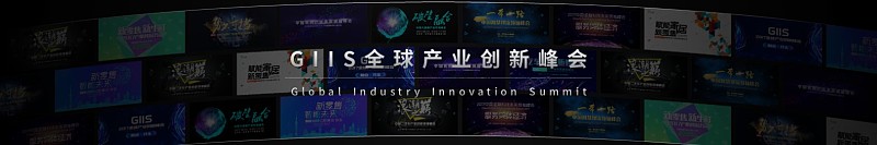
The meaning of the second picture is that Yiou believes that "serving the real economy will become the core theme of 2018 industrial innovation. For a long time, Yiou has been focusing on how to use new technologies, new ideas and new policies to drive the development of the real economy, and Many summits have been held in the past year. The speaker here did not want to talk about a specific summit, but wanted to emphasize that this year, Yiou held 12 summits in order to explore the future development of the real economy. So we use The method of picture wall is used to set off the momentum.
Attention! Ordinary PPT designers will basically stop at the picture wall, but as a company with strong style, we wonder if we can turn the ultra-wide screen into a curved screen.
So we processed the background picture wall, so that the original background picture wall has a curved feeling. In this way, the three-dimensional effect of the curved screen can be shown even on a flat screen.
2/
How should the trends on the page be reflected?
It may be a little fluidity that makes a page of PPT say goodbye to dullness and rigidity, and make it more dynamic and vibrant.
Yiou's third new trend judgment for 2018 is: the arrival of the fifth wave of IPOs in the United States.

Here is a key word: listing tide. We enhanced the visualization of the "tide" with the "tide" of the background image, but the still image somewhat lacked a kind of fluidity. So we added some gradient lines in the background to make the overall upward momentum stronger.

The fourth trend is from Internet entrepreneurship to industrial innovation. We continue to use gradient lines, on the one hand, to make them more integrated and echo back and forth. More importantly, after we added the lines trending from left to right, we supplemented it with two background pictures representing the Internet and industrial innovation, so that the audience can experience a change more intuitively when looking at this page.
Gradient lines can make the changing trend more intuitive and clear, and the page will be more active and vivid.
If the above-mentioned gradient line plays an icing on the cake when expressing the trend, the following method focuses more on functionality.
In Yiou's view, in 2018, artificial intelligence will extend from AI to "AI+" and "+AI". Here we use gradient arrows to express its internal evolutionary relationship, and the presentation of the entire page's moving lines will also make people's visual experience more impactful than using only a small arrow.
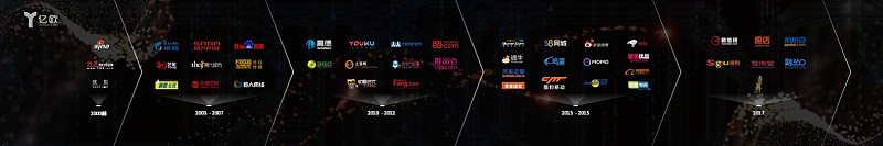
Similarly, when expressing the five listing tides in the United States, there is a time-recursive relationship. If only a simple timeline is used to express it, it will not only be routine and monotonous, but also cause disadvantages in the expression of the logo. If you use triangular color blocks to express advancement, because of its size, it is easy to be submerged in colorful logos, making it impossible to distinguish the function, and the evolution trend will also be weakened.
So we applied this method again to make the five listing waves clear, and vividly express the feeling of "wave after wave" of listing, with continuity.

The gradient arrows make the trend between evolutionary recursive relationships clearer.
3/
We may have found the most atmospheric ultra-widescreen graphics solution
Internet conference screens have evolved from the 16:9 standard to ultra-wide screens, curved screens, special-shaped screens, and screens with different aspect ratios. The layout rules are also quietly changing.
Many customers came to us and said that the ultra-widescreen PPT made by the previous company looked strange. Please take a look. In many cases, the designer directly moved the layout of the 16:9 PPT to the ultra-wide screen. Naturally, there is no way to highlight the ultra-widescreen features.
In view of the ultra-wide screen's wide length and strong sense of immersion, the AbleSlide team has been trying to use symmetrical pictures to create a calm and atmospheric visual effect from a very early age, giving people a strong sense of immersion.

For example, in this picture, we use the meteors in the universe in the picture to represent new things—new technologies, new ideas, and new policies, descending on the earth to represent the driving and changes of new things to the original world. The direction of the shooting star just points to the core vocabulary of this page "driving industrial innovation", allowing the audience to consciously focus on this and leave a deeper impression.

The wave design on this page can be said to be the classic presentation of AbleSlide. The role of pictures is not only to reproduce the scene, but also to express emotions. Different pictures of waves will also show different emotions, states, momentum, etc.
The relationship between the depth of the waves in this picture is more obvious. The lowest part of the waves is like a road leading to the distance. The brightness of the picture is low, and the atmosphere is relatively low, echoing the "last wave".

In the press conference of Tuya Technology in October, we also used the technique of wave symmetry. But in the picture selection, we chose this one out of hundreds of pictures. On the one hand, because the waves on both sides tend to converge towards the middle, it allows everyone to follow the trend of the waves and focus on the "IQ Free Plan" in the middle. , On the other hand, the large area of splashing waves in the picture is more majestic, which can set off the feeling of the press conference.
Therefore, the symmetrical picture design not only needs to have a deeper perception of the content, the emotion that the speaker wants to express, and the scene, but also can find the picture that best expresses this perception from hundreds of pictures. Although the method of PPT design Simple, but how to make the best use of simple effects, even turning decay into magic, is the focus and difficulty of presentation design.
4/
Logical structure presented
Structure is the skeleton behind the PPT. For speeches, a PPT with a logical structure is more likely to be impressive and easy to understand.
There are few separate transition pages in the PPT of the press conference, and most of them are organically integrated with the content, but this also has a disadvantage, that is, it is easy for the audience to ignore its internal logic, and thus cannot understand the speech.
This issue is dealt with reasonably in this PPT. We deal with similar elements in Trends 1 to 5, and repeat them, which will help strengthen people's impression of it. Moreover, its font size has been enlarged reasonably, so that people cannot ignore its existence.
On the final summary page, the five-point trend as a subtitle reappeared, effectively responding to the previous five scattered pages. It also clearly shows the five-point trend.
And once there are more than 3 points of view, it is easy for the audience to forget the previous content when they hear the latter, so such a summary page is also very necessary, which makes the overall sub-total structure clearer.
As you can see, the above is the story behind the PPT we completed for the press conference, and it is also our design review of the Yiou Innovators Annual Conference.
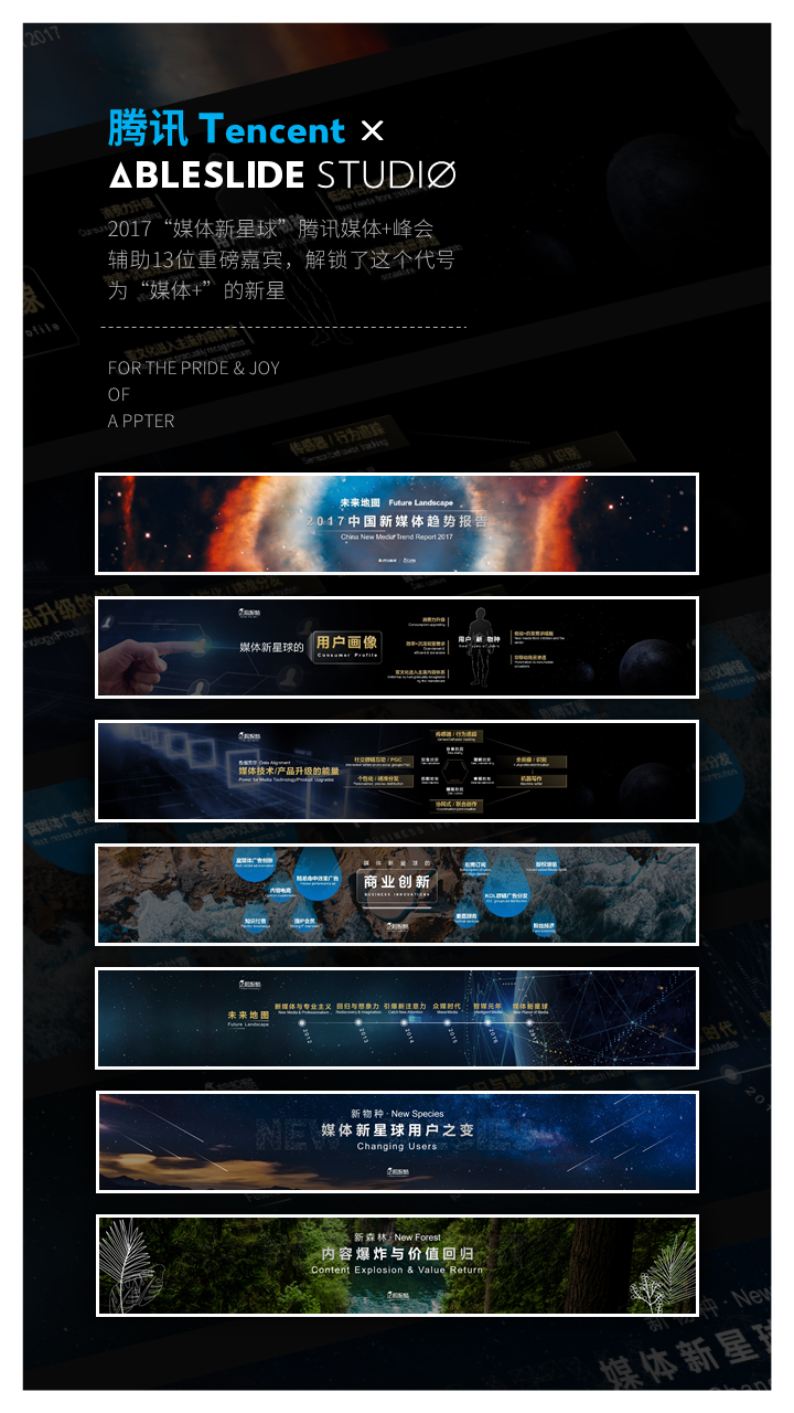
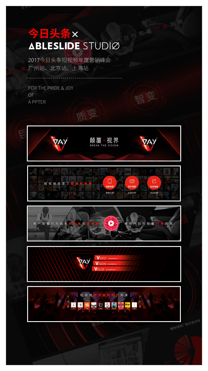
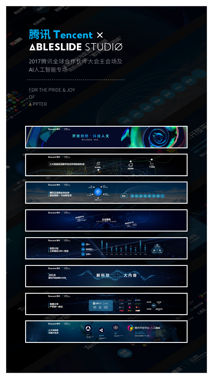
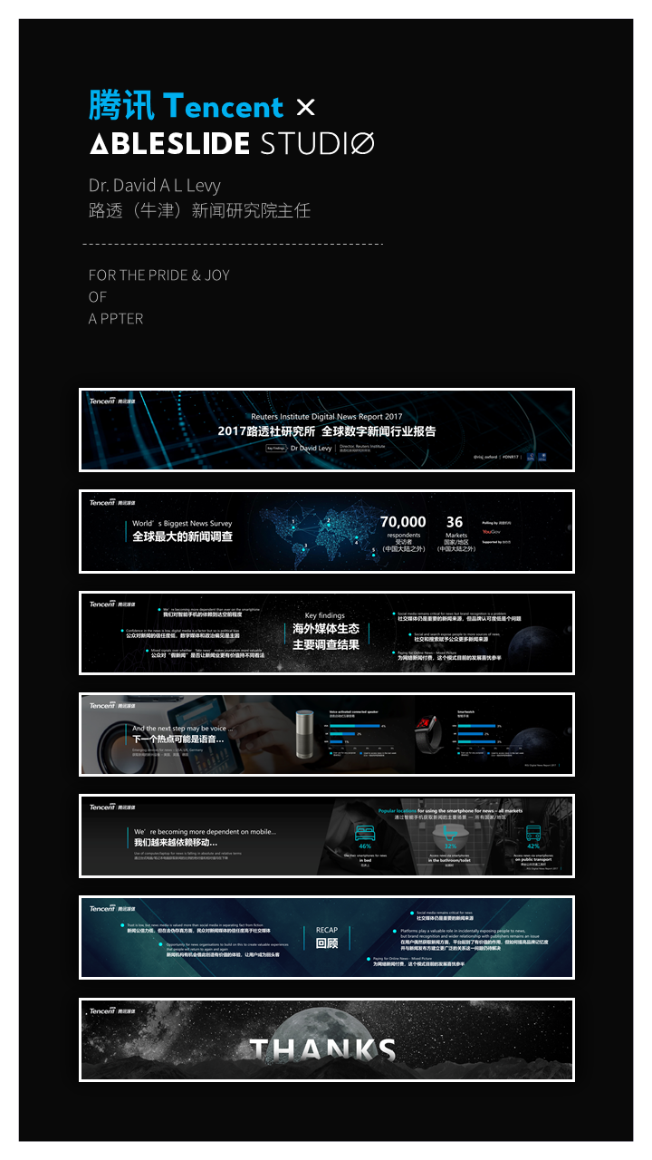
With the same attitude, we have also created top-notch press conferences one after another with these comrades in arms:
...
Who will AbleSlide roll up his sleeves with next?
we do not know.
We look forward to it as much as you do :)
In this life, people always find one or two things that they really like to do. If they can change an industry because of this, they will be so happy! ——AbleSlide Team
Articles are uploaded by users and are for non-commercial browsing only. Posted by: Lomu, please indicate the source: https://www.daogebangong.com/en/articles/detail/How%20to%20design%20a%20powerful%20press%20conference%20PPT.html
 支付宝扫一扫
评论列表(196条)
测试