Original text: "Before downloading fonts, take a look..."
From: justfont
Before downloading fonts (whether legal or illegal), have you ever wondered how a complete set of Chinese fonts is designed?
Normal people should not be curious. The history of type design is mysterious, never talked about in the past, and rarely wondered. Over time, some people began to think that fonts are a gift that comes with computers, and even think that fonts are produced by computers themselves. But fonts have been created by professional craftsmen since ancient times.
And the process of building it takes a lot of time. As far as Chinese fonts are concerned, it will take at least two years to achieve good quality control. And it only takes two seconds for us to download the work results of a staff member for more than two years.
In our documentary "How Fonts Are Made", justfont font designer Zeng Guorong and founder Ye Junlin talked about the internal design process of justfont font design team:
·Preparation before design·
Like any other product launch, typefaces undergo market research. No matter from the perspective of function or style, it is speculated whether there is a gap in the market for new typefaces. After the characteristic concept of the font you want to make is almost determined, you can start from scratch: first determine the frame, whether it is long, square or flat, and the shape of the font will significantly affect the style. The skeleton is the key to the feeling of the font. Whether the font is "easy to read" and "functional" of "easy to recognize" also largely depends on the "skeleton".
In the early stage of design, you will definitely try to make a few words. In the process of trial production, I will try many ways to match different stroke shapes and skeletons, and when designing these basic characters, I will experiment with how the stroke space allocation of this set of fonts is most appropriate.

The general process of font design
·Extended character set from basic characters·
There are tens of thousands of Chinese characters, and it is usually not done one by one (otherwise when will it be done). Although there are many words, they can actually be disassembled appropriately to form a combination of radicals. That is to say, in theory, once a specific group of radicals is prepared, these radicals can be recombined into more characters. This is the importance of "basic characters": as the basis for future expansion of the word count.
When it comes to basic characters, you must be able to experiment with ideal space allocation, so not just any character can become these characters. Usually, when designing Chinese characters, the characters "Jin, San, Li, Yong, Dong, Guo, Remuneration, Love, Yu, Ling, Eagle, and Bag" are selected for design. The reason for this has been explained in detail in the article "About "Going south through the Three Kingdoms and going east through the Five Lakes"".
In the Chinese font industry, a few basic characters that were often used to test concepts in the early stage
To put it simply, these few characters can represent the most extreme situation among commonly used Chinese characters. For example, "东" is the widest character on the left and right, so it can be determined that this set of fonts is the widest "Eagle" is the representative character with the most horizontal strokes among commonly used characters, so it can be used to determine how to adjust the width of the horizontal lines when the strokes are more complicated (so as not to be too thin or stick together).
However, because there are tens of thousands of Chinese characters, these ten characters cannot effectively represent all situations, and they also lack "knowledge" and "phonetic sound", that is, characters composed of more than two radicals (and They again account for the majority of Chinese characters). Therefore, it is still necessary to select more characters and determine the shape and details of each radical. Usually need about 300 characters, just can contain enough radicals and can expand to the basic commonly used characters of 10,000 characters.
The radical component can be reused, but it does not mean that there is no need for fine adjustment of each word
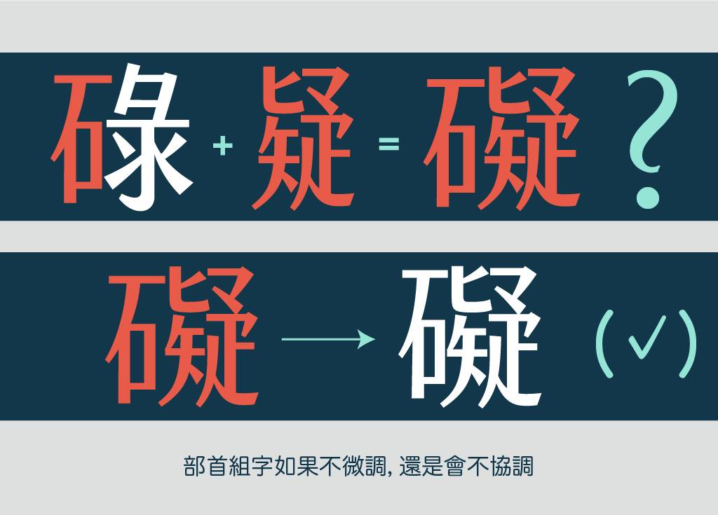
Although in the computer age, each component can be copied and pasted to the next character, but this does not mean that Chinese fonts are a highly automated production process. Because every word in Chinese characters is actually a picture. Radicals from other characters often have to be revised for a long time before they can conform to the reasonable balanced layout of this character.
That is to say, you need to manually spell each word. Typeface is still very close to the handicraft industry.
·Tools·
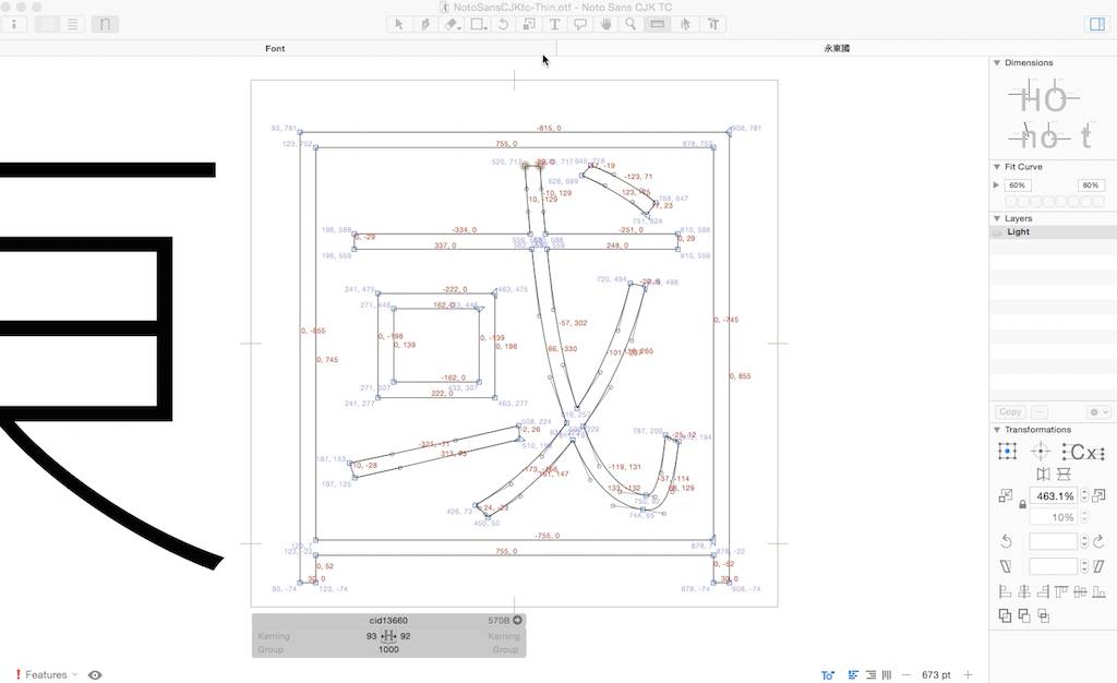
Digital fonts are drawn with vectors, so in theory, as long as a designer wants to use Illustrator to first draw a set of Chinese fonts (such as design Ying Yonghui of "Zhejiang Folk Script"), and then output the specific format to open source font software such as FontForge to encode fonts.
But doing so is actually hard work. A set of Chinese font has thousands to tens of thousands of characters, which will need to be encoded and output as a font file; it is best to adjust the common value of each character uniformly, For example, the thickness of the stroke, and the width of a character. These dimensions are not easy to manage through ordinary drawing software. Therefore, it is more necessary to use fonts to design software: not only for drawing, but also for managing tens of thousands of characters and symbols.
The mode of the font design software Glyphs to measure stroke width
Moreover, if you look at each character individually, you usually can't see any shortcomings, and you will feel "Well, this character is so beautifully designed!" The quality of a Chinese character is not determined by a single character, but by arrangement Write an article to see how the readability and legibility are done, and make sure that some characters are not too large, or the center of gravity of some characters is distorted. The font design software used by justfont for current design
·The pursuit of consistent quality control·
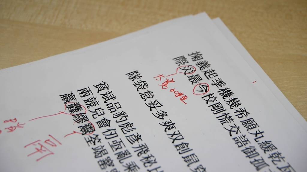
However, tens of thousands of words can rarely be done by one person, and usually the whole team has to do it.
The problem is here: Everyone has a different sense of beauty. Some people draw smoother curves, while others like to adjust the angles sharper. The unity of a typeface. Therefore, font designers need to meet frequently, and everyone will review whether the characters made during the past period can be adjusted more consistently.
Behind this "cool" job: keep repairing, keep repairing, keep repairing
Moreover, mistakes are bound to be made by hand, just like writing, it must be reviewed by others. If you look at a word for too long, it doesn't feel like a word. This mental blind spot also occurs in typeface design. Designers stare at the screen all day, and it is easy to get visual fatigue. Enlarging the fonts to fill a 20-inch screen feels beautiful, but zooming out is another matter. At this time, everyone needs to print out their own words in different sizes and cross-review each other. It is very common for a word to be revised five times. A set of good quality fonts needs to go through many such revisions before it can be achieved.
·Social Responsibility of Font Design·
As Guorong said at the end, font design is often a "responsibility": once these fonts leave the company, they may appear on the streets everywhere. Well-made fonts are invisible, functioning quietly, allowing people to experience them smoothly, and even few people will notice; but bad fonts are likely to become "visual pollution", a clean and bright good A place, a good photo taken with care, is likely to ruin a pot of good food with mouse shit because of the poor font.
So, a lot of the time, type designers are struggling with their own sense of responsibility. Even if there are many people who can't see the "defects", if they can't pass their own level, the work of typeface designers cannot be easily closed.
(Picture and video source network, GrayDesign organize and share)
Long press the QR code to follow "GrayDesign"
(ˊᵒ̴̶̷̤ꇴᵒ̴̶̷̤ˋ)꒰Discover the beauty of design~
Articles are uploaded by users and are for non-commercial browsing only. Posted by: Lomu, please indicate the source: https://www.daogebangong.com/en/articles/detail/How%20to%20design%20a%20complete%20set%20of%20Chinese%20fonts.html
 支付宝扫一扫
评论列表(196条)
测试