With the widespread use of mobile devices such as mobile phones and tablet computers, information originally carried by paper media has been continuously migrated to electronic media, and screen reading has become the main way for people to obtain information on a daily basis. For electronic reading, if you want to achieve the same comfort as paper reading, you must pay attention to the application of screen display fonts. Nowadays, many fonts specially designed for screen display have emerged as the times require.
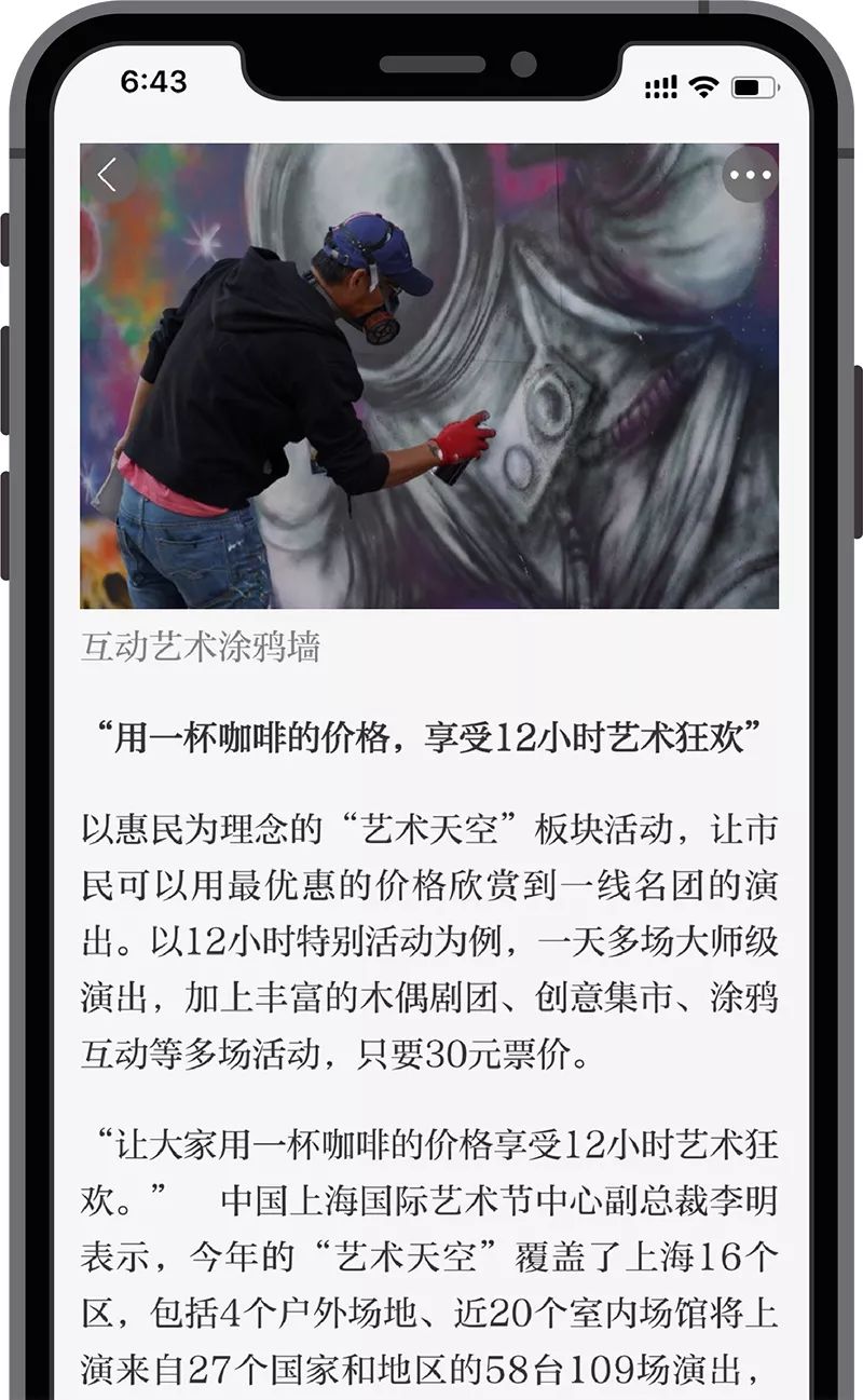
Currently, the Central Propaganda Department’s Learning Power, People’s Daily Haike News, Guangming Daily App, The Paper App, Beijing News App, Beijing Daily App, Jiefang Daily Shangguan News App, Xinhua Daily Intersection News, Jinan Times New Times App, Influential central and provincial newspapers, such as Gansu Daily’s New Gansu App and Shenzhen Newspaper Group’s Reading Special News App, successively replaced the fonts embedded in the apps, allowing the on-screen fonts to show their talents.

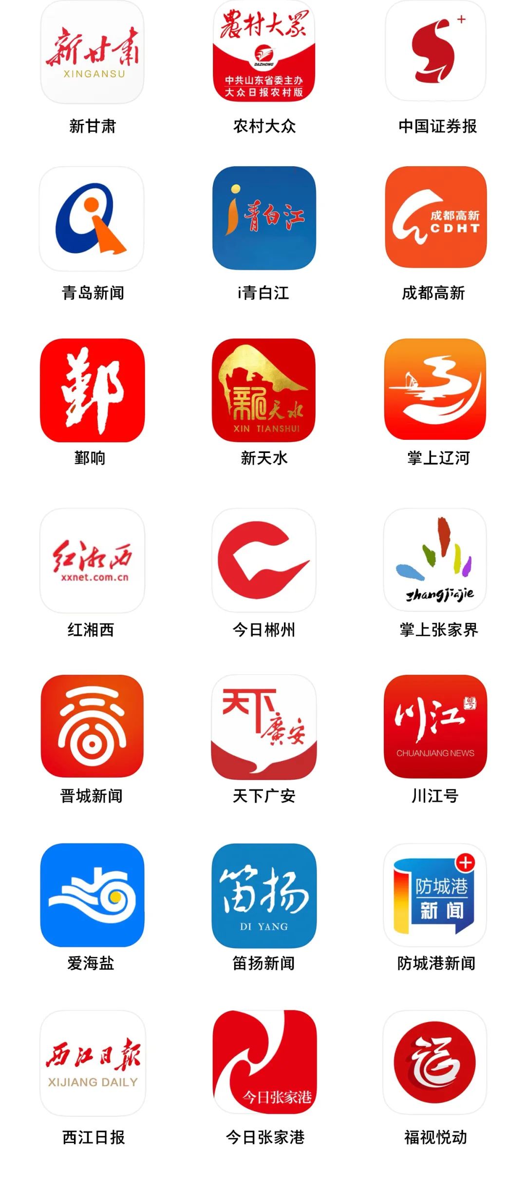
▲ Some news apps using Founder fonts
01 Why change the font?
Enhance the experience
While showing a variety of visual styles, on-screen fonts can significantly improve the recognizability of content and enhance the user's reading experience, which is especially important in long-form reading environments such as news and information.
Renewed
Most of the news and information APPs are dominated by large-scale text layout, and fonts are particularly important. Replacing an embedded font will give the overall style of the APP a new look and a new life.
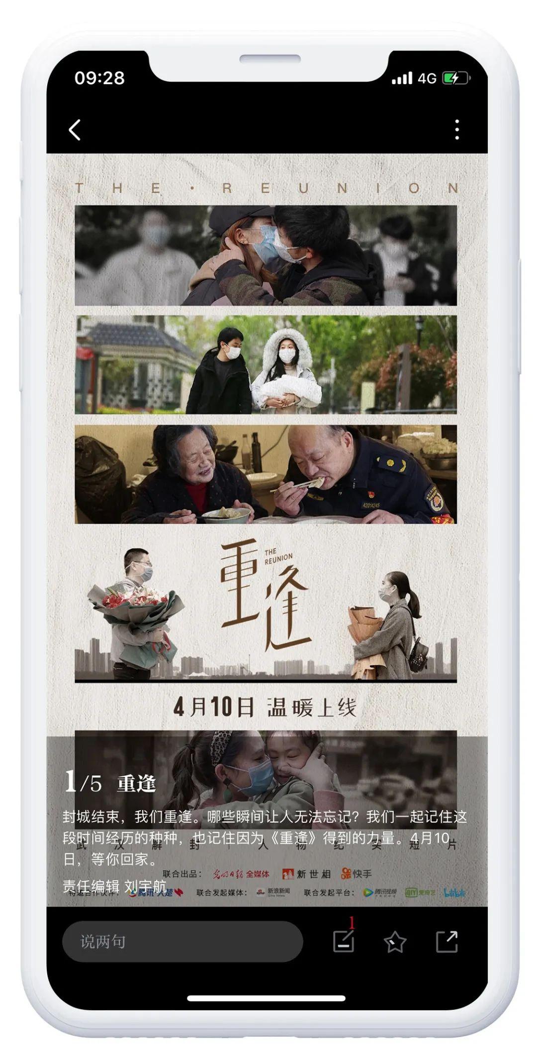
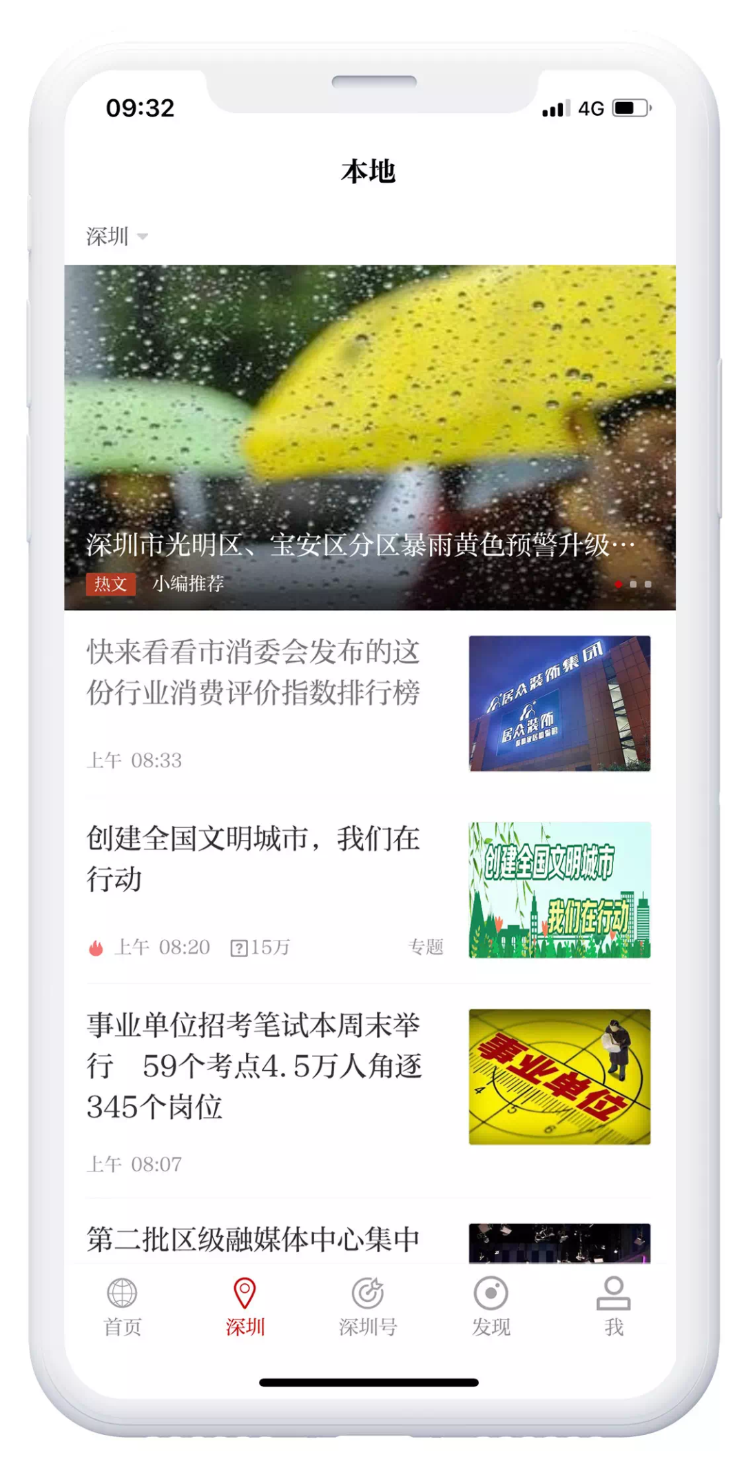

▲ The application of embedded fonts for screen display in different apps makes it present a completely new visual style
02 Arial for screen display
Fangzheng Yousong Family
▲ The first generation of Chinese screen display Song style - Fangzheng Yousong
The biggest difference between Song typeface and Hei typeface is the contrast between the decorative angle at the end of the stroke and the thickness of the stroke. Fangzheng Yousong changed the traditional inverted triangle style to a right triangle style, which makes the font and pixel fit better. Improves the sharpness of glyphs displayed on the screen.

Whether it is in newspapers or books, long-form content on paper is usually presented in Song Dynasty, and the decorative corners at the end of Song Dynasty strokes make people breathe and pause when reading. Fangzheng Yousong has this feature, but uses it very restrainedly. At the corners, Yousong actively reduces the characteristics of Song Typeface. This not only retains the advantage of Song Typeface that brings pause to reading, but also makes the display under small font size more clear. exquisite.
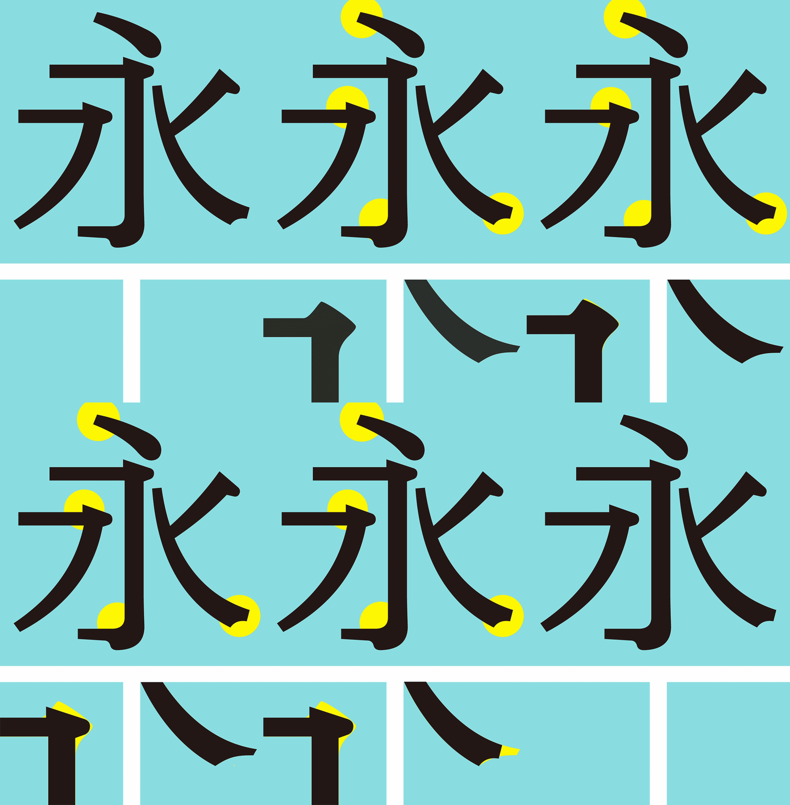
▲ Fangzheng Yousong's pen shape characteristics
Fangzheng Yousong specially made fine adjustments for the characteristics of the screen. On the basis of the traditional Song style, properly enlarged the middle palace, and properly discrete between strokes, so as to avoid Stroke sticking and blurring during screen display.
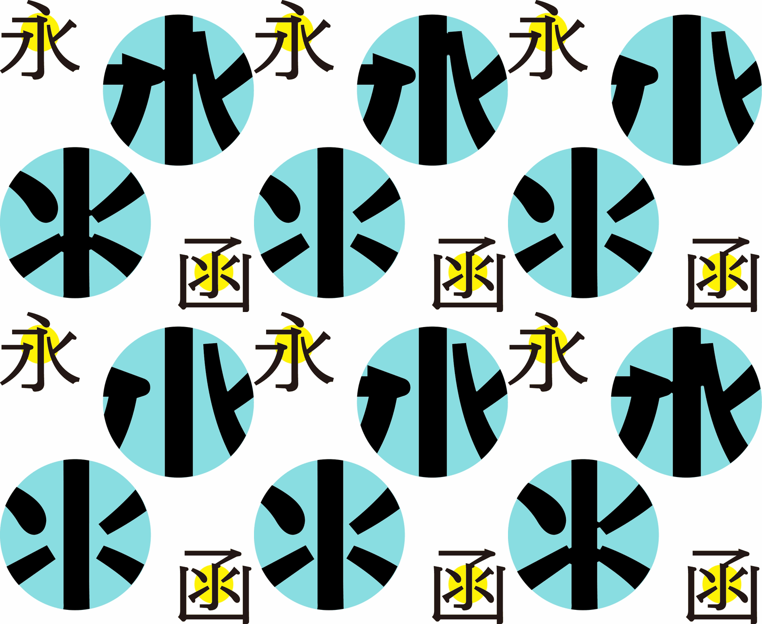
▲ The strokes are appropriately discrete to avoid sticking of strokes when displayed on the screen
At the same time, Founder Font also cooperates with Typetogether to provide Founder Yousong with a version combined with Portada in English to meet the designer's more detailed typesetting needs in a multilingual environment.

In the screen display, Fangzheng Yousong's reading effect is more comfortable no matter it is against a white or black background.
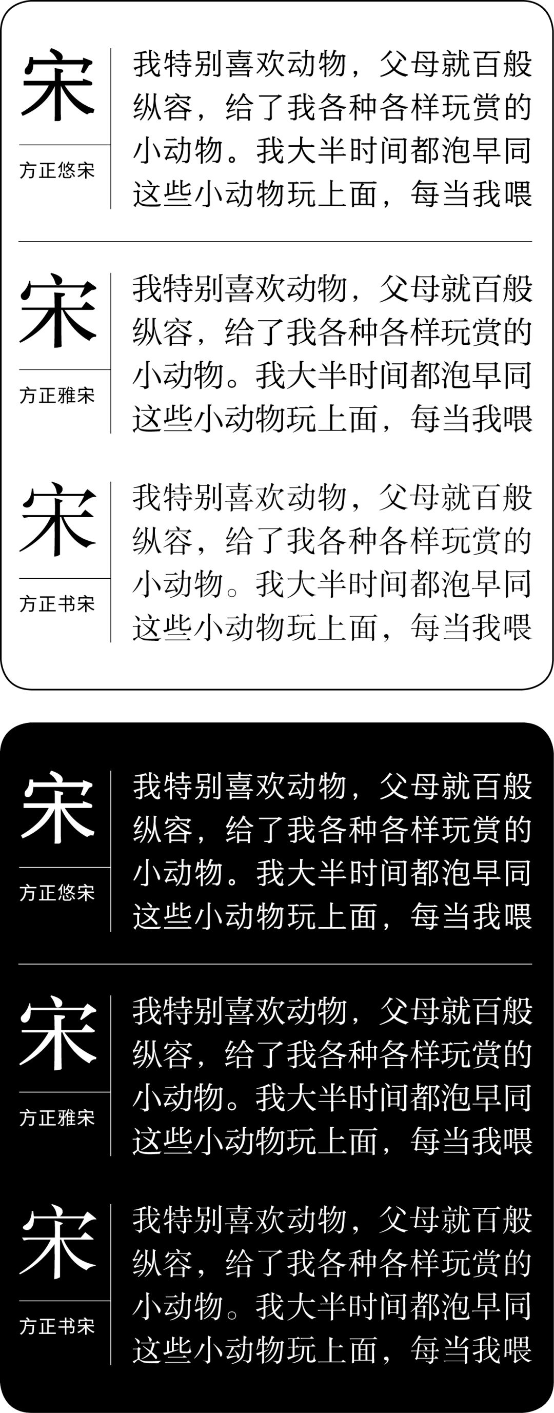
Fangzheng Yousong family is applicable to multiple media at the same time, such as news media, e-readers and UI design and other electronic media. At the same time, Founder Yousong is also applicable to traditional paper media Have good design performance.
-Fangzheng Yousong family application case-
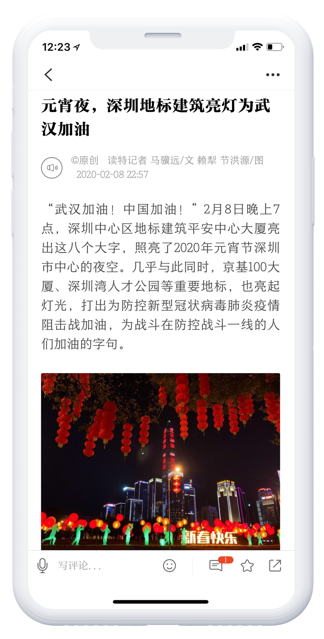
▲ "Du Te News" internal text font: Founder Yousong 507R; title font: Founder Standard Yasong
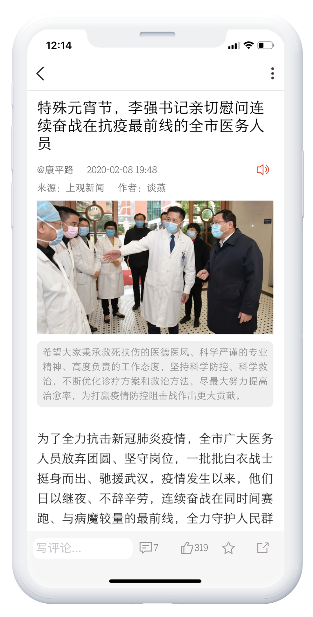
▲ "Shangguan News" embedded font: Founder Yousong 507R
Fangzheng Yasong Family
Fangzheng Yasong was originally designed for rich title Song typeface. The Song typeface originated from the era of lead type, and it is difficult to meet the increasingly rich application requirements from the font structure to the stroke style. Fangzheng Yasong was born in the new digital age.The font structure is full, the palace is relaxed, the strokes are straight and smooth, and the strokes are concise and clear Full of vigor.

The Founder Yasong family has 9 weights, plus 2 narrow and flat fonts, which can meet the typesetting needs of titles and texts.

The overall style of this font is clear, eye-catching, modern and fashionable. It is not only suitable for all kinds of traditional paper media, but also directly used for screen reading because of its moderate thickness of horizontal and vertical strokes.
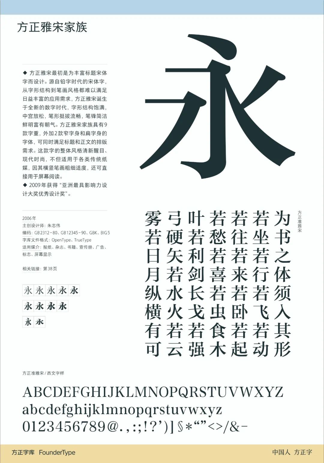
Fangzheng Yasong family is one of the Song type families with many font weight gradients and high design quality. It has won the "Excellent Design Award of the Most Influential Design Award in Asia".
-Fangzheng Yasong family application case-
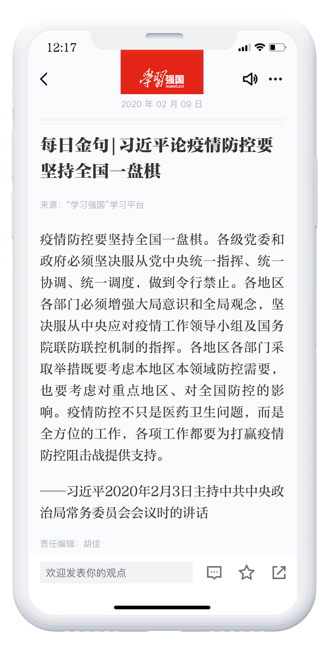
▲ Embedded fonts in "Learning Powerful Country": Founder Coarse Song/Biao Ya Song
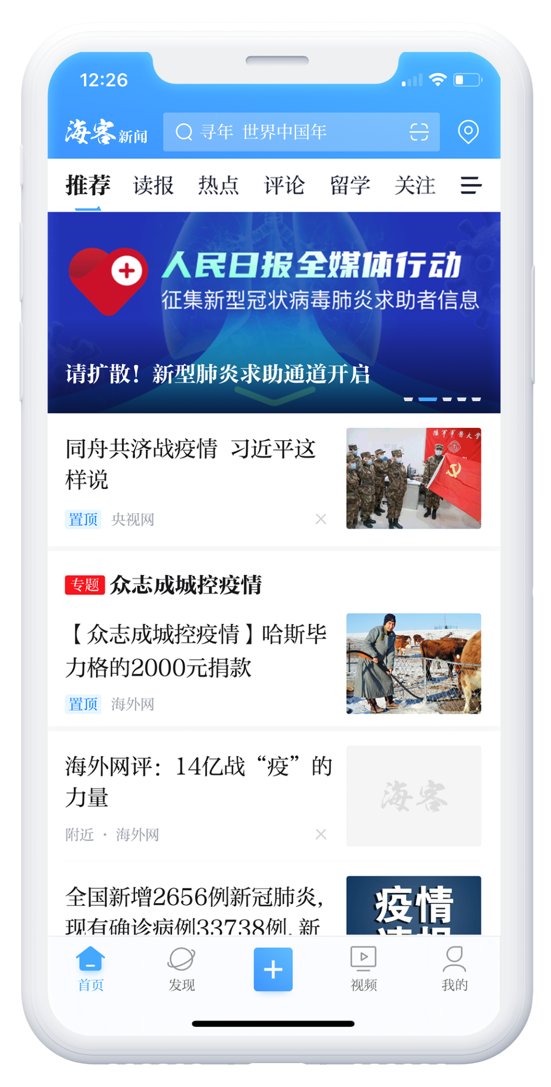
▲ "People's Daily Haike News" embedded font: Founder Coarse Song / Biao Ya Song

▲ "The Paper" embedded font: Founder Zhun Yasong
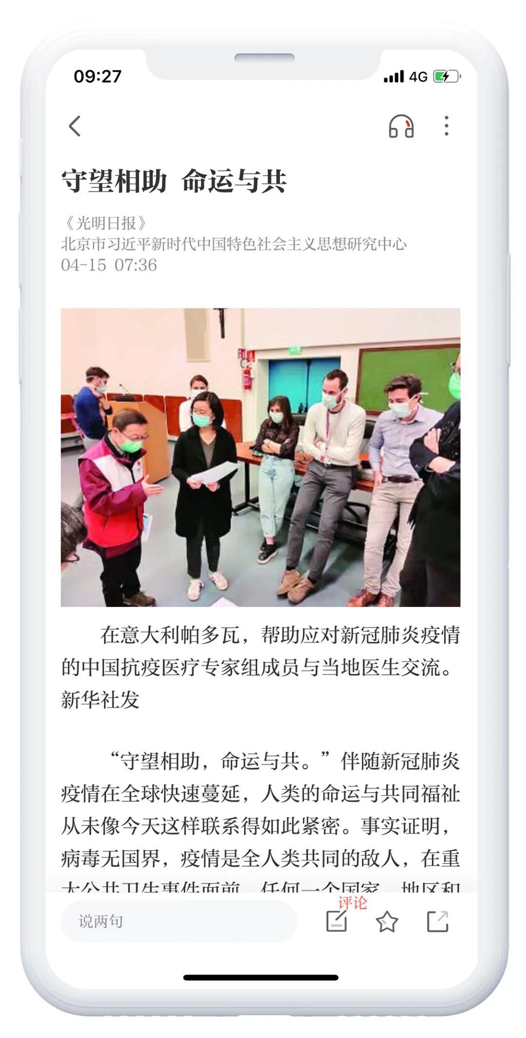
▲ "Guangming Daily" embedded font: Founder Coarse Song/Biao Ya Song
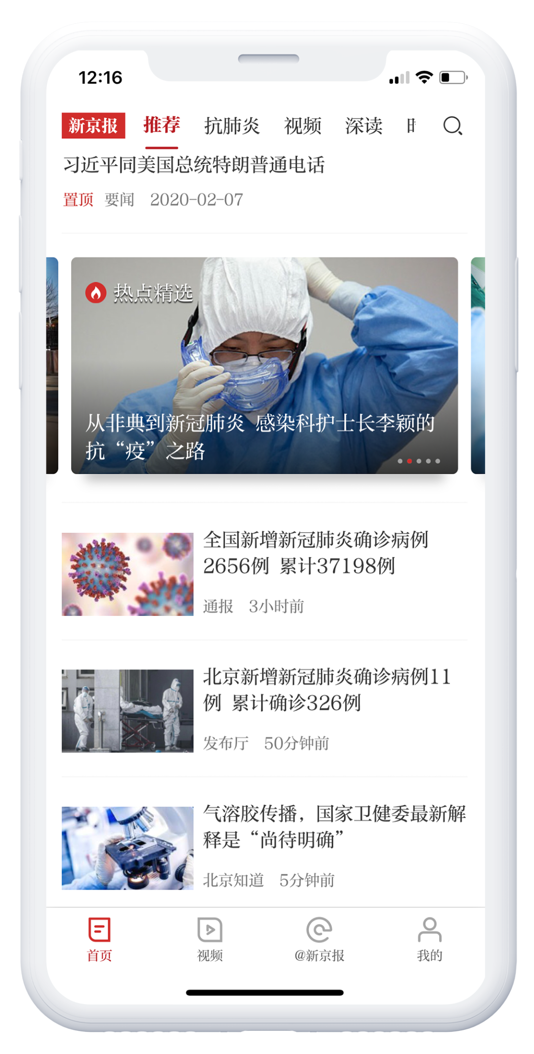
▲ Embedded font of "The Beijing News": Founder Coarse Song / Biao Ya Song
Aiming at the beautification of screen display——Founder Screen Display Yasong
The Ya-Song family is one of the Song-style families with many font weight gradients and high design quality. Founder Screen Display Yasong is an improved design version for screen applications based on the standard Yasong.
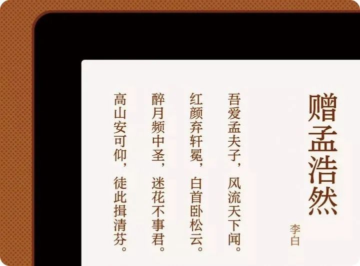
Biao Yasong in the Yasong family is suitable for text typesetting, but the original design focuses on paper printing, and when it is directly used on the screen, the difference between horizontal and vertical is too large, which has a certain impact on the comfort of screen reading. For this reason, Founder Screen Display Yasong reset the horizontal and vertical ratio, and made some partial improvements, so that it has a good performance in screen applications and can better meet the content of news and information apps. embedded requirements.
Founder screen display Yasong supports Simplified Chinese (GB2312-80), Traditional Chinese (GB12345-90), and Extended Simplified and Traditional (GBK).
03 2nd generation Chinese screen display bold recommendation
Fangzheng Youhei
The first generation of Chinese screen display fonts——Fangzheng Lantinghei (Microsoft Yahei) to "flare mouth", the font is large, geometric, and full of industrial feeling. But in order to adapt to the low pixel density, the traditional beauty of writing is lost. With the popularity of mobile terminals, the first generation of on-screen fonts can no longer meet the reading demands of various portable screens.
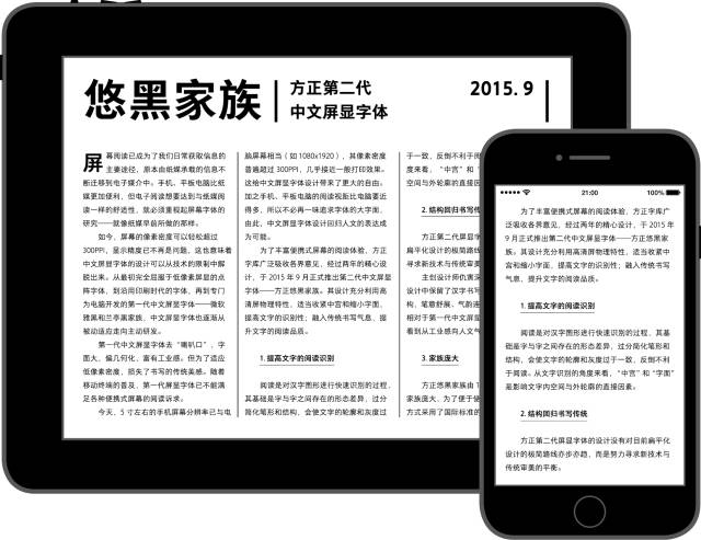
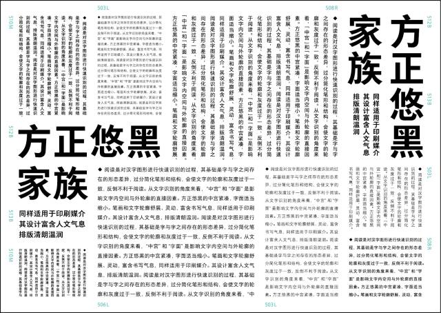
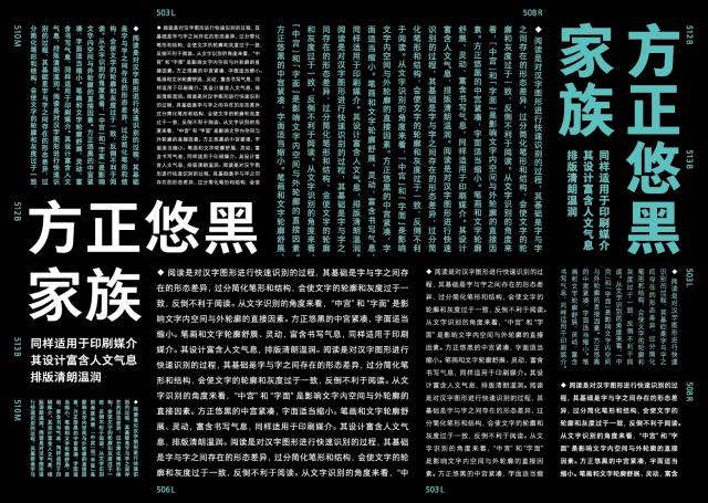
In order to enrich the reading experience on portable screens, Founder Typeface extensively absorbed opinions from all walks of life. After two years of careful design, it officially launched the second generation of Chinese screen display fonts in September 2015 - Founder Youhei Family. Its design makes full use of the physical characteristics of high-definition screens, appropriately tightens the central palace and shrinks the characters to improve the recognition of the characters; it incorporates the traditional writing atmosphere to improve the reading quality of the characters.
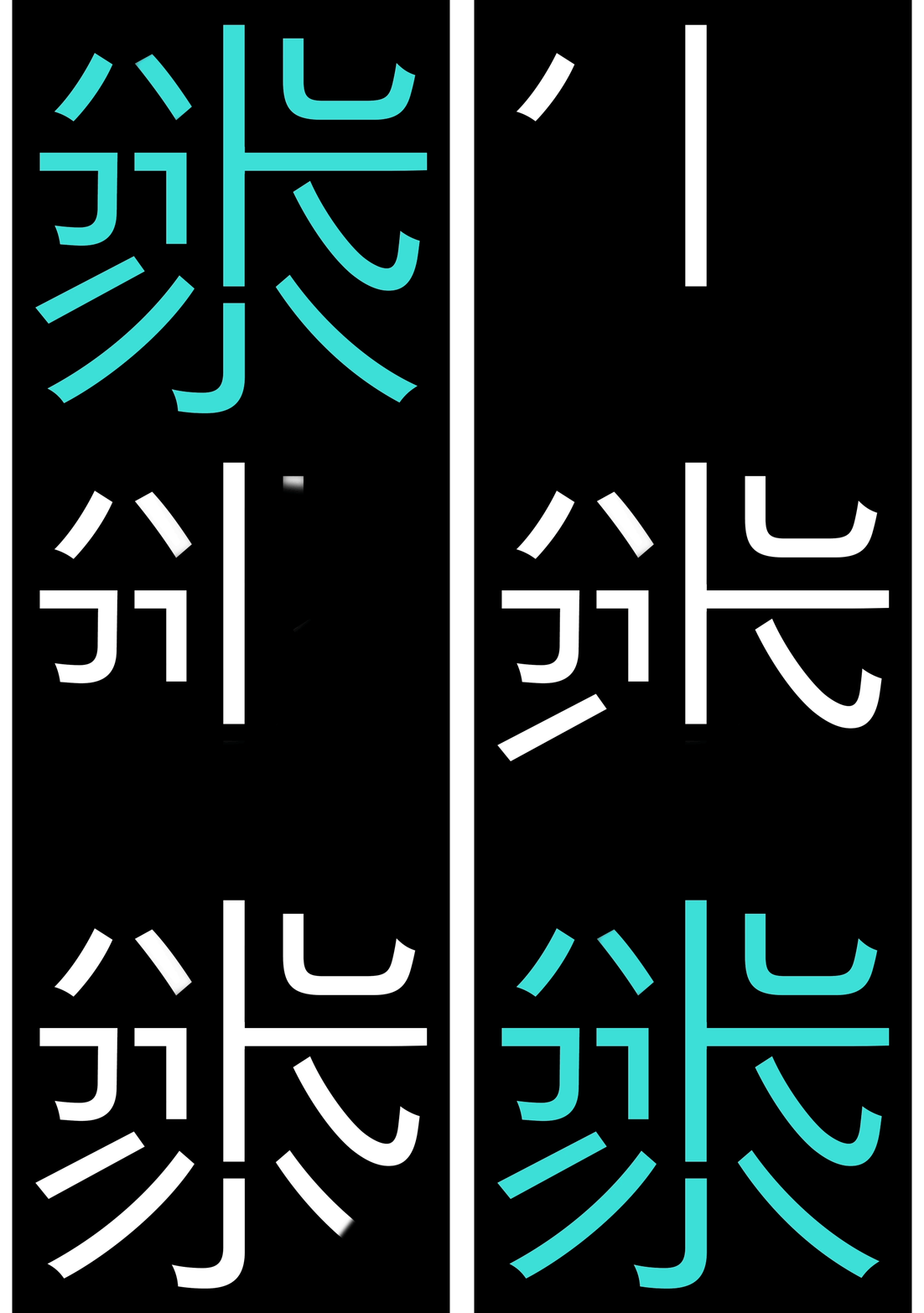
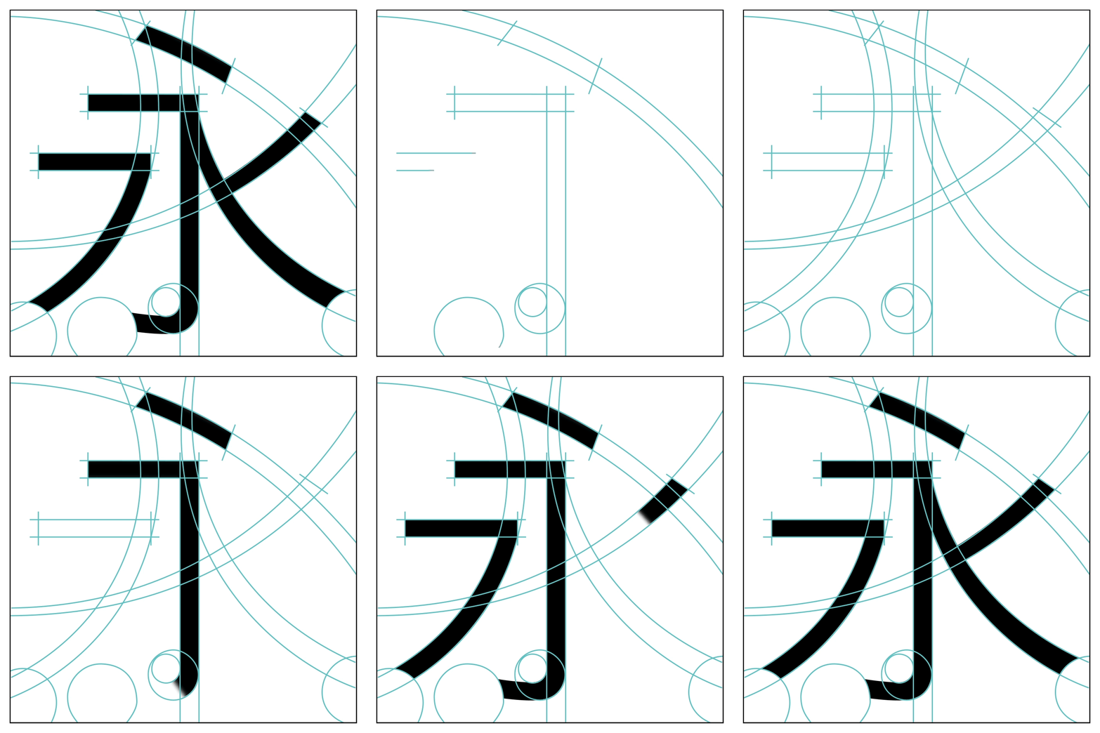
▲ Founder Youhei’s pen-shaped design
As the second-generation on-screen black body suitable for high-definition screen display, Founder Youhei has balanced the relationship between the middle palace and the literal, making the outline of the single character clear, the spacing between characters is moderate, and easy to recognize. It can be read on a portable screen Bring a better reading experience.
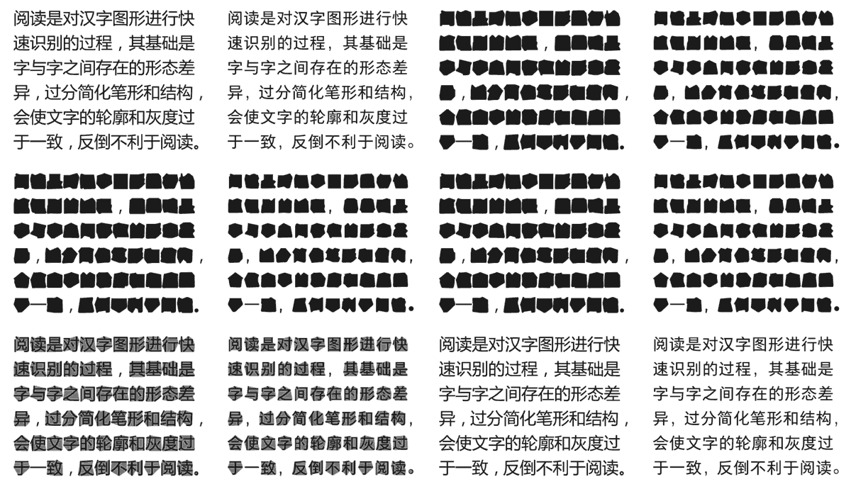
▲ Left: Microsoft Yahei Right: Founder Youhei
In the design of Fangzheng Youhei, retained the stroke characteristics and frame structure of Chinese characters. The strokes are stretched and coherent, suitable for long-term reading. Compared with the first generation of Chinese screen display fonts, we can see the transformation from industrial to humanistic.
In order to match Fangzheng Youhei's pen style, a full set of English fonts and symbols are specially designed. English fonts with different weights are more coordinated when mixed with Chinese.
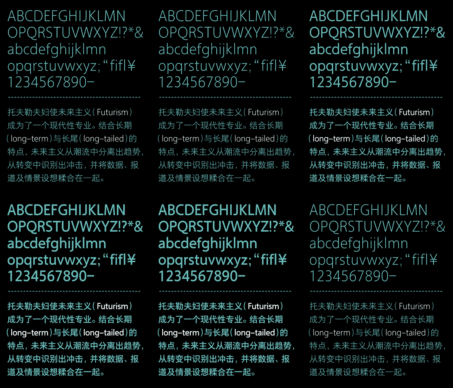
Founder Youhei has a total of 15 fonts from 501L to 515H, among which 11 fonts from "503L" to "513B" support the GB18030-2000 standard (9 models were launched in the early stage), including 27533 Chinese characters, which can meet portable screens of different sizes reading needs.
-Application case of Fangzheng Youhei family-
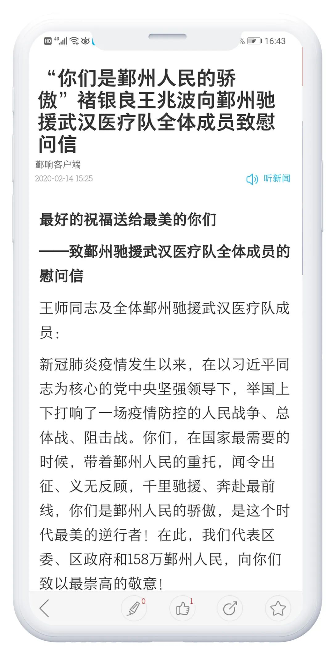
▲ Embedded fonts in "Yin Xiang" APP: Founder Youhei 511M/Founder Yousong 507R

▲ The application of Founder Youhei 506L in the "Duo Kan Reading" APP
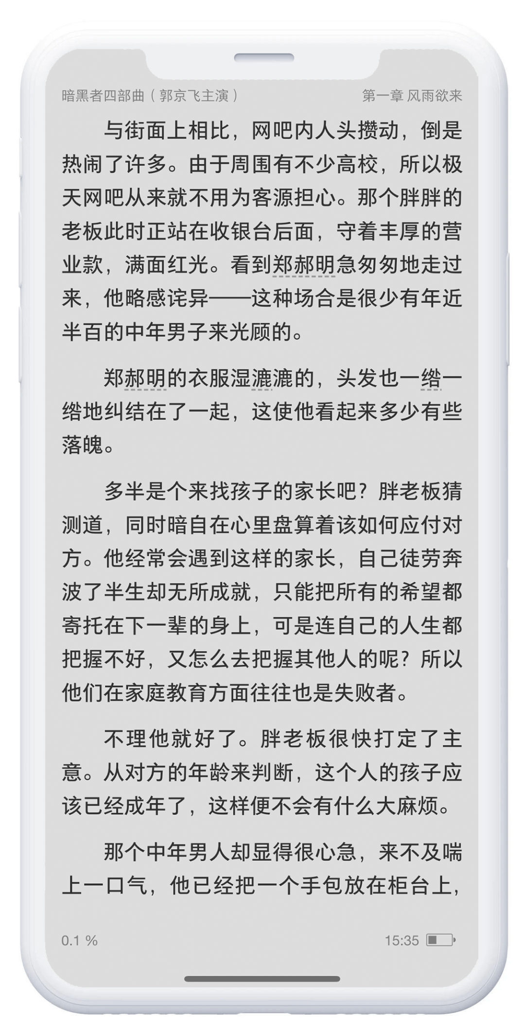
▲ The application of Founder Youhei 509R in the "Handy Reading" APP


Founder has suitable on-screen fonts for you to choose, no matter Song typeface or Hei typeface, for news apps. If you need to use words in the embedded font library, please contact the product manager of Founder type library:
Name: Teacher Dai
Tel: 010-82532501
E-mail: daihr@founder.com
Scan the code to watch the embedded font display H5
▼

-END-
Articles are uploaded by users and are for non-commercial browsing only. Posted by: Lomu, please indicate the source: https://www.daogebangong.com/en/articles/detail/How%20to%20choose%20screen%20fonts%20for%20news%20apps.html

 支付宝扫一扫
评论列表(196条)
测试