The following article comes from the way of beauty, author SJ-QUAN

Share cases, knowledge, tutorials, etc. related to font design.
Whether it is a foreign brand or a movie, after it is introduced into the country, it is necessary to design a corresponding Chinese character font, such as Coca-Cola, Pepsi, Carlsberg, etc.; not to mention movies, not long ago, China and the United States A partial agreement has been reached on related issues such as film industry exchanges and film culture development: China will add 14 3D or IMAX films to the original annual quota of about 20 American films;
Then, when a Hollywood blockbuster is released in China, the Chinese version of the film title font must match the style and temperament of the original English film title font. This requires designers to design skillfully, because the structure of Chinese and Western characters is very different. , Designers must not only ensure the aesthetics and recognizability of Chinese fonts, but also satisfy the unity of form and temperament with English fonts. Below we will learn how to design this type of Chinese fonts through several case explanations.
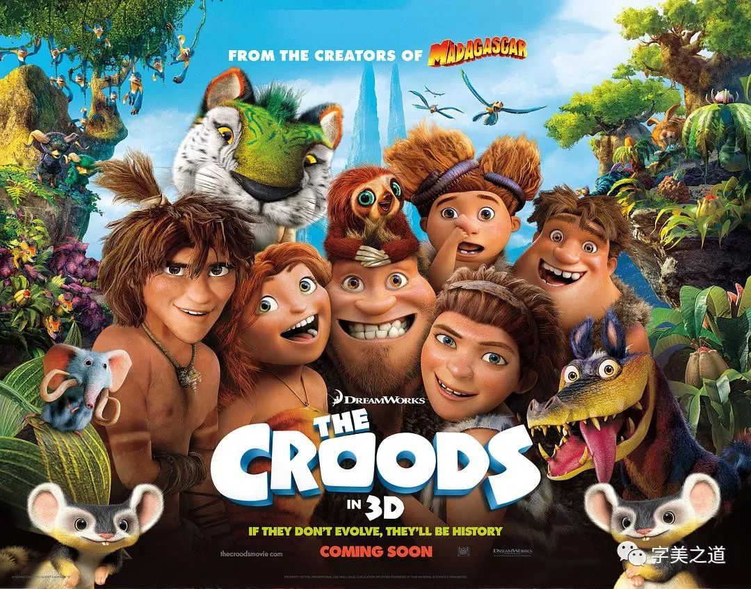
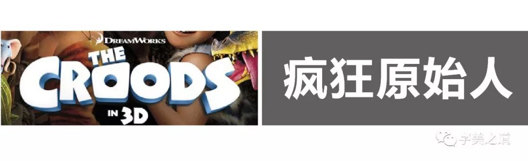
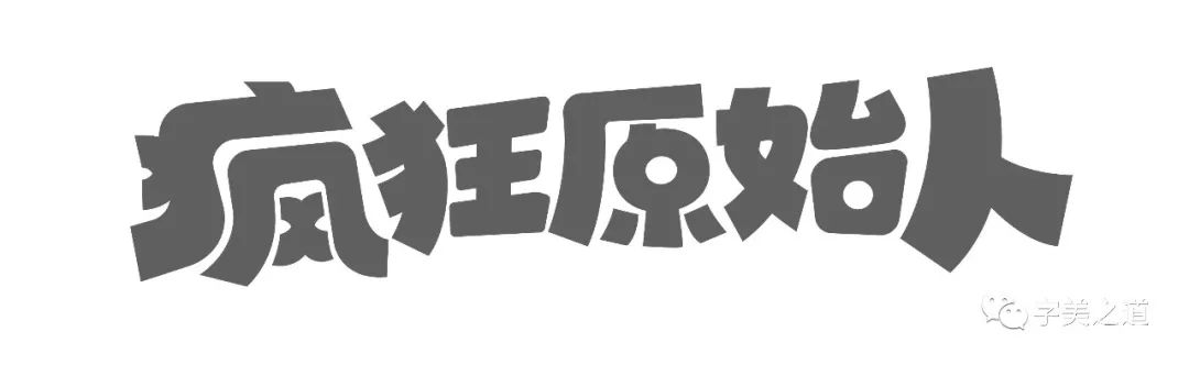
Case 1: Crazy Primitives
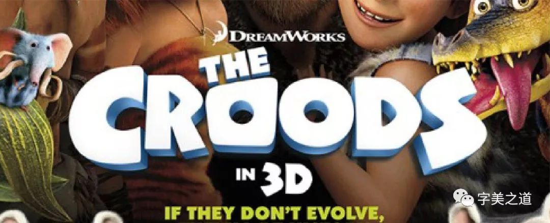
The design of the original English font is very particular. The letters have the feeling of the Stone Age. They not only have the "clumsy" side of the Stone Age, but also have a sense of liveliness and fun. Then we will start to design Chinese, Chinese official The translation is: "Crazy Primitives", let's type these words and put them together in English:
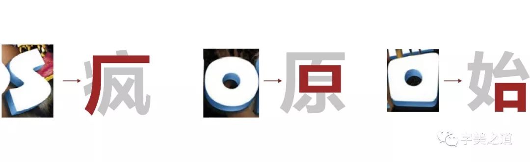
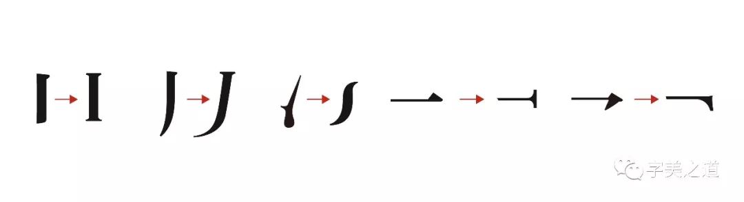
How do you get started designing? Here is a little trick to share with you, that is: "We must first find out which strokes or shapes in the original English font are more consistent with the Chinese film title font, and can even be replaced." Through observation and comparison, we found the following A few points:
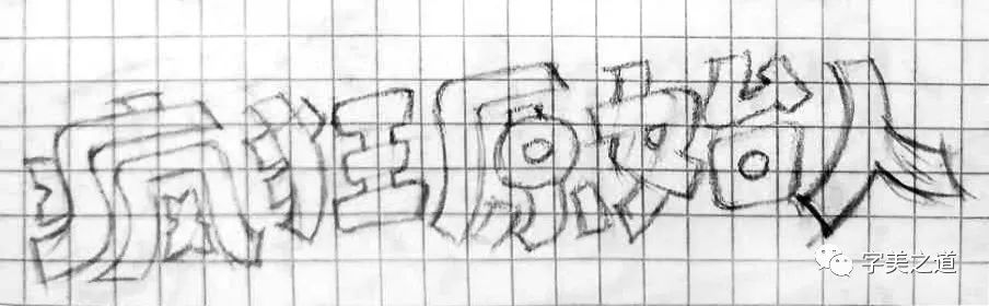
Okay, let's start sketching:
When drawing a sketch, we put the previously analyzed English strokes in the appropriate position of the Chinese, and at the same time draw the general shape of the Chinese according to the style characteristics of English, and then we use the pen tool in AI to outline the shape of the characters Come out and make some adjustments, and the results are as follows:
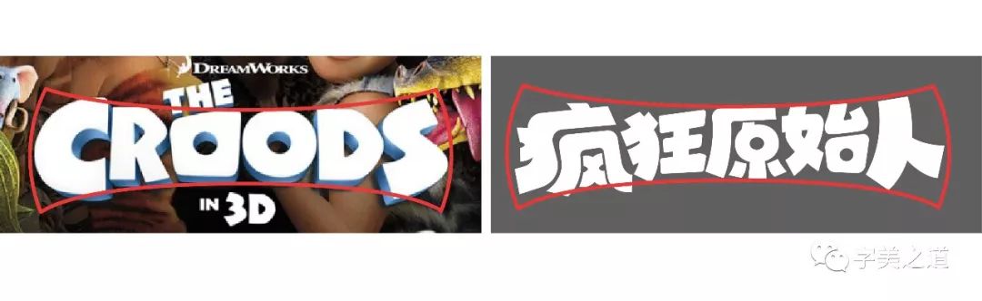
In the process of making Chinese glyphs, you must always appreciate the characteristics of the original English font, such as the characteristics of strokes, the overall feeling, the arrangement of spacing, etc., and at the same time, pay attention not to deviate from the basic structure of Chinese characters. Sex is also very important. In order to ensure the consistency of Chinese and English visual effects, we must ensure that the Chinese and English fonts are basically consistent in the shape of the overall outline, as shown in the figure:
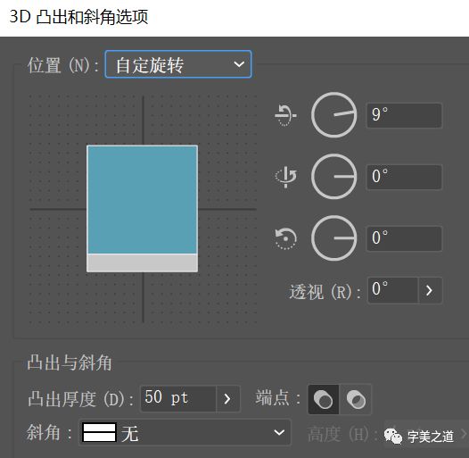 The design of Chinese follows the shape characteristics of English with wide sides and narrow middle, so it is more unified visually. Next, we add three-dimensional effects to the characters. First, let’s analyze the three-dimensional effects of English:
You can see that the angle of view of this three-dimensional character is equivalent to that of a person looking at a lower position directly opposite the character. You can see the bottom of the character, and you can hardly see the sides on both sides, so we use 3D in AI -Protrusion and bevel tools, set the parameters as follows:
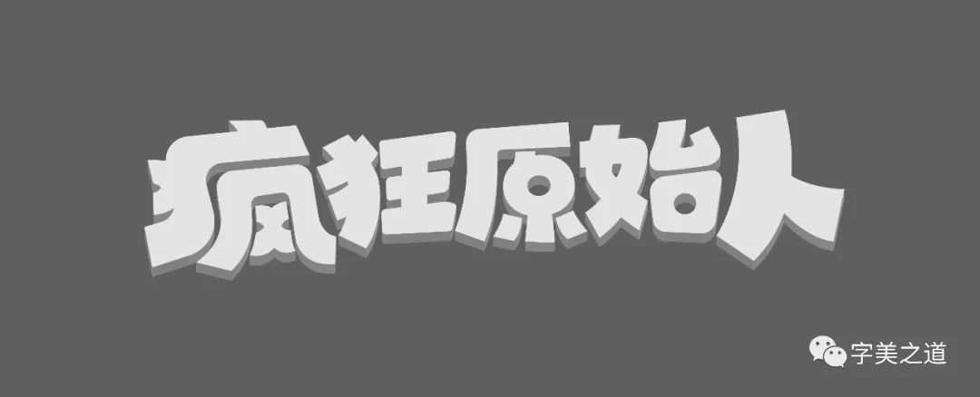
Get the stereo angle consistent with English, the effect is as follows:
 Next, we add a gradient color to the three-dimensional part of the text, select the text, and select "Object-Extended Appearance". Part of it is colored separately, and the effect after coloring is as follows:
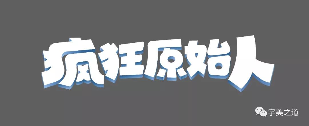
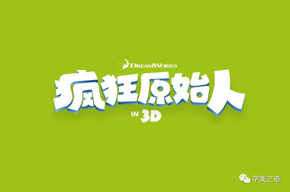
Finally, we add the movie company Logo and 3D logo, and add an appropriate background color:

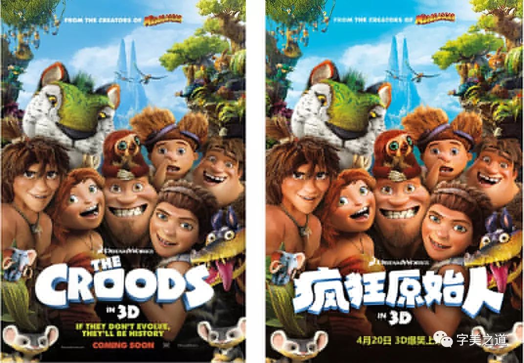
You're done! Let's take a look at the comparison between Chinese and English:
Is it very harmonious, without any sense of disobedience?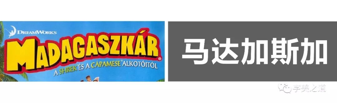
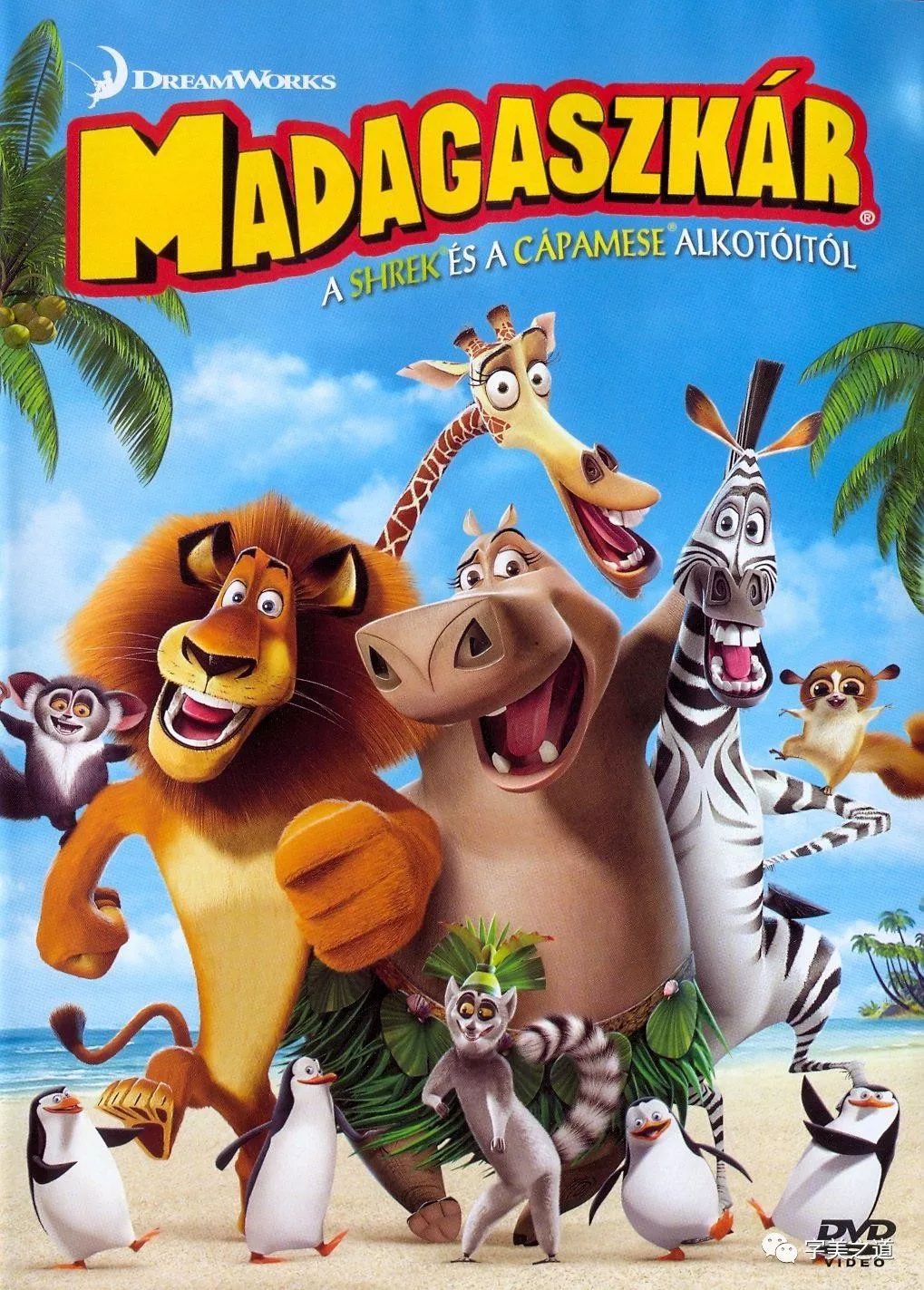
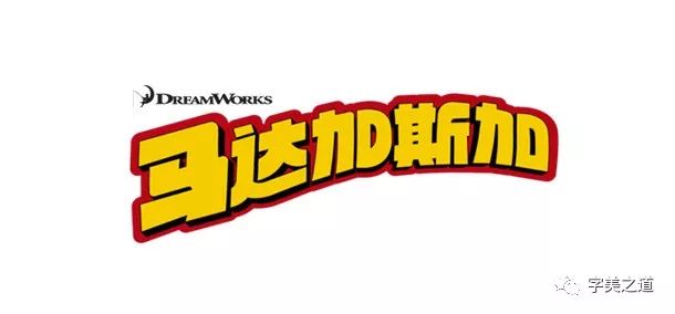
Case II: Madagascar
This English font is also very good to convey the atmosphere of the film. At first glance, it is a very interesting movie, a bit like a circus. Let’s analyze the characteristics of the original English font: The first is that the font uses sans lining The line is bold, the entire font is high, and there is some feeling of handwriting in it, that is, the radian is not very regular, and it feels more relaxed. Then let's look at the Chinese: the official translation of the mainland is called "Madagascar", we put this Type a few words and put them together with the original English version:
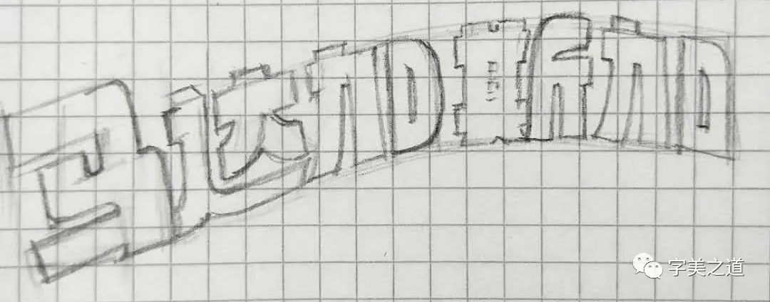
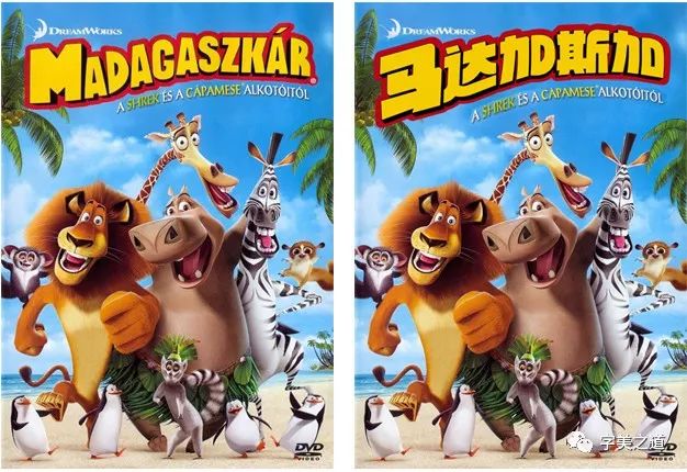
At this time, the problem came. We found that there are 11 letters in English, but only 5 characters in Chinese. What should we do? Can it be made to have a unified sense of form with English? The answer is: yes! After careful analysis, we will find that the three characters of Jia Sijia in the Chinese film title have a left and right structure, which can be regarded as two parts. In this way, the shape of the characters also conforms to the English vertical shape. We make the horse character and M Consistent with the visual size, the next four words should be understood as 8 letters, so it will be much easier to arrange, and then we will start to draw a sketch:
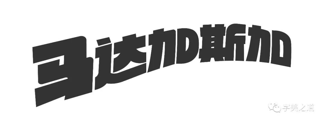
Same as the previous case, we integrated the stroke features of the original English version into the Chinese design when drawing the sketch, and the outline of the overall character was drawn according to the shape of the original English version, so as to make the Chinese and English fonts as visually as possible Form a unity, such as integrating the feeling of the English letter D into the right half of the Chinese character "addition", so that Chinese and English are visually in the same line. After the sketch is drawn, we import AI, use the pen tool to draw out the characters, and then make a series of adjustments to get the following results:
It can be seen that the style and temperament of English are consistent, and the recognition of Chinese is not affected. Next, add a three-dimensional effect to the text according to the method mentioned in the first case, and add a double-layer stroke. , fill in the color, and the design of this font is complete. Let's take a look at the final effect:
how about it? Pretty unified~
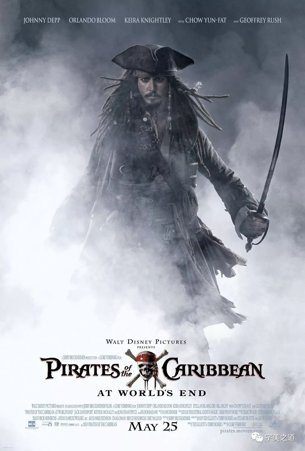
Case Three: Pirates of the Caribbean
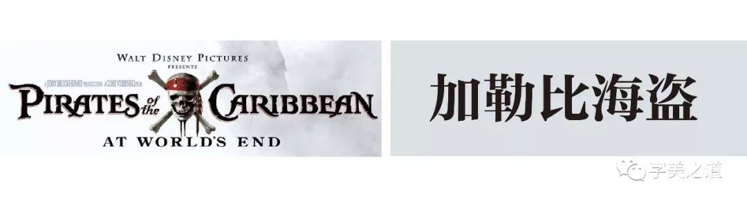
Different from the previous two cases, the style of this font is a typical serif, because it tells a story in the 17th century, so the style of the font needs to convey a strong sense of history and mystery, which is why the title The reason for choosing this style of font, next, let’s type out the Chinese translation and put it together in English:
Because English is a serif font, Chinese also uses Song typeface for comparison. The Song typeface in Chinese characters can actually be regarded as the serif typeface in Chinese characters. Many times when we match Chinese and English, we use Song typeface to match English For the design of the Chinese film title font, if we directly use Song Ti, the temperament can basically match, but to achieve the visual effect of the original poster, the temperament of Song Ti is far from enough. So, how do we What about designing Chinese fonts that are closer to the original temperament? After some observation and thinking, we found that the stroke features of English serifs can be directly integrated or even replaced into the strokes of Chinese characters, as shown in the figure:
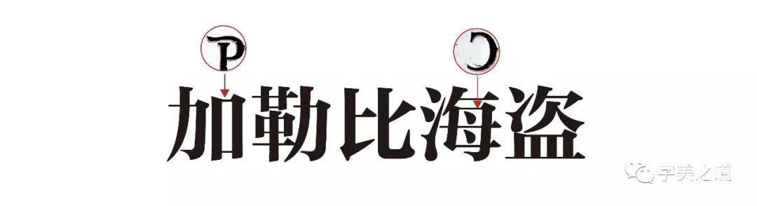
Then we found the most distinctive part of the English film title font to see if it can be integrated into Chinese. After observation and analysis, we found that the letter "P" can be combined with the right half of the Chinese character "plus" with a slight adjustment. Parts can be perfectly replaced, and the letter "C" can be integrated into the right half of the Chinese character "sea" after being flipped horizontally, as shown in the figure:
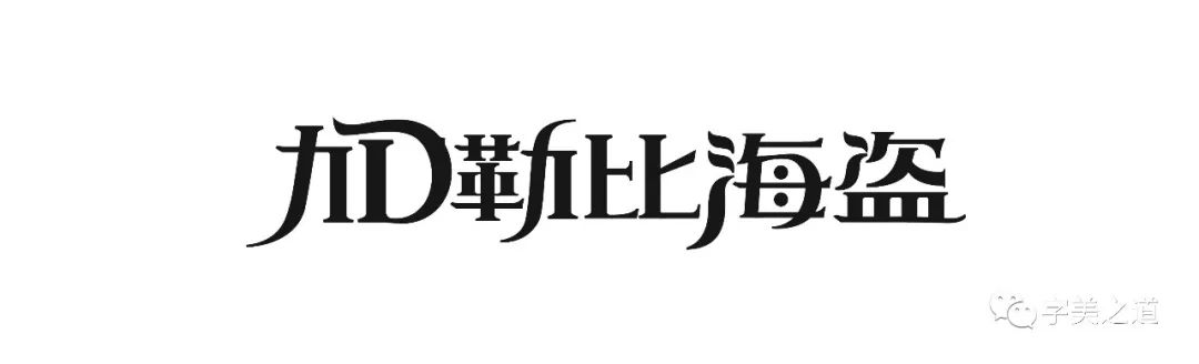
Well, according to this idea, we can make the words:
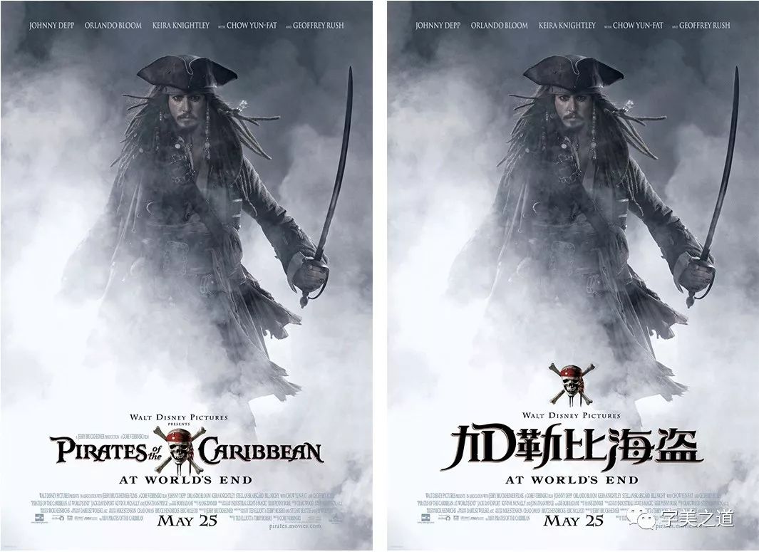
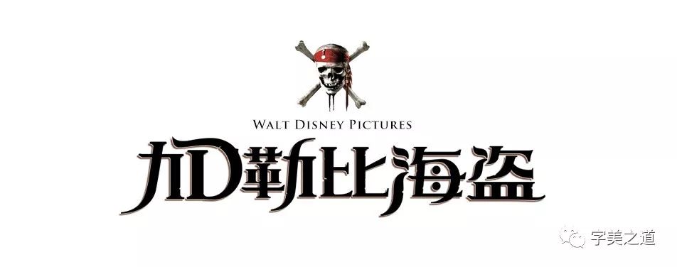
It should be noted that the previous analysis is only the idea of writing. When writing, it is not a simple and rude replacement of English strokes into Chinese characters, because the structural characteristics and writing habits of Chinese characters are different from those of English. Therefore, while incorporating the characteristics of English strokes, it is necessary to ensure the visual comfort of Chinese characters, the rhythmic arrangement between each character and the even distribution of blank parts, so as to properly integrate the characteristics of English fonts into Chinese characters. Finally, we add font effects, skull graphics, and film producer information, and the character is created. Let's take a look at the final effect:
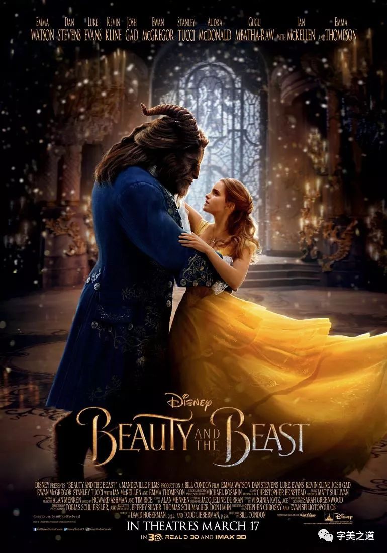
Case Four: Beauty and the Beast
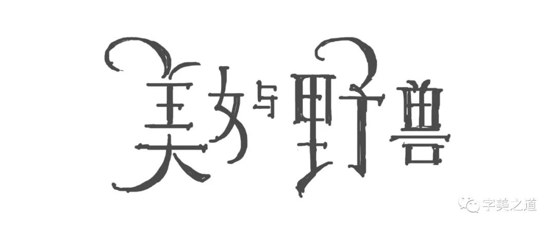
About this film, our mainland official posters are actually more sophisticated in terms of characters. They basically refer to the design style of the original English film title font, and the final font effect is also good. Let’s take a look:
The stroke characteristics of the entire font are quite consistent with the original English version, and some characteristic strokes of English are also integrated into Chinese characters. Generally speaking, it is still good, but, I mean but, don’t you find this? Doesn’t the font feel elegant at all? The font of the original English version looks very elegant, but the dancing temperament is not felt in this Chinese version at all. Why is this?
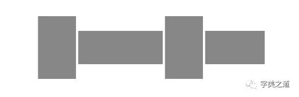
After careful analysis, the most prominent feature of this English font is the curved strokes of the two letters "B". Yes, the rhythm is roughly as follows:
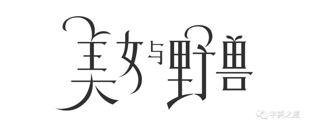
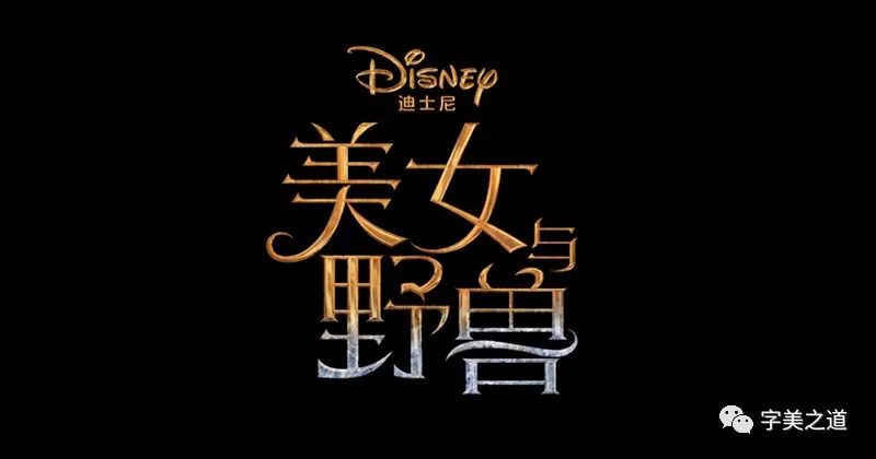
The Chinese characters used in the official posters in mainland China do not reflect these characteristics of the original English version, so they are not elegant enough compared to English in terms of temperament. Then we redesigned the Chinese fonts according to the previous analysis, and drew a sketch first:
The most prominent stroke features in English are fully reflected in Chinese, and at the same time, Chinese is designed according to the rhythm of English typesetting. The sketch draws the big feeling, and then the font is perfected in AI:
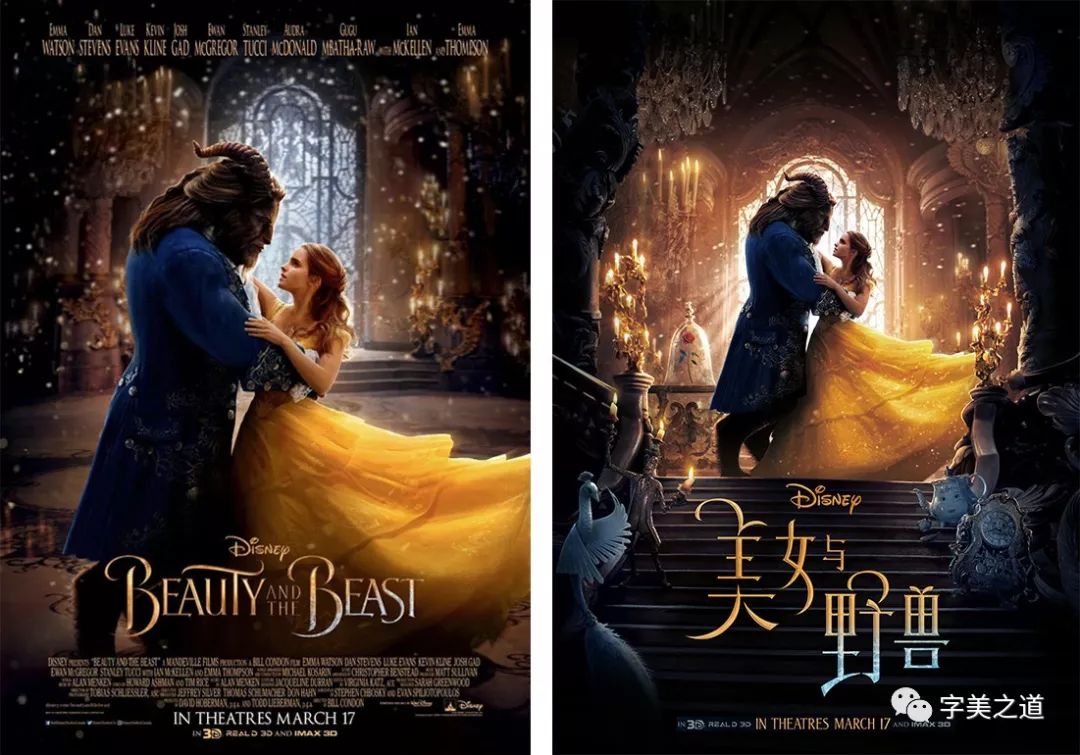
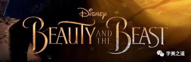
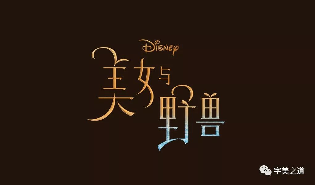
Then it’s time to add effects to the characters. Refer to the original gold and add a little three-dimensional font effect, use PS to add effects to the designed Chinese font, and you’re done. Let’s take a look at the final effect:


Is the temperament of Chinese and English much closer?
OK, that’s all for this issue, let’s review the key points of this tutorial at the end:
1. Find the most distinctive part of English strokes and skillfully integrate them into Chinese strokes;
2. The stroke characteristics of Chinese characters should be consistent with the original English version, while paying attention to the structure and writing style of Chinese characters;
3. The most important point: the temperament of Chinese and English must match!
After reading this article, are you interested in designing a Chinese font that matches your favorite foreign movie? Hurry up and act now!
THEEND
The way of beautiful words

Keyword Reply:
Printing, business cards, posters, logo design, tea packaging, color spectrum, folding
BANNER, Tucao video, takeaway food, AV, quotation, Japanese poster
Layout, Republic of China, software, Olympics, welfare, resume, moon cake, Tmall
Double Eleven, recipes, red envelopes
(see the corresponding knowledge article)

A WeChat shop for sharing design resources

Discover |Share | Grow
Designer's home, communication design problems
Share the latest industry information
Subscription number: SJ-QUAN

Share/Contribute/Product Entry
sj-quan1 719155723
Articles are uploaded by users and are for non-commercial browsing only. Posted by: Lomu, please indicate the source: https://www.daogebangong.com/en/articles/detail/How%20to%20Design%20Chinese%20Fonts%20Compatible%20with%20Western%20Languages.html
 支付宝扫一扫
评论列表(196条)
测试