 Ma Liang's ID: bucuo_8cuo
In some Banner poster designs, the typesetting and selection of fonts are very important, not only for the sake of beauty, but also to express the main body of the work clearly. In this article, you can see how to choose fonts and what methods to use for typesetting, The move of decorating copywriting, the editor thinks it is very practical, I recommend you to try it, let's watch the tutorial together.

1. Font selection and font combination
Speaking with a case:
First of all, I selected some design works that I personally think are good. According to the design purpose and final effect of these works, they are divided into two groups: "A" and "B".
Group A is "picture highlights", the purpose of the text is only to whitewash this photo.
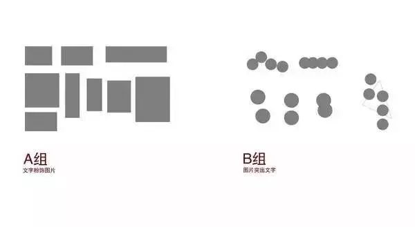
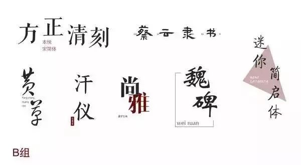
Group B is "text highlighting", and the text is highlighted against the background of the picture.
There is a big difference between the two groups of fonts, in how they are combined:
The font combinations of Group A are all tightly arranged in an invisible rectangle, visually forming a face.
The characters in group B are loosely placed and combined together to form dots visually.
▲The effect of two groups of fonts on visual psychology
2. Subject matter and visual focus
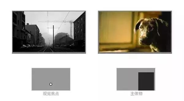
The visual focus of the subject is the two basic elements in photography, so there is usually a prominent person or object as the subject in a photo.
The main object and visual focus of a photograph are easy to see, such as ▼
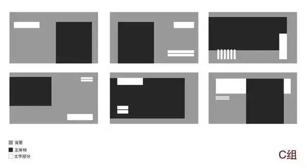
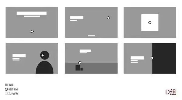
In order to show the positional relationship between the text part and these two basic elements in the excellent design works of "picture outstanding", the renderings are also made. Divided into two groups C and D for display.
Group C is the positional relationship between the text part and the main object.
▲The dark block in group C is the main object, the white dot in group D is the visual focus, and the white block is the text.
 Group D is the positional relationship between the text part and the visual focus.
Let's review:
There are three principles for the position and size relationship between the text part and the main object:
The area of the text part must not be larger than or close to the area of the main object.
The text "Face" remains connected (straight or parallel) to the edge of the body "Face".
The text "face" or distance from the edge of the frame is almost equal to the distance from the subject "face" to the edge of the frame.
Look at the following cases:
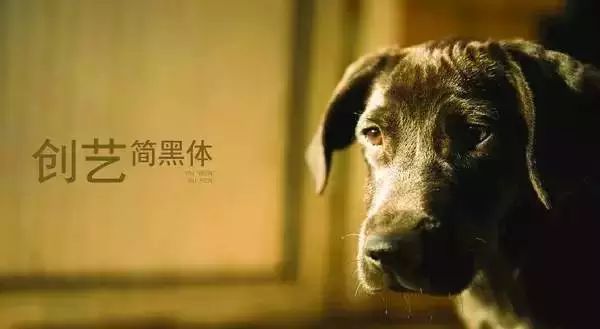
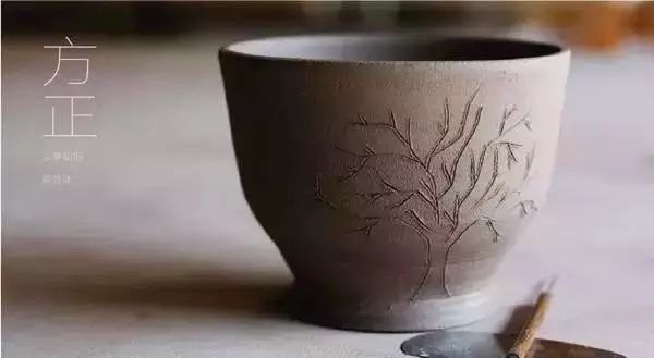
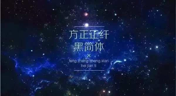
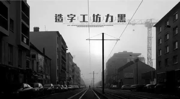
When the main subject of the photo is scattered and meaningless, the visual focus defaults to the center of the frame.
When a photo is cut by a certain scene or object, the visual focus will only appear on the cutting line. By default, it is located at the center point or where the color is dense.
3. Coordination of fonts and graphics
The typesetting with the purpose of "picture highlighting text" is characterized by the fact that it does not need to analyze the elements in the photo.
It exists only to set the tone for the words (emotions) you want to express in the end.
But this has a big disadvantage: too scattered fonts are not only prone to lack of connection, but also cause reading difficulties.
The solution used in most excellent typography is to use the combination of fonts and graphics, and there are three types of them:
Type 1: Shape Graphics
Shape graphics mainly refer to squares, circles and some irregular shapes.
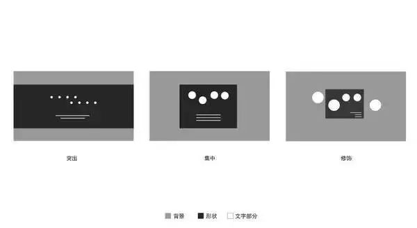
▲Three ways of using the square
Three ways to use the square:
Protrusion: When the text partially blends into the image and becomes difficult to read. The best way here is to place a square on the background like this, and then adjust the color of the font to contrast with the square to make the text stand out.
Concentration: This method is to concentrate the text in a square without weakening the picture, increasing legibility. It is a typography that often appears in packaging design.
Modification: This square is actually just a representation, representing the use of all irregular shapes. When the combination of characters is too scattered, or the size difference between fonts is too large, place an (irregular) graphic to connect to each word as much as possible to form a connection.
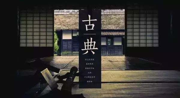
▲An example of square "concentration". The existence of squares highlights the text itself and ensures smooth reading. At the same time, this box can be in any position on this photo without any influence, so it is very suitable for the needs of packaging design.
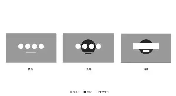
Three ways to use the circle:
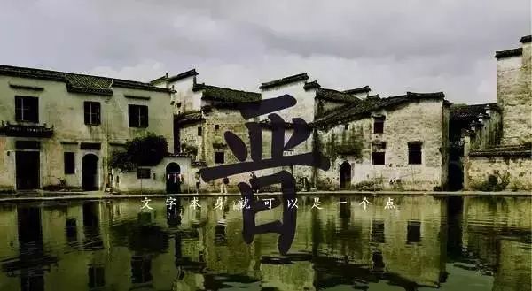
Normal: This is a normal typography for comparison.
Prominence: This has a better prominence effect than a square shape. This circle can be replaced with some materials, such as ink droplets and other circular materials. You can even use the picture itself to have a huge round object to highlight the text part.
Applicability: This can also highlight the "surface" text, which is why this method often appears in various business brochures, posters and various leaflets.
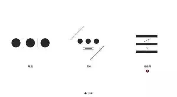
▲Ancient characters can also be used as a circle
The second type: straight line
There are two types of straight lines, one is a pure straight line, and the other is a paragraph of text composed of small characters.
1. Pure straight line:
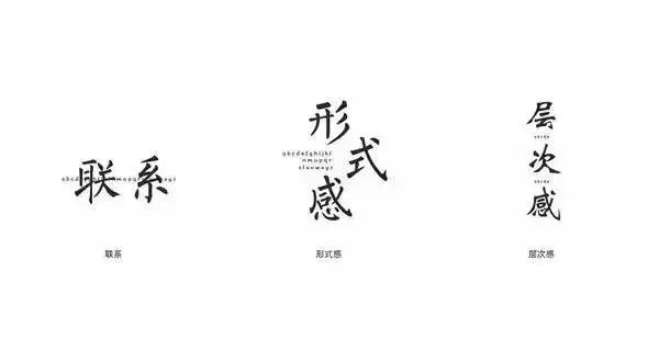
The first type: connection The second type: concentration The third type: connector
Three common ways to use straight lines:
Contact: Very common method of use.
Concentration: The function is the same as that of the square "concentration", except that two lines are used to form an invisible square, which has a more formal sense. This kind of difference can only appear in photos with a single color or a lot of white space.
Connector: A small thing that increases the sense of similarity... It can be used to connect the content of two paragraphs of text, and it is most commonly used in fashion design works.
2: A paragraph of text composed of small words:
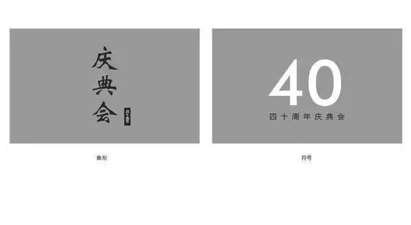
▲Another type of "straight line", consisting of a row of small characters.
The third type: characters
Generally refers to the numbers and English letters, with the text can have a better prominent effect.
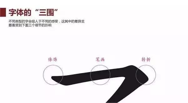
Four. The shape of a single font
Summarizing all the tutorials and excellent design works, I think the four most important characteristics that distinguish individual fonts: such as ▼
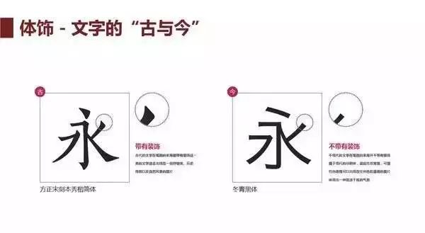
Body decoration refers to the decoration at the end of the font strokes. The body decoration of the font is not whether there is or is not there, but more or less. This is a relatively vague concept.
"Ancient" characters are suitable as titles, and they appear in themes that express nature, tradition, or express a heavy sense of history.
Most of the "Jin" texts are in the subjects of fashion, technology or ordinary life.
The most important feature of "ancient" characters is lyricism, while "modern" characters focus on simplicity.
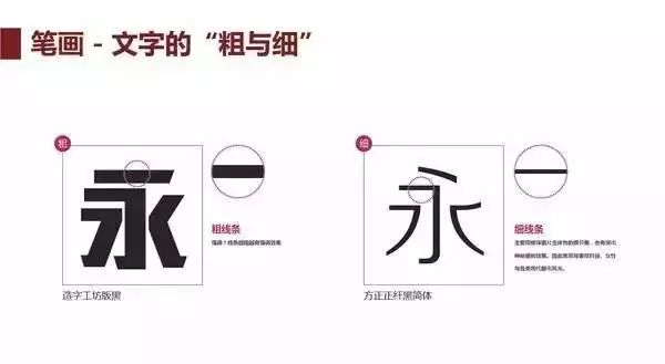
The difference in strokes lies in thickness, with thick strokes used for emphasis and thin strokes used to modify details, such as highlighting the fine workmanship of a product.
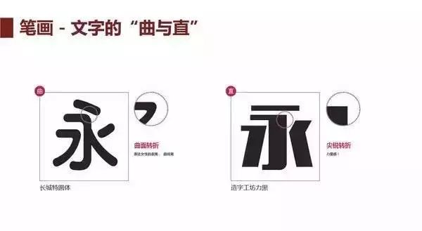
The difference in turning is that it is straight and straight. Fonts with sharper turns are suitable for expressing a sense of strength, whereas fonts with curved surfaces are suitable for expressing femininity.
Recommend 2 sets of good Chinese fonts for download:
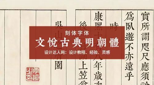
Free engraved Chinese font: Wenyue Ming Dynasty style (better than Kangxi dictionary style)
"Wenyue Ming Dynasty Style" is mainly in carved style, ancient and classic styles, and it is produced by the same team as "Kangxi Dictionary Style".
Enter the download page
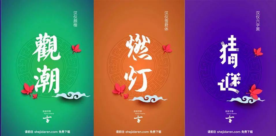
Suitable for Mid-Autumn Festival Chinese font package (Hanyi series)
Enter the download page
Articles are uploaded by users and are for non-commercial browsing only. Posted by: Lomu, please indicate the source: https://www.daogebangong.com/en/articles/detail/How%20should%20Chinese%20fonts%20be%20selected%20and%20typeset.html

 支付宝扫一扫
评论列表(196条)
测试