
When it comes to user-centered experience design, everyone must be familiar with it. Usually, the users here refer to the users that the product is oriented to, that is, external users. However, in the workplace, we often need to communicate design plans with product operations and technology development, report to leaders and superiors, share thoughts with students in the design circle, etc. We define these users as internal users for the time being. For internal users, what should we talk about when communicating with them, how to express our work value, and how to make others agree with the design plan?
In response to the above problems, this article will discuss and communicate with you from the perspective of user experience in terms of the core content of the report and summary, object-oriented, scene classification, and content standards.
Two types of designers
Mr. A usually works hard and produces a lot of content, but he can’t share anything, and it’s hard for others to understand. Therefore, he is relatively disadvantaged in actual work, which is also the majority of the designer group; Mr. B lacks hard work and is very Knowing how to do PPT, the methodology and design concept are well-documented, but the work proposal itself is mediocre, and experts can often identify it at a glance.
We do not advocate the two types of people. The summary report is not just a report on the work content, but more about the improvement of abstract ability, cognition, and overall thinking, rather than a fake PPT. The core of this article is not to teach you how to do PPT, but to improve your ability and better convey your own value through this form. All forms serve the content.
The bottom-level post view (core value)
Why talk about the view of bottom jobs? I have heard many designers share or report, the content seems to be very rich, but after a little consideration, it is not difficult to see that a lot of content is the scope of responsibility of the product manager, so where is the boundary of the designer's job responsibilities, and what is the value of design? But it was not communicated clearly. As we all know, a person's worldview determines your methodology, and your methodology determines the results of your behavior.
In the same way, a person's position view determines whether your core output content is off topic. This is very important, especially for designers in positions such as interaction, experience, and product designers, who often overlap with product managers in their daily work.
Therefore, before making a summary, we must clarify our own position view. Of course, in different companies, there are many situations where job responsibilities have the same name and different responsibilities. The best way to solve this problem is to check the job model of the company’s job model. This is often the case, and you can get a good performance evaluation for this job in the future. standard.
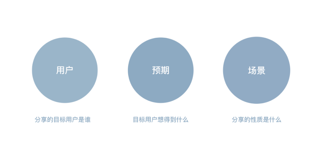
Classification of target users and scenarios (content range)
After the job concept is clarified, we need to clarify three points: users, expectations, and scenarios.
 User, that is, the audience of the sharing, whether it is the boss leader, internal colleagues, or an external communication team. For different groups of people, the setting of sharing strategies will also vary widely. For example, for internal colleagues, they have a good understanding of the background of a certain project, so there is no need to talk about the background in a large space, and explain more about the core plan and details. For external sharing, a relatively long foreshadowing is required to reduce the cognitive cost of the audience.
Expectations, which is what your target audience wants from what you share. Everyone will not waste half an hour to several hours listening to an uninteresting and useless sharing. Then, we have to use the core ability of experience designers - empathy. Look at the main content of your output from the perspective of the other party, whether it is professional dry goods, project process, experience summary, or good news of results. This is particularly important. I often listen to a lot of project process reports in the professional sharing of designers, and even in the high-level dry goods sharing in the circle, what I hear is the good news of the results, product advertisements, etc., which is completely different from the expectation. .
Scenario, that is, what is the form of sharing. This is usually closely related to the audience and their expectations, and also determines the way the content combination is presented. For example, for a professional dry goods sharing meeting, the PPT form needs to show complete details and highlight designs, and be equipped with a complete big picture of ideas. The review-based summary meeting will focus on data results and trend charts. Even, for some speech sharing, PPT is only used as an auxiliary guide.
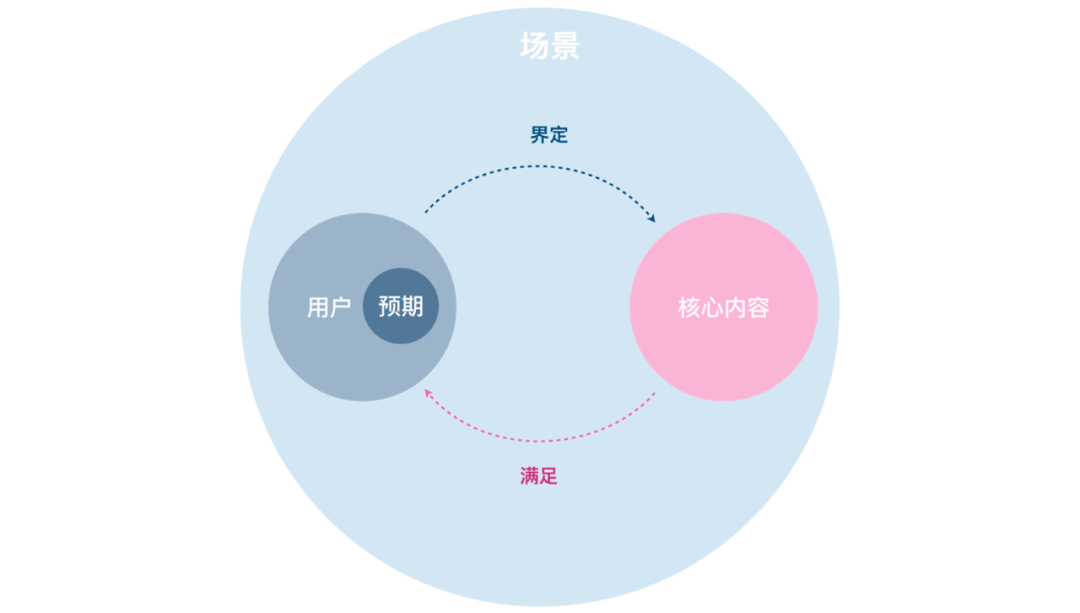
Based on the above three points, we can quickly define what the core content of the output should be, and express it in one sentence: in a certain scene, through the expression of the core content of XX, meet the psychological expectations of a certain audience.
For example, in the case of promotion debriefing, the psychological expectations of the judges can be met by describing content that can reflect higher-level capabilities. Therefore, the content of higher-level capabilities is the core point we want to express. In the next content material preparation process, it can be divided according to the standard baseline of the Job model to decide whether to add or delete.
So in other cases, what is the core content of meeting expectations. Here I summarize several situations with high usage rate, for your reference only.
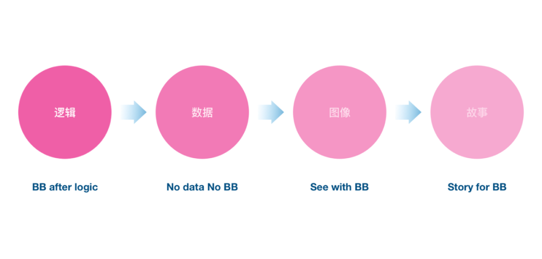
Key Four Elements (Content Standards)
Logic: The expression should be logical, the causal relationship should be clear, the materials displayed should have their value, and don’t put them indiscriminately just to make up the numbers.
Data: It is best to have data in the argument, which can greatly increase the persuasiveness of the content. Of course, reasonable multi-angle data mining is also an ability that needs to be constantly improved.
Graphics: This is an area of expertise for us as designers.
Suggested here:
The core output is large and numerous, increasing the visual impact
Visualize large graphs of complex logic to reduce the cost of understanding
Appropriate data visualization to enhance core value
Stories: Stories belong to the high-level gameplay of sharing content. By creating virtual (or real-source) stories, the core values are strengthened and brought into the scene. Students who are interested in this can study the TED talk.
Overview
A wonderful sharing requires our repeated iterative review, and more planned material accumulation. Usually, preparations for a sharing should start at least one month in advance, and key sharing such as promotion defenses have already started preparations and completed the goal of dismantling half a year ago. All in all, what makes us climb the peak is not the magic trick, but the basic skills that practice makes perfect!
PS: I have summed up a template, and friends who need further communication and discussion can join the community.
Articles are uploaded by users and are for non-commercial browsing only. Posted by: Lomu, please indicate the source: https://www.daogebangong.com/en/articles/detail/How%20does%20a%20designer%20make%20a%20PPT%20centered%20on%20user%20experience%20%20Report%20and%20summary%20ability%20improvement.html
 支付宝扫一扫
评论列表(196条)
测试