After the product goes overseas, it is necessary to carry out localized design for different countries in order to meet the usage habits of local users. This article takes Apple as an example to analyze how it does localization design for Arabic users. I hope it will be helpful to you.

Spoken by around 660 million people worldwide, Arabic is the third most written language in the world, after Latin and Chinese. People from more than 22 countries may use the products you design. You have to consider not only the translation of the text, but many other issues as well.
Next, I will share some aspects that need to be paid attention to when designing for Arabic users.
1. Direction of UI
The picture below is the interface in the App Store, from left to right are the story cards in the Today tab, then the card details page, and finally the App product page.
The best way to think about the directionality of your UI layout is to convert it to a wireframe. In the Arabic design, the positions of these UI components need to be reversed.

Titles, buttons, and navbars should change order and position; paragraphs of text should always be right-aligned; carousels and swipeable elements should also flow from right to left. Finally got the layout of the following picture.
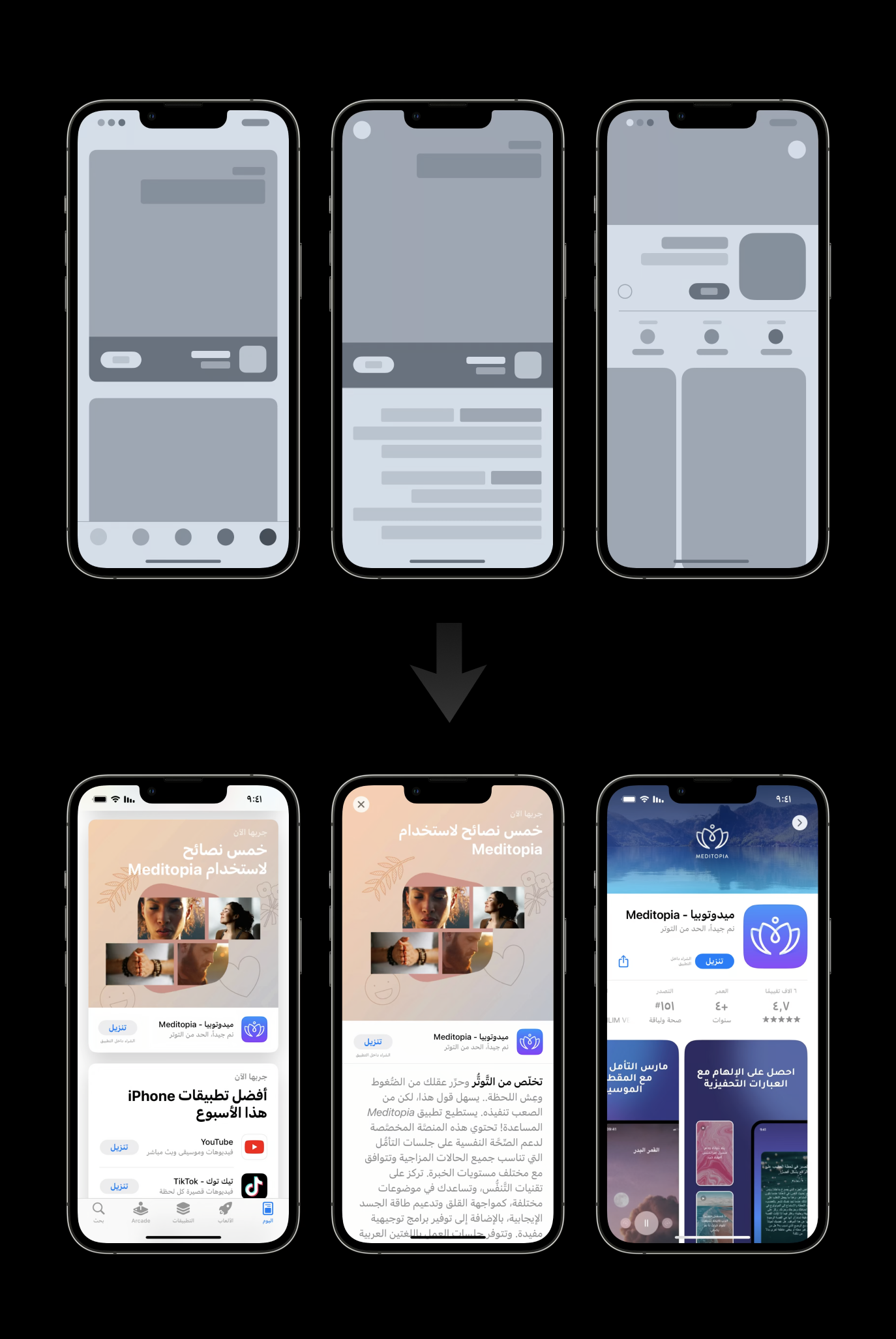
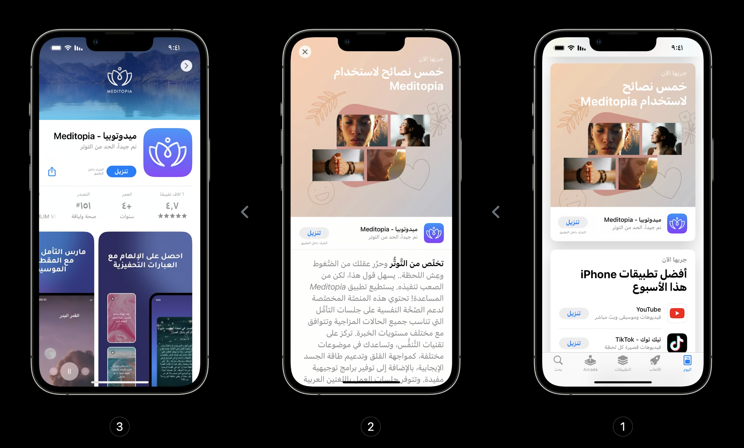
However, changing the layout direction is only the beginning, Arabic users will consider switching between these pages in reverse order. Because in their cognitive habits, they start using the app from the Today tab on the right, just like they browse an Arabic book from right to left.
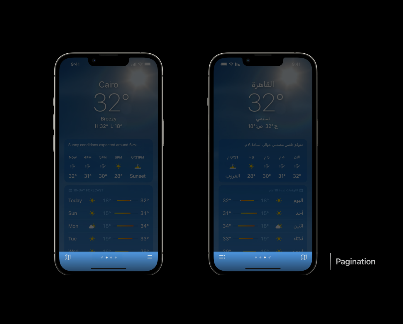
Next, let’s take the example of the weather app. The left side of the picture below is the English version of the weather, and the right side is the Arabic version of the weather.
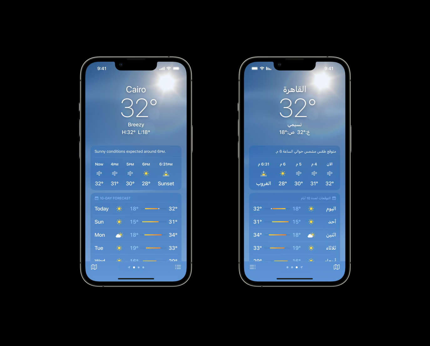
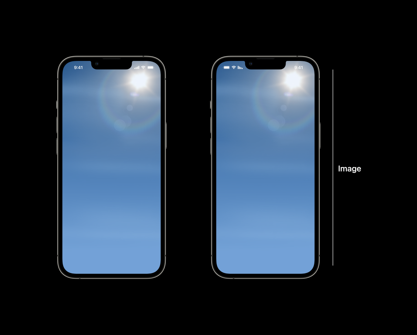
We will find that the background images are placed in the same position without mirroring. The reason is that no matter which country you are in, the sun always rises from the east, which is in line with the laws of nature and user perception.
The second is a component that changes weather throughout the day. The element layout and sliding animation of this component will be reversed.

The third is the temperature indication range. In Arabic, the lowest temperature is on the right and the highest temperature is on the left.

The fourth is the page turning indicator. As mentioned before, the thinking mode of page-turning for Arabic users is also reversed. The main page is on the far right, and you need to swipe left to see other pages. So the pagination symbols should also slide from right to left.
Second, typography
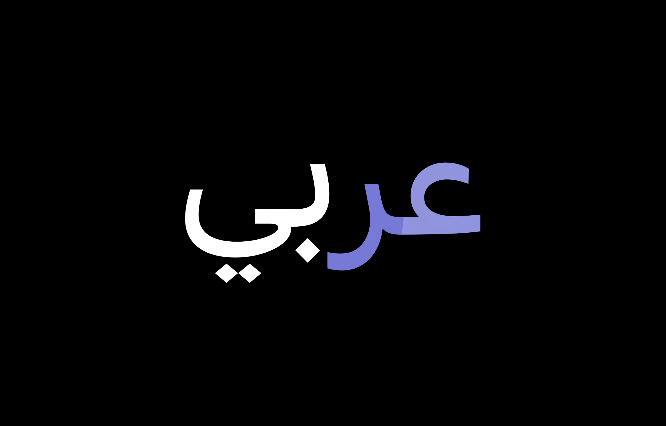
Before discussing typography, let’s briefly introduce the main features of the Arabic language. In Arabic, the four letters below spell out the word "Arabic". But in writing, the individual letters that make up the word don't really mean anything.
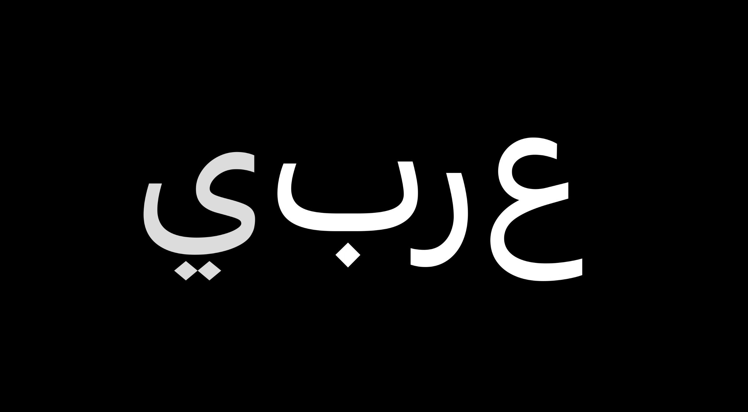
For example, the word pictured below consists of two parts, each with two characters. This is one of the main characteristics of Arabic fonts, its associativity, which also means that each letter may correspond to many glyphs.
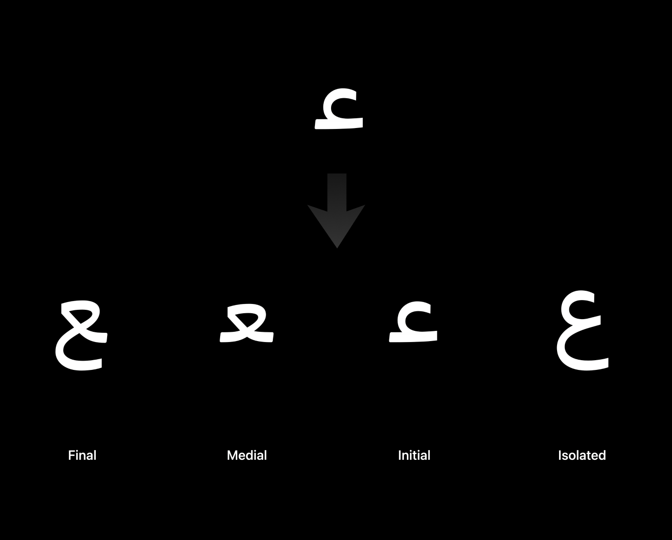
Taking the first letter "Ain" in this example as an example, its glyph will change depending on its position in the word, whether it is at the beginning, middle, or end, the glyph is different. This also results in the Arabic font library being much larger than the Latin font library.
Another feature of the Arabic font is that, in most cases, its words are more succinct than those of Latin. Because of its interconnected character between letters, it will give a word or phrase a more concise feel.

Also, Arabic fonts have higher line heights than Latin letters, especially when dots, diacritical marks, and diacritical marks are used. Sound marks are used to emphasize certain letters or to differentiate pronunciation. If your app uses a lot of pronunciation marks in the Arabic language, you need to ensure that the UI layout has enough vertical spacing to avoid text being cut.

Apple offers a special Arabic font, SF Arabic, which has been carefully designed with legibility and functionality in mind.
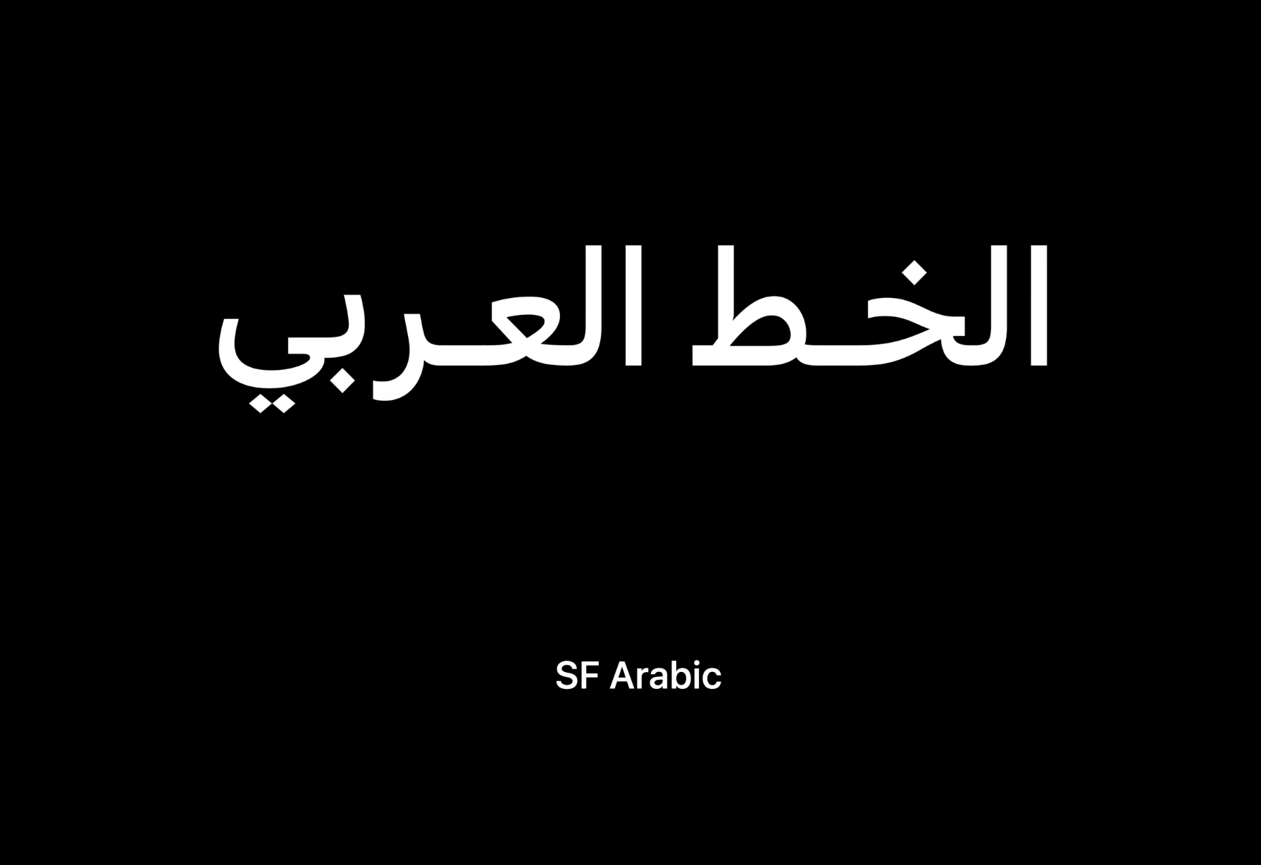
The design of this font is also consistent with the style of the Latin SF series, so that in the case of bilingual mixed typesetting, it can also achieve natural typesetting.

SF Arabic also takes scalability into consideration. Its glyph will vary slightly with font size.

Overlapping the largest and smallest letters reveals a difference in their structure.
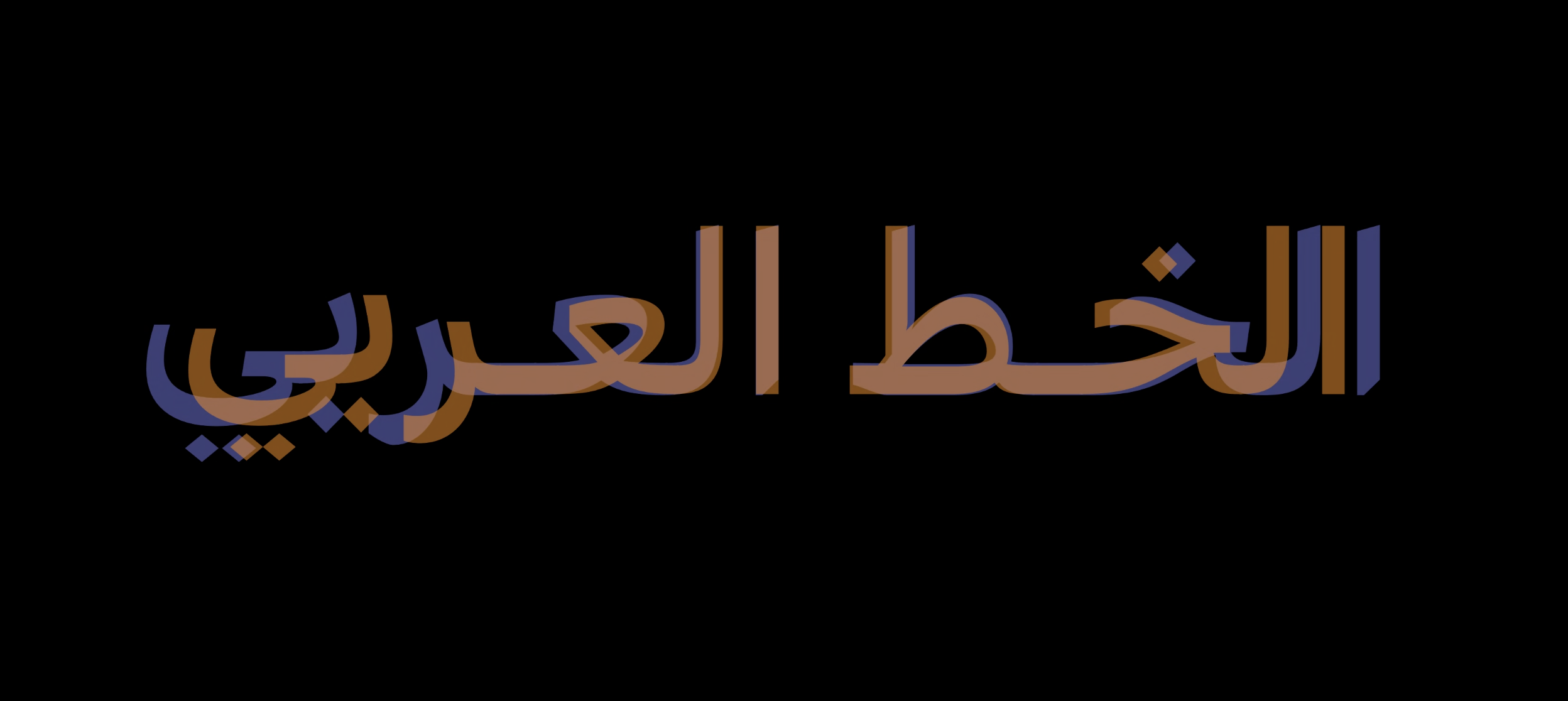
Large font size is often used for titles, and text font size is usually used for text, because the font size is small, in order to ensure legibility, the end of the font strokes is often cut at the end.

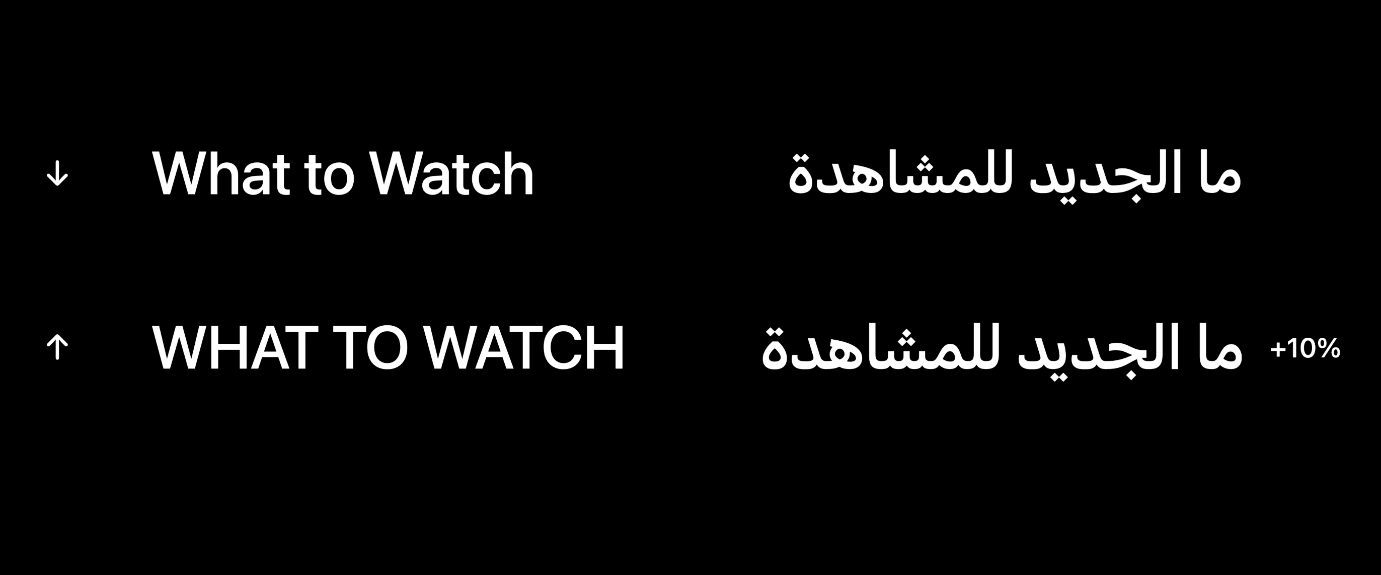
Also, Arabic is not case sensitive. When Latin and Arabic are mixed, the uppercase Latin letters will appear to be much larger than the Arabic font size. To compensate for this visual difference, the font size of Arabic can be increased by 10%.
Another consideration is letter spacing. The picture below is the normal style of Arabic language with 0 spacing. If 10% word spacing is used, but the word spacing is not handled in a correct way, it may cause Arabic letters to break or display unnecessary spaces.
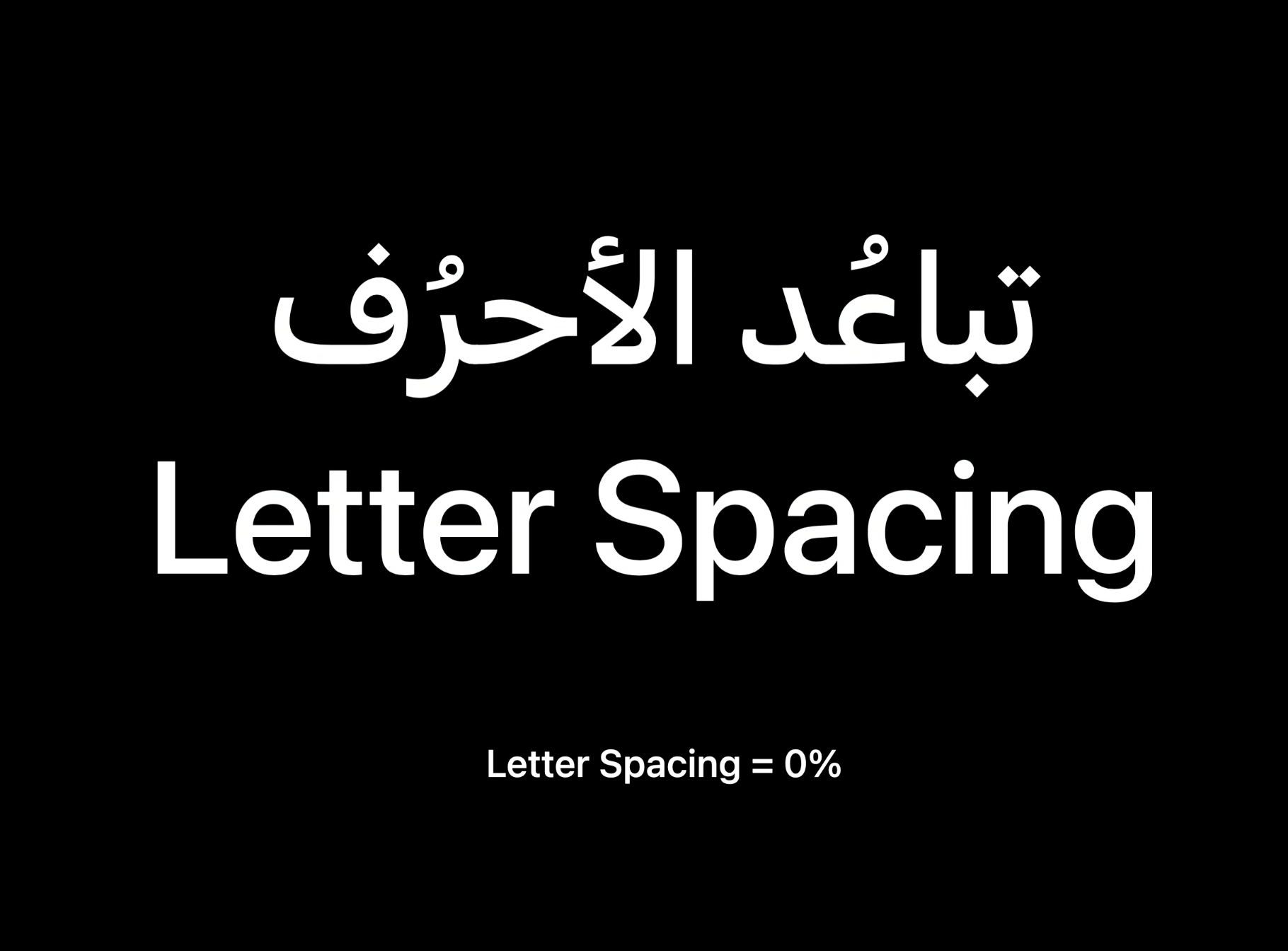
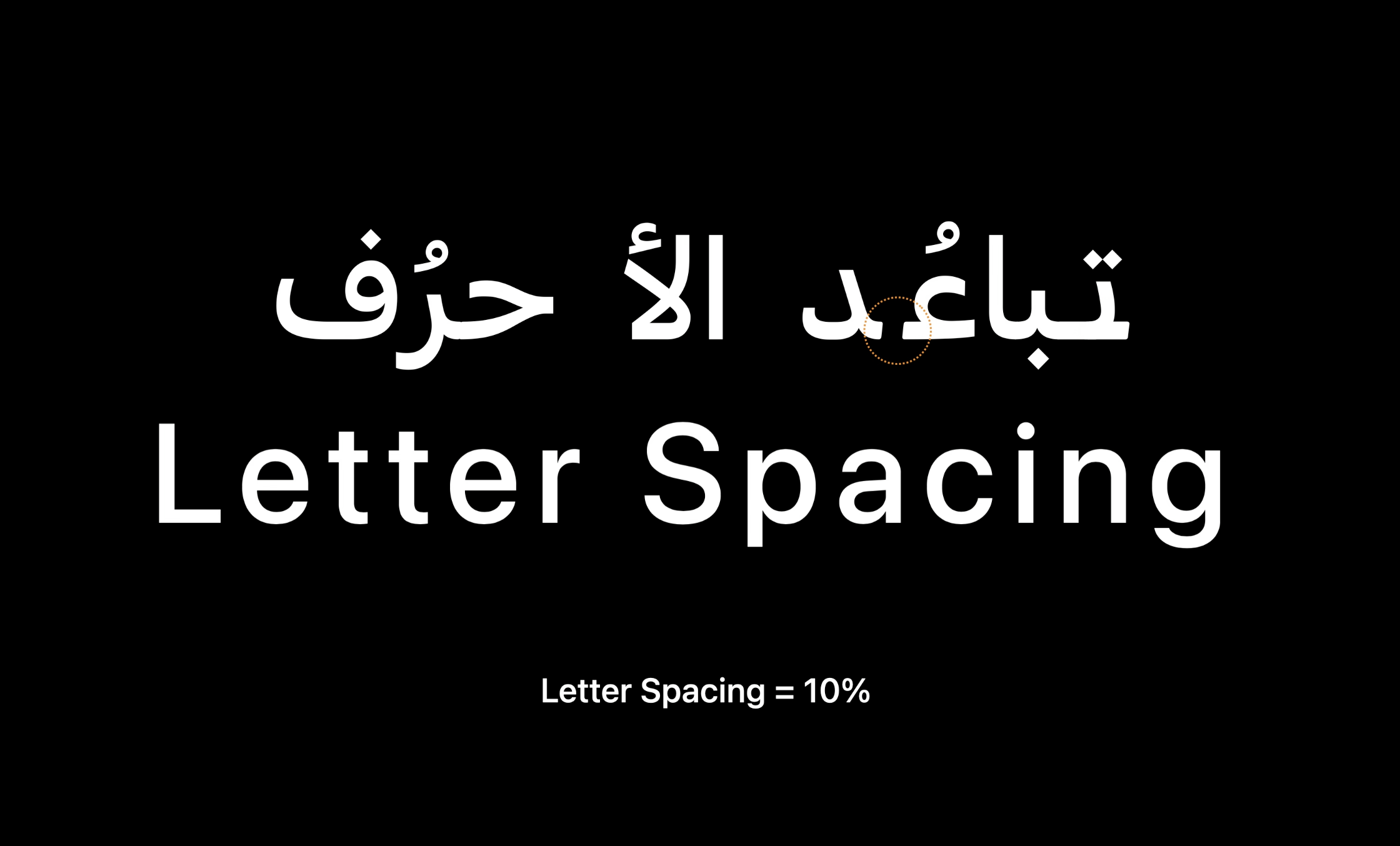
Therefore, if the Arabic font you use is not optimized for word spacing, it is best to use the default word spacing or use the SF Arabic font that comes with the system. When adding kerning to the SF Arabic font, it adds extra connections between letters, and this also conforms to Arabic writing conventions.
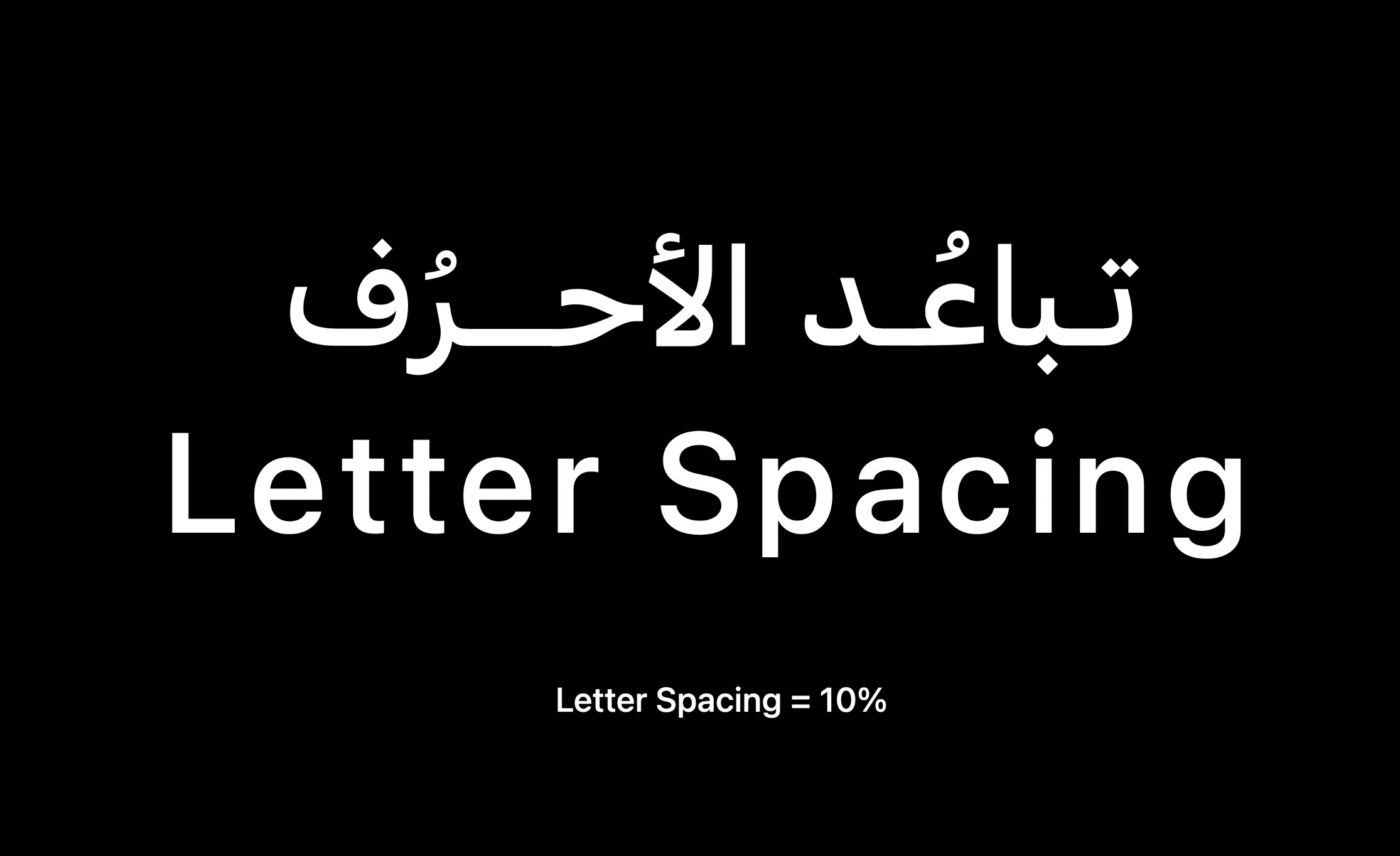
Because of the increase in word spacing, the extra letter connection is called "Kashida" in Arabic. Different word spacing will have different lengths of Kashida.

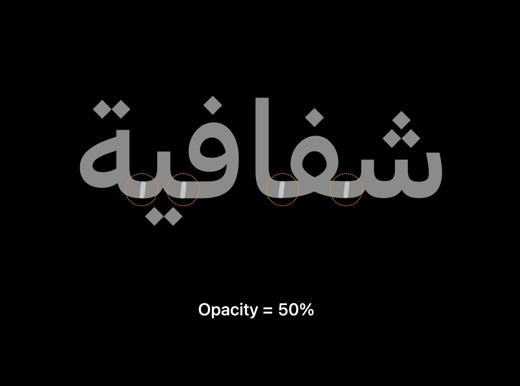
The last thing to pay attention to is opacity. When adding opacity to the font, you can see that there are obvious seams where the letter links. This is because the Arabic font is not well optimized. This doesn't happen if you use system fonts, the opacity is applied to the whole word or phrase.
3. Icon
Now let’s talk about icons, icons are one of the elements in UI that are easily overlooked. In the Arabic language products, the design of the icon also has a lot of places that need special attention. Let's take the icon in the navigation bar at the bottom of the App Store as an example:
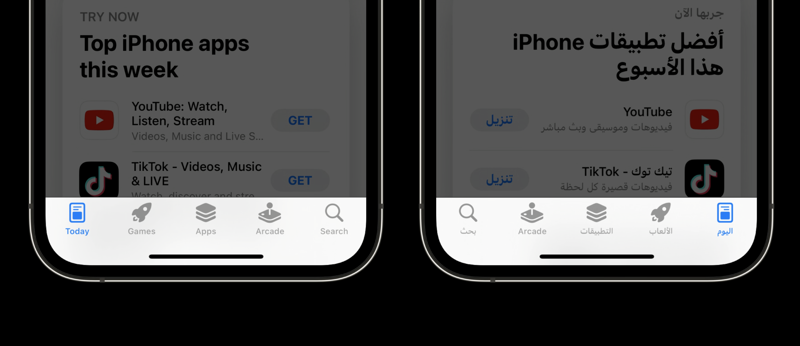
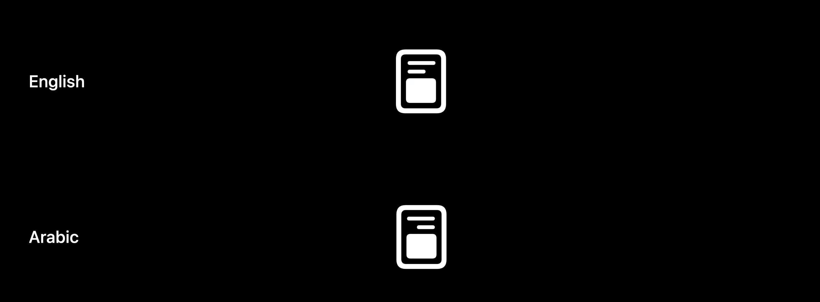
The above pictures are English and Arabic interfaces respectively. Except for the “Today” icon, other icons are consistent. The two horizontal lines in the "Today" icon indicate the alignment direction of the text. For Latin speakers, the text should be left-aligned; for Arabic speakers, the text should be right-aligned, matching the natural reading direction of the text.
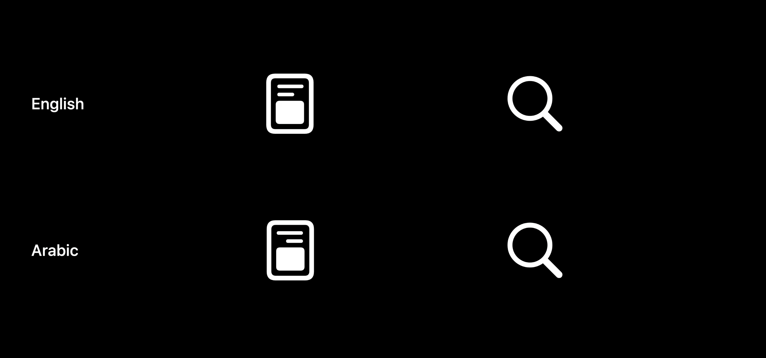
For the "Search" icon, the orientation of the icon remains the same in both Latin and Arabic contexts. Because most people hold things with their right hand, no matter which country they are from.
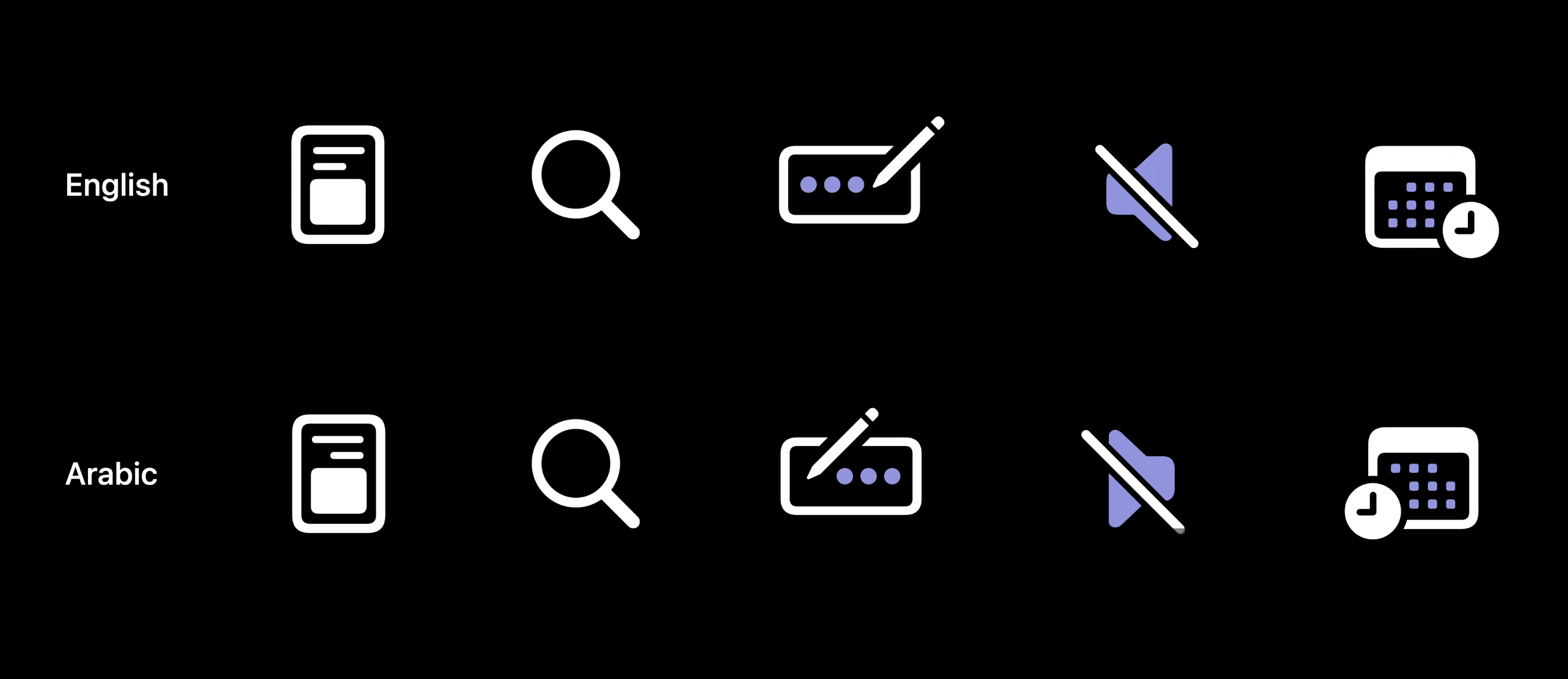
There are some other icon examples in the figure below, which also illustrate the differences in icon design in the Arabic context.
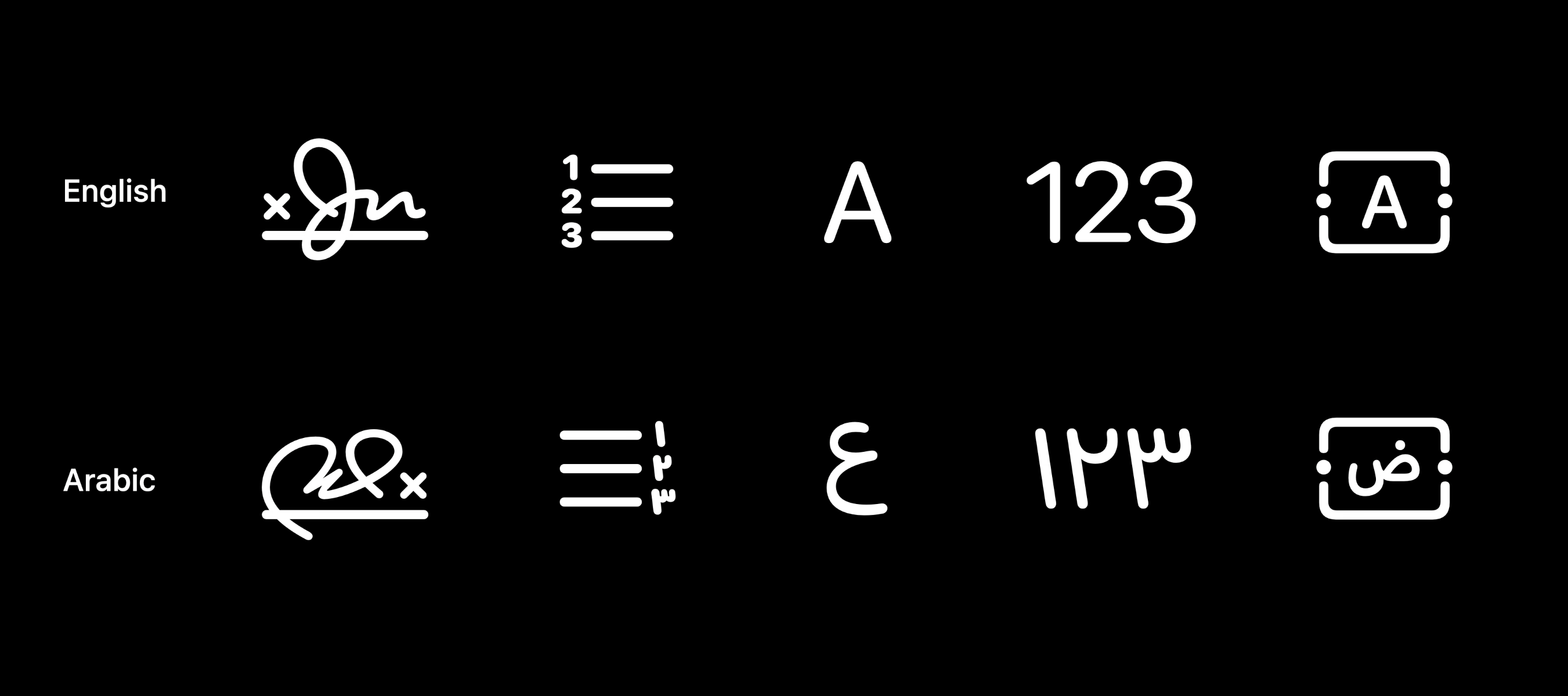
In addition to the directionality of icons, the relationship between icon design and local culture should also be considered. The icons in the picture below are from the SF Symbols library, which contains a specially hand-drawn Arabic signature icon and other text format icons.
Using locally designed icons can improve the overall experience of your app because the style of the icon is more relevant to the user. Especially for countries or regions that use non-Latin scripts, we need to pay more attention, because we sometimes unconsciously forget the nuances of different languages and cultures.
Fourth, Arabic numerals
Now let's talk about Arabic numerals. The numbers in the picture below are Arabic numerals that we are very familiar with. Arabic numerals are called because they were invented in the Arab world and replaced Roman numerals.
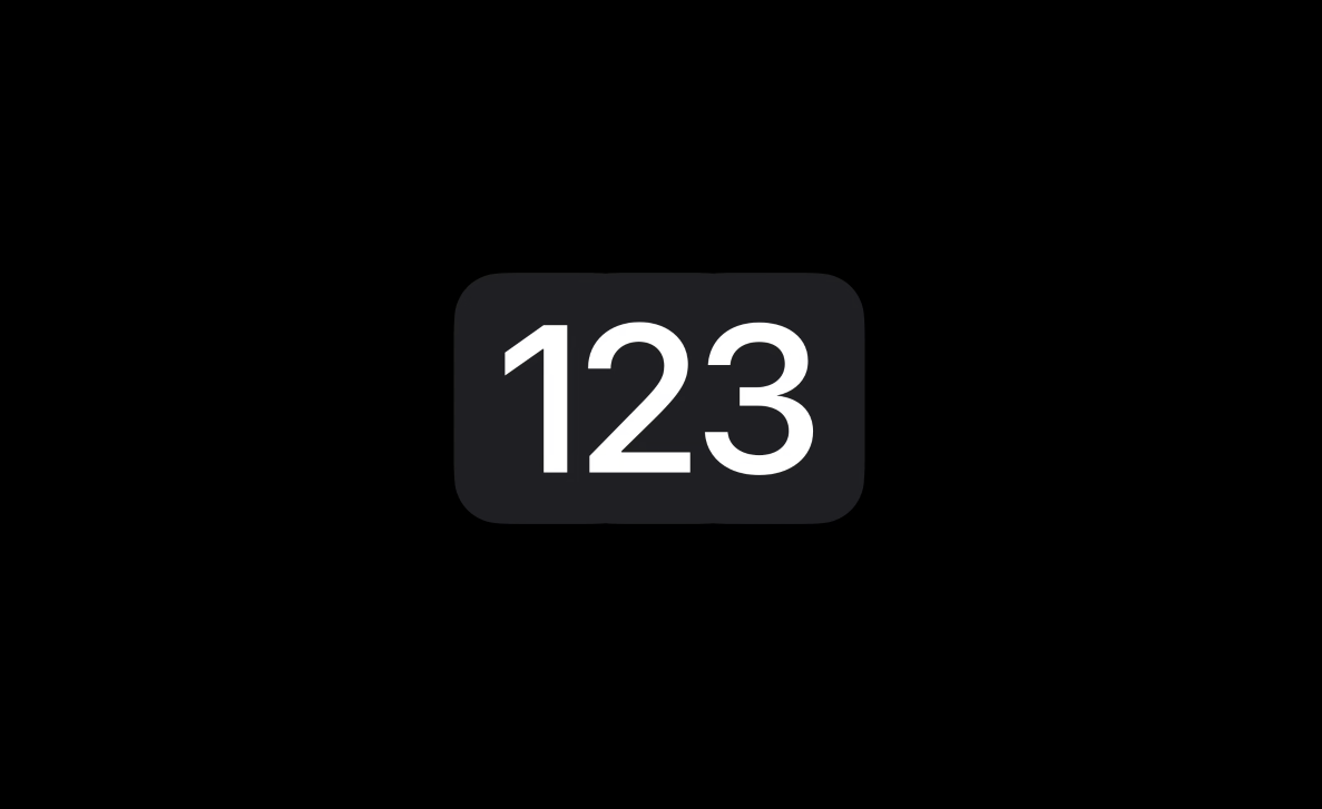
You will find that current calculators operate from right to left, which is the same reading order as Arabic text. In today's world, such numbers are known as Western Arabic numerals.

This is to distinguish it from Eastern Arabic numerals. Both numbers were invented in the Arab world and are used in different Arab countries. Western Arabic numerals are mainly used in West African Arab countries such as Morocco, Algeria and Tunisia. While Eastern Arabic numerals are mainly used in some Mediterranean and Gulf countries. But countries like Egypt and Saudi Arabia use both versions. If the app you are developing contains numbers, it is best to include the above two versions of Arabic numerals.

5. Ending
This article is quoted from WWDC22 Apple designers shared about how to design for Arabic-speaking users. It discusses design considerations about UI direction, icons, typography, numbers, etc., which is very inspiring for localized and internationalized design.
Original link: https://developer.apple.com/videos/play/wwdc2022/10034/
Shared by: Mohamed Samir
Translator: A cake talks about design
This article was translated and published by @阿饼言设计 in Everyone is a product manager, without permission, reprinting is prohibited
The title picture is from Unsplash, based on the CC0 agreement
The opinions in this article represent only the author himself, and everyone is a product manager platform only provides information storage space services.
Articles are uploaded by users and are for non-commercial browsing only. Posted by: Lomu, please indicate the source: https://www.daogebangong.com/en/articles/detail/How%20does%20Apple%20design%20for%20Arabic%20users.html

 支付宝扫一扫
评论列表(196条)
测试