Beautiful Chinese fonts can always add cultural force to the design of catering brands. There are probably two reasons: Chinese characters have rich meanings and vigorous strokes; Li Chinese is as complex and beautiful as painting. Today, Fanshi Jun will take you to appreciate three examples of Fanshi's winning works with Chinese fonts, hoping to inspire Nimeng~
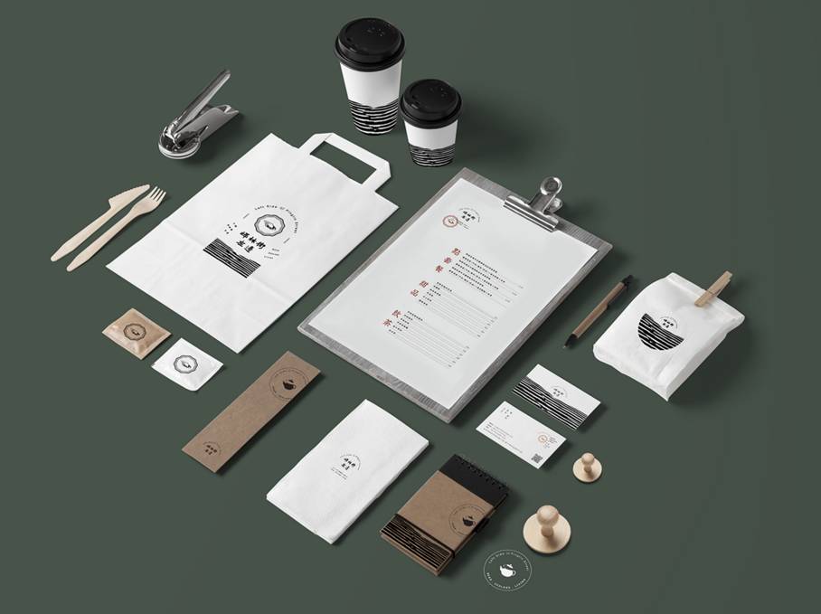
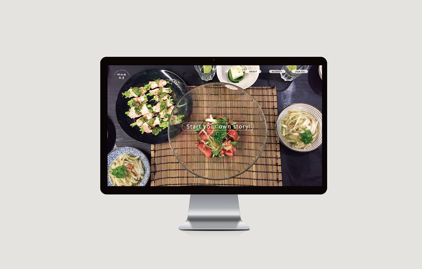
One, the left side of Pinglin Street

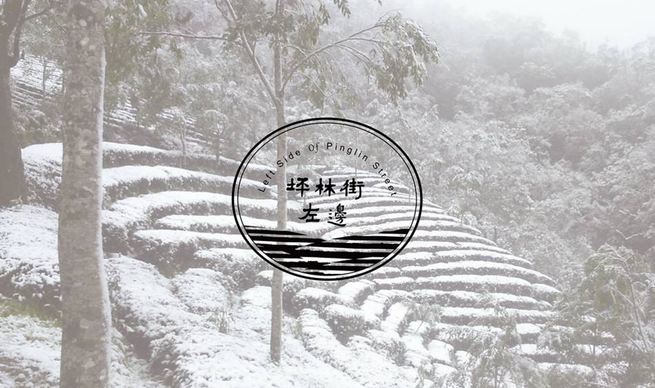
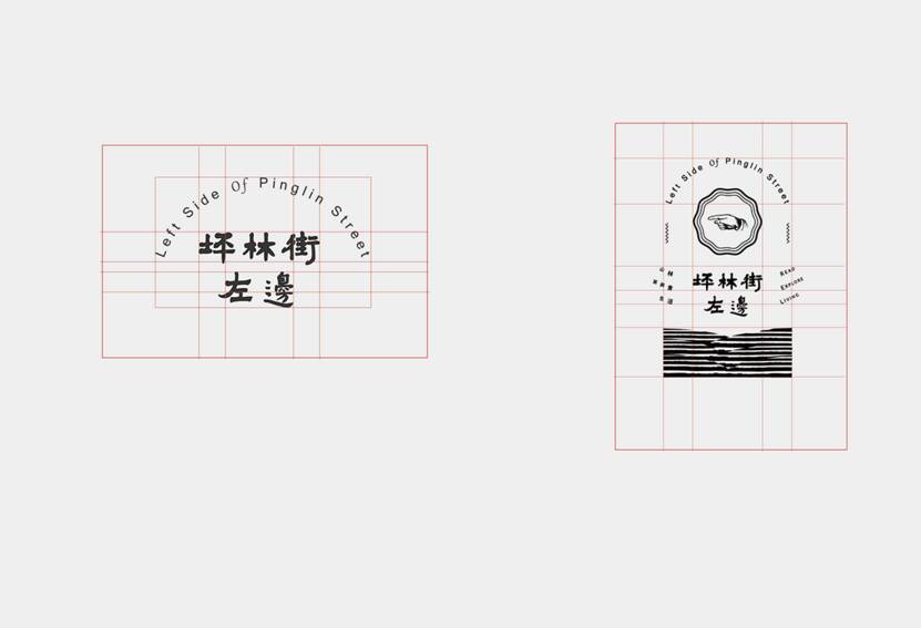
This case uses imitation rubbing techniques to combine Chinese fonts with background images, creating a sense of age-old precipitation.
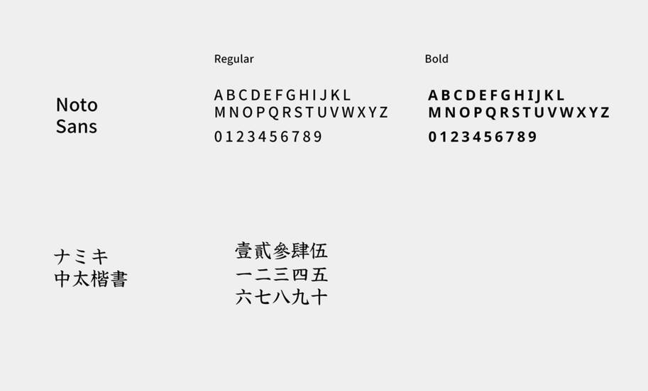

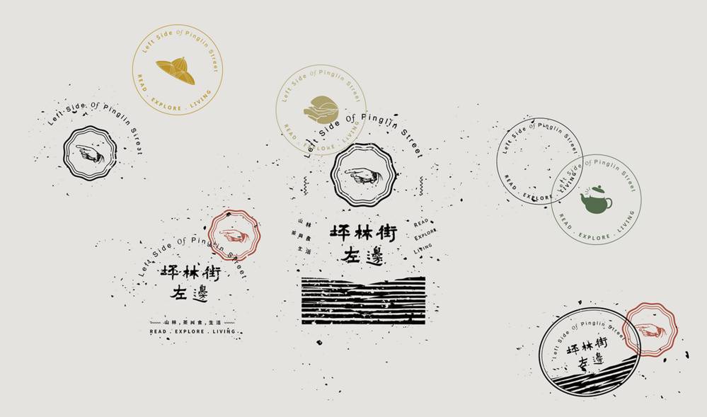
Succinct strokes ensure the connection and integrity of VI design.
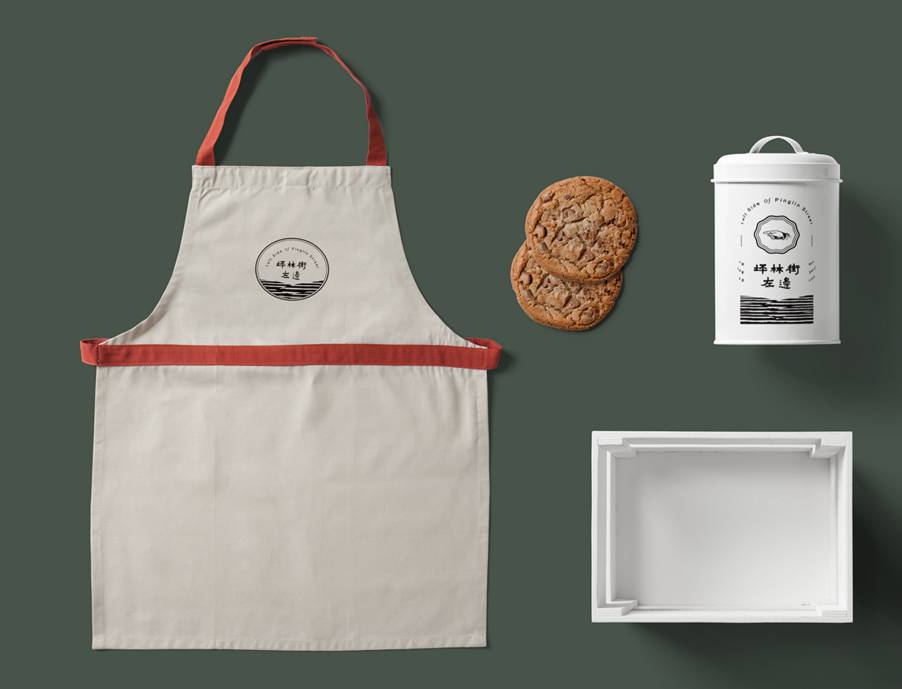
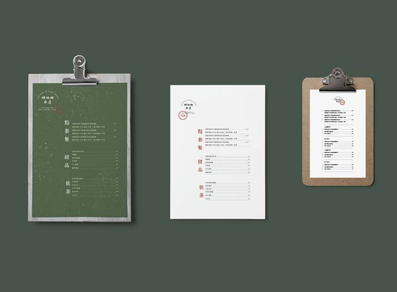

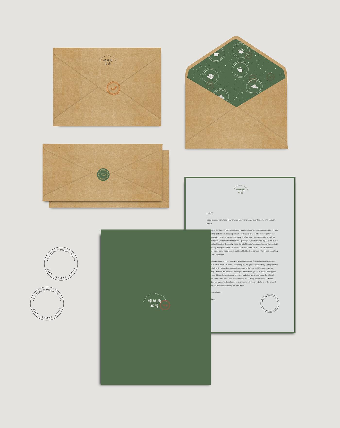

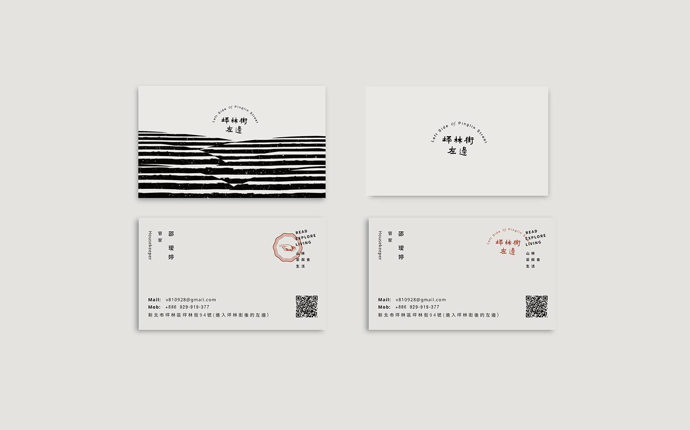
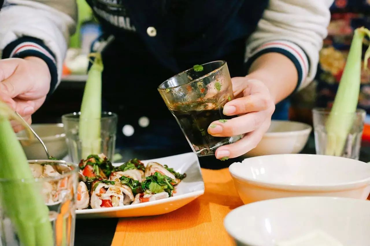
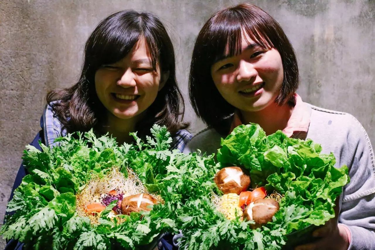
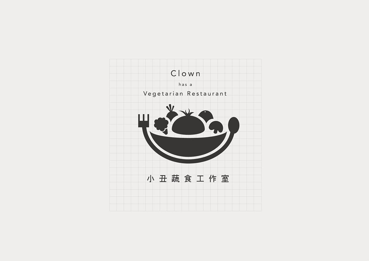
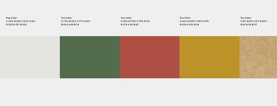
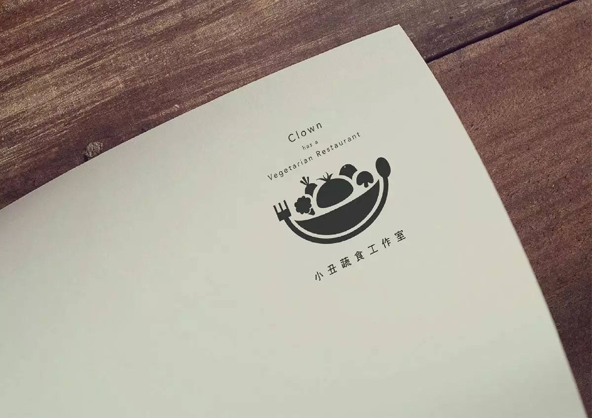
The actual application part is also in line with the VI vision, and the colors are mainly simple black and dark green to highlight the healthy fruits and vegetables of the restaurant.
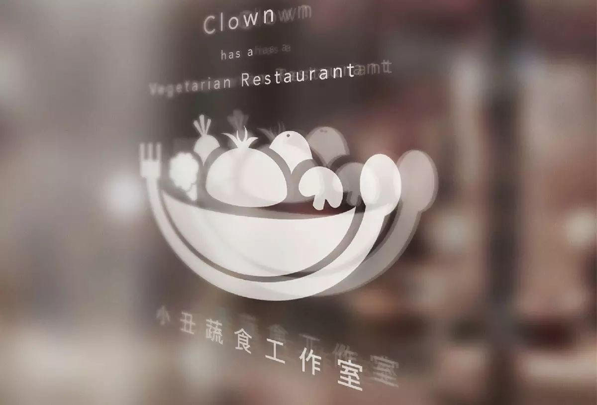
2. Clown Vegetable Food Studio
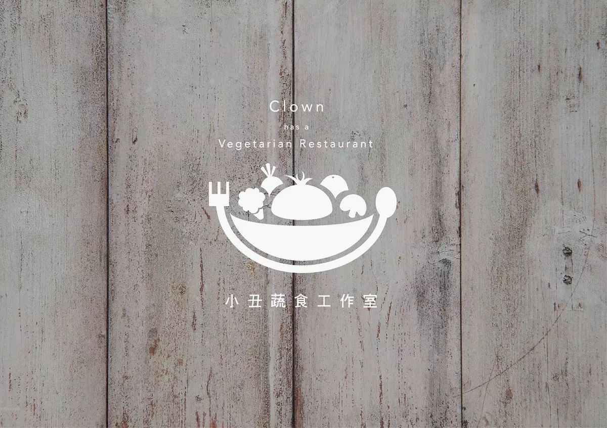
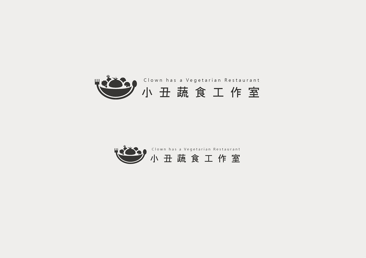
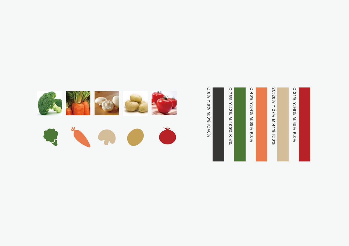
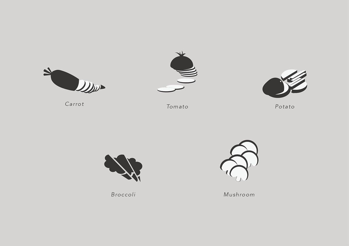
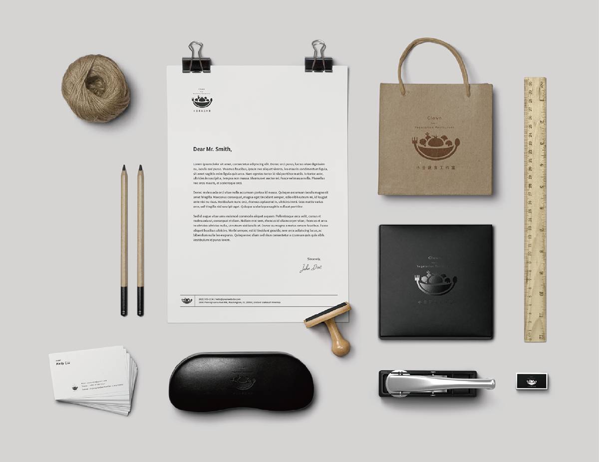
The brand identity of the restaurant is very creative. The visual elements of the clown and fruits and vegetables in the name are properly combined to achieve an effective combination of vision and copywriting.
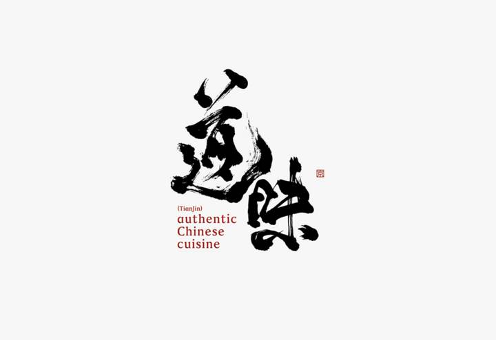
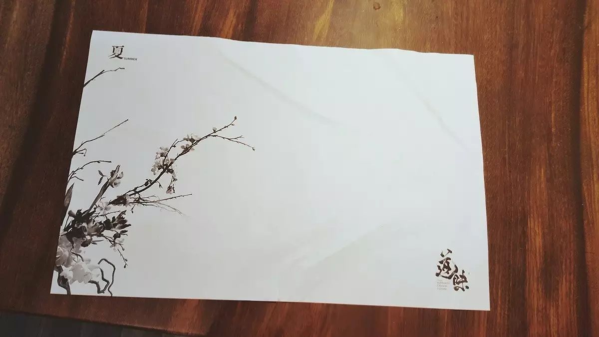
San, Lianwei Chinese Restaurant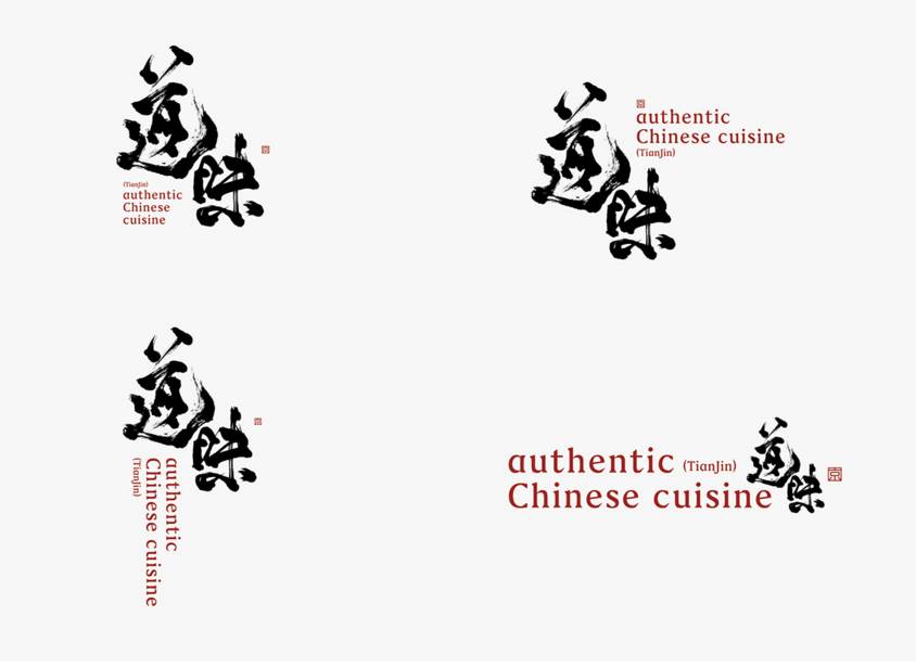
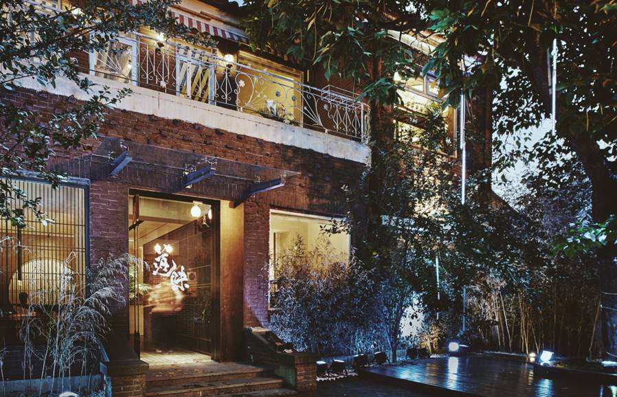
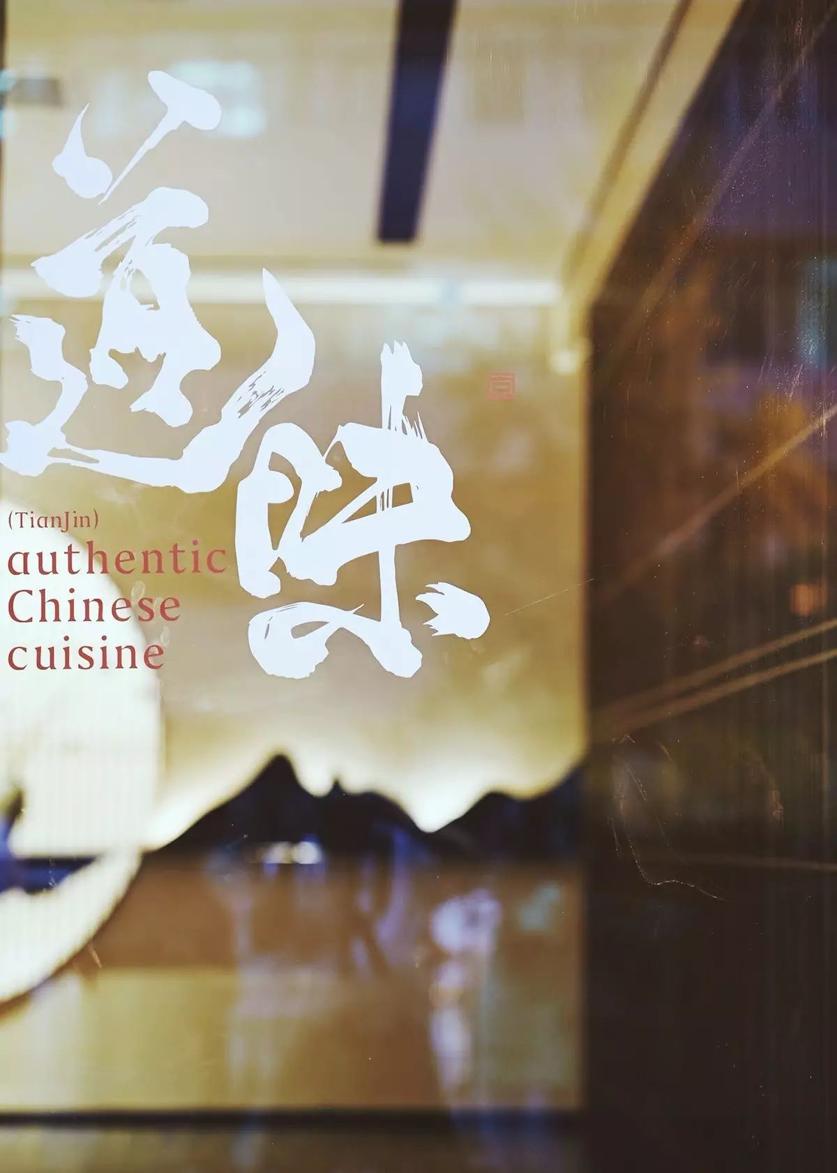
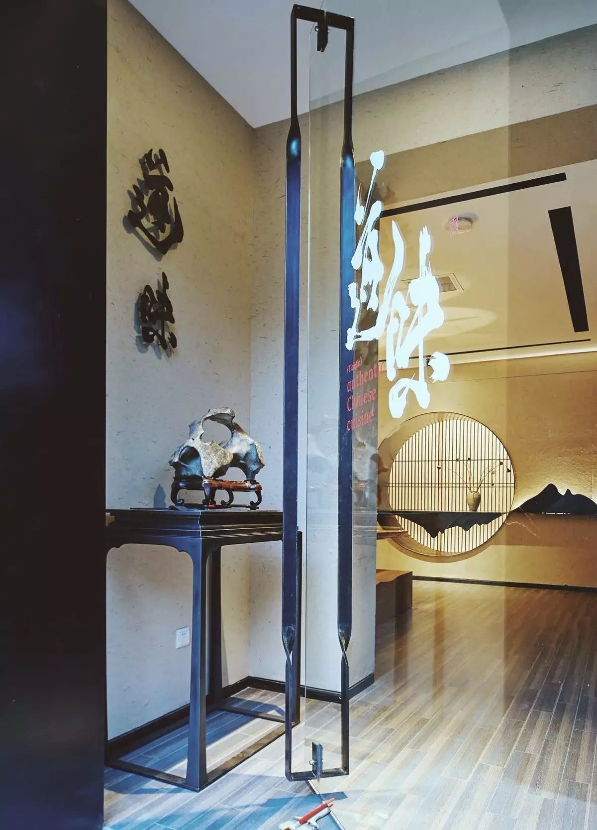


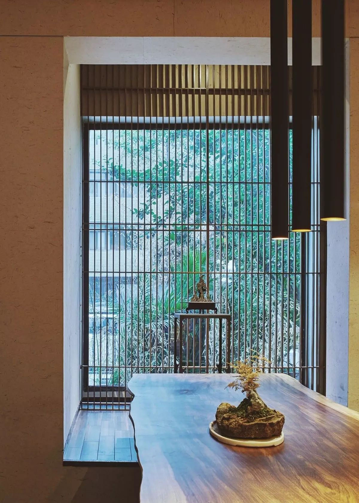
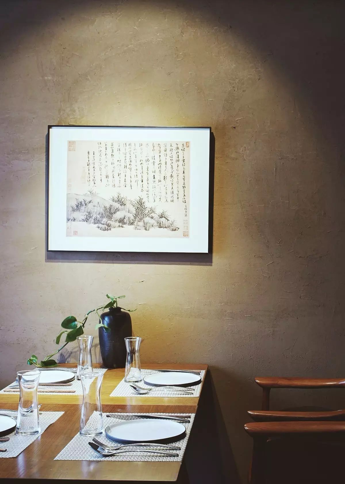

This brand case is a typical case of using calligraphy fontsto break visual fatigue. The whole design does not use many painting elements. The unrestrained Chinese style runs through the entire atmosphere of the restaurant.
Today’s meal video is here first, we will continue tomorrow~
image behance
Original editor of Catering Vision Lab (ID:cysjstudio)
Please specify the source for reprinting, thank you
Director WeChat: jdviper
Articles are uploaded by users and are for non-commercial browsing only. Posted by: Lomu, please indicate the source: https://www.daogebangong.com/en/articles/detail/How%20do%20Chinese%20fonts%20shine%20in%20catering%20brand%20design.html
 支付宝扫一扫
评论列表(196条)
测试