In the past few days, I believe that everyone's circle of friends has been swiped by these two Japanese posters:
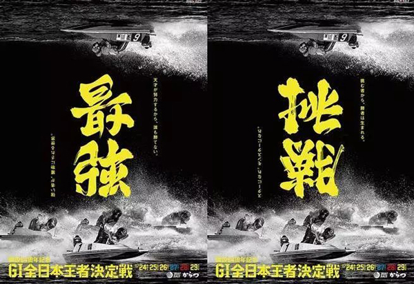
Because the main title is very characteristic, the front view and the reverse view are different words.
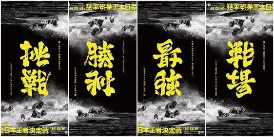
If you look at it from the front, it is a "challenge", but if you look at it backward, it is "victory". The reason why these two posters are so popular is that the main title uses the treatment method of the meaning of the word.
The processing method of the meaning of the word has the effect of looking at the horizontal as a ridge and the side as a peak, and the distance and height are different. It may be possible to change the direction and see the different glyphs. I believe that just looking at these two posters is not enough for everyone, so I will show you some works of Yi Mingzi in the form of classification.
1. Mirror font
Different glyphs can be presented by mirroring
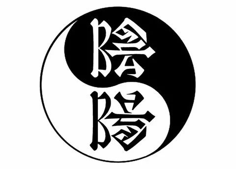
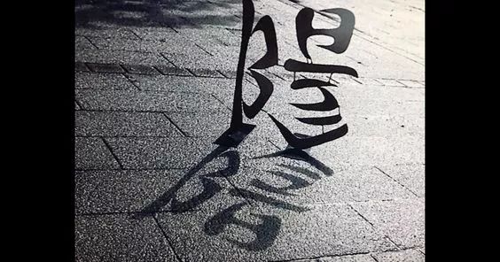
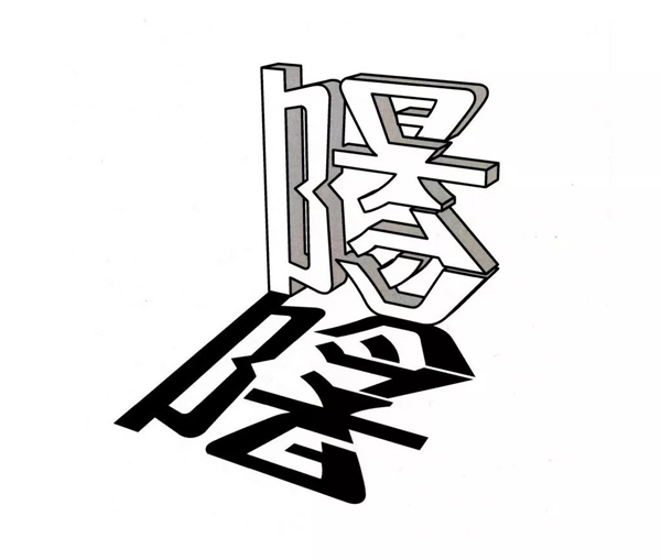
Yin and yang coexist and mirror each other
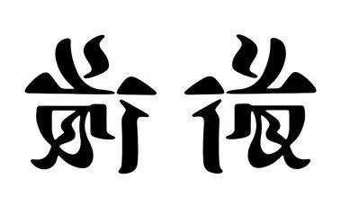
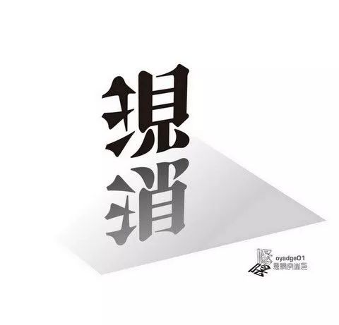
Disappear now, mirror vertically
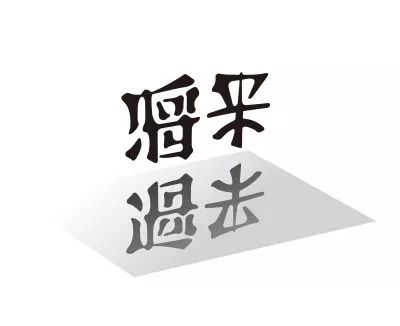
future past, mirror vertically
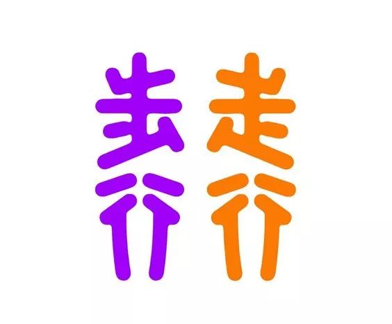
walk, walk, mirror horizontally
2. Reversed synonym
The reversed synonymous design of the meaning of the word has the same meaning after changing the direction by 180°, which is the same as the above two pictures The form on the poster is the same.
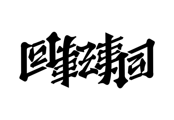
Conveyor sushi
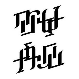
Hello, goodbye
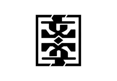
text
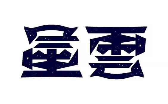
Nebula
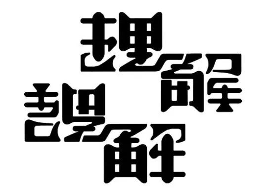
Understand
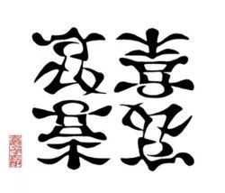
Emotions, anger, sorrow, joy
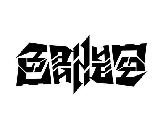
color is empty
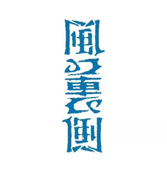
The inner side of the wind
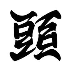
Header
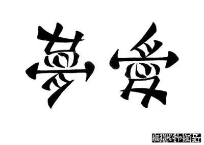
Dream Love
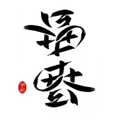
Fuchun

hard soft
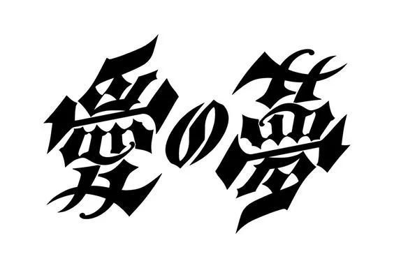
Aiの梦
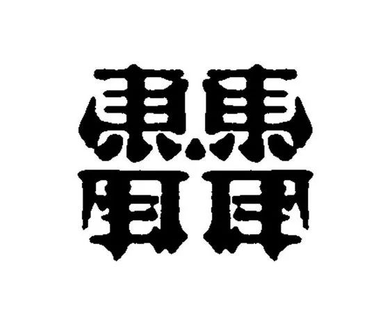
Maer Dongfeng
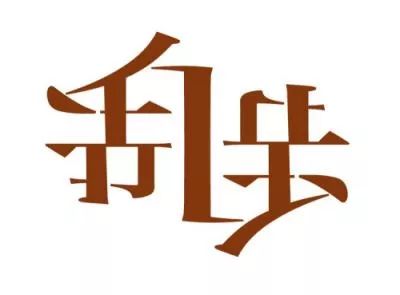
Random walk
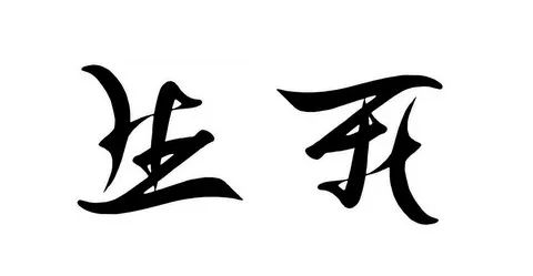
Life and death
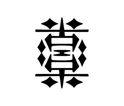 '
'
Bitter and happy
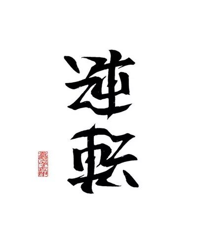
Reverse alignment
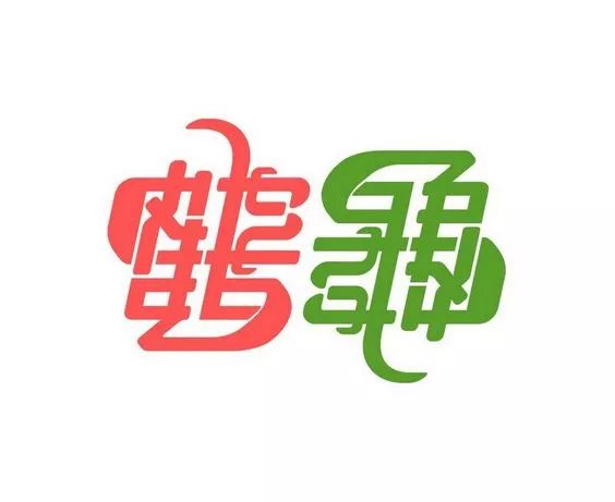
Crane Turtle
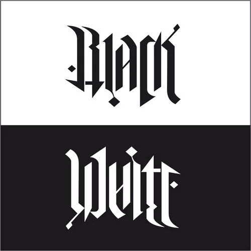
Black, White, English can also be used
3. Special angle rotation of glyphs
Different glyphs can be obtained by rotating different angles of the meaning of the word.
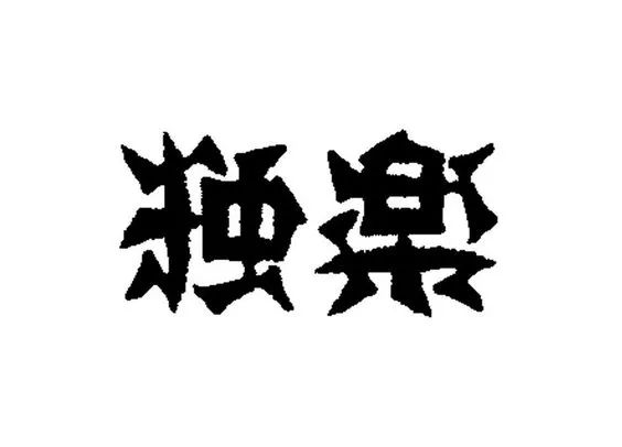
Solo, 90° rotation
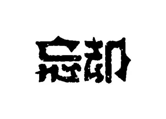
Forget, rotate 90°
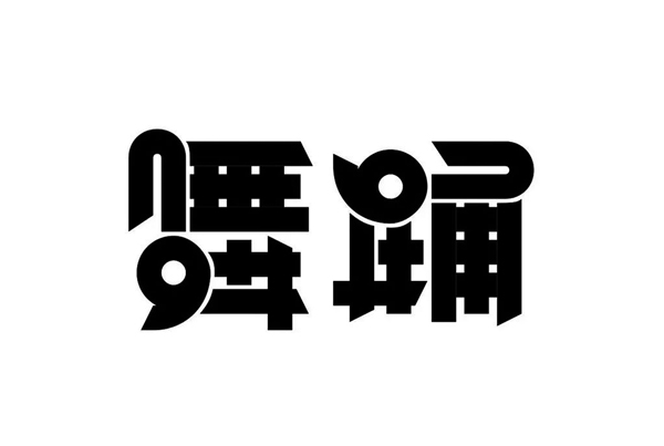
Dancing, 90° rotation
4. Yin-yang combined characters
Display other glyphs through blank space.
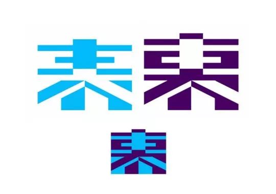
Exterior and interior
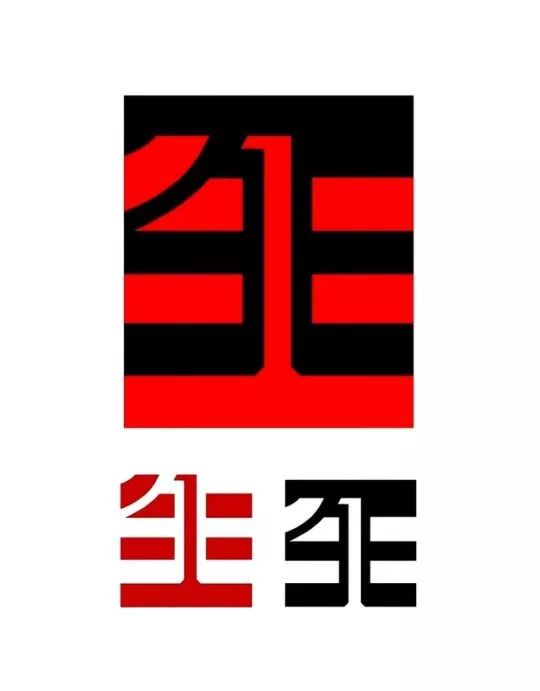
Life and death
There are four types of characters in the meaning of the closed eyes, and the second reversed type is the most commonly used. Although the characters of Yi Ming are very individual, they should be used with caution in commercial projects, and the recognizability of the font must be ensured.
Articles are uploaded by users and are for non-commercial browsing only. Posted by: Lomu, please indicate the source: https://www.daogebangong.com/en/articles/detail/How%20did%20you%20design%20the%20font%20of%20the%20popular%20Japanese%20poster%20recently.html

 支付宝扫一扫
评论列表(196条)
测试