You may have noticed that in 2017 and 18, gradients were used more and more in print and web design.
It looks like the design industry has embraced this trend, and this gradient transition is only getting more dynamic in shape and color. Working with colorful shapes and backgrounds can be tricky if you don't know how to apply them to the message you want to convey through your design.
What are the top five gradient trends, and how can you use them effectively in your work?
1. The gradient of the two-color version

Duotone gradients are two colors with a smooth transition between them. No more, no less. Creating these types of color transitions is very easy with the gradient tool in Illustrator.
When combining colors for Duotone gradients, there are no rules. The rules come in when you mix 3 colors or more. But two, you can do whatever you want. It all depends on your intentions for the design itself.
If you need a strong and bold message, then you might want to consider a brighter, higher-contrast color combination. On the other hand, if you're looking for a softer, quieter approach, using less saturated colors is just fine. see how you use it
How to use gradients in two-color version?
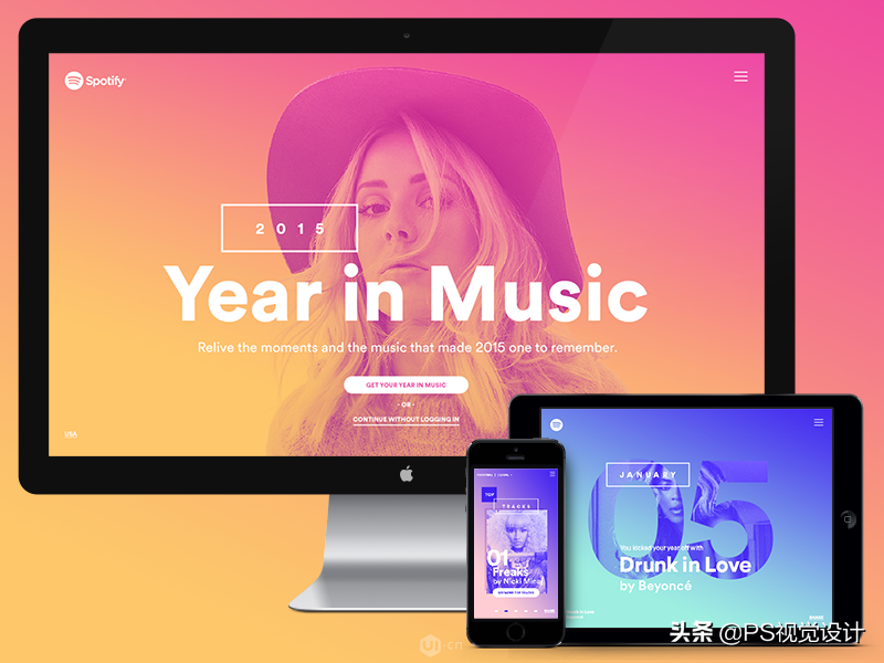
You can be as creative as Duotone Gradients. The most widespread use of this type of gradient is in photo overlays. Gradients are mostly used as simple backgrounds for content. The example below is one such case created for Spotify by Jessica Hägg and Stink Studios.
Another example of Duotone Gradient is the home navigation design created by Barthelemy Chalvet for AgenceMe. Here again, we're looking at Duotone as the backdrop for the content. Content includes text and illustrations. However, the colors used in the figure are taken with great care. The illustration is mostly light toned with just some brightly colored details, as opposed to the background duotone (warm) (cold).

All in all, the safest way to use the duotone gradient trend is to mix gradient backgrounds with black and white photos, or apply them as photo overlays. If you mix them with other colors, make sure not to overdo it.
Multiple colors can be brilliant in design, but they can also introduce chaos and confusion if not matched properly. When in doubt, use fewer colors. In most cases, less is more.
2. Semi-transparent gradient
The top five gradient trends include translucent gradients. These types of gradients have a fade effect in them, they have full tint at one end and 0% color opacity at the other end.
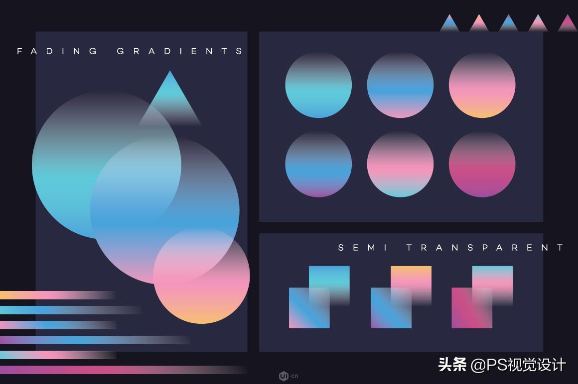
These translucent gradients can be duotone or even tritone gradients, but they always end or start with transparency.
How to use semi-transparent gradient?
One way to use semi-transparent gradients is to overlap them with other gradient shapes and backgrounds, or as an overlay on a photo. The example below shows the artwork produced by Studio-JQ
Here we can see a semi-transparent shape being used on top of a three-color gradient circle. Subtle translucent shapes create a foggy atmosphere in front of the gradient circle, like a faded moon, a simple yet effective use of transparency.
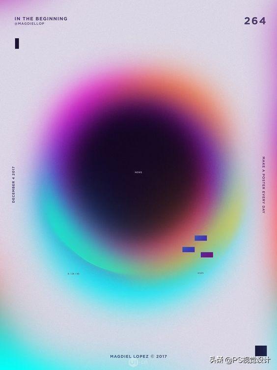
Another fantastic use of translucent gradients mixing photography and texture can be seen in this poster artwork by Magdiel Lopez.
3. Mesh Gradient
Mesh Gradients are gradients made with the Mesh tool in Illustrator, hence the title. This type of gradient takes a bit more skill to make. Usually they have multiple colors mixed together, this should be produced with care as some colors don't match well. In addition to mixing multiple colors together, they form a liquid-like textured pattern, giving it a more dynamic appearance.
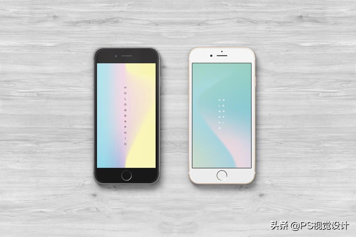
By now, you've probably noticed how all the gradients work perfectly with black and white photos, giving them the contrast they need to enhance the intensity of their colors. It also removes the clutter and feeling of "too much" in the design.
How to use mesh gradients?
Mesh Gradient can be used as a standalone mode. Since they often have a dynamic look, they can be applied as minimalist patterns, complemented by creative typography.
Branding using mesh gradients is also gaining in popularity. This type of use can be seen in the minimalist branding project below made by Focus Lab.
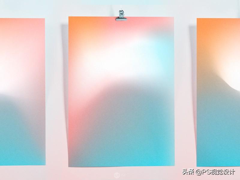
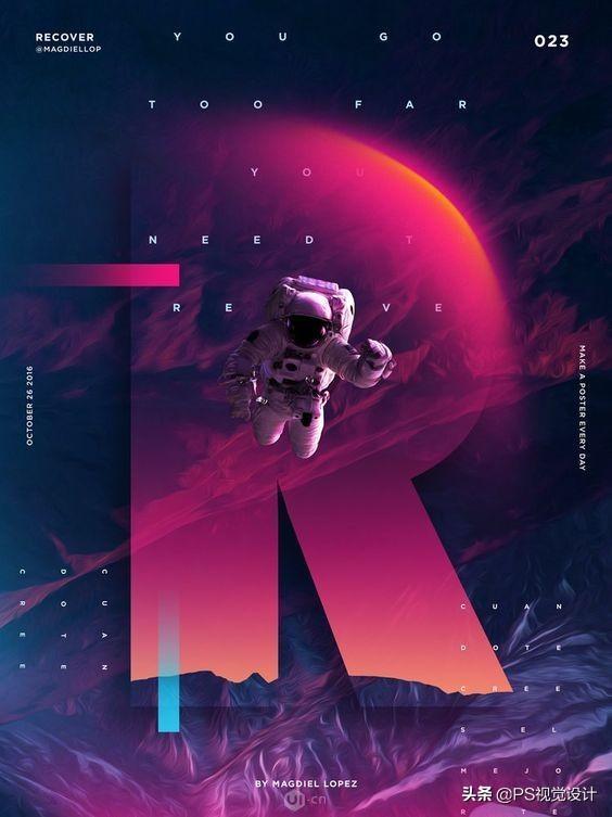
4. Gradient blur
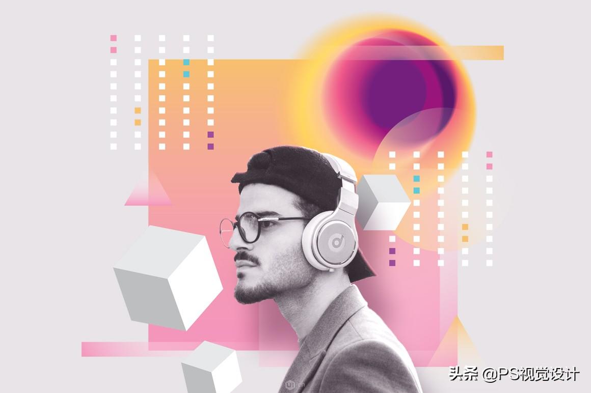
This is where things get interesting…. Introducing Gradient Blur! I'm sure you've seen these interesting looks, with a strong "art" feel to them. They are now part of the Top 5 Gradient Trends.
How to use gradient blur?
They seem to be used quite often as part of poster designs. The great thing about abstraction is that it can be used to describe all kinds of emotions and abstract concepts. It can illustrate sound, light, the universe, happiness or sadness. We simply don't know how to describe many of these words, but well-chosen fuzzy colored shapes can help us.
Let's see some examples using gradient blur:
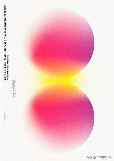
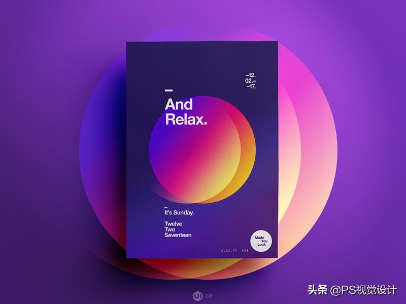
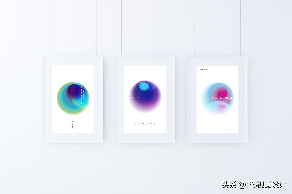
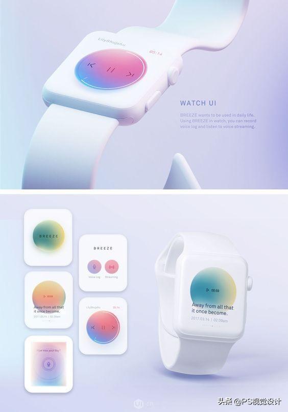
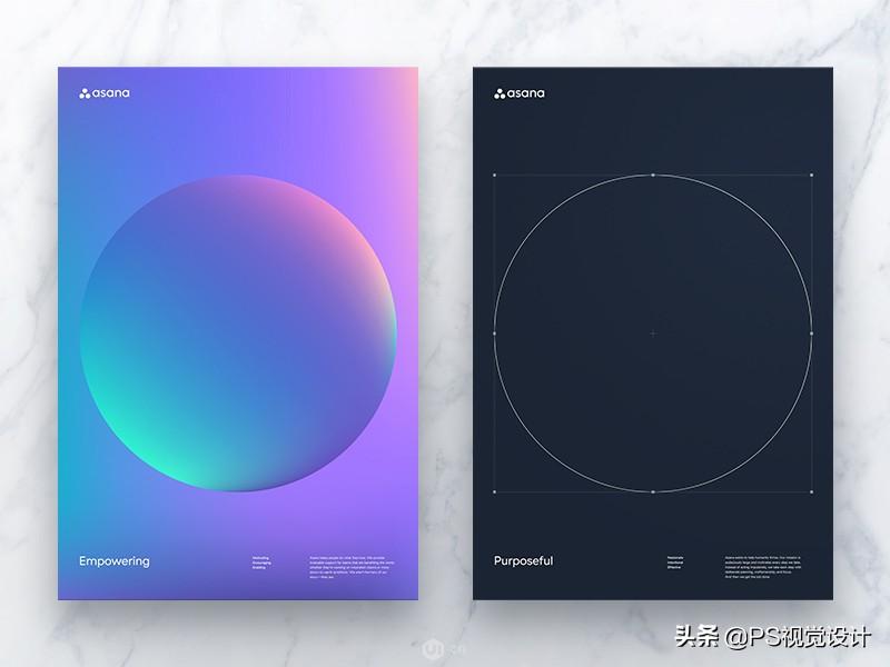
5. Gradient sphere
The final gradient trend is gradient spheres, mesh circles with strong three-dimensional shapes that remind us of being on planets and bubbles.
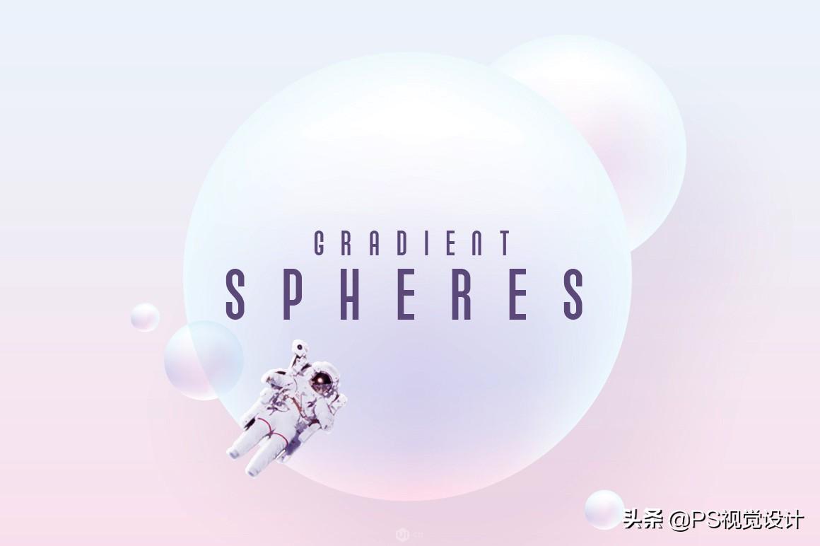
How to use gradient sphere?
Gradient Spheres have found their place in app and web design. Due to their resemblance to planetary analogues, they are often used in technological futuristic type projects. For example, Jiyoon Kim used Gradient Spheres to design a creative watch UI with a light and futuristic feel.
Another creative example of a Gradient Sphere used in this poster design by Mirtho Prepont for Asana:
Welfare】
I am Xiaoyong, to give back to fans for their support
A set of PS cutout video tutorial, logo design, font design video tutorial
After liking + commenting on this article, private message I will receive the tutorial
Articles are uploaded by users and are for non-commercial browsing only. Posted by: Lomu, please indicate the source: https://www.daogebangong.com/en/articles/detail/How%20can%20designers%20use%20gradients%20correctly%20to%20make%20highend%20design%20works.html
 支付宝扫一扫
评论列表(196条)
测试