Editor's note:Original author of this article, Linus Boman, original titlePapyrus: The World's 2nd Most Hated Font, posted on YouTube on December 29, 2022. This picture and text are reproduced and published on Minorities with authorization, and translated and arranged from the original video by the editorial department. The original video also has Chinese subtitles. If you are interested in watching it, you can follow the link above.
There are so many Few fonts are ugly, and some are bad, but there are only a few that are truly obnoxious. On the list of hated fonts, two names stand atop the list: Comic Sans and Papyrus. However, only one of them was notorious enough to become the subject of a "Saturday Night Live" skit.
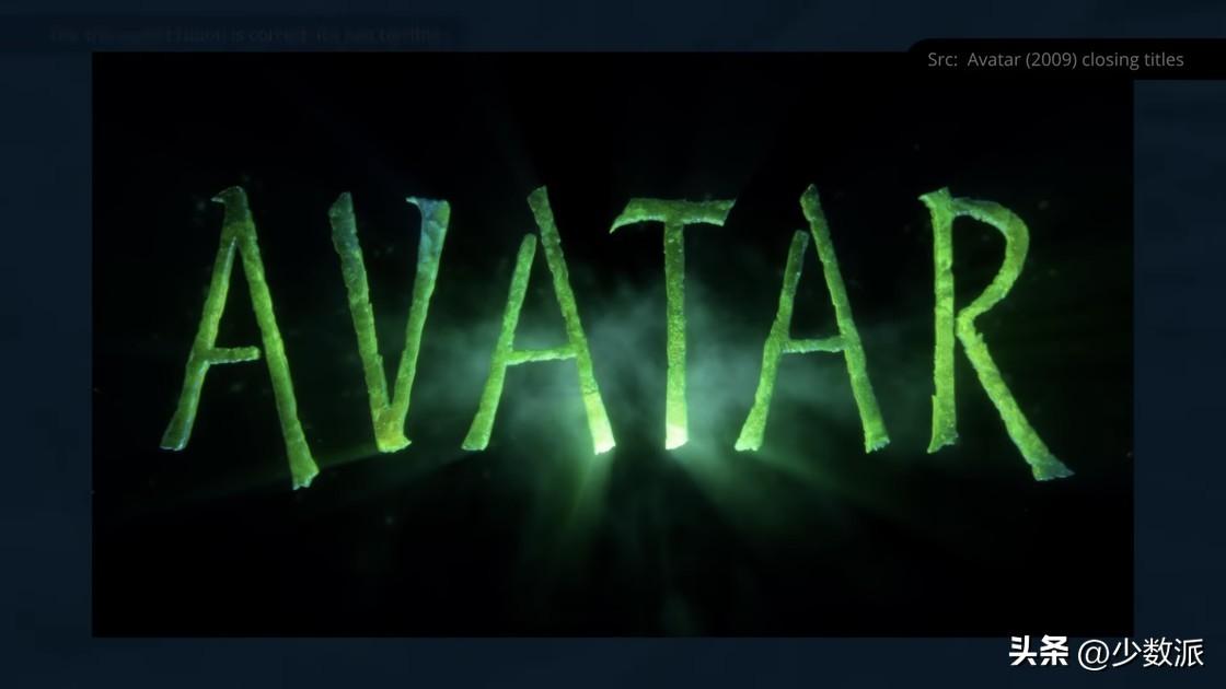
In the play, by Ryan Gosling's man goes berserk when the Papyrus font is used in the Avatar movie's logo, and the skit has more than 19 million views on YouTube. When the therapist revealed to him that "Avatar" was making a sequel, he asked with a sense of relief: "Did they get it right this time? Did they change the logo!" But the design sketches at the time did not give him a good answer. Fortunately, in real life, the font design of "Avatar 2" has taken a turn for the better.
Design new typeface for "Avatar"
I had a conversation with John Roshell. He is a prolific designer, co-founder of ComiCraft, and now has his own company, SwellType. John was commissioned to design a new set of fonts for the "Avatar" series of movies and peripherals.
John:
The only one between us One of the conversations about Papyrus was when I first communicated with them, which happened to be the day the satirical skit aired. Everyone just sits there and texts back the friends who forwarded the skit to them. That skit definitely had some influence on them. I think at least part of the reason they wanted to make a new font system was that they were made fun of.
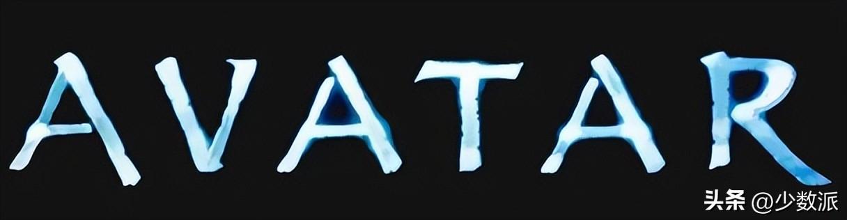

Logo from 2 You can also see in the pictures that they have retained this primitive and rustic style to a certain extent, with some small frayed corners here and there. When they first sent me the logo it was just an Illustrator document. The first thing I did was clean it up and simplify it.
Original logo
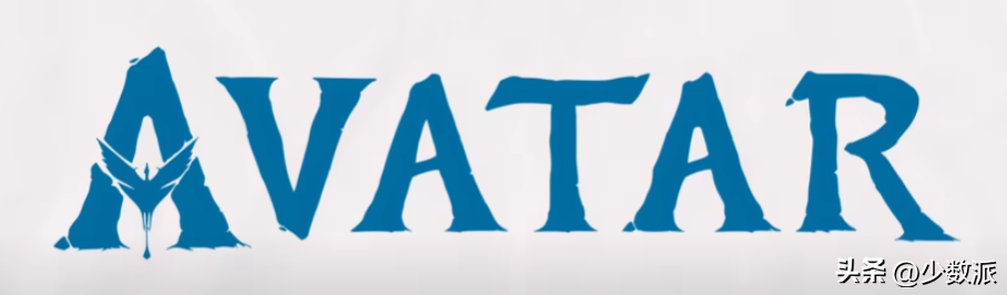
Simplified
The request given by the crew was: "We want to extrapolate from this logo to a whole alphabet, can you do that? ’ So my job is to extrapolate from those few words to all the remaining letters. The capital letters were quick to do, and the lower case letters were more challenging—we came up with maybe three or four different proposals before we settled on one.
When John is in When the project was posted on LinkedIn, Chris Costello, the designer of the Papyrus font, sent a joking reply.
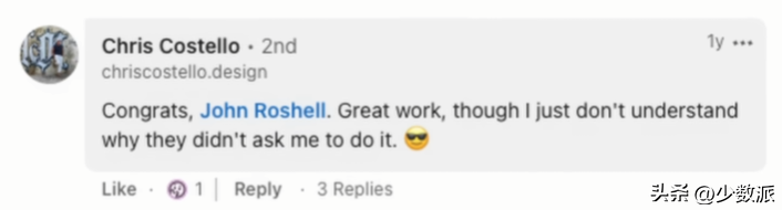
Why don't they let me come
Costello is still in graphic design Active and well-respected in the field of metal and coin design, clients include the United States Mint and the Royal Mint. During my research, I read quite a few of his interviews. He seems to have come to terms with the fact that he designed one of the most despised typefaces in popular culture. As he got older, he seemed to be able to find some humor in it, too.
More than fun with Papyrus Saturday Night Live, this font has been the subject of jokes and memes for years. But why, exactly, has it gained such notoriety?
To answer this question, we Let's start with the very beginning of the story.
80s, Collage and Letraset
In the early 1980s, some things seemed timeless, such as the popular Afro, Rubik's cube culture Rapid rise, and the absolute mainstream in graphic design: collage typesetting (Paste-up). But as we know it, with the rise of desktop printing, the entire design industry is going to be turned upside down by home computers.
collage and phototypesetting The detailed principle is very complicated. We just need to know that this is a very cumbersome process, you need to cut and paste the physical page elements on a board, including fonts, photos and drawings, and manually align all elements to the grid, and then be photographed and turned into printing plate. But for designers, this has more creative space than the previous metal font mold.
Use in graphic design for blockbusters The fonts used for text are called body typefaces. Generally they will be conservative, but easy to read, and the font itself won't draw too much attention. Display typefaces, on the other hand, have larger sizes and are used for short text such as headlines or advertisements. These fonts can then be more expressive and unconventional. They are meant to grab attention.
The 1970s and 1980s , is to show the era of rapid development and evolution of fonts. That's largely thanks to a company called Letraset, which pioneered a technology called dry transfer lettering.
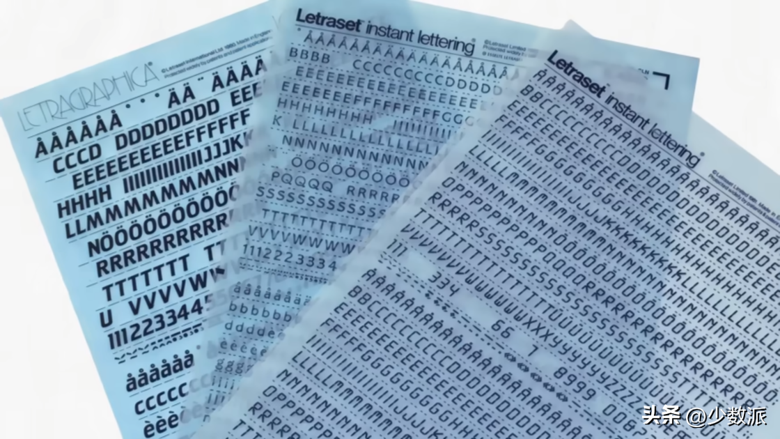
The left side of the picture above is some printed Translucent film of the alphabet, numbers and other symbols with pressure-activated adhesive over the characters. To print characters on the typesetting, just rub the upper layer with a pen or short stick. For customers, dry transfer printing is cheap and easy to use, and it can bring more flexible typesetting than other typesetting methods. These advantages of dry transfer type, combined with its greatly reduced production and distribution costs compared to metal type, helped make Letraset a huge success.
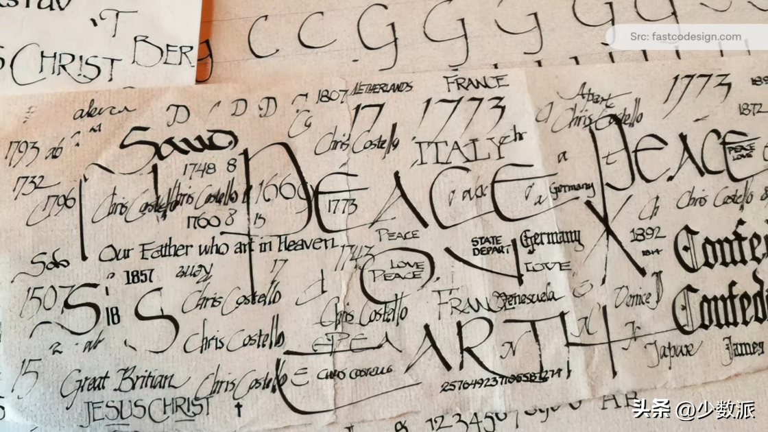
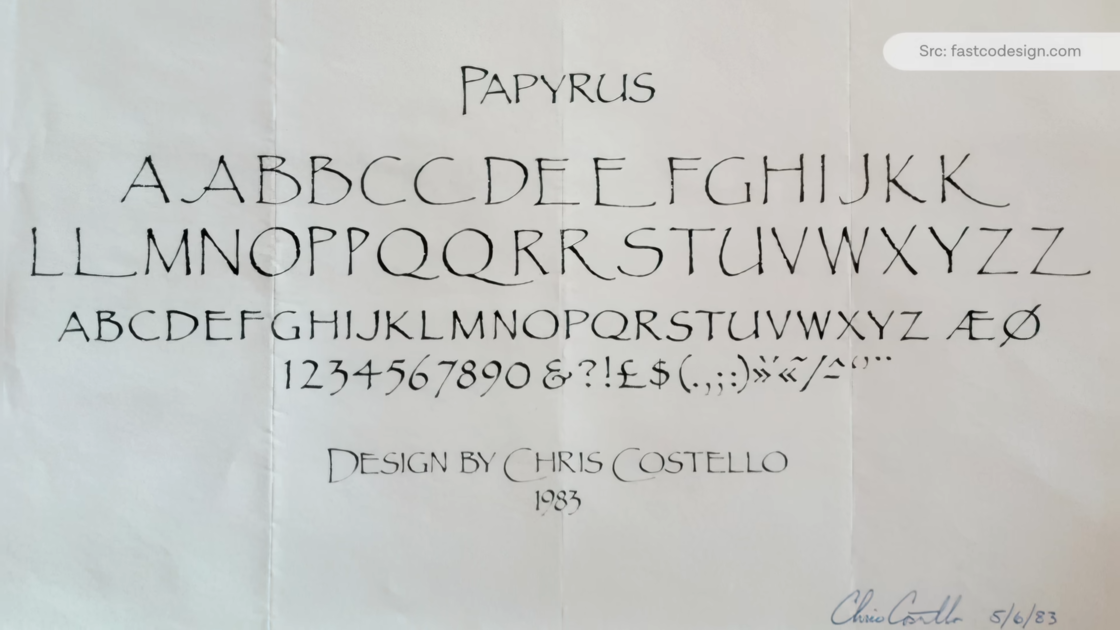
Letragraphica and Instant Lettering
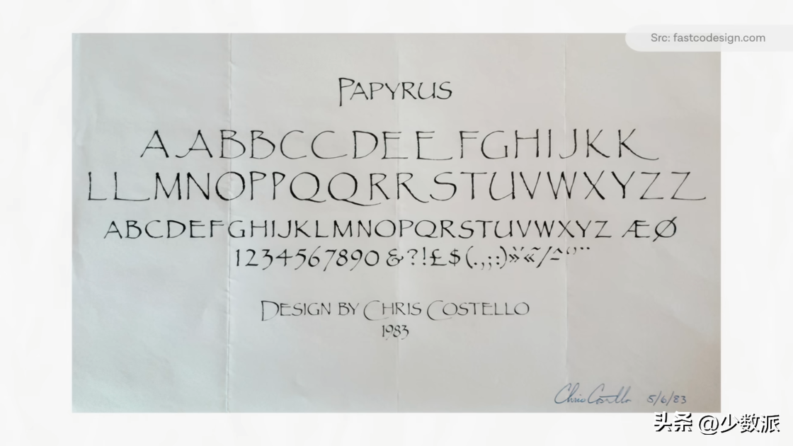
< span style="color: #4C4E4D; --tt-darkmode-color: #979A99;">Fast forward to 1982, and Chris Costello, then 23, was working as a junior draftsman at an advertising agency in Florida. It was his first job out of art school before the company hit a three-month hiatus. A devout Christian and the son of a store sign painter, he began to experiment with fonts and began to imagine what the Latin alphabet would have looked like in biblical times. Based on the manuscript, he created an alphabet of all capital letters, which he then sent to more than a dozen different printing houses. Only Letraset wrote back.
Letraset is nothing in this market The unquestionable leader. They have a large collection of well-known typefaces, including Helvetica, Futura, and others licensed from the foundry. At the same time, they are an incubator for emerging designers, especially when it comes to displaying typography. They offer firms, offices, and design studios a subscription service called Letragraphica that mails in a few new display fonts every month, and those that aren't used can be mailed back to Letraset.
This is a very savvy business Model. Letraset can take a gamble with a new typeface from an untested newcomer without committing to mass production or putting it directly into the main catalog. So Letraset bought Papyrus for just £750, published on the Letragraphica service in 1983.
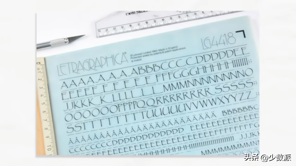
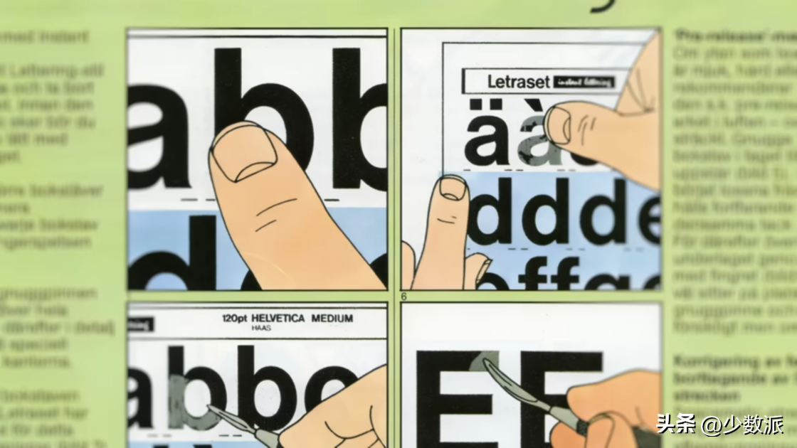
Of course, drafts and can be called There are still differences in the fonts of arts and crafts works. The transfer paper is all made with photographic production technology. British type designer Freda Sack started her career at Letraset Type Studio, a production process she described in an interview.
Freda Sack:< /span>
This job requires Meticulous. Accuracy is the number one priority. After measuring and analyzing various aspects and characteristics of a typeface, we make a "jig" (jig) as a template, draw the outline, cut the rubylith... the capital letters are about 4 to 6 inches high.
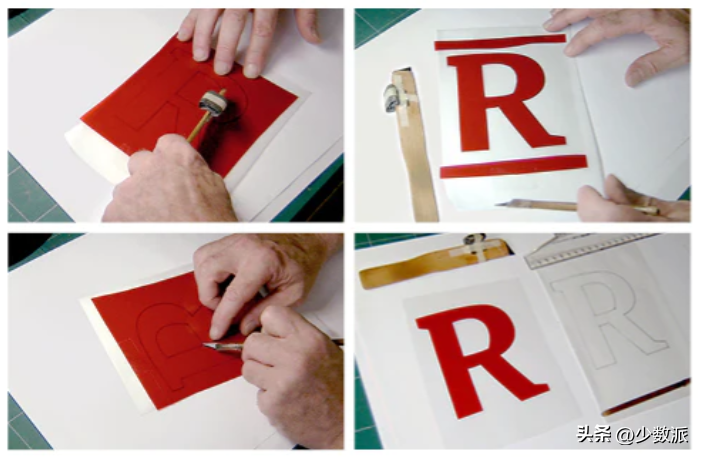
Although it is called " "Instant Lettering", the process of creating it is not fast at all. It used to take a person 4-6 weeks to draw, cut and arrange a font. If we're not doing "classic" fonts, it's font concepts sent in by font lovers. Most of the time, these typefaces submitted to Letraset are a crude small-scale drawing, sometimes just a marker sketch. Each had to be relined, and most of the time, a more complete alphabet needed to be devised.
Manufactured in Letraset Most of the time fonts have existed as an alternative to traditional hot metal typesetting. I think it's fair to say it helped democratize typefaces a lot.
In the next few years, Papyrus is included in Letraset's front catalog, but it's not much to look at either. It's just one of a plethora of quirky display fonts that Letraset has published. Some of them have stood the test of time and some not so long. If it weren't for a twist of fate nearly 10 years later, Papyrus will most likely be as quickly forgotten by pop culture as the latter.
90s: Thank you, Microsoft
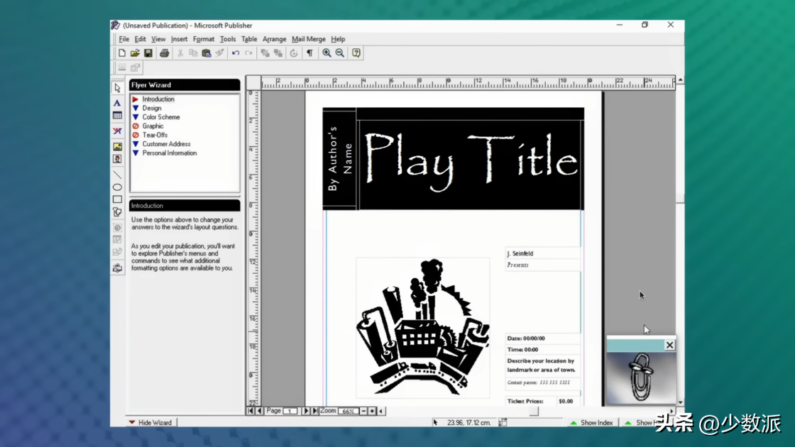
In 1991, Microsoft released Publisher, marking the entry of desktop printing into the mainstream. Publisher wasn't built to compete with professional design software like PageMaker and QuarkXPress. It's packaged as a software that makes it easy to create professional-quality newspapers, business cards, brochures, and more, marketed to an entirely different audience.
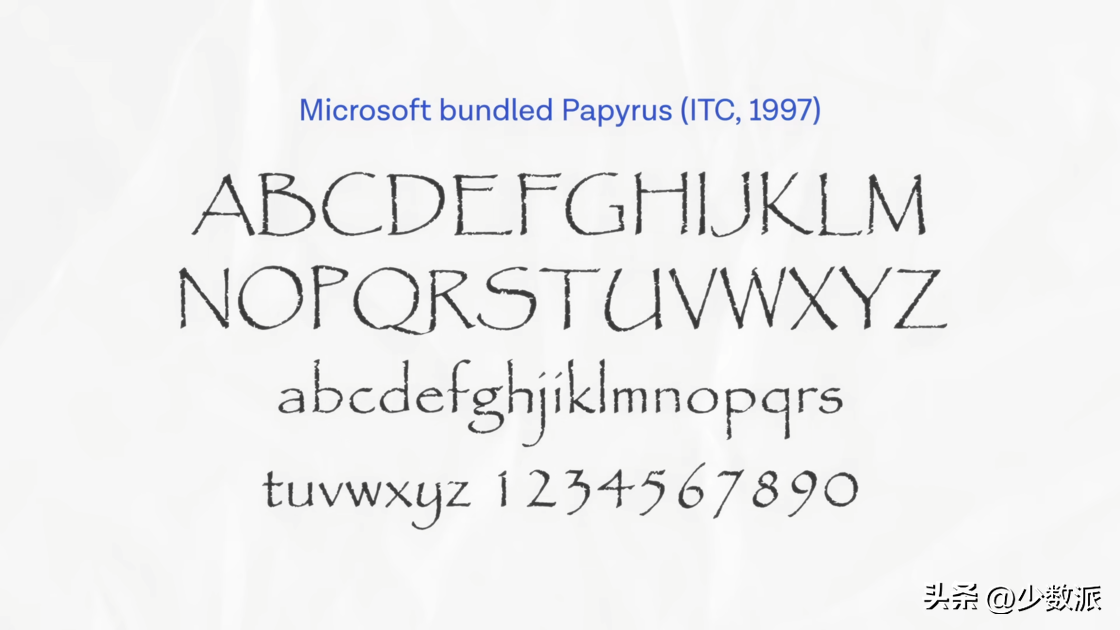
In 1997 they asked Microsoft An updated Publisher 98 was released for Office Small Business. This version includes a headline feature called Clipart Live, and it's the first time clip art in Office has appeared on the Internet. This release also includes a new set of display fonts, among them Papyrus. A few years later, Papyrus became the default built-in font in every version of Microsoft Office.
Before the widespread use of broadband networks, let The fonts you design are bundled with Microsoft software, which is a super bargain. It's a bit like being singled out by a major record label out of a sea of nobodies to sign before music streaming was commonplace. This means that millions of users who know nothing about typography can use the font you design.
In 2003, Apple will also Papyrus is listed as one of the system fonts in their operating system, bringing a larger user base. But Microsoft's and Apple's font versions are not exactly the same.
Let's see The design of the font itself.
Confused font version
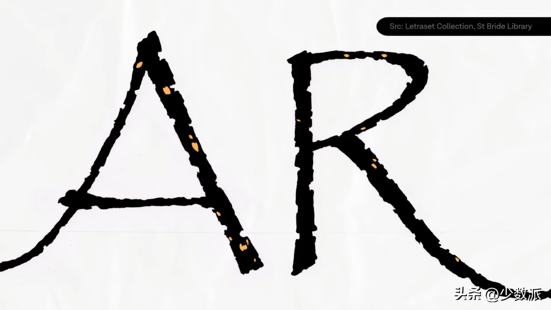
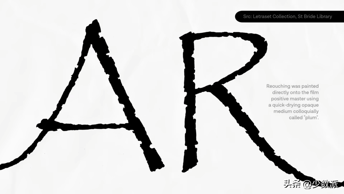
< span style="color: #4C4E4D; --tt-darkmode-color: #979A99;">Papyrus' rough character edges are not a real ink on paper effect. This typeface was created before high-resolution digital scanning technology, so even if the original draft was done on fine-textured paper stock, it cannot be the original transfer of the paper-ink effect.
The original master of the font is still Deposited at St. Bride Library, UK. From the original design, we can see that the font itself is designed with even more rough edges, and there are also blocks of blank space inside the characters. But these gaps were erased in the final version, and there were traces of retouching with opaque media on the film positive template, probably because these details were either lost or caused other problems when the size was reduced.
Original material
Convert font
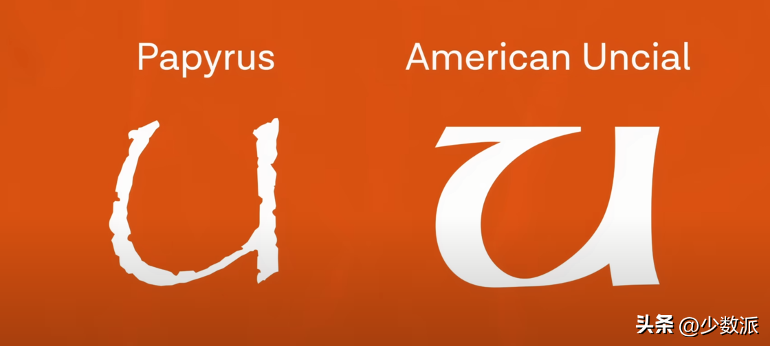
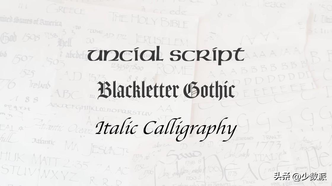
Papyrus has a handwriting style, but it Not calligraphy/calligraphy nor cursive. It is largely composed of capital letters with unusual features. In Costello's original scribbles, he's clearly experimenting with a mix of calligraphic typefaces such as Uncial, Blackletter and Italic, but the end result has little to no reference to all three — except for the capital letter U. The bulging word bowl (bar) has obvious Ansel characteristics.
The remaining strange features are more obvious Is the uppercase crossbar (crossbar) position, such as E F H.

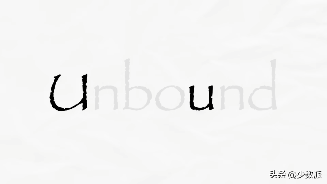
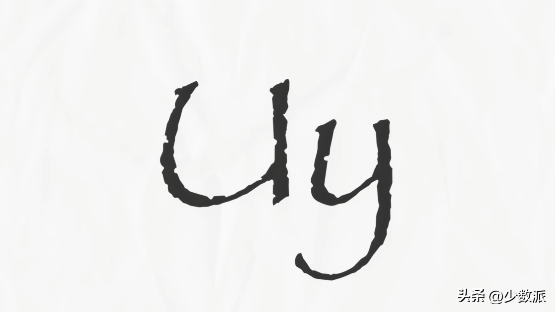
Initially, Costello's design did not Includes lowercase letters, but was later added at Letraset's request. The result of this is that there seems to be some separation between the upper and lower case letters, for example, the upper and lower case U does not match, but that special bulging bowl appears on the lower case y.
As a handwritten font, letters The x-height is also very short, and the ascendant is unusually long. Instead of the single-layered a and g lowercase letters that are common in handwritten fonts, it uses the double-layered a g that is common in print.
The picture above is the original draft Version. We can find two sets of capital letters, a larger set with curlicues and a smaller set. Small caps are not uncommon, and we can find similar designs in print serif body fonts such as Garamond and Palatino.
However, Papyrus hasNotRegular caps and small caps. The lower set of smaller caps is regular caps, while the upper set is oversized title caps. Because in dry transfer printing, the same font size is used within a page of letters, this means that small caps are not as usable for displaying text.
and convert the font to numbers In the process of formatting, the version adopted by Apple uses regular uppercase letters by default, while Microsoft adopts a group of super large uppercase letters-a group that was never intended to be mixed with lowercase letters when it was designed.

and compare the same text in Given the differences in fonts in different systems, it's self-explanatory why so much of Papyrus' text looks awful.
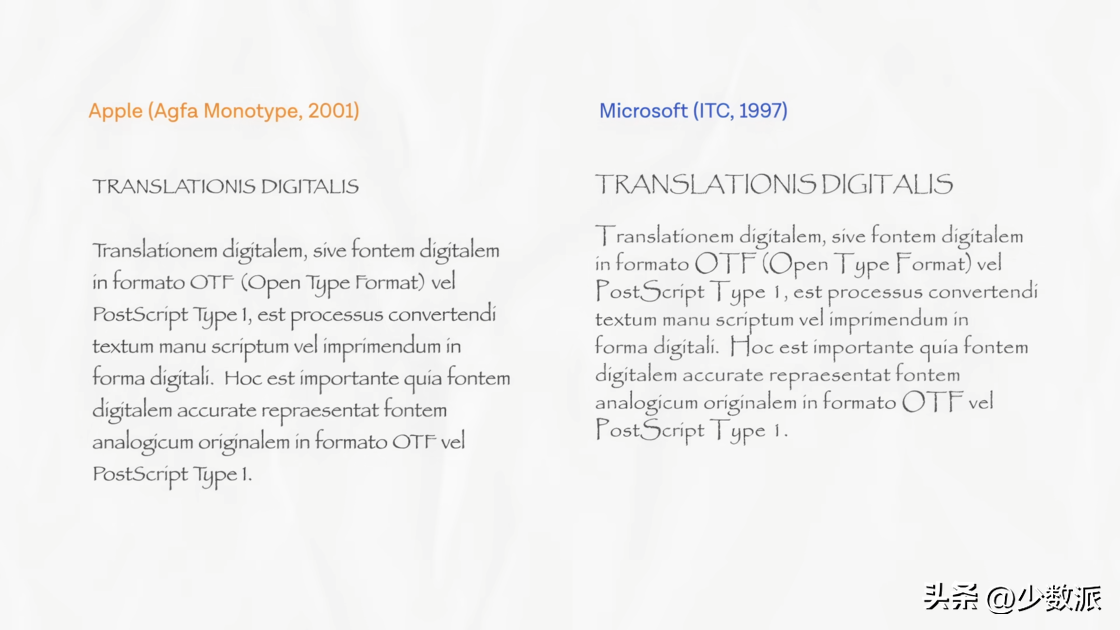
The font ratio is very straightforward Mistake. Titles in uppercase are not even on the same baseline as lowercase.
Personally, I do think , renders Papyrus text in all-caps mode, and capitalizes it with title capital letters as originally designed, which is much better visually. The examples in Letraset's own 1985 catalog also favor this configuration.
Into the 21st Century: The Papyrus Big Bang
While I'm not a fan of the Papyrus font (and I don't think any other graphic designer is), the The core audience of Papyrus is no longer professional design. Microsoft and Apple made this font available to the general public, and there's a reason why it has so much love.
Papyrus has a quirky charm. Its handwriting gives it an easy-going appeal that sets it apart from other default fonts. It’s not overly dull or formal, but it’s still highly readable compared to other authentic handwriting fonts.

Papyrus

handwriting
So when we go back to 1998 , if you're looking for a font that's easy to read and still has some personality, Papyrus is probably the best choice.
By the late 2000s, Papyrus has reached saturation. No one would be mad at their grandma for using Papyrus to advertise her stall at a church sale, but things go way beyond that.
By 2008, there are three separate Blogs (I Heart Papyrus, two blogs with the same name Papyrus Watch) were dedicated to showcasing this tacky/inappropriate use case of the font, timed to coincide with the height of the public's distaste for Comic Sans. This also shows how much influence Microsoft has on popular fonts.
2007, iPhone released, smart With the advent of the mobile phone, things started to change. But even in the 10s, with Windows and Office still present in people's lives, most people still only used the fonts that came pre-installed on their computers. This means that smaller signage and printing houses often have to use fonts that clients are more familiar with, even if they are far from a good choice from a design point of view. While Papyrus is often frowned upon by design practitioners, it is still very attractive to many people, which has led to many small businesses using this font on signage and promotional materials.

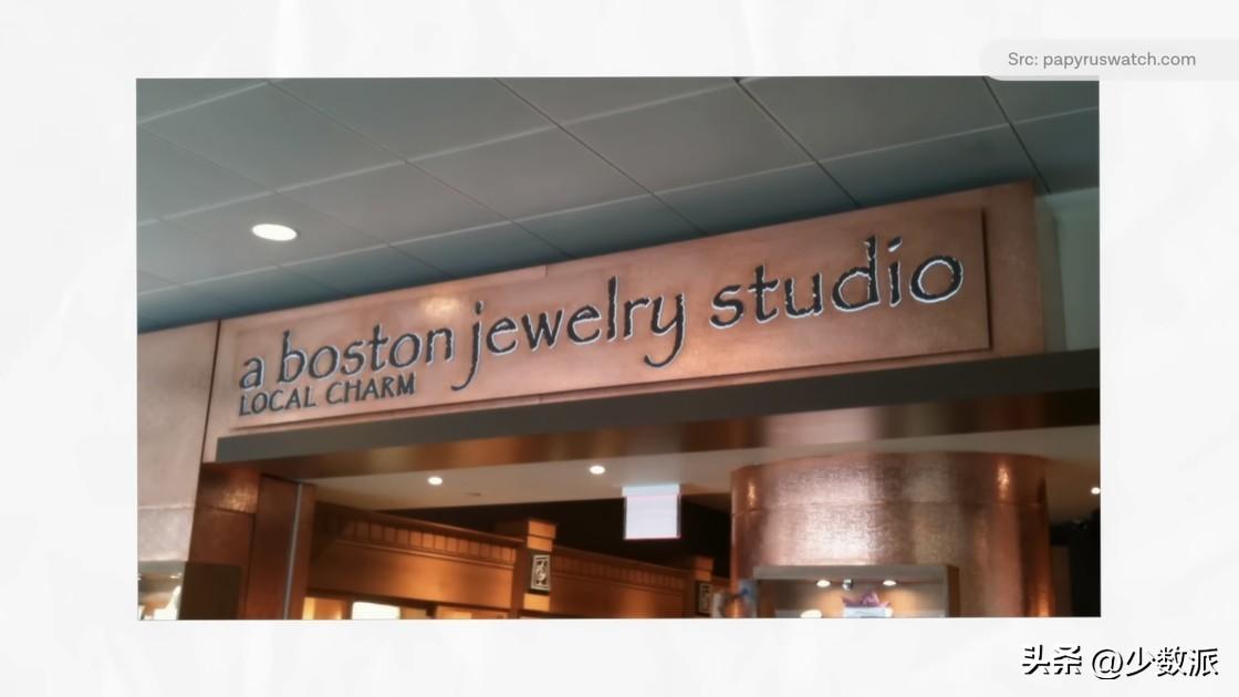
In the 10s, yoga, organic These "healthy" concepts such as food are gradually entering the mainstream. But many of these products originated from grassroots or family workshops before eventually growing into large companies. When they create flyers for their studios or label their organic oatmeal, they often do so at home with their own printers. Papyrus is also used by them to express their rejection of the industrialized modern consumer lifestyle, or to demonstrate what they call a "natural" lifestyle.


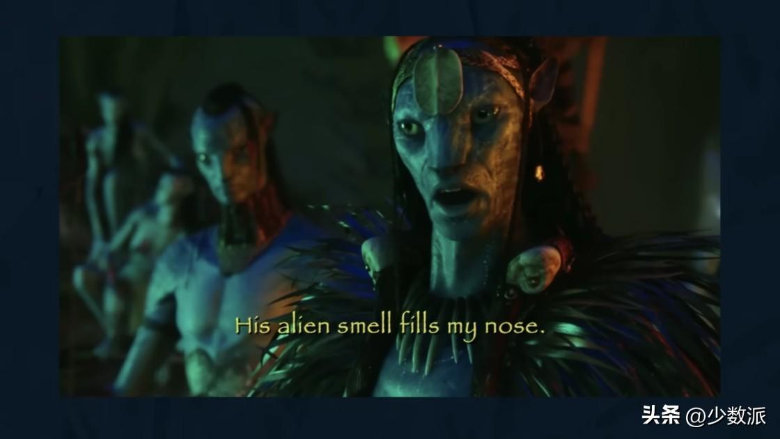
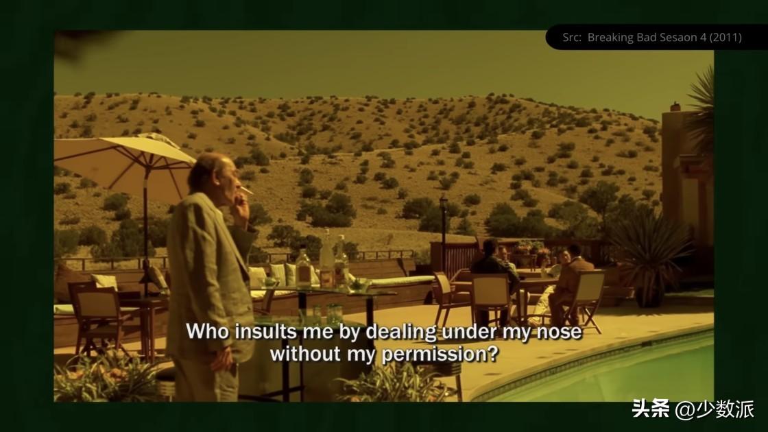
In 2009, James Carr The release of Mellon's blockbuster "Avatar" thrust Papyrus further into the spotlight. The film introduces a humanoid alien race known as the Na'vi. Not only is the logo based on the Papyrus font, but when the Na'vi speak in an alien language, the subtitles use Papyrus.
This decision has received a lot of criticism, There are many reasons behind it. In my opinion, the skit that went viral on "Saturday Night Live" captured the essence of it.
Why is Avatar having problems with Papyrus?
At the time of release, "Avatar" is a big project. The budget for the film was a whopping $237 million, plus an additional $150 million in promotional budgets. Because of this, using a free system font that you can see on the sign of the nail salon down the street is ridiculous. It’s the equivalent of the latest Marvel blockbuster saying it has a Spider-Man cameo, only to find out it’s just someone in a crap Halloween cosplay costume. Especially in the graphic design industry, the choice of Papyrus seems ridiculous.
In the skit, Gosling One of the reasons for his madness is that he felt that the choice of Papyrus was too careless. I don't quite agree with this though.
A font can become famous , often because it has found its niche. At this time, the font itself can carry another layer of meaning beyond the literal.
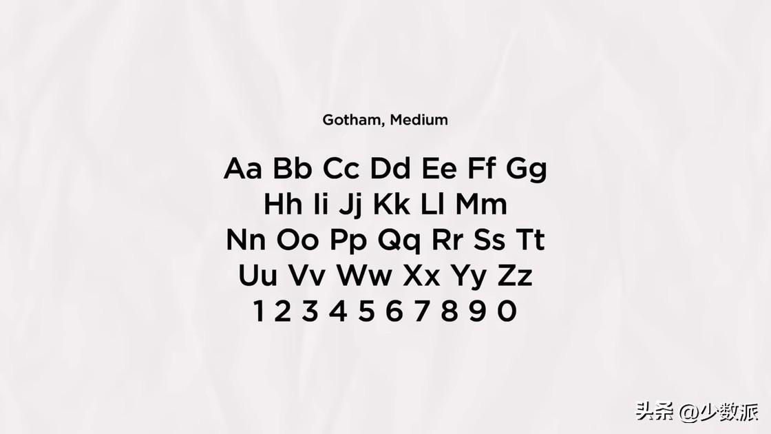
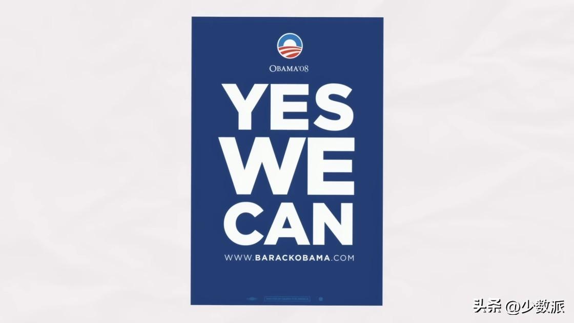
For example, Yves Peter believes that Trajan It can become a commonly used font for movie posters, largely because it is one of Adobe's default fonts. Also, the Gotham font was heavily used by politicians and governments right after Obama's successful campaign in 2008.

Papyrus cannot escape this law. In order to promote the sequel of "Avatar" "Avatar: Way of Water", Empire magazine conducted a crowdfunding interview with James Cameron. Most of the questions were collected from actors and show business workers, and a question from Chris Costello was mixed in. :
"For better or worse, Papyrus is used as widely for Aboriginal themes as it is for all things organic, natural, and New Age. So, was the choice to use Papyrus in Avatar influenced by its association with the current and Inspired by the connections between Native American cultures?”
Cameron's answer is pretty shallow , Said that this was the decision of the art department, and he didn't even look at it. But a follow-up interview with a 20th Century Fox creative director revealed that it was Cameron himself who first used Papyrus in the script, which further led to the decision. He also mentioned the skit in his answer, but laughed off the larger hidden agenda behind it—somewhat ironic for a magazine called Empire.
(About font stereotyping For impression questions, please refer to this video.)
Actually, don’t think too much, you You can feel the exoticism implied by the use of Papyrus in the film. Native American Cherokee writer and artist Roy Boney Jr. wrote about his experience in 2015:
“Papyrus has become a The typeface used in the context of the aborigines... Its damage comes from the symbolism that binds Papyrus, such as nature, ancient concepts. It portrays us as noble and mysterious savages, while forcing us to continue to use this It is the same concept behind those who tried to subvert our nation by destroying our culture, language and land in the past. It demeans us as a strong culture, a distinctive 21 The status of modern man in the century.”
Compared to calling it "casual Choice", Papyrus is more like the perfect embodiment of "Avatar". The plot of the film itself is quite formulaic, and even led to multiple allegations of plagiarism against the director-of course, these accusations were unsuccessful.
But in 2012 Gerald Morawski mentioned In the lawsuit, Cameron submitted a 45-page sworn affidavit detailing how he came up with the concept for Avatar and completed the script. In the summary, he also lists the past works that influenced him:
"My references are very rich, From serious films about Europeans or Americans immersed in Aboriginal culture... to animated films. They include jungle stories like Tarzan... science fiction... and adventure stories."
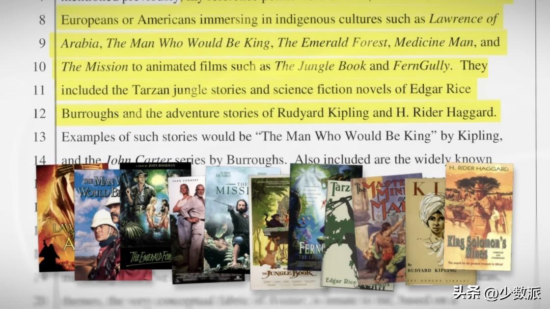
Avatar has been criticized for precisely Including the primitivism, exoticism, and perpetuation of the "white savior" cliché in these works-although this is not the focus of this discussion, but if you want to understand what these noun metaphors refer to, Just look at James Cameron's collection of works to understand.
Why does Papyrus have these additional meanings?
Although in Papyrus The Aboriginal metaphors that exist are the most damaging, but it's even more important to note just how broad the concept is that is tied to Papyrus.
For example, in food-related visual language, Papyrus has been used to representanyForeign food, no matter where it comes from. Japanese sushi, Greek feta cheese, Jamaican shredded chicken, it's all Papyrus on the packaging. It's also tied to organic, natural occurrences, as well as New Age movements, or "spirituality."

But why?
If you look at the font of Papyrus design, its font design itselfdoesn'tWhat an exotic. Going back to its draft stage, its main references are also the three European calligraphy shown below.
So, what exactly makes this A typeface is associated with the aforementioned stereotypes?
2019, writer, blogger David Kadavy wrote a 6,000-word long article titled "In Defense of Papyrus." Despite some professional mistakes and myths about Papyrus' origins, I think his central point hits the nail on the head - that Papyrus violated the principle of "material honesty".
In design and architecture, Material honesty refers to the practice of using materials in a way that is true to their natural properties and does not try to hide or disguise their characteristics. The artificial rough texture of Papyrus is like a child dyeing with tea or coffee stains, and then using fire to burn off a part of the edge to make the treasure map he made himself old-it tries to express something that it does not belong to. . This is what makes it so attractive, and why others find it tacky.

The dishonesty of this material, Just falls into a subcategory of design that I've come to call "exaggerated patina."
You often have Examples of this can be seen. When it comes to medieval villages, the picture is dirty, brown, and dull; when it comes to Mexico and the Middle East, the picture has a yellow-orange hue from nowhere. These visual cues are meant to quickly convey the message that we are “in a different place” or in a “different time”—but they are not value-neutral.
Visual technology can be used to express A place is "other place", even "primitive" and "dangerous". These examples are in contrast to the color palette of science fiction films. When the scene is set in the "future" or with "sophisticated technology", the color palette often presents a noticeable cool color.
Avatar is a rare exception , which has a sci-fi cool tone and a Papyrus full of primitive plating, uniting these two metaphors.
Post-Papyrus Era
Although it is not an obscure font, compared with ten years ago, it is difficult for you to see it casually Papyrus is gone. It's not because the font itself is avoided, it's more like a manifestation of some kind of technological progress.
On smartphones and social media Times, Microsoft's relevance in people's lives is becoming less and less. People use services like Google Docs and Canvas as much as they use Office. Moreover, we also read more online on our mobile phones than holding any physical documents.
The focus of the times has shifted, Google Fonts The influence on popular typography is bigger than Microsoft these days.
Does Papyrus deserve its notoriety? ?
Some say the opposite of love is not Hate, but "irrelevant". Regardless of the evaluation, Papyrus is far from being "irrelevant" in people's minds.
Moreover, the quality of a font are highly context-dependent. Like its notorious counterpart, Comic Sans, their greatest sin may be that they are too outlandish and too accessible at the same time.
At the end of the day, Papyrus is more than just the The product of that era of creation is the product of the development of printing technology in the past 40 years. Desktop publishing and home computers killed Letraset, but Microsoft gave Papyrus a second life, making it one of the most used—and most abused—typefaces of the 20th century.
Among the no-nonsense font options , Papyrus is a friendly face. It has become synonymous with yoga classes and herbal teas, and has become a handy symbol for the concept of "other". It may be one of the most offensive, even downright disgusting, fonts ever written, but it's also more likely to be one of the last to truly become a household name.
Articles are uploaded by users and are for non-commercial browsing only. Posted by: Lomu, please indicate the source: https://www.daogebangong.com/en/articles/detail/How%20a%20Notorious%20Typeface%20Became%20the%20Default%20Typeface%20in%20Avatar.html
 支付宝扫一扫
评论列表(196条)
测试