The theme of the anniversary celebration mainly expresses a cheerful and lively atmosphere. How can you make your design unique? The editor here recommends three methods.
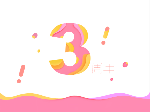
1. Rainbow gradient color, combined with numbers, colored balls, and smooth and dynamic lines.
The most important part of this method is the color matching, according to the actual project, combined with the characteristics of the product to choose the color.
The design method, first select a font with thick strokes, Arial Black, enter the number "3", fill in a gradient color, and then use a pen or other round tools to outline the color blocks that need to be superimposed. To draw a rich gradient color, we have a detailed method in the previous article. We need to create a gradient grid of color blocks first, and then fill them in blocks. For details, please refer to the article "IPhone8 Camouflage Screensaver Effect Design Applied to Festival Posters" How about it? 》, and other auxiliary decoration parts are drawn in the same way.

2. Repeatedly arranged lines
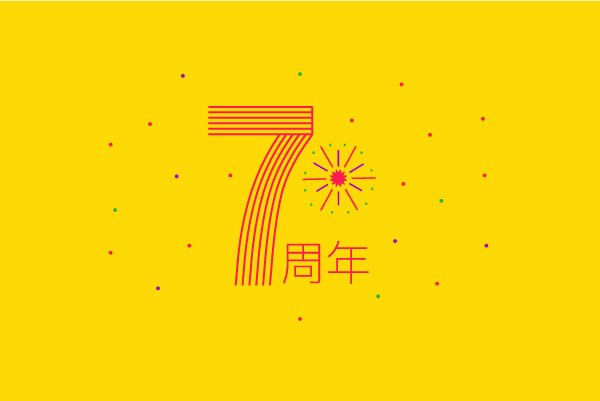
The theme numbers adopt the method of repeated arrangement of lines, with fireworks and colored balls to highlight the warm atmosphere. This effect is simple and elegant, suitable for flat printing products.
Design method: Also choose the font Roboto Condensed Bold with thicker strokes, enter the number 7, we can turn off the fill color, keep only the stroke, and then select the scissors tool to cut off all the seals, horizontal For strokes, we can draw two horizontal lines separately, then select the blending tool, and build. The number of steps can be set to 4. We keep the vertical strokes, cut off the horizontal strokes above, also select these two lines, and select the blend tool.

3. Monument Valley Wind with 3D effect
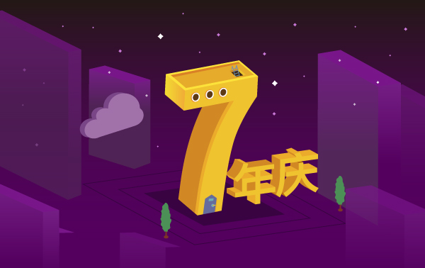
This method is a popular style so far, with a more three-dimensional effect and strong visual impact.
The design method and the production method of the three-dimensional effect are still using the 3D effect of the AI tool. This method is more suitable for the production of H5 promotional activities. It can be used to outline the picture by telling a story. When drawing, you can draw according to your own project. For the plan, first draw a sketch on paper with a pencil, and have a complete design idea, so that the things produced in this way will be more complete and rich, and will not deviate from the theme. The picture below is an example of a simple drawing by the editor, just to express a design technique.

In short, no matter which method you use, the most important thing is to have your own design ideas, let users understand where your project is promoting, and what help or influence it will have on them. Do this It can be regarded as a complete design. Personal opinion, don't spray if you don't like it.
Articles are uploaded by users and are for non-commercial browsing only. Posted by: Lomu, please indicate the source: https://www.daogebangong.com/en/articles/detail/Here%20are%203%20ways%20to%20help%20you%20open%20up%20new%20ways%20to%20design%20anniversary%20typography.html

 支付宝扫一扫
评论列表(196条)
测试