If you are not interested in gradients, then today's article will give you 10 reasons to use gradients that you cannot refuse.
1. Make the background visually appealing
Gradient backgrounds can help users perceive and understand the design better. When the eye perceives changes in tone and light and dark on the screen, it consciously pays attention to specific colors and visual focal points.
Gradients are very useful and attractive visual tools that add color to many design projects. Although there are many ways to use gradients, the most popular is still to place pictures and text on a gradient background.
The following example does just that. The soft color makes it easier for the eyes to find the place where it is placed. The empty background looks high-level because of the gradient. The foreground elements have good readability, and the "discover more" at the bottom is easier to be noticed.

2. Create focus in text fonts
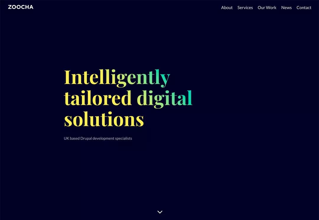
Gradients can be used in the background, and gradients can also be used in foreground elements. If the highly saturated gradient color is superimposed on the font, it can create a rather eye-catching design sense. However, it is worth noting that in the selection of colors, the contrast must be consciously controlled so as to ensure readability.
3. Gradient color overlay can make plain pictures more colorful
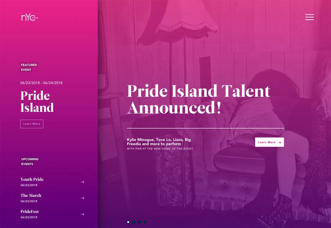
Colors have emotions, superimpose colors on pictures On, it is possible to give emotions and emotions to pictures. When the gradient color is superimposed on the picture, even if the quality and sense of form of the picture itself are not strong, the blessing of color can also make the whole scene more fashionable.
Gradient color accents reinforce your brand and give your website personality. The effects of bright colors and pastel colors are quite different.
However, considering that gradients and color overlays are used frequently, we must pay attention to adding some unique and individual elements when designing.
4. Guide the sight
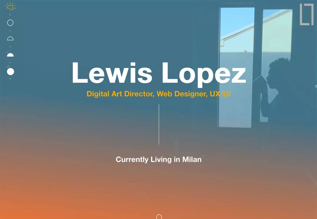
Good gradient design can play a role in guiding the sight. The vast majority of users read information from top to bottom and from left to right. This is what we often call the F-style reading method.
You can use the light and dark changes of gradient colors to strengthen this reading habit. For example, from the user's reading starting point (the LOGO in the upper left corner or the navigation at the top), the color gradually changes to the CTA button at the bottom, and the eyes will Notice the bright parts first, then gradually move on to the darker parts.

5. Unforgettable color matching
Although gradients are becoming more and more popular, each different color scheme The experience it brings is quite different. Some killer color schemes are worth long-term use, and branded color schemes can also make it easier for users to remember the visual characteristics of the brand.
Gradients can create associations between colors, and even gradients can make gradients composed of these colors work like a brand new color. This visual connection can be very powerful, especially when these colors match up with your color scheme.
6. Strengthen the brand
If your brand color scheme is suitable for making gradients, you must try it. Using such gradient colors in your own website and graphic design works can better connect with users.
Think about how to make the same gradient work in different situations. On the website, in advertisements, in posters, in store decoration, and on social media, when this kind of gradient appears in various places, users' awareness of the brand will become stronger and stronger.
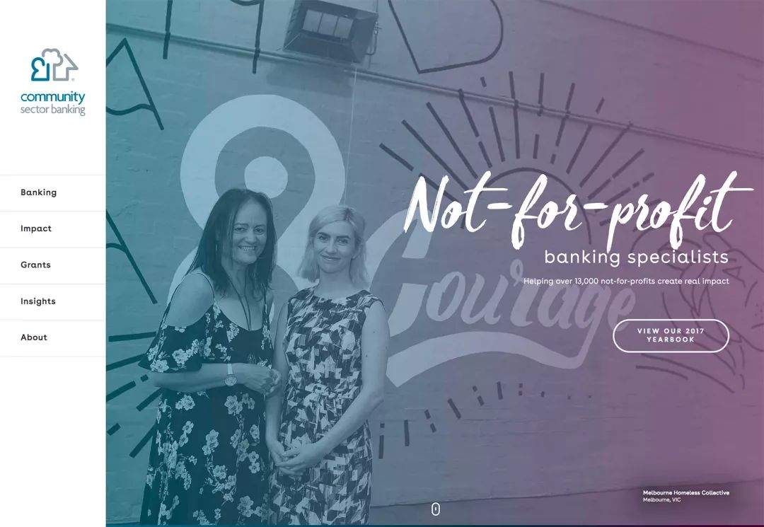
The following case is a bank website. Their gradient is quite interesting. They not only design this way in the website, but also use similar color matching in other places, so as to strengthen the color matching the concept of brand.
7. Gradients are very easy to create
Creating gradients is very simple, you only need to choose 2 to 3 kinds Different colors, and then select the shape of the color change, the starting position of the color, and the superimposed position.
As far as the shape is concerned, the color gradient is directional, from left to right, from top to bottom, or based on a point, which is ever-changing. When designing gradients, you can include one or more types of gradients.
Choosing the color of the gradient may be the most troublesome step. You can choose a contrasting or similar color on the color wheel to make a gradient. Of course, in many cases, you don't have to design the color scheme yourself, but you can use the following ready-made tools to make it:
WebGradients: Built-in 180 pre-designed gradients, which can generate CSS, PNG, Sketch, and PS versions.
Gradient Buttons: Can generate CSS buttons with different hover states
Gradient Wave Generator: You can use your custom colors to create cool gradient effects, and you can also control the starting position.
8. Color gradients will feel more natural
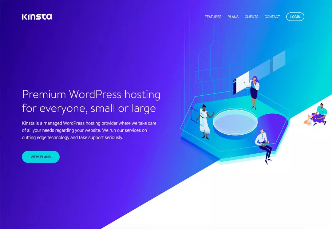
Although gradients will not be your first thought, they will usually be It gives people a more natural feeling, especially when the gradient color matching matches the natural characteristics. Most objects in nature are not of a single color.
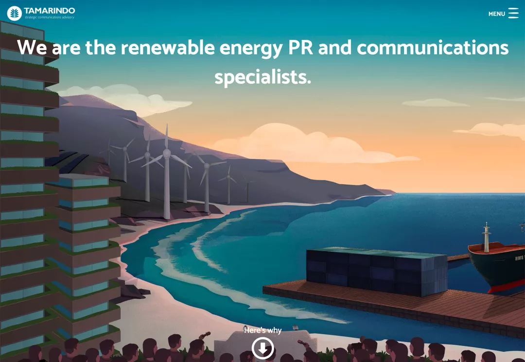
Gradient itself is a natural choice, so when you don't know what color to choose, you can choose a suitable color from a natural photo. The following illustration is a typical example, the color of the evening sky will naturally transition from orange to blue.
9. Help you build a unique main vision
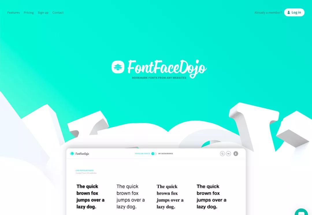
When your entire design is not so personalized , a good gradient effect can help you create effective and interesting visuals. Vibrant bright colors or brand colors can make your website design very distinctive.
Color variations are very interesting on their own, and even when used as design elements alone, they can create a good enough design to make the page emotionally appealing and help users find the right feeling.
10. Gradient is a design trend
Gradient is a simple and highly usable element, which can create some fashion atmosphere without worrying about information overload. This makes gradients an infectious and very practical design solution.
Gradients become a design trend every few years largely due to their natural character and universal appeal.

Original address: www.webdesignerdepot.com/2018/04/10-reasons-to-love-and-use-gradients-in-2018
Excellent design translation: Chen Zimu
Cover Design: Gabriel Lam
Want more? Scan the QR code to follow the WeChat official account, and lock in the daily push!
?Designer essential skills! How to ensure that the design effect is implemented in place?
Articles are uploaded by users and are for non-commercial browsing only. Posted by: Lomu, please indicate the source: https://www.daogebangong.com/en/articles/detail/Here%20are%2010%20reasons%20why%20you%20should%20use%20gradients%20in%20your%20designs.html

 支付宝扫一扫
评论列表(196条)
测试