Helvetica (Helvetica) is a widely used sans serif font, designed by Swiss designer Max Mittinger Miedinger and Eduard Hoffmann (Eduard Hoffmann) designed in 1957, has a history of more than 60 years.
Although known as the most powerful on earth Font, but this time, Helvetica was rejected!

There is a REIT in Toronto The company, called Choice Properties. The company has recently changed their logo with a new look byPuncture Design Inc.< /strong>Design.

Left is old and right is new. , This time the logo change is the kind of "press the enter key" design. To the uninitiated, the new logo appears to be a color swap, but as a designer you should know, the font is noticeably different.
The old font is the famous Helvetica , with the plainness and robustness of sans-serif, the new typeface is slightly rounded, and the dot above the letter "i" is particularly active.
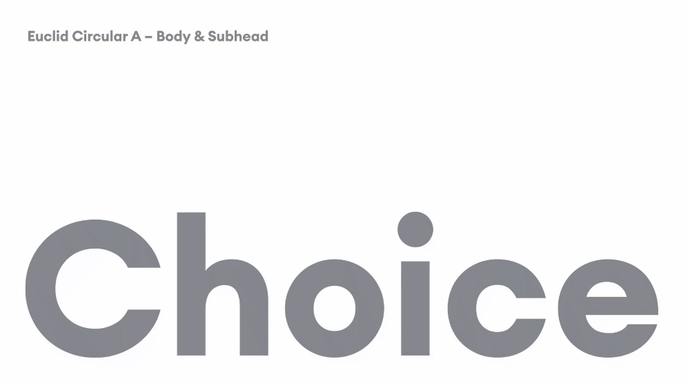
It’s really not better than not knowing, and full of Compared with the vibrant new font, Helvetica looks a bit old-fashioned.
Of course, the copyright of Helvetica The company redesigned it in 2019, and launched a variable font last month. No matter how classic the font is, it must bow to the digital age.
Related Links
1.235 million variations! Helvetica launches variable fonts, is this the rhythm to dominate the earth?
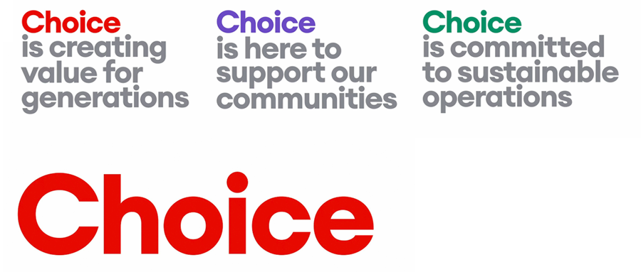
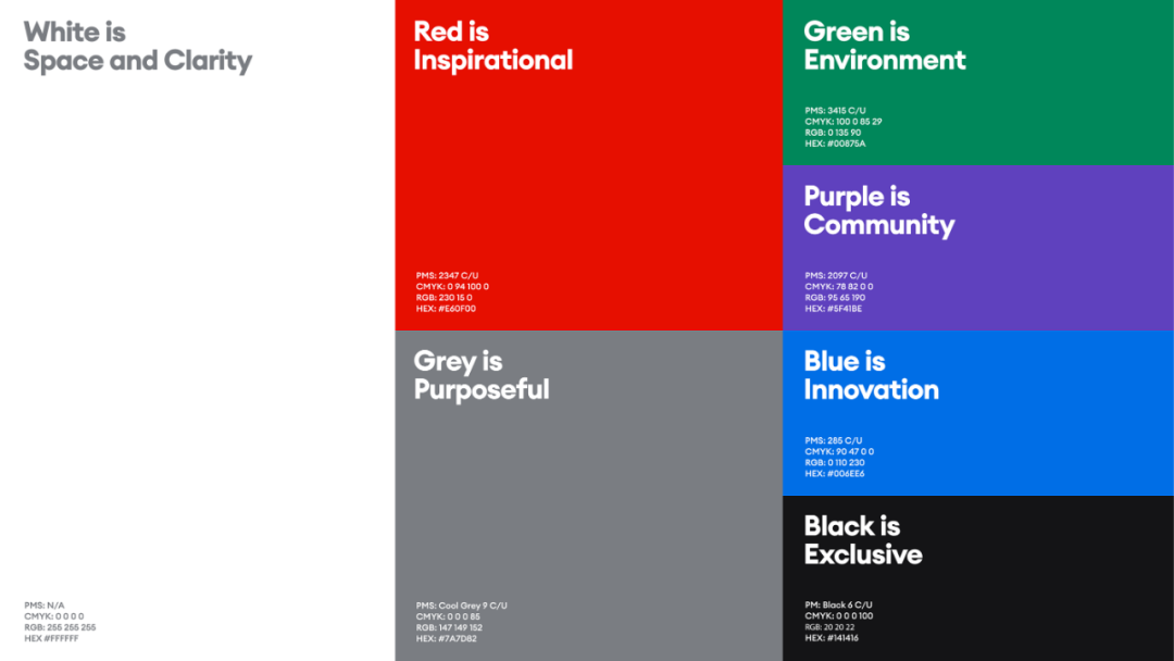
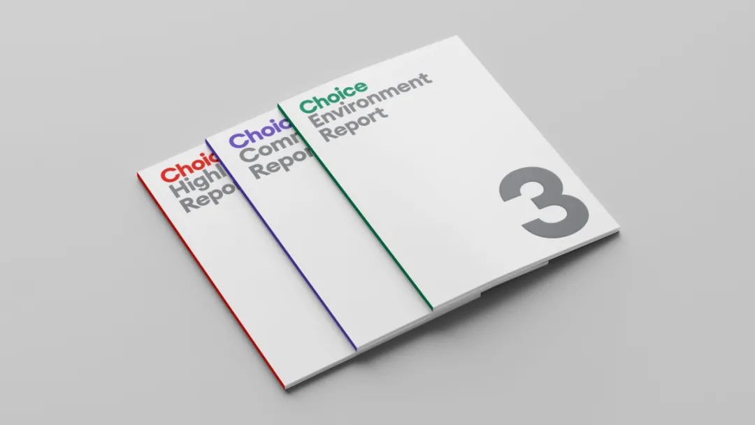
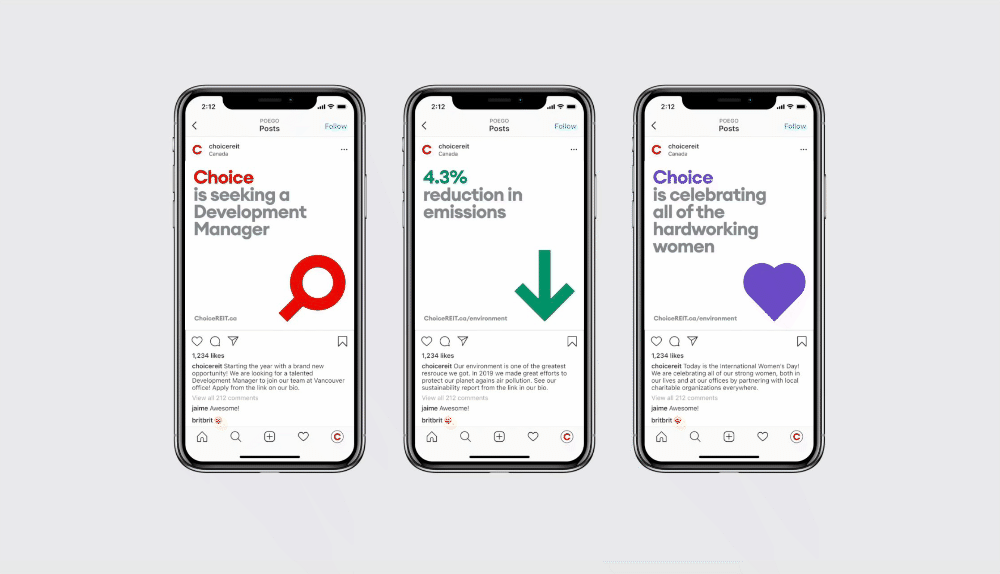
Let's continue to appreciate Choice Properties In VI design, red and gray are the main colors, and this color is used in the main occasions.
But there are also series of colors, white Represents space and transparency, red represents charisma, gray represents determination, green represents environmental protection, purple represents unity, blue represents innovation, black represents uniqueness...
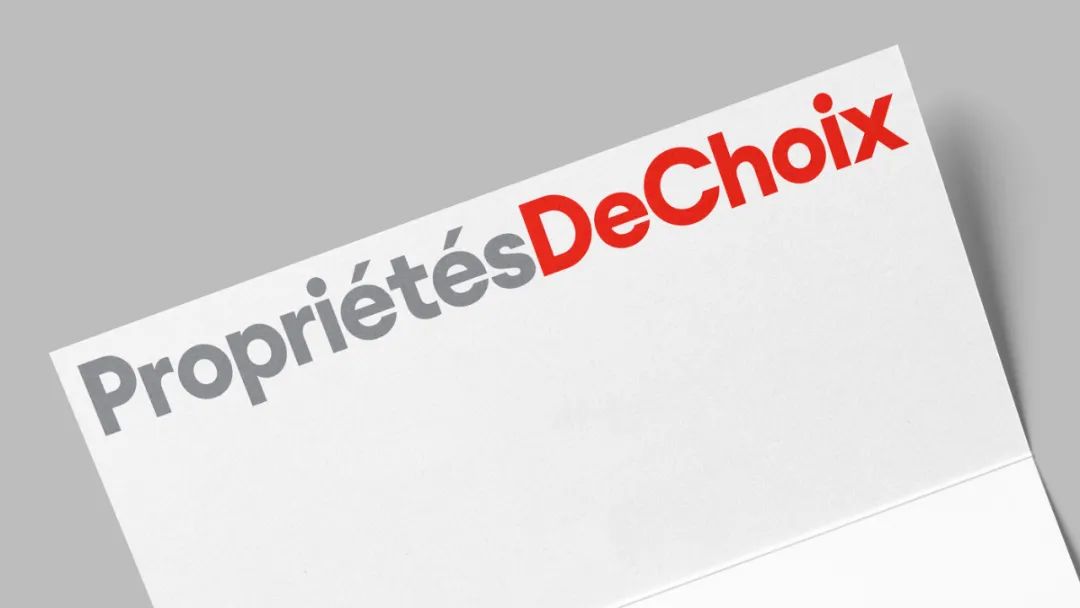
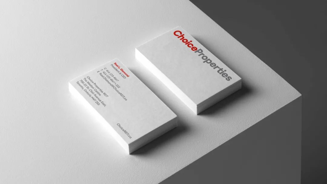
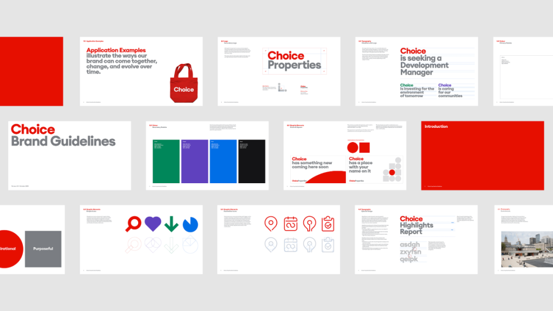
The design and use of personalized icons, A lot of points for the brand.

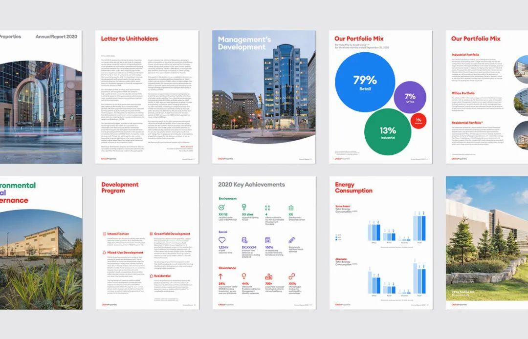
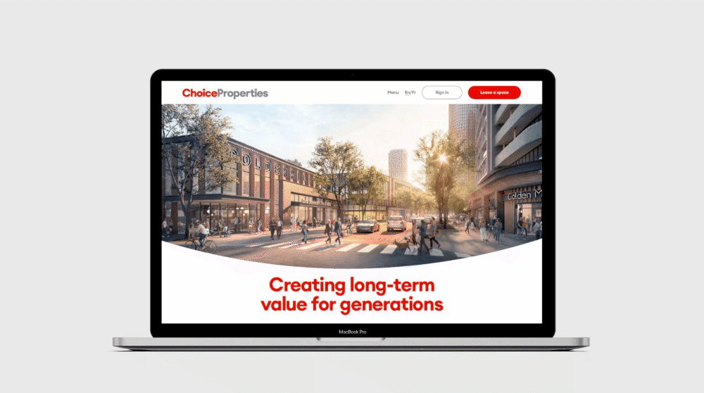
Web design for mobile and desktop , is also full of vitality.
There are many big brands in the world using Helvetica, but Choice Properties abandoned it , do you think you did the right thing? Welcome to leave a comment.

Related Links
The most tenacious font VS vitality The Most Tenacious Brand
Reposted from "Most Design", edited : The second setting
The copyright of the picture belongs to the copyright owner< /span>
Articles are uploaded by users and are for non-commercial browsing only. Posted by: Lomu, please indicate the source: https://www.daogebangong.com/en/articles/detail/Helvetica%20will%20also%20be%20disliked%20I%20dont%20know%20I%20look%20old%20when%20I%20compare%20it.html
 支付宝扫一扫
评论列表(196条)
测试