I will bring everyone a plate todayAcademic Defense PPT:

▎style design
Academic defense PPT, the first step of style design is to determine the color matching.
Generally, we can pick the color from the school badge, but the premise is that you have a clear school badge material. The usual method is to go to the school’s official website or Baidu Search, but we have a more unusual approach:

in[Illustration Library] for iSlide plugin, directly search the school name, you can find a lot of school emblem materials in vector format:

Use [take Colorizer] tool draws directly from the school badgegreen as the main color, withUniversal yellow as a secondary color:
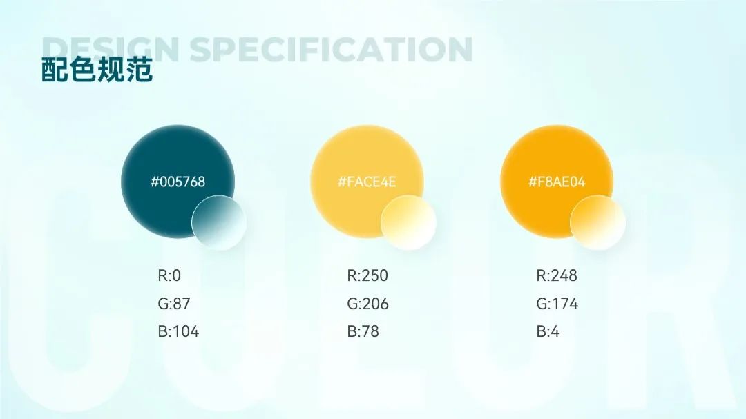
You can choose a concise sans-serif font for easy reading, such asHongmeng series black body:

Design specification confirmed After that, start to modify this PPT page by page~
At the end of the article, I packed the third page of this article for you [data chart Page] PPT case source file, you can get it after reading it at the end.
▎cover design
The layout is monotonous, the background is dirty, the text is dull, and the logo material is blurred...
First step , first handle the entire page clean and concise, and thencreate a multi-dimensional contrast for the text span>.
such as text Font size, font, length, color and other dimensions:

After modifying the text In the future, you can find a wetland map related to the content and put it under the text:

You can see I can't read the text clearly.
Meet this In this case, the first thing you think of is to build a shape with [transparency] set on it?

Don't know me Have you successfully predicted your prediction? Anyway, after I finished the cover, I felt that the cover completely lost the feeling of natural ecology.
You may wish to try Try to enlarge the picture and increase the space in the sky to place the text:

But the picture is enlarged After that, the image starts to blur and appear pixelated:

So, I I directly found a picture of the sky, and used [transparent image< /span>] function, process it into a fading effect, and cover it on top of the original image:

Take a look" After replacing the background image of the sky, it is much cleaner, right?
In the end we will Can get such an effect:

If you dislike The above operation is troublesome, in fact, it is not impossible to directly cover the background image with a mask:

I don’t know everyone Which version do you prefer?
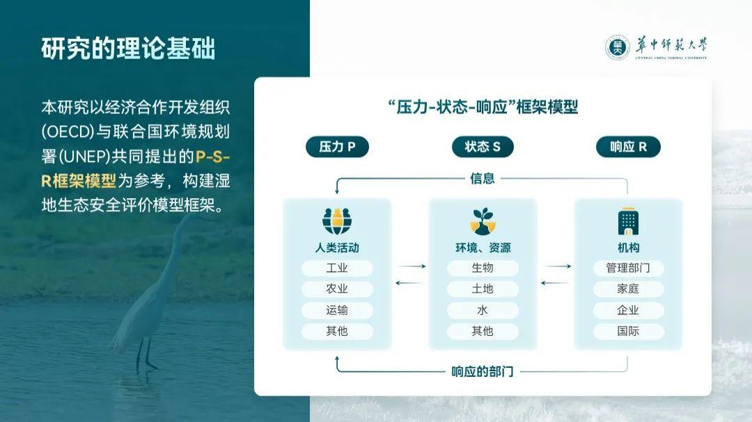
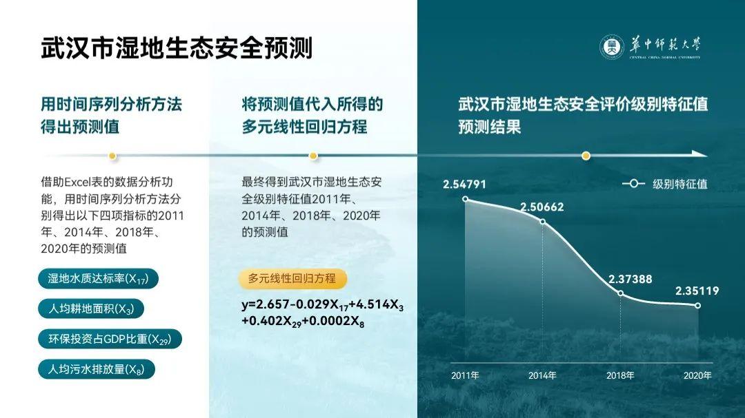
▎Logical Architecture Diagram
Read this carefully Page PPT, it can be seen that it talks about two things:

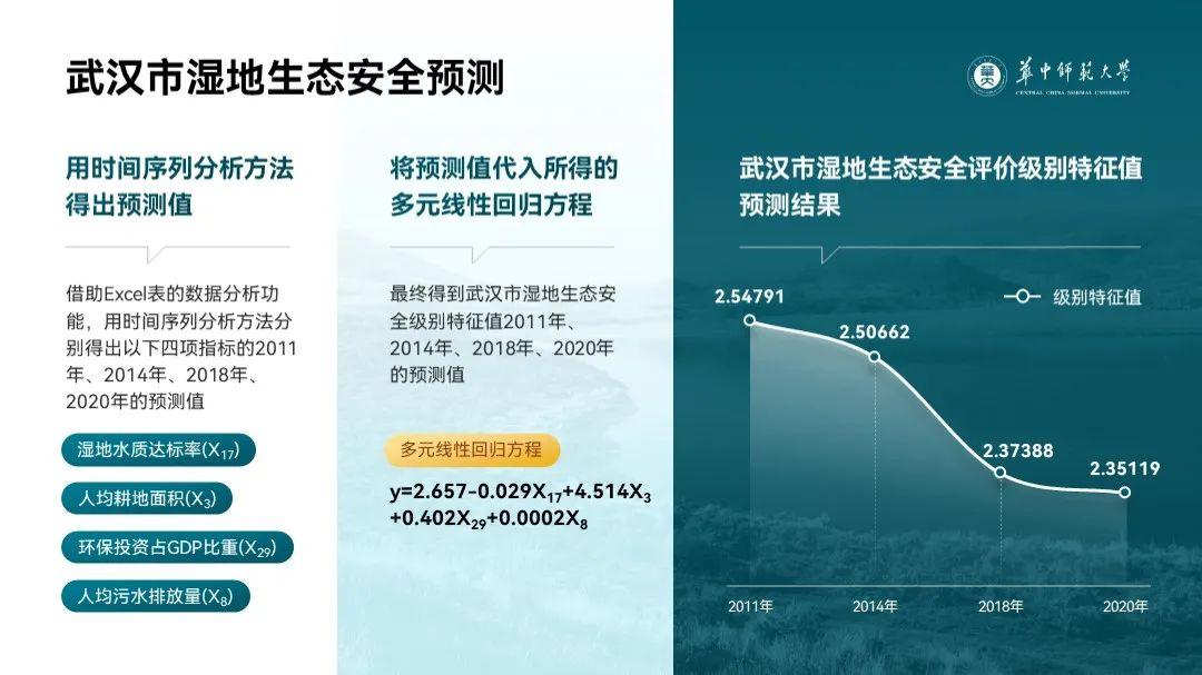
You can see The PPT looks very simple, mainly because of the ugly screenshot...
Want to improve the design Feeling, what you want to do is not to "typeset the screenshots to look good", but to directly reconstruct the information in the screenshots, that is, Draw a new chart with a shape.
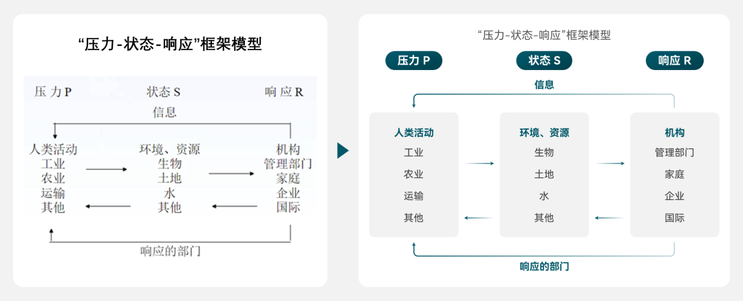
for the chart Adding graphic decoration to the text can make the chart more graphic and textual, such as adding icons and rounded rectangles, etc.:
Look, He looks a lot handsome now, right:

The screen is a bit empty ?
Don't panic, You can add two color blocks, and the right color block is superimposed on the left color block to make the picture more layered.

I still feel monotonous If so, you can add pictures to the background to make the picture more scene-like, and the design of this page is complete.
At the end of the article, I packed the third page of this article for you [data chart Page] PPT case source file, you can get it after reading it at the end.
▎Multiple Text Chart Page

Dense text I believe everyone sees the head is big, right? ReallyIt will explode if you look at it more.
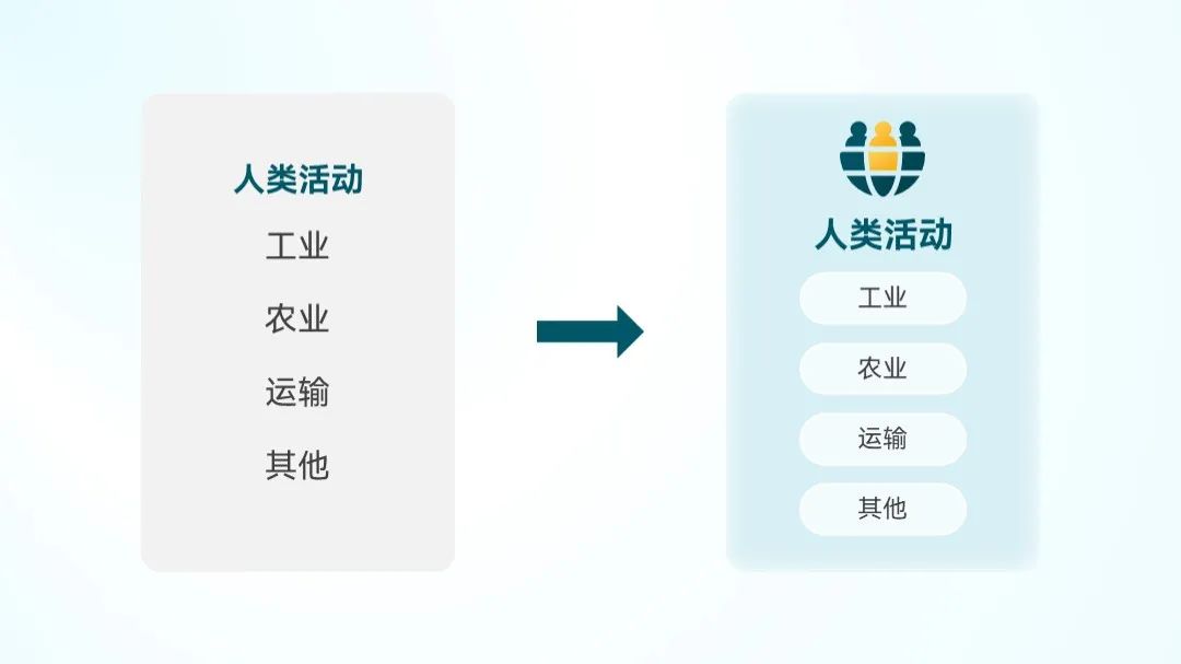
Calm down though The analysis will find that it is not difficult. First sort out the large paragraph of copywriting, it is not difficult to see that it talks about two main points:
One point for copywriting After two, the page can be divided into three content modules:
use split type Layout, to draw clear boundaries between modules:
Is there now Do you feel uncomfortable with long paragraphs of text and crude screenshots?
Don't panic, We can try to "turn a long text into a short sentence" by sorting out the main points of the content:

And then for Add some graphical elements to dense text, such as lines or rounded rectangles:

follow the same After thinking about the second paragraph of copywriting, we can get a layout like this:
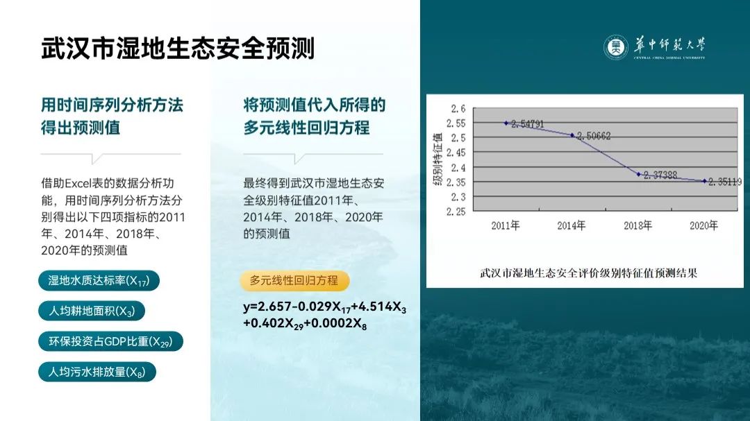
Finally, old Rules, refactor the diagram in the screenshot.
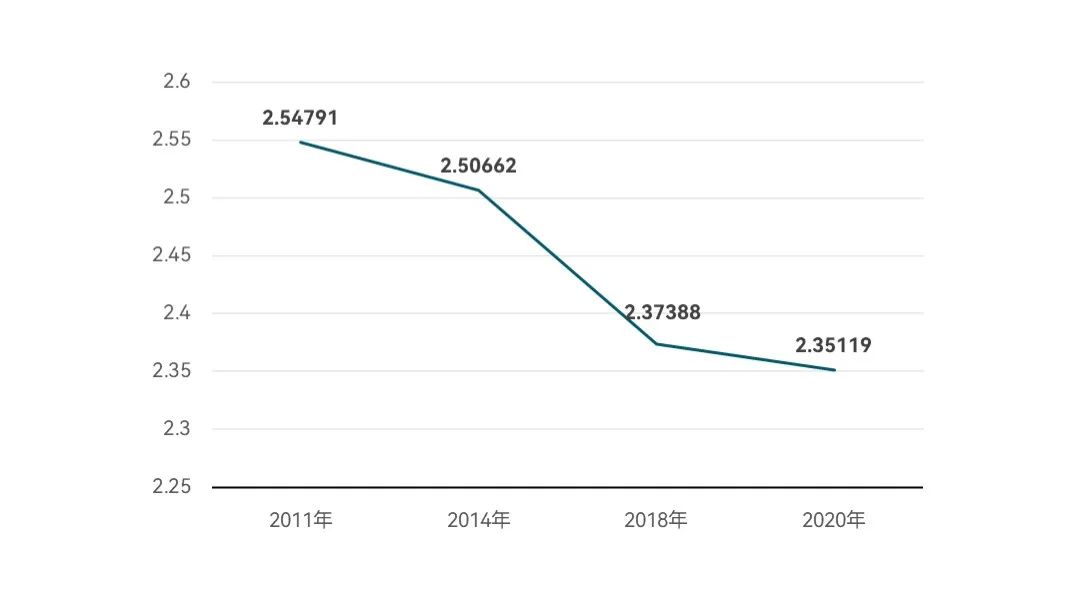
Insert a polyline Figure chart,Delete redundant elements, let straight lines become curves, and then add gradient shape decorationYes:
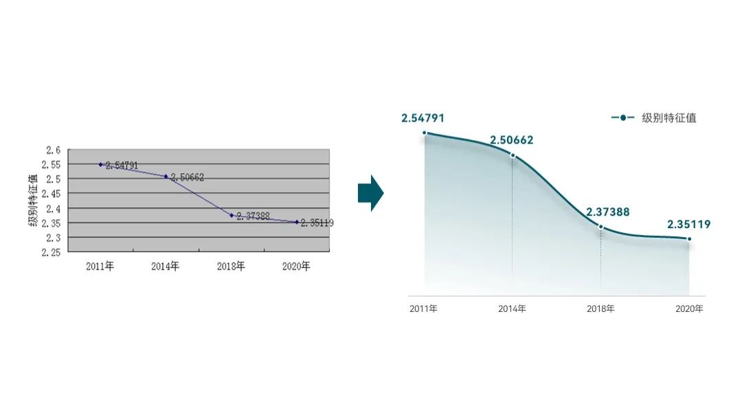
Look at the final effect, it's handsome!
Taking into account the original text The three paragraphs in the content are related to the order of reading, so I also replaced the original line with a time axis:

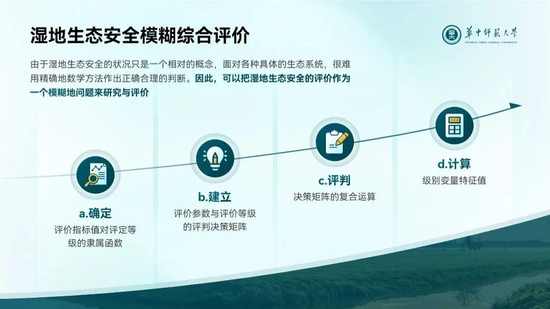
▎Flowchart Page
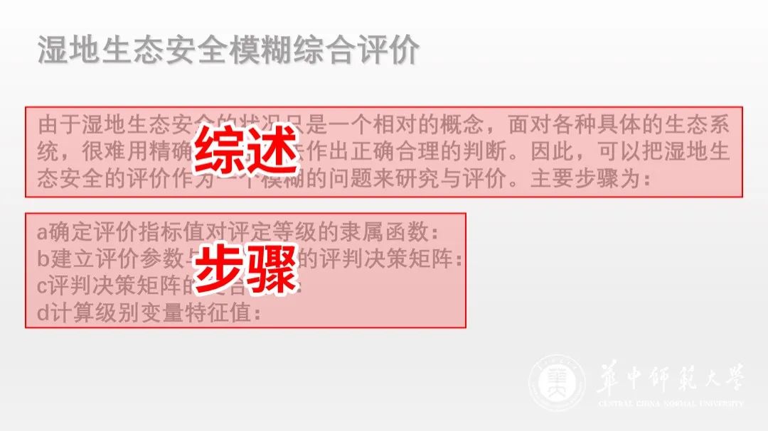
Read the PPT carefully , it is not difficult to see its two-paragraph content structure.
We can insert A rectangle that divides the content in two:

Then put the original The four main points of "package" into the shape, and then add icon decorations to get a more layered layout:

But at this time The sense of flow of the 4 "steps" is not obvious enough, we add a directional line below:
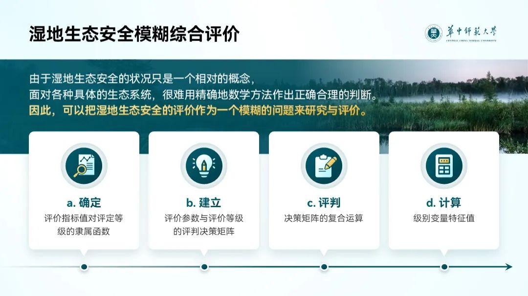
If you think The layout at this time is too straightforward, here I also made a curved flow chart:
Is there also A gay beauty in gay?
At the end of the article, I packed the third page of this article for you [data chart Page] PPT case source file, you can get it after reading it at the end.
▎Summary
Look at the final Modified overall effect:


Not bad ?
PPT for academic defense needs to pay more attention to content rather than design, so you can I didn't use too fancy design in the whole PPT.
Also, while The theme of this PPT is an academic defense PPT, but the idea of beautification can also be used in the workplace PPT, everyone must learn to draw inferences
Students who want the source file of the case on the third page of this issue can:

Articles are uploaded by users and are for non-commercial browsing only. Posted by: Lomu, please indicate the source: https://www.daogebangong.com/en/articles/detail/Helped%20a%20colleague%20to%20change%20a%20PPT%20academic%20PPT%20can%20still%20be%20made%20like%20this.html
 支付宝扫一扫
评论列表(196条)
测试