
Picture/Textj>
Fonts --- are all around us, especially signs, street signs, and various indicators. These life-like fonts come in all shapes and sizes and have different uses. Exploring them is the best way to get started with learning fonts.
But how can this highly visual, difficult-to-tell thing be understood? Especially Chinese fonts, because of the lack of consistent and systematic organization for a long time, it is even more difficult to get started, even if this is something we have been exposed to since childhood. (Recommended reading: Comprehensive interpretation of the mysteries of Chinese fonts!)
Try to give a rhetoric to describe the Chinese font:The special feature of this font is that the central palace is tight, the center of gravity is high, the overall shape is thin and waisted, just like the beauty of traditional Chinese characters. The strokes have the charm of regular script, and the special adjustment of the cut corners also makes it look very energetic.
But what exactly do these proper nouns mean? How can a word have a waist? Why does the black body also have the charm of regular script? What do spiritual characters look like? It's too professional, right?

Pure Bo Jun smiled.
These proper nouns are very important concepts in Chinese characters, especially related to "skeleton". And we can judge the personality of a font based on this. These concepts are not so difficult to understand, and there are many real-life examples.
Next, let’s briefly introduce some signboards and book covers as examples:
Shape
The so-called shape is based on the "Gestalt" impression that a word gives you - is it wide and flat, square or thin? Because Chinese characters are mostly made inside the frame. No matter how the shape of the frame is defined, the characters will grow, and the shape defined by the frame will naturally be preserved.
For example, the font under the signboard of the clinic in Dalongdong has a wide and flat impression.
Compared to the italic font of the main title, the font below is a wide and flat rectangle in Gestalt.
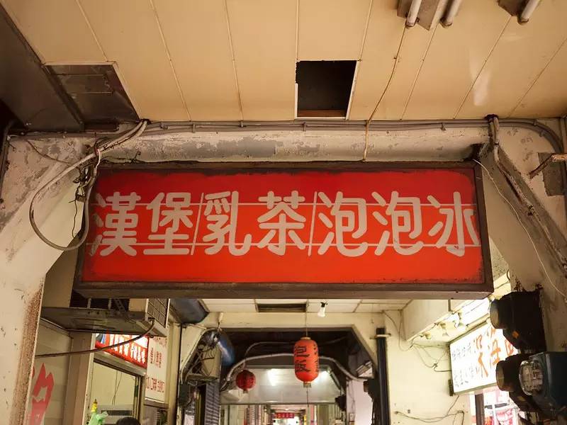
The signboard of this breakfast shop has an elongated impression.
Upright rectangular font: Just like people are tall, short, fat and thin, the Gestalt impression of the font also affects our perception of the "body" of the text.

Volume
Otsuka black body hyperbold and Hiragino black body W8 with the same thickness, which one has more visual impact? This is the concept of "volume".
is the same thickness, but the force of the impact is different, partly due to the shape of the lines, and partly due to the different proportions of black and white space distribution.
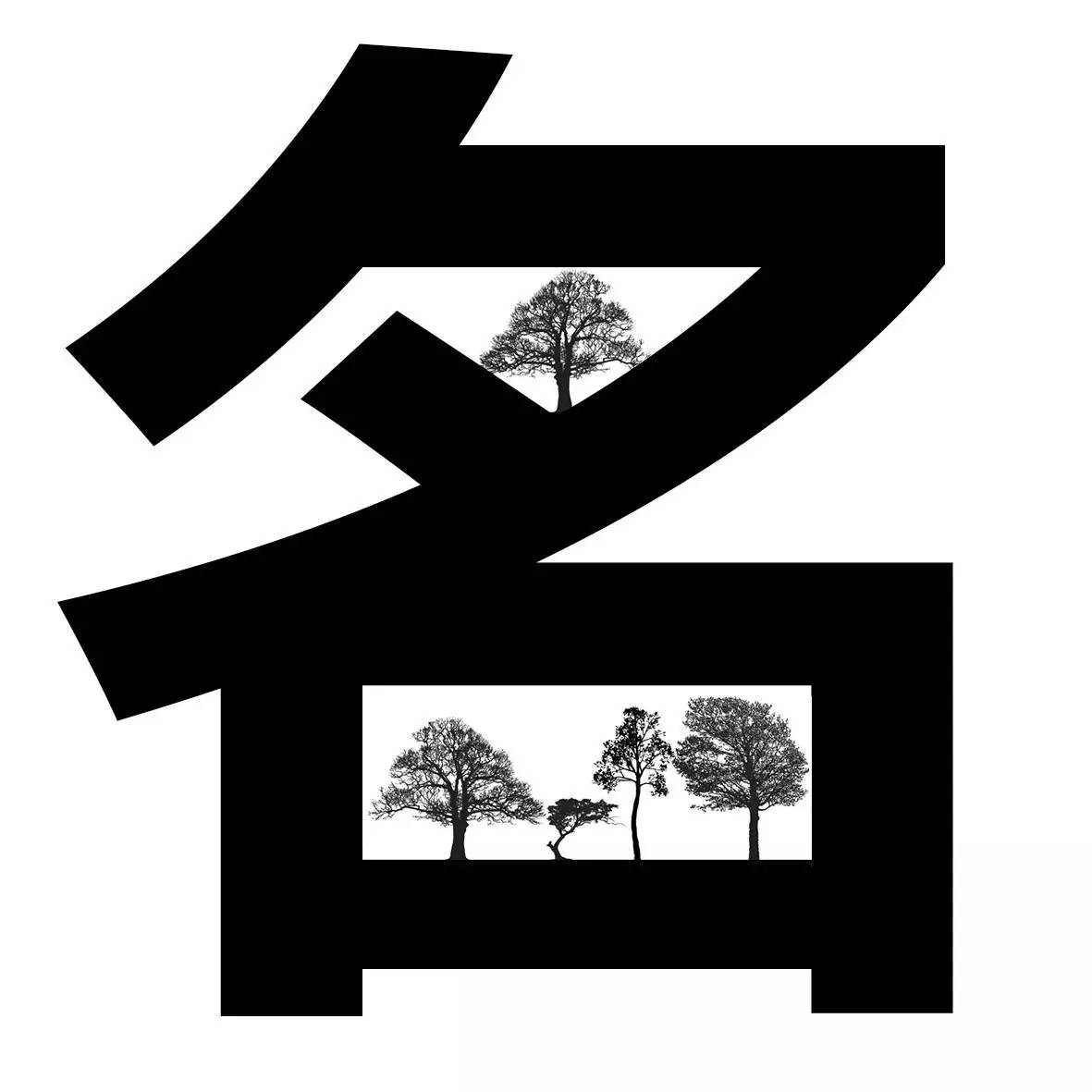
"Volume" is a metaphor. The greater the visual impact of a word, the more conspicuous it is, just as the louder the sound, the more attention-grabbing it is. The conspicuousness of the font comes from the degree of "fullness", which is the concept of proportion: the larger the proportion of black and the smaller the proportion of white, it will look full.
For example, Kanting Liu is the ancestor of "Man". Kanting style originated from Kabukicho in the Edo period of Japan. Black occupies most of the space, leaving only some critical white space for us to recognize the outline of the text.
We say that the literal meaning of this word is full, which means that its "black space" distribution ratio is much higher than that of "white space". The visual "fullness" is not only more eye-catching (in my opinion, the volume is louder), but also has the image of a house full of friends and a thriving business.
The authentic Kanting style looks like this, very gorgeous, not the greasy Kanting style like octopus balls.
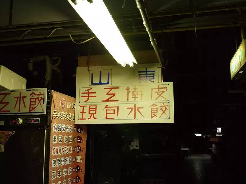
The "volume" of this hand-made font photographed at the dumpling stand is not as large as the above example. Not necessarily because of the thinner lines, but also because the distribution of white space still accounts for the most important visual impression.
△Grassroots handmade body with low volume and special shape
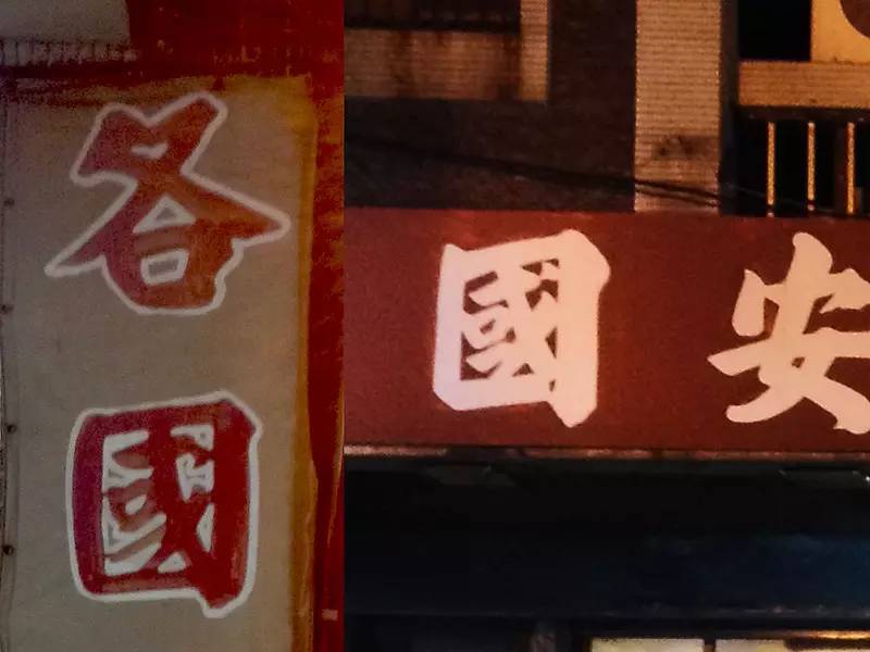
For example, the following two styles are the same (both are Yan Zhenqing-style italics), the line thickness is very close to the "Guo" character, and the volume of the "Guo" character with a red background on the right is still relatively large, and the reason is also in this box The reason for the relatively small white space ratio.
Center of Gravity
Here I take the font "Kotsuka Heiti", which is very common in bookstores, as an example.
Described in terms of feeling, the center of gravity is the area where a word attracts the most eyes at first glance, and where the line of sight falls. Below we invite the traditional Chinese HeiTi Li Hei Pro to compare the difference in the center of gravity between the two.
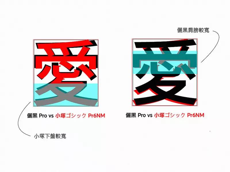
Generally speaking, like the center of gravity of the human eye, the center of gravity of Chinese characters is generally set above the center of the box. After overlapping and comparing the two fonts, we can find that the lower plate of Kotsuka HeiTi is wider, and the shoulders of Li Hei Pro are wider.
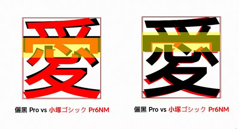
The wider lower plate of the Kotsuka Heibody brings down the visually average weight; and its parts in the lower part are also relatively long. These two factors bring the focus of the word down. It can also be seen from this point that the center of gravity is an average concept.
Zhonggong
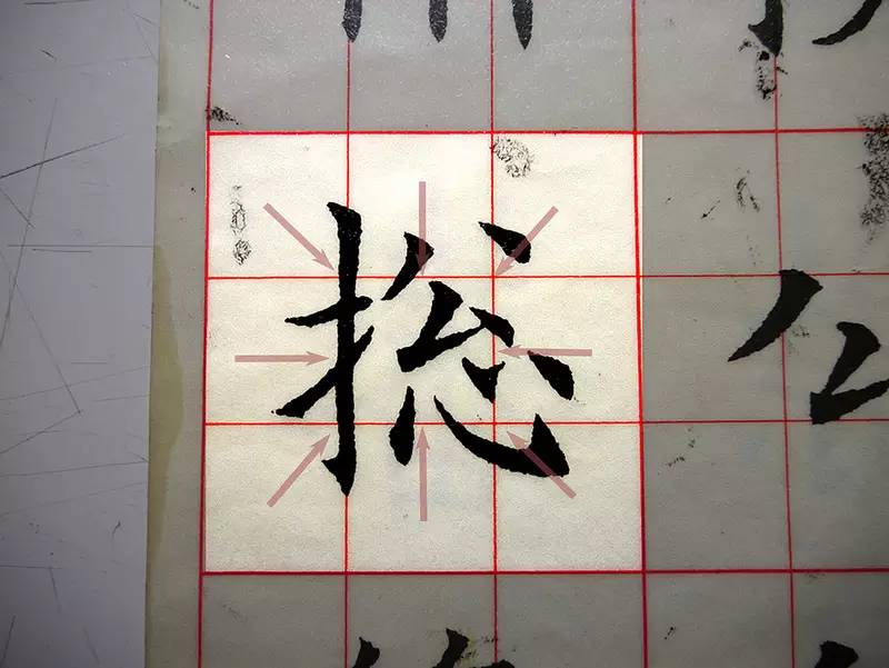
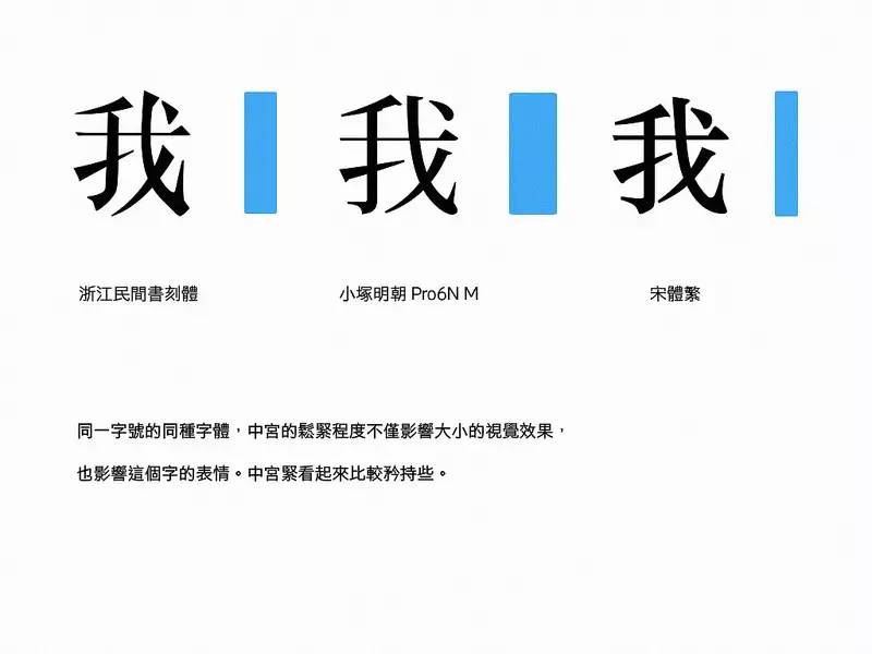
The name comes from Jiugongge. The grid in the middle of the Jiugong grid is called Zhonggong. However, when you practice calligraphy, you may find that Zhonggong is an abstract concept without a clear line (like the baseline in Western). It talks about a balance of tension—the balance of strength of strokes passing through the four lines of Zhonggong. (Balanced rice characters)
In the characters written by Ouyang Xun, a calligrapher of the Tang Dynasty, the strength of the layout of the rice characters is tightened towards the middle frame, so the characters look solid. Recommended resources: Chinese fonts necessary for designers http://yun.baidu.com/s/1i5pS2R7
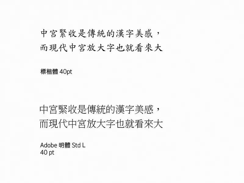
This firm-loose criterion can also be used to read computer characters. Maybe you also found that the standard script of the same font size seems to be smaller than other fonts. This is because the middle palace of italics will be made tighter.
The tightness of the middle palace is the traditional aesthetic feeling of Chinese characters, and the enlarged middle palace makes the characters look bigger.
If you think it is unfair to compare italic script and Ming font, we can also use the same method to look at three different Ming fonts, for example, the following three Ming fonts:
For fonts of the same font size, the tightness of the middle palace not only affects the visual effect of the size, but also affects the expression of the character. Zhong Gongjin looks more reserved and serious.
(above) Like this picture, the Japanese round Nakamatsu on the left looks big and feels relatively loose; the traditional old Taiwanese signboard on the right has a relatively small visual effect and feels more compact. So we can summarize:
Shape of literal box
literally wide or plump
The height of the center of gravity
The tightness of the palace
These skeleton features will affect the feeling of a Chinese font to us. These characteristics can in turn correspond to the associations of "character".
More examples
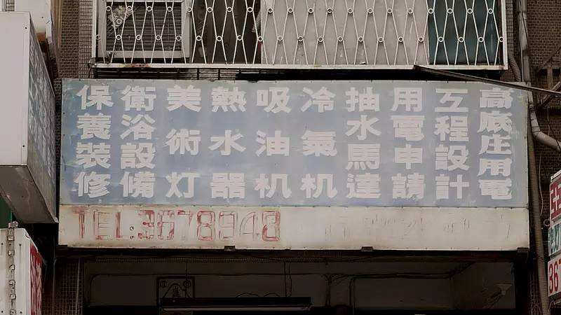
The characters on the street sign found on Tingzhou Road are wide and flat. Especially the bright body on the far right has a longer lower body and a shorter upper body, resulting in the effect that the center of gravity is significantly higher than that of the font next to it. The center of gravity is high, generally speaking, it is more serious and gives people a greater sense of oppression.
Signboard of water and electricity shop on Tingzhou Road
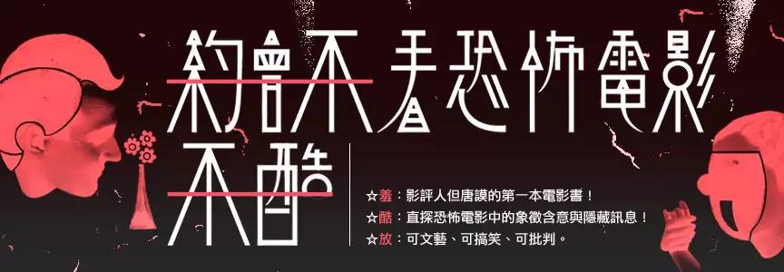
And if the center of gravity is extremely high or extremely low, it may create a weird feeling of aliens and Frankenstein, such as the title of the book "Dating is not cool without watching horror movies" is a good example.
As for the official script found in Dalongdong, it is flat in shape, with a low center of gravity, and has an adult-like soothing and calm temperament. But its strokes are the twists and turns of the gorgeous atmosphere of official script. The stability of the skeleton and the gorgeous appearance of the flesh give people the impression of grace and generosity.
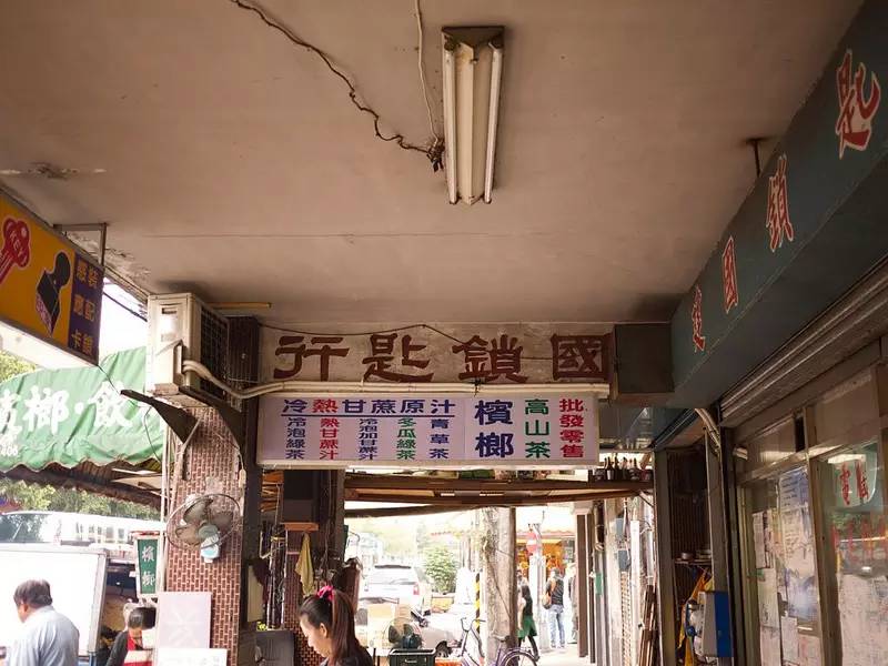
△The old signboard of Lock and Key Store on Coulomb Street
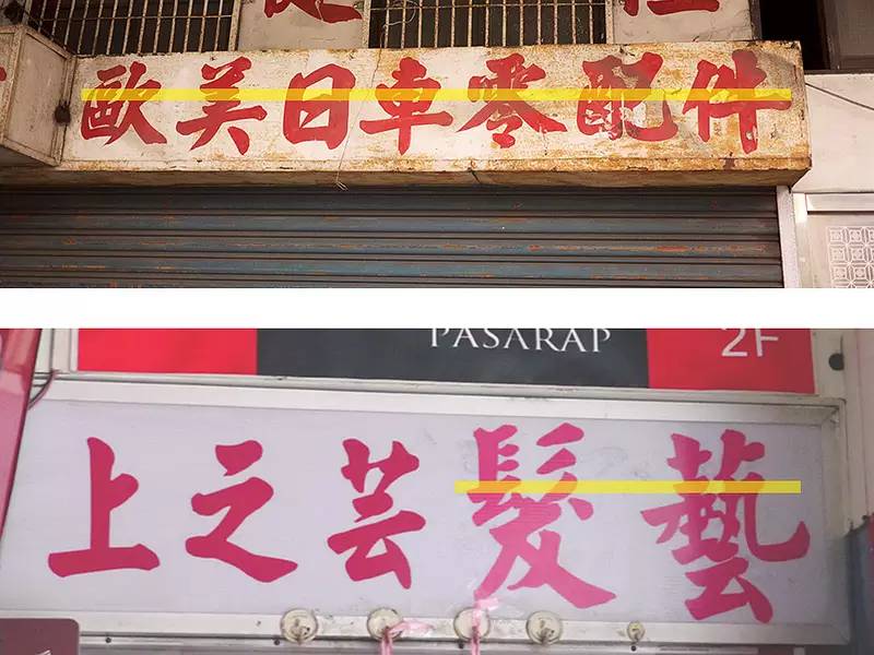
And the italics we often see on the road can also be discussed in this way. Signboards in italics are a representative phenomenon of Taiwan's folk street scene, and they are very unique in the cultural circle of Chinese characters. However, block letters can be roughly divided into two types: Yan style (Yan Zhenqing) and Ouyang style (Ouyang Xun).
Yan Zhenqing’s regular script has a more stable base, and the shape of the font is square; Ouyang Xun’s regular script is high-spirited, with a high center of gravity, and the font is thin and long. You can see it from the following two signs.
Upper near Yan style, lower near European style
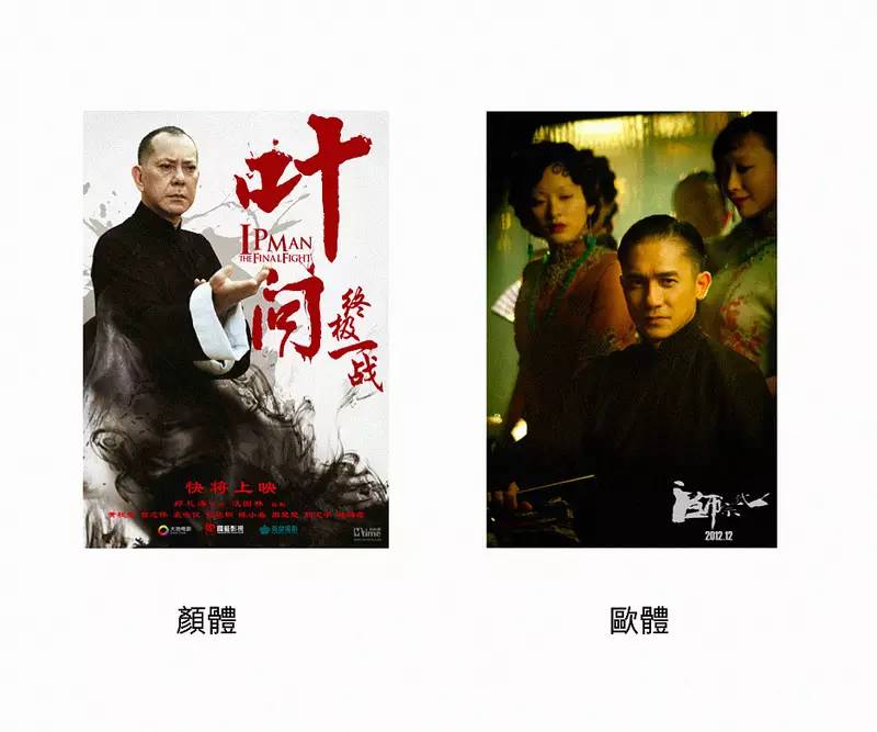
Yan Ou Diti can be regarded as the representative of regular script of the Tang Dynasty, reflecting the spirit of traditional calligraphy. This reminds me of Kung Fu, and when I think of Kung Fu, I think of Ip Man. Different people interpret Ip Man with very different feelings.
According to the above classification and analysis, Huang Qiusheng's Ip Man feels more like Yan body, probably because it is wider and thicker; while Tony Leung's Ip Man in "The Grandmaster" is like Ou Ti, thinner, It is also more romantic and elegant.

represents a character, a In fact, after analyzing in this way, the difference in skeleton characteristics shapes the different expressions of Chinese fonts, and thus has various personalities.

Articles are uploaded by users and are for non-commercial browsing only. Posted by: Lomu, please indicate the source: https://www.daogebangong.com/en/articles/detail/Help%20you%20get%20it%20done%20easily%20The%20character%20of%20Chinese%20characters.html
 支付宝扫一扫
评论列表(196条)
测试