
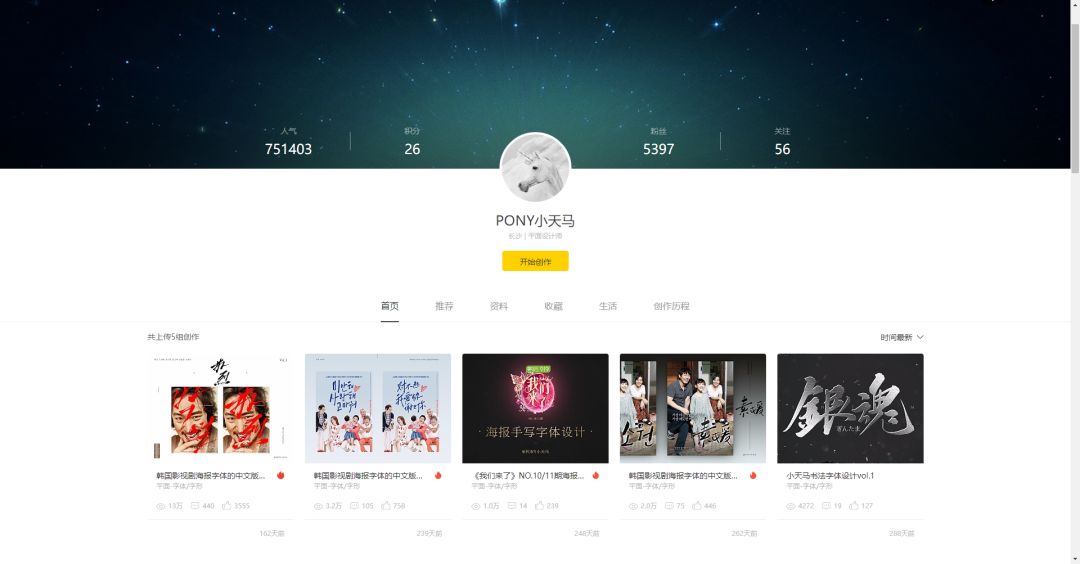
Review last week's Design Open ClassContent: Korean film and television drama Poster font Chinese version design
Guests sharing dry goods: Little Tianma
No.1 font designer on Zhanku total list
Course Outline
1. Theoretical knowledge about calligraphy practice
• The benefits of practicing calligraphy
• Recommended copybook
• Close relationship between calligraphy and font design
• If you don't want to practice, there are ways you don't want to practice
Two, Necessary work before designing fonts
• Choosing the right tool is half the battle
• Brush recommendation
• Teach you how to install brush files
• Demonstration of brush application effects
Third, Xiao Tianma's original "poster font" method (sinicization of foreign fonts)
• How to Find the Right Prototype Poster Font
• Font personality analysis, characteristics induction
• How to choose a brush to improve design efficiency
• Font Temperament Match
• Tips for retouching pictures
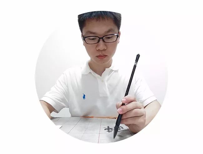
About me l Su Changchun (@PONY小天马)
Graphic designer, born in Hengshan, Hunan, graduated from the Department of Visual Communication, China Academy of Art in 2014. He used to work in the guide/satellite channel of Hunan TV station, engaged in video packaging/editing and font design. Now he has left to work independently Design for one year, mainly for brand/font business.
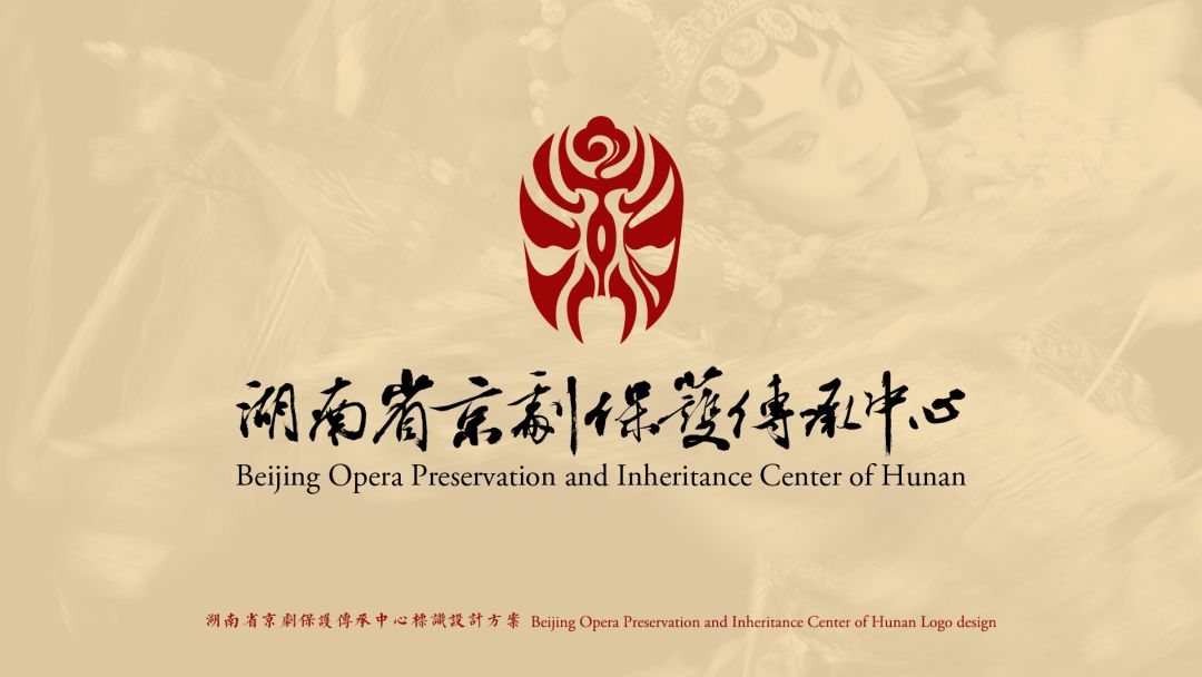
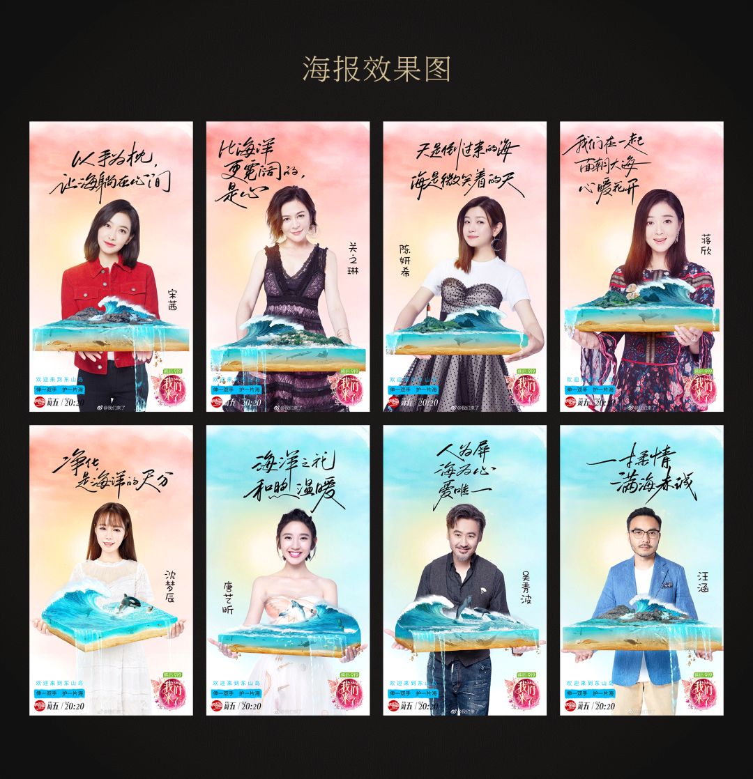
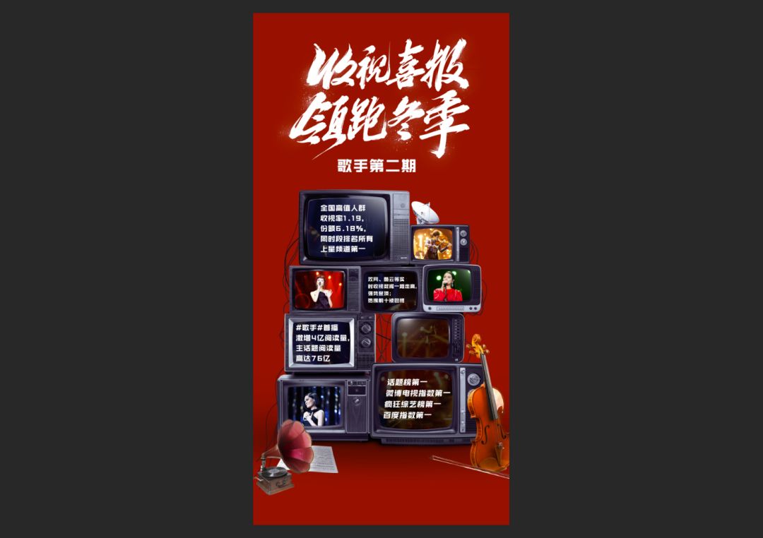
Participated and responsible projects mainly include "Everyday Upward", "2015 Hunan Satellite TV Spring Festival Gala", "2015 Hunan Satellite TV Chinese Spring Festival Gala", inner packaging fonts, "Singer 2", "Here We Are 2", "Meng Zi" Advertisement poster fonts for Adorable House, opening video of Nissan Kicks press conference, logo design for Hunan Peking Opera Company, etc.
Recently, the business I have received is basically based on fonts. It may be known to everyone because of the few font works I published on Zcool. In fact, I didn’t like doing fonts when I was in school. That course The score was also relatively low, and I didn't take over until the job required me to go to work, and then I was assumed to be responsible for the work in this area by default. It’s been a long time, and the more I study fonts, the more I love them. I think it’s quite interesting to make fonts.
Thoughts on the Chinese design of fonts for foreign film and television posters
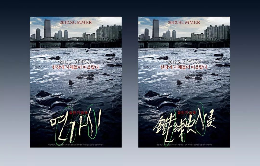
I usually like to watch movies. Before watching or watching, I will go to Douban to pay attention to their poster designs. I also like to collect beautiful posters. When sorting out, I found that Korean film and television posters use handwriting quite frequently. Although I don't understand the content of Korean, from the shape of the fonts, I think these handwritten fonts with different styles are suitable and vivid in the layout of the poster layout, and can accurately express the artistic conception of their respective movies.
I have this idea because most of these film and television dramas have not been broadcast in China, so no relevant posters have been released. Therefore, I want to try to imitate the font style, layer style and material of the original poster. Techniques and using the form of Chinese fonts to do multiple sets of font exercises with different styles. What does the original font give me?I try to write with this feeling. I like it like a propositional composition It gives me a sense of restraint and re-creation.
Knowledge learned and exercise gained
This is the most accurate, efficient and practical font practice method in my opinion. We have already told us the theme and font style in the movie introduction and the original poster font. It will not go astray. Every time a font is finished, its inner logic can be found out in the few characters, and so on, and even a complete font library can be created. Learn the use of its layout and font texture effects in poster fonts. In addition, it is the improvement of image editing skills. This is also the cultivation and test of patience. Of course, there is a more divergent thinking to reconstruct the more ideal Chinese fonts in your mind. It's even better.
Practice and practice
After doing so many exercises, you still look good.When it comes to receiving orders, you are still confused. What should we do without reference?
First of all, our exercises cannot be done in vain.After accumulating a certain amount, we can analyze our own "big data", such as science fiction movies as a Class, horror/thriller as a class, etc., look at what this type of font has in common, extract keywords, combine the unique highlights of the target business, and make characters that are not far from each other. For me Personally speaking, when a client asks me to do calligraphy, they usually take screenshots from the works I published on Zakuol, saying that they want this or that style, which makes it easier to handle, and the calligraphy I have done becomes a reference.
Important Calligraphy Practice l Benefits of Practicing Calligraphy
Although my own calligraphy level is only entry-level, I have learned a lot from it when making fonts. The biggest and most basic advantage is that I can distinguish between good characters and broken characters. Without further ado, I just happened to read two articles on Zhihu, "How anti-intellectual can Chinese people treat art?" " "Calligraphy, what is the most important thing for everyone?" ", if you are interested after class, you can read it further.
https://www.zhihu.com/question/277092772/answer/397852837
https://www.zhihu.com/question/266133912/answer/304677173
In addition, designers who have a foundation in calligraphy usually know more about words such as brushwork, lines, Zhonggong, and composition, and can skillfully use them in their own designs.
Recommended copybook
"Yashan Carved Stone" Qin seal script
"Zhang Qian Stele" Eastern Han Dynasty official script
"Stele of Ritual Vessels" Eastern Han Dynasty Lishu
"Cao Quan Stele" Eastern Han Dynasty official script
"Zhang Menglong Stele" Northern Wei regular script
"Yan Qinli Monument" Tang Yan Zhenqing regular script
"Self-Book Report" Tang Yan Zhenqing Regular Script
"Jiucheng Palace Liquan Ming" Tang Ouyang Xun regular script
"Preface to the Holy Religion of the Yanta Pagoda" Tang Chu Suiliang regular script
"Ni Kuanzan" Tang Chu Suiliang regular script
"Confucius Temple Monument" Tang Yu Shinan regular script
"Zhi Yong Zhenshu Thousand Characters Essay" Sui Zhiyong Xingkai
"Thousand Characters in Zhiyong Cursive Script" Sui Zhiyong Cursive Script
"Orchid Pavilion Preface", Eastern Jin Dynasty, Wang Xizhi's running script
"Jiu Hua Tie" Five Dynasties Yang Ning Style Running Script
"Cold Food Tie" Northern Song Dynasty Su Shi's running script
"Fathering Vow", Northern Song Dynasty, Huang Tingjian's running script
"Ling Fei Jing" Tang Zhong Shaojing regular script
"Declaration Form" Three Kingdoms Zhong Yao Lower Case
"Tao Te Ching" Yuan Zhao Mengfu lower case
"The Story of the Three Gates" Yuan Zhao Mengfu regular script
"Luo Shen Fu" Yuan Zhao Mengfu running script
"Fengju Tie" Eastern Jin Dynasty Wang Xizhi running script
"Book Book" Tang Sun Guoting Cursive Script
You can buy copybooks or download high-definition uncoded pictures from the Calligraphy Space Network: www.9610.com to your mobile phone/tablet. The pen is used as a hard pen to practice calligraphy.
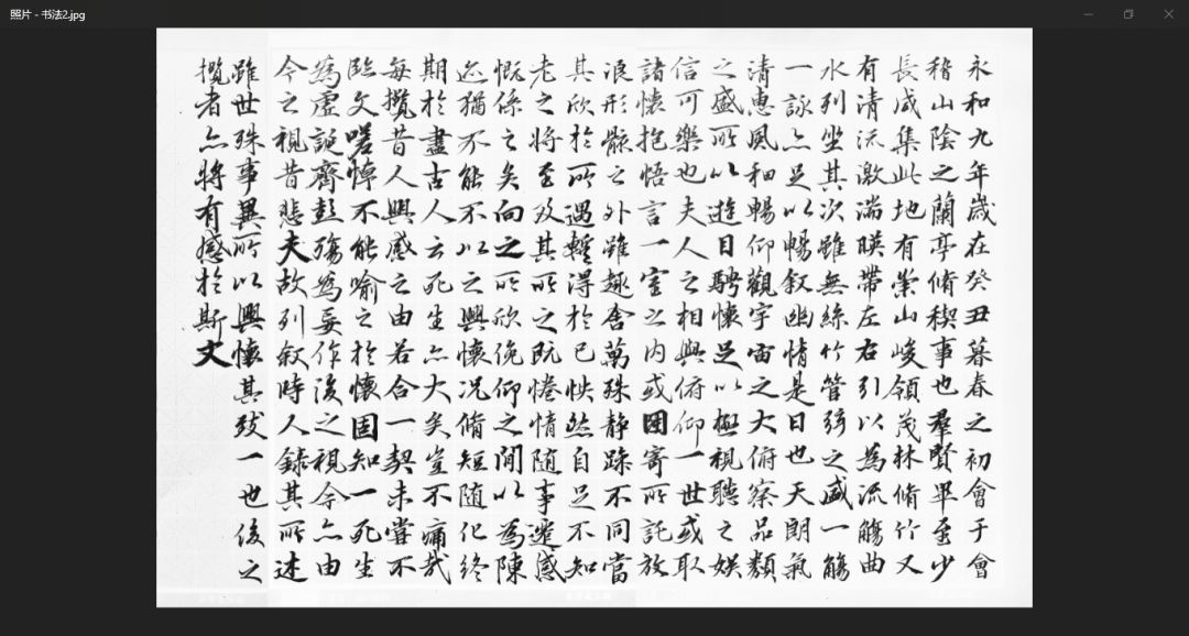
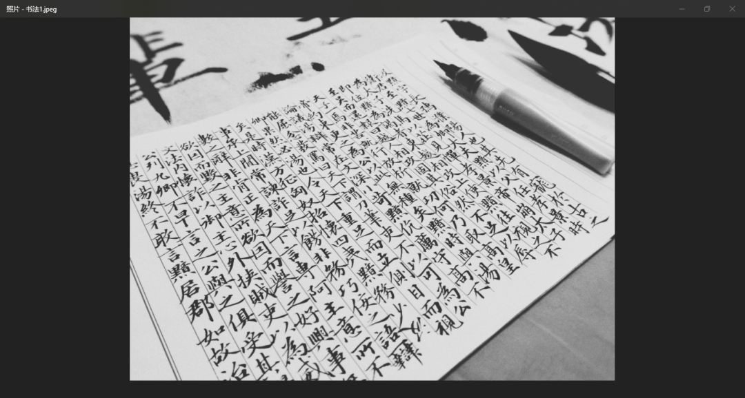
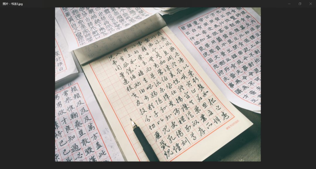
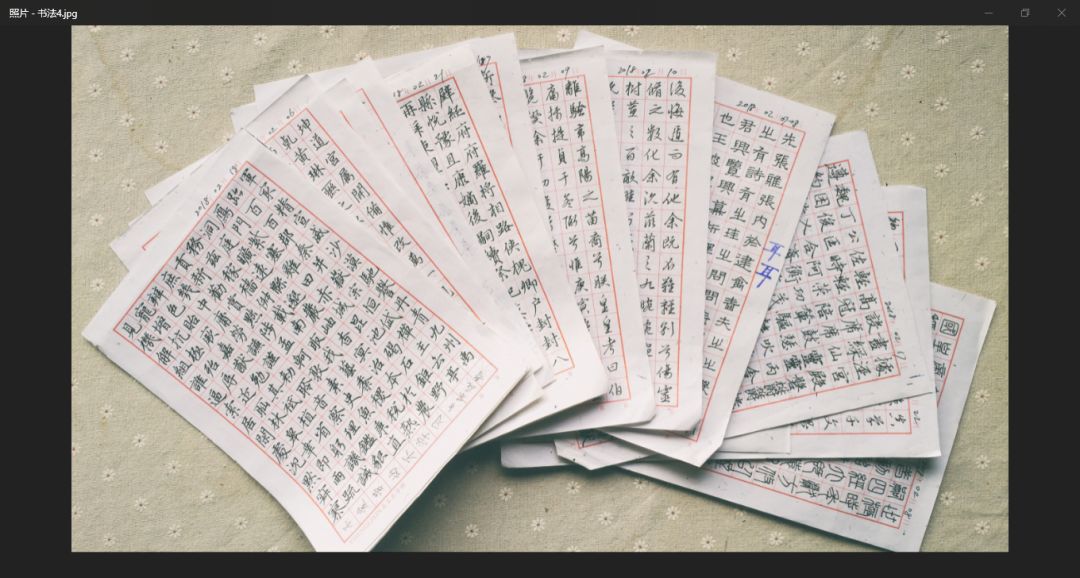
The above is my usual practice.
Calligraphy and Typography
Calligraphy is written, and font design is actually drawn. Writing calligraphy here is a relatively restrained learning process. It must be done step by step. You can’t smear and fill in order to achieve the purpose of looking like or looking good. cheat yourself. To treat the inscriptions of the ancients, one must be in awe; the font design, which is rarely formed at one time, needs to be constantly adjusted to the most suitable for the font structure, the momentum of the strokes and the beauty of the layout. In general, calligraphy is art and typography is design.
If you don't want to practice, there is a way not to practice
1. You can download ready-made fonts. In order to achieve your goal, you can replace the strokes of computer characters with various calligraphy style radicals PNG circulating on the Internet. I won't talk about it here
2. Contact me
The following is dry goods
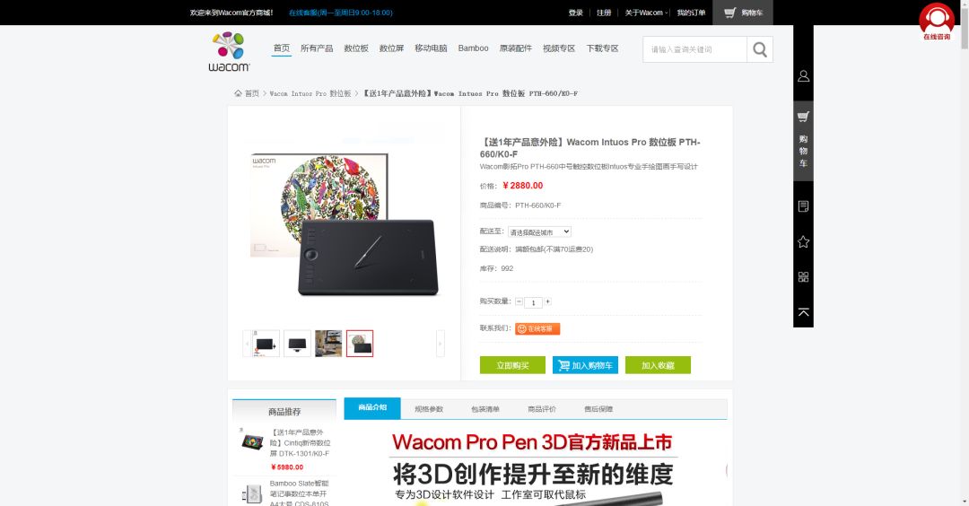
Preparation before design l choose the handy tool
I often use hand-painted tablets, the model is WACOM Intuos 4 Medium, I really want to change to a new one, but it is still strong after 8 years of use...I have not paid attention to it Which generation is it updated to now? If you want to buy it, I recommend this series~ I like to use it mainly because it has rich brushes, easy modification, and the effect is immediate. The reason why I don’t use a regular pen to write is that I need to take pictures/scan after writing. These steps are too troublesome, and it’s quite expensive to buy a pen. This is my personal choice, and you can just follow your own habits.
Recommended brushes
I haven’t made any special brushes myself, but I use Linghua ink brush 6.0 trial version (I want to buy the official version), deoR tool preset 2018.1 and Heizi PS brush library v1.6, thanks to the original author , very useful!
Link: https://pan.baidu.com/s/12JCvTP2OWdY5x0mLk4HMcg Password: ahaa
Installation of brush files
TPL files are loaded into tool presets, ABR files are loaded into brush presets, pay attention to distinguish between tool presets and brush presets.
Demo of brush application effect
Let me demonstrate some of my most commonly used brushes and see what effects they can achieve.
Here is a video demonstration.
Heizi.【Calligraphy pen】
Heizi.【Liquid pen】
Dry Ink
Thin Gold Calligraphy - Capillary (1)
https://v.qq.com/x/page/v0703fn52eg.html
Thin Gold Calligraphy - Capillary (2)
https://v.qq.com/x/page/r0703k6vlgd.html
Calligraphy-Round and Big Feibai
https://v.qq.com/x/page/y0703rakm81.html
Line small triangle smooth
https://v.qq.com/x/page/b07037sefss.html
You can play freely after downloading! Some effects may not be achieved by one brush, you can try combining them. Some time ago, I made fonts for a design related to "Hip Hop", and used the above brushes
This is a font for the cover of a book, all black and white drafts, no font effects, I don't need to do the font effects.
This is how I practiced fonts l choose the appropriate prototype poster font
What are suitable archetypal poster fonts and why were they chosen?
Movie poster fonts on the market are basically qualified, but what we are looking for is one that has learning value. It may have a unique font style, high-end font effects are difficult, etc. This is We have to learn and challenge.

You can go to the movie website to find the ones you are interested in or see what I have already done on Zakuol.
Font personality analysis, characteristics induction
Fonts can be roughly divided into two categories: "clumsy" and "clever". Here I will give a few examples and show you my thinking and process of making characters.
Take "Happy Death Day" as an example, let's take a look at the original poster to feel it~
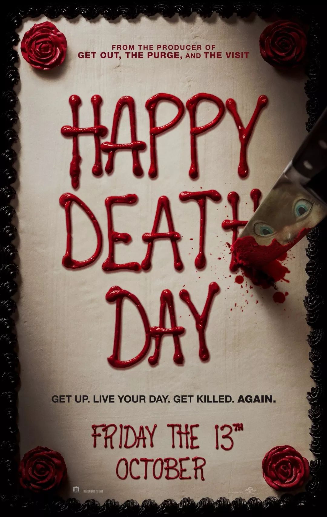
The font of "Happy Death Day" simulates the effect of the cream on the cake, or it may be directly squeezed with cream. This font has a slender shape and a strong sense of handwriting. Form the thick feeling of cream accumulation. I found a problem when doing the layer style, that is, I have to separate the strokes. Only in this way will there be the effect of superimposed cream characters.
https://v.qq.com/x/page/x0703hoh68y.html
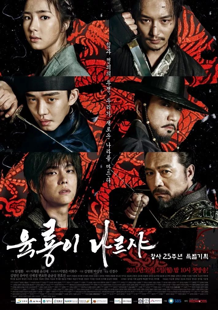
"Six Dragons Flying to the Sky" is a typical calligraphy font. Although I can't understand the original font, I can see that it is well written. When using this font,I can only use my usual level of handwriting as much as possible. After writing, I will modify the shape and I will try my best to imitate the feeling of the original strokes to correspond to similar strokes.
"Method School" is written with a side edge, with a flat head, thick tail and a sharp tail. The strokes are basically independent, and have a certain dry brush effect. When you write with this feeling, you can Come out with a basic type. After comparing with the original font, it is found that the original font has a certain inclination, and a little adjustment is enough.
https://v.qq.com/x/page/j0703kcxuor.html
The characters in "Cheese in the Trap" look smoother, casual and not scribbled.One of its characteristics is to imitate the effect of chalk characters. Due to contact with rough surfaces, chalk characters will leave a lot Similar to the gradient effect of small dots, this can be easily solved by layer dissolution in PS.
https://v.qq.com/x/page/b0703sknbkb.html
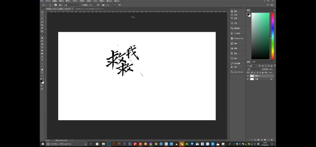
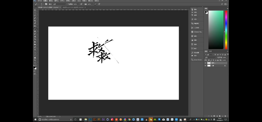
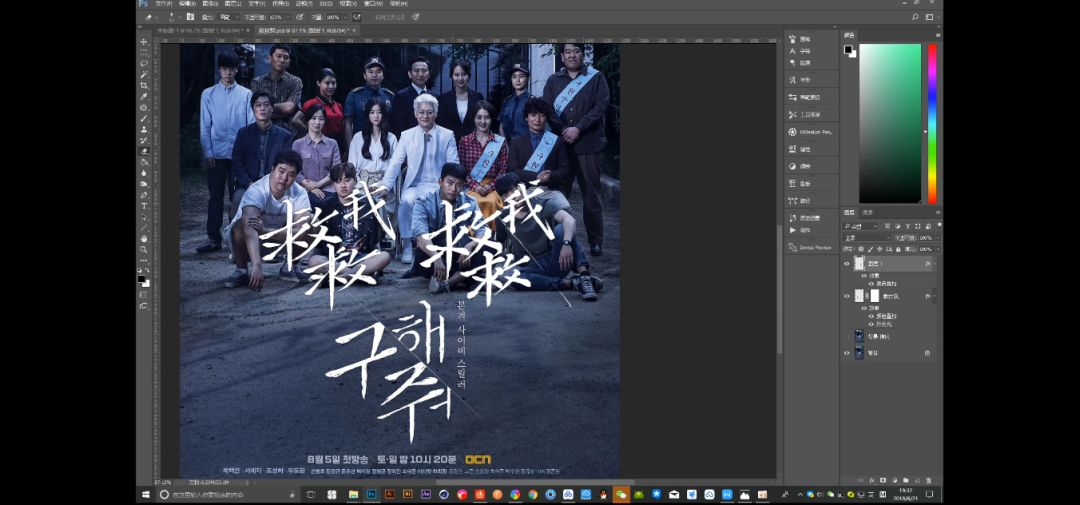
"Save Me" cannot be transmitted because the video is too large, here is a screenshot to demonstrate


Choose the right brush to improve design efficiency
Familiarize yourself with your own brush library as soon as possible to see what effects they have. When analyzing the original poster, you must know what brushes they can use to write more similarly. If you use it properly, you can improve a lot efficiency. When I demonstrated these four groups of fonts, I used 3 brushes, which can basically reflect the characteristics of the original fonts.
Font Temperament Match
The matching of the internal temperament of the fonts is mainly due to the logical unity of the external shapes of the two groups of fonts.
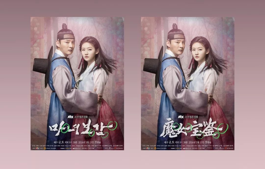
Take "The Witch's Treasure Book" as an example. The original font is similar to Xingkai in calligraphy, but it is similar to official script in the processing of some strokes. "마녀보감", this is its original Korean text, you can compare it Take a look, the last strokes of the 1st, 3rd, and 4th characters should be a horizontal stroke, but on the original poster font, there is a slight horizontal stroke in the official script, and the ending sinks and upturns, This feature is very important when making Chinese fonts. If this point is not preserved, the charm of the original font may be lost.
The font of "Invasion of Iron Worms" is a group I am quite satisfied with. I haven't watched this movie, and I don't know the content, but I know from the poster screen and title that it should be a disaster of parasites. Its original font uses a distorted anti-calligraphy handwriting method to show the shape or movement of iron nematodes(my guess), so I am doing Chinese When writing the font, it continued its morbid writing state, and some important strokes were retained without affecting the recognition.
Tips for Retouching
When choosing the original poster, try to choose one that is easy to cut out and beautiful, if you really have no choice, you can also challenge your ability to edit pictures. The most troublesome thing I have encountered so far seems to be "Go to the World of XX". That picture made me very broken.
You can give it a try. The general picture can be almost free of PS traces through imitation stamps and repair tools, but it is more difficult when it comes to close-ups of characters’ faces and characters’ limbs being largely blocked. Those two Small tools may not be able to meet the needs of image editing. At this time, the designer needs to have a certain understanding of the structure of the human body. On this basis, do some material synthesis, and then match the color and light source. If you can’t find a suitable one on the Internet, you can light and take pictures by yourself. for material. In fact, I didn't do such exaggerated operations when doing exercises.After all, this is not a special training for synthesis, and the tips I want to talk about are not for this kind of complicated pictures.
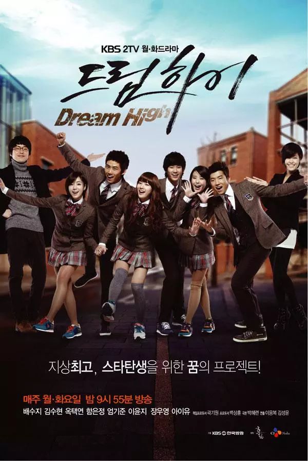
To give another example, take "Dream Chasing High School" as an example. The font is thin and the background is simple. A practical way,is to split the font to be cut into independent color blocks, so that it is very easy to use the repair tool,If it is not split, it is difficult to I found a large enough background for patching on the screen, and if I didn’t choose an independent color block, there would be the kind of blooming effect that I repeatedly circled with the mouse in the video, which would affect the matting even more.
https://v.qq.com/x/page/v0703uybrd8.html
That’s all for today’s sharing. Teacher Xiaotianma’s sharing is so dry and hard work! If you feel that you have gained something, you can long press the reward code below and send a red envelope to appreciate the teacher~
Articles are uploaded by users and are for non-commercial browsing only. Posted by: Lomu, please indicate the source: https://www.daogebangong.com/en/articles/detail/He%20designed%20Chinese%20version%20poster%20fonts%20for%20200%20Korean%20TV%20dramas%20and%20easily%20won%20the%20first%20place%20in%20the%20cool%20list%20and%20Hunan%20TV%20came%20to%20praise%20him%20%20Dry%20goods%20of%20the%20Ninth%20Factory.html
 支付宝扫一扫
评论列表(196条)
测试