
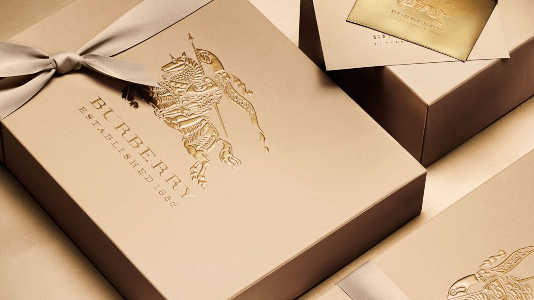
Last week, Burberry announced a new brand logo and monogram printing. This is the first time Burberry has made subversive changes to the logo in the past 20 years. Discussions with mixed reviews, everyone must have participated in it.
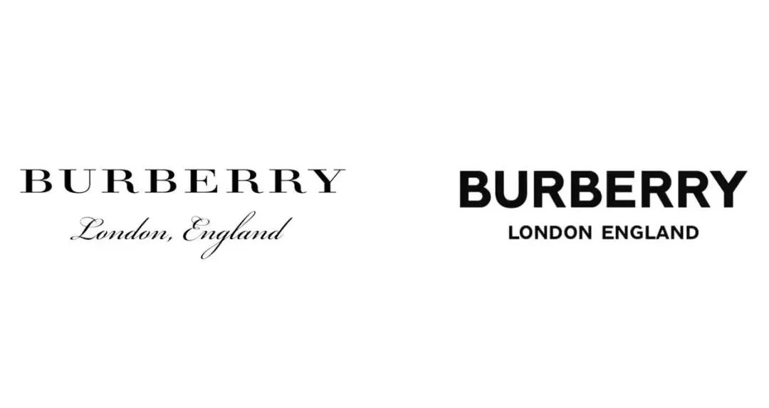
Left: serif typeface, letters with "little tail" strokes
Right: sans serif
Different from the serif font of the old logo, although the font of the new logo is more concise and modern, it inevitably looks like a "trendy brand" and weakens the classic style of this century-old fashion house. Of course, Burberry isn't the first brand to do this.
In the past year and a half, brands such as Calvin Klein, Diane von Furstenberg, Balenciaga and Rimowa have used similar routines to innovate their logos.

Under the general trend of networking, it is normal for brands to attract attention through innovation. It’s just more and more similar font logos, will it bring homogenization and reduce the uniqueness and recognition of the brand?
We researched the fashion brands around us and found that these 4 fonts are especially favored by the fashion circle, and the value content behind them has also become an important part of shaping the brand image.
01
The ultimate form of sans serif

Helvetica is regarded as the representative of modernism in font design. It is like a transparent container, allowing readers to focus on the content expressed by the text when reading, without paying attention to the font used in the text itself. In short, it is suitable for conveying all kinds of information.
>>>
It is precisely because of Helvetica's softness with rigidity and neutral style that it has an indescribable tacit understanding with the very individual Rei Kawakubo, which just explains why it has become Rei Kawakubo's royal font.

>>>
Helvetica font itself has a good relationship between positive and negative shapes, so it is very popular. Even in the fashion field that emphasizes uniqueness and originality, it can also take all street culture and avant-garde fashion.

>>>
For a brand with a relatively pioneering concept, the choice of this font seems understandable. Saint Laurent, which has always regarded itself as elegant since its inception, changed the "Yves Saint Laurent" that originally highlighted the handwritten elements and the sexy and casual "Yves Saint Laurent" in 2012 to the "Saint Laurent" capitalized in Helvetica font. Paris".
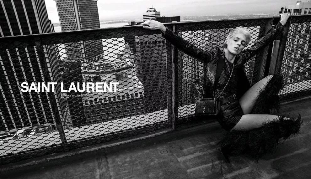
Although this move seems to have erased the traces of the founder, in fact, Saint Laurent has a rebellious nature in its bones. Such innovation can be said to be in line with Mr. Saint Laurent's routine of subverting the tradition with "smoking clothes".
02
The font that became popular because of Supreme

Futura and Helvetica are sans-serif fonts, both products of modernism. But the Futura created by German designer Paul Renner lives up to its name and is more futuristic. The strong sense of geometry also adds emotion to it, with sharp edges and corners.
>>>
Choosing the avant-garde Futura to interpret Supreme can be said to be the most appropriate. If Supreme is the pioneer of street culture, then Futura is the leader of modernism's march into graphic design.

>>>
The unique geometric structure design makes Futura highly decorative, leaving sufficient ups and downs in lowercase, and harmonious and comfortable proportions in uppercase. As the font designer said: "The true modernity is to faithfully express the objective spirit of the times. The true modernity is the perfection that can stand the test of time." Therefore, Futura, which has both rational logic and emotional style, is favored by big brands.


03
Gothic font popularized by Kanye West

Gothic fonts originated in the Middle Ages have been resurging wildly in the past two years. The extensive use in fashion and the promotion of popular music have brought this ancient text to modern times. Although the artistry of Gothic fonts is far greater than its practicality, with graffiti-like techniques and special brushstrokes, it also collided with street culture a lot.
>>>
The New York Times once pointed out: "Gothic fonts contain very diverse cultures, and reflect a kind of faith and rebellion." So we went from the A$APMob album to Yeezy Season 3, to SSUR, MISBHV, 424, ChromeHearts... can all see it become a phenomenon-level popularity around the world.
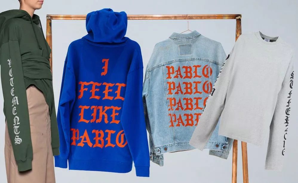
Kanye West x The Life Of Pablo
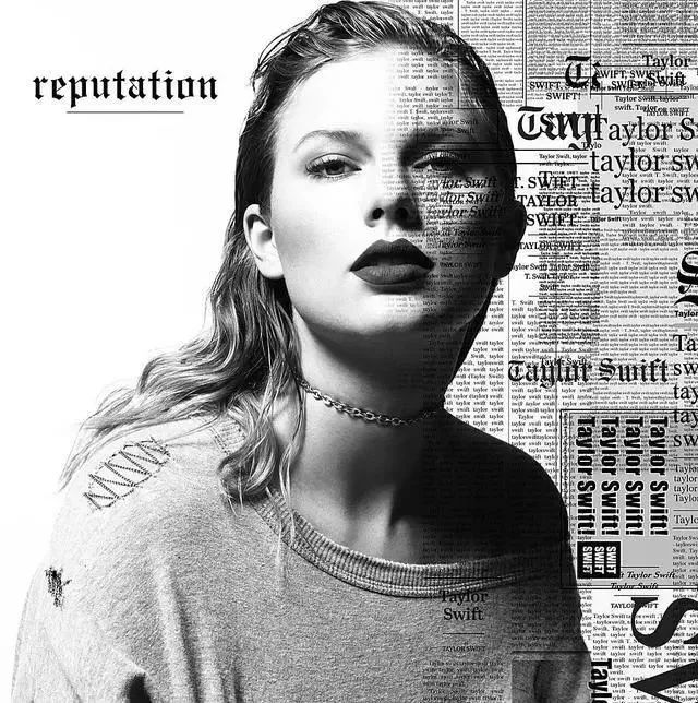
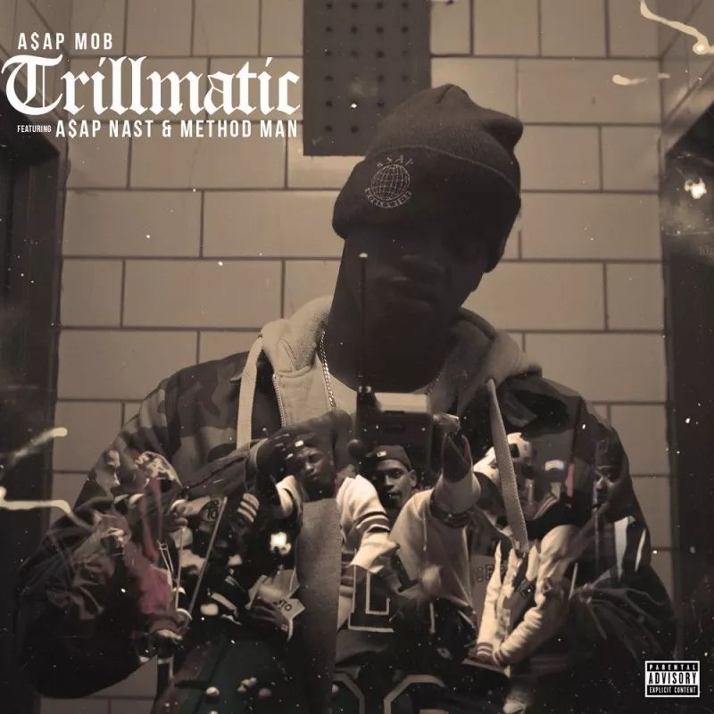
Taylor Swift (left), A$AP Mob (right) album covers

Marcelo BurlonCounty of Milan SS17

Vetements SS16

424 on Fairfax
>>>
“Too many brands are using Gothic fonts today, especially in Los Angeles.” The director of Palm Angels expressed his concern, because in the eyes of Westerners, Gothic fonts have the power to Symbols of religious power and self-preservation. However, how many young people who step on Yeezy and wear Vetements really understand the meaning and history behind this font?


04
The most decent serif font

Didot with French origin was born at the end of the 18th century and the beginning of the 19th century. In that era when literature, aesthetics and philosophy were highly respected, Didot was endowed with unique temperament and classical beauty. Compared with the ancient Roman serif font that was popular before, the thickness of the strokes is also more exaggerated and sharp, which is supported by many fashion magazines.


>>>
The angular serif Didot looks vaguely luxurious in the old century, while many luxury brands have a long history and are noble and elegant. temperament.


>>>
Burberry’s original logo not long ago was also a prototype based on the Didot font. Increase the ratio of height and width, and then adjust some details, which is the original trademark of Burberry.
For the fashion industry, the rise and fall of all trends, whether it is existential anxiety or a carnival of cultural flow, is behind the dialogue of cultural values, and the participants and promoters of the dialogue , it is bound to be the font used as the facade of the brand.
If a brand only follows the pressure and trend of "Hypeization" in the fashion circle, and gradually distances itself from its own culture, the brand itself will surely become a victim of the industry's aesthetic fatigue.
━━━━━
Editor: Li
Vision: Car
━━━━━
Past highlights

▲Tanabata warning! Emergency evacuation? No, there is a Singles Society

▲How hard is the luxury brand trying to make the Qixi Festival limited edition that the Chinese people snap up?

▲It's been a year, just lie down
Articles are uploaded by users and are for non-commercial browsing only. Posted by: Lomu, please indicate the source: https://www.daogebangong.com/en/articles/detail/Have%20you%20ever%20used%20the%204%20most%20popular%20fonts%20for%20fashion%20brands.html
 支付宝扫一扫
评论列表(196条)
测试