Preface
❝Hello! Friends!
First of all, thank you very much for reading Haihong's article. If there is any mistake in the article, you are welcome to point it out~
Haha let me introduce myself
Nickname: Haibo
Label: a programmer|C++ player|student
Introduction: I got acquainted with programming because of C language, and then transferred to computer science. Currently learning C++/Linux (really really difficult~)
Learning experience: solid foundation + more notes + more coding + more thinking + learn English well!
Daily sharing: Wechat public account [Haihong Pro] to record life, learn a little bit, share some source code or learning materials, welcome to pay attention~
Effect display

Thoughts
The above effect can Summarized as:
When the mouse does not stay: blue (gradient) background, the middle text is white, and the four corners of the button are rounded Processing When the mouse stays: the background of the button turns white, the text turns blue, and the upper right and lower left corners extend two perpendicular lines at the same time < /li>
According to the effect diagram, some ideas of implementation can be drawn:
Background and text color changes can be achieved using hover - < section >The two lines in the upper right corner can use the ::before/::after pseudo-class of the button, combined with transition, when the mouse stays, the extension of the two lines can be realized
Demo code
HTML
<!DOCTYPE html>
< ;html lang='en'>

<head< /span>>
 <meta charset='UTF-8'>
 <meta http-equiv='X-UA-Compatible' content='IE=edge'>
 <meta name='viewport ' content='width=device-width, initial-scale=1.0'>
 <link rel='stylesheet' href='style.css'> span>
 <title>Document</title>
</head>

<body>
 < ;button class='btn'><span>< /span>Haihong Pro</span></button>
</body>

</html>
CSS
html,body{
 margin: 0;
 height: 100%;
}
body{< br> display: flex;
 justify-content: center;
 align-items: center;
}< br>.btn{
 width: 390px;
 height: 120px< /span>;
 color: #fff;
 background: linear-gradient(< span >0deg, rgba(0, 172, 238, 1) 0 %, rgba(2, 126, 251, 1 ) 100%);
 font-family: 'Lato', sans-serif;
 font-weight : 500;
 border-radius: 10px;
 box-shadow : inset 2px 2px 2px 0px rgba(255, 255, 255, .5),
 7px 7px 20px 0px rgba(0, 0, 0 >, .1),
 4px 4px 5px 0px rgba(0, 0, 0, .1);
 transition: all 0.3s ease;
 cursor: pointer;
 border: none;
 position: relative;
 line-height: 120px;
 padding: 0 ;
}
.btn span{
 position: relative;
  display: block;
 width: 100%;
 height: 100%;
 font-size: 48px;
}
.btn::before,.btn::after{
 position:absolute;
 content: '';
 top: 0;
 right: 0;
 background: rgba(2, 126, 251, 1);
 transition: all 0.3s ease;
}
.btn::before{
 width: 0;
 height: 2px ;
}
.btn::after{
 height: 0;< br> width: 2px;
}
.btn span::before ,
.btn span::after{
 position:absolute;
 content: '';
 bottom: 0;
 left : 0;
 background: rgba(2, 126 span>, 251, 1);
 transition: all 0.3s ease;
}
.btn span::before{
 width: 0;
 height: 2px;
}
.btn span ::after{
 height: 0;
 width: 2px;
}

.btn:hover{
 background: transparent;
 color : rgba(2, 126, 251, 1) ;
}

.btn:hover::before{
 width: 100%;
}
.btn:hover::after{
 height: 100%;
}
.btn span:hover< /span>::before{
 width: 100%;
}
.btn span:hover::after{
 height: 100%;
}
Detailed explanation of doubts
< p data-tool='mdnice editor' >How to realize the extension of two lines?First, use the ::before and ::after pseudo-classes to add two pseudo-elements before and after the button, one with width=0, height=2px; the other with height=0, width =2px
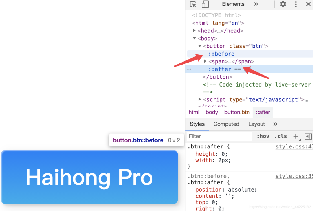
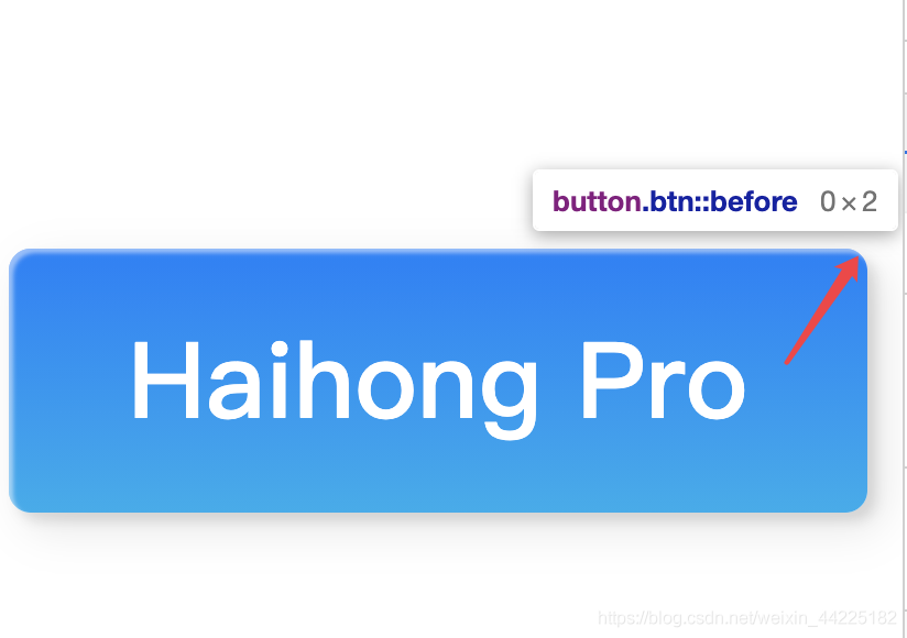
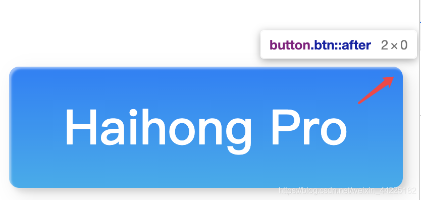
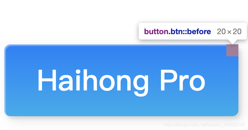
It is easy to understand and observe here, we will display these two elements
Modify the css code: change the before to red for easy observation, and change the width and height to 20px
.btn::before,.btn::after{
 position:absolute;
 content: '';
 top: 0;
 right: 0;
 background: red;
 transition: all 0.3s ease;
}
.btn::before {
 width: 20px;
 height: 20px;
 }
Now you can observe the specific location of before
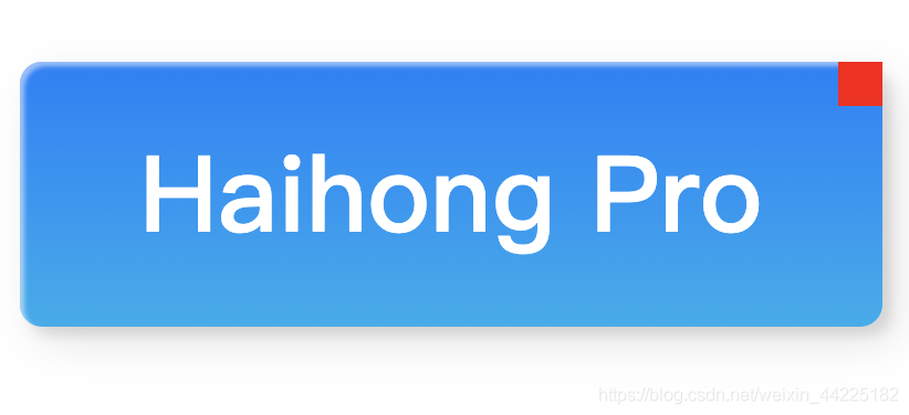
Using the transition attribute in CSS, when the mouse hovers over it, modify its width to 100%, and the extension effect can be achieved
// When the mouse stays on the top, the width becomes 100%
.btn :hover::before{
 width: 100%;
}
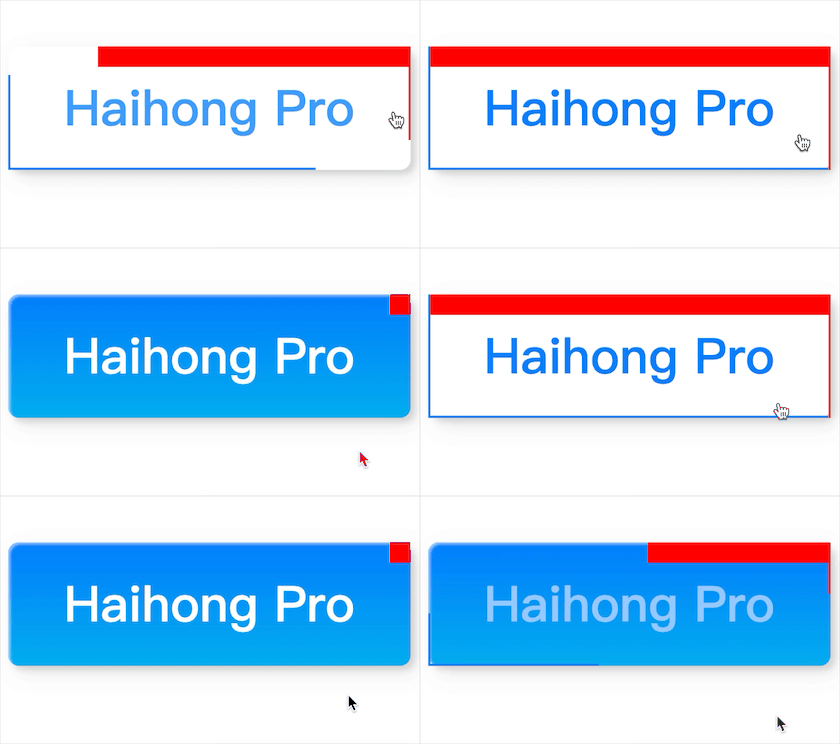
Friends who don't know css transition can view:
❝Introduction to transition: https://www.w3school.com.cn/cssref/pr_transition.asp
One before realizes the extension of width, and the other after realizes the extension of height, so two pseudo-elements of one element can realize the extension effect of two lines
Similarly, the extension in the lower left corner is to use the ::before and ::after pseudo-elements of span
step on the pit
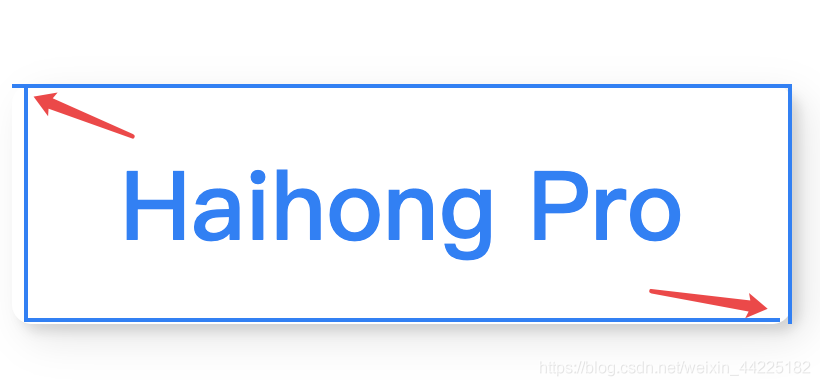
1. The parent element button does not Set padding=0, there will be a situation where the four lines are not perfectly closed
2. position: relative should be set in the button element, if not, it will appear:
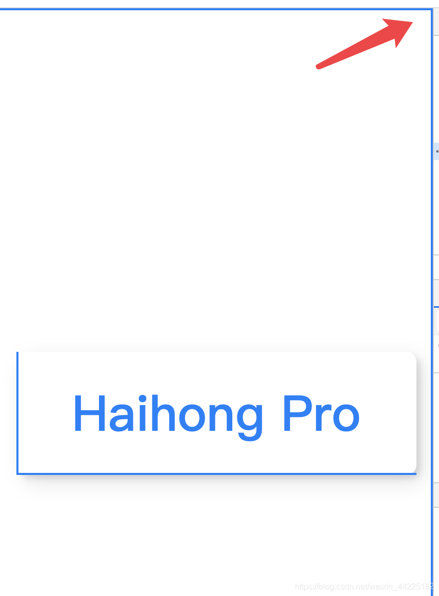
Reason: Because of the position:absolute; in the before and after pseudo-elements of the button, you must set the button position: relative< /strong>,
absolute in position refers to the element that generates absolute positioning, and positions relative to the first parent element other than static positioning >.
If you do not declare the position of the button as relative, then button::before/after will think that its parent element is the browser, so absolute positioning is based on the browser deal.
Comment version code
html,body{2px 0px rgba(255, 255, 255, .5),
margin: 0;
height: 100%;
}
body{
/* The element is in the middle */< br> display: flex;
justify-content: center;
align-items: center;
}< br>.btn{
width: 390px;
height: 120px< /span>;
/* text color is white */
color: #fff;
/* button background color is gradient blue */
background: linear-gradient(0deg, rgba(< span >0, 172, 238, 1) 0%, rgba< /span>(2, 126, 251, 1) 100%) ;
/* font settings */
font-family: 'Lato', sans-serif;
< span >font-weight: 500;
/* Fillet processing */
border-radius: 10px;
/* button shadow setting */
box-shadow: inset 2px < span >2px
7px 7px 20px 0px rgba(0, 0, 0, .1 ),
4px 4px 5px 0px rgba(0 , 0, 0, .1);
/* set the transition attribute so the element transition duration : 0.3s Speed curve type: ease*/
transition: all 0.3s ease;
/* When the mouse stays, Become a small hand */
cursor: pointer;
border: none;
position: relative ;
/* line-height */
line-height: 120px;
padding: 0;
}
.btn span{
/* relative positioning */
position: relative;
/* block level element */
display: block;
width: 100%;
height: 100%;
font-size : 48px;
}
.btn::before,.btn ::after{
/* absolute positioning */
position:absolute;
/* content Must have or not displayed */
content: '';
/* locate the upper right corner */
top: 0;
right: 0;
/* Background color: blue */
background: rgba(2, 126, 251, 1);
transition: all 0.3s ease;
}
.btn::before{
/* initialization */
width: 0;
height: 2px;
}
.btn::after< /span>{
height: 0;
width: 2px;
}
.btn span::before,
.btn span::after{
/* absolute positioning */
position:absolute;
content< /span>: '';
/* Locate the lower left corner */
bottom: 0;
left: 0;
background: rgba(2 span>, 126, 251, 1);
transition: all 0.3s< /span> ease;
}
.btn span::before{
width: 0;
height: 2px;
}
.btn span::after{
height: 0;
width: 2px;
}
.btn:hover{
/* background transparent */
background: transparent;
/* Font color changes to: blue */
color : rgba(2, 126, 251, 1);
}
.btn:hover::before{
/* width transition is 100% * /
width: 100%;
}
.btn:hover::after{
/* The height transition is 100% */
height: 100%;
}
.btn span:hover< span >::before{
width: 100%;
}
.btn span:hover::after{
height: 100%;❝https://codepen.io/yuhomyan/pen/OJMejWJ
Css can only be a little bit, after learning, I like to watch some great-level css effect display, learn knowledge points bit by bit according to the source code, there is something wrong in the text place, welcome to point out~
【Write message|View message】
Articles are uploaded by users and are for non-commercial browsing only. Posted by: Lomu, please indicate the source: https://www.daogebangong.com/en/articles/detail/HTMLCSS%20%20custom%20button%20style%20001.html

 支付宝扫一扫
评论列表(196条)
测试