Recently, HSBC updated its 35-year-old logo.
Related links: Henry Shi said: Designs without comparison will inevitably decline. Then, HSBC updated the logo...
Today, let’s take a look at the design comparison of HSBC’s Chinese fonts——
Xu Hanwen is a senior font designer of Monotype, a former font developer of DaltonMaag, a British font company, and a font designer of XinheiTi team. He led the design of Chinese characters in Monotype, the main creative team of "Tencent Font" last year.

Related links:Video: The story behind Tencent fonts
For the HSBC New Logo Chinese font, Xu Hanwen put forward his own analysis and solution.
Recently, HSBC's new logos have appeared one after another, and it is estimated that there is little chance of revision.
Ask myself professionally, I have been keeping the Chinese language for enterprises for the past ten years. I am very disappointed to observe that the designs of major traditional enterprises are constantly falling apart in the new era. .
HSBC was a company loved by Hong Kong people in the past, but in the recent brand update, the handling of Chinese characters surprised many designers. In my opinion, it is best to keep the old style. I found out that the new logo is a set of 1 size fits all processing, so it feels very weird when zoomed in. But if it has to be processed according to the current format, will there be a better result?
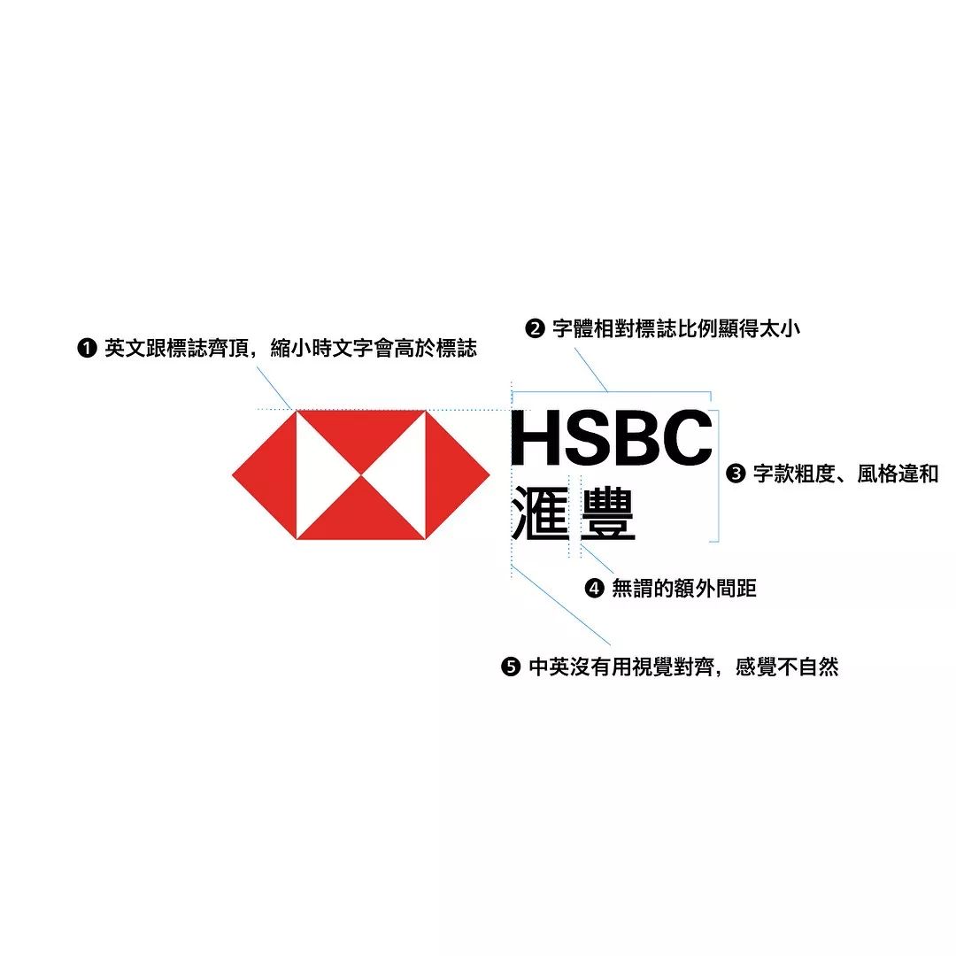
I fantasized about a fix for this logo to find the problem before it can be fixed:
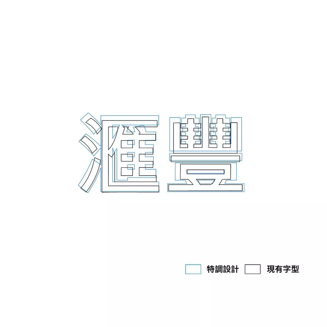
1) In the existing logo lock-up, the logo pattern is on top of the English name, so the English often seems to fly out; 2) In order to make the space between English and Chinese large enough, the designer put the English part If it is too small, the scale will be wrong after zooming in; 3) The thickness of Chinese and English characters is inconsistent with the style, which is a taboo in contemporary brand design; 4) In order to make it clearer when zooming out, extra spacing is added between Huihefeng, which looks locked It feels more fragmented; 5) Chinese only uses mathematical alignment (fractional>
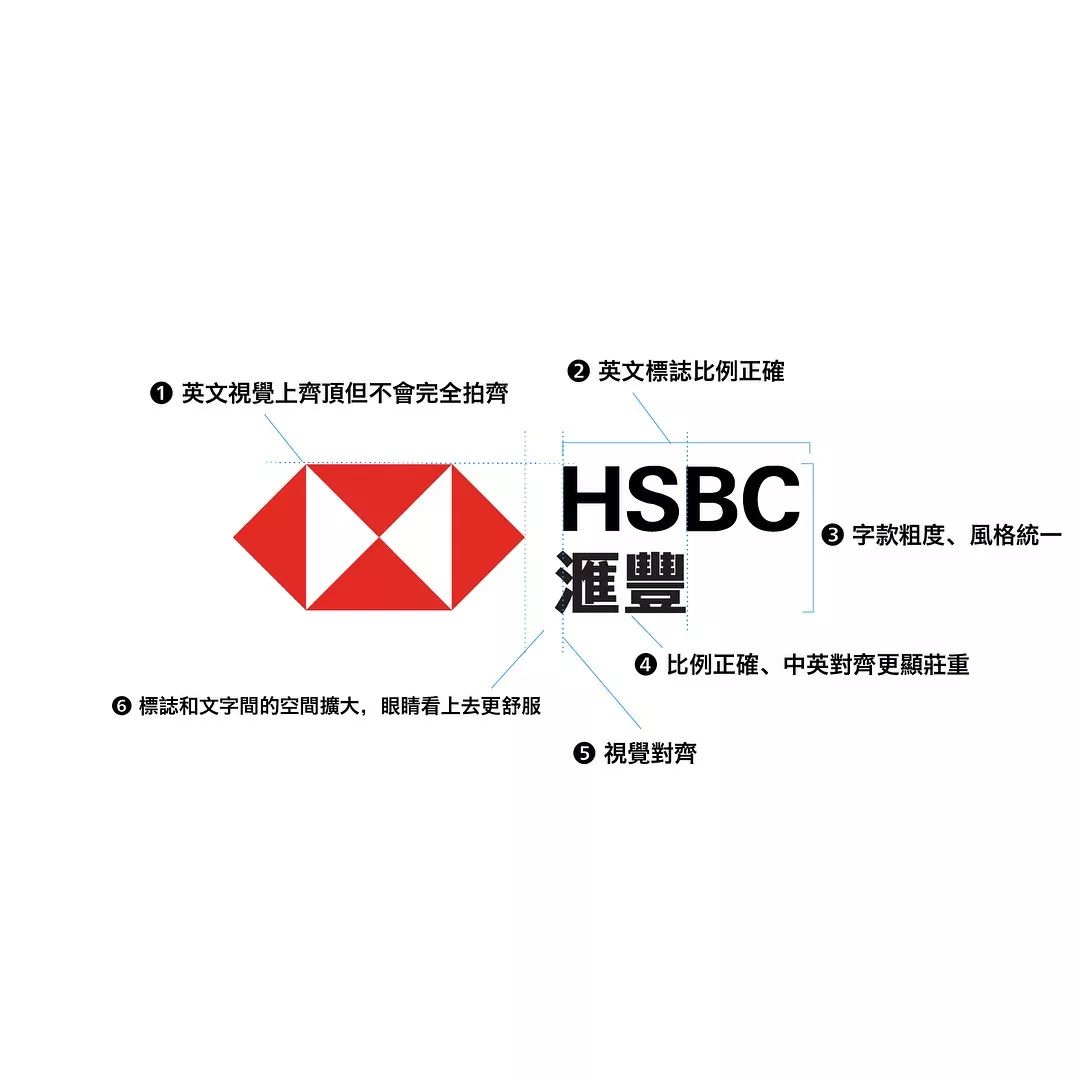
Then prescribe the right medicine:
1) The English name is only a little lower than the logo pattern, which feels like it is on top but will not run out of the pattern range; 2) Correct the proportion of the English logo; 3) Re-match the middle palace to be relatively wide, uniform in thickness, and small characters Considering the thickness of the special horizontal strokes, it is still very clear even in small characters, and it feels solid and unified; 4) After removing the extra spacing, the alignment of Chinese and English is more solemn; 5) The visual alignment of English and Chinese, with the Chinese palace as the focus, It feels comfortable; 6) The space between the logo pattern and the text is also slightly increased, and it feels more mature.
Honestly speaking, I don’t think the revision is any better. Compared with the old-fashioned design, it has always become petty, without the grand plan of a world enterprise. Or maybe this is the language of the times? I don’t know, but what is certain is that the craftsmanship of the design must be emphasized, so that the beauty of the minimalist logo can be effectively displayed.
Finally, let's briefly review the old and new logos of HSBC——
HSBC, founded in 1865, is one of the world's largest banking and financial service institutions, the largest registered bank in Hong Kong, and one of the three note-issuing banks of Hong Kong dollars.
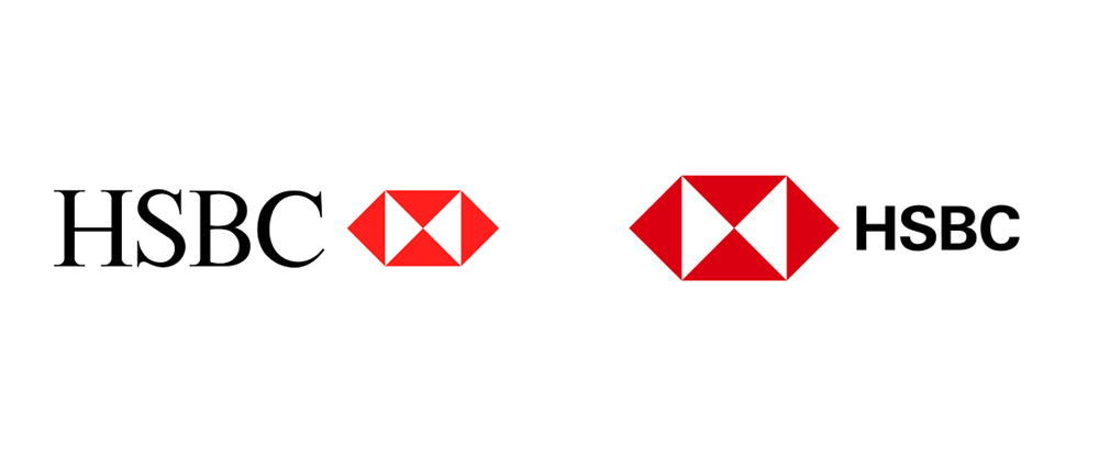
HSBC’s old and new logos Comparing the old and new logos, we can find that the graphics have not changed, but the graphics and fonts have been swapped left and right, and the fonts have been changed to more recognizable sans serifs; at the same time, the red color has been deepened to make It is thicker; the typeface in the composition becomes relatively small, accentuating the logo graphic.

Chinese and English combination of HSBC's new logo.
Some pictures/texts in this article are copyrighted by HSBC andMr. Xu HanwenIf you reprint, please be sure to indicate
-
Welcome to pay attentionMost Design subscription number!
Past Tweets Hi! China Feng!
Holy shit! Coco's new packaging is designed like this?
I also want such a beautiful medicine packaging!
Unexpectedly, the 14th Winter Games will present the emblem with the word "Winter" again!
Belgian watchmaker MaisonDeGreef rebrands for 2048!
Beilin, beilin, you made the admission notice so beautiful, what's the matter? ? ?
Articles are uploaded by users and are for non-commercial browsing only. Posted by: Lomu, please indicate the source: https://www.daogebangong.com/en/articles/detail/HSBC%20your%20Chinese%20font%20should%20be%20designed%20like%20this.html
 支付宝扫一扫
评论列表(196条)
测试