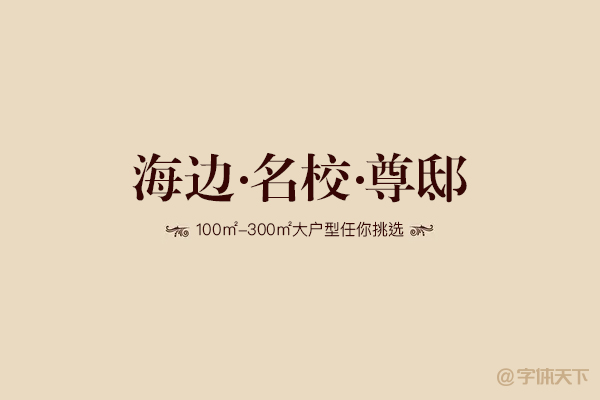
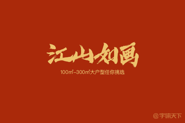
The real estate industry has been popular for more than ten years, housing prices have been rising, and the skills of graphic designers are also soaring. The advertising of the real estate industry has always been based on luxury, dignity, and grandeur. The characteristics of words used are more appropriate: simple and elegant, generous, noble, and dignified.
Let me talk about the standard three-piece set of real estate advertising design, deep tones, textured background, and dignified fonts.
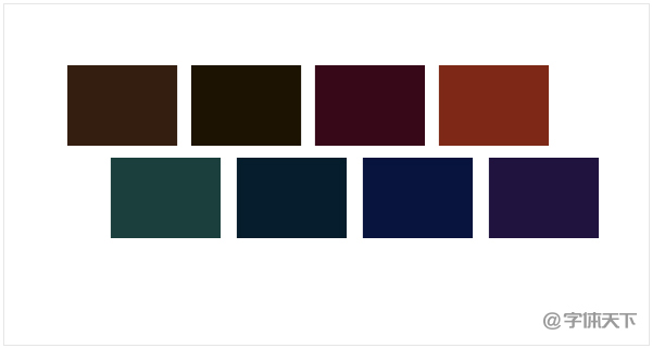
Dark tones
Most of the advertising screens are dominated by dark colors, with fonts or graphics in golden colors. The whole screen is calm, luxurious, and high-end. The following picture shows a few commonly used colors. In short, no matter what color system you use, as long as it is dark and gold, you can't go wrong.
Textured background
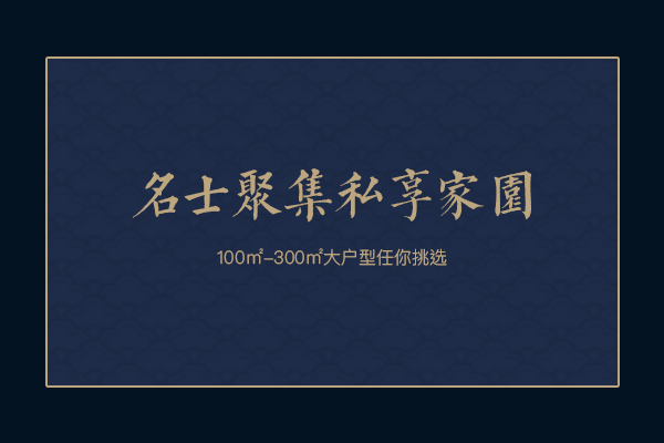
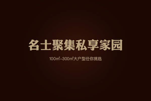
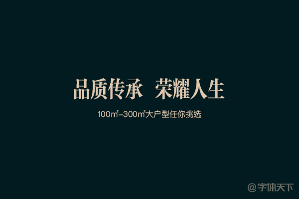
The shading background is the most used in the design of the real estate industry. No matter how monotonous the picture is, as long as the shading is added, the picture will immediately become rich and textured.
Atmospheric font
Most of them are HeiTi, SongTi, Variety, and Calligraphy.
The following are some fonts commonly used in real estate design, and the editor has sorted them out for you.
1. The word Kutang Qingkai
The brushwork is bold and powerful, very crisp, and has a retro temperament.
2. Huakangli Golden Black W8
Huakangli's gold and black strokes are thick and sharp, with the dual characteristics of HeiTi and SongTi. Just like its name, it is very gorgeous and atmospheric.
3. Shangya, a character-making workshop
The strokes are strong and powerful, and the typeface is soft and elegant, similar to the rough Song Dynasty.

4. Han Yizhong Song Bamboo Slips

5. Founder, elegant and long
Slightly thicker than Zhongsong, the font is more slender, and the font is beautiful and elegant. It is a good choice for the title. Note: Founder fonts can be downloaded for free as long as you log in and register as a designer on the official website.
6. Founder Small Standard Song Simplified
Small standard Song typeface is wider than other Song typefaces, and is generally used for government red-headed documents.
7. Hanyi Qinchuan Feiying
It is a calligraphy font. The strokes are sonorous and powerful, like two knights waving swords and swords. It has a very classical temperament.

8. Chaozishe Lingdu Kunpeng bamboo slips
The font itself has a little flying white, full strokes, sharp turns and slightly inclined fonts, making it look like a Kunpeng soaring in the sky.
Articles are uploaded by users and are for non-commercial browsing only. Posted by: Lomu, please indicate the source: https://www.daogebangong.com/en/articles/detail/Graphic%20design%20benefits%20%20summary%20of%20fonts%20commonly%20used%20in%20the%20real%20estate%20industry.html
 支付宝扫一扫
评论列表(196条)
测试