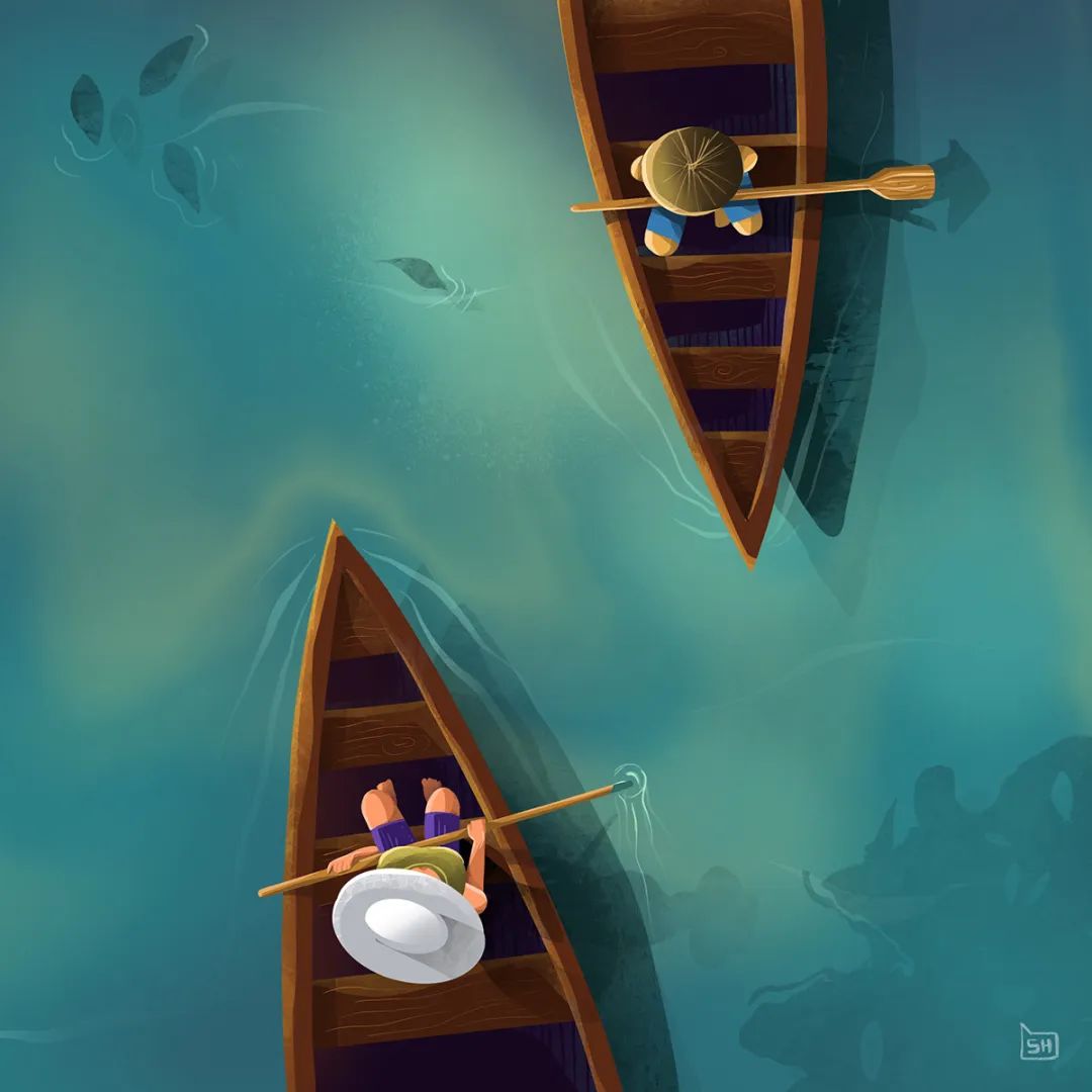
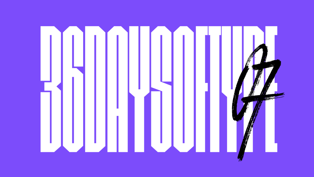
Have you ever tried to use the "punching card" method to insist on continuous design creation for a period of time? If this "daily design exercise" becomes a competition, what kind of works will designers with different styles collide with? Design a work every week or every day to exercise your skills and accumulate inspiration. Such projects are not uncommon in the design industry. Another Shanren once designed a poster every week and created the "Weekly Out to Sea" series; American designer MarsMaiers continued to design posters every day for more than 1,000 consecutive days (click here to learn more about MarsMaiers' works). ... and two designers from Barcelona, Nina>
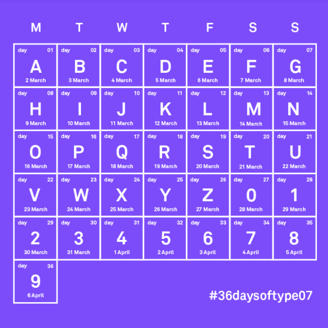
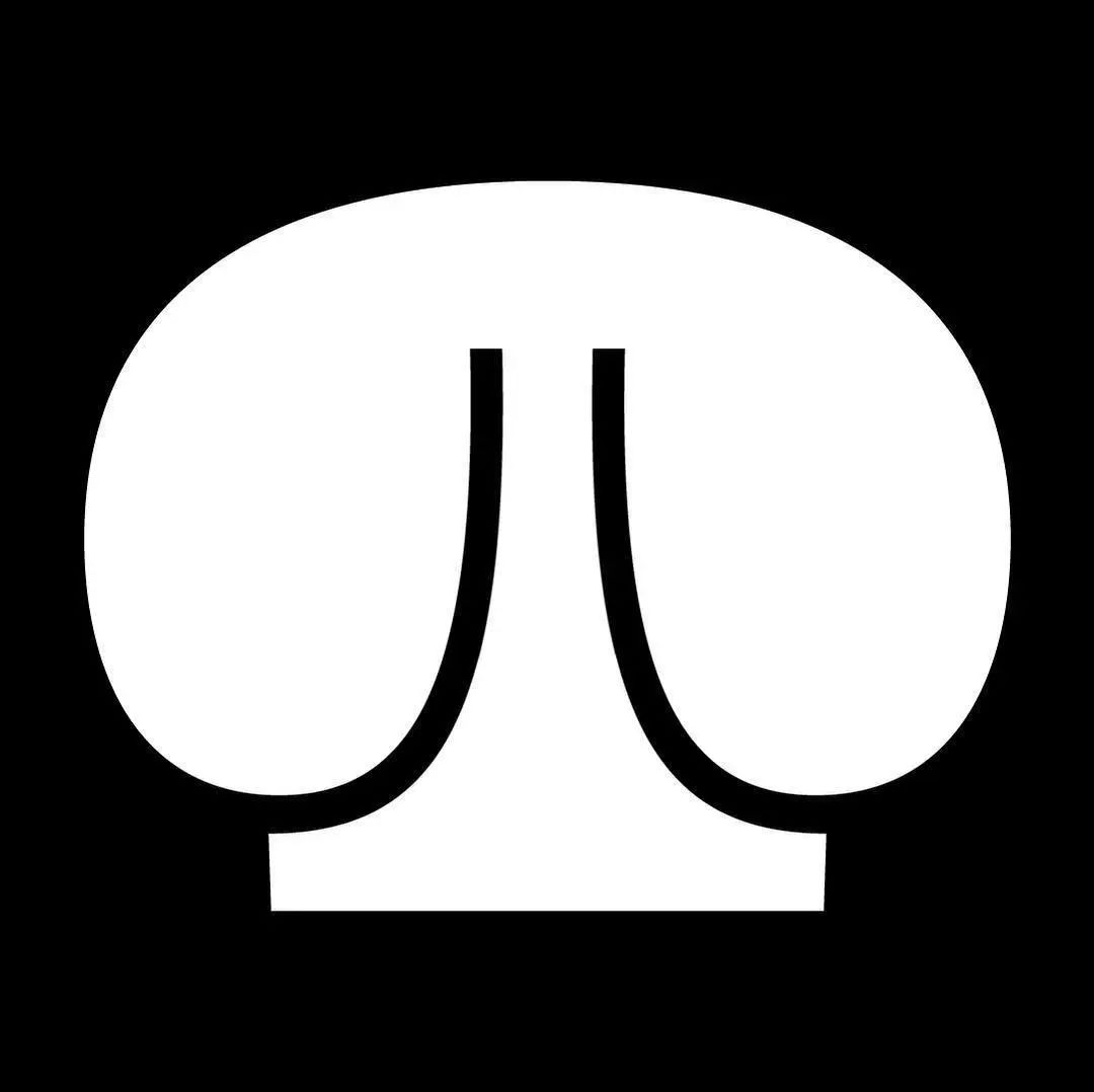
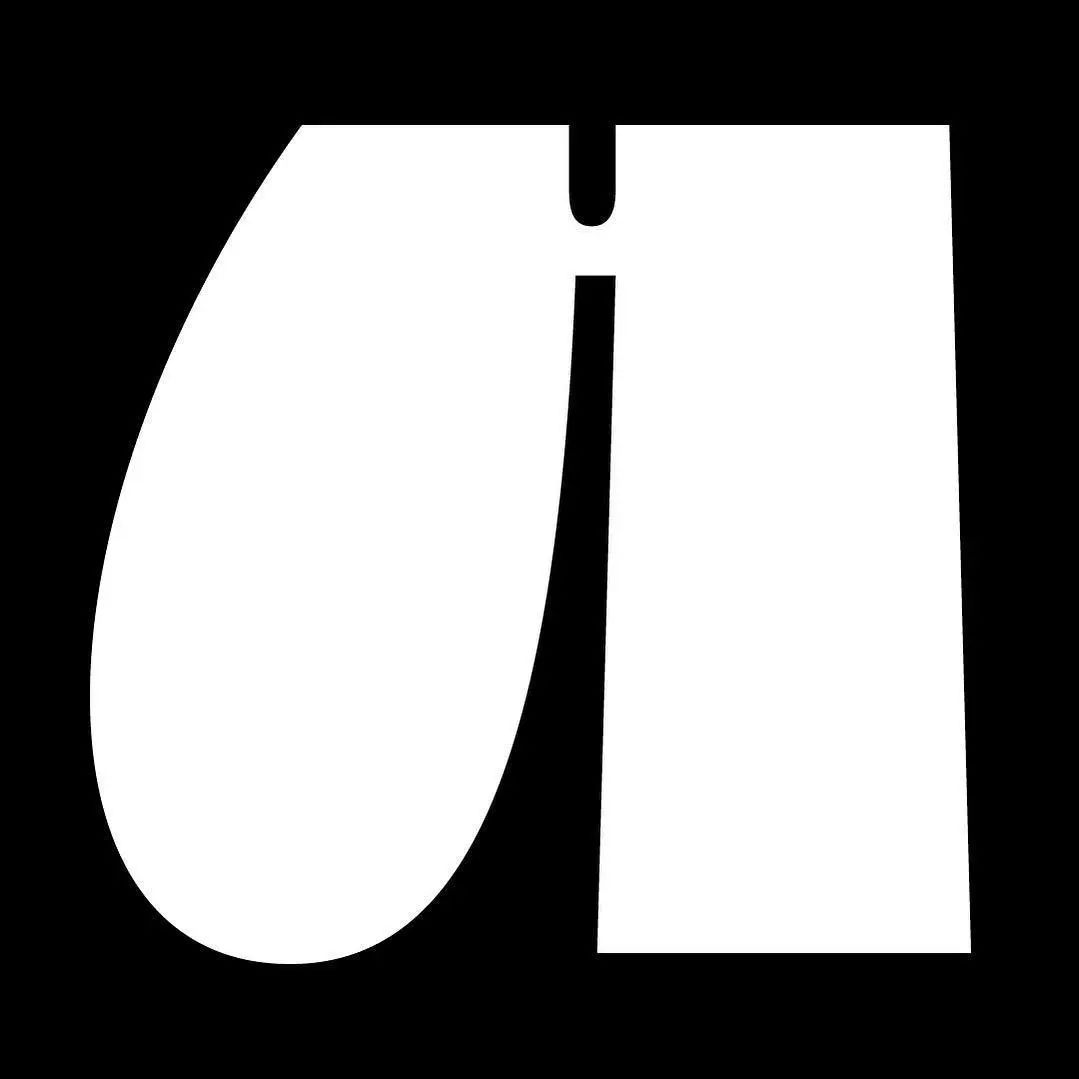
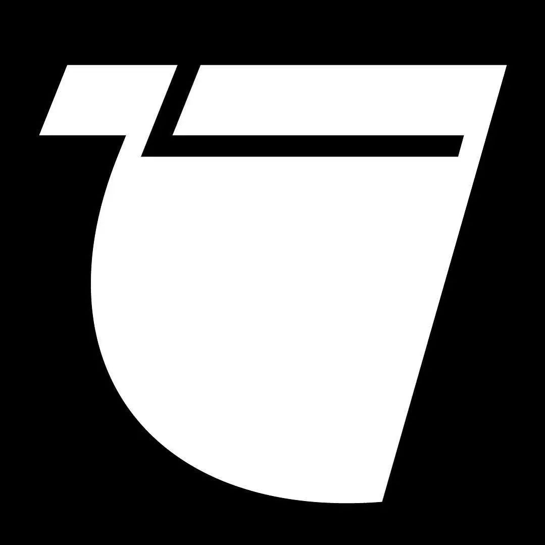
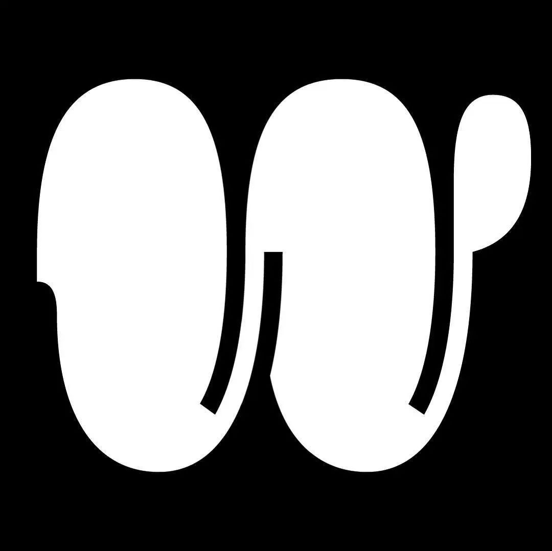
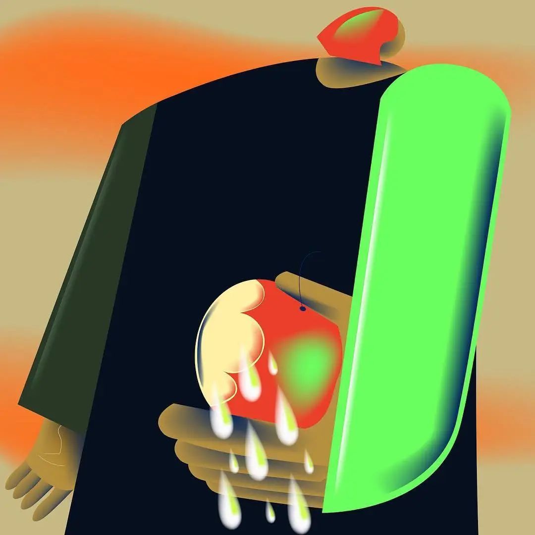
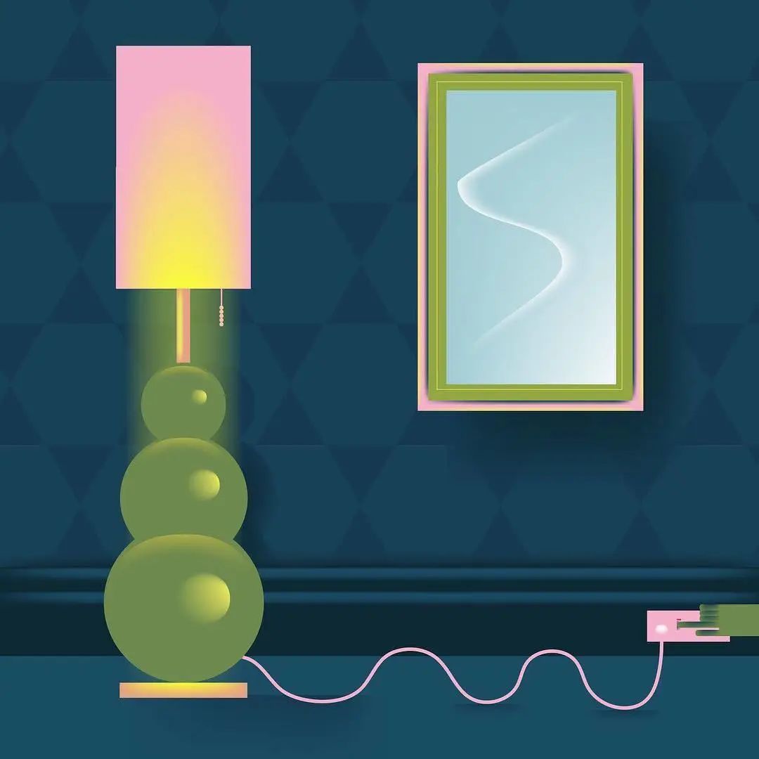
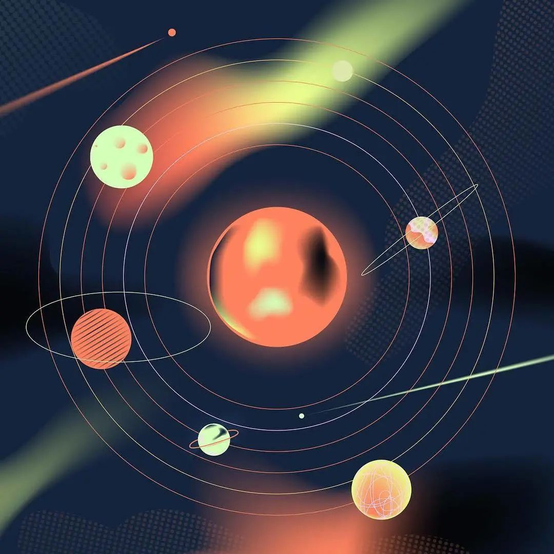
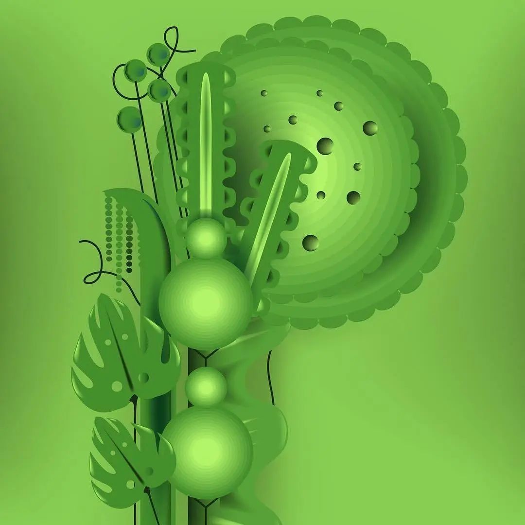
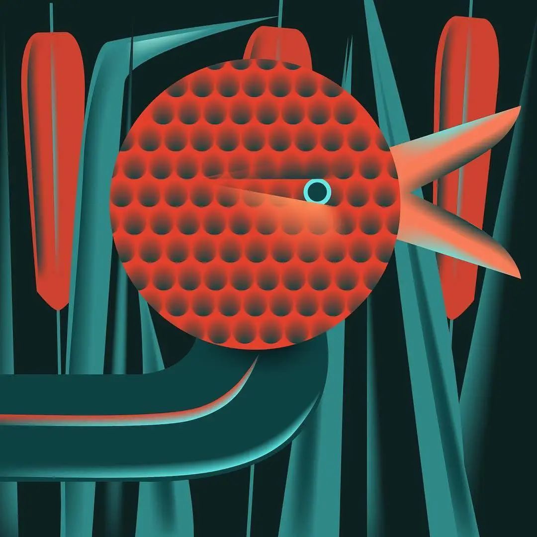
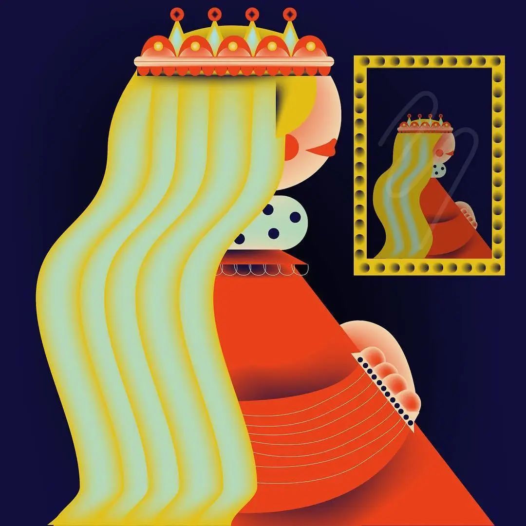
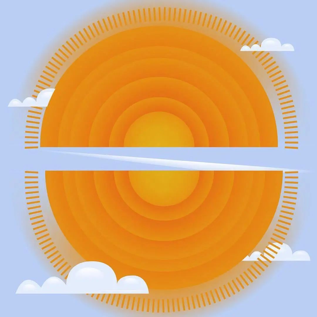
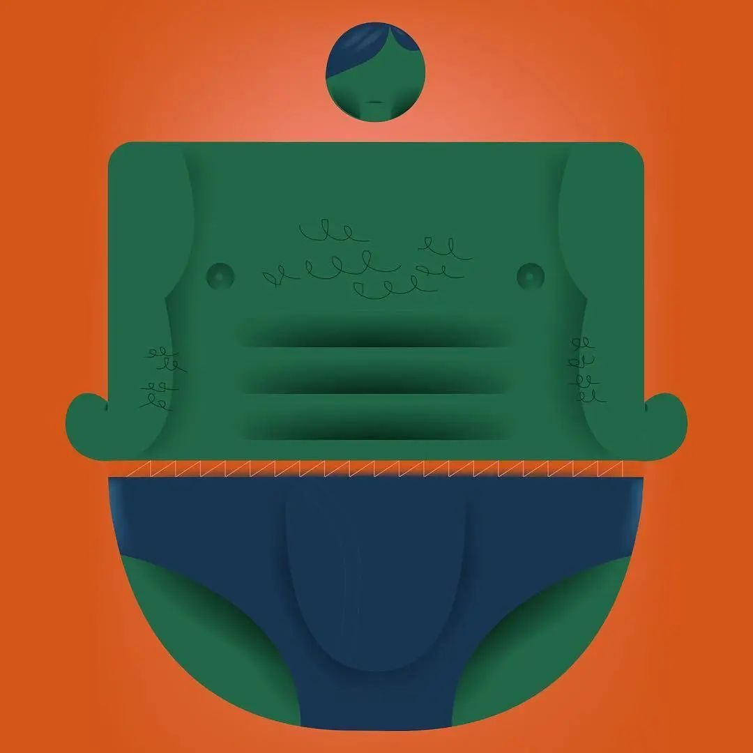
Examples of designers uploading works on Instagram to participate in this project in 2019
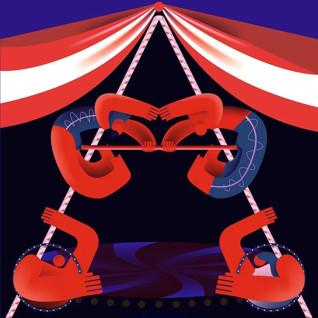
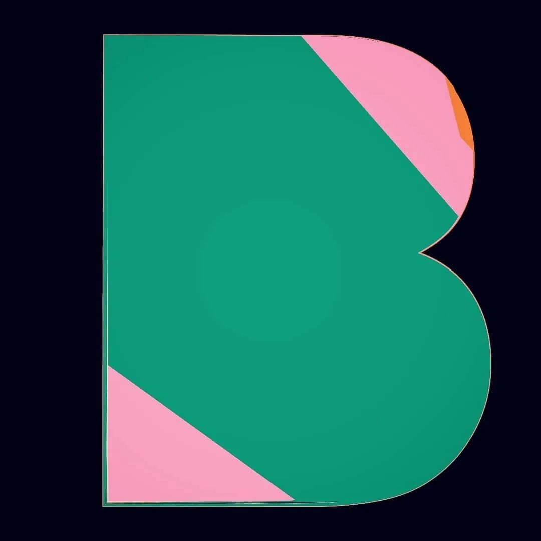
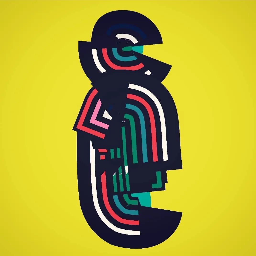
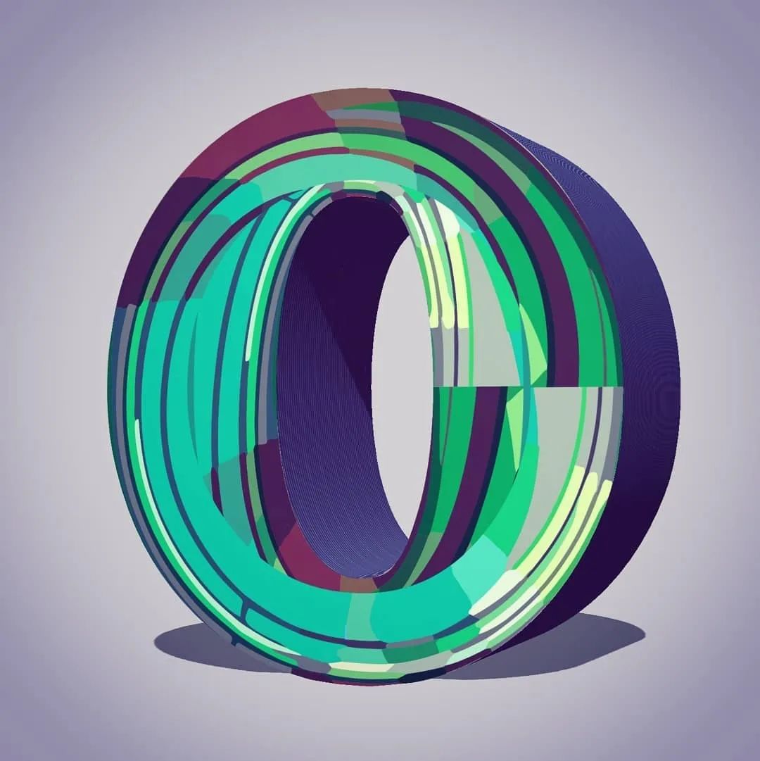
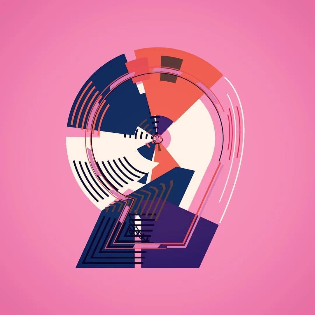
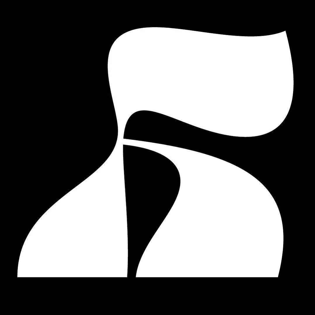
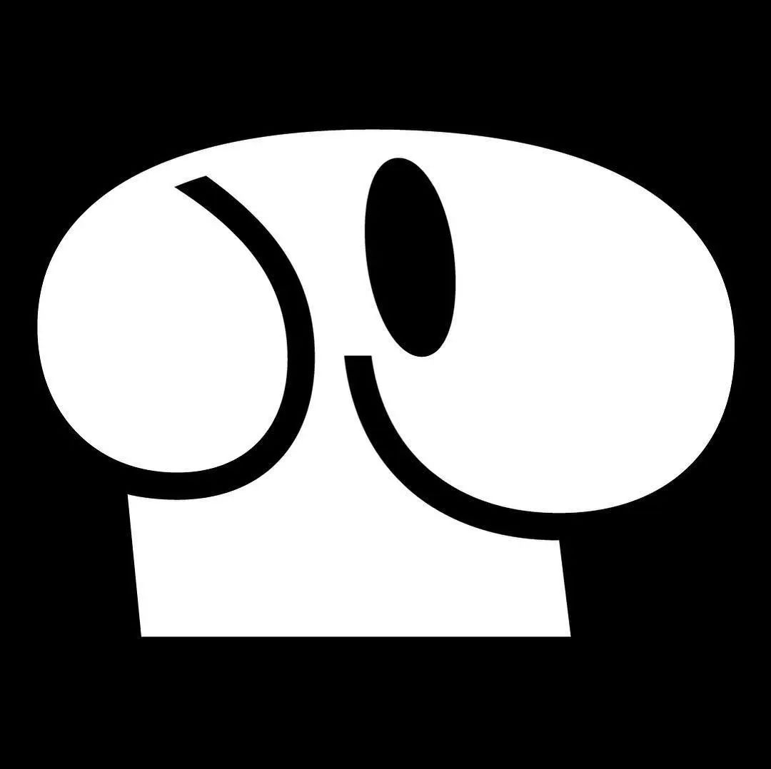
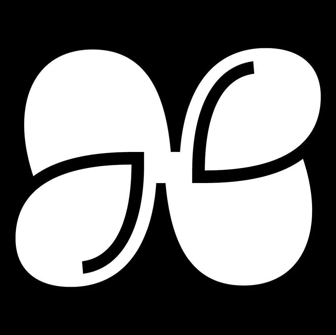
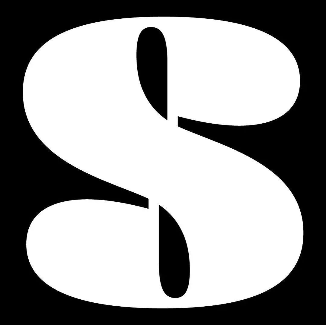
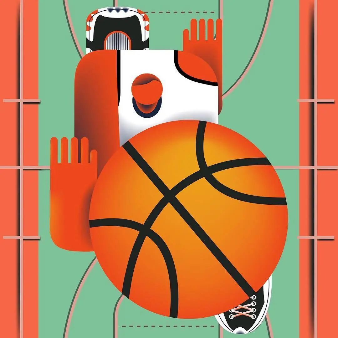
and Rafa decided to cooperate with Adobe Cooperation, select six groups of the best works among many participating font designs, and present their creators with a one-year creative>JulieFeatherstone, LewisMacDonald, ShakthiHariNV, JessEbsworth, LiamBevin and ZaiDivecha. Design360° will share their award-winning design works, as well as the introduction of graphic designer and critic Yves Peters on AdobeBlog. 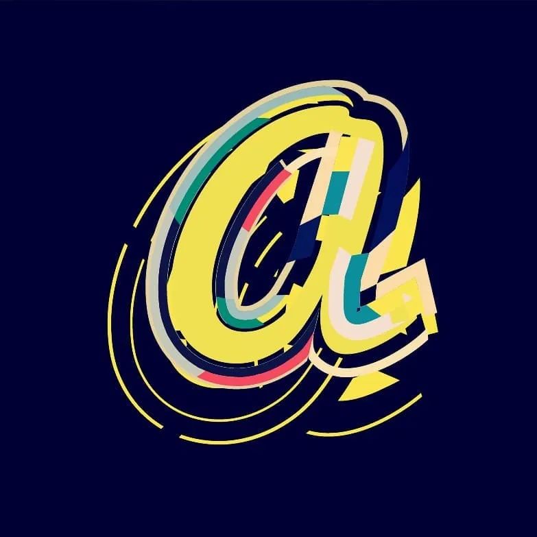 JulieFeatherstonePersonal official website: www.behance.net/juliechicagoJulie is a designer at Ogilvy & Mather in London. She usually does personal illustrations and artistic creations in her spare time. A graduate of Central Saint Martins College of Art and Design, she has become increasingly interested in illustration and typography in her design practice. In her 18 years of design work, she has also successfully applied illustration and typography to some clients' design projects.
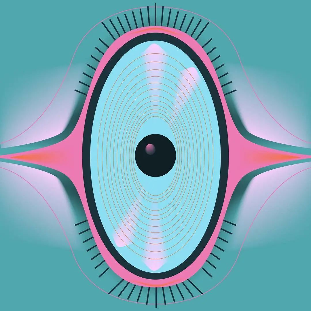
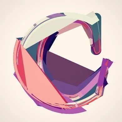
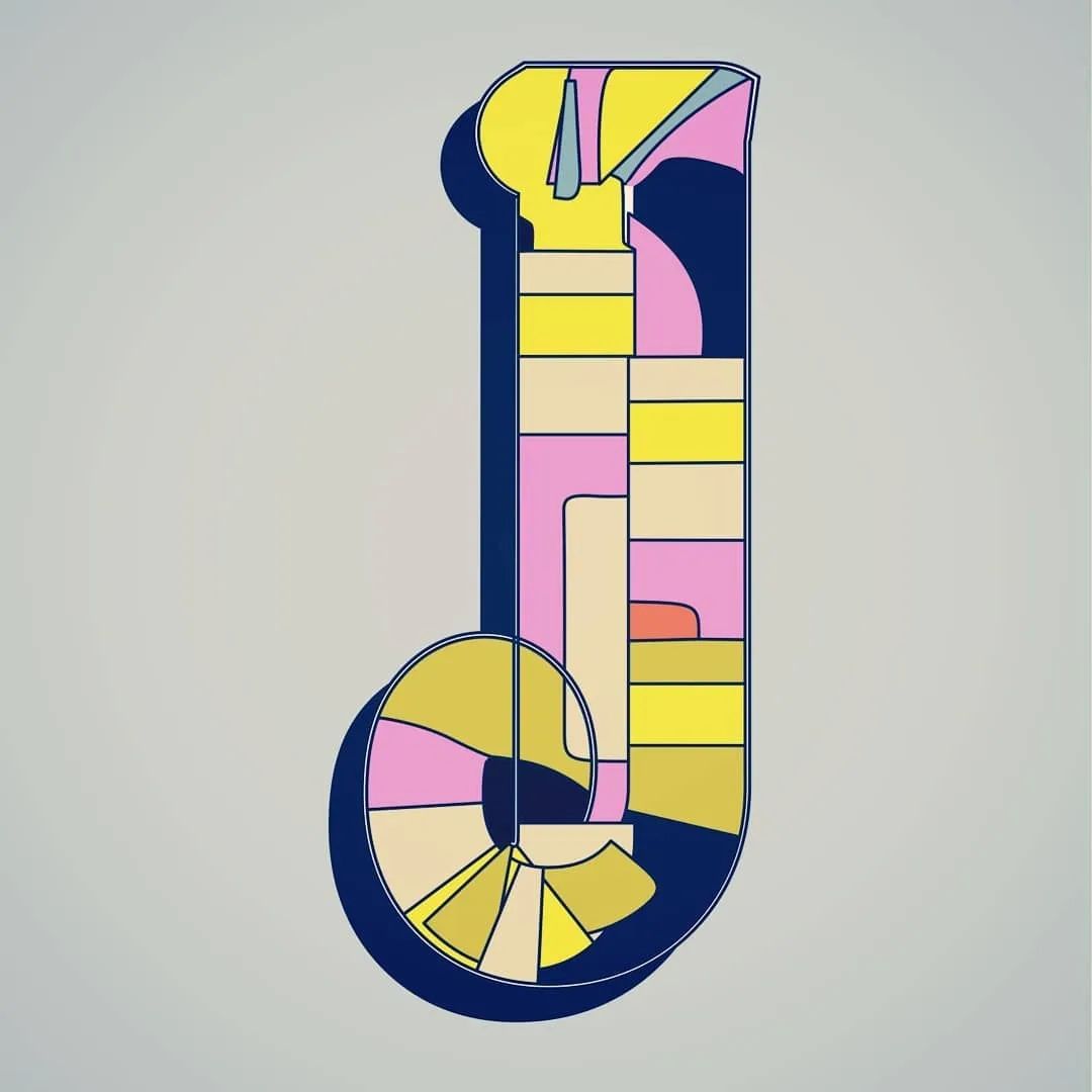
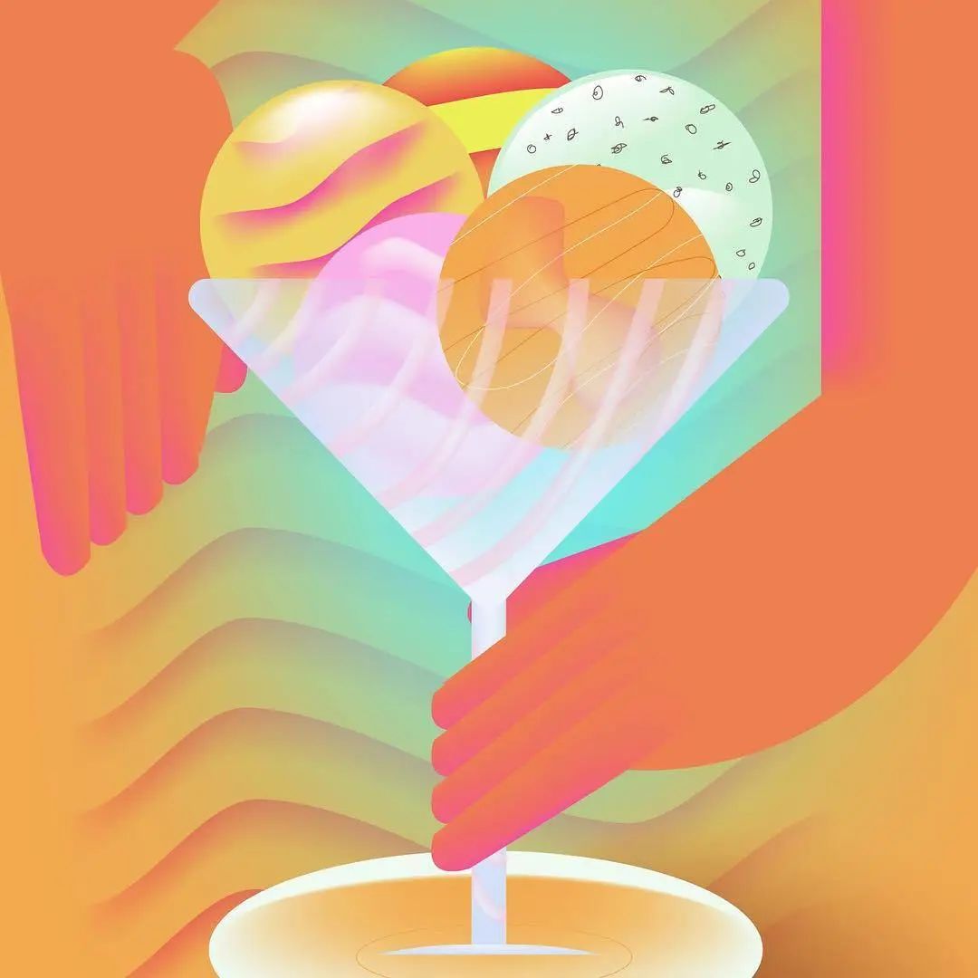
 In recent years, she has learned to create custom vector brushes in AI and apply them to her own font creation . According to Julie, this required a lot of experimentation and fine-tuning of layers, width, color and brightness. Julie has been following "36DaysofType" on Instagram for a long time. Last year, she decided to enter the competition with a few colleagues. "We encourage each other to keep going and push ourselves to create something new every day. I also love that each of us has a different style."
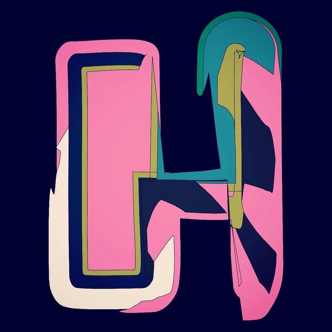
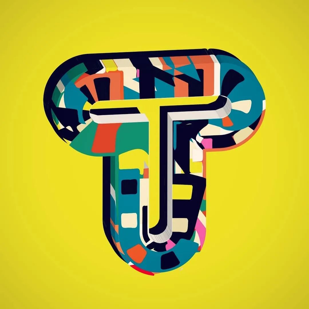
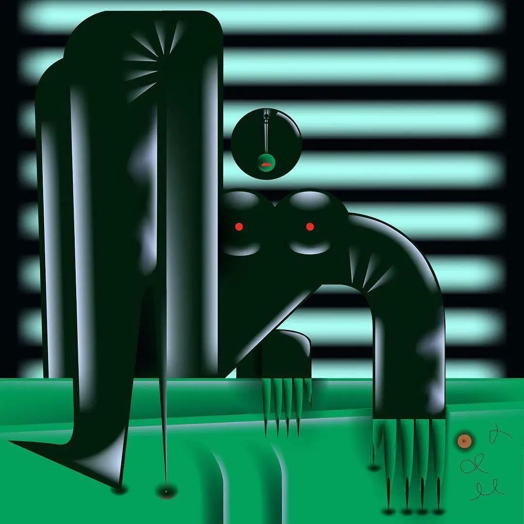
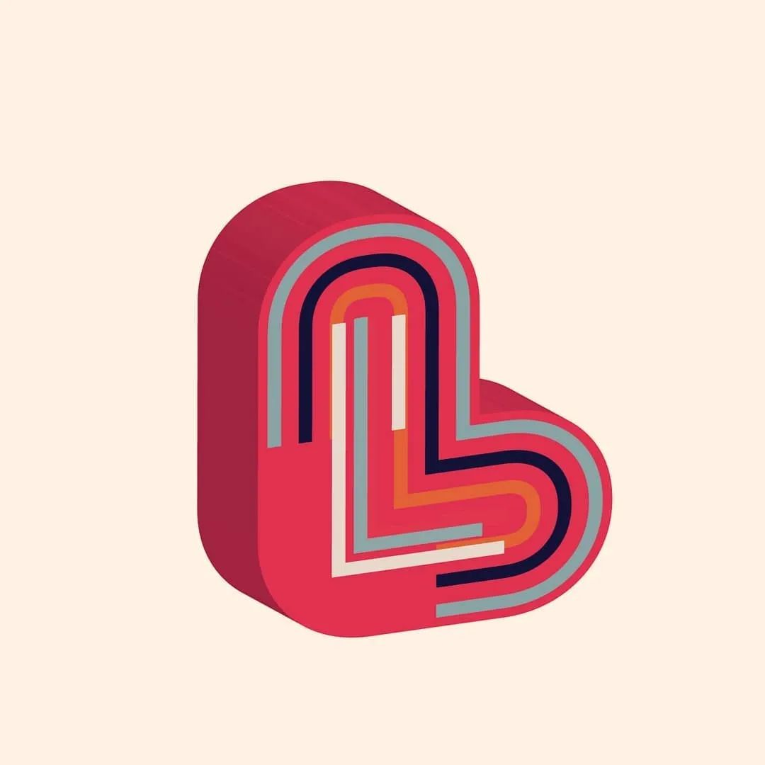
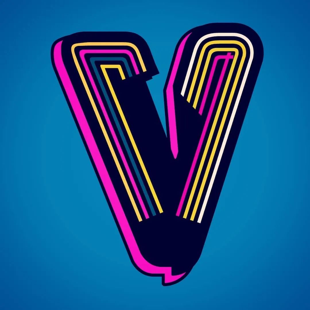
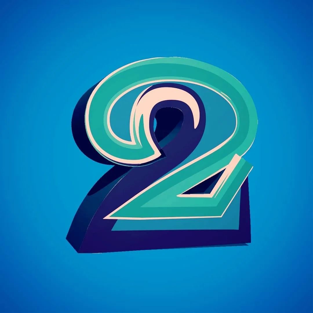
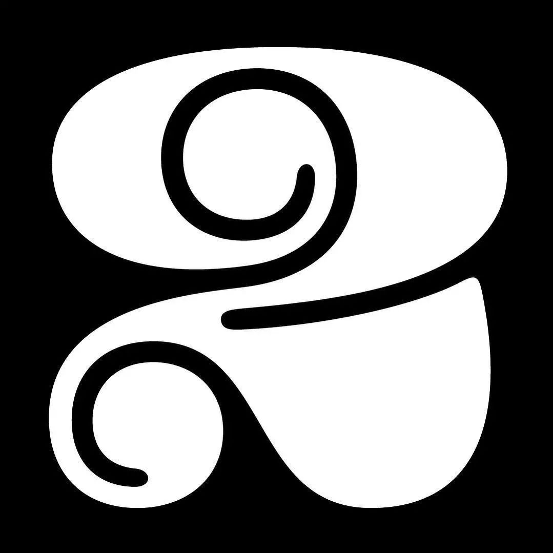
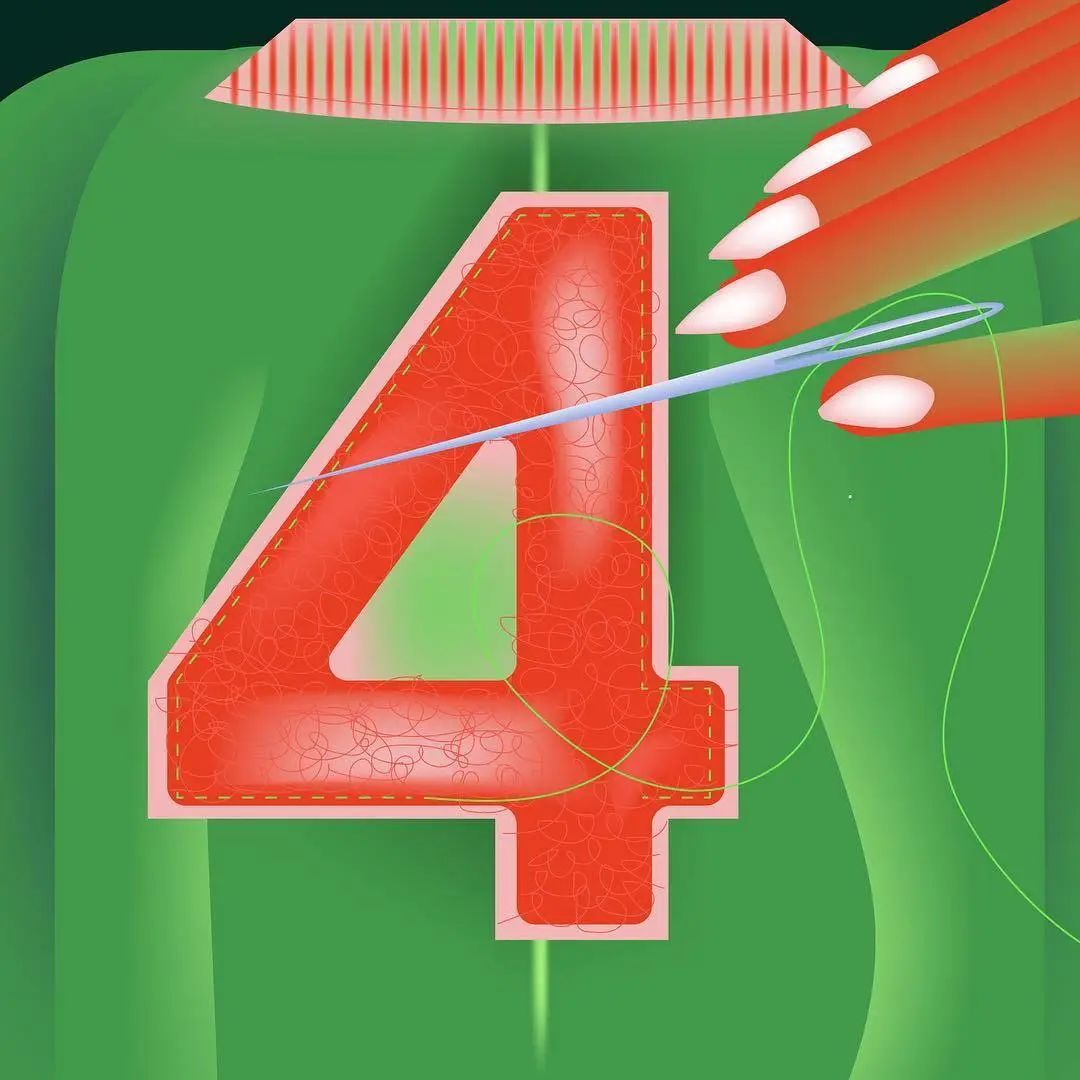
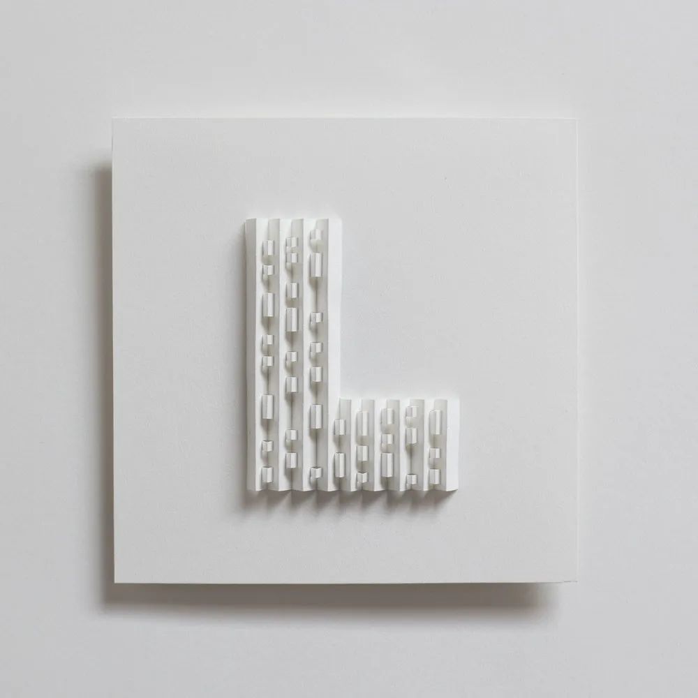
 Julie's conception of each font corresponds to her mood at the time. Plus, she'll discover new design techniques she's never used before while creating. For example, when designing "L", she found that the letter can be designed as a three-dimensional figure in PS. Sometimes she can directly sketch out the creative scheme that comes to mind, but most of the time she starts with an image or a set of colors, and then Slowly inspire yourself. "At first, I couldn't believe that I won, especially when I competed with so many well-designed works." Thinking of her award, Julie was very happy, "When the result was announced, my colleagues in the office cheered for me, it was great !"
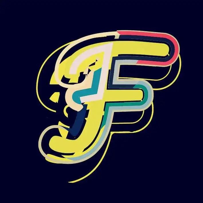
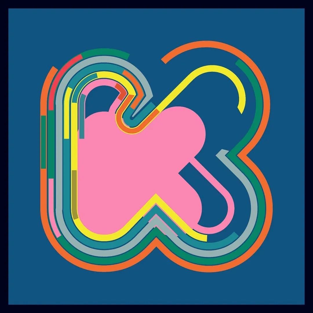
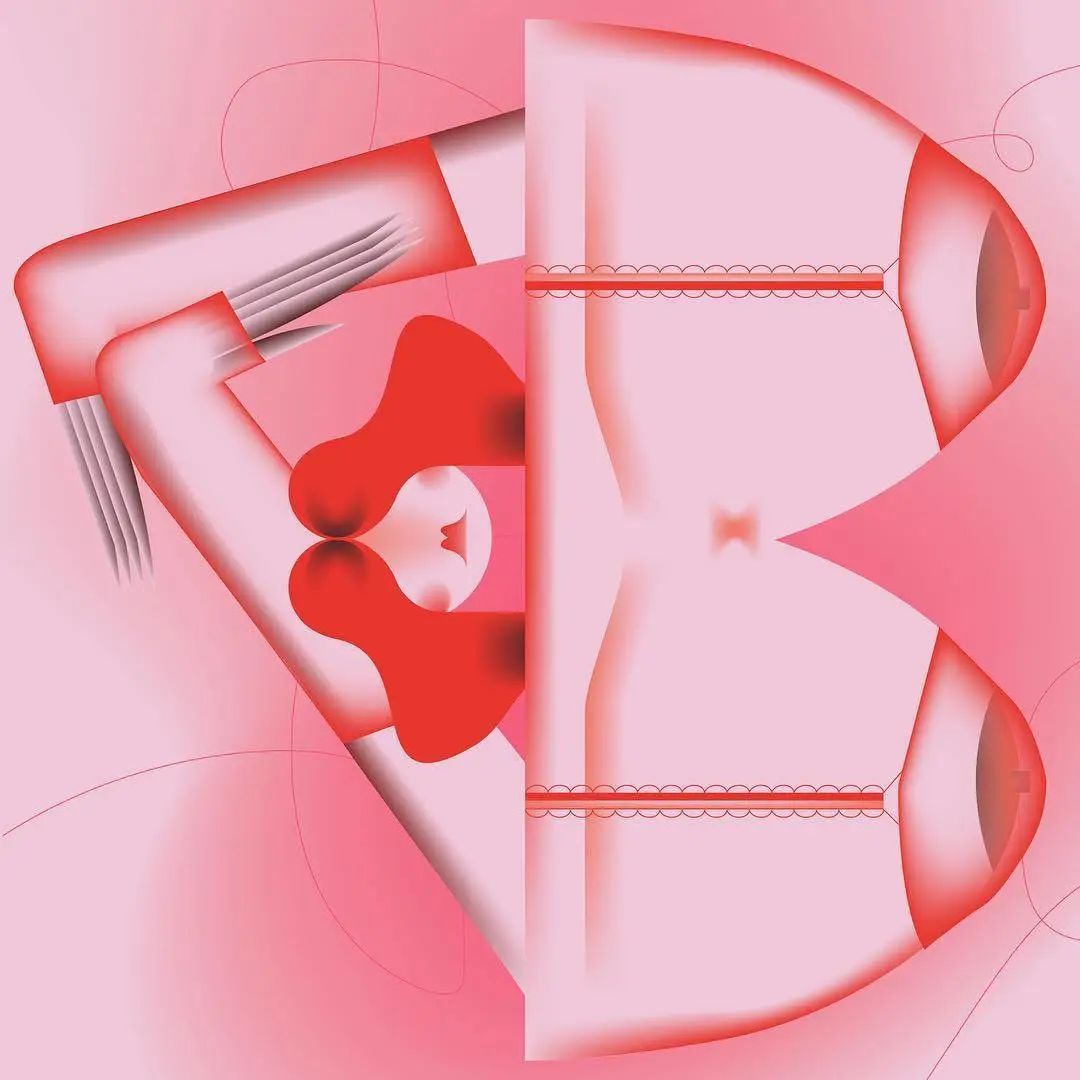
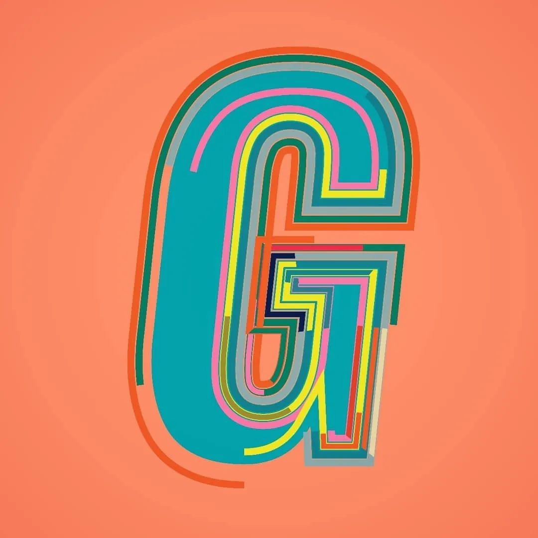
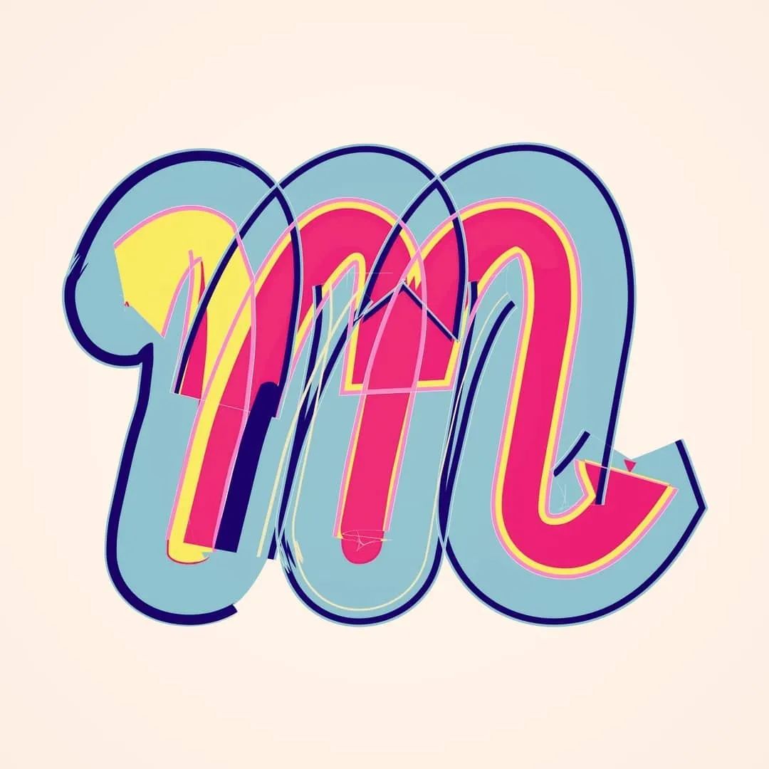
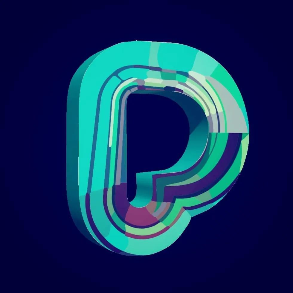
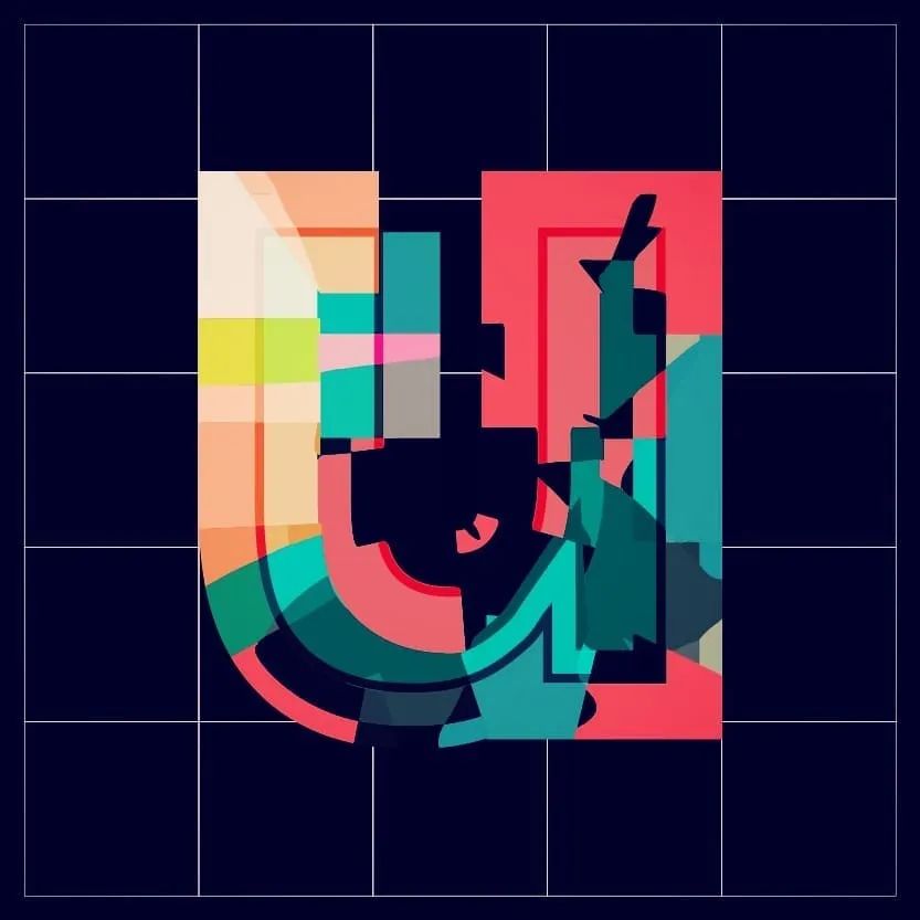
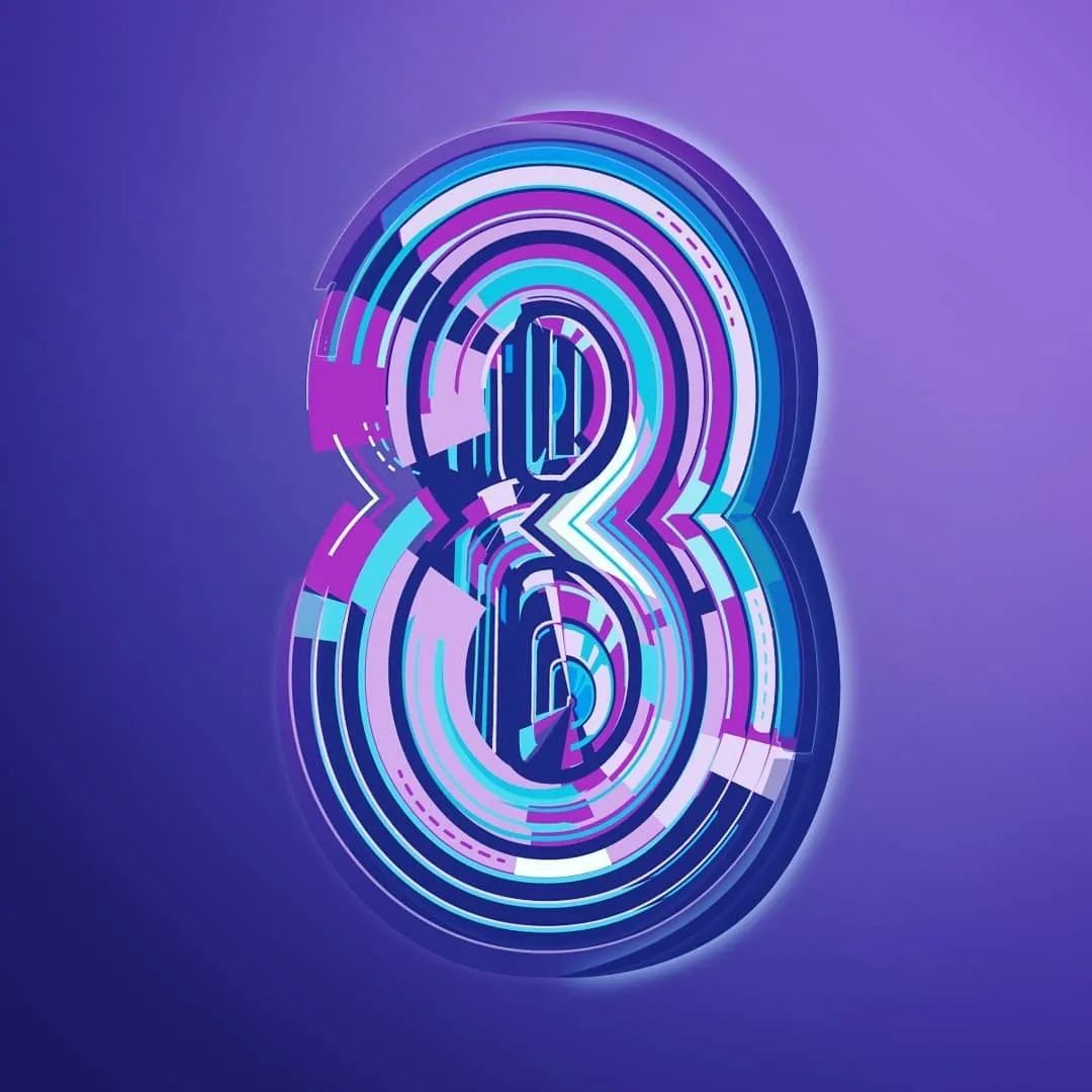
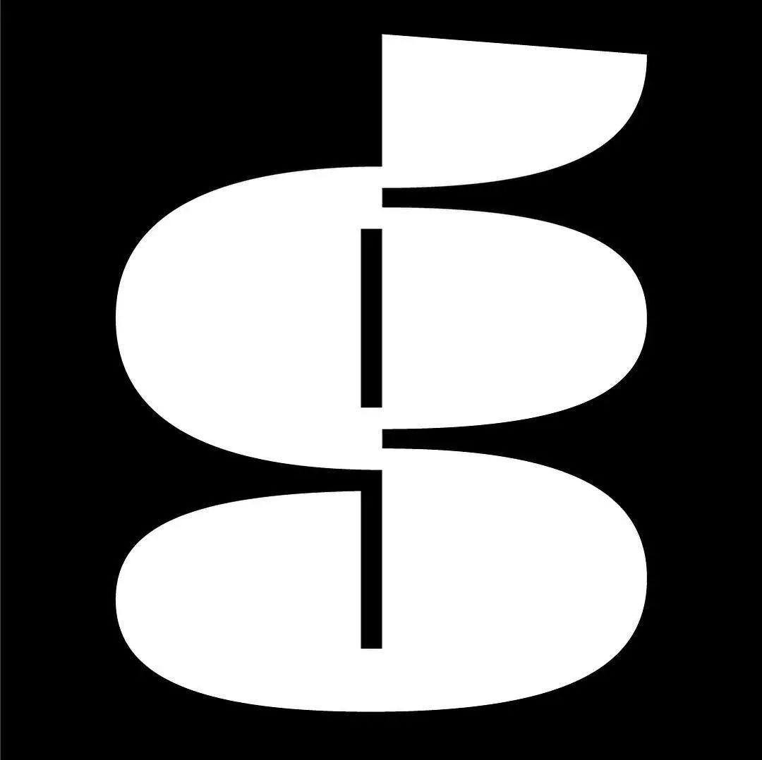
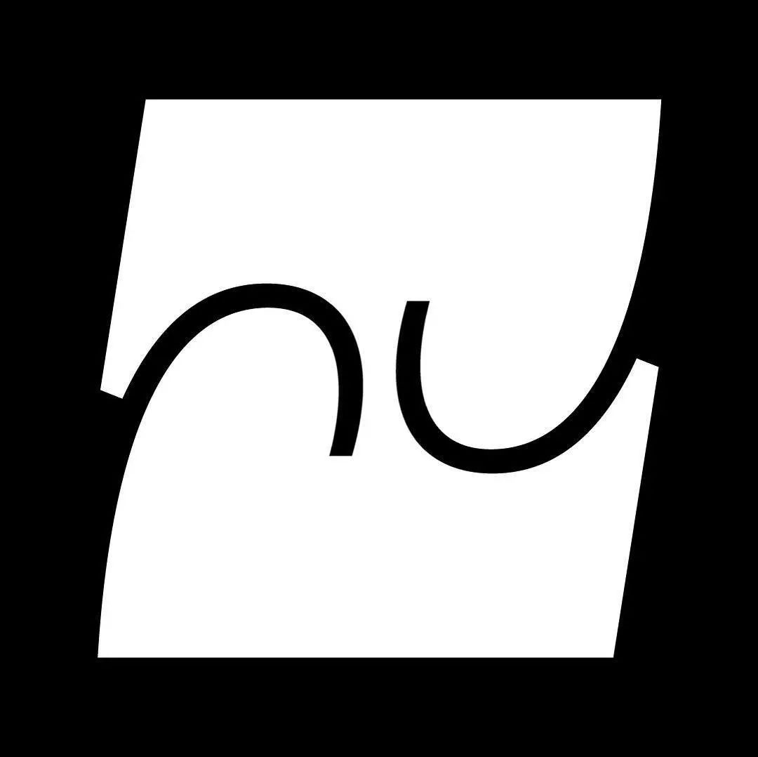
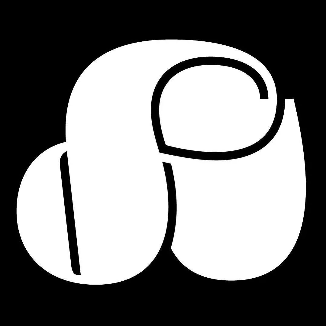
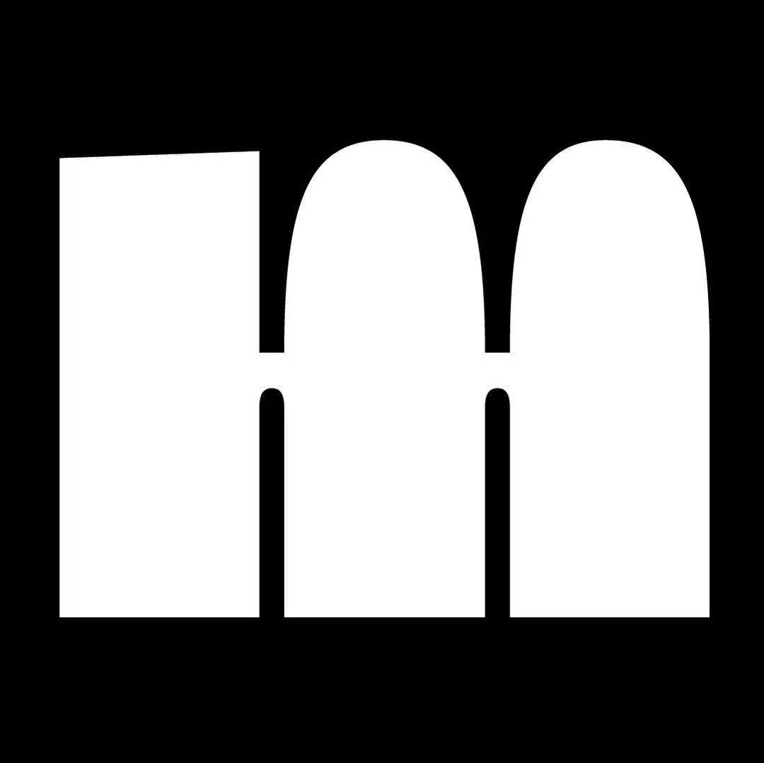
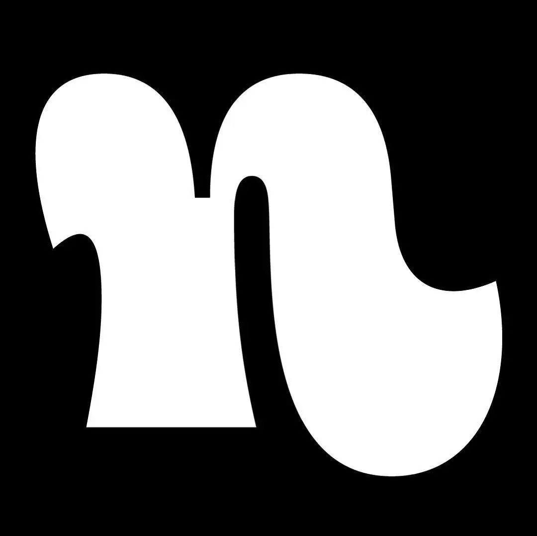
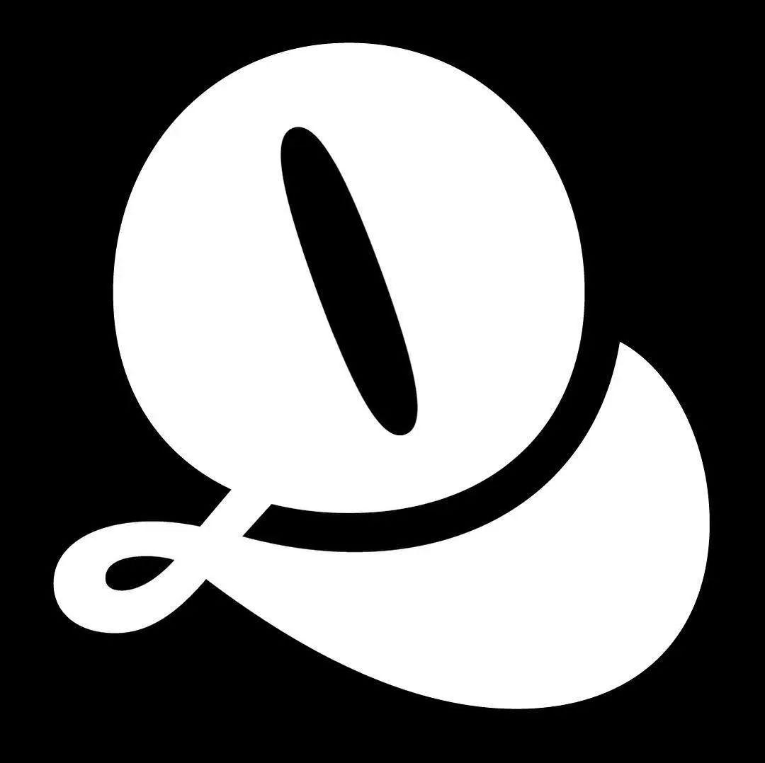
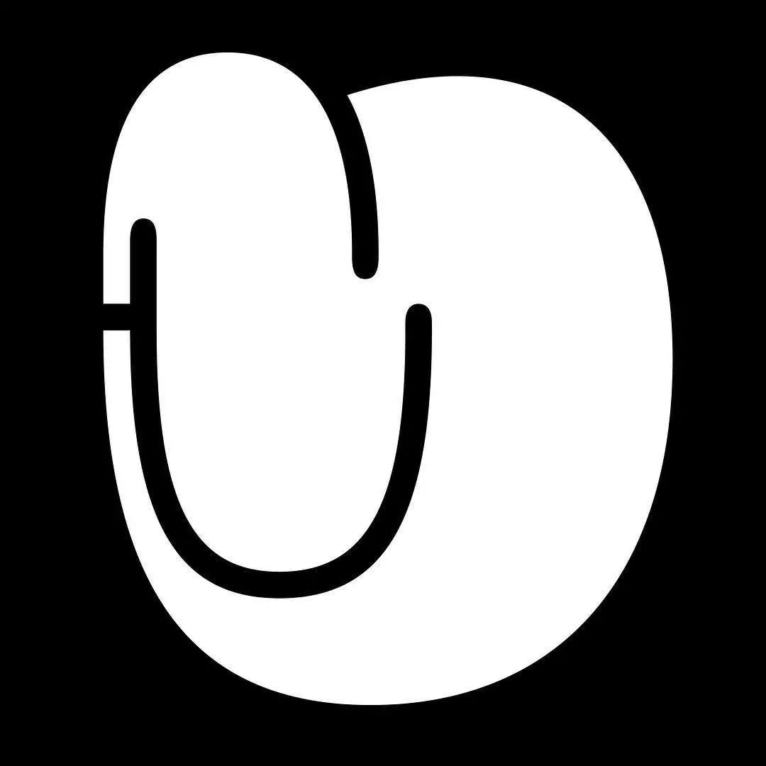
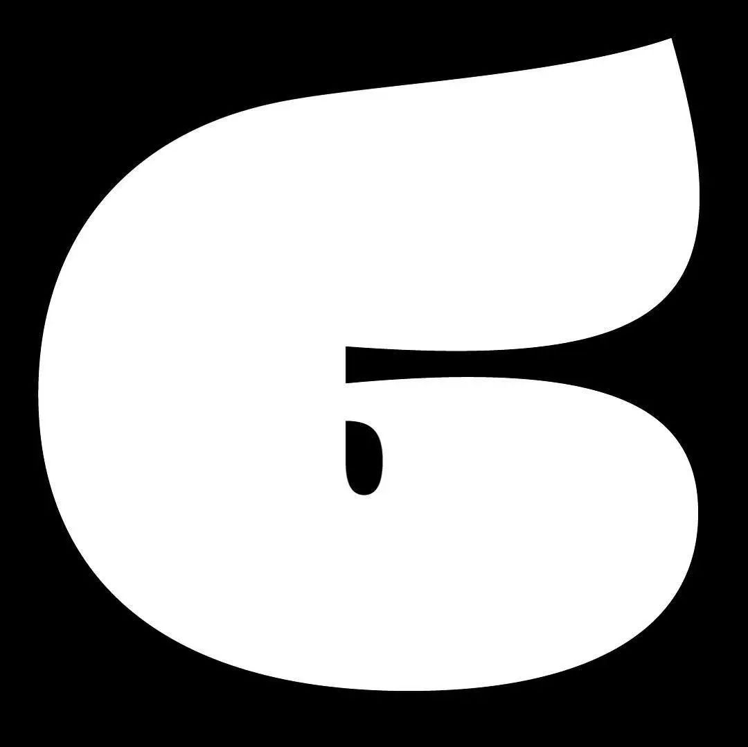
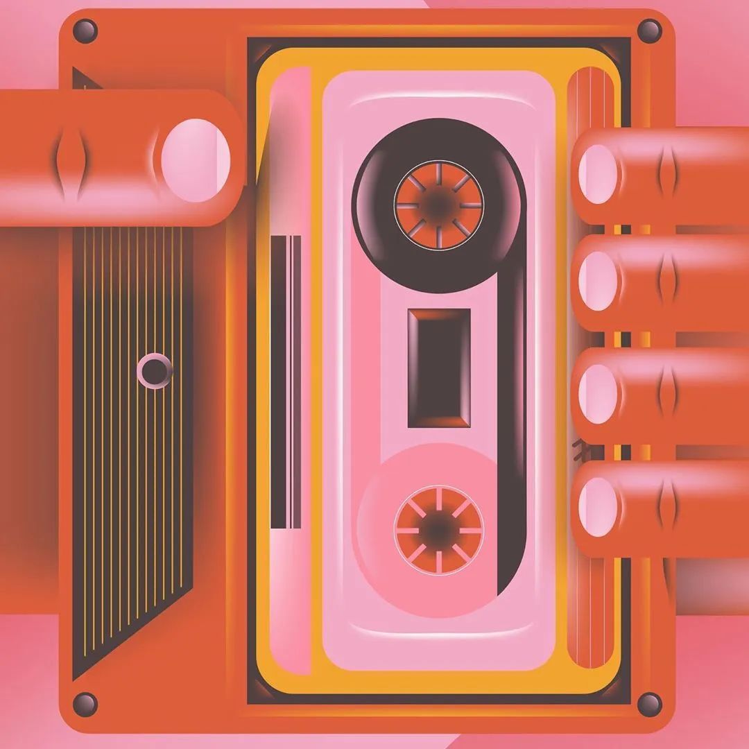
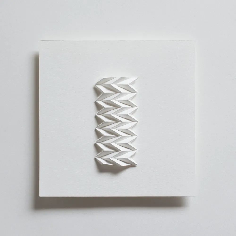
 < section>Personal official website: www.polytype.co.ukInstagram: @polytypefoundryLewis' font design is through his independent font design studio Polytype platform Published. When he was in college, he often designed posters and leaflets for school music and dance activities, and gradually began to pay attention to good-looking and excellent fonts, and could easily recognize many fonts. He was so obsessed with creating his own font that he even failed his final exam.
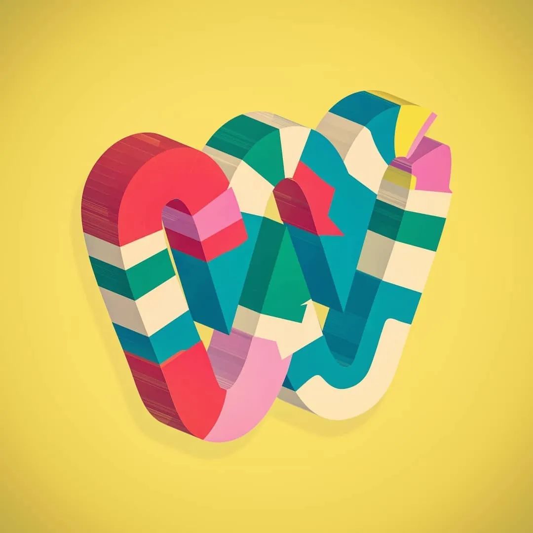
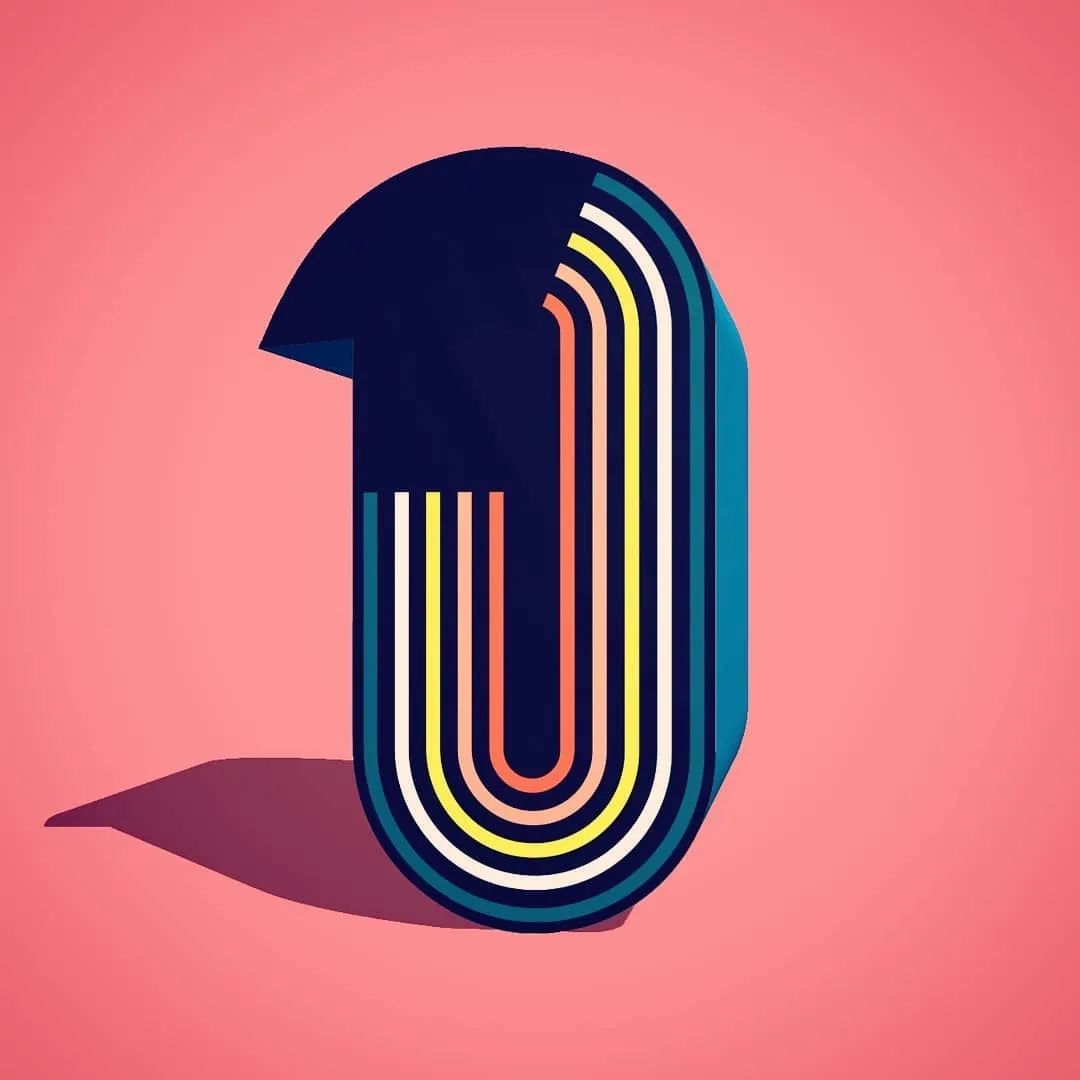
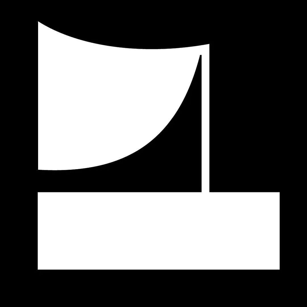
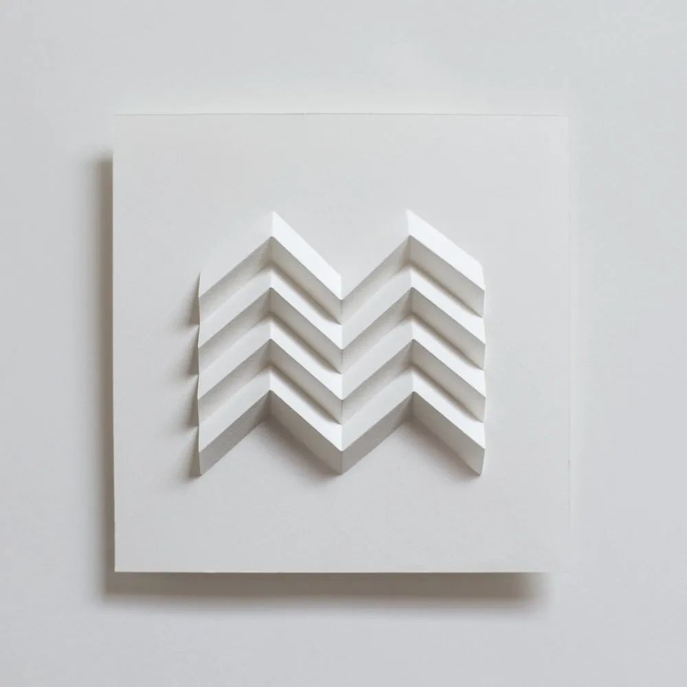
 Lewis sees the design of each letter or number as a new challenge. Every day, he would scribble whatever idea came to his mind, slowly refining it and exploring a bunch of variants, from which he would choose a favorite style. He sometimes staggers consecutive lines (as in the "F"), or shrinks connecting lines in typefaces (as in the "M" and "U"). "Drawing these shapes and figuring out how to fit all the elements together like a puzzle is very enjoyable and satisfying."
This is the third year for Lewis to participate in "36DaysofType", but it is the first time to complete it completely The whole challenge. He realized that the challenge had begun when he saw other people uploading the first day’s typography on Instagram! With past experience, he understands that if he misses a daily update, the whole progress will be lost Will fall behind and then lose motivation to complete the series. "Although it is difficult to make a work that I am satisfied with for a few days, overall, the whole challenge is going well, and I can always come up with something I really like."
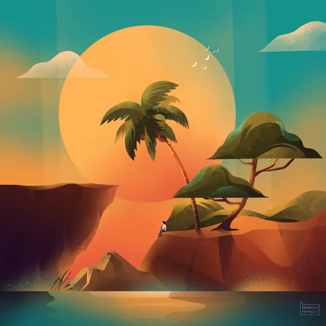
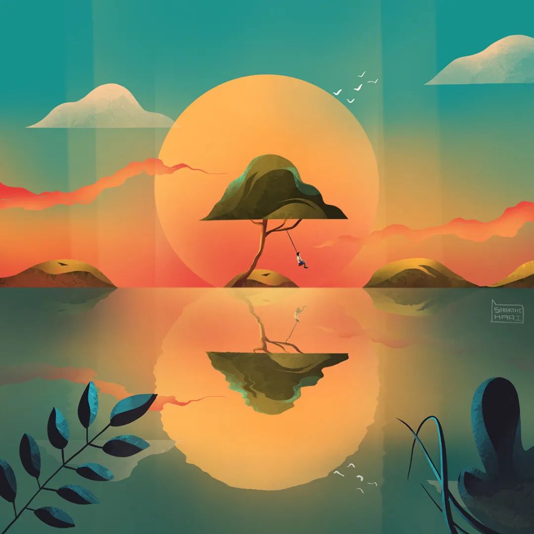
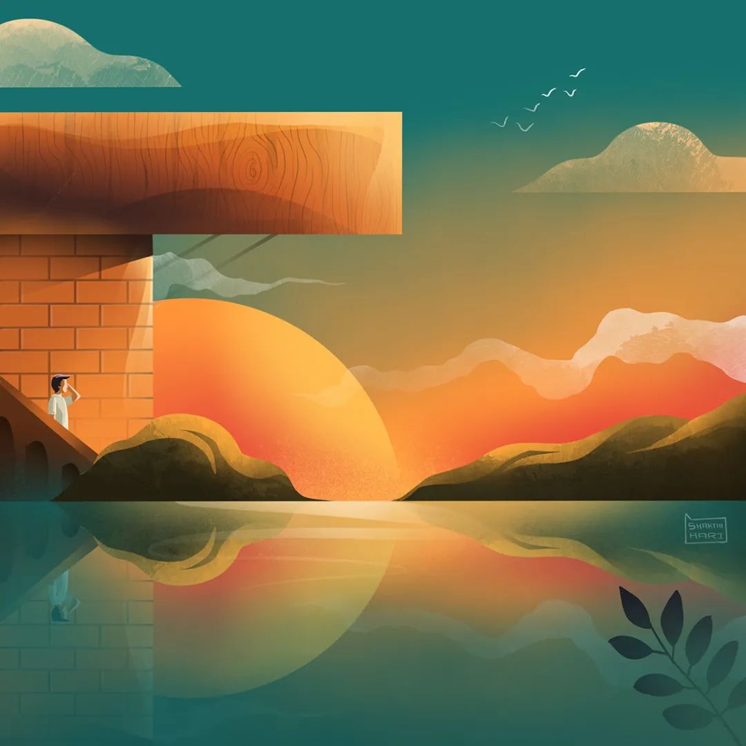
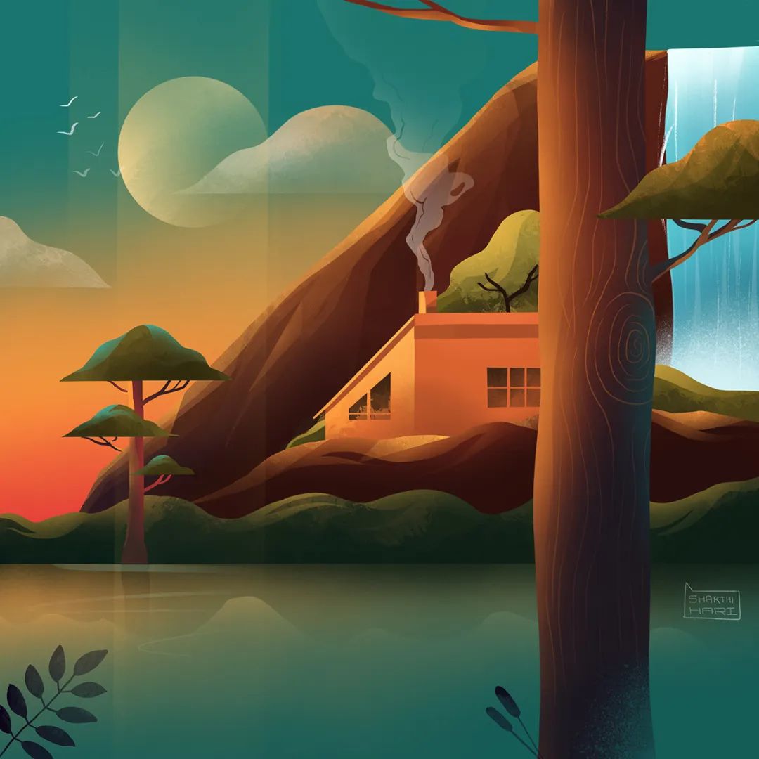
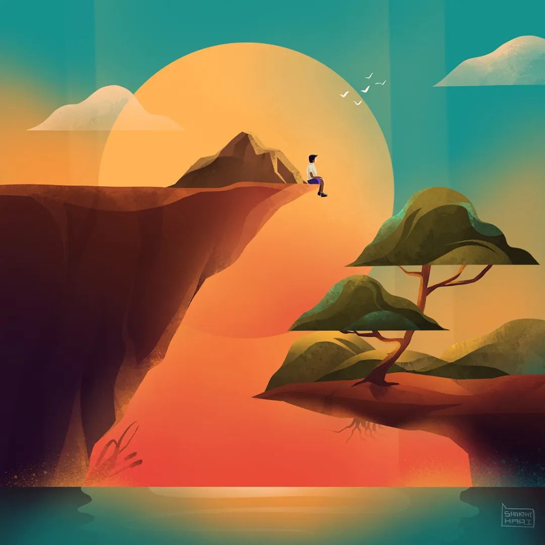
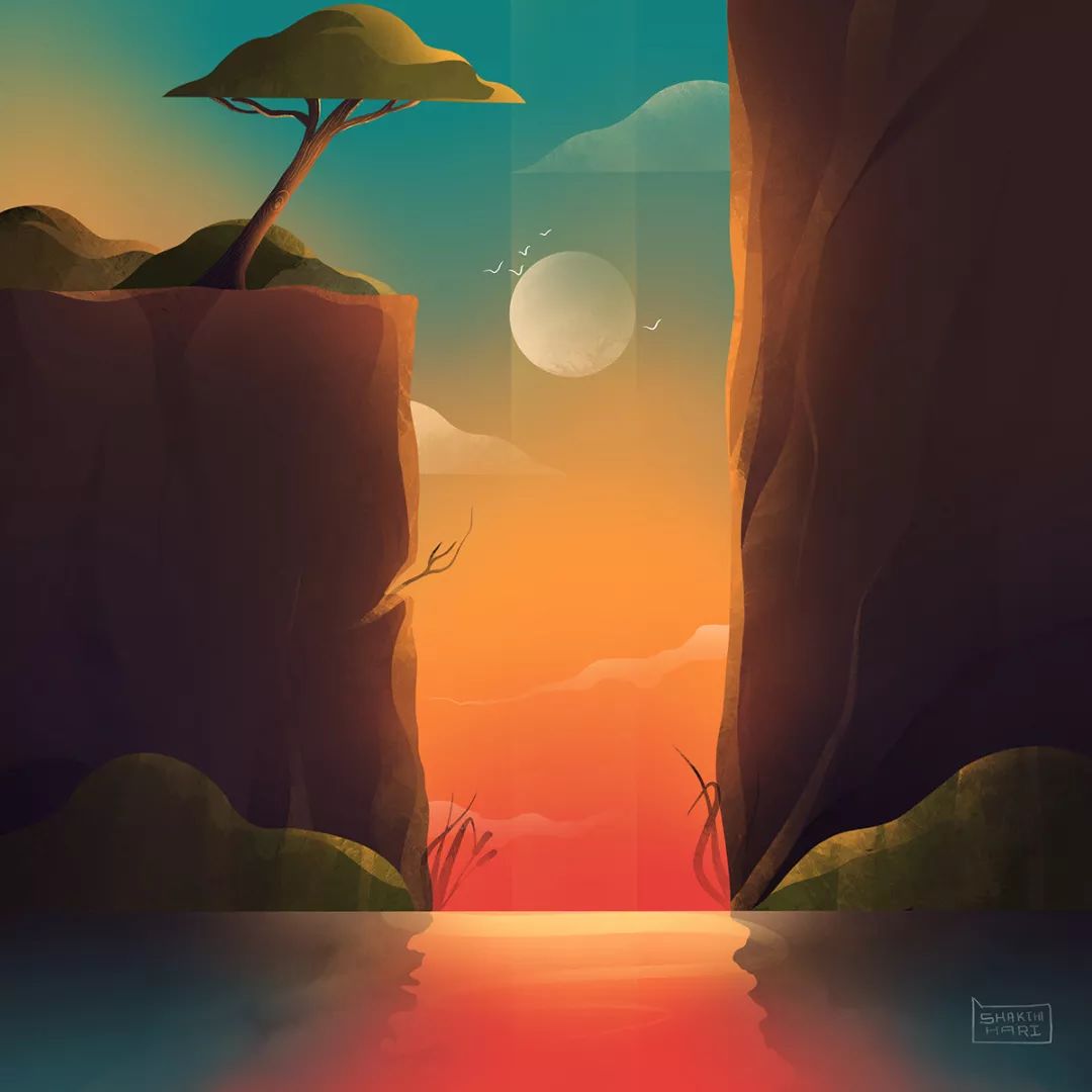
ShakthiHariNV
India, Tamil Nadu
Personal official website: www.dribbble.com/shakthiharinv
Instagram: @shakthiharinv
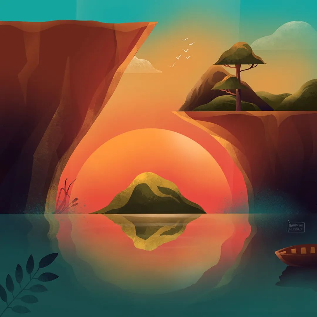
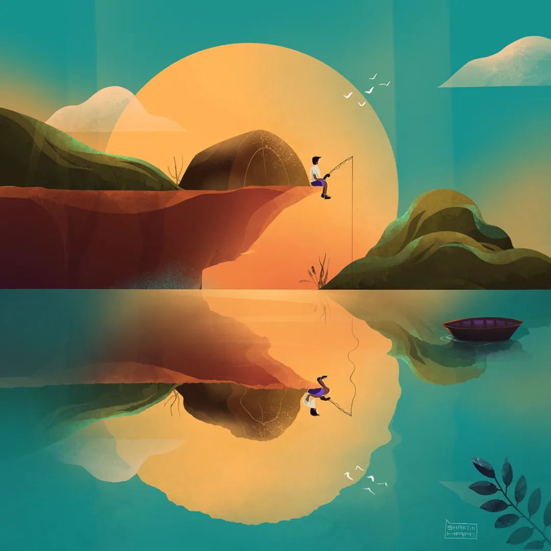
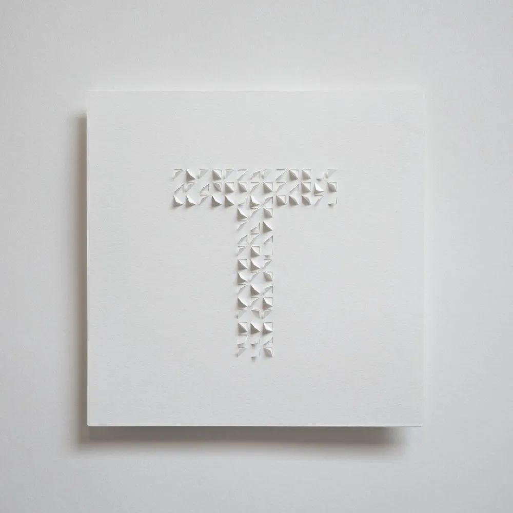
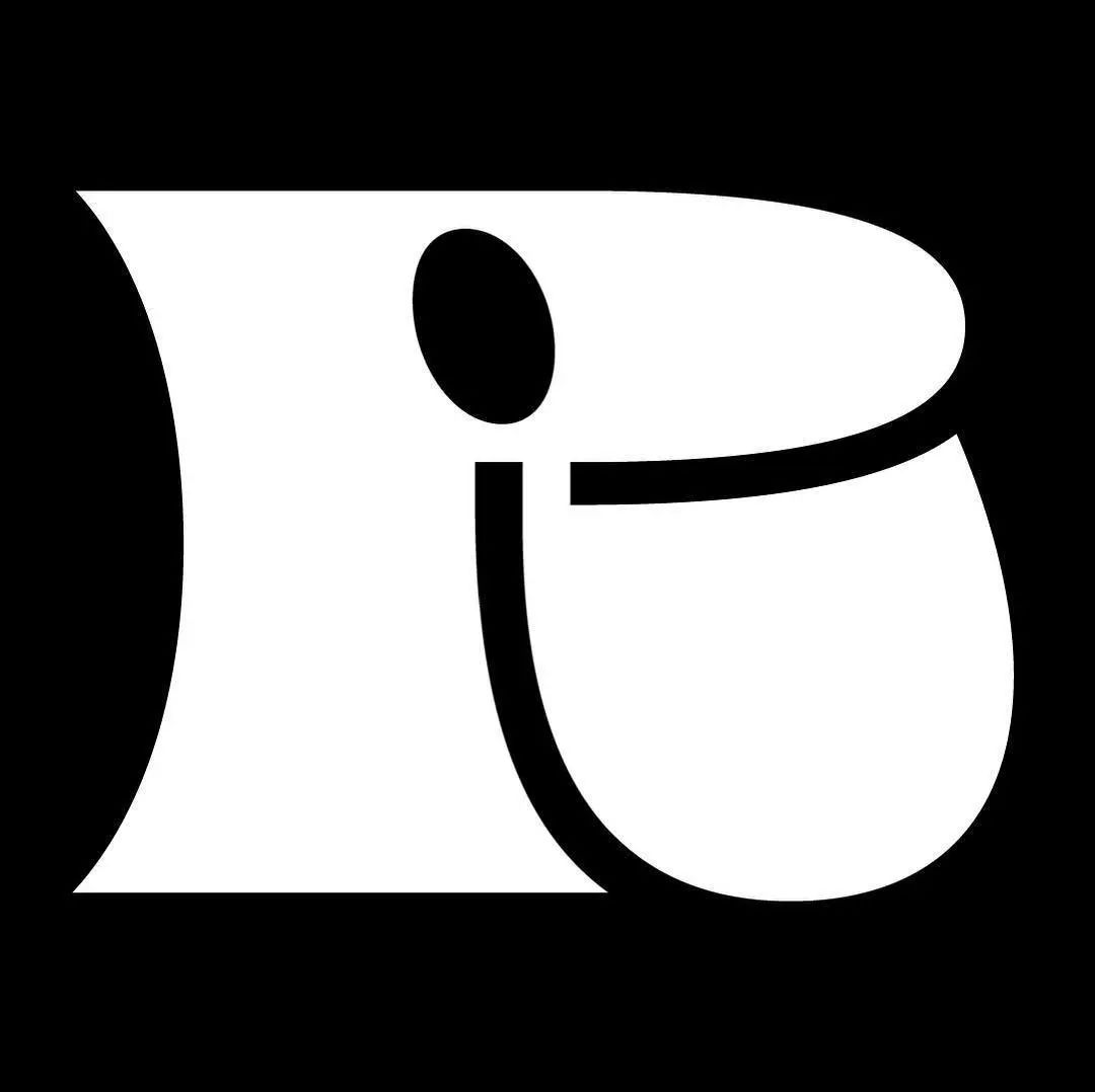
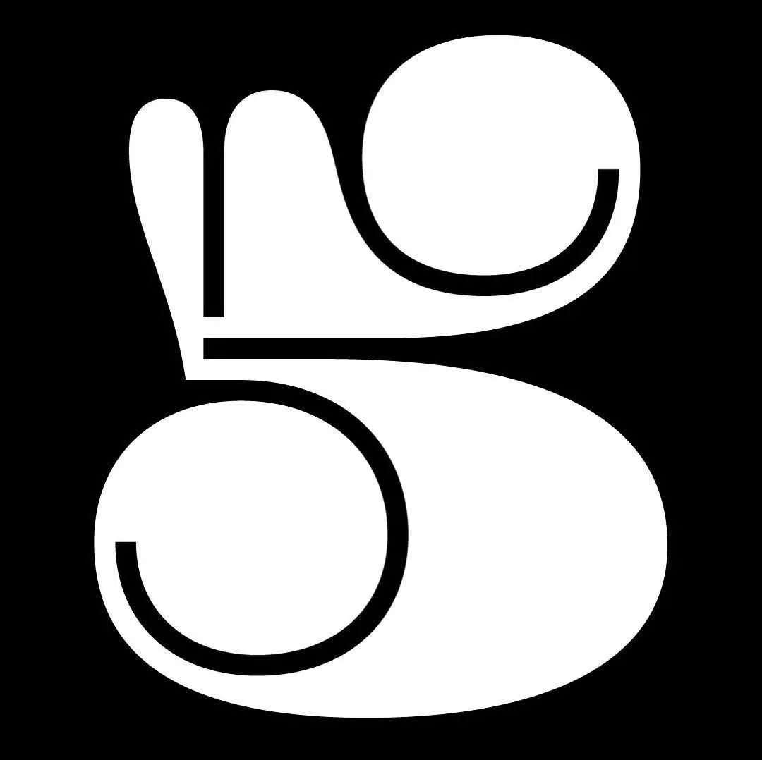
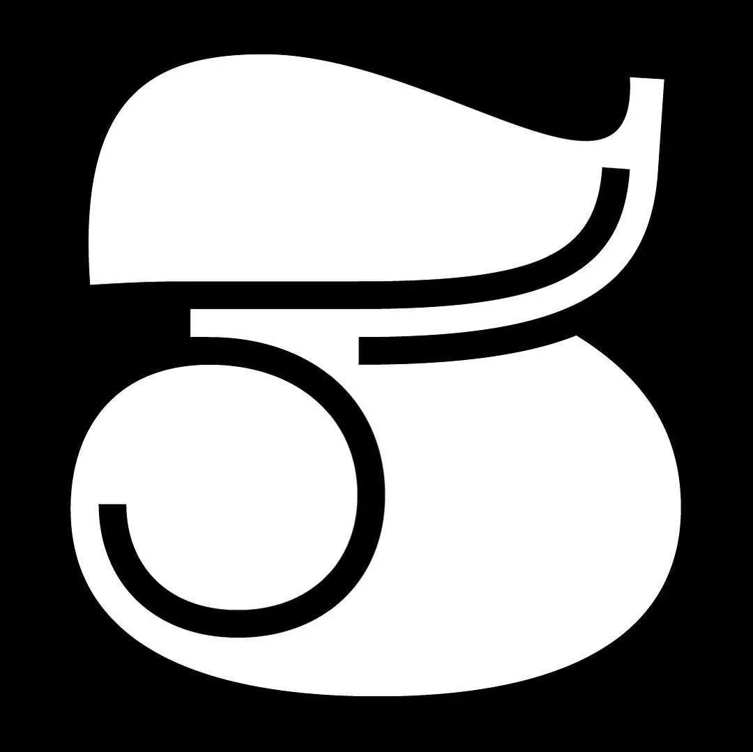
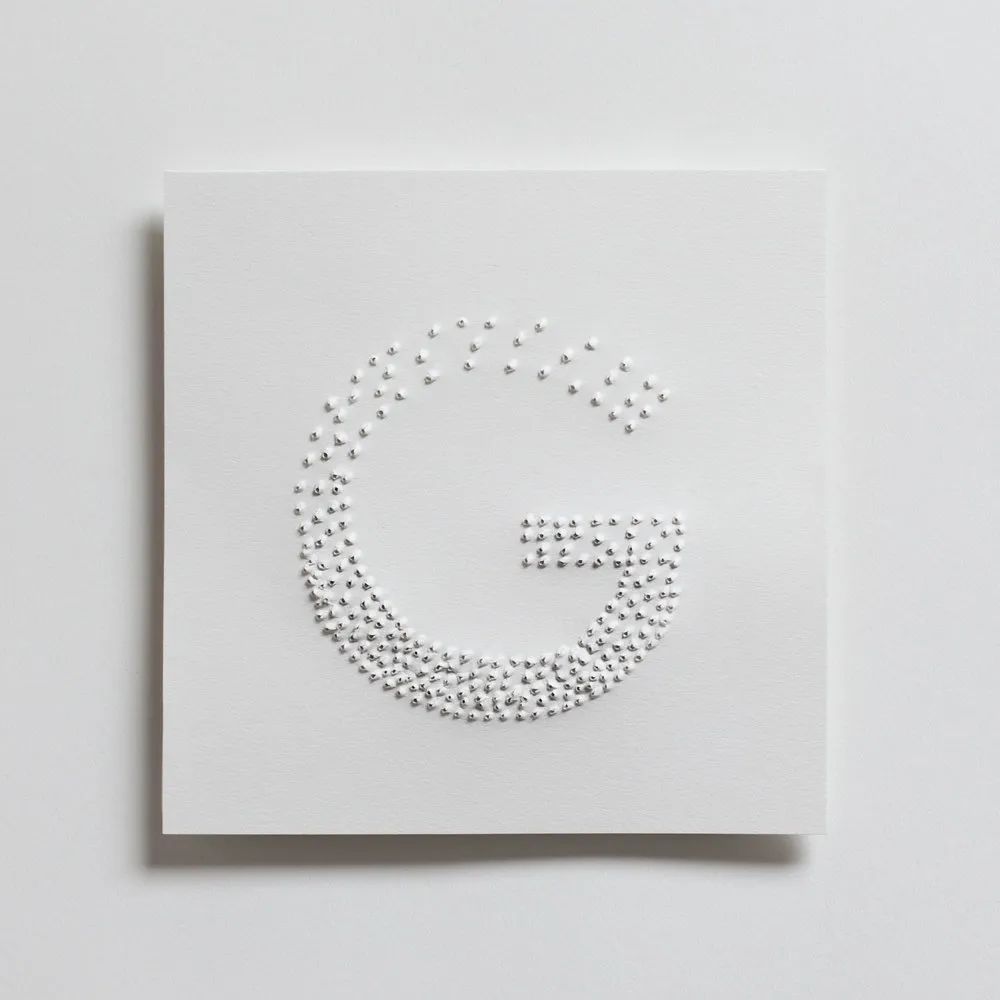
ShakthiHariNV is a self-taught graphic designer and illustrator. He comes from a small town called Jayankondam in Tamil Nadu, India, and taught himself Photoshop, Illustrator and other Adobe tools in college. Shakthi studied chemical engineering and worked as a business technology analyst. Later, I gradually realized that creativity and artistic creation are what I really want to do. 
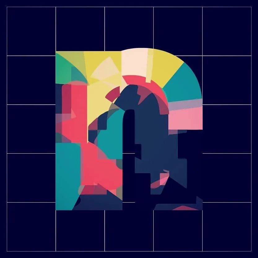
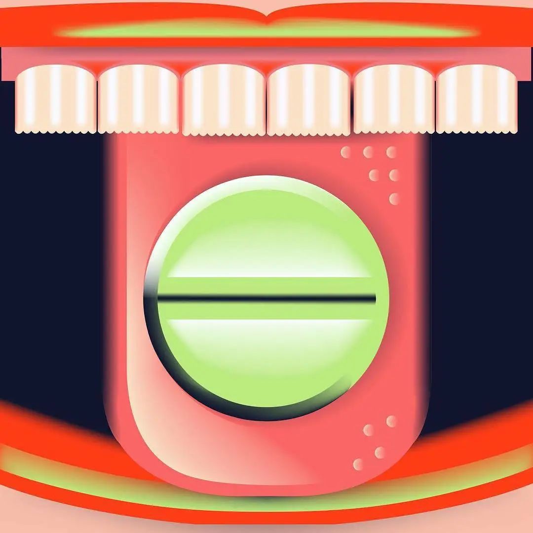
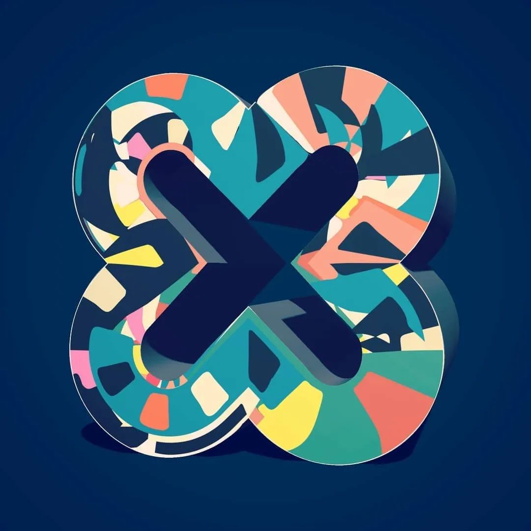
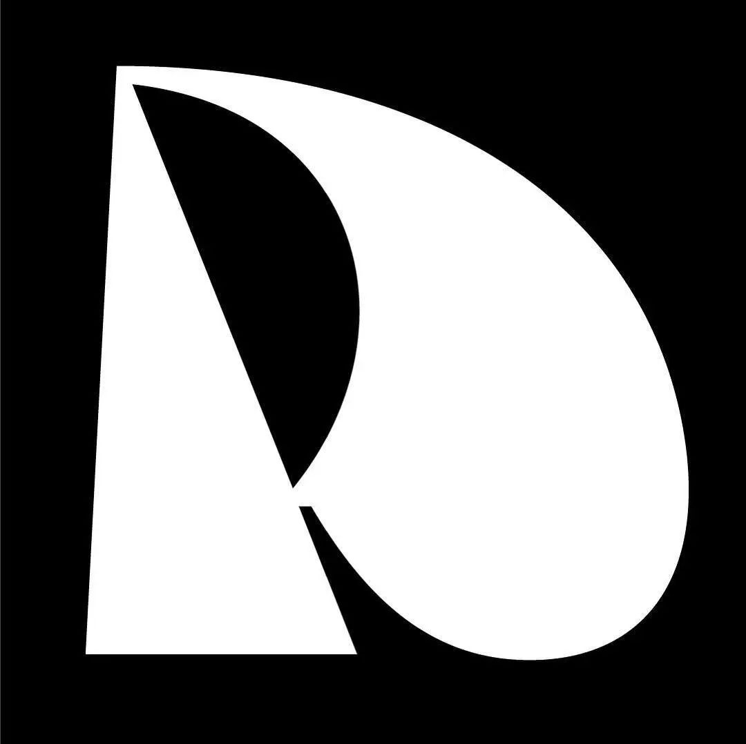
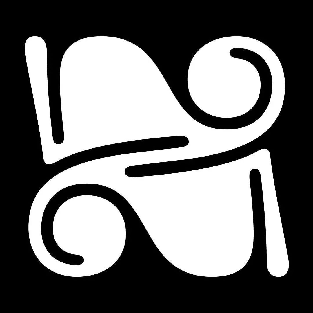
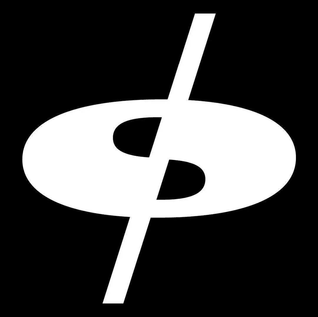
 This is the third consecutive year that Shakthi has participated in the "36Days of Type" challenge, "I have known this project since college .I was looking for inspiration on Instagram and noticed several amazing designs with this hashtag attached.” He hadn’t specialized in typography in the past and had limited knowledge in typography design. Therefore, he decided to use "negative space" to create letters and numbers instead of designing a whole new typeface.

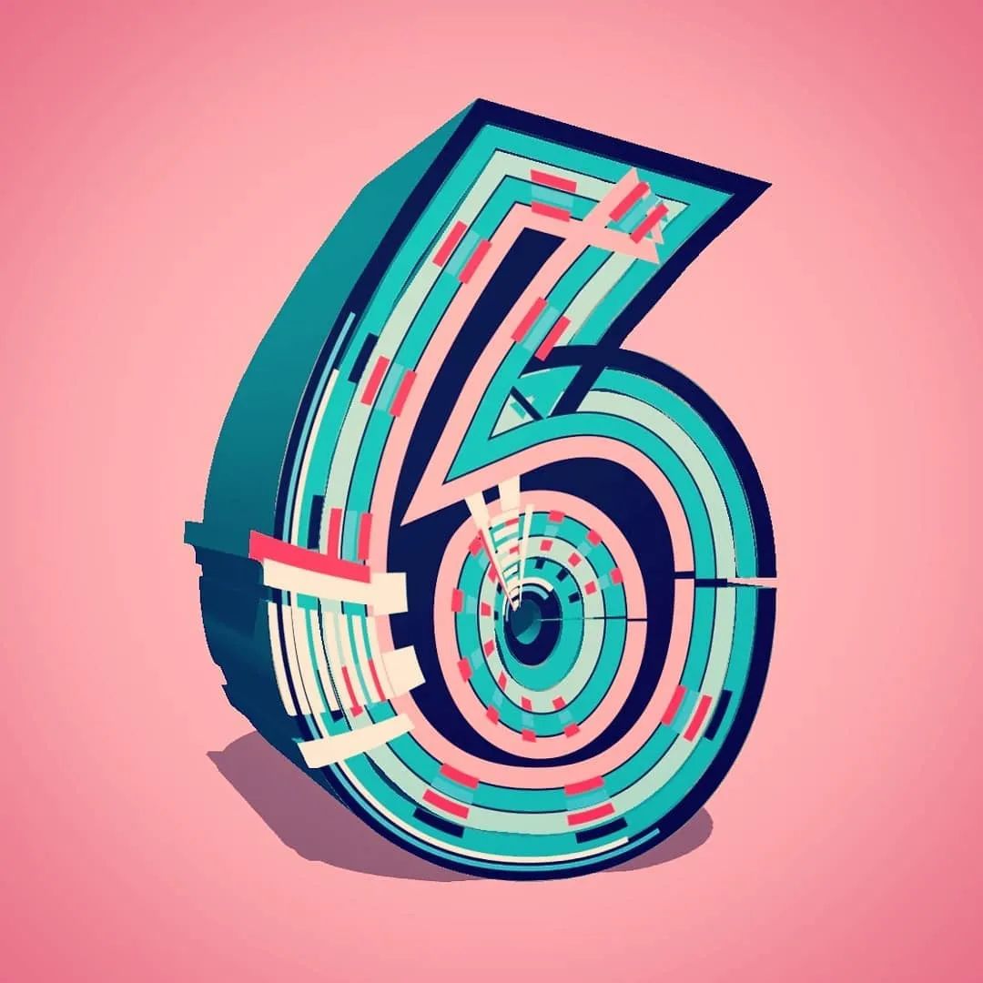
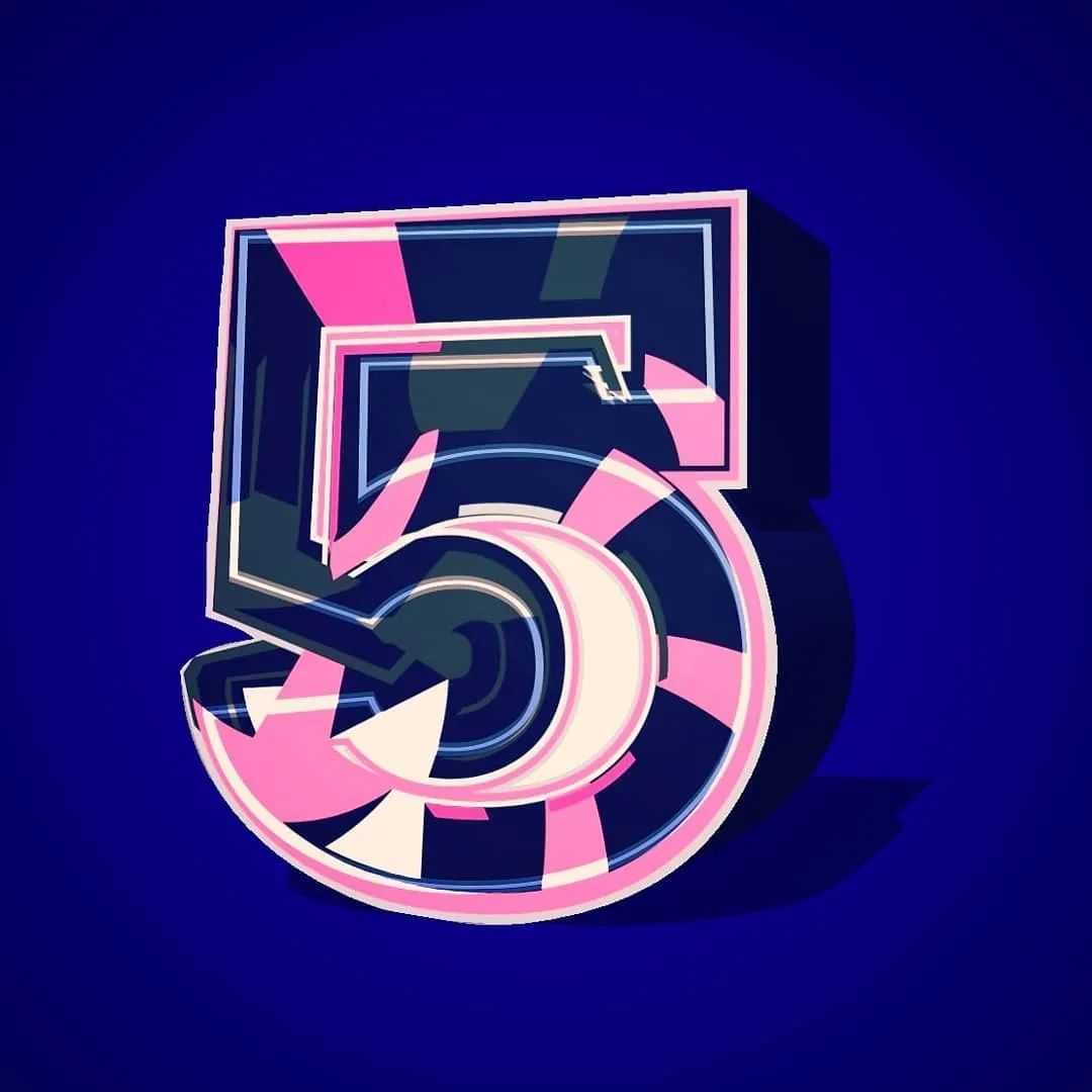
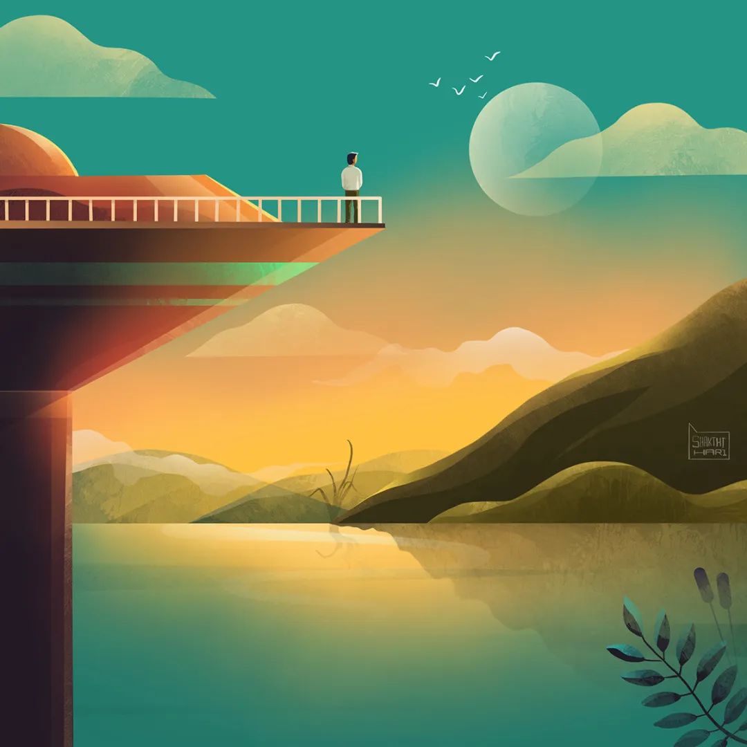 The use of "negative space" technique makes it easy for Shakthi to design symmetrical fonts, but to design sharp The letters and numbers on the edge are more difficult. In the end, his favorite is the illustration of 10 numbers from 0 to 9. When creating, Shakthi will first use the traditional method to draw a sketch of the work, and then import it into the computer to enrich the details. Doing the 36-day challenge while maintaining a full-time job was a challenge for Shakthi, “Sometimes I really want to give up, but creating something new every day for a month gives me joy.” and fulfillment... and creating these illustrations every day also brings peace to my mind.”
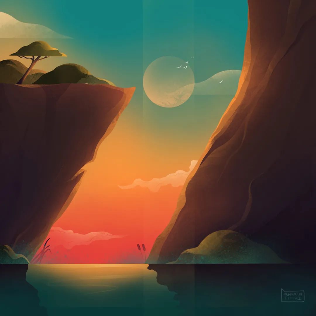
Jess Ebsworth
London, United Kingdom
Personal official website:www.jessica-ebsworth.squarespace.com
Instagram: @jessebsworth
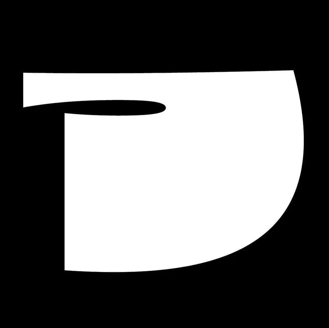
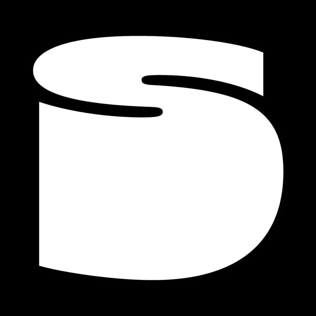
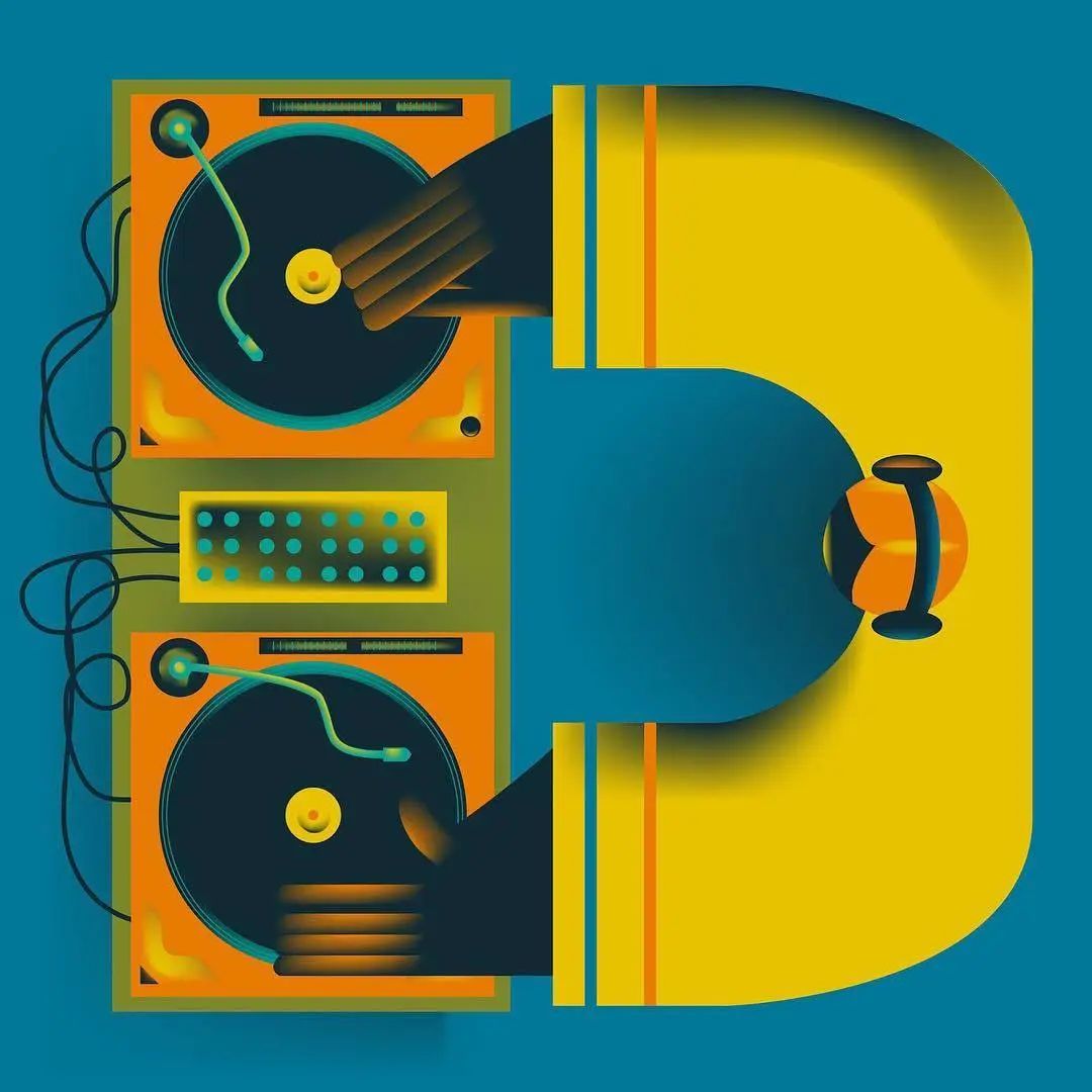
JessEbsworth graduated from Manchester Metropolitan University's School of Arts and Humanities in 2015, and in the following two years designed packaging for the beer brand PlatoBrewing and designed posters for club nights across the UK . She also signed an illustration company RoarIllustration Agency, so she came into contact with more clients. 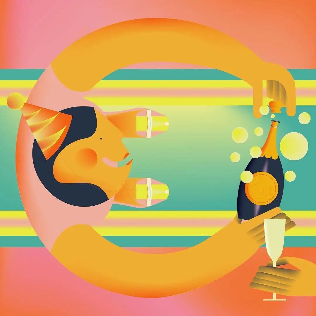
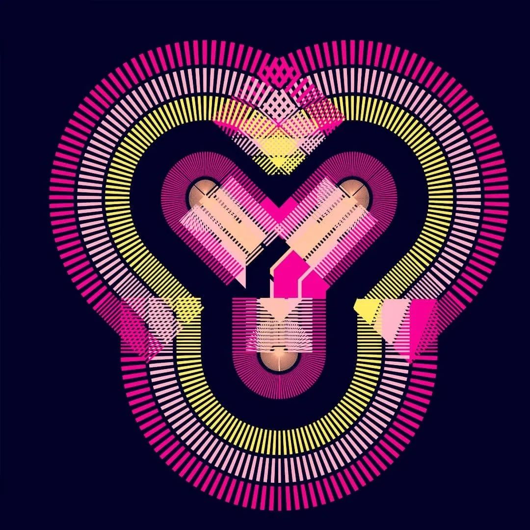
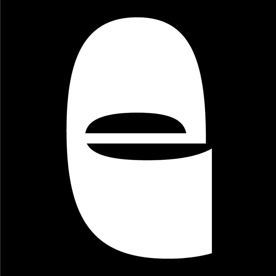
 Jess is not very familiar with typography, but she likes to use illustrations to create fonts. And her designs are lively and playful, showcasing her own unique visual language. When she participated in "36 Days of Type" in 2018, she only created part of the alphabet, but it was widely acclaimed. Therefore, she decided to complete all letter and number design challenges in 2019.
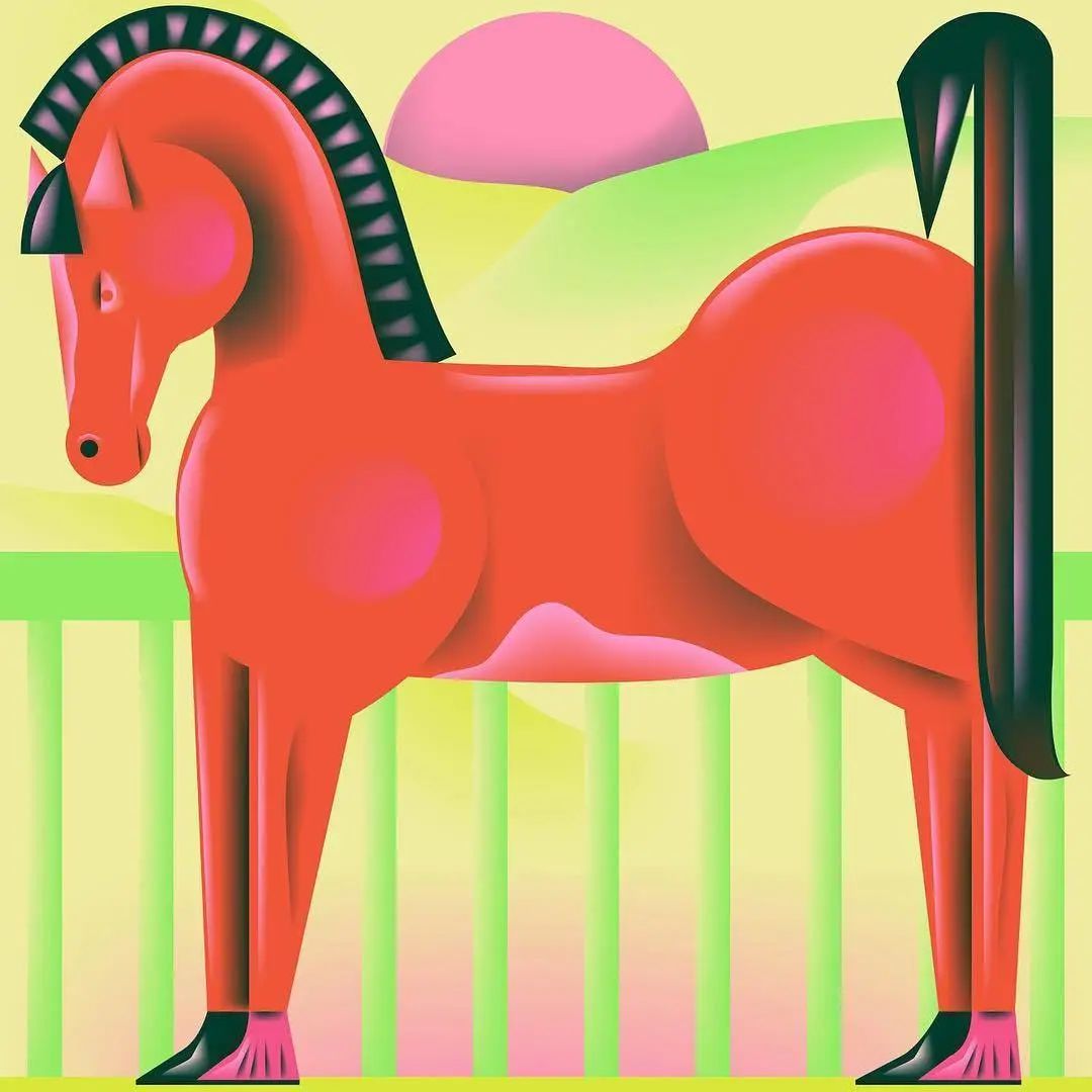
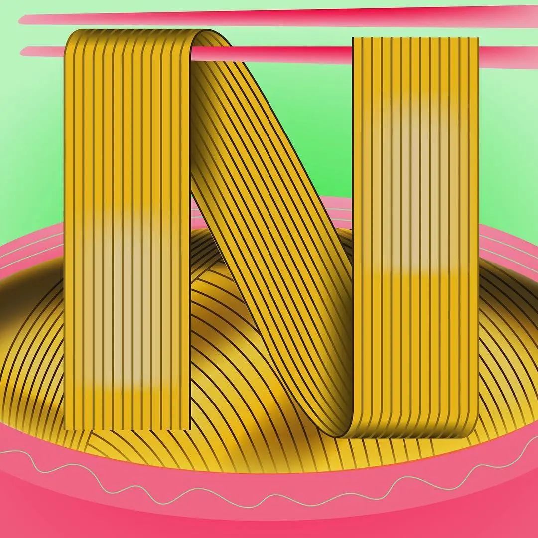
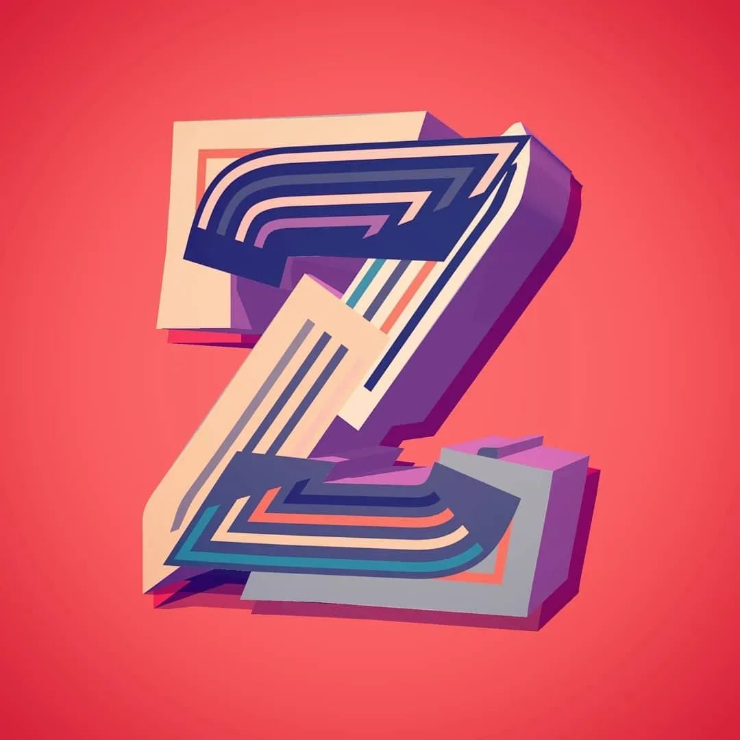
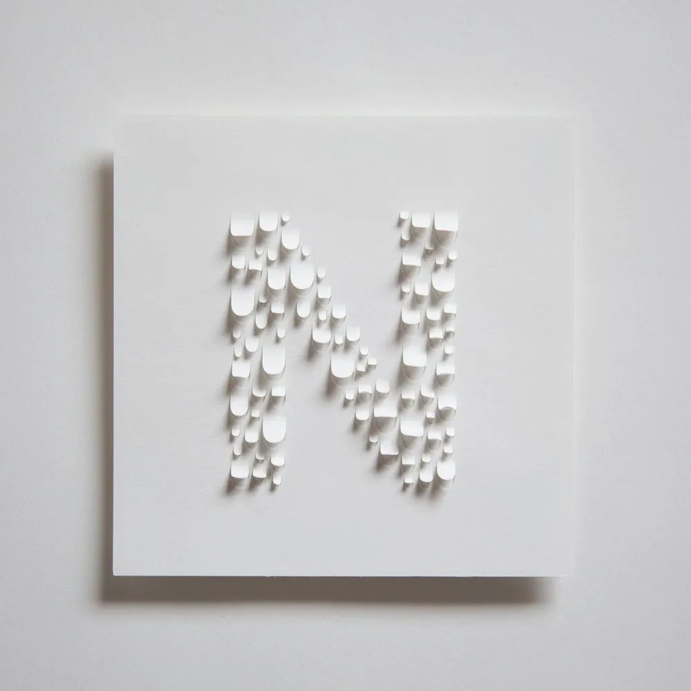
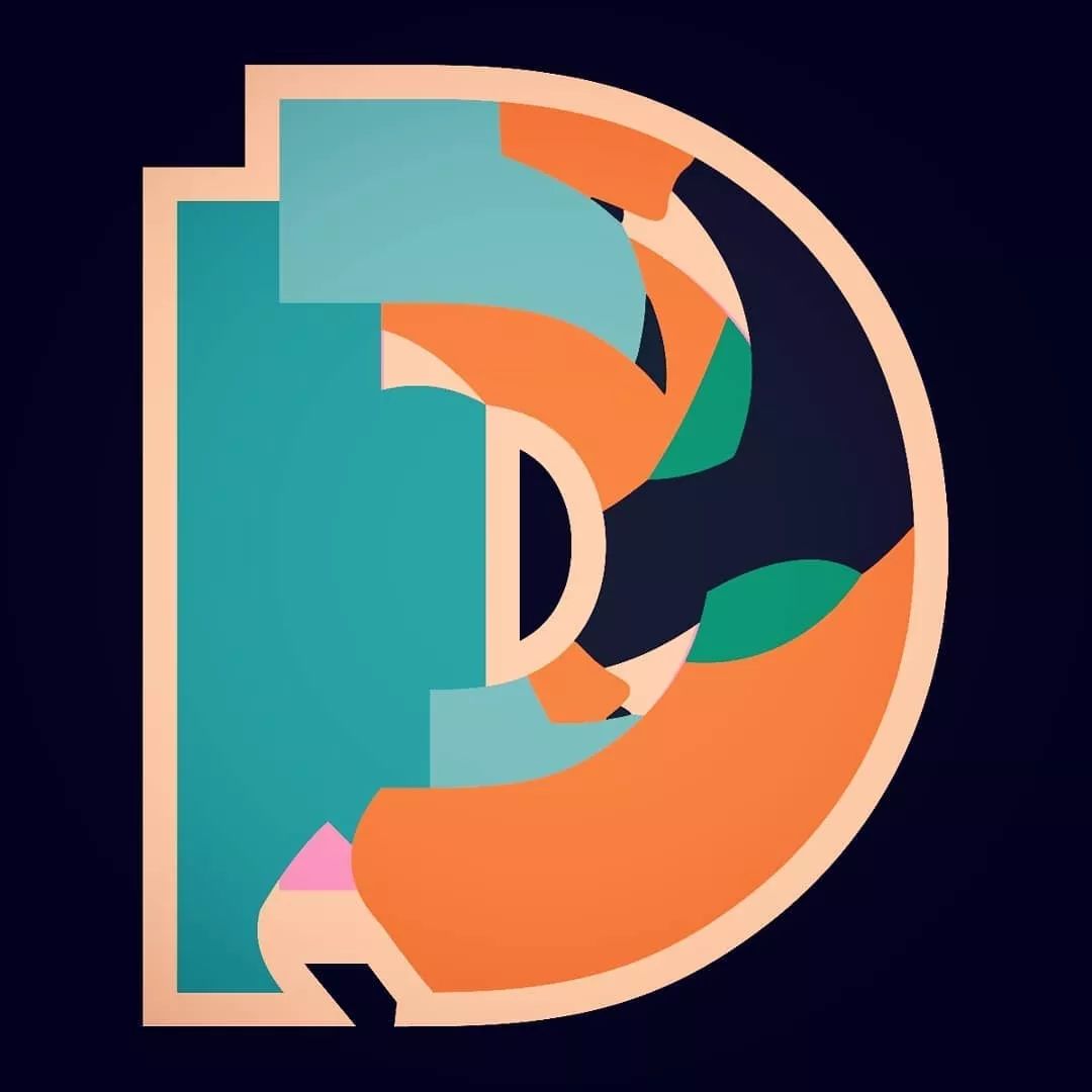
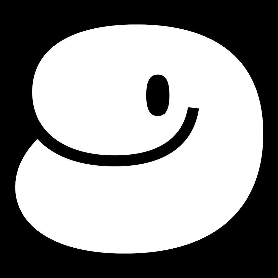
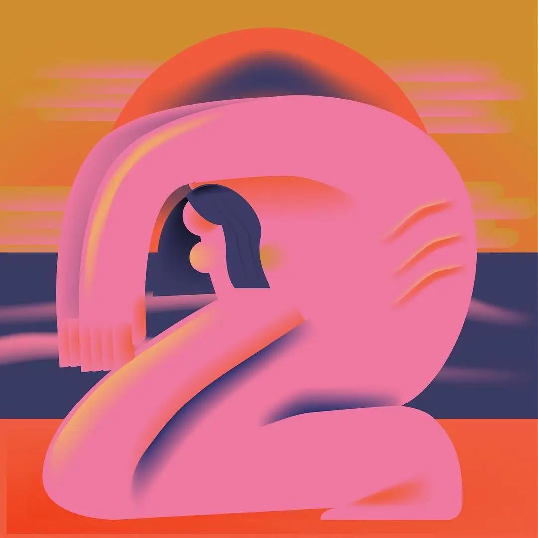
 Jess hopes that each letter or number has an independent style, and the illustration itself should be related to the letter or number of the day couplet. For example, "D" stands for DJ and "N" stands for "Noodle". Jess doesn't start with a specific word in mind. She usually draws basic character shapes first, and then randomly draws them in the AI, matching different shapes and colors. During this process, good ideas will slowly come to mind, "Overall, the whole design process is an exercise for creative thinking, and it really allowed me to find many new ways to solve problems."
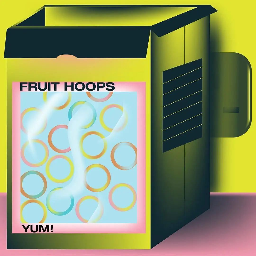
Liam Bevin
Birmingham, UK
Personal official website: www.liambevin.net
Instagram: @proline.lb
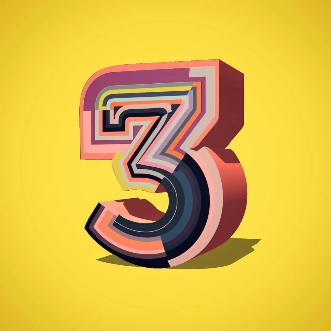
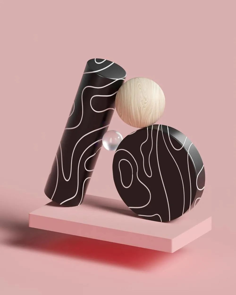
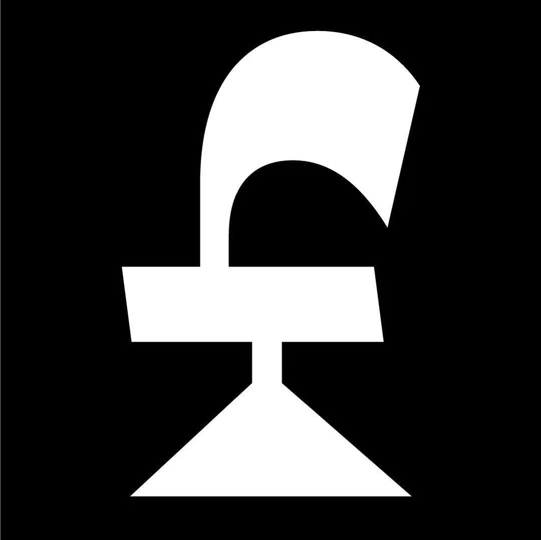
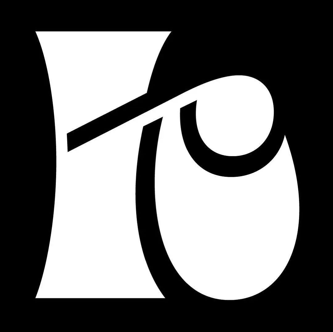
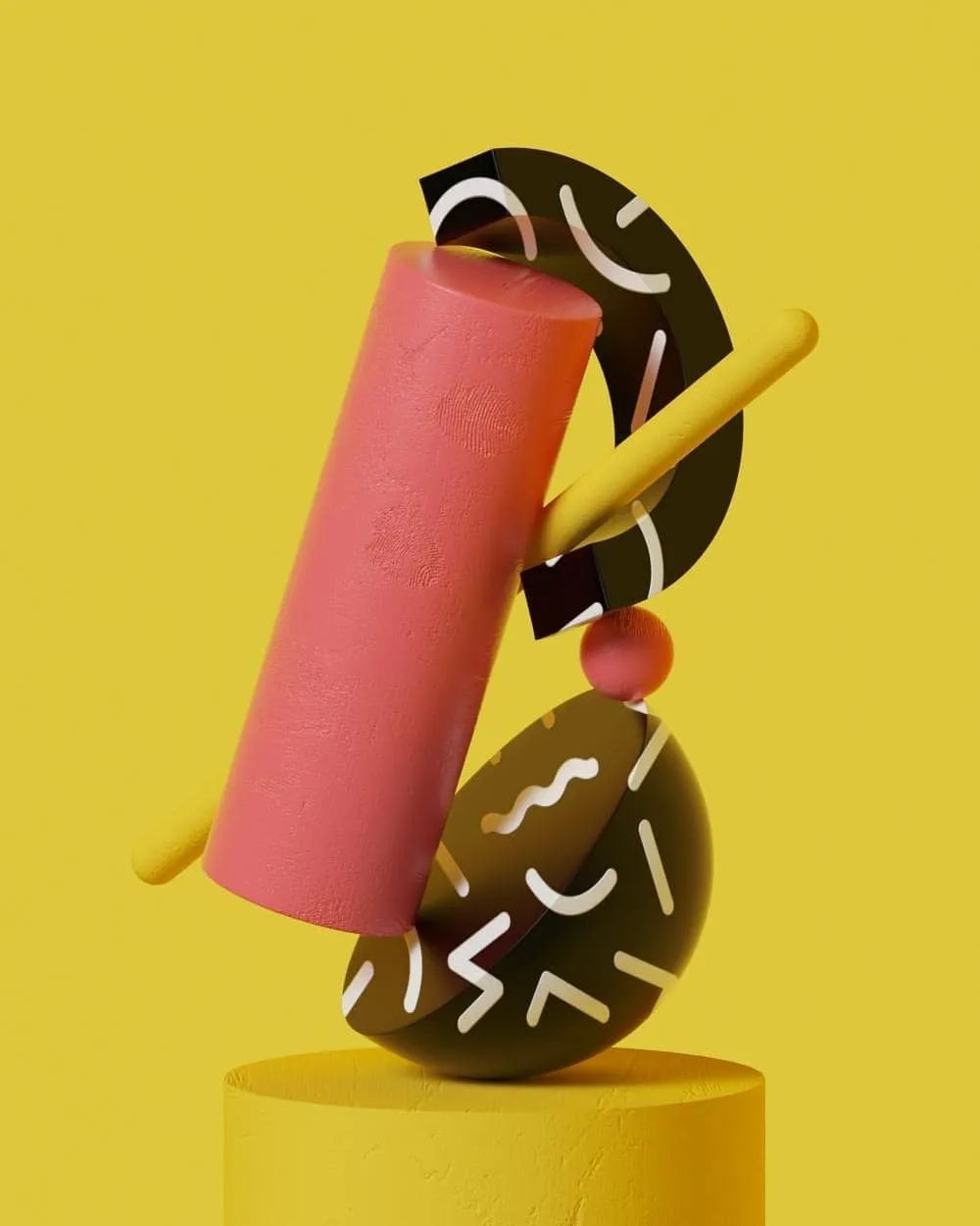
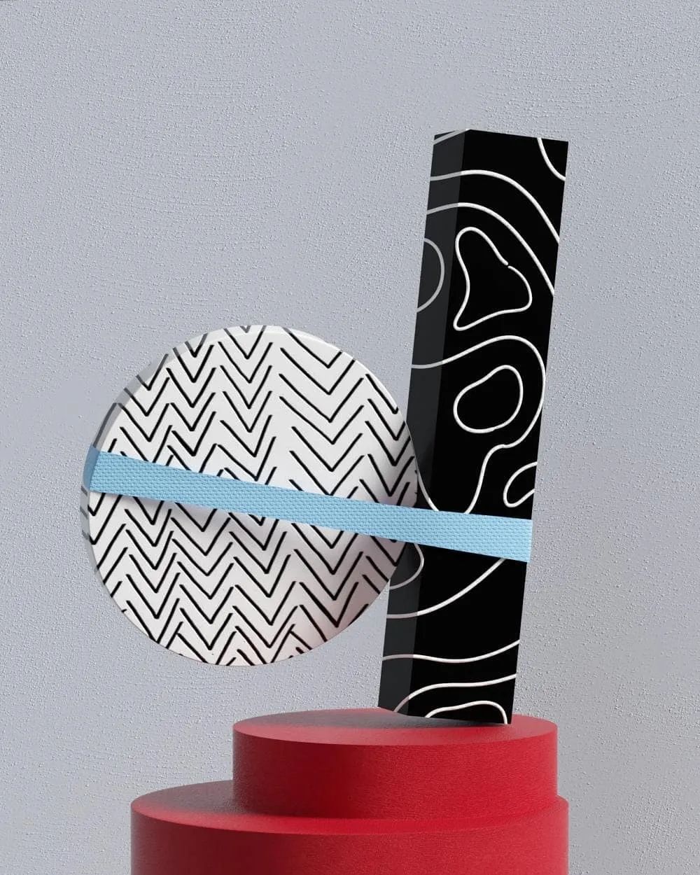
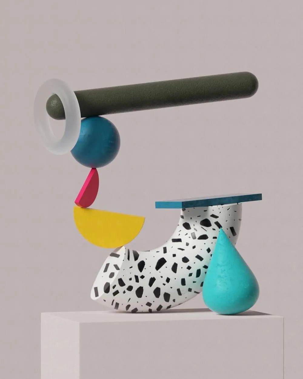
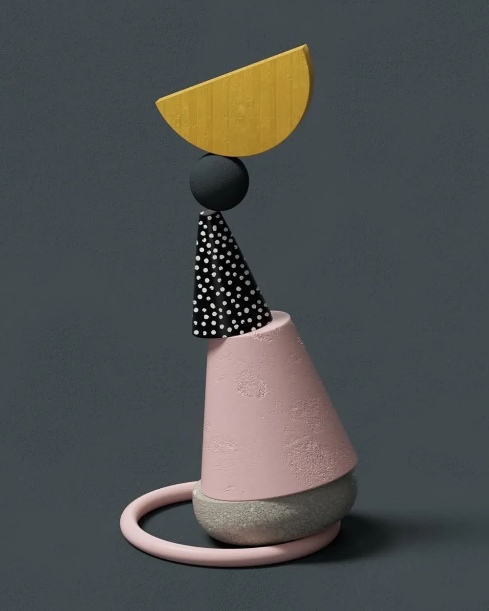
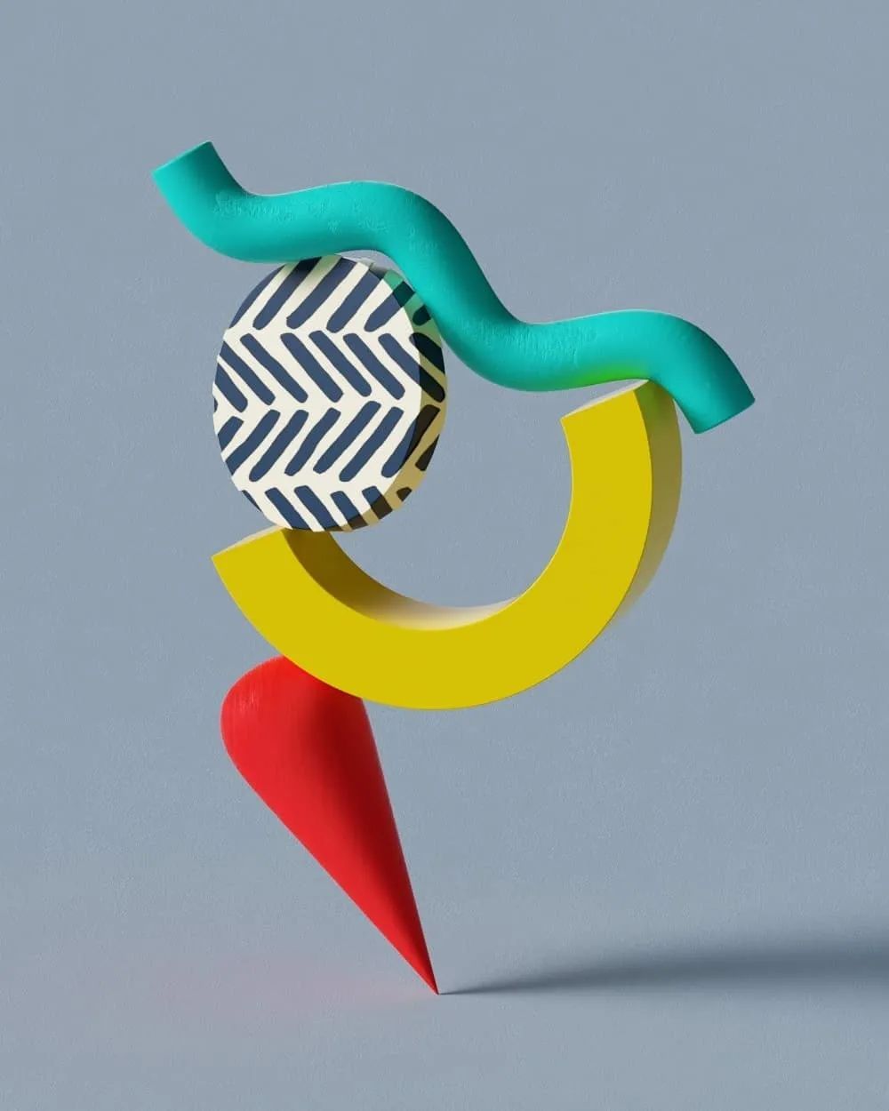
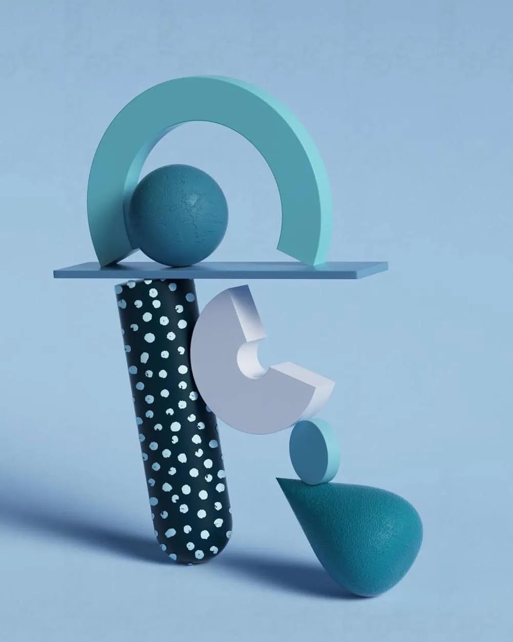
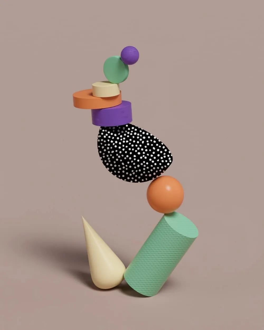
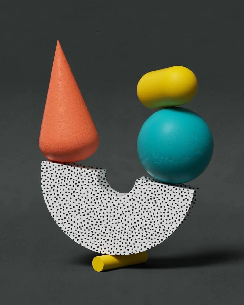
19-year-old LiamLiam graduated from FEEDStudio, an art education institution in Birmingham, UK last year. He did not continue his studies, but participated in some design projects such as MV production as a freelancer, and operated several YouTubes. Liam participated in "36DaysofType" for the first time in 2018, but he didn't put in much energy at that time. Talking about font design, Bevin said: "I don't have much experience except creating a set of fonts in college, but this makes the competition more interesting!" In the 2019 competition, he used a I completed this set of designs in a more relaxed way, "I think the most important thing is to make myself happy and to be creative, and not to put pressure on myself to complete the project quickly."< /section>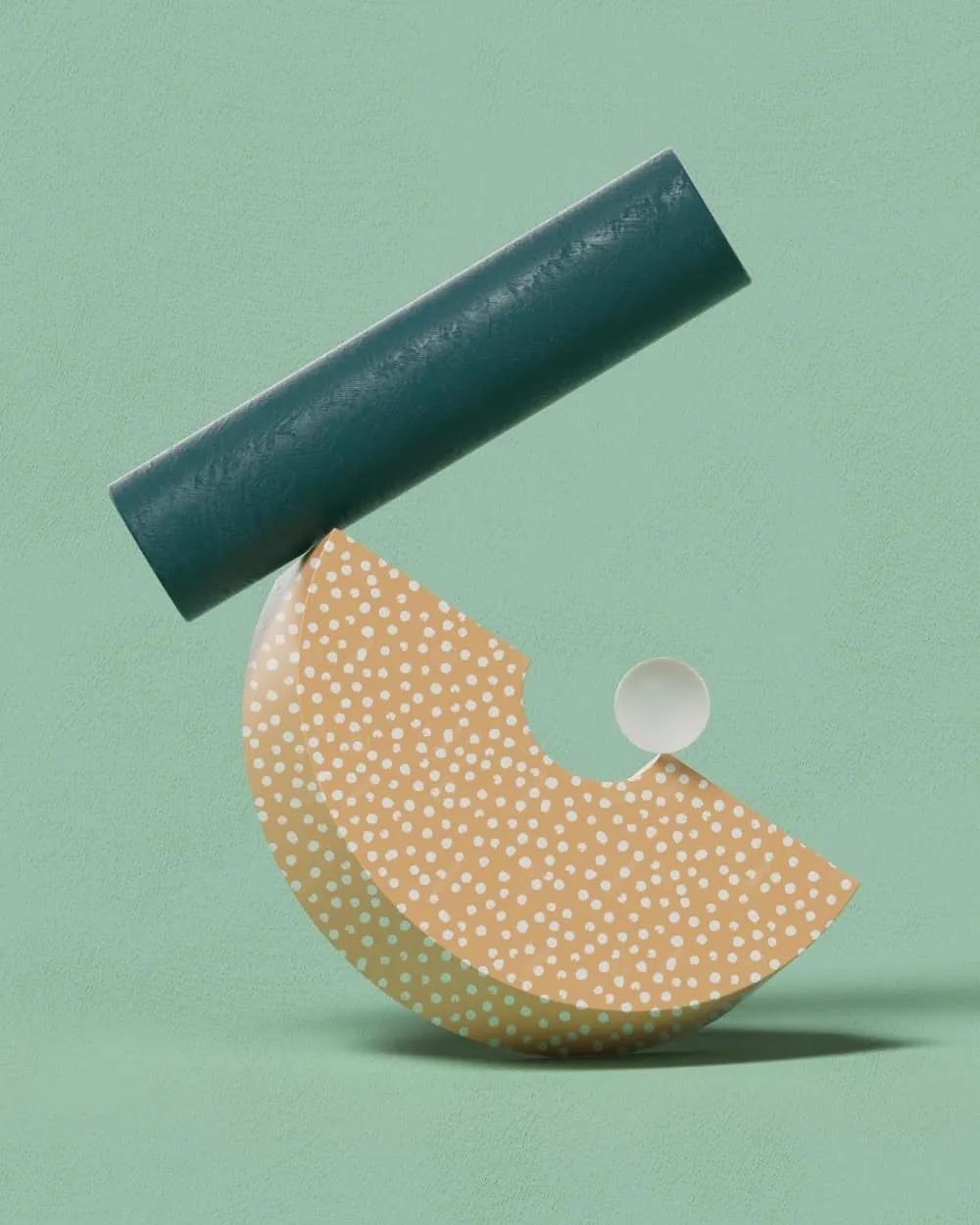
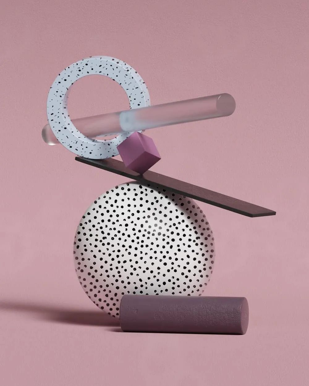
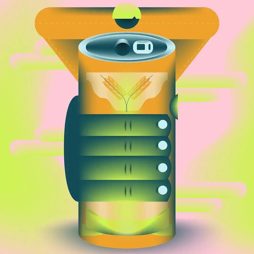
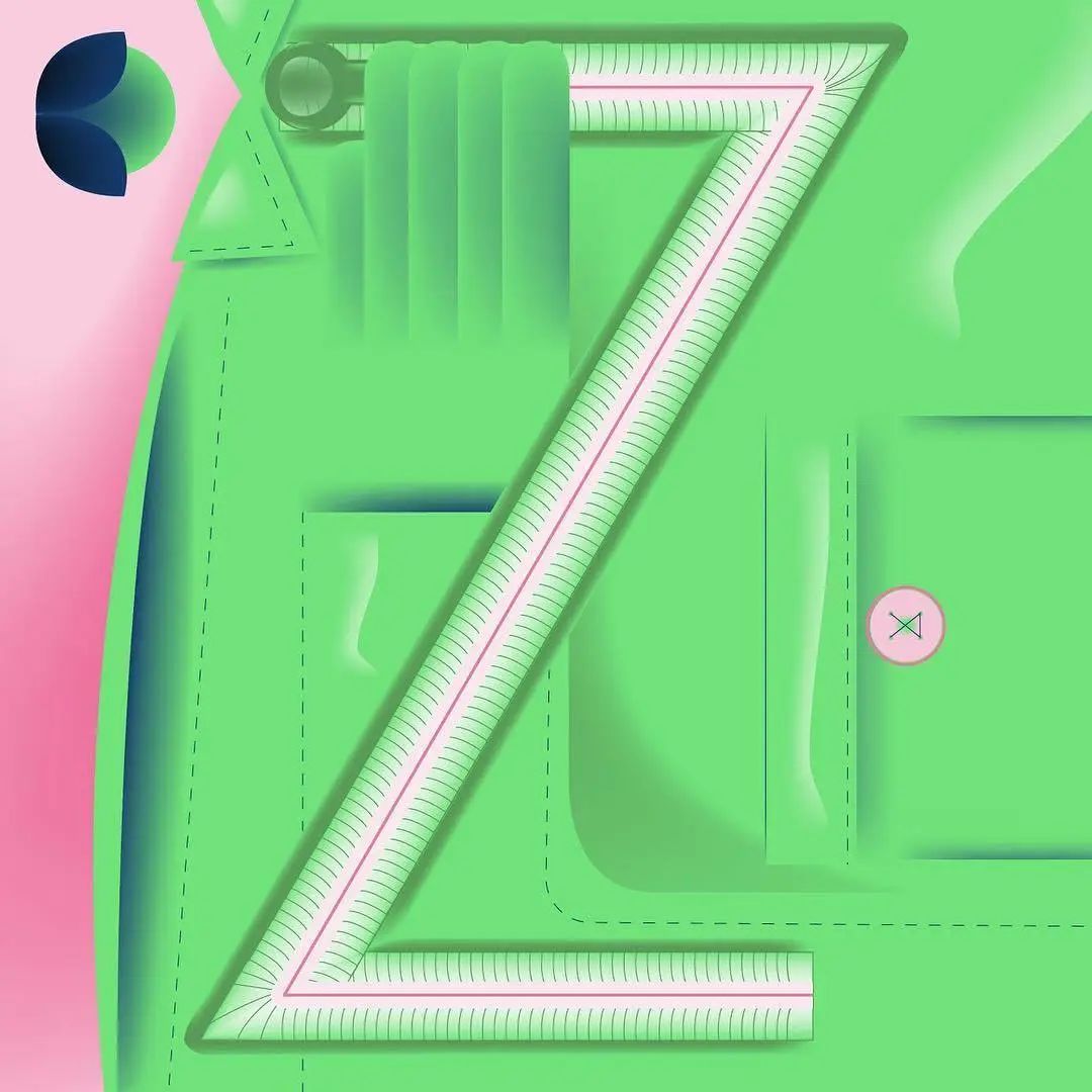
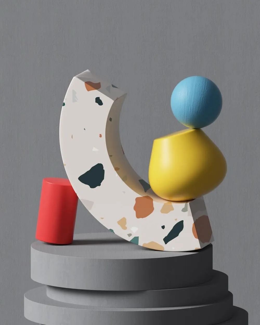
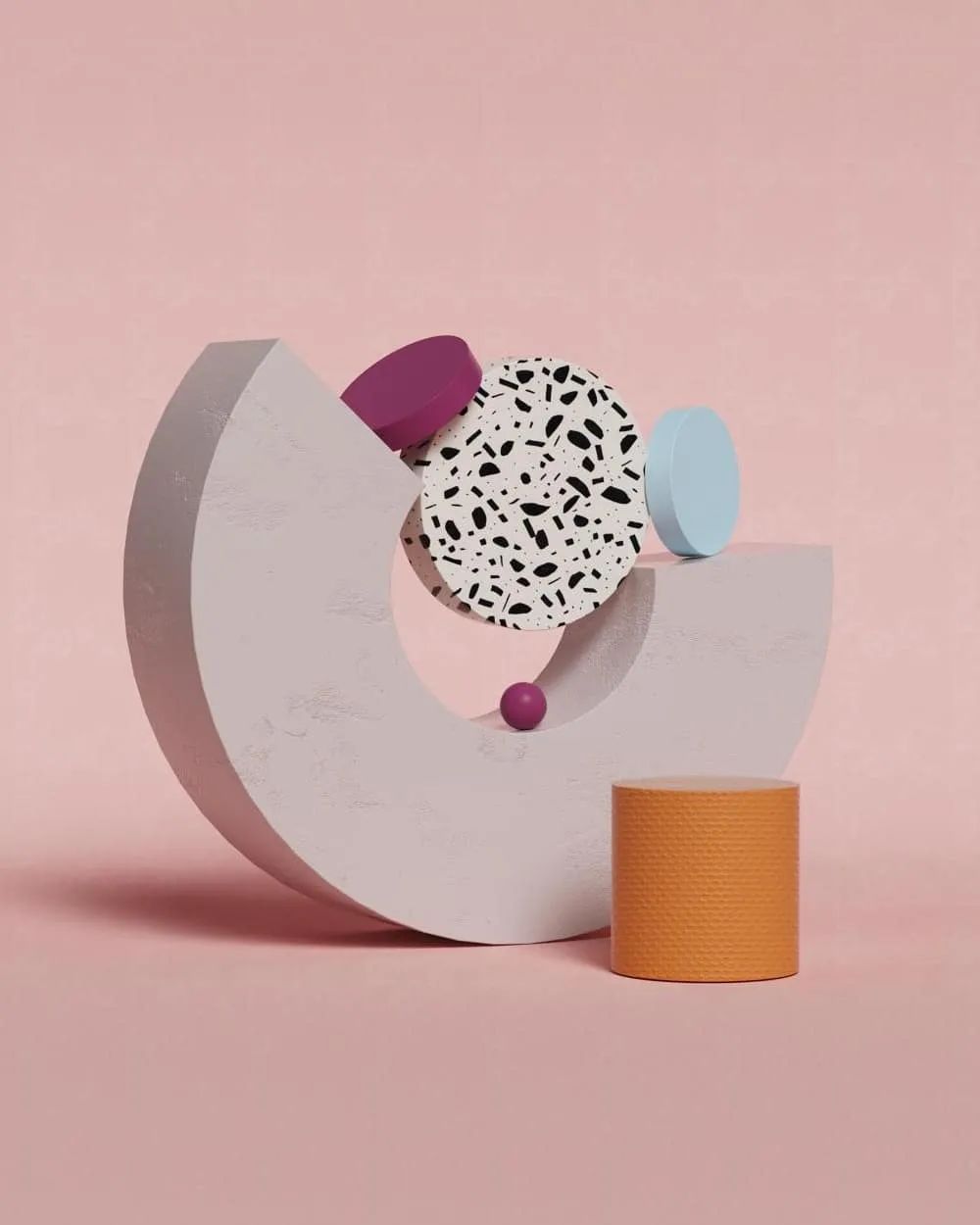
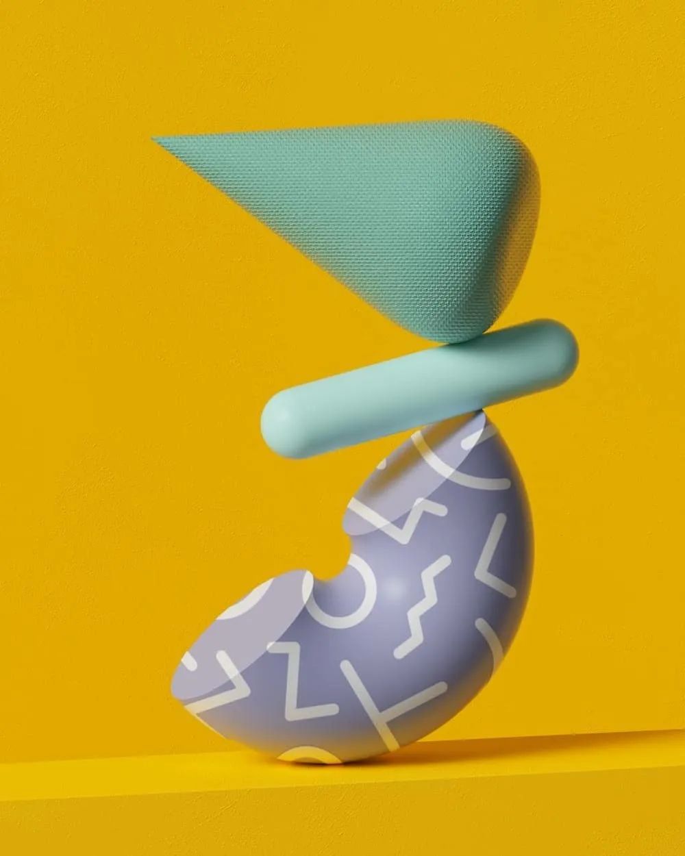
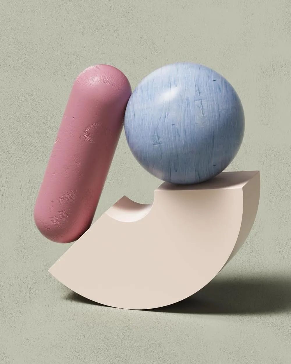
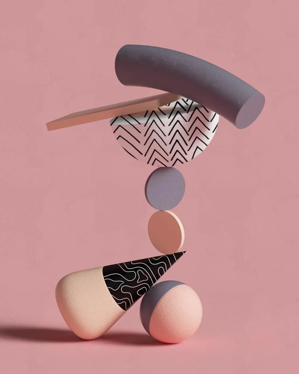
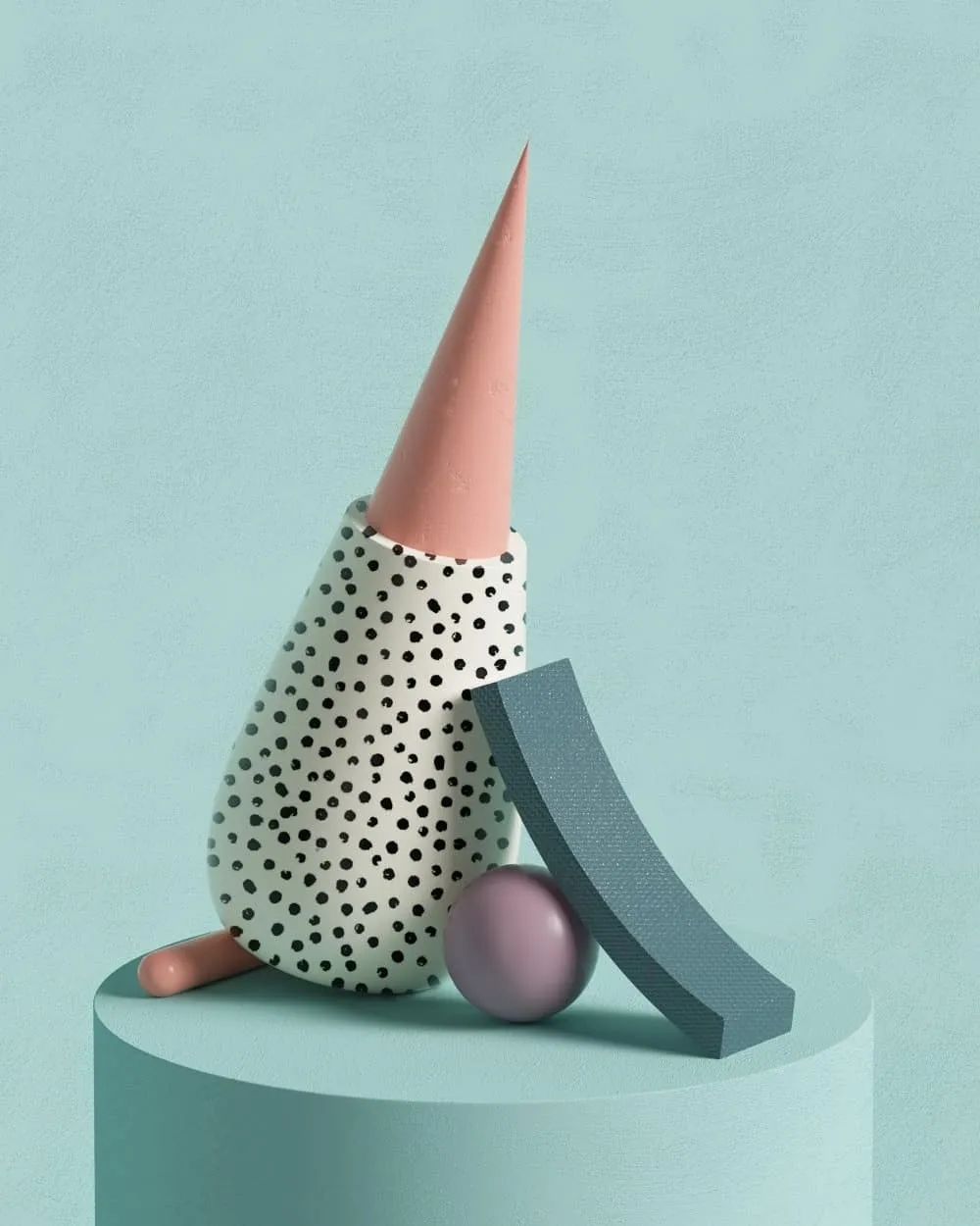
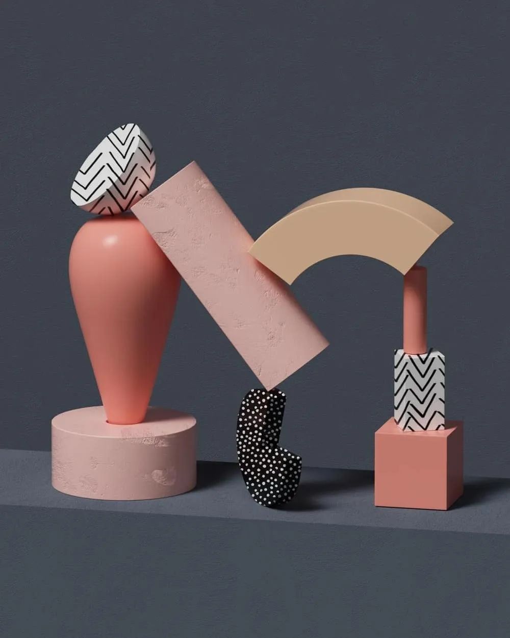
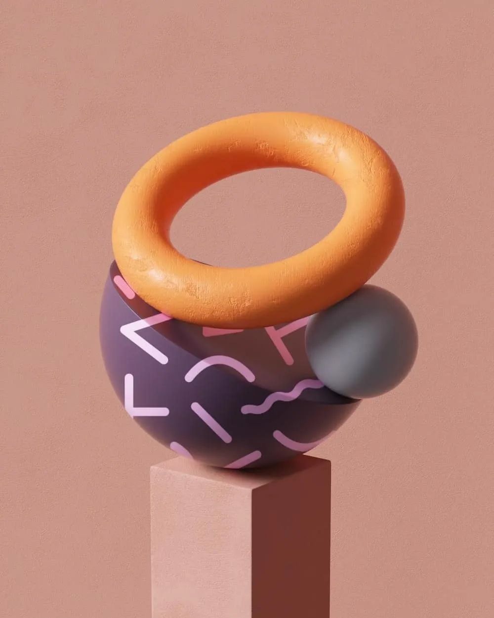
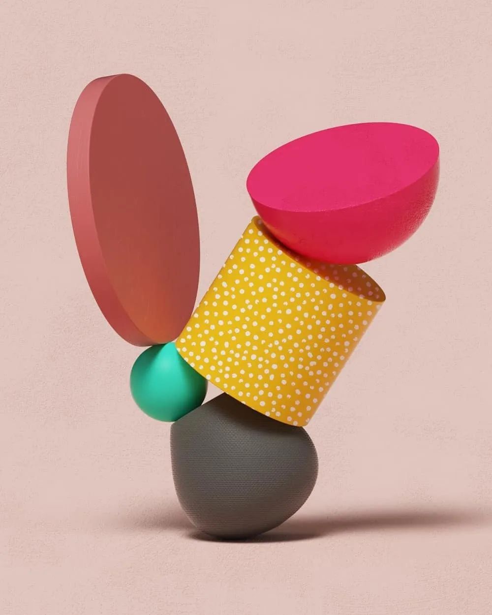
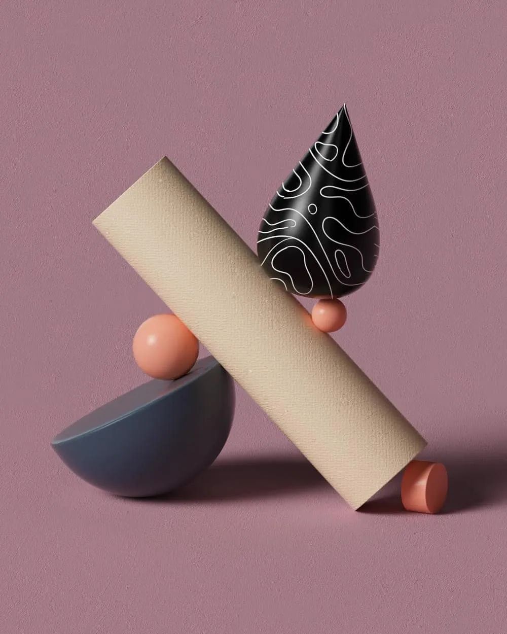
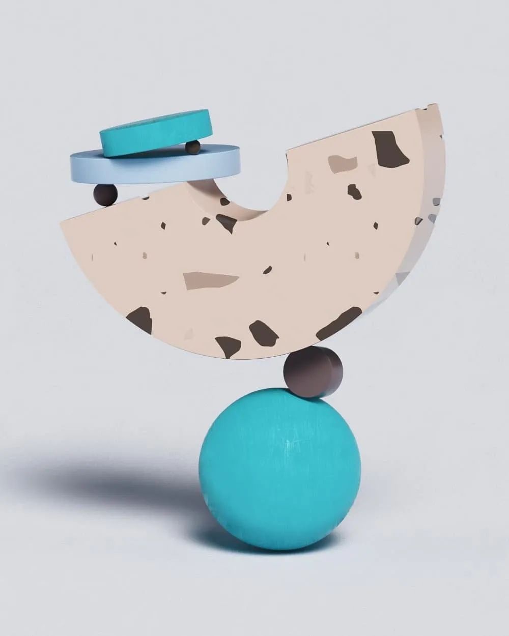
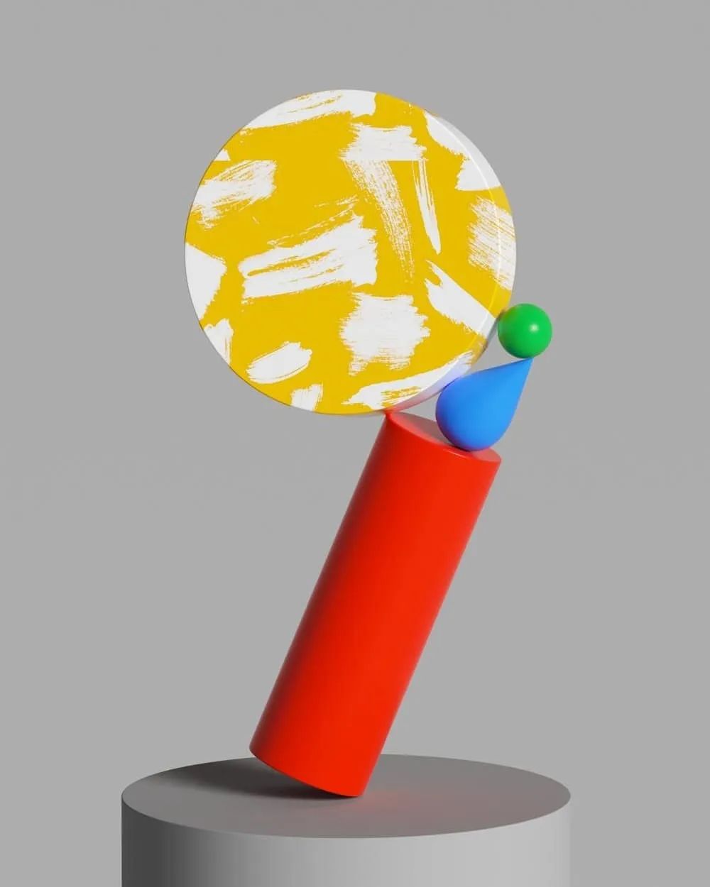
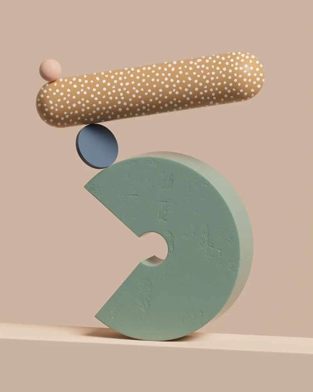
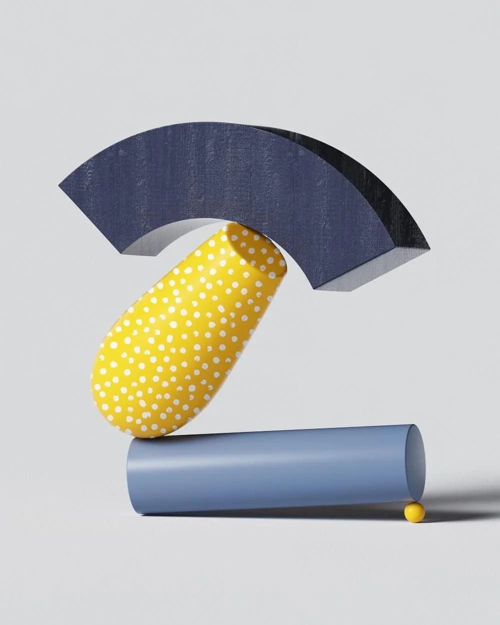
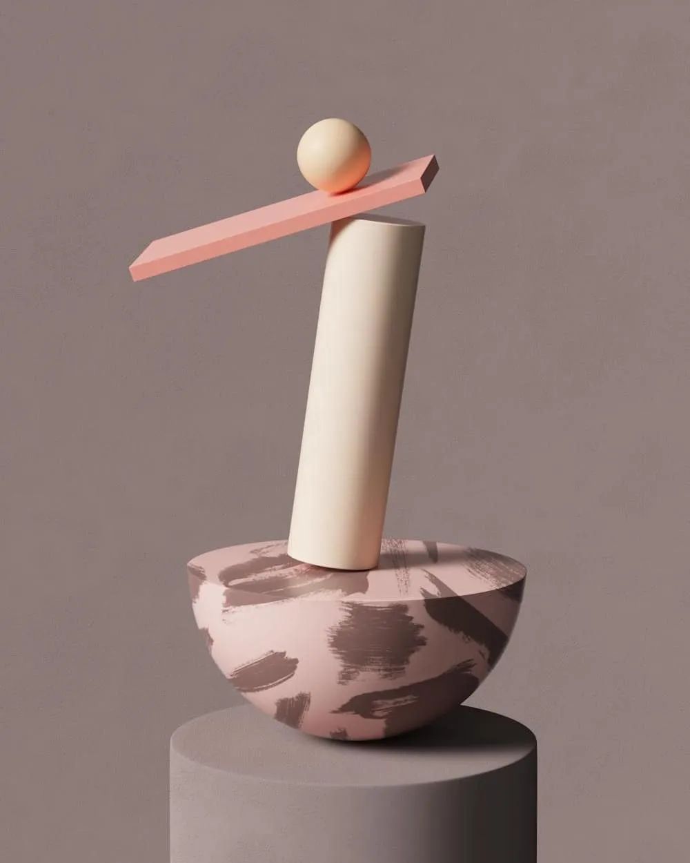
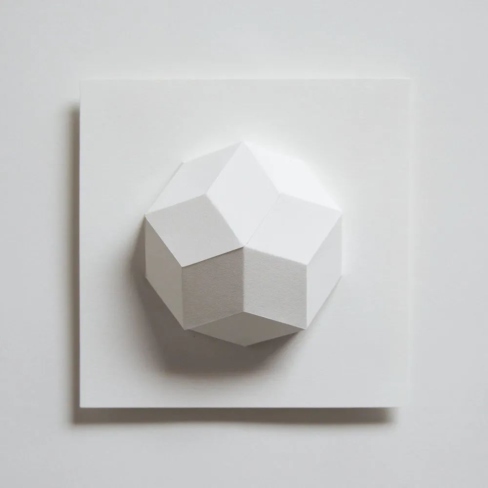
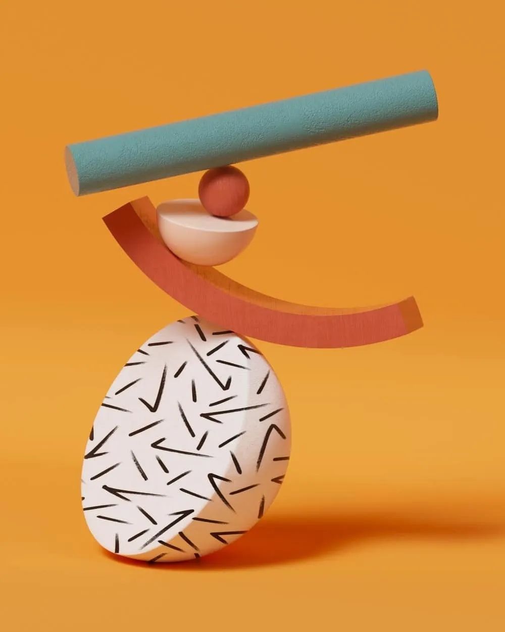 Liam sees the competition as an opportunity to try a new style. The design of each letter or number starts with a main volume, such as a long cylinder, and then builds other volumes around this as the main focus. Liam needs to try his best to make the whole structure not look messy on the phone, "I hope that the balance between the three-dimensional blocks can be maintained, and at the same time, people feel that these fonts really exist in reality."
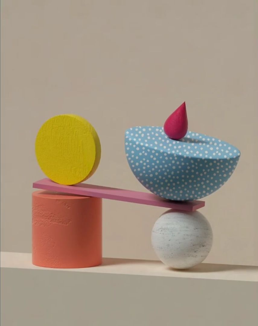
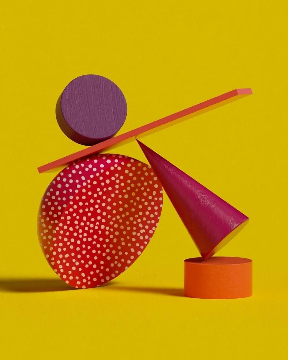
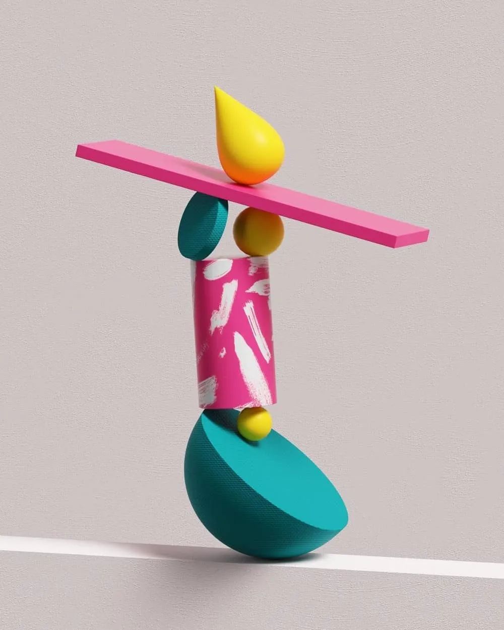
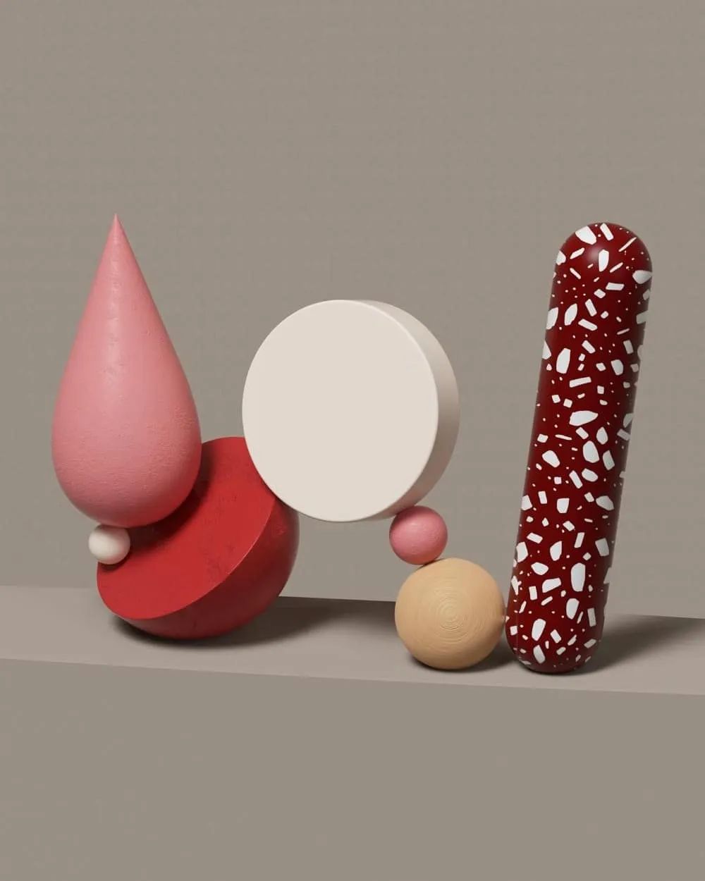
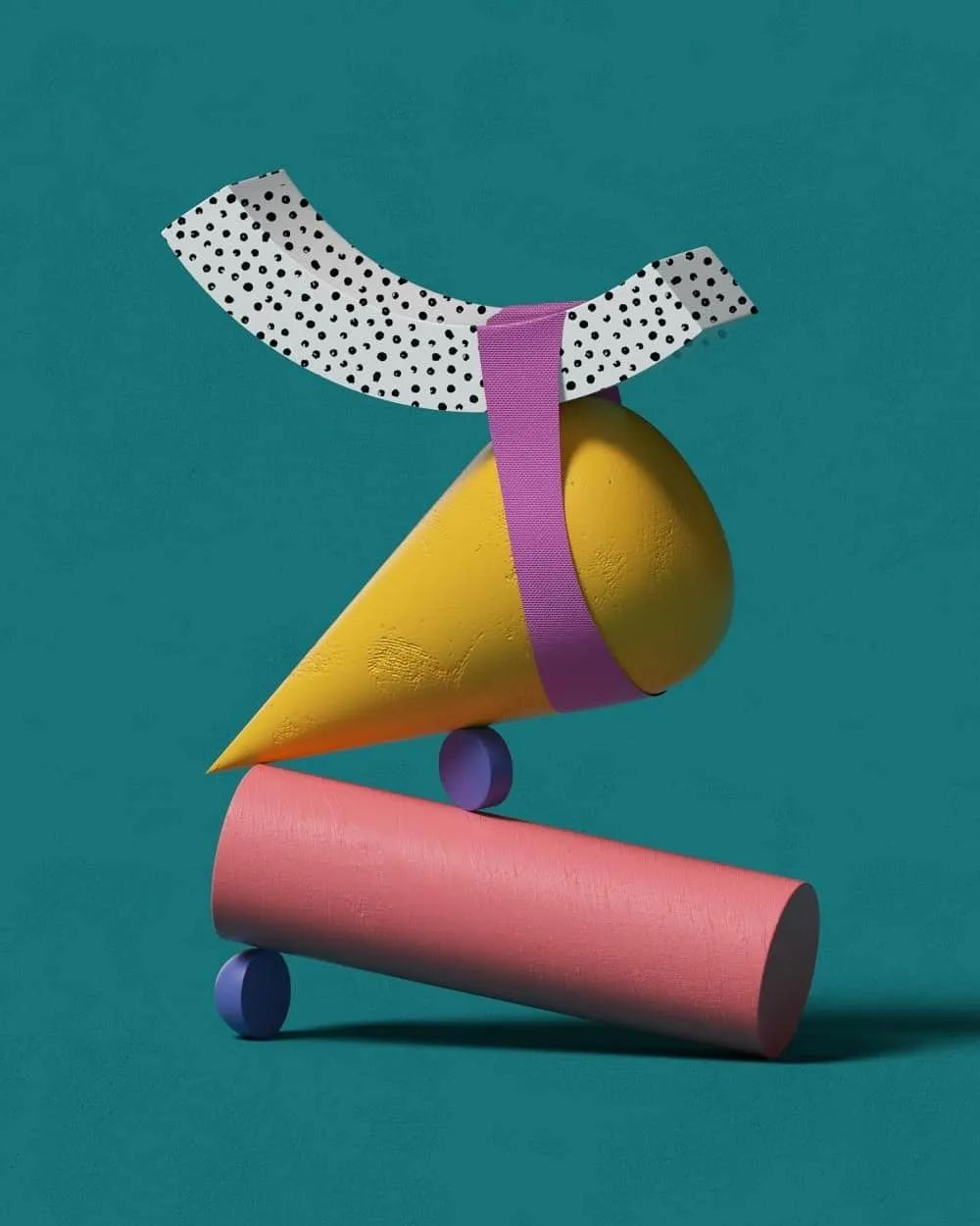 Liam also tries to make every letter or number readable. “Sometimes I realize that the draft design doesn’t look like the numbers and letters, or that the overall sense of weight and balance isn’t working well. In those cases, I’ll go away for a few minutes and come back with a new idea to try again. Once."
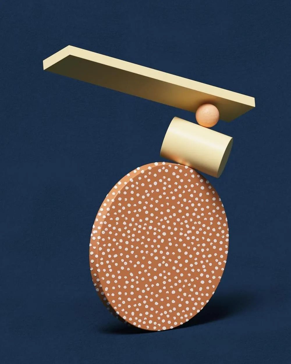

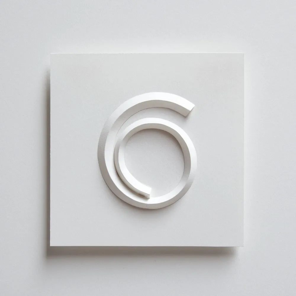
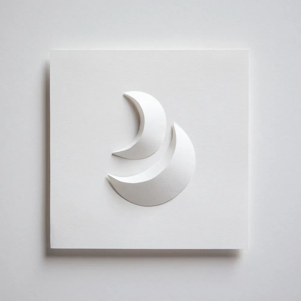
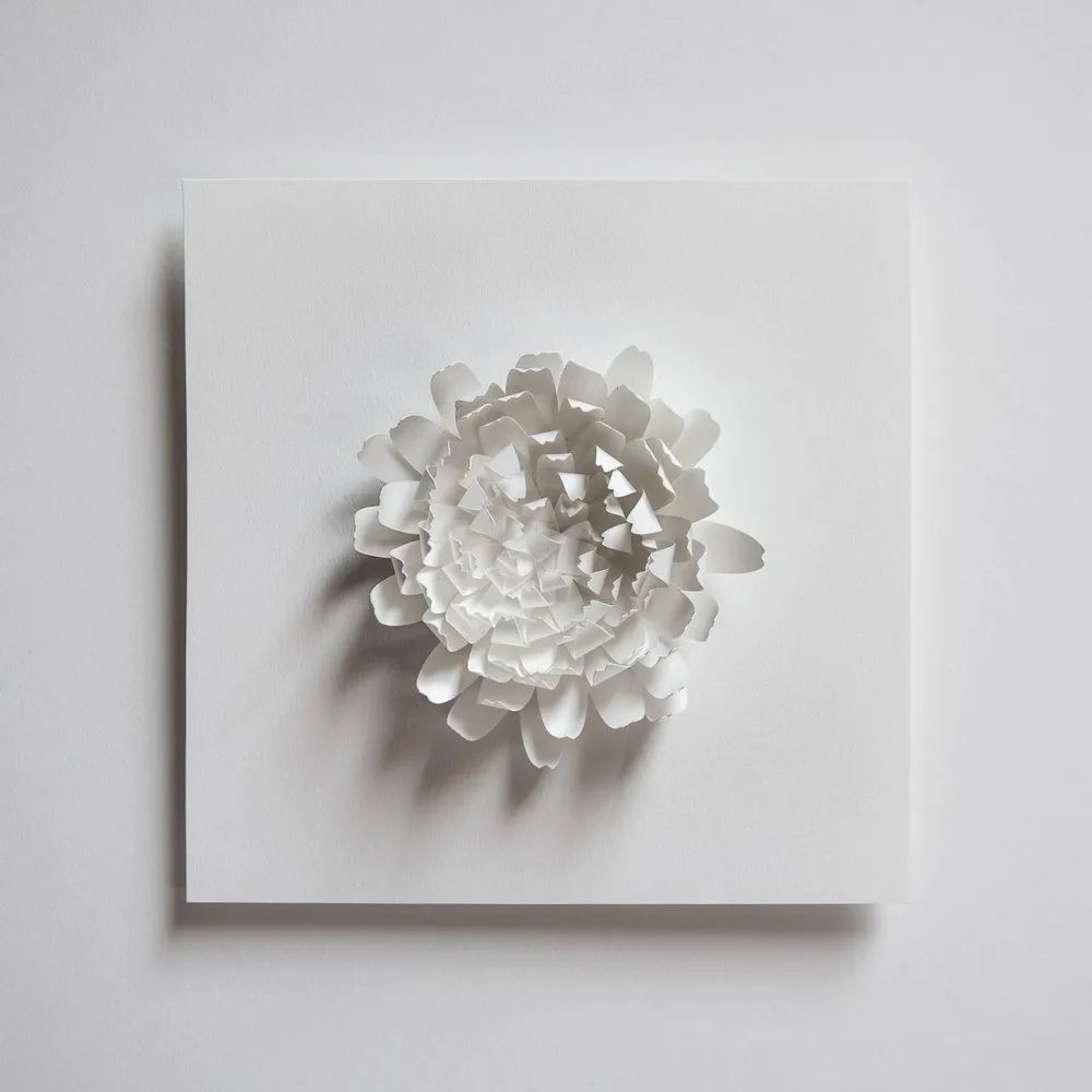
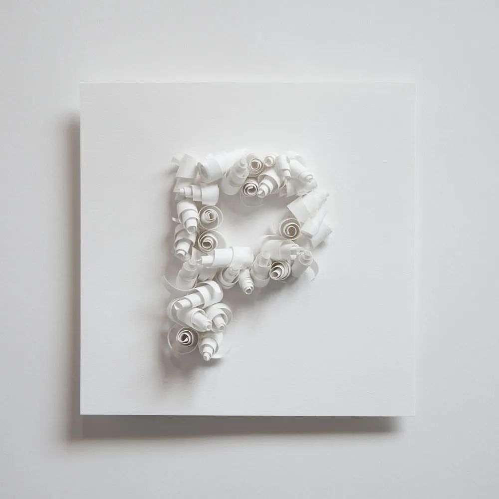
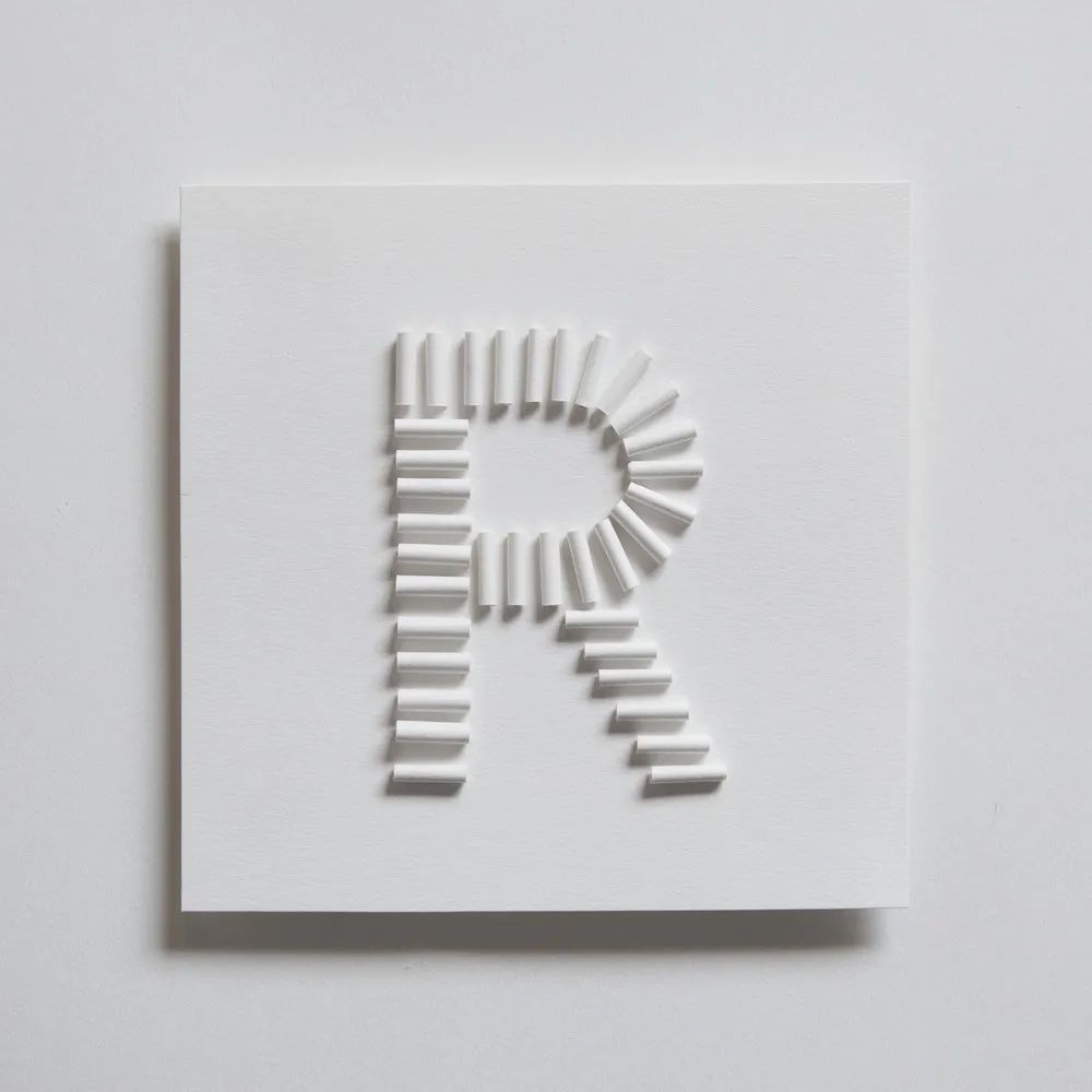
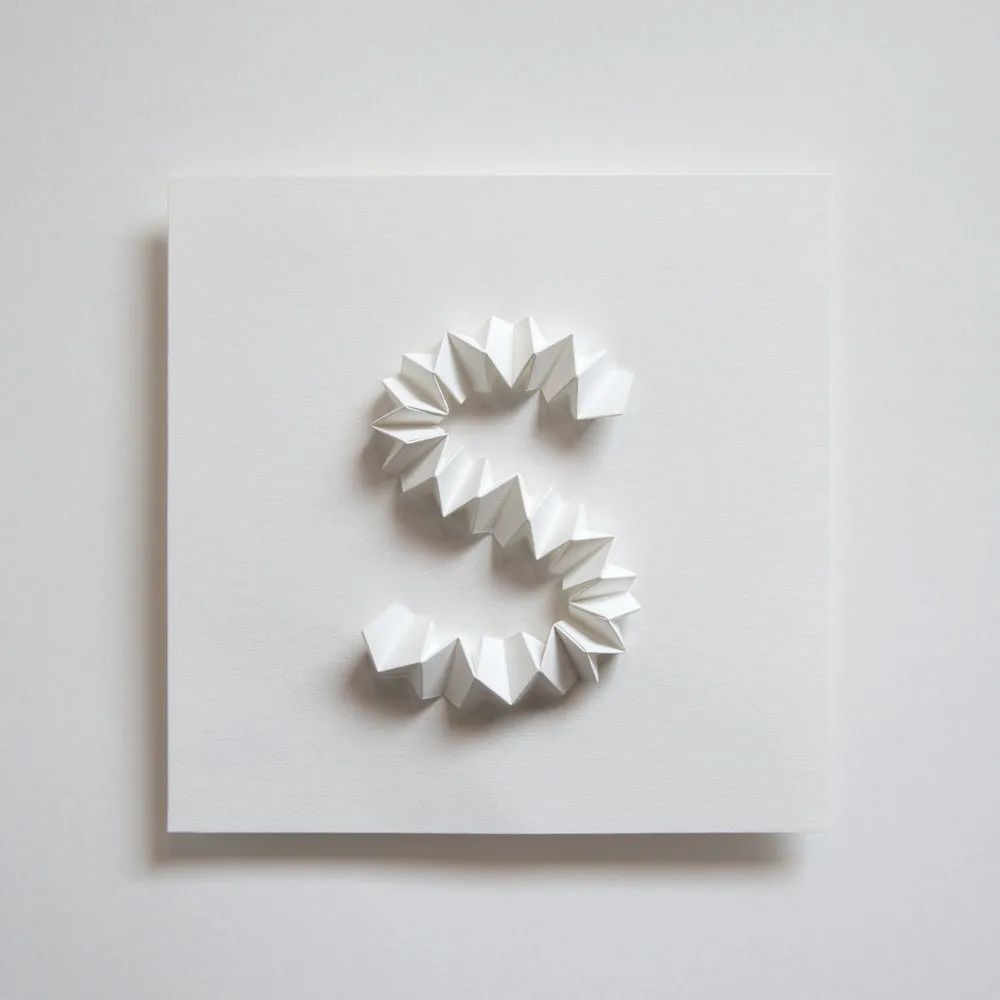
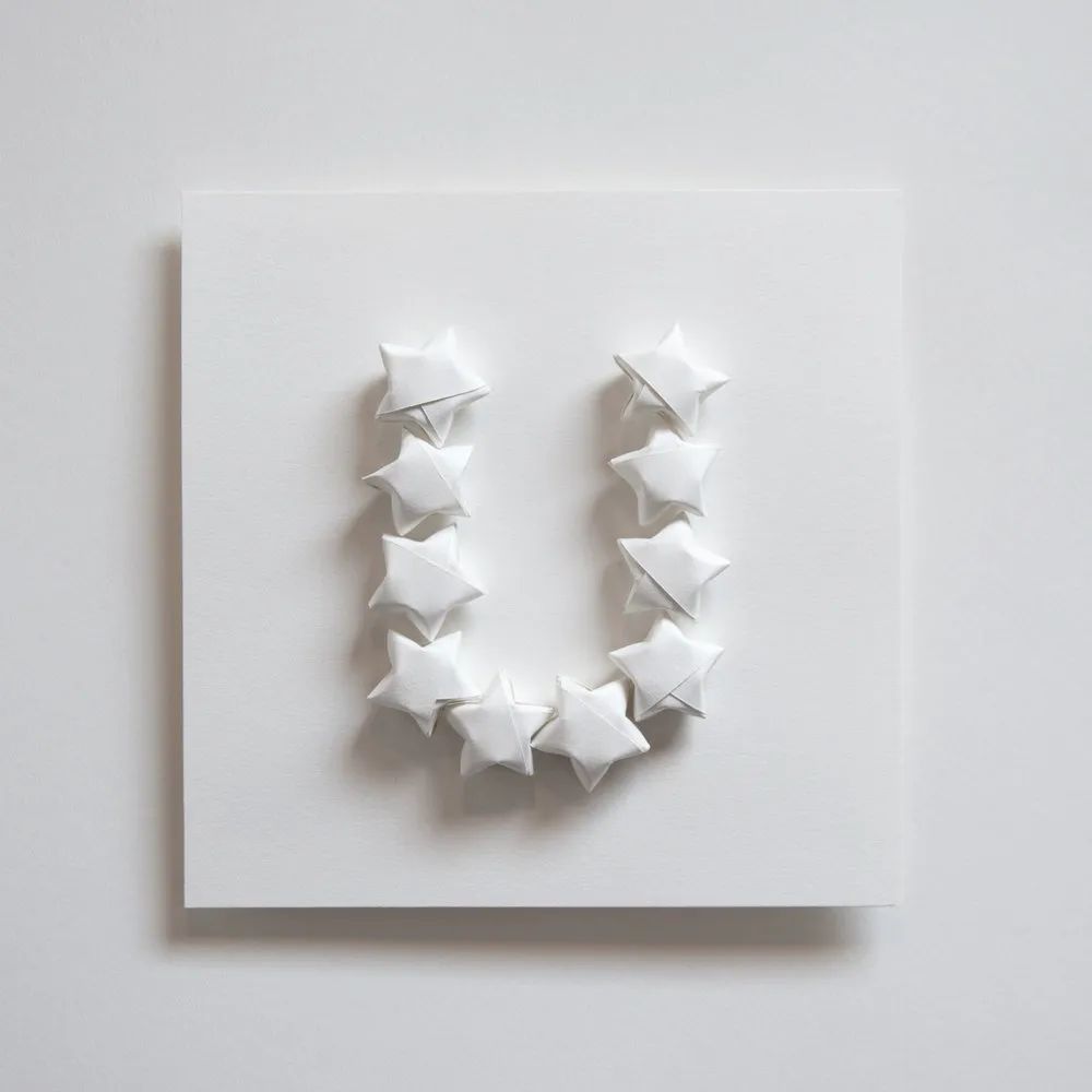
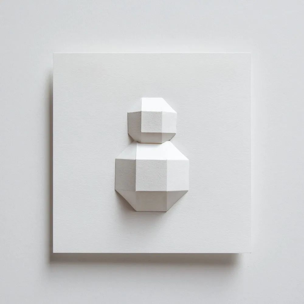
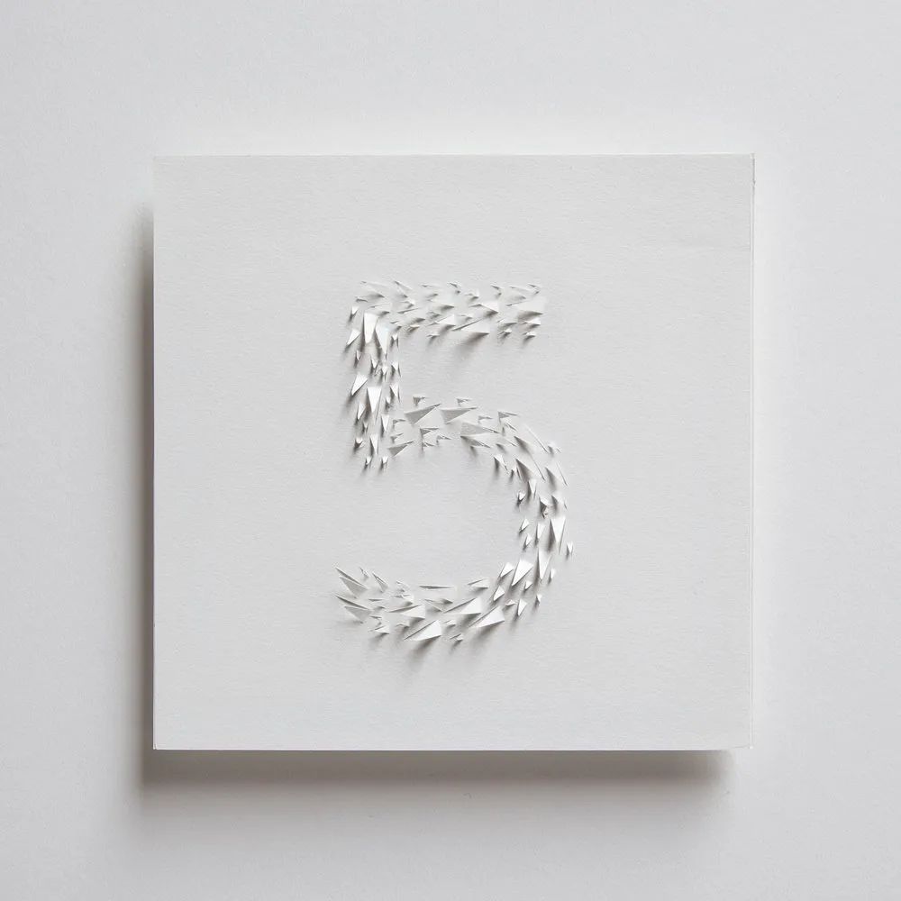
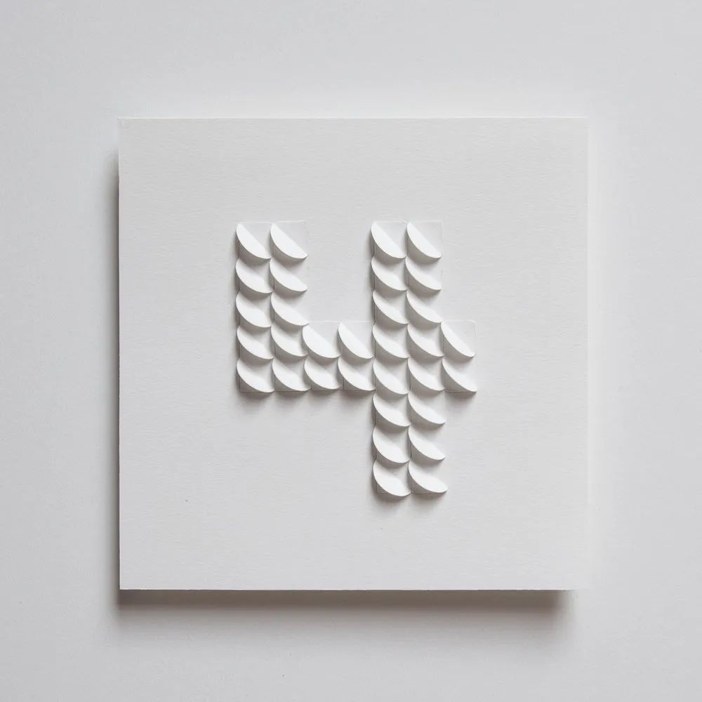
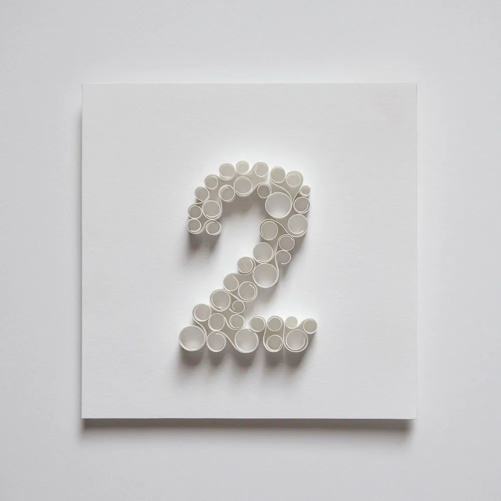
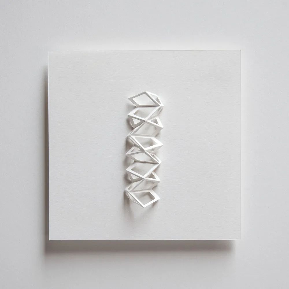
Zai Divecha
San Francisco, USA
Personal official website: www.zaidivecha.com/links
Instagram: @zaidivecha
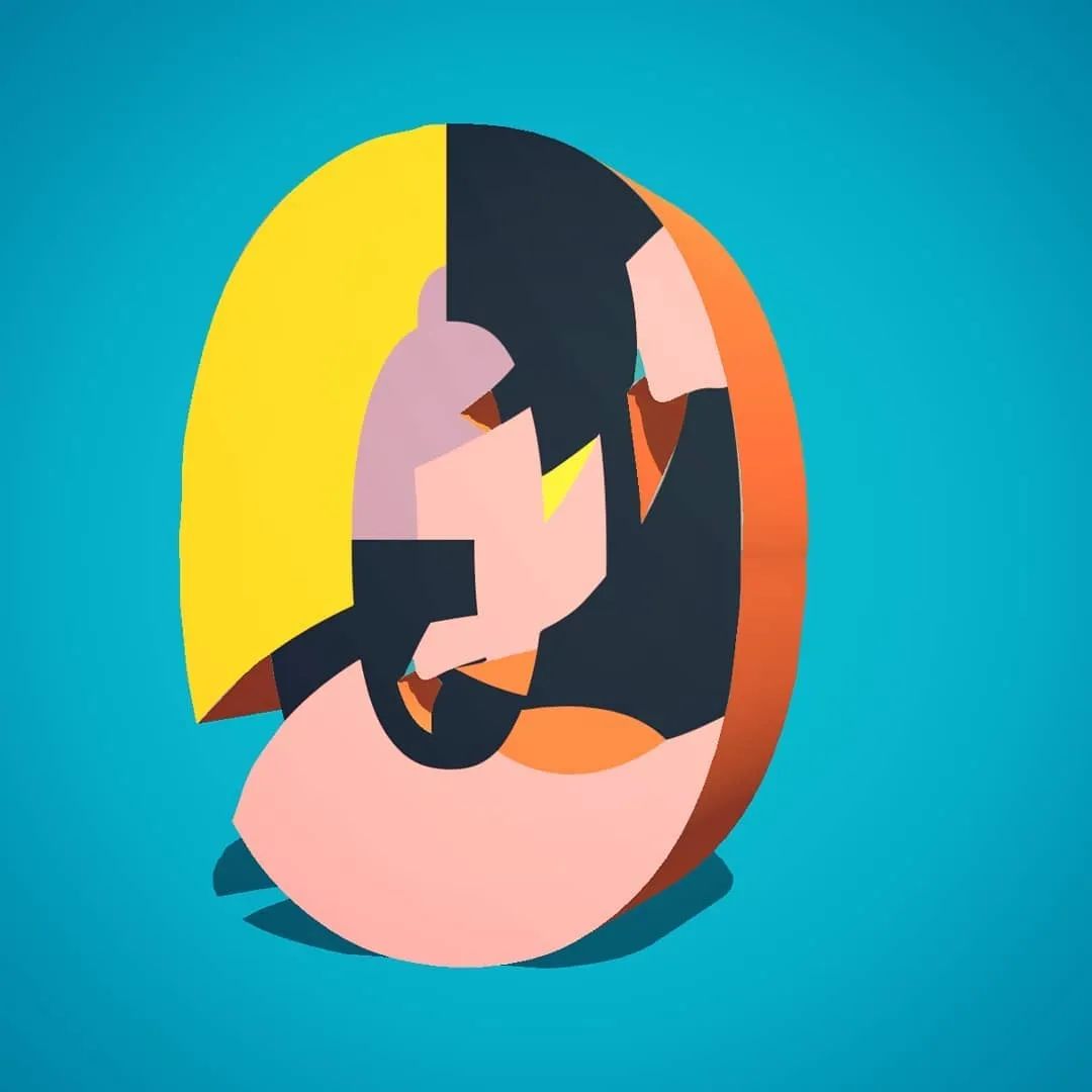
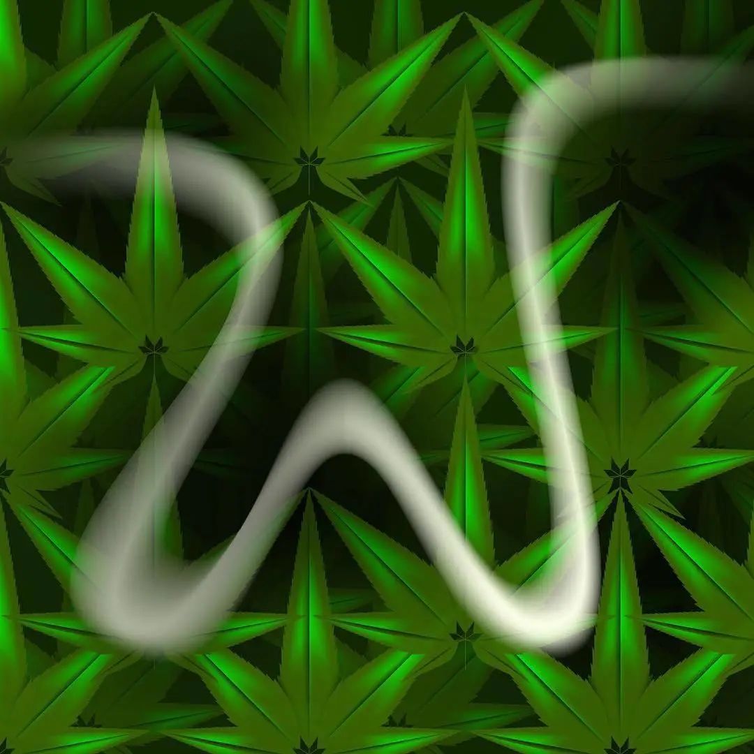
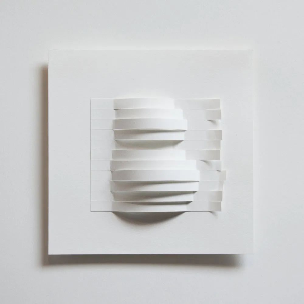
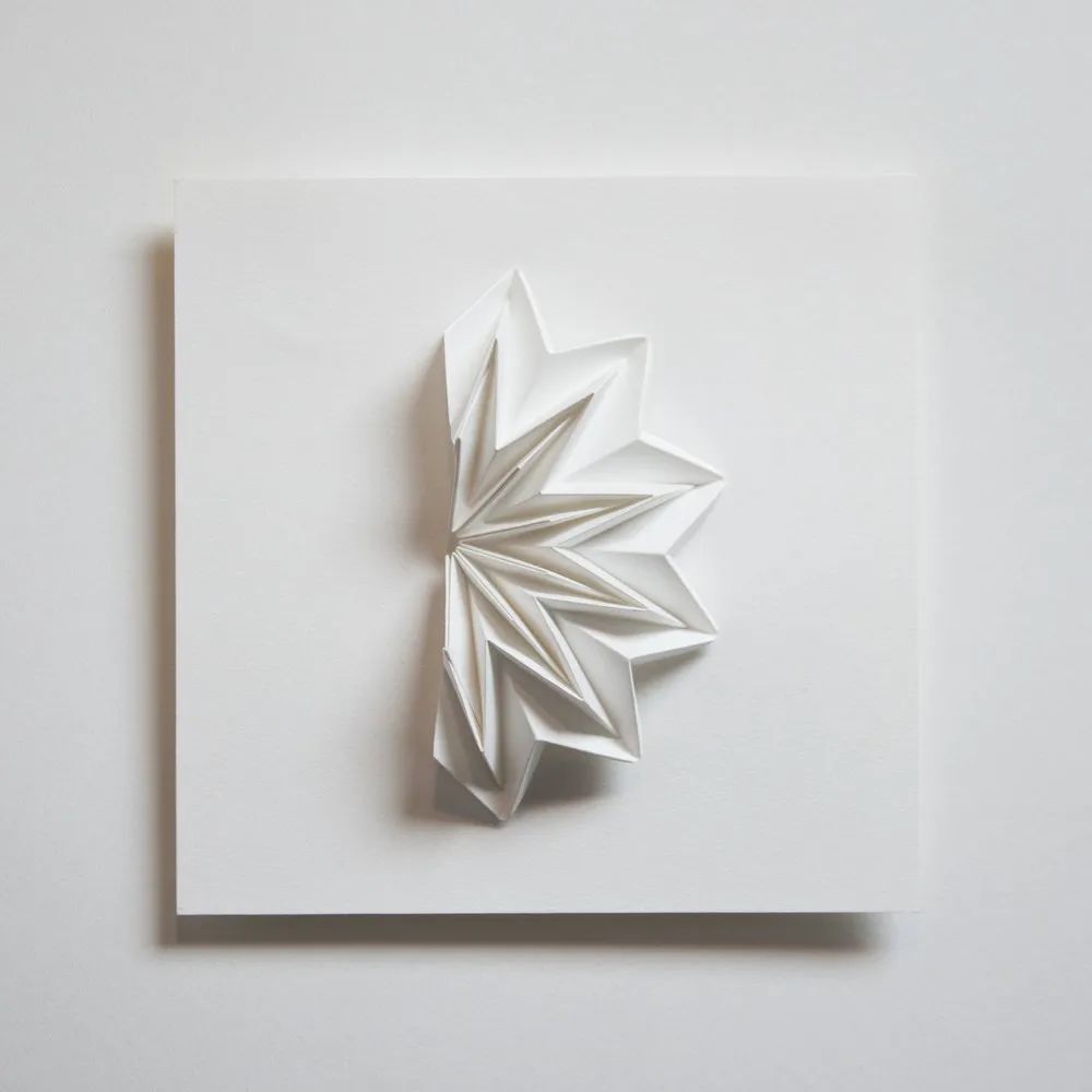
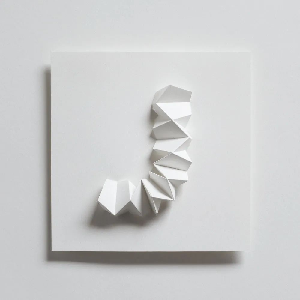
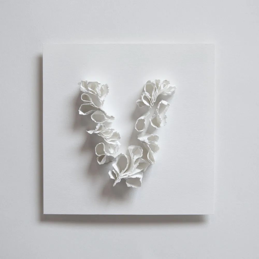
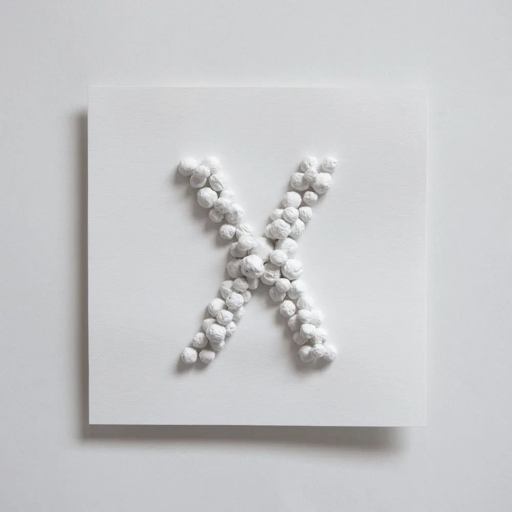
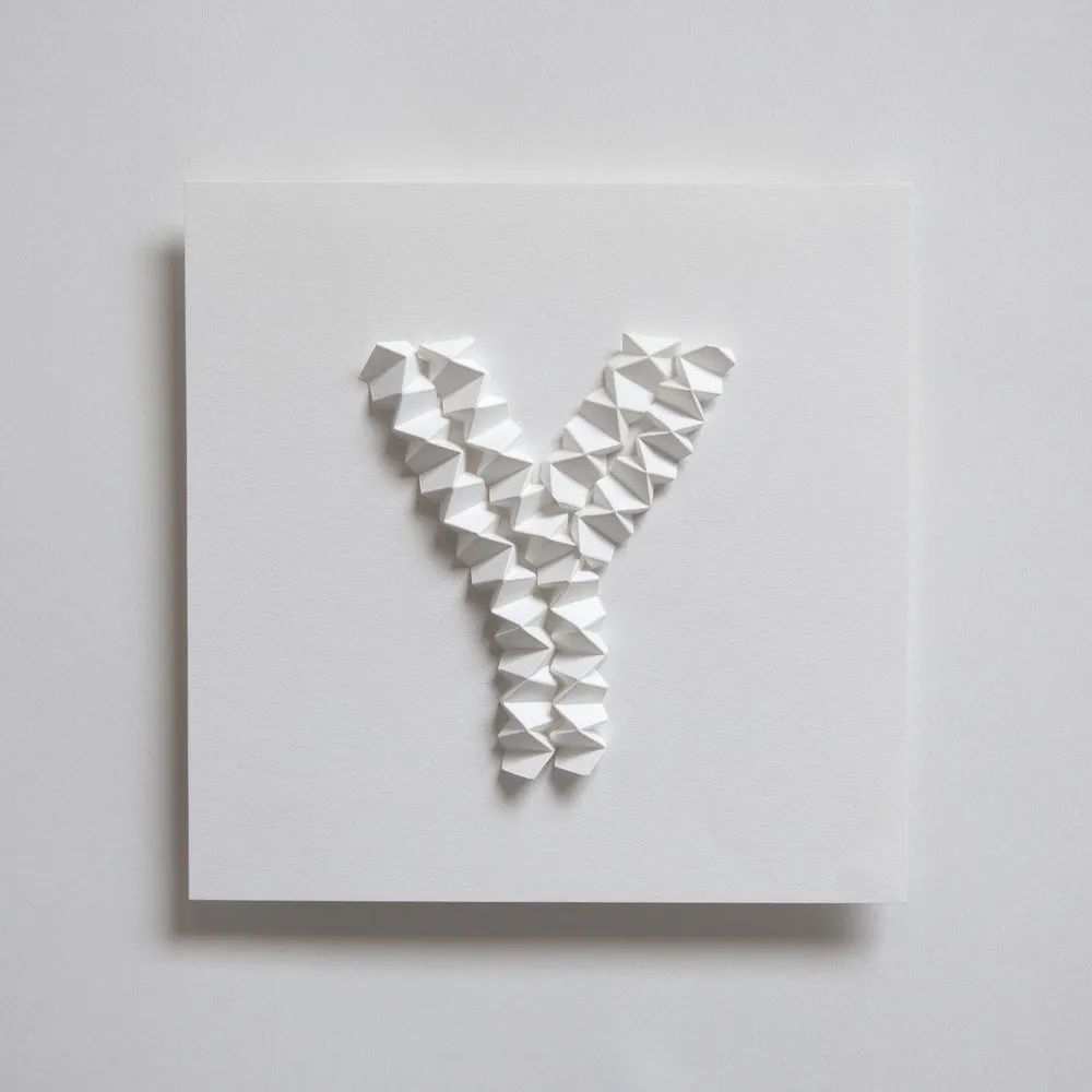
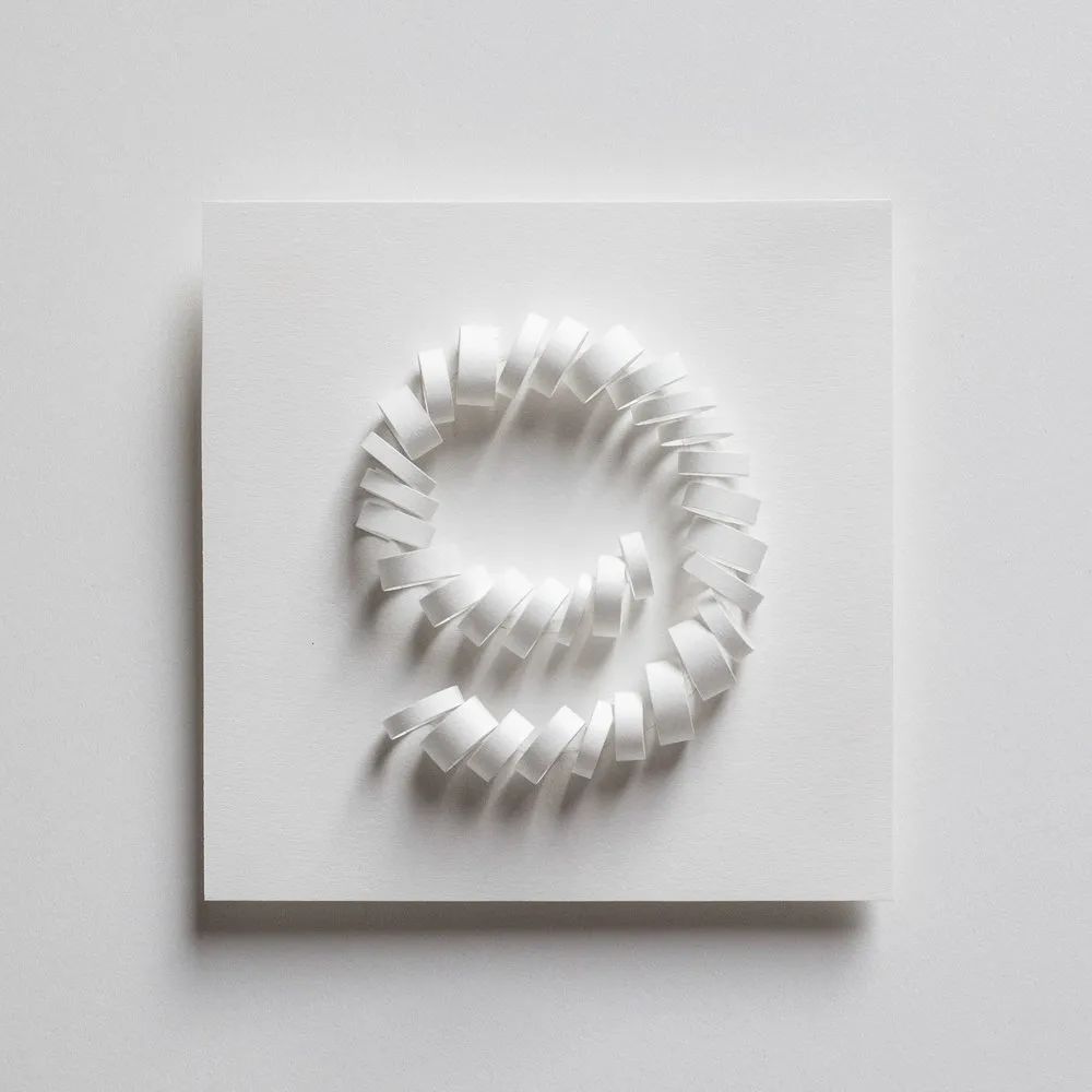
San Francisco-based paper artist Zai Divecha has transformed 36 letters and numbers into geometric paper sculptures and large-scale art installations. At that time, it was an illustrator friend who participated in "36 Days of Type" for three consecutive years and mentioned this project to her.
Although the competition is about to start, there is not much time left for Zai to prepare, she still decided to devote herself to the project, "I determined the elements and materials needed for this design - white paper, glue, 5× 5-inch bottom plate cards, etc., and figure out how to shoot these works, and then start the competition.”
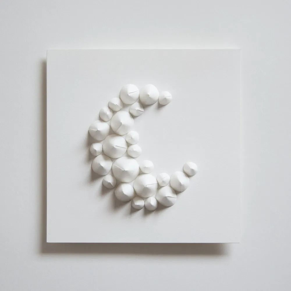
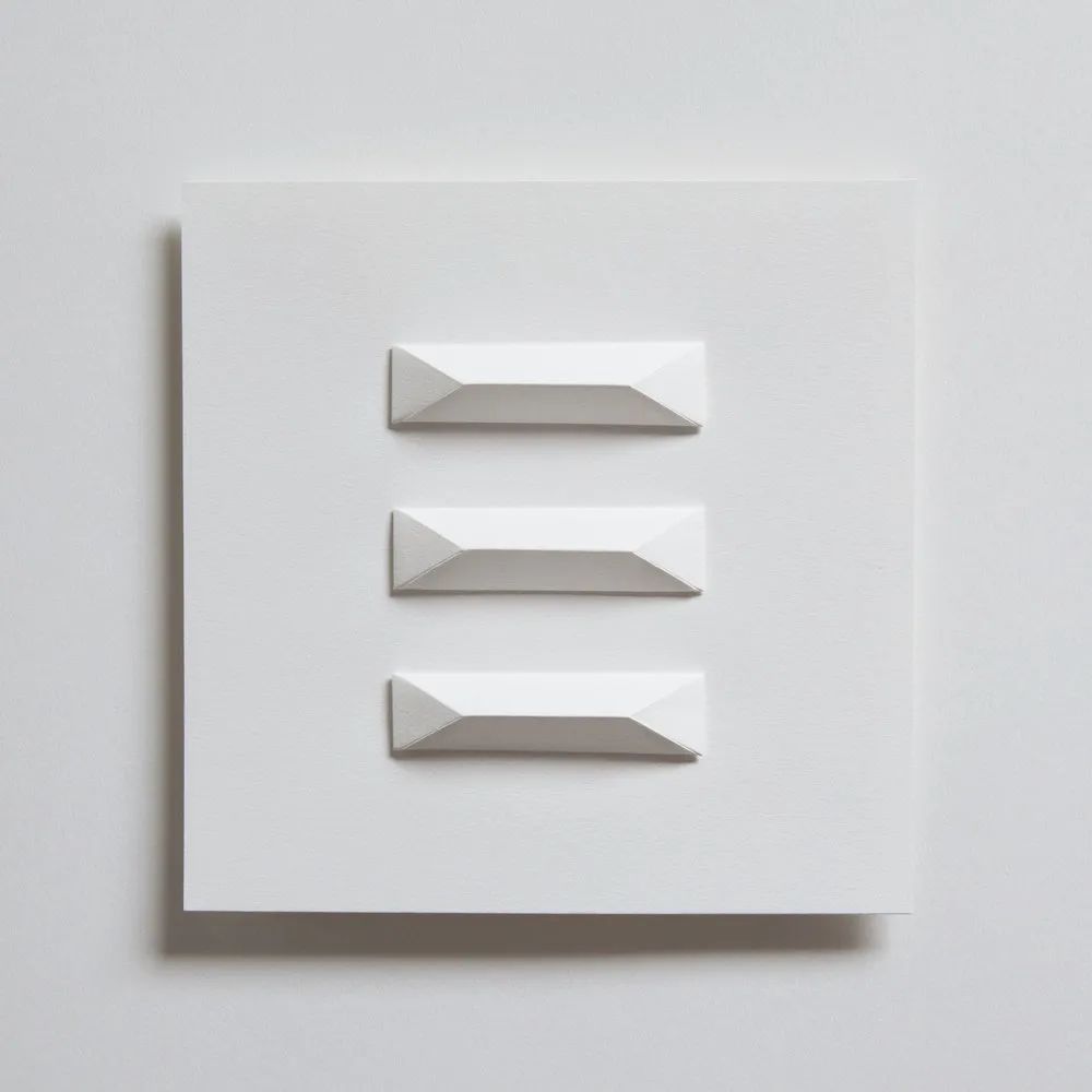
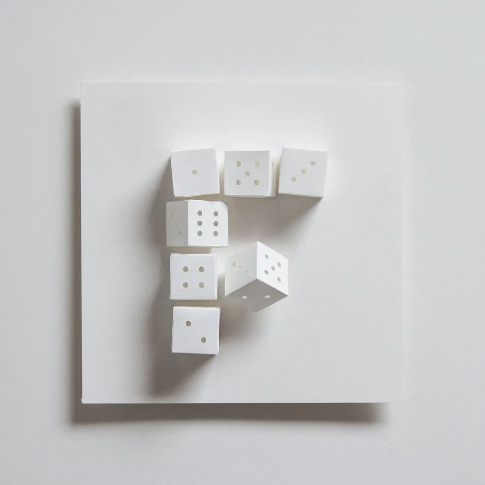 Apart from taking a typography class in college, Zai has never seriously studied or tried typography. Therefore, this is not only Zai's first time participating in "36 Days of Type", but also her first time specializing in font design and creation. “At that time, I tried various paper crafting techniques such as folding, rolling, tearing, poking holes or cutting, and used this as The basic concept of designing letters and numbers." Zai recalls, "Once I found a new pattern pattern or making technique that I liked, I would find a way to turn it into a letter or number."
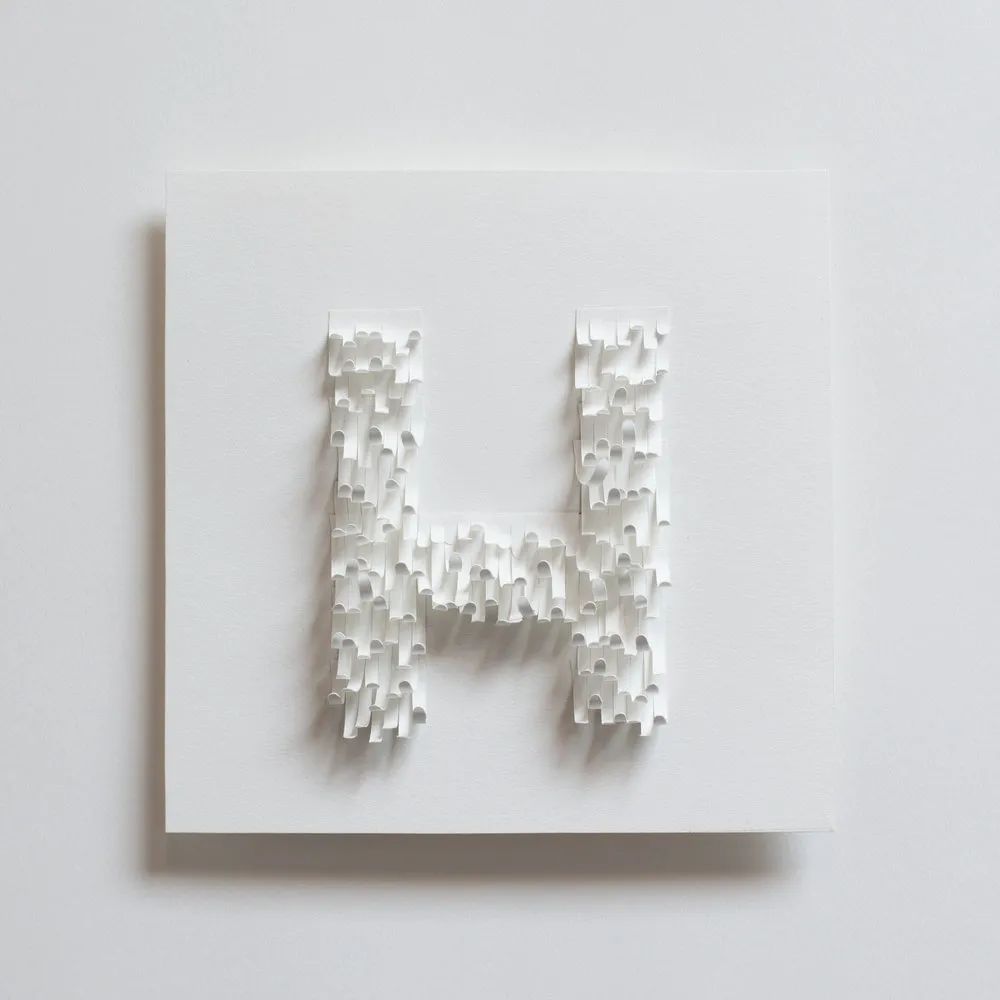
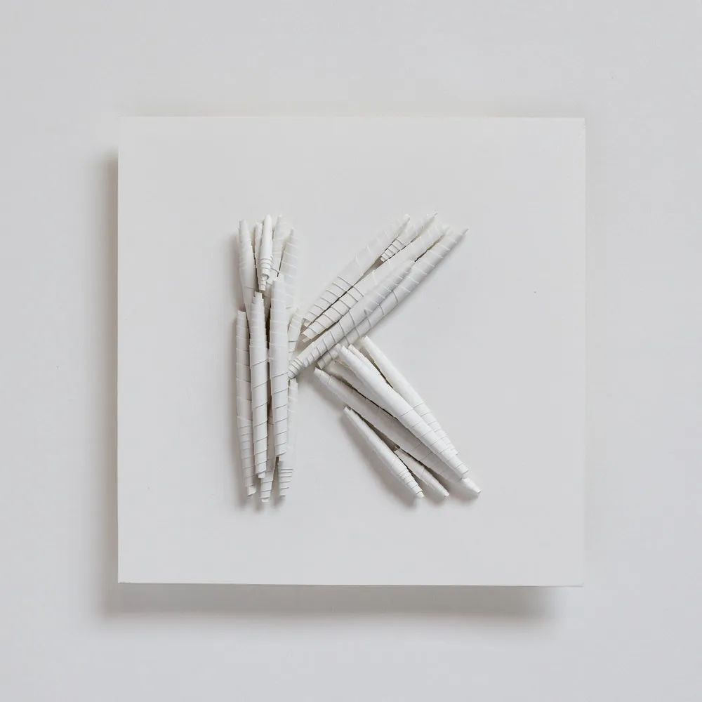
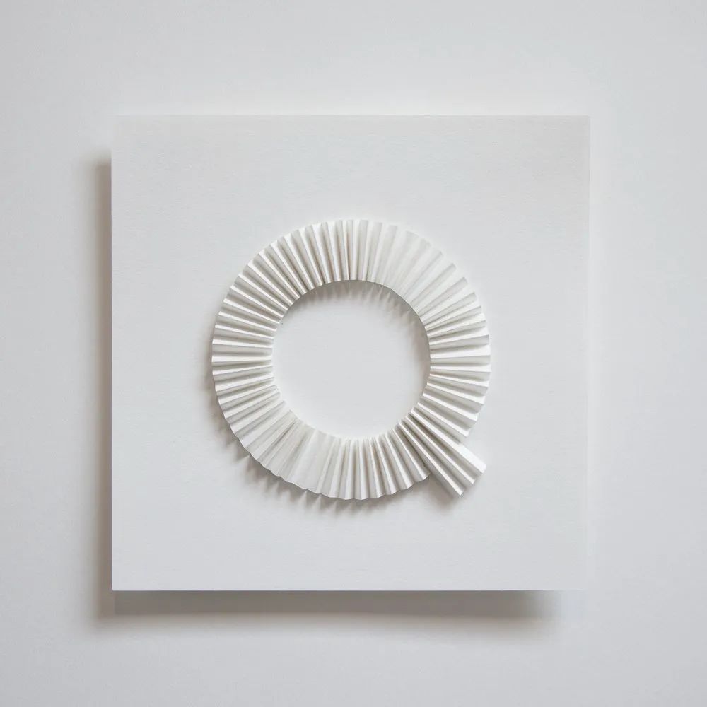
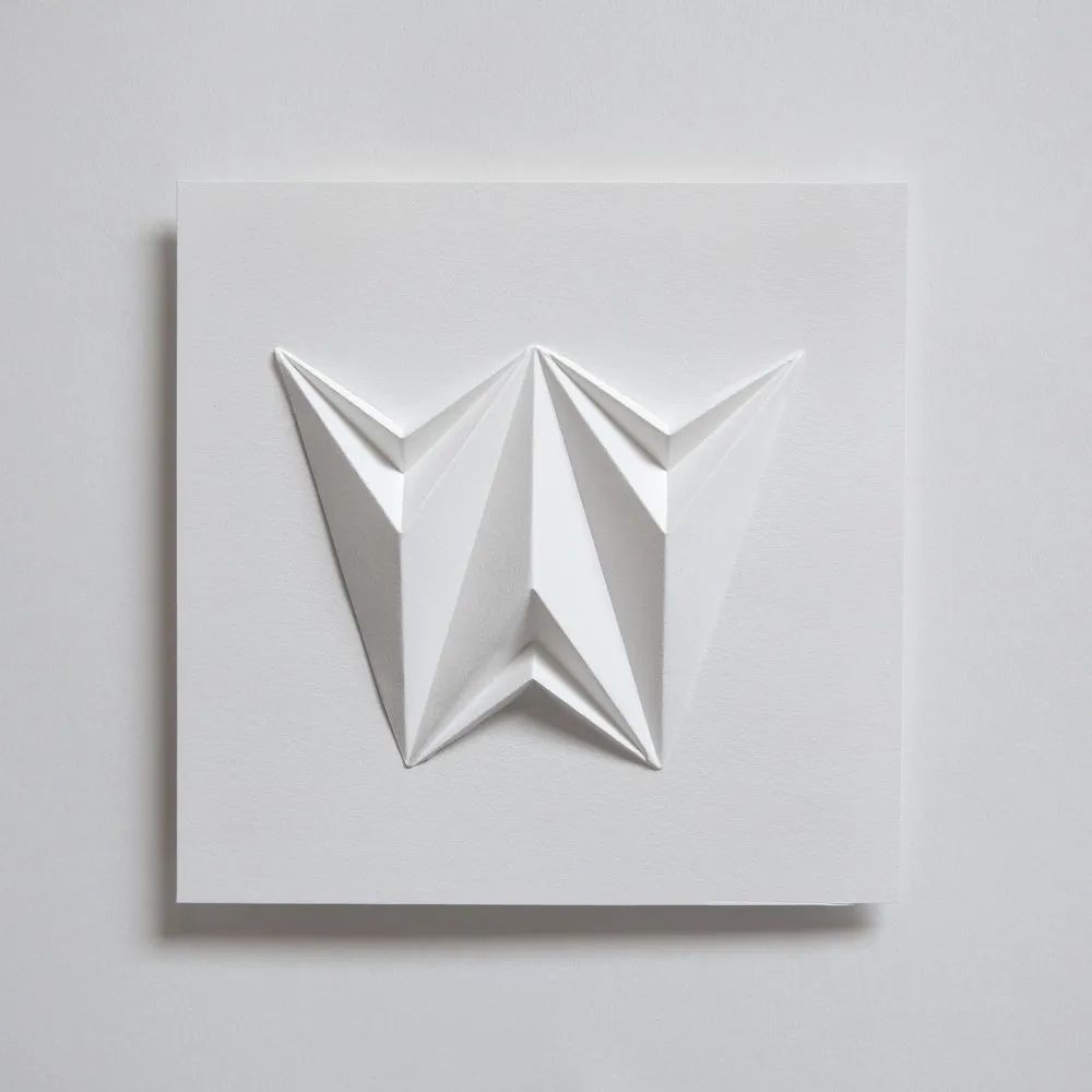
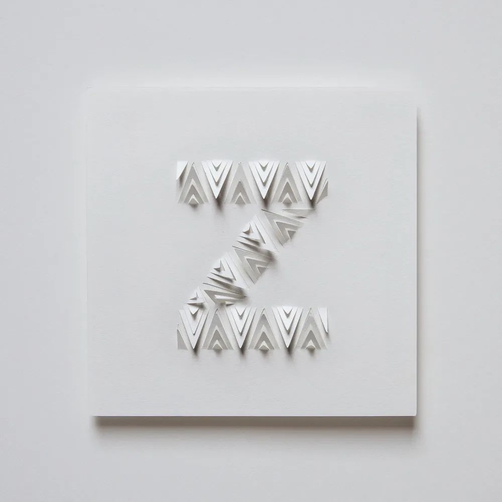 In the process of creation, Zai needs to conduct a lot of experiments, such as rolling the paper into a tube and cutting out small folds, Or knead into paper balls. These experiments also allowed her to improve some common skills and develop many new technologies. Each work takes 1 to 3 hours to create, and then takes half an hour for shooting and post-production. Zai can occasionally create 3-4 alphanumerics at a time, but most of the time it's at the last minute to finish the day's work. She kept going because of the encouragement and support she received from designers and fans who participated in the competition. Some of the works in this project have also become the inspiration for her subsequent large-scale installation works.
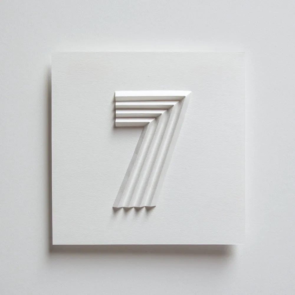
 The seventh "36DaysofType" competition in 2020 started on March 2. Looking forward to more smart, interesting and amazing works in this year's challenge. For more works or competition information, go to the official Instagram: www.instagram.com/36daysoftype
Sources|www. theblog.adobe.com
Compilation typesetting|Roni
Proofreading | ChipsandYogurt, Yeeman
This content is reproduced from Design360°
These font posters are really elegant!
The magic of fonts can make the picture even better!
With these fonts, you don't have to worry about copyright issues anymore
Some pictures are from the Internet, and the copyright belongs to the original author. If you need to reprint, please contact this number


 支付宝扫一扫
评论列表(196条)
测试