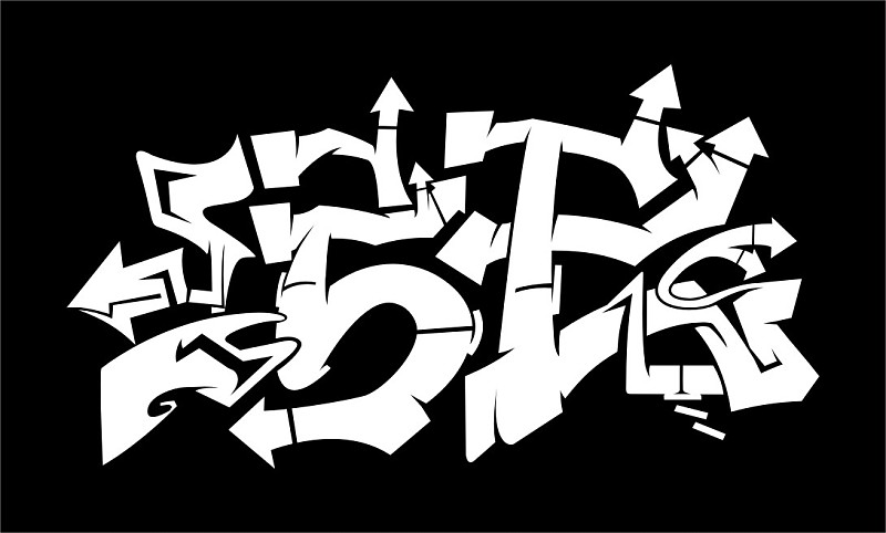
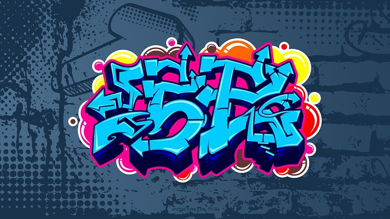
First look at the finished picture

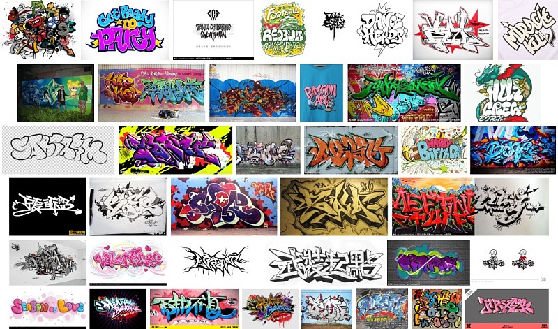
Graffiti fonts, for a designer, may be rarely encountered. But sometimes, you have to make this kind of font, so we can find references on Baidu, especially those English street graffiti, which can get unlimited inspiration. So, the first step is to collect these pictures.
After that, you can start thinking about the font shape.
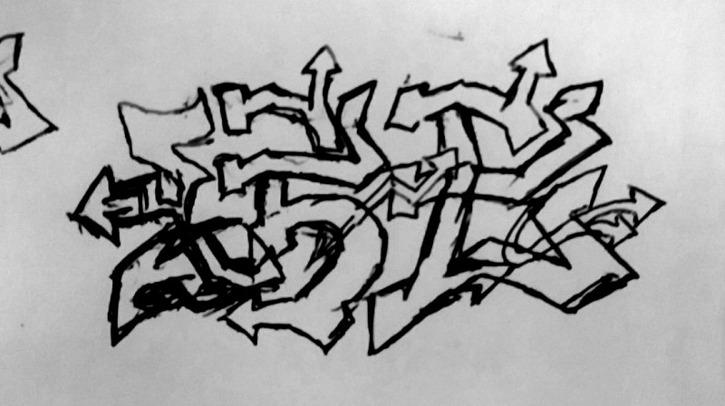
First of all, brainstorm on the draft paper, paint and draw, and when you find the feeling, you can re-draw a slightly complete one, which does not need to be too neat. The sketch is as follows:
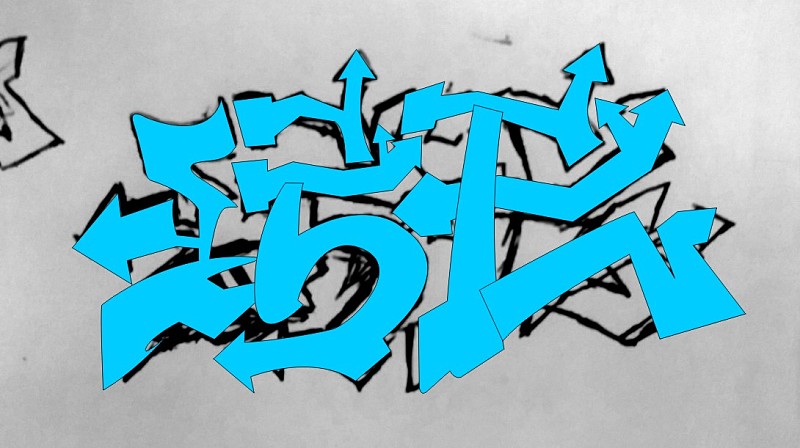
Then import the software, I use CDR. Use the pen tool to draw a rough outline. You don’t need to worry too much about the position of a certain curve, because the sketch itself is very messy, and you can adjust it in the software later. The two words of the drawing process also have fine-tuning. The finished line looks like this:
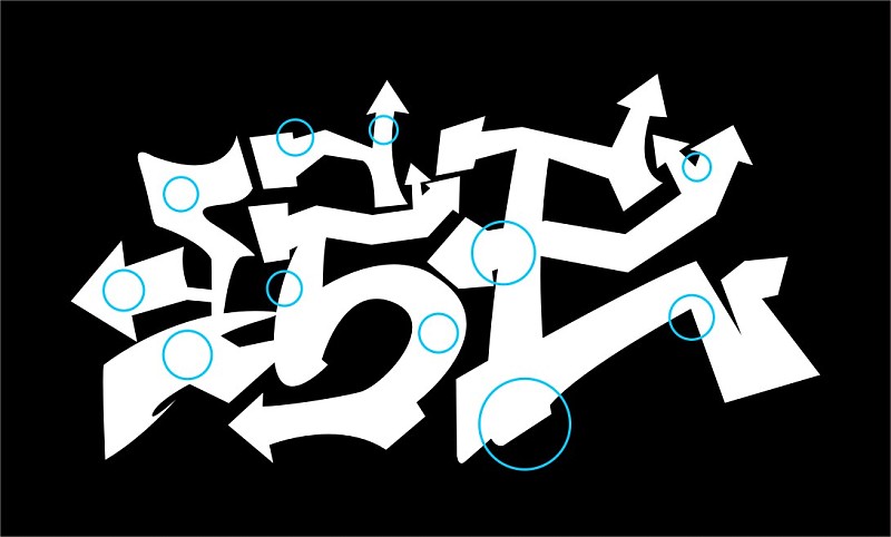
Duplicate one separately, add a black background, and fill the words with white, in order to make it easier to observe the addition of shadows later. As shown in the figure below, add shadows inside the arrow, where the arrow connects with the strokes, where the strokes are stacked, etc. Some of the positions are as shown in the figure below:
This step can only be patiently ticked out one by one. I ticked out the shape, then used the pruning tool to complete the cutting, and then fine-tuned the words and added some details, as shown in the picture below:
To increase the three-dimensionality of the font, use the pen tool to outline the bottom shape. Here we start to consider color matching, as shown in the figure below:
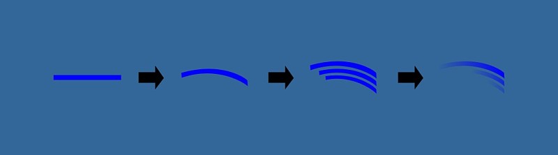
Add one of the unique features of graffiti fonts here. Use the rectangle tool to draw a long rectangle, fill it with blue color, then use the envelope tool to deform, copy two, the size is gradient, and the sense of perspective is stronger. Finally, pull the transparency, the degree of transparency Increment, the steps are as follows:
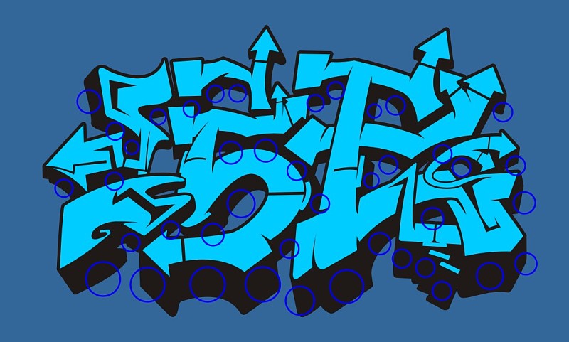
Then apply this feature to most of the three-dimensional shapes of the entire character, because the shapes of each place are different, and each part needs to be adjusted separately, which will be cumbersome. Please adjust it patiently. The approximate position is shown in the figure below:
After adjustment, add a magenta stroke, as shown below:
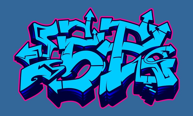
Add highlights in some places, try to ensure that the light source is in the same direction (maybe some places are wrongly added, some places are not added--), and the shapes are drawn one by one and filled with ice blue, as shown below:
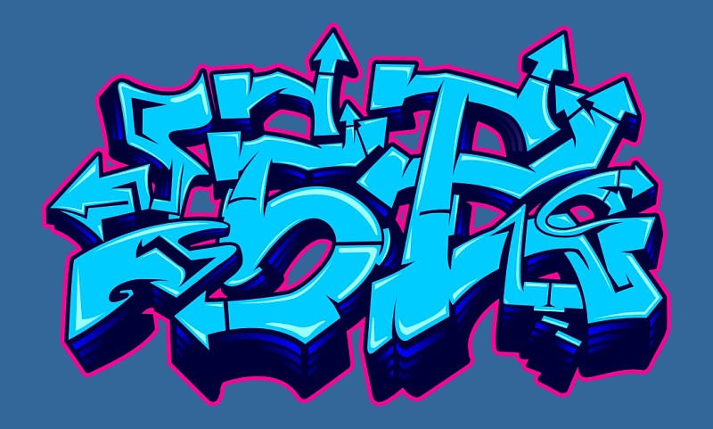
Add some circles, like bubbles or something, and fill in some magenta blocks in the font gaps as shown below:
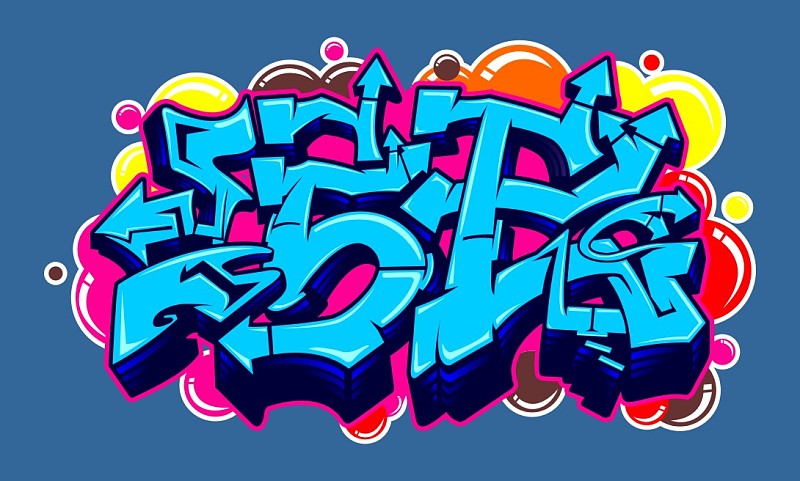
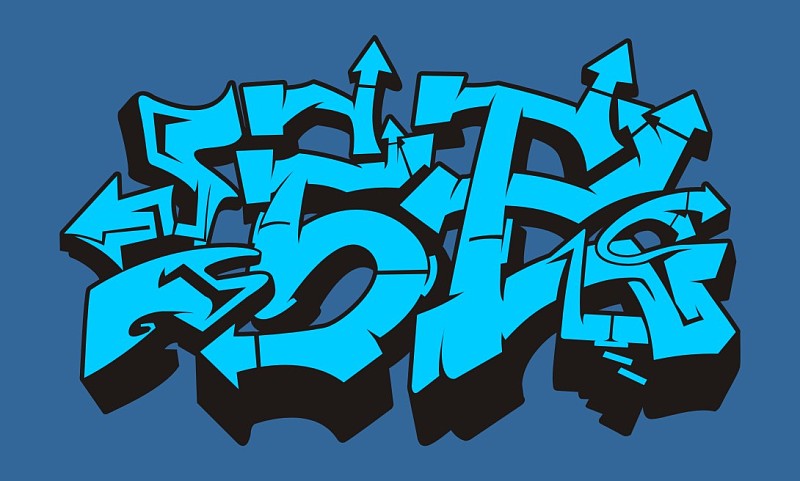
In the end, I was lazy, and directly found the material on the material website, and processed it a little bit. The completed picture is as follows:
Articles are uploaded by users and are for non-commercial browsing only. Posted by: Lomu, please indicate the source: https://www.daogebangong.com/en/articles/detail/Graffiti%20Font%20Series%20Tutorial%201.html
 支付宝扫一扫
评论列表(196条)
测试