By Deanna deBara
Many popular design trends from the 90s are back! This design beauty is breathtaking and is taking a design storm in a trend that would have felt comfortable in 1995 - it's the gradient.
Gradients were a popular way to add color and depth to designs a few decades ago, and they remained a fairly prominent design trend until the late 2000s, when flat designs took hold and gradients faded away. But there's a big comeback in 2018, and we're seeing them everywhere. They're a way to enhance graphic design (a design update called Flat 2.0), add color overlays to photos and add texture to backgrounds.
This trend will continue in 2019!
So how do gradients work? Why are they so hot right now? How will we continue to see gradients in 2019 and beyond?
What is a gradient?
-
Gradients, also known as color transitions, are gradual blends from one color to another (or, if you're in a colorful mood, from one color to another color to another - a gradient not limited to two colors).
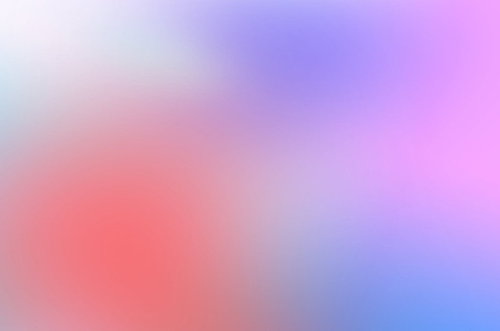
Gradients can mix or transform similar colors (for example, different shades of blue or light orange to dark red) or completely different or contrasting colors (such as purple and red or blue and yellow).
The gradient trend is very flexible, it can be bold or subtle, and is the focal point of a design or background element. And because they mix and blend different shades, gradients can create color combinations that feel different, giving a design a totally unique feel.
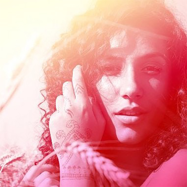

Gradients can be used to add depth to graphic designs, create interesting textures for backgrounds, or breathe new life (and color!) into photos – the possibilities are endless!
Why are gradients so trendy right now?
So, why is the gradient trend so popular now? The energy of these stunning vibrant color transitions makes them stand out and make the picture stand out.
When gradients came back to the design scene in 2018, many designers were surprised - especially when big brands started using them. Many thought going the gradient route was too regressive. Nostalgia is one thing. But will people really connect with the trends we've seen before?
It turns out that people love it - especially the gradient trend of 2018 that feels more refined and high-end (from backgrounds to textures to overlays) and these new gradients feature bright colors and fun colors Combinations make them feel fresh and modern.
People are crazy about the gradient trend for a greater purpose than nostalgia factor, and with the amount of content consumers are exposed to every day, brands need to find a way to break through and capture their ideal customers attention, adding interest to the design, gradients of color are the perfect way to achieve this.
Gradient application
-
Gradients are versatile, and they're a solid choice for just about any design medium under the sun.
Here are some examples of gradual trends:
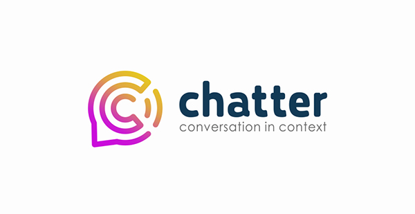
Logo
Gradients can add a unique feel to your logo and help you stand out from the competition, try incorporating bold colors into large areas of soft-feeling colors for a more subtle effect.


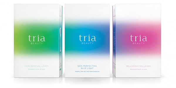
Packaging
Make your packaging design stand out - gradients are the way to achieve it.
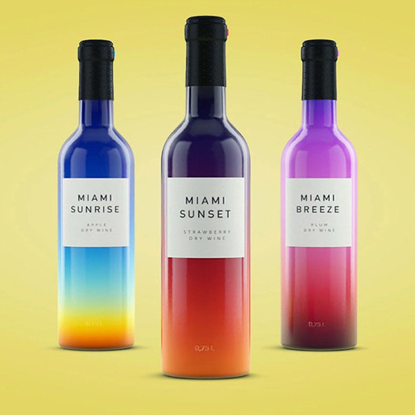
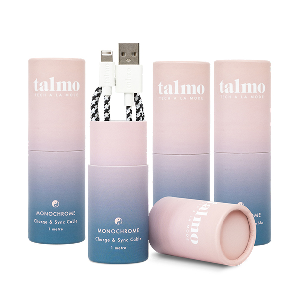
Use a gradient background as the main image in your packaging. Bold or subtle gradients can make a lot of impact as long as your product and brand feel fit the style.
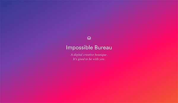
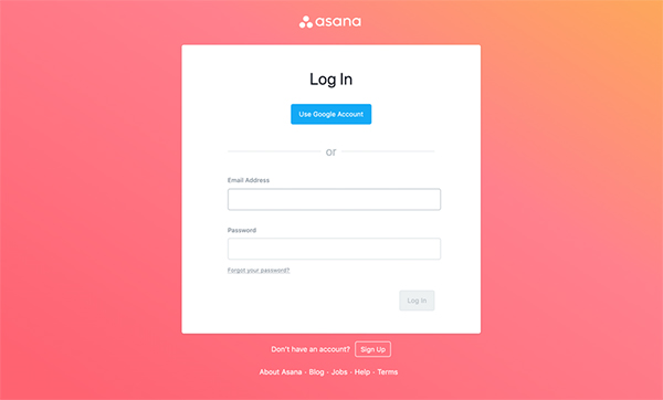
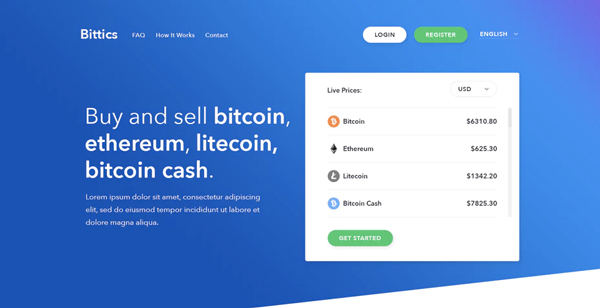
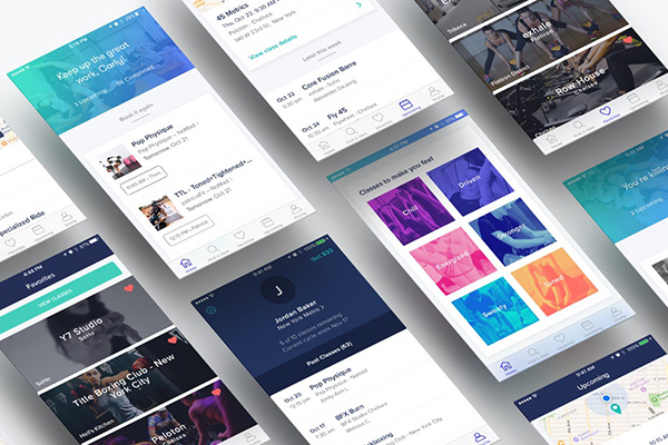
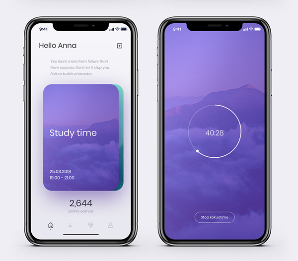
Web design
Incorporate the gradient trend into web design, you can use a combination of soft colors to get a subtle background, and you can also get a fun and trendy atmosphere through photo overlays ,
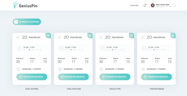
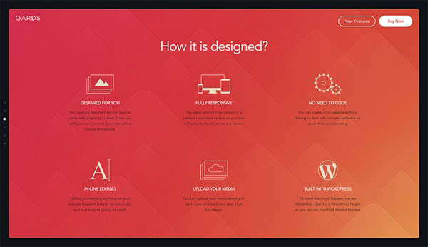
Use in UI Design
Whether you use it in marketing collateral or in the background of your app, or as a UI element, gradients are a great way to good way of showing. Depending on the color you choose, you can set a bold color mood to give the picture a vibrant feel.
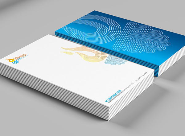
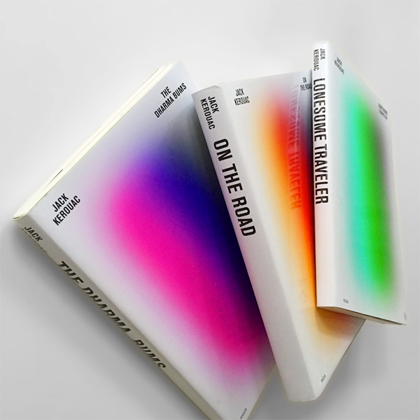
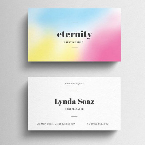
Printed Materials
Business cards, book covers, and posters: Printed materials are a great opportunity to bring the gradient trend to life, using subtle color combinations as backgrounds, or Use it as in illustration. In short, as long as you like, you can use this design method arbitrarily.
How to use gradients correctly in your design
1. Choose the right color
The most important thing for a gradient design is to choose the right color. In order to make the gradient design look beautiful, you need to choose colors with similar hues Colors (e.g., a gradient from light blue to dark blue) or complementary colors (colors opposite each other on the color wheel), analogous colors (three colors side by side on the color wheel) in color composition theory.
2. Reasonable use of gradients
Since gradient colors can add luster to our works, we must use them reasonably, not overuse them, and keep the design beauty.
3. Know your audience
If you want the gradient design to bring the right direction, you need to really understand your users' preferences. For example, if you’re marketing to a more traditional group of merchants, it’s unlikely that a neon pink and yellow gradient will be to their liking.
4. Make it fun
This is a fun trend, so have fun! Play around with different colors, experiment with gradients in the background, and find what works best for you as a focal point, crazy coverage... Point is, this isn't a trend meant to be taken super seriously. So relax and enjoy your gradients!
Articles are uploaded by users and are for non-commercial browsing only. Posted by: Lomu, please indicate the source: https://www.daogebangong.com/en/articles/detail/Gradients%20have%20been%20around%20for%20so%20long%20do%20you%20know%20where%20they%20are%20used.html
 支付宝扫一扫
评论列表(196条)
测试