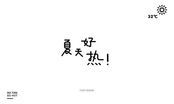
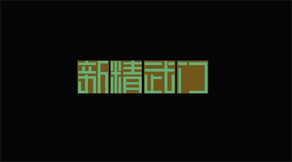
A few days ago, I saw a friend (Pippi) post his own font practice, as shown below:
The evaluation of this friend is: the attitude is very good, and there are some unique ideas in the design, but according to this practice method, even if you do more exercises, you will not There is a qualitative leap, because the basic understanding of font design is not enough!
In fact, there are often situations like this: a good (or bad) font design, let us evaluate it, maybe we can't tell what is good or bad, only Can rely on feeling, but due to limited experience, feeling may not be accurate. If you can’t tell the difference between good and bad, let alone create it yourself, it must be luck. Today we will solve this problem and talk about how to get started with fonts design.
1. Give up complex font design effects first
I have emphasized the basics in every article recently. Don’t be confused by other people’s excellent works. Behind those excellent works are profound basic skills and day and night exercises. If you haven’t experienced these, then Please do the basic font first, and then make complex changes.
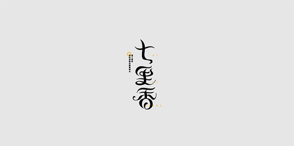
For example, try not to try this font first:
We can't control it at all in the early stage. At most, we can try to do the following horizontal and vertical:
But if you don’t understand the principle, it’s not easy to do a good job in basic fonts, so we must first grasp the principles and do a good job of the foundation, and then talk about other things, continue to read !
2. Remember this knowledge point that can excite you
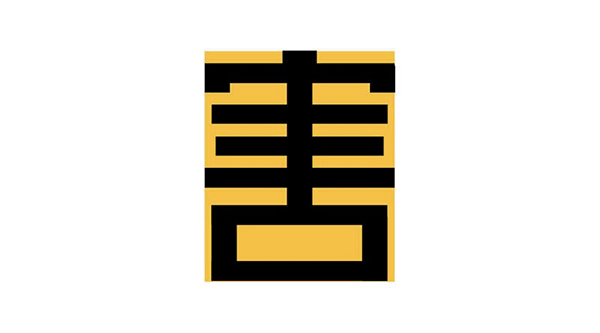
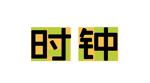
If you know how to give up, then our problem will be much simpler. In fact, it is not difficult to do a good job in basic fonts. It is enough to remember one knowledge point. There are many sayings about this point, but the meaning is the same. The font is full! What is fullness? For example, first draw the range box (yellow) of the font. Fullness means to make the font expand the entire yellow area as much as possible. Let's first take a look at what it looks like if it is not full:
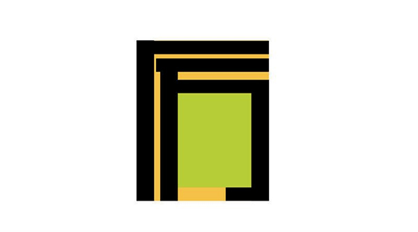
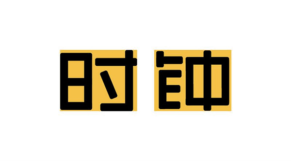
The green areas are places that can still be stretched outwards. After stretching, the appearance is as follows:
In this way, it will look much fuller. This knowledge point is very, very, very important. You must practice hard to digest it! We can take a closer look at those excellent font designs to see if they are all full, and draw a few frames to see if they are all stretched out:
3. Emphasize two points for attention
The designed font must conform to the rules of the actual font
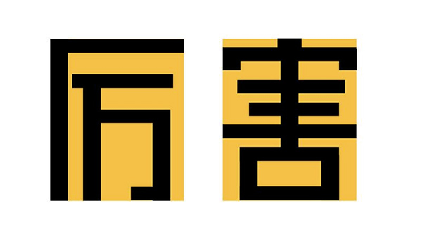
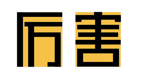
The basic principle of font design is to conform to the rules of the actual font as much as possible. If they are made to be the same length, there will be ambiguity. Is your character "shi" or "earth"? Another example is the word "harm" here:
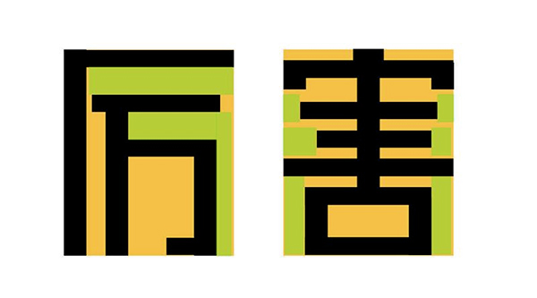
The three horizontal bars in the middle are named as the shortest in the middle, but if you insist on designing it to be the longest, it will definitely not look good. If you don’t believe me, try:

Don't try it, it won't look good, hum!
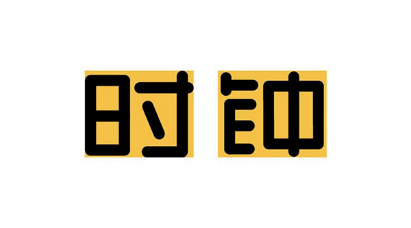
Although it is said to be full, don't overdo it!
Then many friends may know that the font needs to be full, and they will not be flexible at first, so that the font will be full to death. We must keep in mind that while full, we must also consider balance, which is the balance between each negative line. Let’s see now The green negative line is much larger than the yellow negative line, which is a bit too much, as shown in the figure below:
Of course, there will be some masters who intentionally do this very special effect, but for newcomers, it’s better to be steady in the early stage, ha!
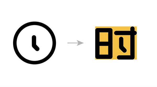
4. Let's design a font together
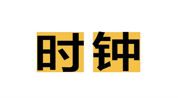
According to this point, let's make a simple font design step by step - "clock", here we use the basic font Fangzheng Lanting Bold Black, as shown below:
Let's build a basic glyph based on this font first. Think about it, and according to that knowledge point, you think it's not full enough. See if it's the same as I thought (the green part is places that can be optimized and stretched out):
By adjusting the green part, the following picture is obtained:
Remember to do the horizontal and vertical first, and don't rush to turn. Next, add some attributes to the font, such as round and cute, then turn the right angle into a rounded corner:
If you think the basic font is OK, then think about how to add some small ideas. For example, the clock can think of the dial and hands. Can the hands of the clock be combined with the font? As shown below:
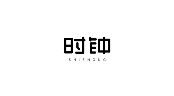
In this way, a simple basic font design is almost obtained, with a little modification, as shown in the figure below:
In the early stage, you can build the basic skeleton without any creativity! The above is what Cai Xin wants to share today. It is not absolute to learn to be flexible in everything. For example, I wrote before that I used Boolean operations to make graphics. Some students have been thinking about it. Just use a pen, don't hold back, your body is important.
Articles are uploaded by users and are for non-commercial browsing only. Posted by: Lomu, please indicate the source: https://www.daogebangong.com/en/articles/detail/Getting%20Started%20with%20Typography%20Master%20these%20two%20knowledge%20points%20that%20excite%20you%20first.html
 支付宝扫一扫
评论列表(196条)
测试