Text is an important part of human culture, and it is also used by people to communicate and transmit information main means. Text is an important constituent element in layout design, and it is also the most direct way of visual communication.


In layout design, the selection of font type, font size setting, word spacing and row spacing arrangement are the main components of font expression. Not only should the visual impact of the text be fully considered, but also a sense of order and balance should be formed.

font
①Arial. It is the easiest to read, giving people a sense of generosity, elegance, and simplicity. In the layout design, the arrangement of Song typeface gives people a delicate and unique temperament.
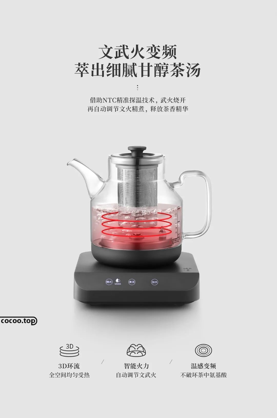
②Blackbody. The strokes are thick and straight, and the font is square and full, giving people a stable, eye-catching, and rational visual experience. It is mostly used for titles, covers, or prominent parts of the text. Many similar fonts are also creative deformations based on boldface.
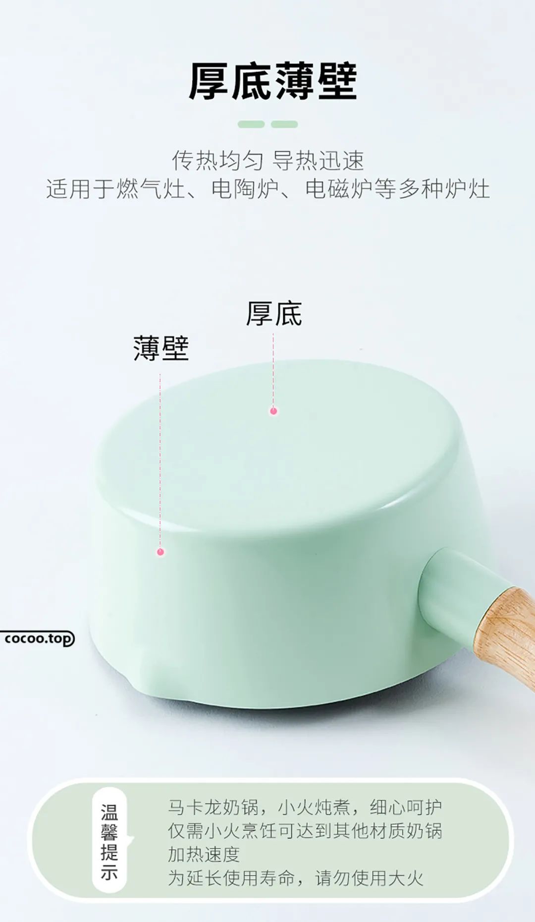
③Calligraphic font. Calligraphic fonts have an internal echo with modern fonts. The combination of this font gives people a sense of harmony between modernity and tradition, conforms to modern aesthetics, and can create a simple and artistic atmosphere.
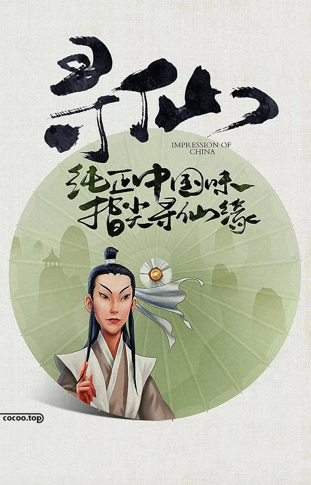
④Artistic font. There are many changes in artistic fonts, which are novel and unique, and have distinctive personalities. They can be expressed by choosing different fonts to form a combination of multiple fonts, which can produce strong visual effects and be more eye-catching.
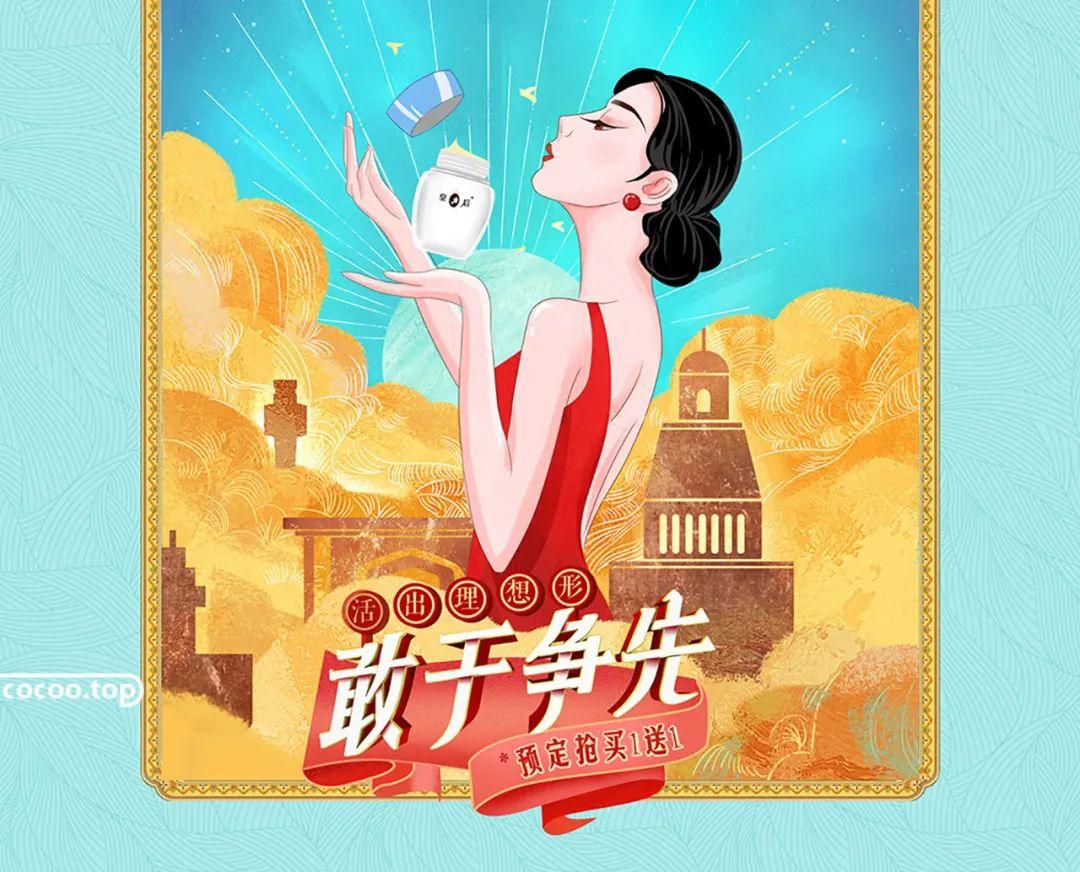
On the same layout, no matter how much information there is, it is best to control it to two or three fonts. If there are too few fonts, the picture will appear monotonous; if there are too many fonts, it will feel messy and lack integrity.

Font size
Font size is the size of the font. Large fonts have a strong visual impact, while small fonts are slender, elegant, and strong in integrity. The ratio of the smallest character to the largest character in the layout, and the font size is called the text jump rate. The larger the ratio, the higher the jump rate, and vice versa. A layout with a high jump rate is lively, while a low jump rate appears elegant.

Word spacing, line spacing
The design of character spacing and line spacing should first follow the principle of easy reading. Variations in kerning and leading can produce drastically different typography effects. The word spacing and line spacing are tight, giving people a sense of compactness, concentration of sight, and fast pace, which can improve the utilization rate of the layout. But sometimes it will cause similar words to interfere with each other and affect reading.

Word spacing and line spacing are loose, which can reflect a relaxed and stretched mood, but a large number of blank spaces will also make reading lack of good continuity, and long-term reading will cause visual fatigue. The design of character spacing and line spacing is not absolute, but can be determined according to the actual situation.

Sometimes in order to pursue the special effect of the layout, the word spacing and line spacing are too tight or too loose to produce a fresh and modern visual experience. In addition, mixing letter spacing and line spacing of different widths can increase the layering of the layout.
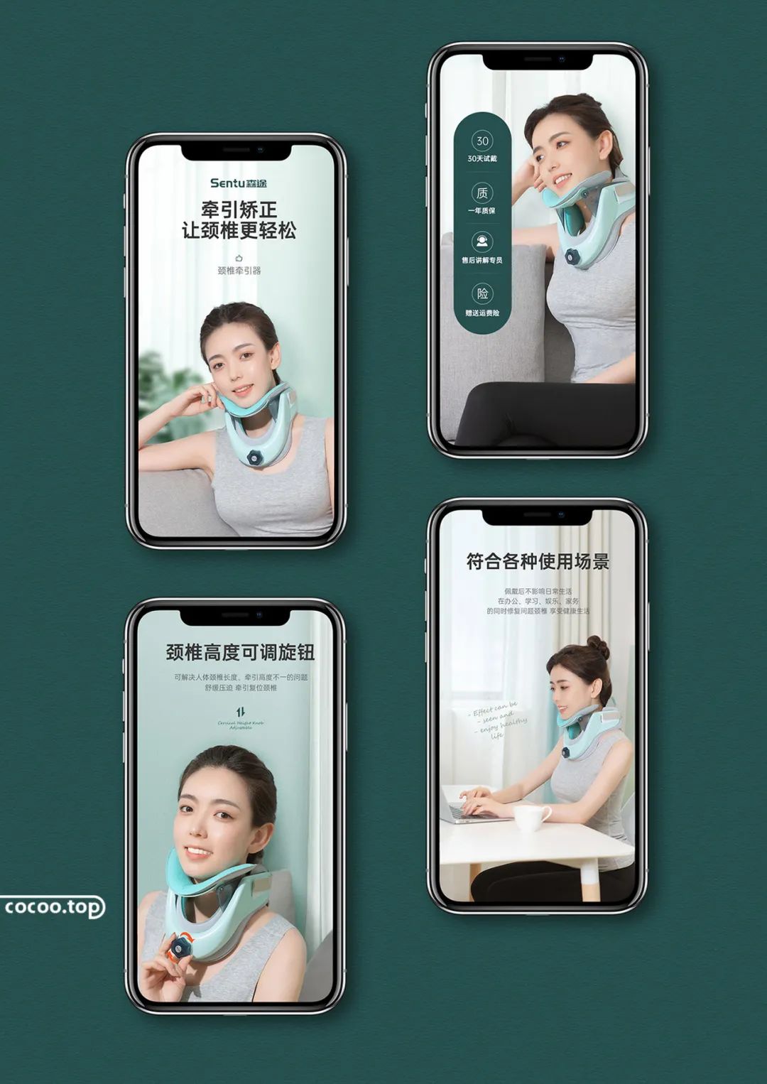

The arrangement of the text can determine the reading effect, and the regularity of the text can be arranged according to the needs of the design. The arrangement of text can be said to be free, but it must be arranged reasonably in accordance with the reading habits of the human body while free arrangement.

Left and right
The length of the text from left to right is uniform, and the combination of text forms a straight line of uniform length, giving people a sense of correctness, rigor, and beauty. In the process of layout, attention should be paid to the treatment of hyphens justified at both ends, and different fonts can also be interspersed, which can increase the variation without losing the overall effect.

Qizhong
Take the center line of the page as the axis, and the characters on both sides have equal spacing. Centered text is not well suited for body copy, but is great for headings. Alignment in the center makes the entire layout concise and generous, with a strong visual effect.
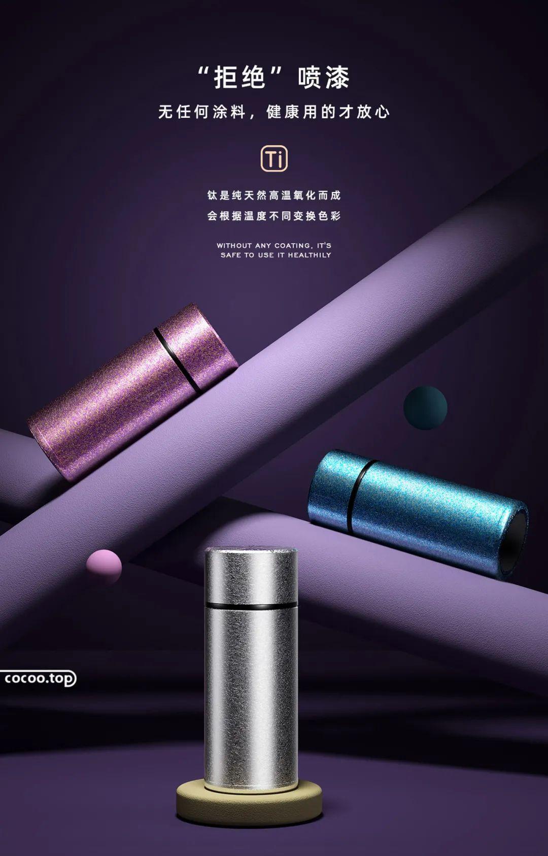
Left or Right
People's reading habits are generally from left to right and top to bottom. Aligning to the left is the most common arrangement in our reading, which is in line with people's visual habits of reading; It is uncommon to read from right to left suddenly, which makes the layout have a novel visual effect and breaks the conventional layout design.
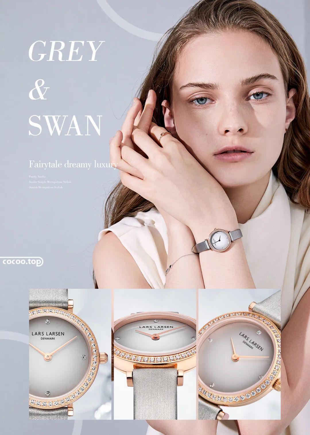
Tilt
Slanting is to arrange the whole or part of the text in a slanted form to form an asymmetrical picture form and form a strong visual effect. The overall layout has a sense of movement, direction and rhythm.
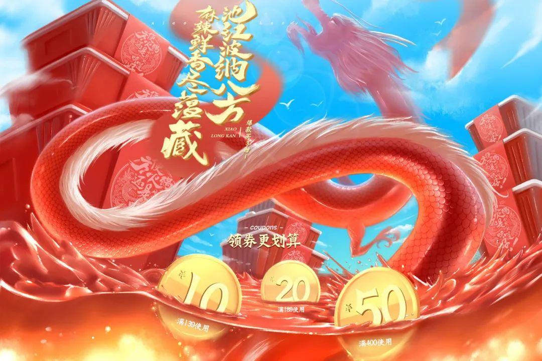
along the shape
Along the shape is to arrange the text around the figure in an orderly manner, with the outline of the figure undulating, sometimes tense and sometimes gentle, with a clear sense of rhythm and the beauty of the picture. The arrangement along the shape expresses a novel visual effect, making reading more unique.


①Pictographic font. It is a font created artistically based on the meaning of a word or the content contained in a phrase. It is not only a character, but also a picture, which belongs to the image characters of half text and half characters, so it has more symbolic and richer connotations.
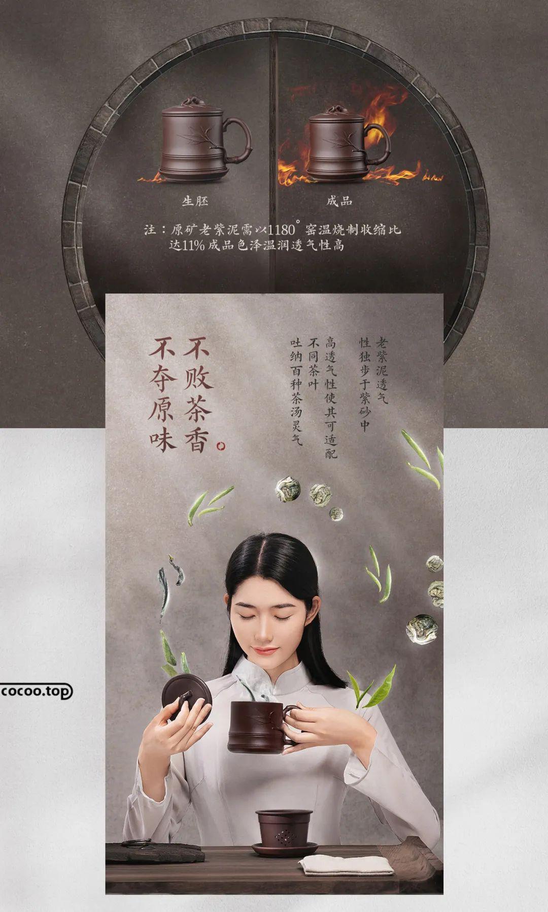
②Image font. By changing the stroke structure design of the characters to achieve the purpose of reflecting the image of the characters, it is different from the general variant art characters and gives people more room for imagination.
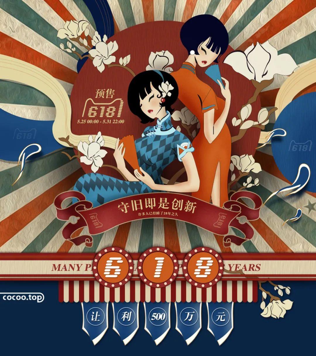
③ Graphic and text overprinting. Printing text on a graphic or image background creates a visually blurry clutter effect, also known as noise in design. Although visual noise will affect legibility, it will also form a unique layout effect, greatly enriching the layout level.
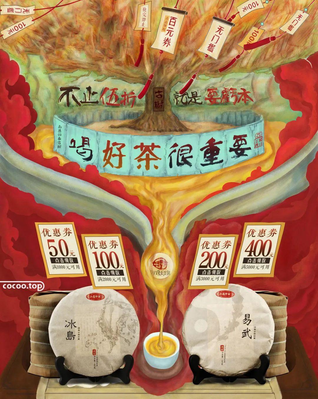
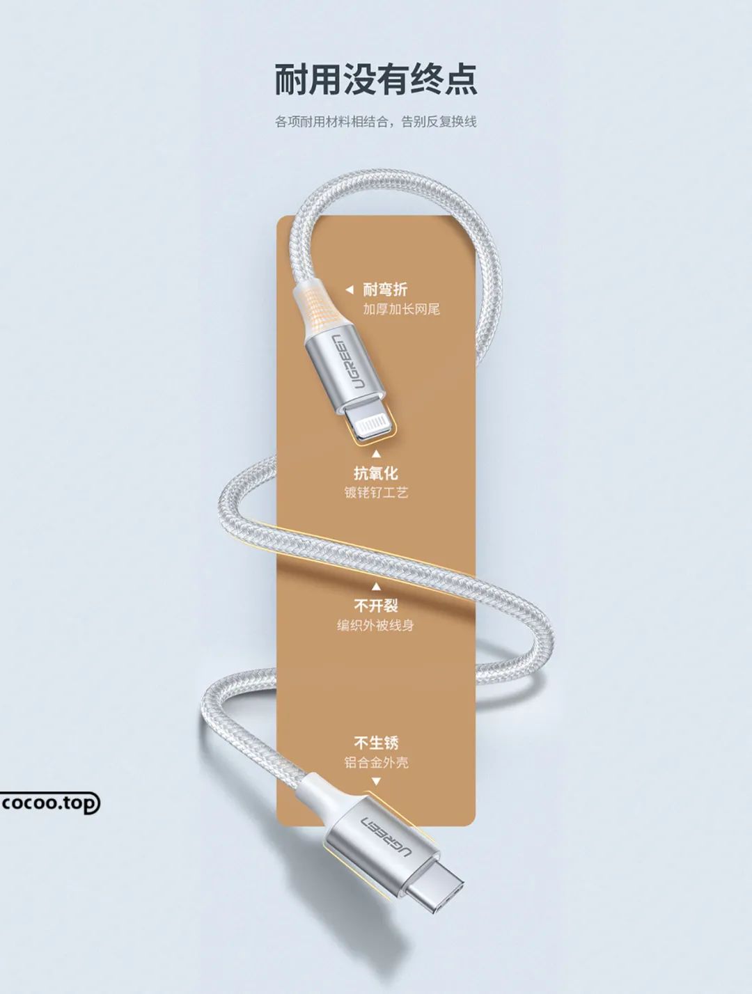
④Group arrangement. Combining text in concrete shapes is a common form of arrangement, which can avoid the phenomenon of messy layout, clear theme, clear picture and overall unity.
Source: WeChat official account PingMianDesigner (graphic design)
Articles are uploaded by users and are for non-commercial browsing only. Posted by: Lomu, please indicate the source: https://www.daogebangong.com/en/articles/detail/Get%20the%20text%20layout%20done%20The%20layout%20is%20not%20boring.html

 支付宝扫一扫
评论列表(196条)
测试