In order to make the arrangement of the text accurately convey the information, it is also conducive to beautification The layout can break the traditional square arrangement format and adopt a more flexible arrangement format.

Left
The first character on the left of each line in the horizontal row is always in the top case, a sentence or a pause is lined up in a line, and the end of the line is natural. When the text group is arranged on the left or in the middle, it is generally aligned to the left, which has a sense of liveliness.

Left right
The last word on the right side of each horizontal row is aligned with each other, while the left side is uneven. When the text group is arranged on the right, it is generally aligned to the right, which also has a sense of liveliness.

All up
The first character of each line in the vertical row must be at the top, while the bottom can be uneven. When the text group is arranged in the middle and upper part of the screen, it is generally arranged on top.

Let's go
The lower feet of each vertical row are aligned, and the lengths of each row can be uneven. When the text group is arranged in the middle and lower part of the picture, it is generally arranged in the same order.

Center
Set an axis on the screen, and arrange them equally on both sides of the vertical axis in horizontal arrangement, which gives a sense of stability; in vertical arrangement, arrange them equally on both sides of the horizontal axis, which gives a sense of liveliness.

Tilt
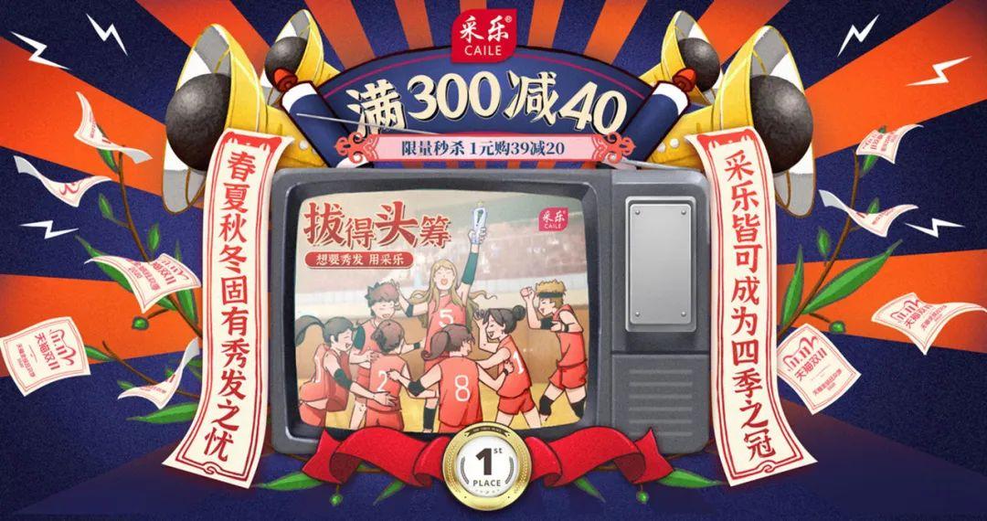
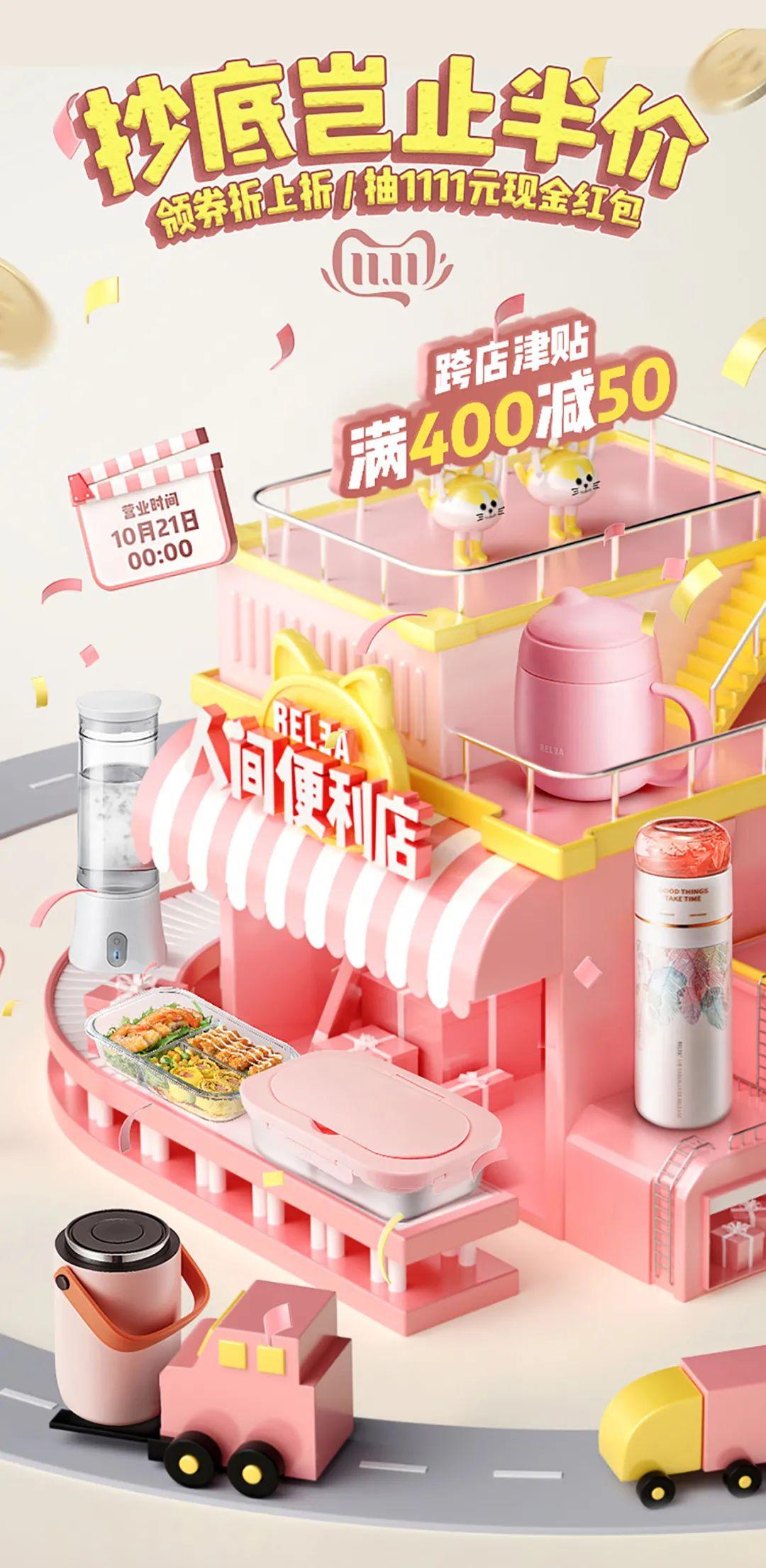
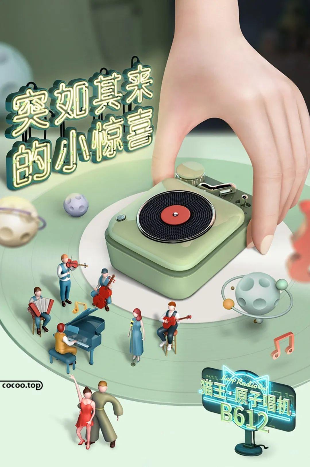
Break the conventional parallel direction and arrange the text diagonally. Slanted arrangement is suitable for titles and thematic text processing, which can make the picture dynamic and improve the effect of the theme of the picture.

along the shape
The first or last character of each line in vertical or horizontal row is arranged along the outer edge of the image, which changes with the change of the image, which can strengthen the theme and make the theme of the picture eye-catching.

Multidirectional
The text is arranged and combined in multiple directions, which can produce a fashionable and lively feeling. For multi-directional arrangement, attention should be paid to the rhythmic relationship such as the size, thickness, and density of the text.

Beating
The text is arranged in a jumping style, which will make the picture lively. Because jumping arrangements can easily cause confusion in the picture, it is necessary to pay attention to the overall grasp of the picture.

A variety of arrangement formats are used to achieve better visual effects, but the basic rules of text arrangement must be followed, such as line spacing should be greater than word spacing, and a complete string of Arabic numerals cannot be disassembled. Punctuation marks cannot be placed at the beginning of a sentence, etc. In short, no matter what arrangement format is adopted, it is necessary for the audience to read fluently without causing confusion and trouble to the audience. Recommended reading:Type cannot be separated from text! Layout of text

Articles are uploaded by users and are for non-commercial browsing only. Posted by: Lomu, please indicate the source: https://www.daogebangong.com/en/articles/detail/General%20format%20for%20text%20arrangement.html

 支付宝扫一扫
评论列表(196条)
测试