Sorry, I don't quite understand your question. Can you provide more context or explain in detail what your problem is? This way I can better answer you.
The following article comes from 3type, author Wei Li
3type3type (three words) is an innovative typeface company. Its members come from multidisciplinary backgrounds such as design, computer science, anthropology, and history. They have many years of experience in cross-language typeface research and design. We are committed to cross-cultural text communication, and actively promote the development of multilingual font matching, innovative font development, and font education in China.


This article comes from the WeChat public account "3type" (email hi@3type.cn), the author Weili, the original title "From Zelda to Dongsen: Is there something wrong with using variety shows in games?" ", Ai Faner is authorized to release.
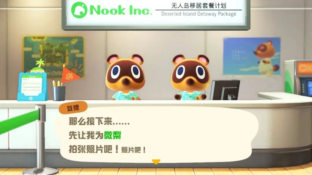
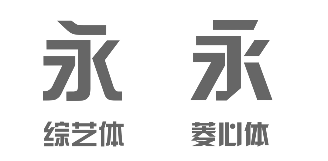
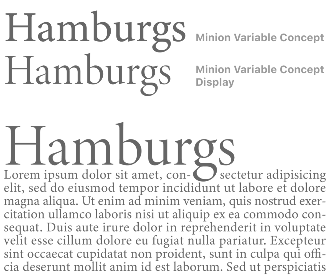
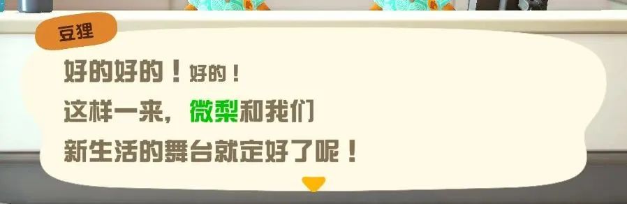
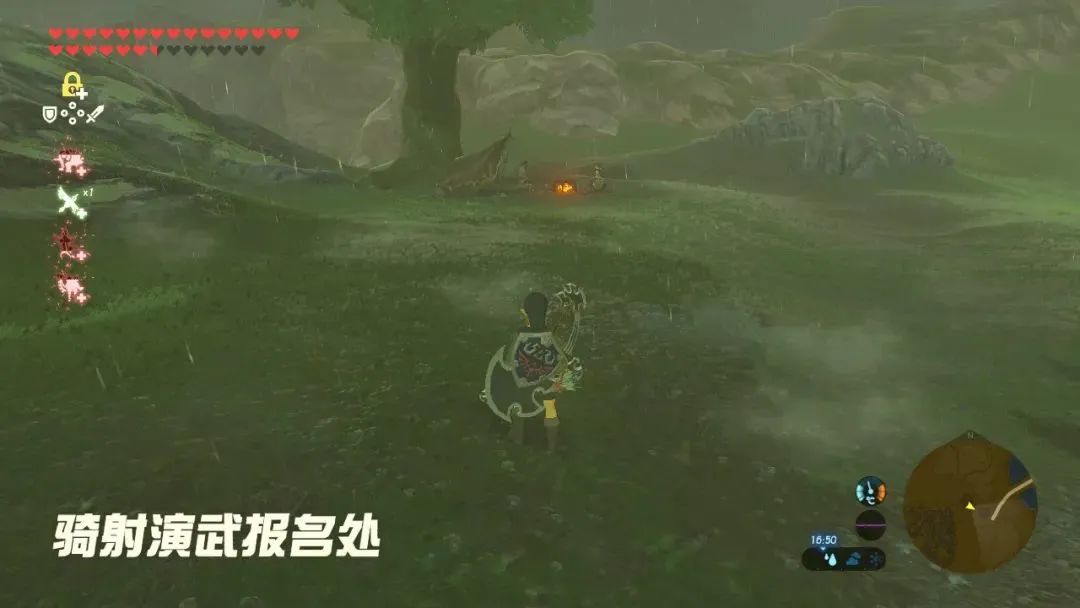
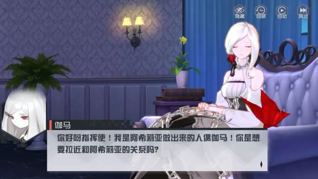
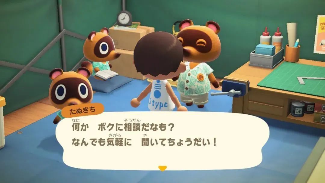
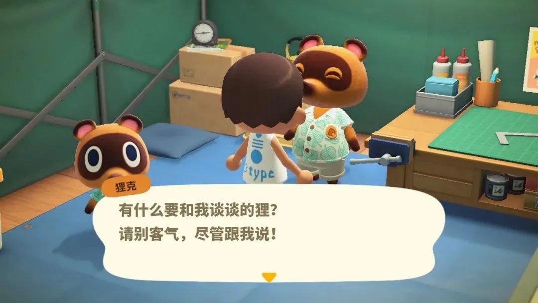
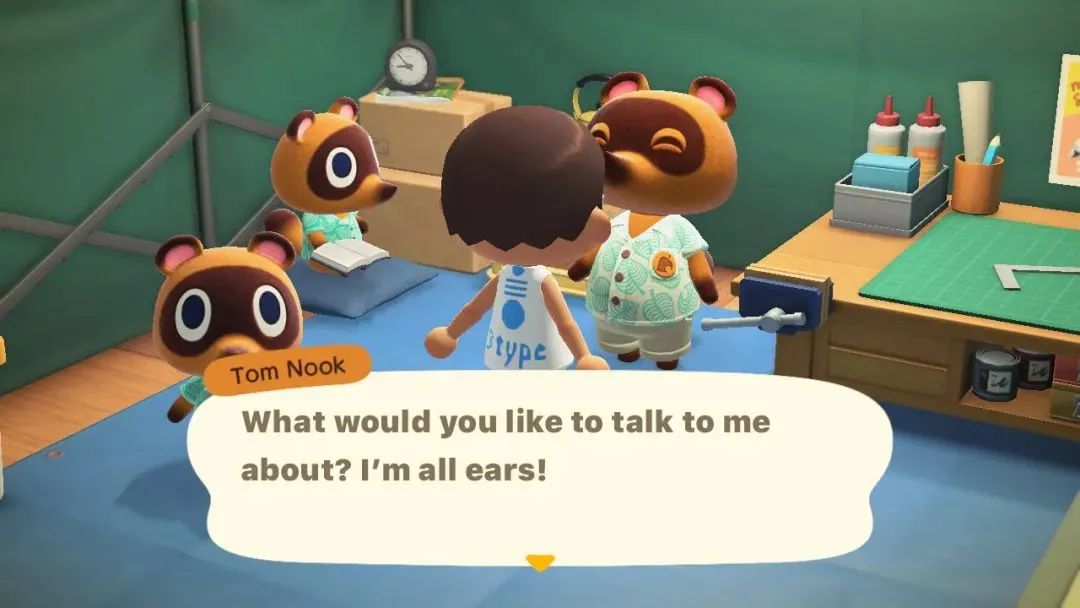
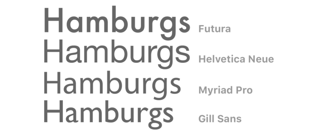
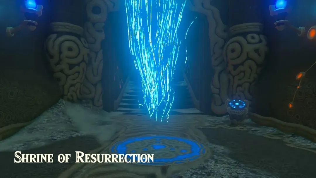
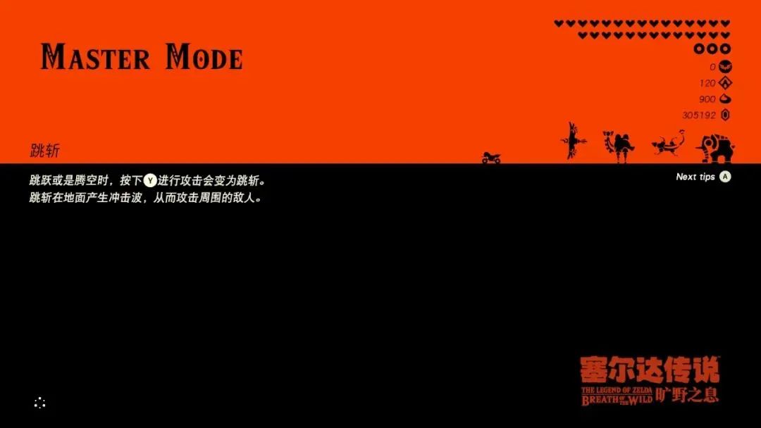
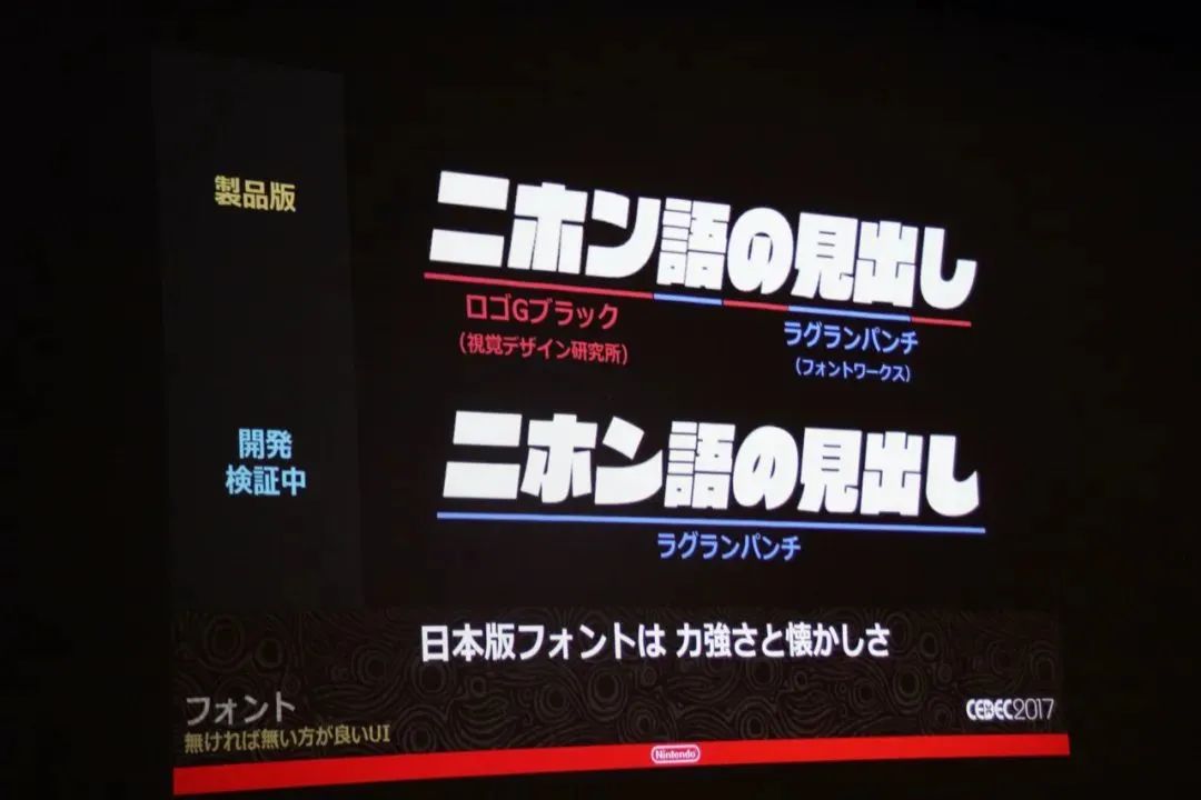
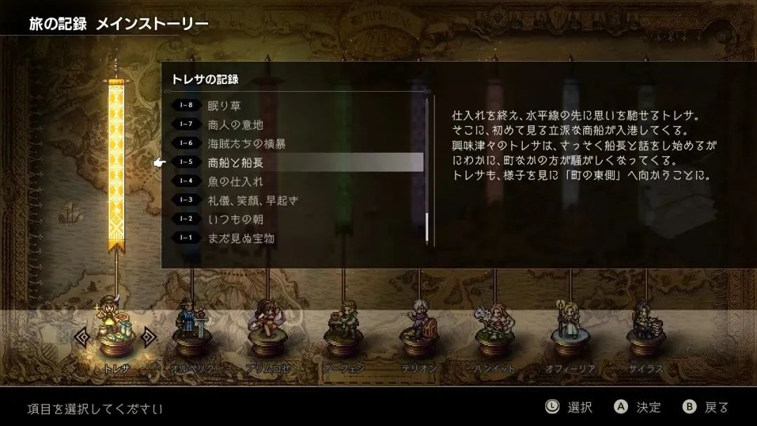
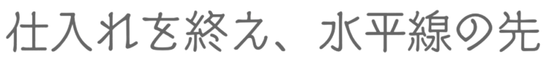
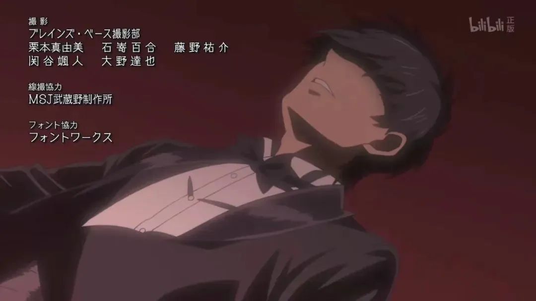
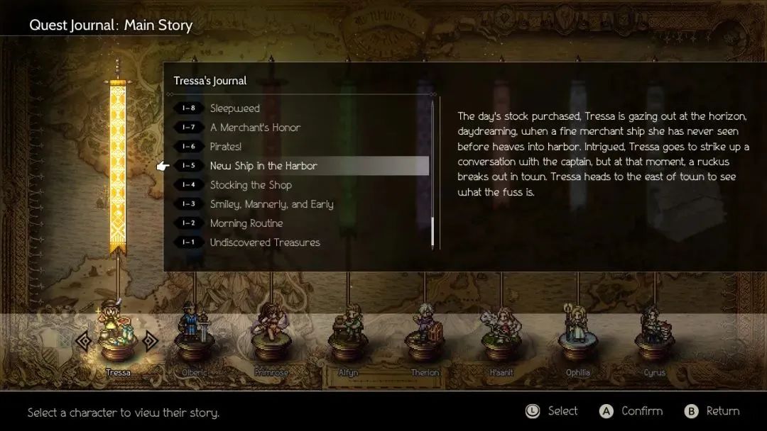
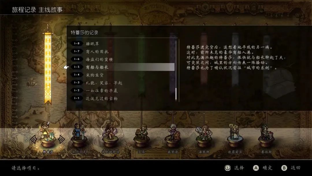
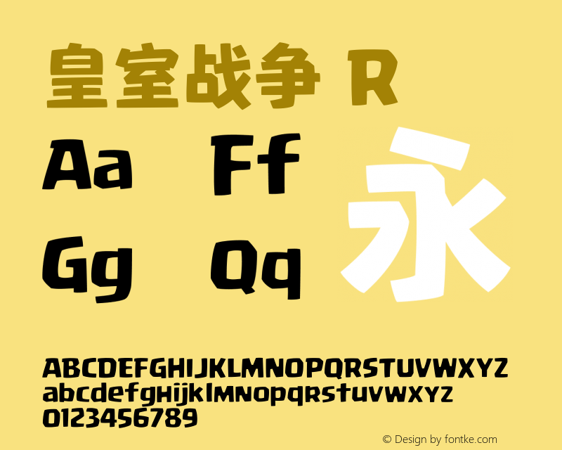
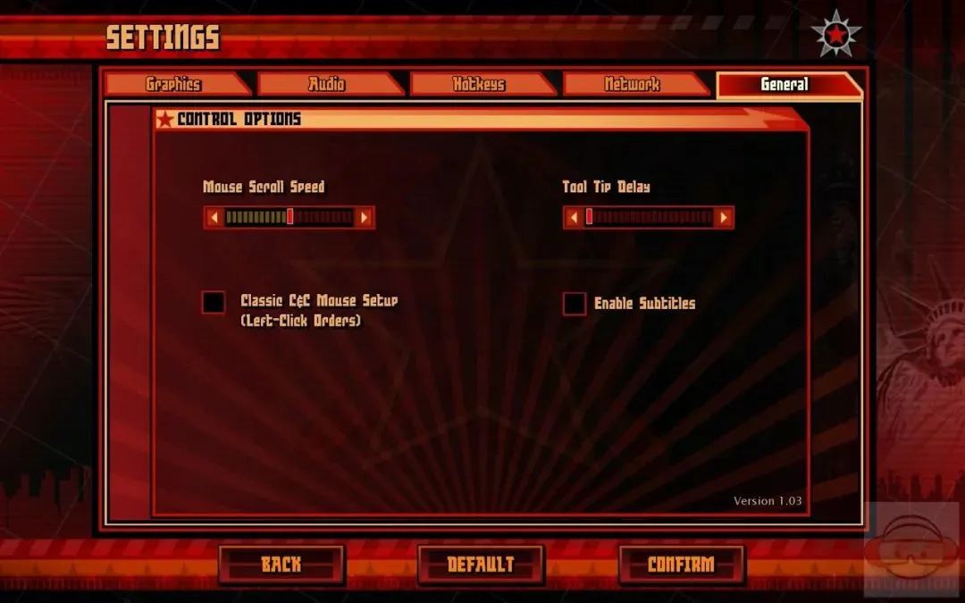
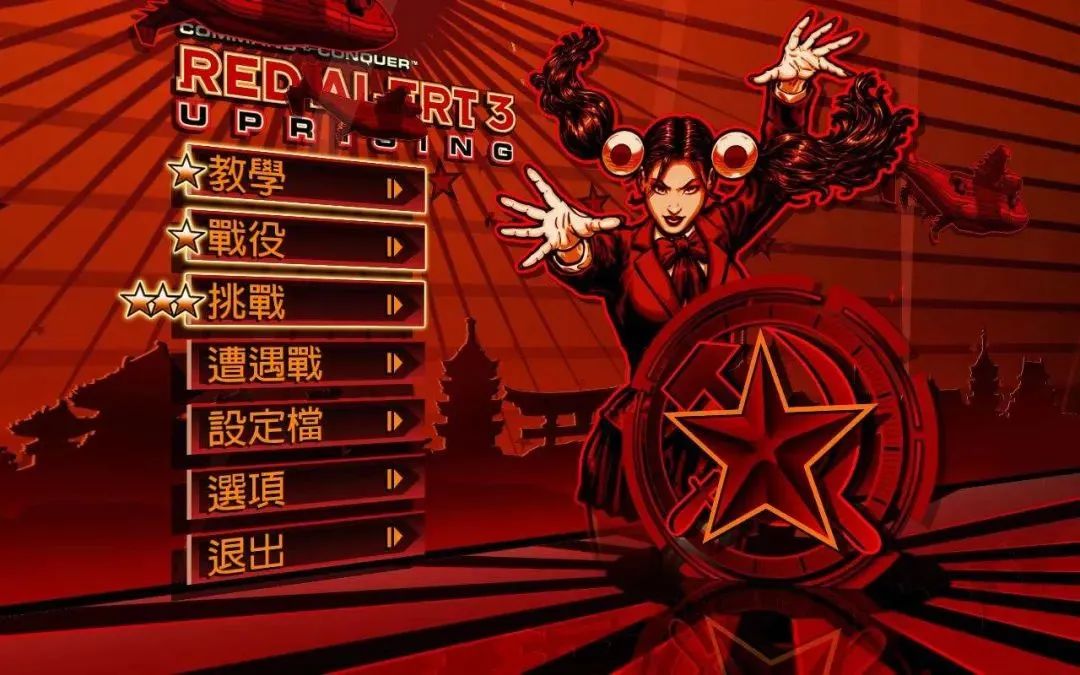
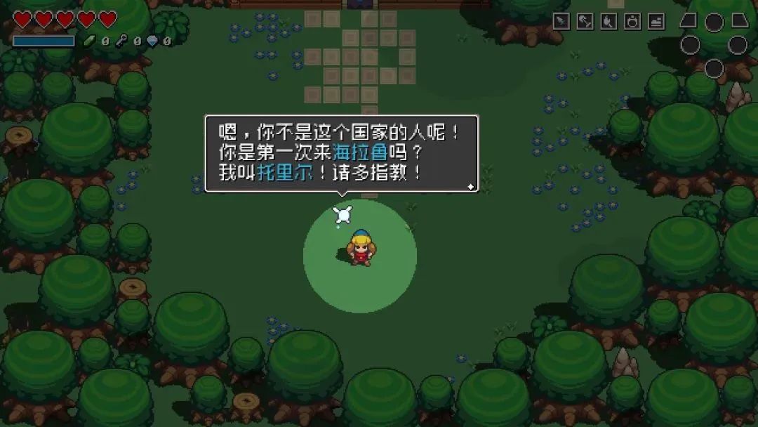
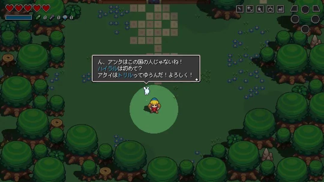
I was preparing to land on the island yesterday. When I checked in with the two raccoons at the office, I felt that they were Something was wrong with what he said. What's going on? This is not a problem with the raccoons, but the Chinese fonts used in the game are a bit strange. In "Assemble!" In the official Chinese version of "Animal Crossing Friends", the fonts used in the subtitles are all variety. What kind of font is Variety? Even if you have never heard of the name "variety", you must have an impression of this font - because its style is too obvious. The strokes are highly geometric, and almost every stroke is transformed into a straight line, but the small arc corner at the end of the stroke is retained, and an additional arc treatment is also made at the lower right corner of the square structure. Variety show is also a frequent visitor to street shops.Variety show was born in the 1970s and was designed by Hong Kong designer Guo Bingquan. It marked the emergence of modern "art characters" Chinese fonts. Later, Guo Bingquan sold this font to a Japanese writing company, which added a pseudonym design (the designer is Tsutomu Suzuki), and launched a font family for photo-engraving under the name of "Chuangjulan". There are many differences between Chuangjulan and Variety in details, but the design techniques are completely the sameThe general-purpose computer font "Variety" was developed by Huakang Company, and has since been passed on Back to the mainland. Later, almost all major font manufacturers launched their own variety shows. In addition to Chuangjulan and Variety, similar design techniques are used to geometrically process the strokes of Chinese characters, and more fonts in the style of "art characters" are obtained. Mona’s Super Rigid Black, Hanyi’s Rhombic Font, Zhang Haishan’s Sharp Line Font, and Zizigongfang Version’s Blackbody, etc., can be said to lead to the same goal in terms of the treatment of bone deformation of Chinese characters. This is also the best way for modern geometric Chinese font design. One of the commonly used methods. Hanyi Lingxin font, which has always been popular, is a variant of Variety This type of font was originally designed for title advertisements and other occasions. "Words for reading" and "Words for reading"In short, fonts can be divided into two categories: English is called text and display, and Chinese literal translation is "text" and "display", or extended as "text" and "title word". The so-called "text", as the name suggests, is usually used for large paragraphs of text. The most important requirement is "easy to read"; in addition, for official publications, the font must also be "standardized" and conform to the standard Chinese character writing. Generally speaking, Chinese body fonts can be divided into four categories: Song, Hei, Song, and Kai. Under each category, there are more or less different fonts. For example, "Hua Wen Hei Ti", "Fang Zheng Lan Ting Hei" and "Si Yuan Hei Ti" all belong to Hei Ti, but their designs are completely different. This difference in design is usually not noticed by ordinary readers, but the impact on the actual reading experience is subtle; and making large paragraphs of text "readable without tiring" is the goal pursued by text font designers. Siyuan Song typeface (left) and Chinese Song typeface (right) text layout effectThe "title word" pays more attention to "novel style, eye-catching and beautiful, attractive, easy to recognize Easy to read, both artistic and practical." Most of the fonts with a little creativity that we see on street signs or web banners fall into this category. Open a shopping app casually, the font you see on the homepage is considered "title word"In German, the two types of fonts Text and Display are called Leseschrift and Schauschrift, literally These are "for reading" (Lese-) and "for seeing" (Schau-). This is not only the design purpose that font designers need to consider, but also a guide for graphic designers (font users). However, in actual use, the boundary between the two is not very clear, especially the bold bold font in the picture above. Some body fonts are also beautiful and eye-catching when enlarged for title display. However, for title words, it is usually inappropriate if they are used to line up large sections of text. In contemporary western font design, sometimes fonts of the same family also distinguish between Text and Display purposes. The two are usually distinguished by a parameter called "visual size", which means almost "how many elements "for viewing" are included." Two styles of a variable font, as well as the layout effect to showThe use of "title font" in the game After reading this, everyone must have known about "Assembly! What's wrong with the fonts in Animal Crossing: Friends. Although the subtitles in the game are not considered "big paragraphs" of the text, they undoubtedly belong to the "words for reading", but they use the variety style designed for the title advertisement. The classic font of Variety has been used in games more than once. In "The Legend of Zelda: Breath of the Wild", the title of the place name is also a variety show. However, in "Breath of the Wild", the variety font is indeed used as the "title word", which seems to be quite appropriate; while the dialogue and other explanatory content in the game use a distinctive slanted bold font. The place names of variety shows in "Breath of the Wild"The official Chinese version of "Forked Road Traveler" uses New Wei Ti on the interface . Xinwei Ti was originally a calligraphy font. It was used in games in a small font size in the last century> (especially on the small screen of Switch), and it looked very blurry. Of course, "it's not impossible to use." The Xinwei font in "Forked Road Traveler", the full-width numbers in this font are also hard to describeI also browsed the mobile game. Some of the more popular games recently use bold as the main font (the background settings of these games are also serious, such as wasteland science fiction), but there are also phenomena of using "title words" as text and even interface elements. For example, "Eternal Capital for Seven Days" also used Variety Style as the subtitle font for dialogue. In this screenshot, two other fonts are used for character names and interface elementsThere are also some other examples, such as the following two games. Although such use deviates from the original intention of font design, it can only be regarded as a choice in the art design of the game interface, and I do not intend to make too many comments on this. As far as the Chinese games mentioned above are concerned, we might as well look at how to choose fonts in the localization design of other languages. What is Dongsen Japanese like? Can't you just "copy homework"? Let's take a look at "Assembly! How did the English and Japanese versions of Animal Crossing choose the font for the dialogue? It can be seen that in the two language versions, the bold/sans-serif font that looks relatively common is selected as the font for subtitles. This font is called "ロダンわんぱく", Japanese and English are the same font with matching design. So, is it better for the Chinese version to directly use ordinary black body? Of course it is possible. For example, let's try to replace this content with Siyuan bold. Screenshot replaced with Siyuan boldface. (Homemade)Is this really better? You may think that, compared with the English and Japanese versions, such Chinese fonts are too serious. For example, we changed the subtitles of the English version to SanFrancisco (the system font of Apple mobile phone/computer):Screenshot replaced with SFText. (self-made)This involves a very important issue in the design of English-Chinese font matching: the diversity of body font styles, or "tolerance". For English text fonts, it can be as serious as Helvetica, or as geometric as Futura. Due to the simple structure of English letters, these fonts are used for large paragraphs of text, and the impact on readability will not be particularly large. The body font of Chinese characters can only be used in a small range. Once it is overdone, it can no longer be called a "text font". Different styles of body sans-serifWhat about Japanese? There are also Chinese characters in Japanese, so it’s okay to copy homework directly to the Japanese version, right? ——Really not sure. Although Japanese includes Chinese characters that we may recognize, Chinese characters account for no more than half of modern Japanese. And those parts we don't know - hiragana and katakana - are the decisive factors in the effect of a piece of Japanese text. The current Japanese font design, especially the body font, is more and more inclined to use existing Chinese characters to match new kana. After all, there are thousands of Chinese characters and only two hundred pseudonyms, but they play a more significant role and have more room for design. From the perspective of font usage, it is also very common for designers to choose different fonts for Chinese characters and kana. Illustrator and InDesign software directly include such a "composite font" function. The kana design of the "ロダンわんぱく" font used by Dongsen is quite lively. Assuming that the Chinese characters in this Japanese dialogue remain unchanged, and only the kana is changed to Siyuan bold, the entire text will be less interesting. Screenshot replaced with Siyuan bold pseudonym. (Self-made) When I was doing it, I found that the kana in the Japanese Dongsen subtitles did not have the widening option turned on, and the kerning was not set-the spacing between ん and て seemed too large. I guess, maybe this is the reason why the Chinese version chose to use Variety Style: only using black body is too serious, so choose a font with a "stronger sense of design". The localization of "Other Ways"Breath of the Wild is a different story. The English font in this game is Nintendo's self-made "Zelda>" font. The style of this font is in the same line as the title word "Zelda" of the early "Legend of Zelda", and the sharp triangular serif is its main feature. Capital letters with decorative elements are used with small caps. In addition to the place names and titles in the English version, this font is also used in plain English in other language versions, such as "MasterMode" in the loading screen of "Master Mode". The Legend of Zelda series logo (Wikipedia)The Japanese font uses the Chinese character part of Laglan>, with the kana part of "ロゴ>" . Both of these fonts are super-bold and bold for titles. From this perspective, there is nothing wrong with using Variety in Chinese. Font selection during the development of The Legend of Zelda (jp.ign.com)By the way, LaglanPunch is the extremely A prototype of a visually striking typeface (roughened in the animation). The text performance in "Kill the Girl" (kill-la-kill.fandom.com)As for "Forked Road Traveler", the font used in the Japanese version is New >. This typeface is derived from handwritten movie subtitle fonts created by designer Hideo Sato in the middle of the last century. Although it seems to have a strong style, its design purpose is to "eliminate the presence of subtitles", and it is designed for the environment of the big screen. The readability itself is very strong-so even on the small screen of Switch, it is still very clear. . This font is also a frequent visitor in cartoons. In January this year, the ED of the new show "Fictional Reasoning" used another version (with notches) NewCinema. The ED subtitles of "Fictional Reasoning"The English version of "Forked Road Traveler" uses a font with a similar style, named Skech (there is no >The difficulty of the Chinese version here is that there is no such style of Chinese font. It is said that the traditional Chinese subtitles of "Monster Hunter: World" use the traditional Chinese extended version of this font, which does not seem to be official. "Monster Hunter: World" traditional Chinese subtitles (bilibili)In any case, the official Simplified Chinese version of "Forked Road Traveler" is very strange. In particular, this version of Xinwei style is also paired with the Western part of running script, and all numbers and money symbols are extremely distorted. Perhaps the localization design team wanted to convey a medieval style that fit the game background, but it was obviously not very successful. The Dilemma of Sinicization Font SelectionIt is not easy to choose the font of the culture in the game. The types of Chinese fonts are far less than those of English and Japanese, and there is still the situation of "narrow style range" mentioned above. Except for the case where the original version uses a relatively conventional serif or sans-serif, if you want to do Chinese matching on the basis of a stylized font, it is very unlikely that you can directly find a suitable font. Then, another way of thinking is to find new fonts according to the overall style, just like the Japanese/English version of "Breath of the Wild" and the Chinese version of "Forked Road Traveler". Or, like "Angry Birds" or "Royal Clash", a custom Chinese font is specially launched. Of course, this must first be economically permitted. "Royal Clash" Chinese custom font (fontke.com)In this case, the Chineseization of many games finally adopted the method with the lowest cost and the least risk—regardless of the original version Why, the Chinese version is directly in bold. Many games on the early AppStore were like this. In addition, I was more impressed by "Red Alert 3" in 2008. The English version uses a custom font with a strong sense of comics (maybe it can be regarded as an example of "misplaced use of title words"), but there is nothing in the Chinese version. The interface font of the English version of "Red Alert 3" (technogog.com)The interface of the traditional Chinese version of "Red Alert 3" (the picture shows the expansion pack "Uprising Moment") (www.gamersky.com)Another type of problem lies in the independent pixel style game. Most pixel games cannot find matching Chinese character pixel fonts. The main reason is that the structure of Chinese characters is complex and cannot be clearly expressed at a smaller size. In addition, today's pixel games are only in style (technically, high-definition can already be achieved), so some Sinicization will directly add high-definition Chinese text on the pixel screen, resulting in a strong sense of dislocation. 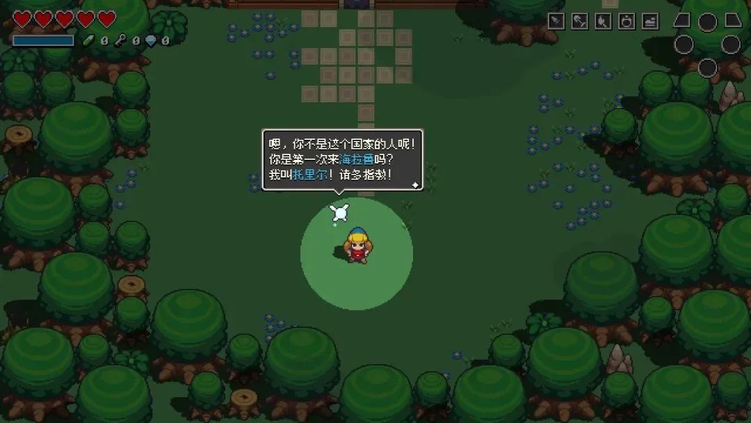
The "Dingmao Dot Matrix" project that 3type has been developing for the past three years is to solve the lack of fonts in this area. "Dingmao Dot Matrix" is the smallest Chinese font family, including 7×7 and 9×9. 9×9 is suitable for most pixel games, and 7×7 is more extreme, which can be used as a smaller explanatory text, or for localized matching of 5 pixel English games. The font display effect of the official Chinese version of "Cymbal of Hyrule" is not good. The matching test of "Dingmao dot matrix 9px", and the comparison of the original Japanese version
The font in "TinyTowerVegas" is only 5 pixels high, it is difficult to match Chinese characters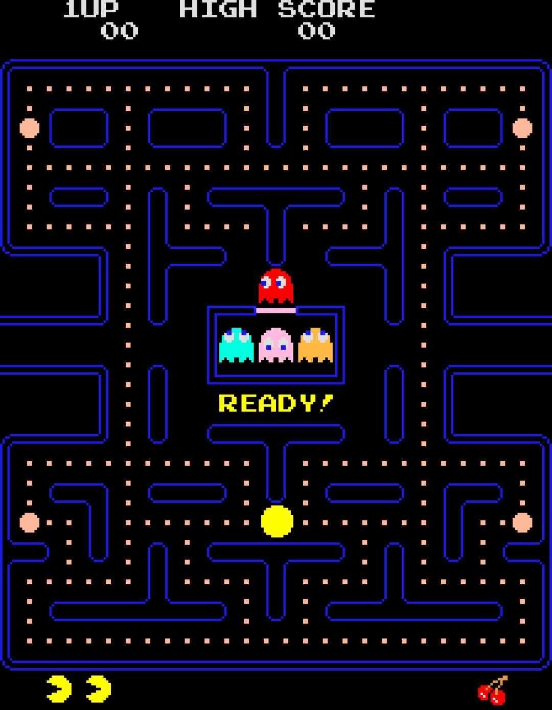 "Dingmao dot matrix>Type designer Daqu Toshi published a book "Arcade Game Typography" (ArcadeGameTypography) last year, which talked about the Typography: "...the lack of day-to-day exposure of the developers to the English and Latin alphabet is evident. ... You will find many quirks which are best seen as a product of naivete rather than as a result of Creative."
The game interface of "Pac-Man" (1980), pay attention to the limited text, the life value and the number of levels are marked below with graphics. Compromise was made on the design of letters such as E, Y, etc., resulting in excessive kerning (Wikipedia, the picture has been enlarged)At the beginning of the birth of video games, the early gameplay stayed on the "algorithm" , such as "Ping Pong", "Snake" and even "Tetris". At that time, the text in the game was only to meet the most important functional needs, such as the score counter or the prompt "please insert coins". Later, the game became more and more "narrative", and the importance of text became stronger and stronger, and fonts became an indispensable element in game art. This article only briefly introduces some thoughts on the topic of "Chinese localization", but "font selection in games" can be a rather grand topic. This article is just for reference, I hope more players and designers can pay attention to this aspect. 
 New ways to play iPad ProHow to play the new iPad Pro? With the lidar iPad Pro, you can not only write calligraphy, but also measure your height. You can change shoes with one click, and "shoe freedom" is not far from you. For more novelty black technology decryption and cool products, come to the video account of Aifaner and learn all about it in 1 minute. ??Note: Wechat video account is still in internal testing,< strong>Some users are not yet openClick here if you like this article
Articles are uploaded by users and are for non-commercial browsing only. Posted by: Lomu, please indicate the source: https://www.daogebangong.com/en/articles/detail/From%20Zelda%20to%20Dongsen%20whats%20wrong%20with%20the%20Chinese%20fonts%20used%20in%20games.html


 支付宝扫一扫
评论列表(196条)
测试