
France on the nib
ofGothic font tutorial
From Baidu user: Bihai Jushi
Gothic is a type of artistic font used by institutions such as ancient churches to copy. It is a very gorgeous writing and printing style. Mostly found in medieval theological literature. The vertical lines are thicker, and most of them have highly decorative dotted lines, which pays more attention to the lines. In another sense, as an absurd and dark art style, it appeared in the late twelfth century, mainly in architecture and painting, and originated near Paris, France.
Pen SelectionIt is still a flat tip pen, you can choose a dipped level tip pen for comics, a professional Gothic dipped level tip pen, a hero5028pen, a Pilot78GBtip , LamySafari1.1mm, 1.5mm, 1.9mmtips (Joy and Al-Star< span>The tip is universal, as long as the tip model is correct) and the Baile parallel pen set (of course, these can be bought in a certain treasure==)
The advantage of dipping the nib is that the writing effect is sharp, and the ink is highly applicable, and it can be used for various inks, gouache, and acrylic paints.
The advantage of the fountain pen and the Pilot parallel pen is that it is easy to carry.
Tip thickness:3.8mmThe tip is slightly thicker on the surface of the invitation card or envelope, and it can be slightly smaller than this size for daily use. If you want to write a poster or something, you can use a wider one.
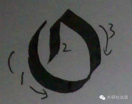
Basic Stroke Diagram
(Picture 1, click to enlarge)
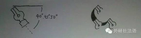
It is different from normal writing. Because the pen is flat-pointed, the thickness of the strokes written in different directions is different.
So under normal circumstances, the direction of the pen holder should not be changed after writing a character (except in special cases, but beginners cannot encounter this problem→_→) Generally speaking, it is about 45degrees. According to experience, a larger angle is better...50degrees are better. But that’s about it. Once the angle is fixed, the direction of the pen tip will remain the same during each painting.
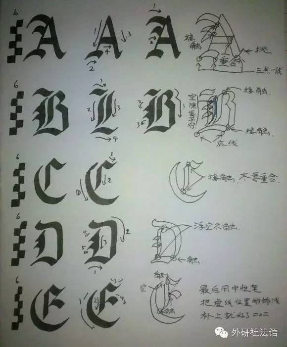
Figure 1 has analyzed most of the structures and strokes in Gothic. It can be said that most of the different Gothic fonts can be disassembled into the corresponding strokes inside. You must be proficient in each one. If you are not proficient, you can try each practice100times...
About thin and ornamental lines among other Gothic characters.
There are two ways:
If it is a long thin line, you can change the direction of the pen tip to the corresponding angle like the last one in Figure 1, and draw it.
If it is a short thin line, or in other cases, please use a point pen tip of the corresponding color/ gel pen.
Detailed explanation of Gothic characters
Capital letters (all the following writing and stroke order are for reference only)

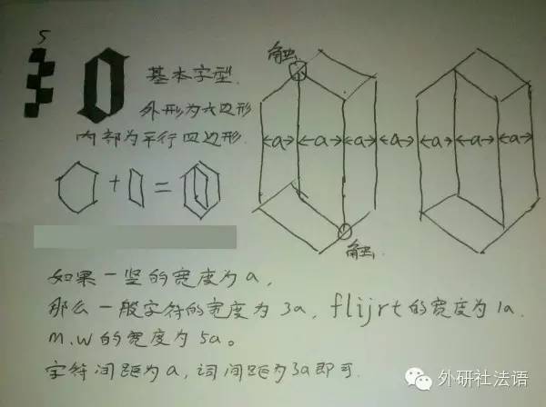
Generally speaking, uppercase characters are the height of 6 nib width, of course, you can also write up to 8.
Lowercase letters are generally 3~5 nib heights (from this we can know that Gothic uppercase letters are not as simple as twice the height of lowercase letters , Of course, it seems to be no problem to write twice the height of lowercase letters=.=)
About stroke order, the basic principle is
1. First outline the general character range
2. Write the basic form of characters
3. Perfect decorative lines
(mainly for the convenience of typesetting, so in the specific writing process, you can temporarily change the stroke order, or add additional decorative lines, etc.) Basically, it is suitable for any kind of Gothic font. Everyone can also find their own way.
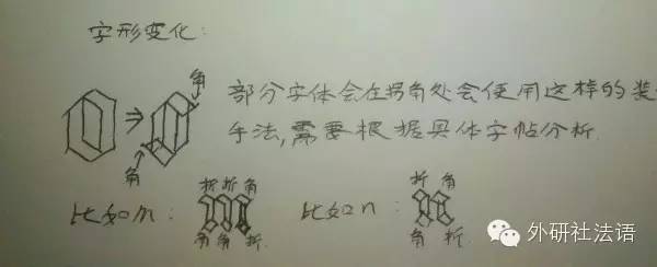
In addition, because there are so many types of Gothic, it is difficult for us to find the so-called most authoritative Gothic, so we need to analyze the structural characteristics of the Gothic at hand. For example, the contact, overlap, hooking technique, and structure characteristics of decorative lines and oblique lines, etc. When we get other similar glyphs, we can also try to analyze them ourselves.
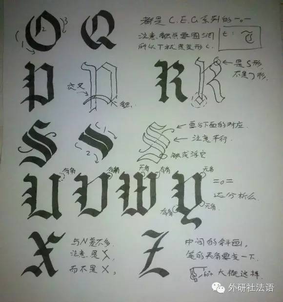
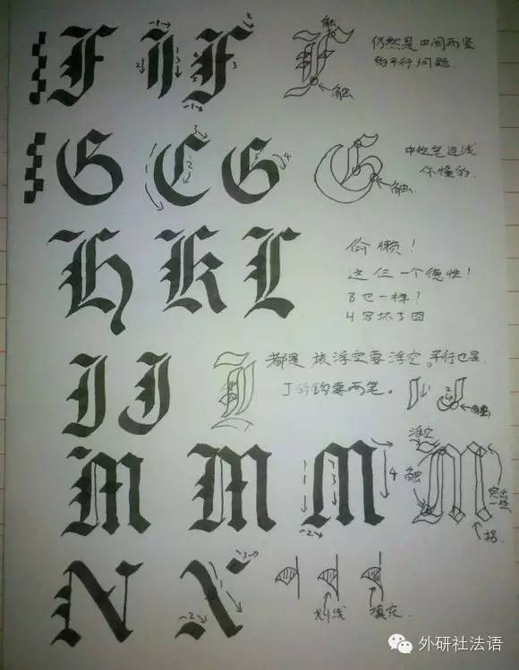
FHKLThese four characters are basically handled in the same way, and J is similar, but J can be written more exaggeratedly. The place that should be in contact must be in contact. It cannot overlap too much and cannot be disconnected. What should be floating must be floating. (Refer to the copybook in the first picture), the vertical line decoration of N is a very special thing, it needs to be filled after the line is crossed (specially marked in the picture)N span>
The writing of G and O is a very typical arc writing. Although it looks like one, it is actually divided Write with two strokes, touch from the smallest place.
ActuallyI and J are the same, the analysis of the four letters of UVWY are written in the picture, It is mainly a question of whether to make a corner or turn directly.
Z is a very special letter. When writing slashes, the inclination angle of the pen tip should be changed, otherwise the effect will not come out. In the picture, the inclination angle is increased (but it seems that it should be possible to draw from the bottom to the top if the inclination angle is reduced). It is not a big problem for the elastic nib. If it is a gel pen, you can draw the edge and then paint it black.
Lowercase and Typography
A Gothic article written in lowercase letters looks like a string of M, N, O from a distance Things made of stuff... "Like a tidy fence in a church" kind of effect. To achieve this effect:
If the width of a vertical line is a, then generally speaking, the width of a letter is 3a, and w, < A wide letter like /span>m is 5a, and a narrow letter like fijlrt is 1a, and the distance between letters and letters is 1a, the space between words and words3a is enough.
In this way, if the upper half and the lower half of a word are cut off, ideally what remains should be black and white bars of the same width, which will naturally feel like a fence.
As for the stroke order analysis of lowercase letters themselves, you can refer to uppercase letters. Here is a translation ofAOCGothic lowercase letters (click to read the original text to view).
The main thing is that the starting and ending points are simple inflection points, or there are prominent corners. This can be analyzed according to the corresponding copybook, such as m in the copybook, three in the upper half There are two folds and a corner respectively, and the corresponding ones below are two corners and a normal bend.

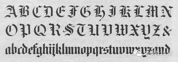
(legendary copybook)
Articles are uploaded by users and are for non-commercial browsing only. Posted by: Lomu, please indicate the source: https://www.daogebangong.com/en/articles/detail/France%20on%20the%20Nib%20%20Gothic%20Font%20Tutorial.html
 支付宝扫一扫
评论列表(196条)
测试