
Screen reading has become the main way for us to obtain information on a daily basis, and the information originally carried by paper media is constantly migrating to electronic media. Mobile phones and tablet computers are more convenient than paper media, but if e-reading wants to achieve the same comfort as paper media reading, it must pay attention to the research on screen fonts—just like paper media did earlier.
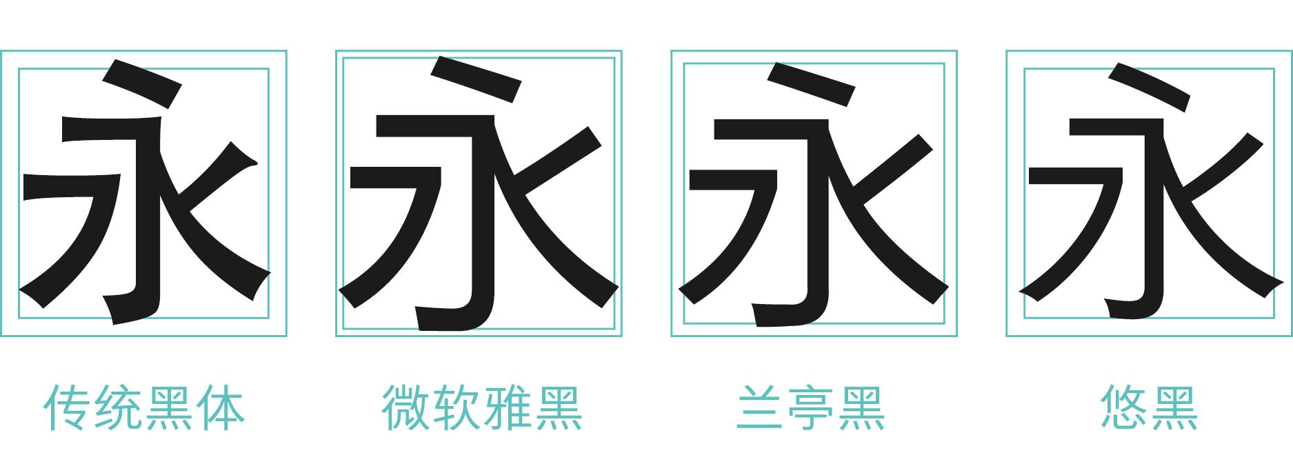
Nowadays, the pixel density of the screen can easily exceed 300PPI, and display accuracy is no longer a problem, which also means that the design of Chinese screen display fonts can be freed from technical limitations. From the dot-matrix characters completely succumbed to the low-pixel screen display at the beginning, to the fonts of the printing era, and then to the first generation of Chinese screen display fonts specially developed for computers-Microsoft Yahei and Lantinghei families, Chinese screen display fonts have also Gradually move from passive adaptation to active research and development.
 Font Design and Technology Evolution
It has always been mutual restraint and mutual promotion, the above example words
is a situational presentation of the screen display technology at that time.
The first generation of Chinese on-screen display fonts was removed from the "bell mouth", which was large, geometric and full of industrial feeling. But in order to adapt to the low pixel density, the traditional beauty of writing is lost. With the popularity of mobile terminals, the first generation of on-screen fonts can no longer meet the reading demands of various portable screens.

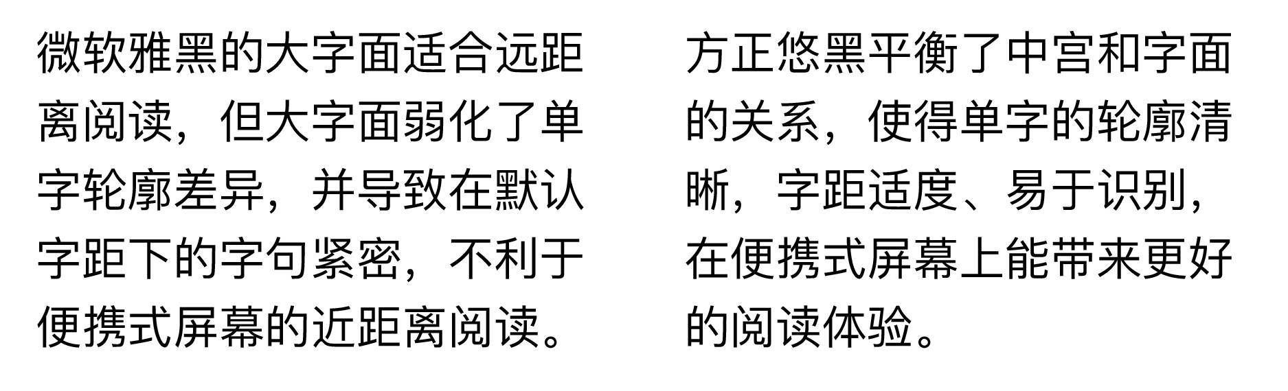
Today, the number of pixels on a 5-inch mobile phone screen is equivalent to that of a computer screen (such as 1080x1920), and its pixel density generally exceeds 300PPI, which is almost close to the general printing effect. This brings more freedom to the font design of Chinese screen display. In addition, the reading distance of mobile phones and tablet computers is much closer than that of computers, so there is no need to blindly pursue large fonts. As a result, it is possible for Chinese screen display font design to return to humanistic expressions.
In order to enrich the reading experience on portable screens, Founder Font widely absorbed opinions from all walks of life. After two years of careful design, it officially launched the second generation of Chinese screen display fonts in September 2015 - Founder Youhei Family. Its design makes full use of the physical characteristics of high-definition screens, appropriately tightens the central palace and shrinks the characters to improve the recognition of characters; it incorporates traditional writing atmosphere to improve the reading quality of characters.
 Founder Yuhei's pen-shaped design
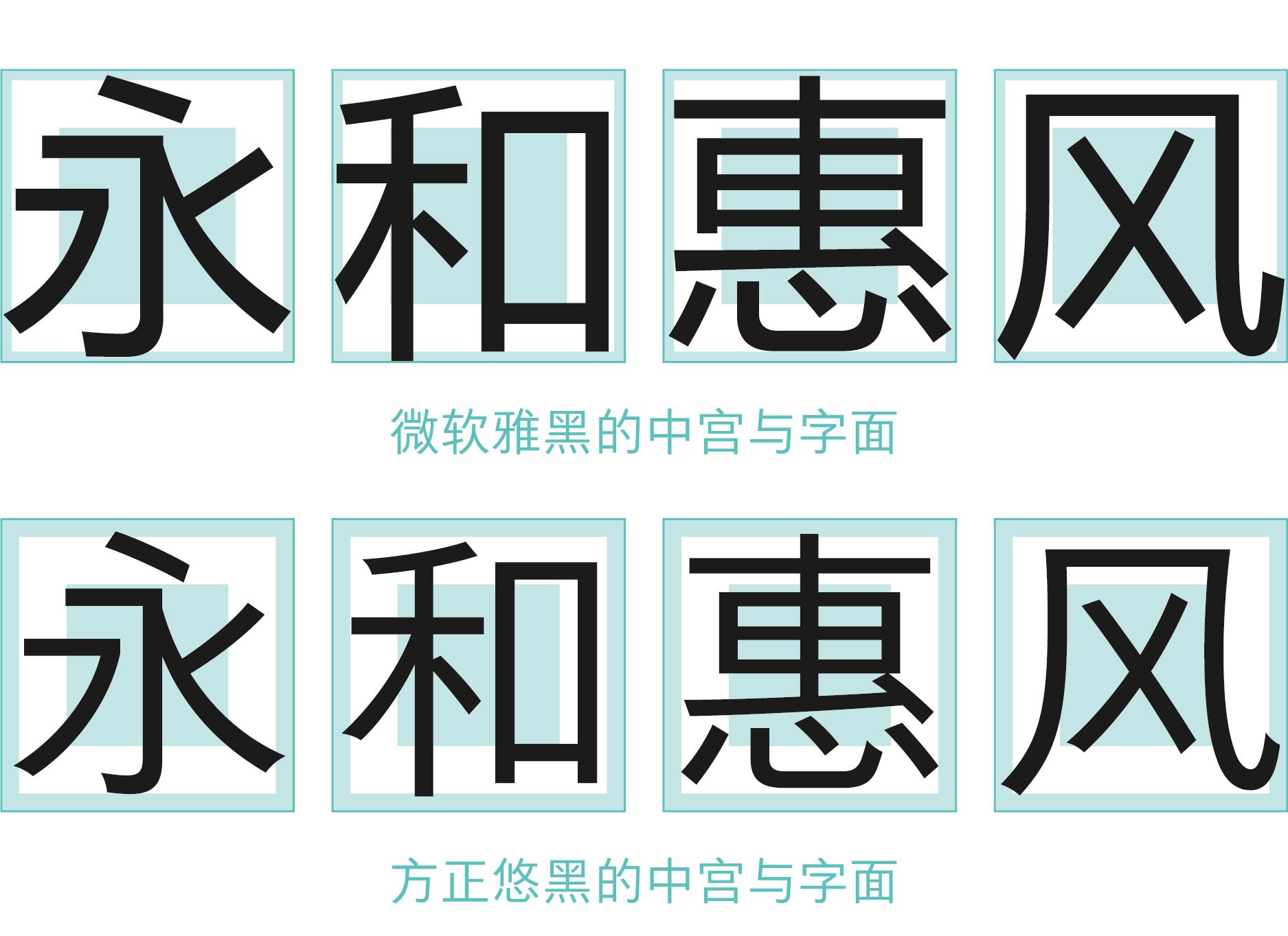
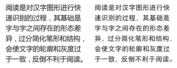
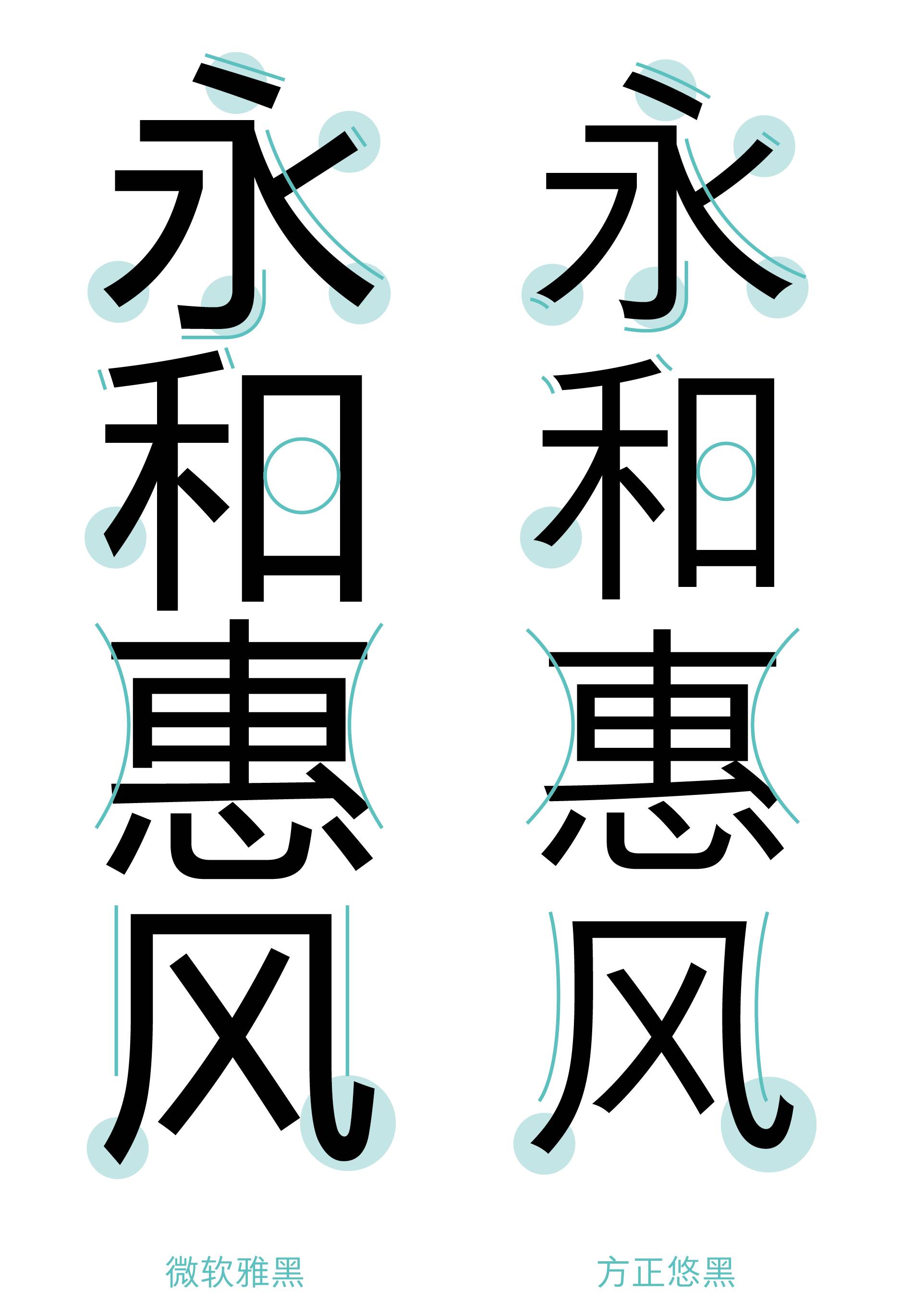
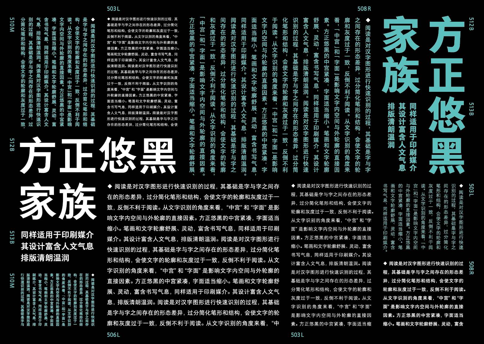
Reading is the process of quickly recognizing Chinese character graphics, which is based on the morphological differences between characters. Oversimplifying the stroke shape and structure will make the outline and gray scale of the characters too consistent, which is not conducive to reading. From the point of view of character recognition, "middle palace" and "literal" are the direct factors affecting the inner space and outer contour of characters.
 Under the same font size, character spacing, and line spacing

The design of Founder’s second-generation on-screen display fonts does not follow the current minimalist approach of flat design, but strives to find a balance between new technology and traditional aesthetics.
The chief designer, Qiu Yin, is well versed in the traditional regular script brushwork. In the design, he retains the stroke characteristics and frame structure of Chinese characters. The strokes are stretched and coherent, suitable for long-term reading. Compared with the first generation of Chinese screen display fonts, we can see the transformation from industrial to humanistic.

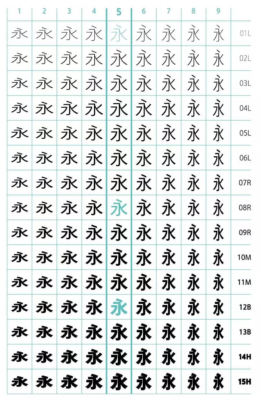
Founder Youhei family consists of 135 fonts. Due to the large size of the family, the fonts are named using a numerical numbering system for easy identification. The vertical axis (1-10) represents the flatness and narrowness of the font body from left to right, among which "5" is a commonly used standard square font; the horizontal axis (01-15) represents the change of font weight from top to bottom, and uses Western characters The abbreviated name of the font weight classifies it (eg 01=Light, 07=Regular, 10=Medium, 12=Bold, 14=Heavy). Especially in printing media, it can better guide designers to use Yuhei in proportion to the font weight of other Western fonts.
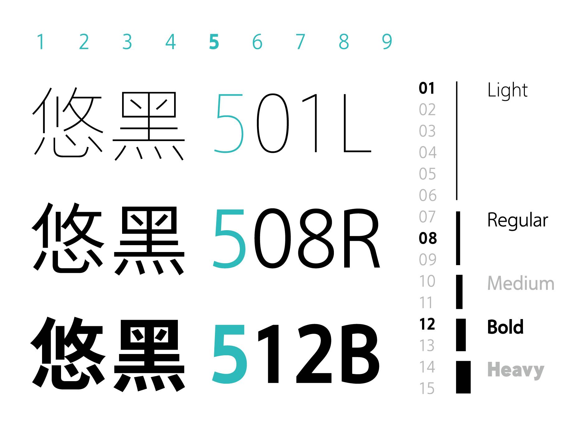
 Illustrating the naming method of the Fangzheng Yuhei family
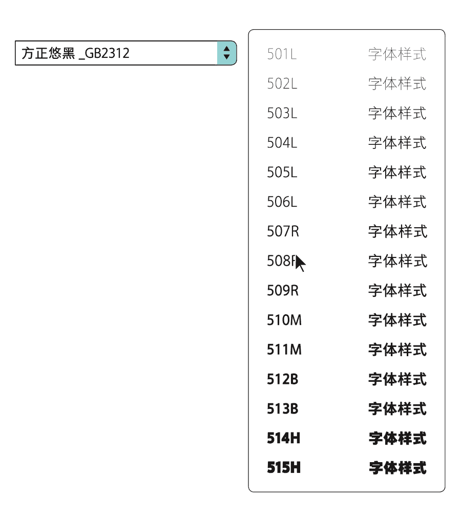
Among them, a total of 11 fonts from "503L" to "513B" support the GB18030-2000 standard (9 types were launched in the early stage), containing 27,533 Chinese characters, which can meet the reading needs of portable screens of different sizes.
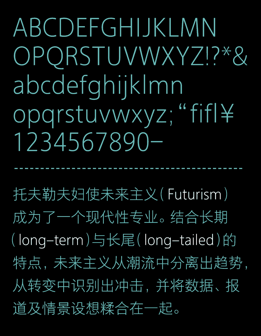
1. In order to match Fangzheng Youhei's pen style, a full set of English fonts and symbols are specially designed. English fonts with different weights are more coordinated when mixed with Chinese.
2. There are many fonts in the Founder Youhei family, and the introduction of submenus is more convenient for designers to search and apply.
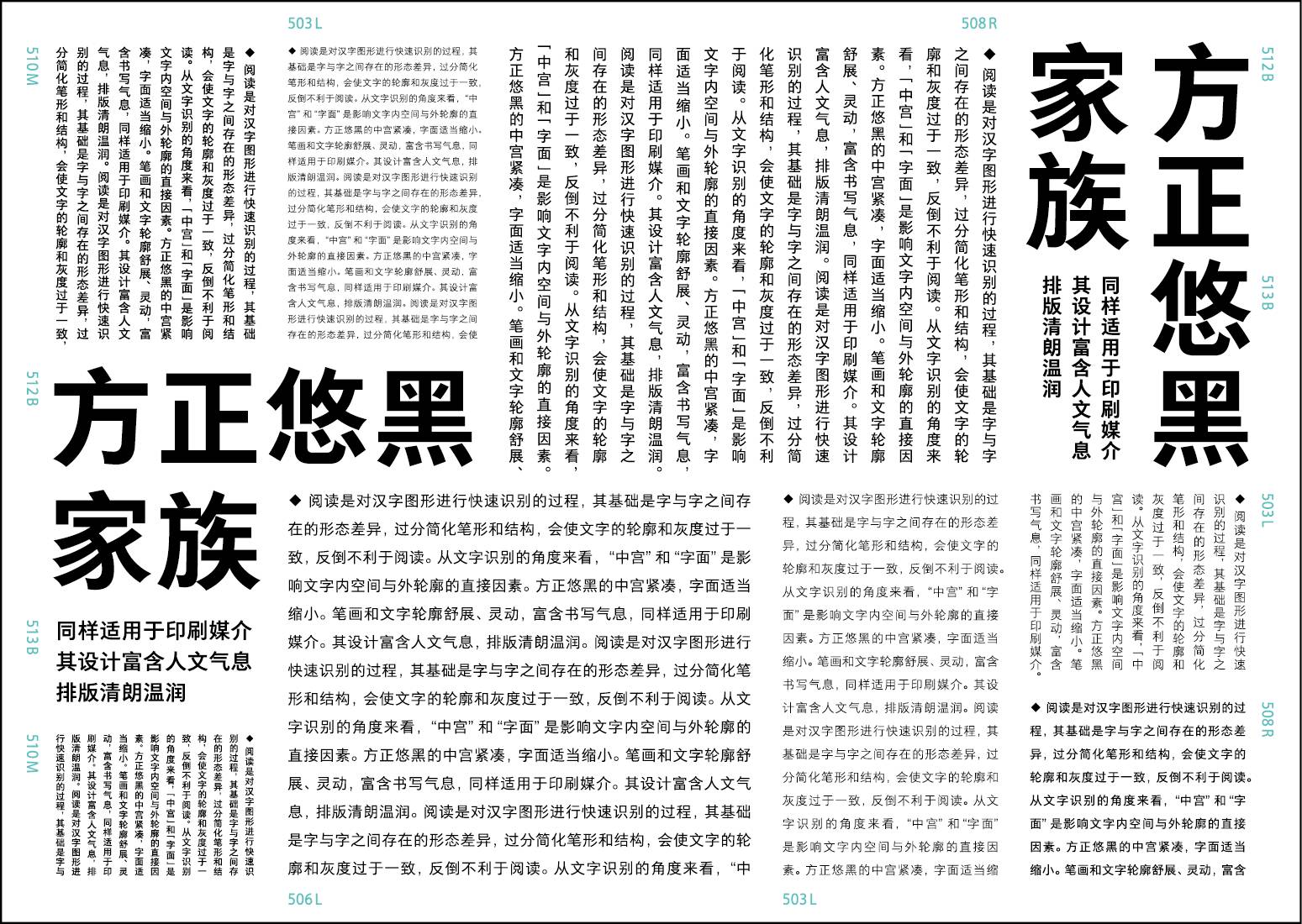
3. The Fangzheng Yuhei family is also suitable for printing media. Its design is full of humanistic atmosphere, and the typography is clear and gentle.
4. Founder Youhei family has TrueType, OpenType, PostScript and other formats, which can meet the needs of various software and hardware platforms.
The Internet is changing our way of reading with the power to change everything. As an important carrier of information transmission-Chinese fonts also need to keep pace with the times. Founder Type will adhere to the audience experience as the starting point, uphold a rigorous scientific attitude, continuously absorb nutrients from tradition, take creating classics as its mission, and make unremitting efforts for the development of Chinese fonts.
(Editor Design: Yang Linqing Studio|Cooperation: Zhou Nan)
Articles are uploaded by users and are for non-commercial browsing only. Posted by: Lomu, please indicate the source: https://www.daogebangong.com/en/articles/detail/Founders%20secondgeneration%20Chinese%20screen%20display%20font%20Yuhei%20Family.html
 支付宝扫一扫
评论列表(196条)
测试