If you talk about the most widely used set of fonts in the domestic market, it must be the Founder Zhenghei Family. Posters, background walls of international conferences, advertising signs, game interfaces... We have seen it in many scenes we are familiar with.
And its "brother" Fangzhengruizhenghei has undergone changes on the basis of justify, which is more tough and powerful, with a generous and fashionable style. Also favored.
Now, the Zhenghei family has ushered in a new member——Fangzheng Ruizhengyuan. Ruizhengyuan, who has inherited the excellent "bloodline", makes this harmonious, fashionable, smooth, Simple design aesthetics are pushed to a new level.


Sharp and justify series, the attributes are between the round body and the black body. It is a moderately neutral design. It has the roundness of the round body and the thickness of the black body , soft with sharp, round with square.
The tip of the brush is designed with semi-rounded corners. Compared with black body and round body, it is more rounded and sharpened. Sleek and stylish yet dignified and stable, it can be used in a wide range of fields.
Introduction to Fangzhengrui Zhengyuan
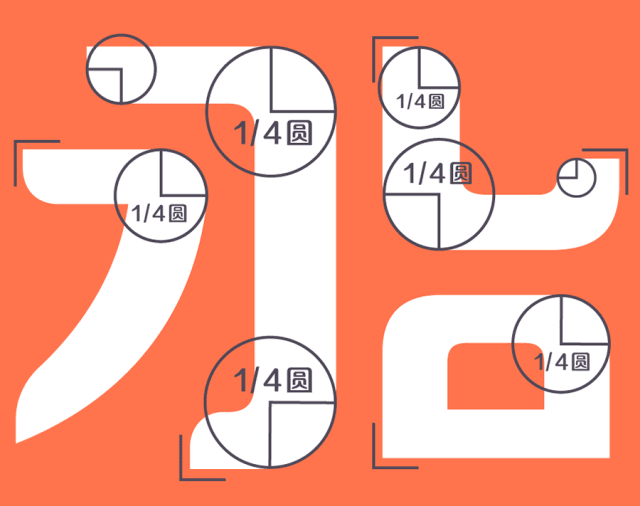
▲ Round and sharp strokes
The arc of the pen is mainly mirrored inside, with the beauty of inner circle and outer square, facing each other.
The shape of the pen follows the writing quality, making a unified and standardized design and enhancing the beauty of the mirror image. It is between square and round. If it is too round, it will be chaotic and unclear; Aiming at the pursuit of roundness, softness, simplicity and clarity.
▲ The beauty of mirror image
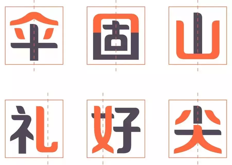
The glyph tends to be up and down, stable and upright.
It is consistent with the traditional Chinese concept of "round sky and earth", combining square and round, and combining hardness and softness.

▲ The beauty of stability
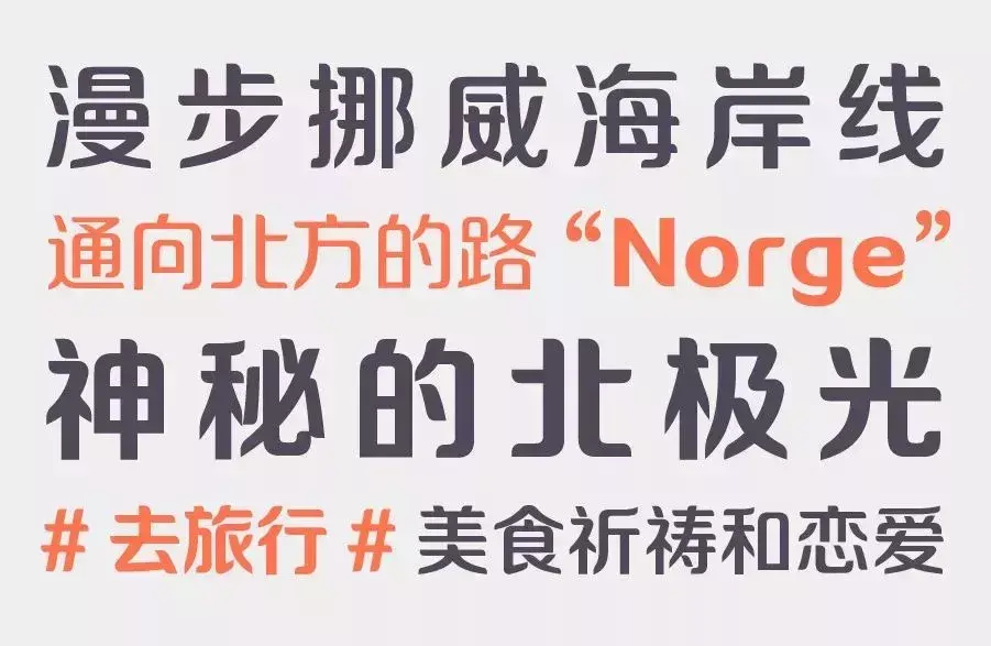
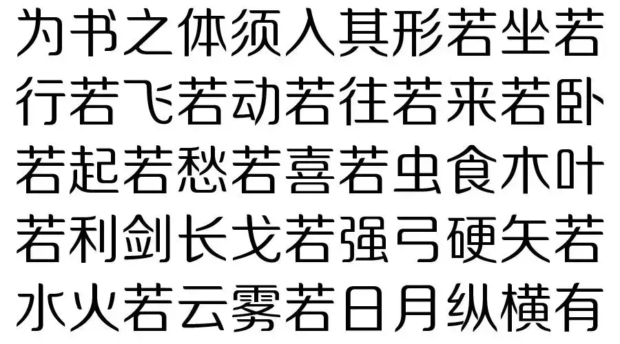
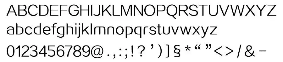
Chinese characters/ Regular
Western font/ Regular
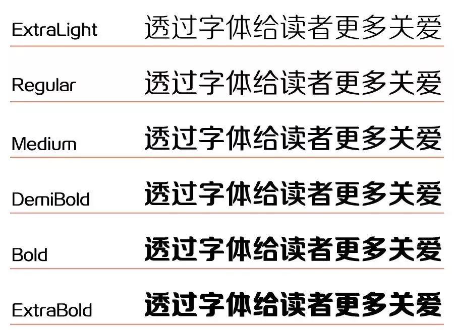
Family Showcase
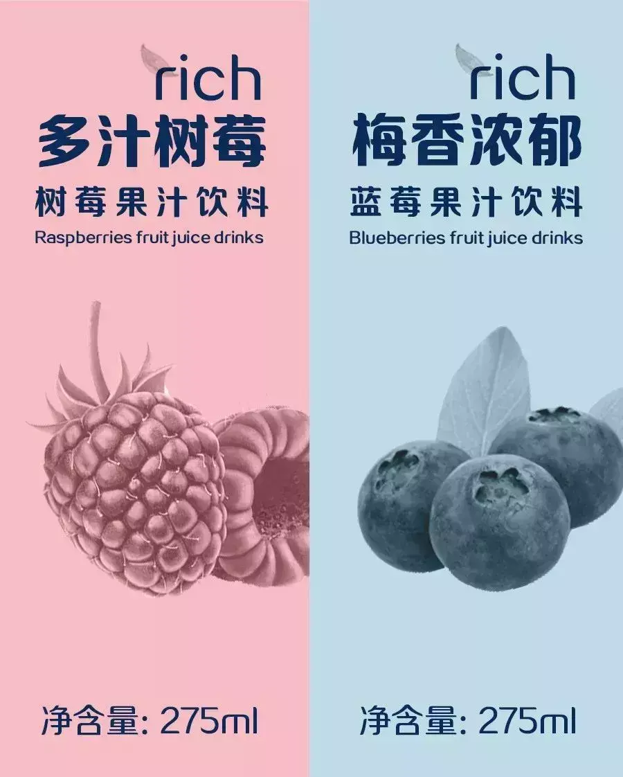
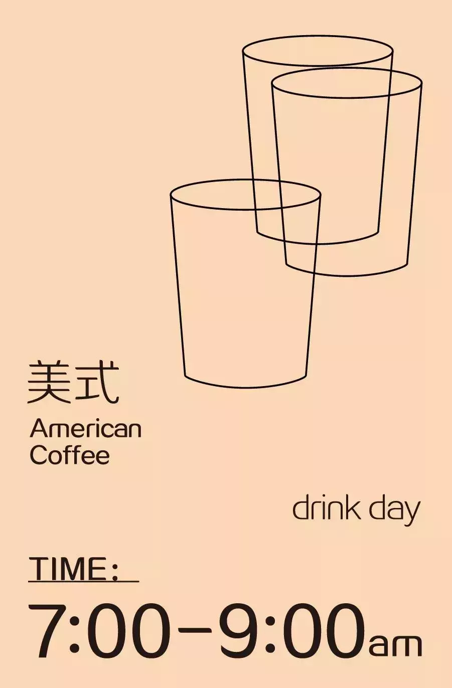
Application case

Chief Designer
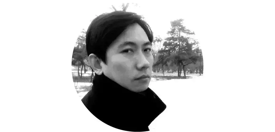
Lu Shuai
Founder Font Senior Font Designer, graduated from Beijing Institute of Fashion Technology in 1999 majoring in Decoration Design, once served as the productization director of Beijing Founder Electronics Company, responsible for the company's software productization and Package Design.
Works: "Hanging Needle and Seal Change", "Zhenghei Series", "Shuiyun Series", "Ruizhenghei Series", "Ruishui Cloud Series", "Sharp and Perfect Circle Series", "Perfect Circle Series" and "Qianhei Series", "Slogan Style Series", "Gothic Black", "Axe Style", "Infernal Black", "Fun and Simple Western" etc., some of them are developed as fonts. The main creative "Zhenghei Series" is one of the most popular fonts in China in recent years, with far-reaching influence.
Won the GDC15 "Graphic Design in China" professional group two finalist awards in the text category, the GDC17 professional group text category excellence award, the only double review award in the fifth to eighth Founder Award font competition , Excellence Award, Popularity Award, Finalist Award, two works were invited to participate in the first China TDC 2017 "Text Design in China" invitational exhibition and were collected.
"Starting from market demand,
Combine the aesthetic trend of the current era"
——Lu Shuai
Every font designer has his own ideas. Some focus on stylization, others on legibility. Looking at Lu Shuai's font design works, whether it is the Founder Zhenghei family or the Founder Shuiyun family, he sticks to his own path: a neutral design approach that combines multiple elements and is moderately neutral.
Talking about the direction of character creation, Lu Shuai said that he prefers to start from the market demand and consider the current aesthetic needs. He pays attention to the market, the aesthetics of the public, and what everyone needs. Therefore, to create new fonts to make up for this market, or even a gap in the current social demand for characters.
When the designer’s set of fonts is launched on the market, Lu Shuai believes that this is not the end of the set of fonts, and the feedback on the application effect of the market may even have a positive impact on the future of the designer. Design direction has a directional effect. It is precisely because of this that he created his neutral design concept of compatibility between stylization and legibility, multiple integration, and moderate neutrality.
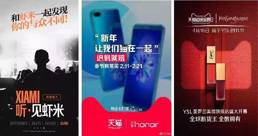
▲ Application case
The so-called neutralization of font functionality and legibility, Lu Shuai said that even advertising fonts or creative fonts should pay more attention to these two aspects. "I think the designers of the new generation should pay more attention to the communication of the font's functionality, because in the final analysis, as a text attribute, fonts are more for reading, not as a presentation of style. It is not a piece of calligraphy after all. Works, or works of art, hang on the wall for everyone to admire. Its stylization cannot suppress its functionality.”
How to get fonts▼
Personal Home Edition: Designers can download and install the "Zi+" client on the official website of Founder Type; they can also register as a member and download and try it for free Home Edition (for personal non-commercial use), please read and agree to the "Founder Font Home Edition User License Agreement" carefully before using the above Founder fonts.
Articles are uploaded by users and are for non-commercial browsing only. Posted by: Lomu, please indicate the source: https://www.daogebangong.com/en/articles/detail/Founder%20has%20released%20a%20new%20font%20Also%20offers%20a%20free%20trial.html
 支付宝扫一扫
评论列表(196条)
测试