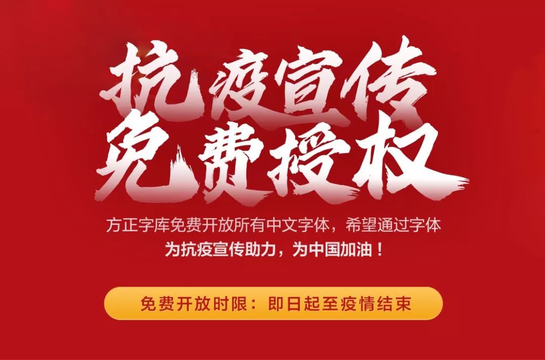
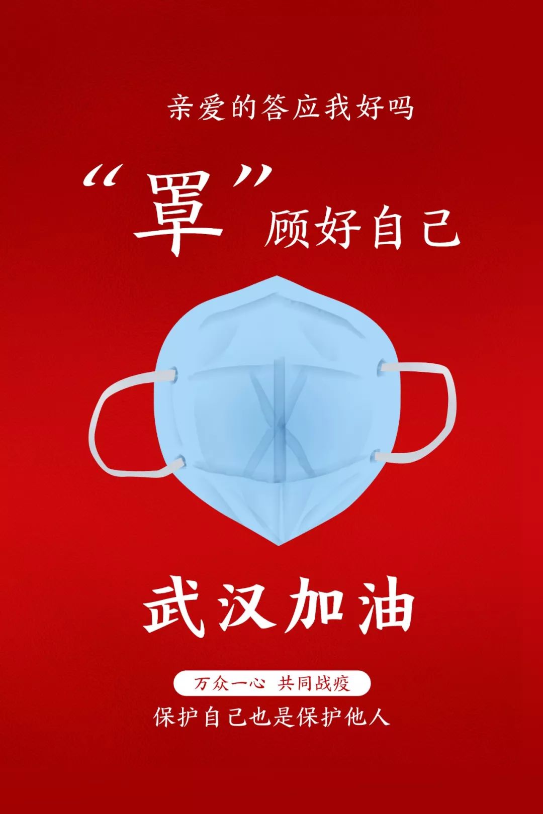
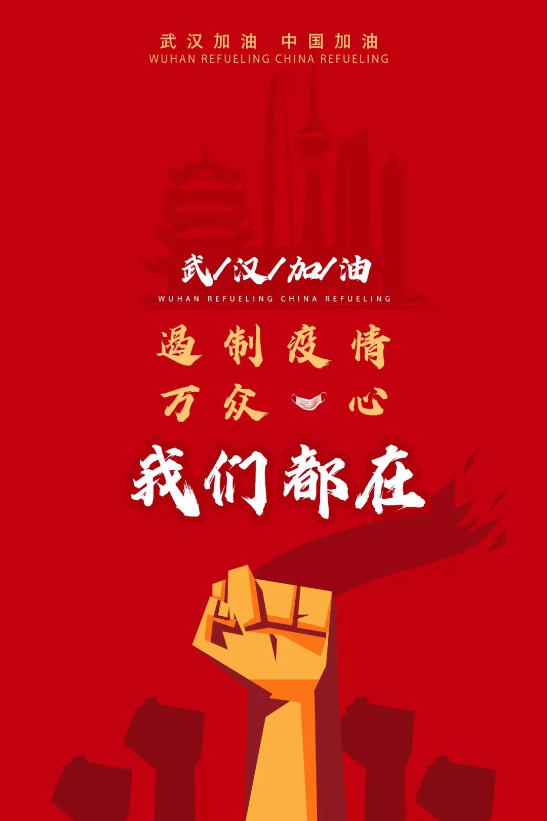
All united to fight against the epidemic! Founder Typeface has released more than a thousand types of fonts for free use in public anti-epidemic publicity.
Free time limit:From now until the end of the epidemic.
How to obtain fonts: All media, companies, and personal anti-epidemic promotional characters can be obtained through the official website of Founder Font Or download and install the "Zijia" computer client to get all Chinese fonts, hoping to use fonts to help anti-epidemic propaganda and cheer for China! Founder Typeface official website:
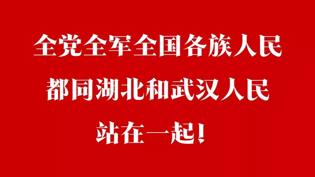
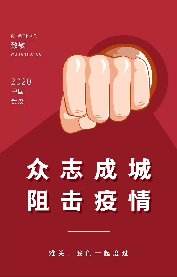
http://www.foundertype.com/ Founder font application example Fangzheng Junker font is a creative font with strong geometric sense. The strokes of this font are completely designed with straight lines, and the angle of the folding pen is rigidly limited. It is expressed by a broken line of about 135°, and the strokes of the left and right strokes are mirror imagesSymmetrical, the center of gravity of the font is stable. The Fangzheng Yongke family includes 8 font weights, and its fonts are full of power. Overcome the difficulties! The people of the whole country are united! We will surely overcome the epidemic! 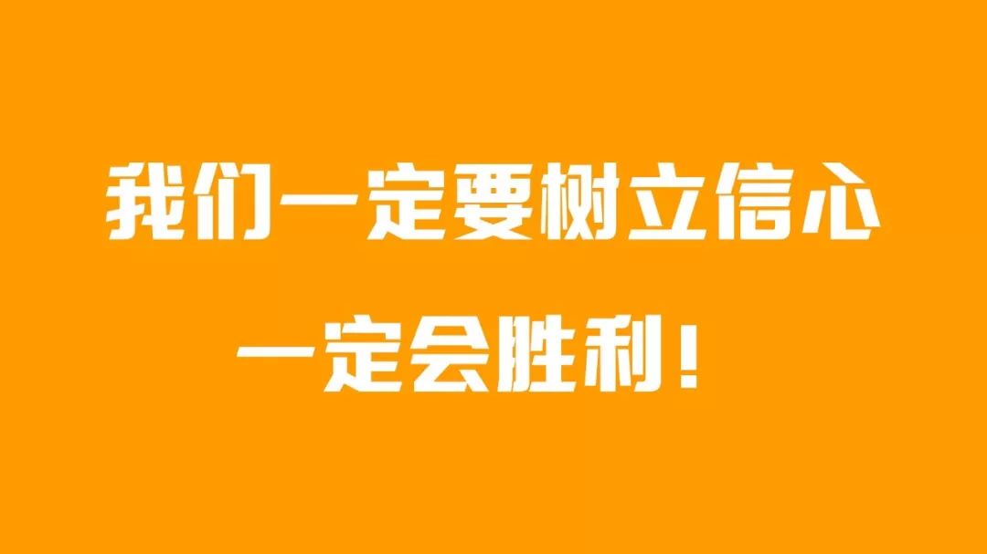 Sanbaoti creatively combines the essence of popular Chinese fonts: Variety, Ganghei and Shengbao. This typeface is also a representative work of Mr. Guo Bingquan, and it is very popular in mainland China, Hong Kong and Macau regions of China, Taiwan region of China, and Singapore. The three treasures contain their characteristics and charm, symbolizing stability, innovation, honesty and harmony.
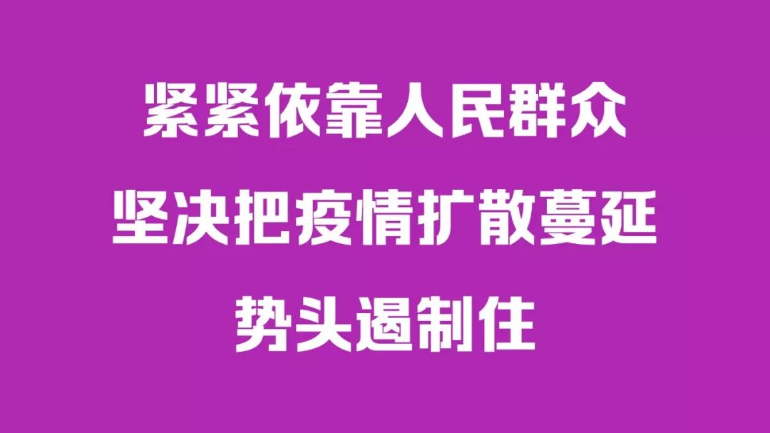
Founder Sharp Black is designed on the basis of Founder Black. Founder Ruizhenghei continues the font structure of Founderzhengzhenghei and the mirror-symmetrical style of strokes, and changes the rounded corners of all hooked strokes and folded strokes into right angles, and the starting and ending points of curved strokes such as dot, left, right and lift Changed to a basic equal thickness, which is consistent with the thickness of the vertical strokes, and the overall font has a more specific sense of volume. Compared with Founder Zhenghei, which has a neutral font style, Fangzheng Rui Zhenghei is tougher and more powerful, with a generous and fashionable style. Founder Shanghei is a bold font with a full sense of geometry. The shape of its strokes blends with squares and circles, and the strokes are straight and sharp, which contrasts with the graceful and round arcs at the turning points. In addition, the horizontal strokes are slightly thinner than the vertical strokes, and the bell mouth is removed, which is more modern and fashionable. The overall style of this font combines rigidity and softness, stability and affinity. Han Song style is inspired by the ancient Han pen, that is, the feather pen. The font style combines Chinese and Western font design elements. On the basis of the traditional Song typeface, it adds a sense of shape and decoration. The thickness of the strokes is relaxed, giving people a sense of elegance, fashion and refreshing. Founder Chivalrous Object
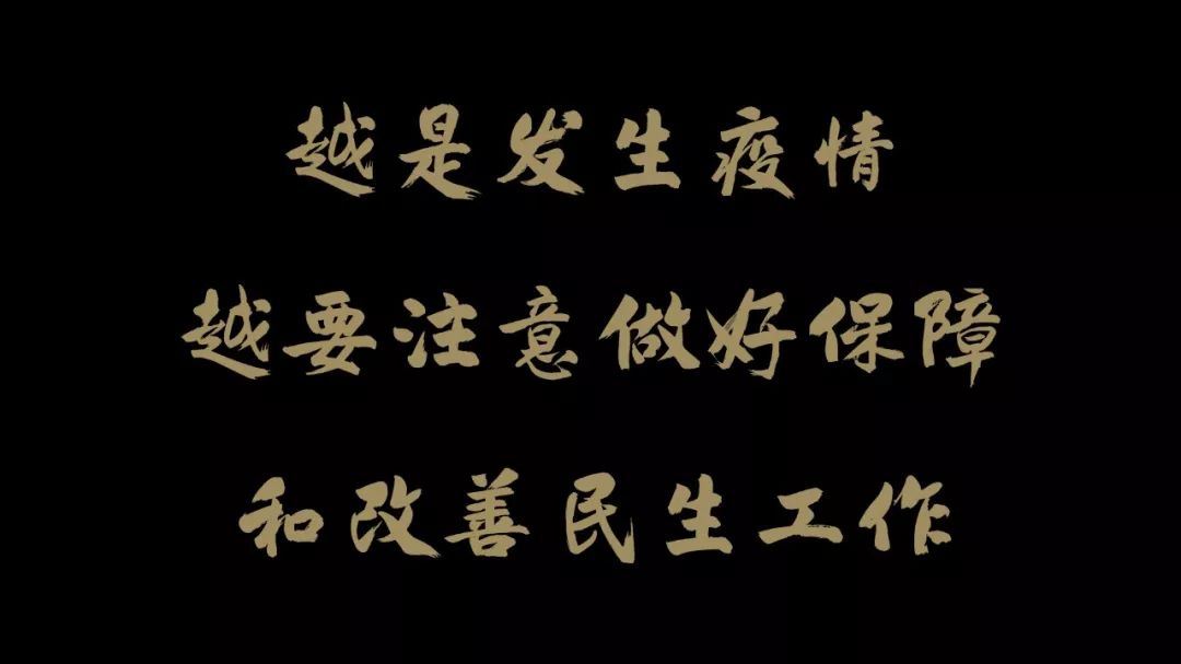
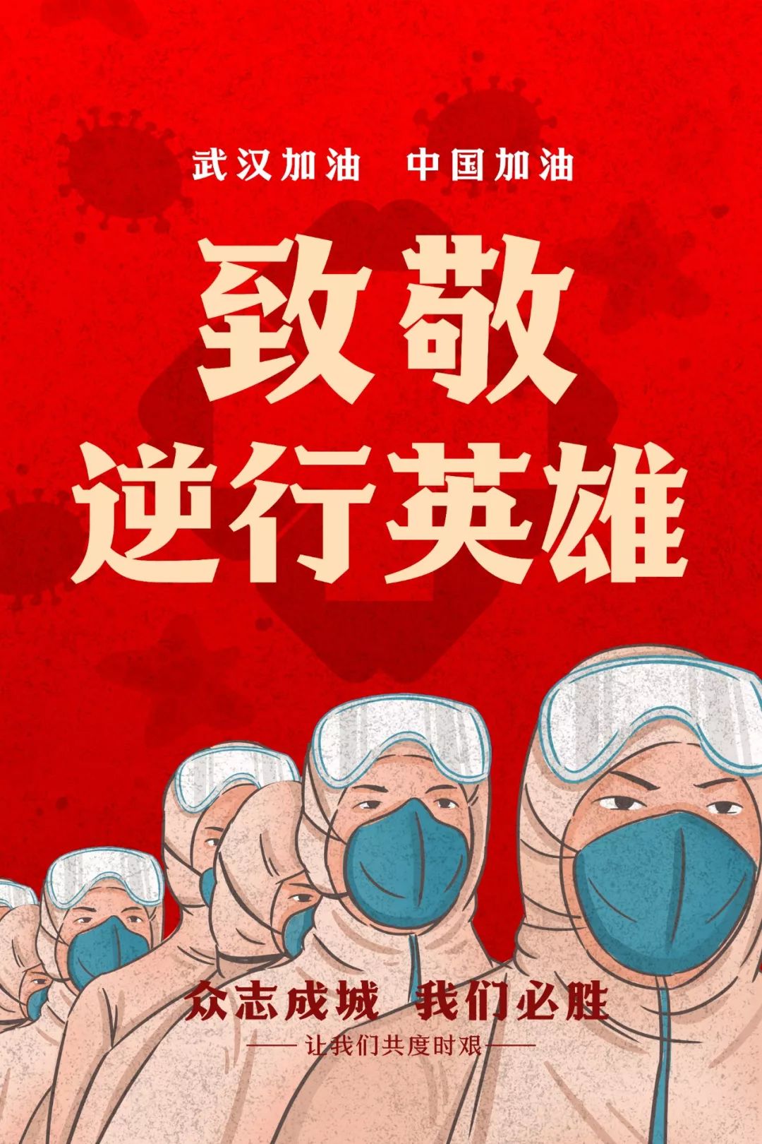
The creation of Fangzheng's chivalrous object originated from the design of the publication "Pingshu Nie Yinniang". Writing is like swinging a sword, paying attention to priorities. The straightforward writing presents the chicness and courage of the chivalrous man. The ancients said: "Do whatever you want without transgressing the rules." We must respect and respect traditions, and on this basis create works with the characteristics of the times. The creation of chivalrous style is based on this concept. Following the example of ancient classic inscriptions, such as Yan Zhenqing, Zhang Jizhi, Zhu Xi and other famous works, the font shape is based on Xingkai, and the richness of strokes is preserved as much as possible, such as changes in thickness, changes in the same radicals, and the effect of flying white. Fangzheng Zhongyi SongThe inspiration source of this word is popular The official hat worn by Bao Qingtian in the TV series "Bao Qingtian". This Song typeface has an improved style, with a flat and stable layout, correct fonts, and a sense of seriousness and loyalty. The epidemic is urgent, and tens of thousands of medical staff from all over the country rushed to Hubei to support and pay tribute to the bravest retrograde heroes! Fangzheng Qiangketi is a Chinese family font with speed, strong personality, perseverance, will and drive. It is a series of fonts full of vitality and a strong sense of campus movement. The font has moderate line thickness and unique stroke design. It has 8 different weights and weights. The overall effect is excellent. It is especially suitable for some scenes that are more impactful or need to show strength. Fangzhengbao black body is a black body with decorative lines, which enriches the variety of stylized bold characters. The design incorporates Western font design techniques, and decorative lines are added at the starting point of the vertical, curving, and lifting strokes and the ending point of the horizontal strokes, making the font more recognizable and adding a sense of refinement. Founder handwriting-Hongfei Han Wei Simplified
Founder handwriting-De Nian running scriptSimplified
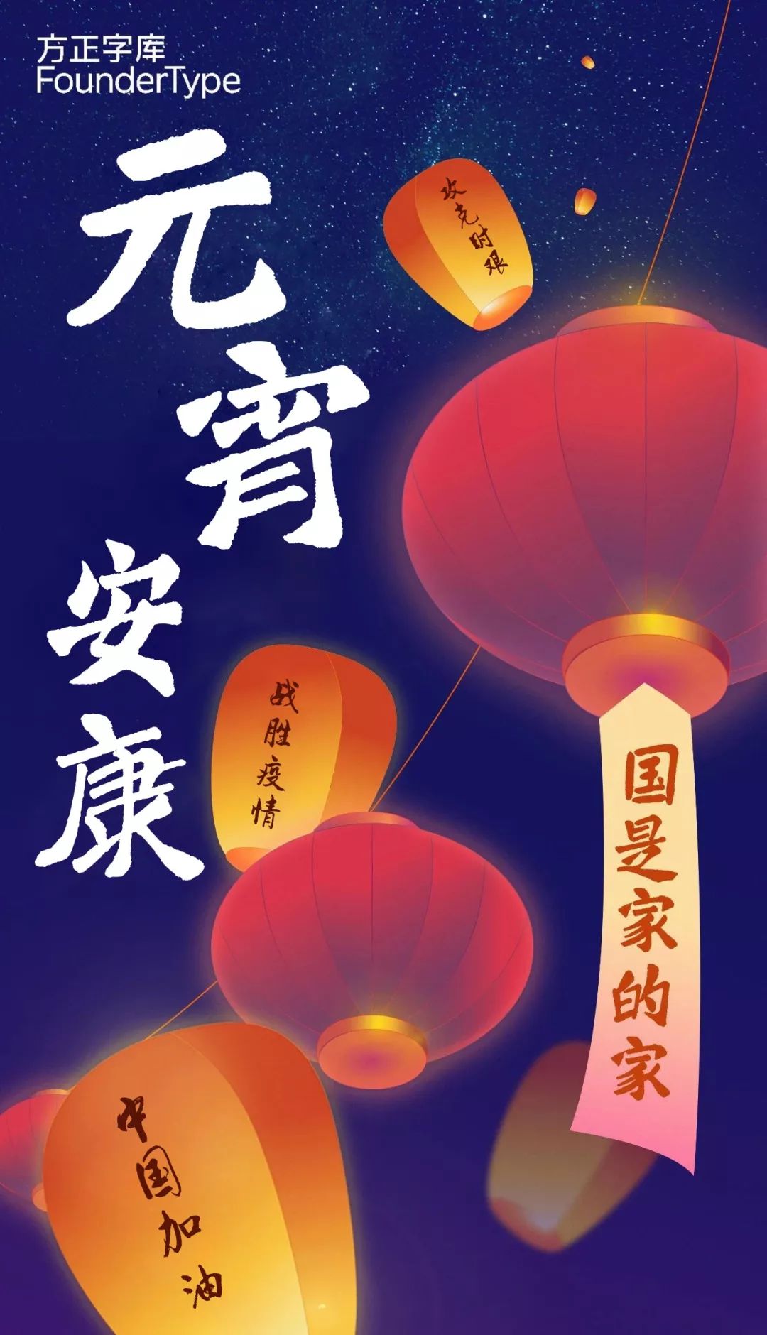
Founder's handwriting-Hongfei's style of Han and Wei, although it is a Wei stele, comes from the heart, and the pen is open and unrestrained. The whole set of fonts is informal, flexible in size, orthodoxy, and weight, like a drunken song of a strong man, with a strong visual impact. The personality of this font is powerful, simple and generous. Founder's handwriting-De Nian's running script is well-versed in writing skills, with vigorous and refreshing pens, strong pen strength, thick and broad strokes, full of contemporary writing aesthetics. The style of this font is passionate and unrestrained, suitable for cultural promotional design.
Fangzheng Shengshi regular script
The design of Fangzheng Shengshi regular script family originated from the fragments of scriptures written in the Northern Wei Dynasty. During the Northern Wei Dynasty, regular script was still in the development stage, leaving distinct traces of official script. Compared with traditional regular script, Fangzheng Shengshi regular script has a tougher style, a much wider central palace, smooth strokes, clear starting and ending strokes, firm and flexible strokes. The shape of the pen absorbs the meaning of traditional ink, giving off a new reading experience. The Fangzheng Shengshi regular script family includes 6 weights, which are suitable for titles and texts, and the thick weights can be directly used for slogan design. Also, thanks to the font's central stretch, text used in smaller sizes does not lose its legibility. Founder handwriting-Dragon Yin style
Founder's handwriting-Dragon Yin style has rigid and sharp strokes, wild strokes, thick and free-spirited fonts, and varied structures. It is not only suitable for horizontal and vertical typesetting, but also facilitates the interpenetration of words.

▲Log in to the word plus client, one-click use of massive fontsArticles are uploaded by users and are for non-commercial browsing only. Posted by: Lomu, please indicate the source: https://www.daogebangong.com/en/articles/detail/Founder%20Font%20Library%20has%20opened%20more%20than%20a%20thousand%20types%20of%20fonts%20free%20to%20use%20for%20antiepidemic%20propaganda.html







 支付宝扫一扫
评论列表(196条)
测试