
Text/Photo by Chen Zhiquan/Google
As a visual language, fonts are accurate and impactful in graphic design, so their formal beauty will play an important role in the display of graphic design aesthetics. In recent years, graphic design has made full use of the art of calligraphy, and the reason why calligraphy art can be widely used in design is directly related to the existence of the formal beauty of font design. Therefore, it is necessary to discuss the application of the formal aesthetics of font design in design in order to make better use of Chinese characters. 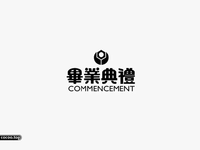
Font design is closely related to people's life, and has established an inseparable relationship with graphic design. The use of words in design can not only convey information in the most direct way, but also help enterprises establish their own image. And through font design, graphic design can become the carrier of text, and then better show the formal beauty of text. In the design process, after the layout of graphics, colors and logos is completed, the design itself can be recognizable to a certain extent through font design, and then a unique overall design style is formed. 
Therefore, font design is actually an important means of artistic processing for the beauty of design form, which is directly related to whether the advertising information can be correctly expressed, and then affects the embodiment of advertising value. 
Application of Font Form Aesthetics
In modern design, whether you use a simple basic font or a design font with a large difference in style, it will make the design have a certain design style, and then bring people different feelings with the unique aesthetic feeling of form. The establishment of this design style will make the advertisement have a distinct brand impression, and then help consumers better identify the product. Recommended reading: Typeface logo design skills! Addition, subtraction, disconnection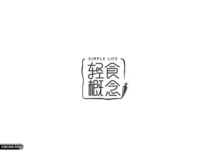
Fonts have a variety of expressions, so that the font can form a unique aesthetic feeling with personality. Some designs are graceful and elegant, bold and unrestrained, and some can reflect the characteristics of business and culture in design. And because the overall design is different, it also has different characteristics. There are many forms of expression in the text itself, with different presentation methods. But the overall concept of design must follow the characteristics and attributes of the product. 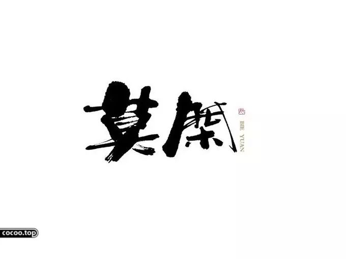
Show the structural beauty of Chinese characters
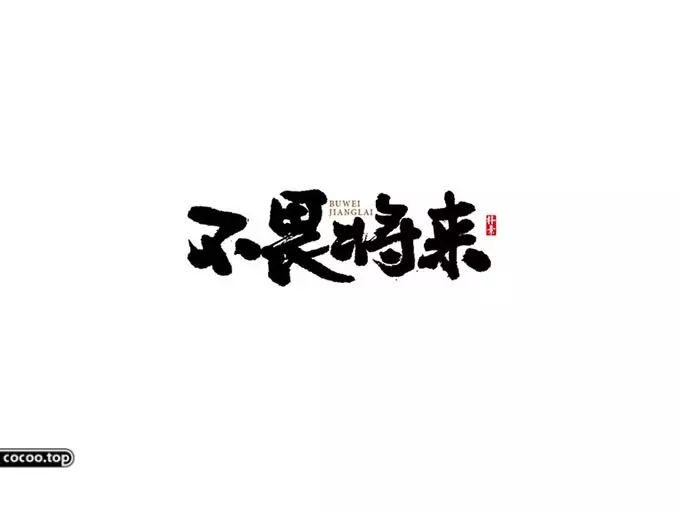
In essence, no matter what form the font takes, it will show the legibility of the text. Therefore, when designing, the layout and beautification of fonts should be based on the principle of clarity and readability, so that consumers can easily distinguish the text. From the perspective of Chinese calligraphy, the ancients had a relatively unified understanding of fonts. Whether it is Lishu or Kuangcao, the structure of the fonts has always remained the same. The reason why this phenomenon occurs is to ensure the clarity and legibility of the characters, and then to ensure the inheritance of the characters. Similarly, when designing fonts for characters, it is also necessary to show the beauty of the inter-frame structure of Chinese characters in order to improve the recognizability of characters. 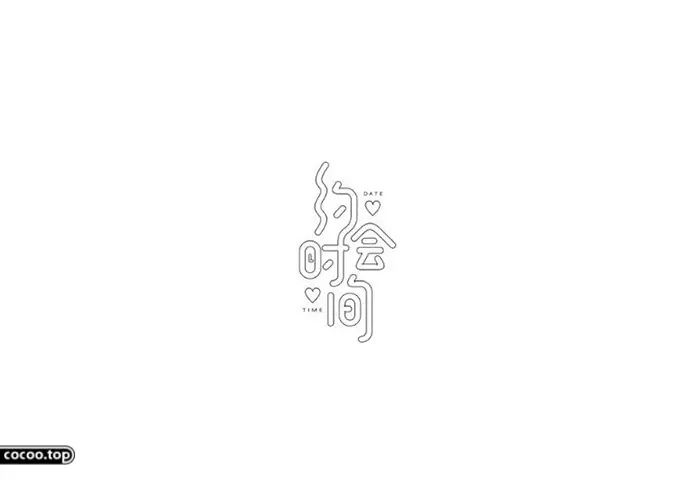
Therefore, the design of fonts should not change too much, and font changes cannot affect the recognition of characters. In terms of overall design, no matter which font is used, it is necessary to ensure that the writing is coherent and consistent with the law. Therefore, when observing the font in the design, it can be found that the last stroke of the font will not affect the recognition of the text, so there are often more changes. 
Highlights the beauty of font style
If you want to apply the formal beauty of font design in the design, you also need to highlight the formal beauty of the font design style. From the point of view of the purpose of product advertising, the design needs to complete the accurate positioning of the product and display the value of the product in order to help the enterprise establish its image and obtain profits. 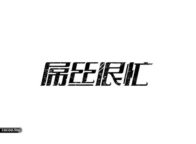
When designing fonts, the same purpose must be followed. Therefore, it is necessary to show the formal beauty of the font style similar to the attributes and styles of the product, so that the font design can echo the attributes of the brand product. In order to achieve this goal, it is necessary to design font lines, contours and softness and hardness from the perspective of product personality, and then increase the affinity of the product by showing the beauty of font style and form. 
Pay attention to the artistic beauty of font design
In essence, typography is an art form in itself, and should show an artistic beauty. Only by bringing people a certain aesthetic feeling through font design can the flexible use of the formal beauty of font design be completed, and then spiritual enjoyment can be brought to the public. In order to achieve this goal, it is necessary to complete the design of the font form in a way of contrast, juxtaposition, divergence, concentration, and symmetry, so that the font form and content can be integrated, and then produce an artistic beauty. 
In addition, according to the content of the advertisement, it is necessary to arrange the thickness of the strokes reasonably so as to bring better visual beauty to consumers. For example, the font strokes of serious content generally need to be bold, while the font strokes of light and lively content do not need to be bold. 
Pursue the beauty of uniform structure
In order to make the arrangement of fonts match the whole design, we should strive to pursue the uniform beauty of the font structure. On the one hand, if too many fonts are used in the whole design, the composition of the picture will appear messy. Therefore, General graphic design uses no more than three fonts to achieve a unified beauty of shape. On the other hand, it is necessary to complete the arrangement of fonts according to the ratio of primary and secondary, so as to highlight the key content text. 
In this process, it is necessary to avoid too large or too small gaps between fonts, and follow a certain rhythm and order to complete the font layout, so that the font layout can be reasonably guided by the beauty of form. And a design that shows the beauty of a unified form will increase people's attention, and then increase the visual impact of font design on consumers. 
The font design contains brand hints, which is an extension of brand culture, and can use the unique beauty of form to deepen consumers' brand impression. Therefore, it is necessary to better apply the formal aesthetics of font design in advertising design in order to better complete the establishment of product brands. Recommended reading:The rhyme of Chinese characters! Creative conception and expression techniques
The formal beauty of fonts plays a very important role in design, and it is the most intuitive expression of visual experience. According to the unique attributes and characteristics of the font itself, the text can be artistically processed in the design, so that it can be widely advertised while having artistic beauty. The text in the design should be consistent as a whole, fully display the advertising information, and at the same time increase the aesthetic feeling of the advertisement. 


Articles are uploaded by users and are for non-commercial browsing only. Posted by: Lomu, please indicate the source: https://www.daogebangong.com/en/articles/detail/Formal%20beauty%20in%20typography%20application%20in%20design.html
 支付宝扫一扫
评论列表(196条)
测试