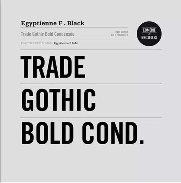
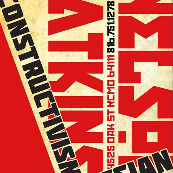
1. Select text with thick lines
Compared with slender text, thick-lined text is more powerful, and such fonts are easier to convey a sense of thickness, thereby creating the required impact.

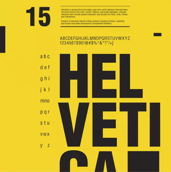
2. Select a sans serif font
Serif fonts have rich details, and non-serif fonts are mostly horizontal and vertical. Fonts like Helvetica have even, thick, and more powerful horizontal and vertical strokes.
3. The word spacing should be small and compact
If the word spacing is too large, it will appear loose and sparse. If you want to have an impact, you need to have a sense of urgency. The word spacing must be controlled small enough, or even bleed and overlap. Only in this way can it appear bold.

4. The topic text should be small and easy to read
If large blocks of text are displayed in bold fonts, the readability is poor, and because there are too many, it will not appear powerful enough. The main text should be small and easy to read, so that it can form a strong and weak contrast with the surrounding elements. Even if there is other text, try not to use bold fonts.

5. Use black text as the main body
When the main text in a poster is in black, the background, regardless of the color used, usually creates a good contrast and has enough power.
6. Use a black or dark background
When the background tone of the main body is black or other deep tones, it is best to use white or yellow with strong enough contrast for the text part, so that the contrast will appear clear enough and powerful.

7. Contrast is the key to creating visual impact
The primary and secondary must be distinct, the size contrast must be strong, the main body must be dense, the surrounding areas must be sparse, and the color contrast must be clear enough, so that the entire design can appear to have sufficient impact.
Articles are uploaded by users and are for non-commercial browsing only. Posted by: Lomu, please indicate the source: https://www.daogebangong.com/en/articles/detail/For%20a%20grand%20shocking%20and%20impactful%20poster%20design%20font%20selection%20is%20the%20most%20critical.html
 支付宝扫一扫
评论列表(196条)
测试