Friends who care a little bit about design must have seen the newly released Helvetica® Now font these days introduce. As one of the most widely used Western fonts in the world, it was redesigned for the first time after more than 30 years.
With the development of the times, old fonts will always have defects in new communication media. For example, many people like to use ([]) at the beginning of Weibo when they post Weibo, and this bracket will cause the first There is no way to align the words with the one below, which looks very awkward. As for the right-angle quotation marks ("") that everyone likes to use in recent years, there are actually similar problems, so I try to avoid using right-angle quotation marks at the beginning of paragraphs.
The main purpose of the redesign of the font is to solve the old defects and adapt to the new era.
Another trend in recent years is that the logos of many first-tier foreign companies have been redesigned. The redesigned Logo is better displayed and easier to recognize on mobile devices. What's the use of a more modern, beautiful logo? Beauty makes people feel happy, and it is also the embodiment of productivity.
However, few domestic companies seem to have this awareness. Some company logos are still using the design more than ten years ago, exuding an old atmosphere, and the recognition is not enough in new application scenarios. The same is true for large Internet companies, not many have this awareness.
I once gave a comment to a friend, saying that the design of the poster was too ugly to share. The friend asked me: What is not good? I think it is very good. It's not easy to talk about. Whether it looks good or not is a subjective feeling. The poster uses such an ugly cursive script as the title, no matter what, it looks particularly awkward on a mobile phone.
A few days ago, the shop signboard on Changde Road in Shanghai was uniformly replaced with white characters on a black background, which ushered in the ridicule of netizens. Some people may say, "This is neat and uniform, isn't it pretty?" In fact, it is more worthy of complaints. Most of the shop signs in third- and fourth-tier cities use Song typeface.
The signboard of the store is a trivial matter. If the traffic signs are not considered and the recognition is not high, the interference to the driver is still quite large. I often observe the traffic signs in various places and find that the relevant departments have not considered this thoroughly.
In this regard, it may be possible to learn from Japan. Japan's traffic signs use the standard font of the Japan Road Corporation. The concept of design is "100 kilometers per hour, 140 meters, and the time required for judgment is 5 to 6 seconds." This font is not just designed, so It has been updated over the years.
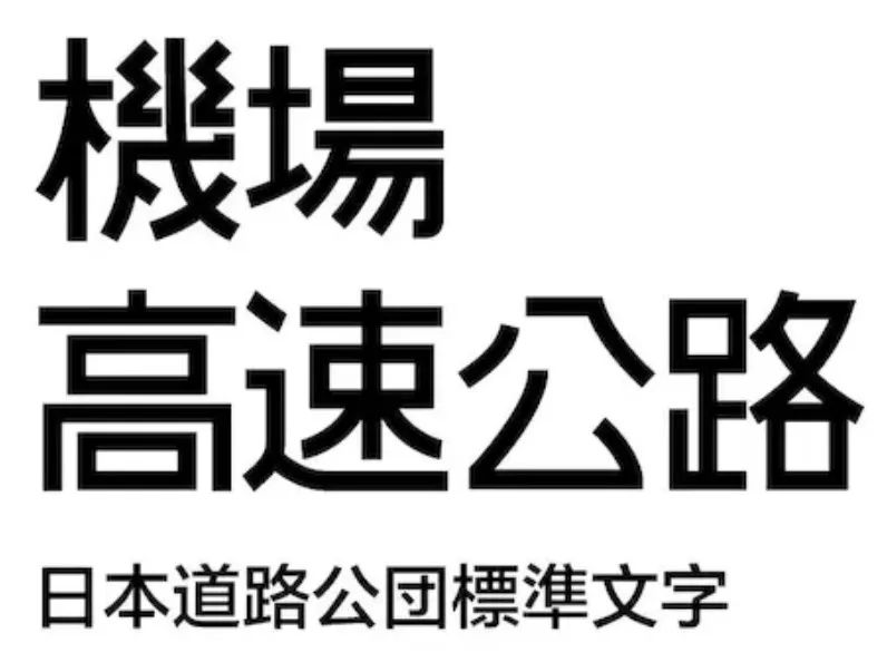
Although expressways in mainland my country have developed rapidly in recent years, there is no relevant special font yet. The national standard "Road Traffic Signs and Markings" in 1999 mentioned a font, requiring the use of "standard bold (simplified)". The 2019 version of the national standard does not seem to be updated, and further improvements may be made in the future.
The design of traffic signs, the most oolong I have ever seen is the exit of Gongzhufen Station of the Beijing Subway many years ago, which used "east, west, south, north exits" to indicate. In the subway station, how do passengers distinguish between east, west, north and south? I believe it has been changed by now.
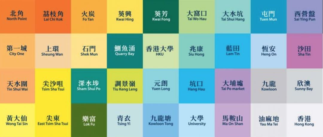
The text of the Hong Kong subway uses a specially designed font "Metro Song", which is both recognizable and aesthetically pleasing, and is extremely beautiful. What is even more commendable is that each subway station has a main color, which is really hard work.
The public signs in mainland China are not without good ones. As far as I know, the related design of Guangzhou Metro is not bad, even better than that of Shanghai. The one in Hangzhou is slightly less interesting.
China still has good design, but generally speaking, in terms of public facilities, it does not pay much attention to design, probably because we pay more attention to functionality.
Title image: Helvetica® Now Numbers and Symbols Effect
Further reading:
Talk about the copyright of pictures
How much does your company cost to design a picture?
New readers, please follow my official account so as not to miss the update:
Articles are uploaded by users and are for non-commercial browsing only. Posted by: Lomu, please indicate the source: https://www.daogebangong.com/en/articles/detail/Fonts%20Logos%20and%20Advertising%20Graphics.html
 支付宝扫一扫
评论列表(196条)
测试