
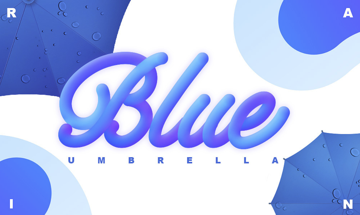
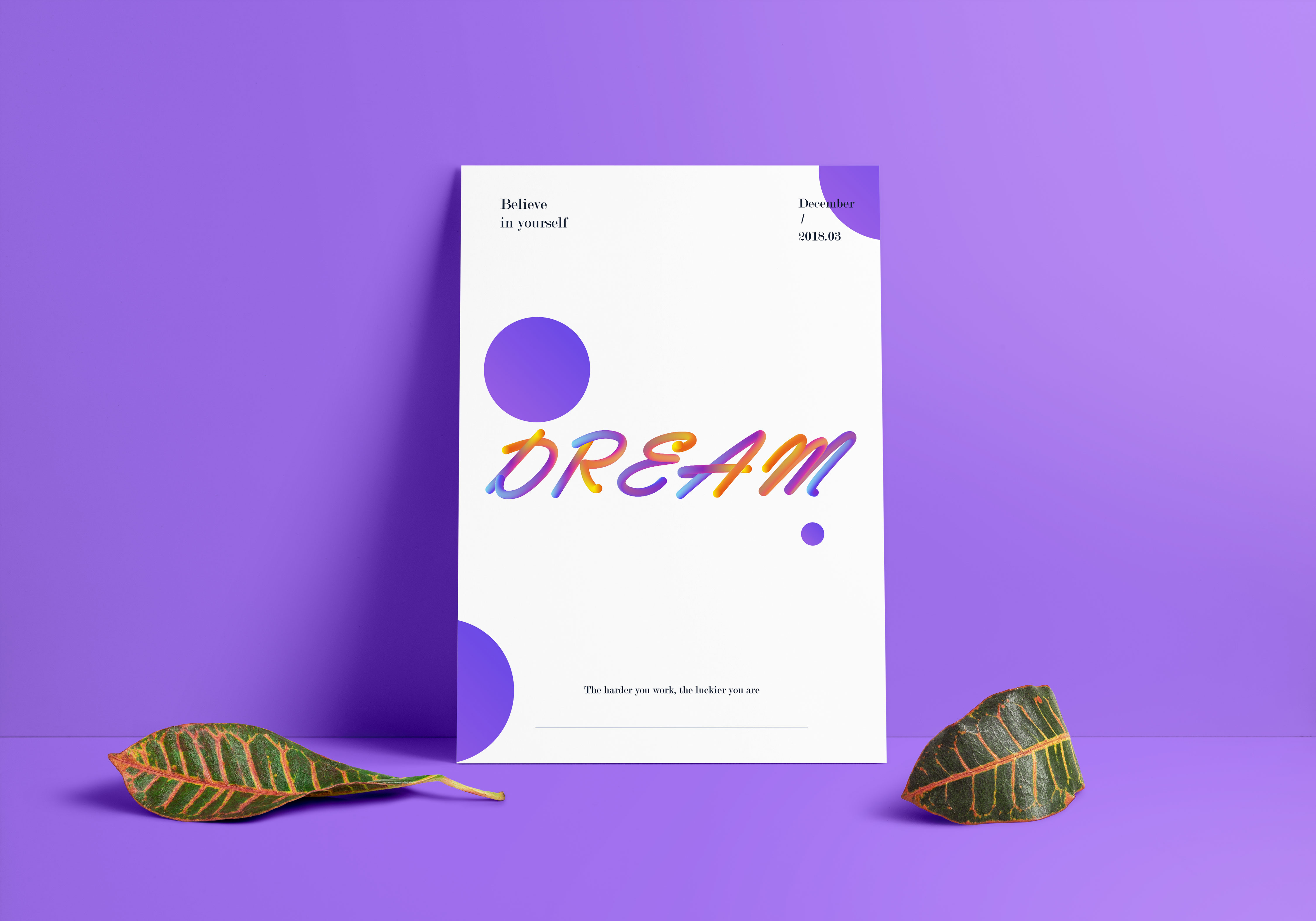
 Zhanku saw these models, I couldn't help it, I started to do it with my little hands! ! ! (The picture comes from the Internet, if there is any infringement, please contact to delete)
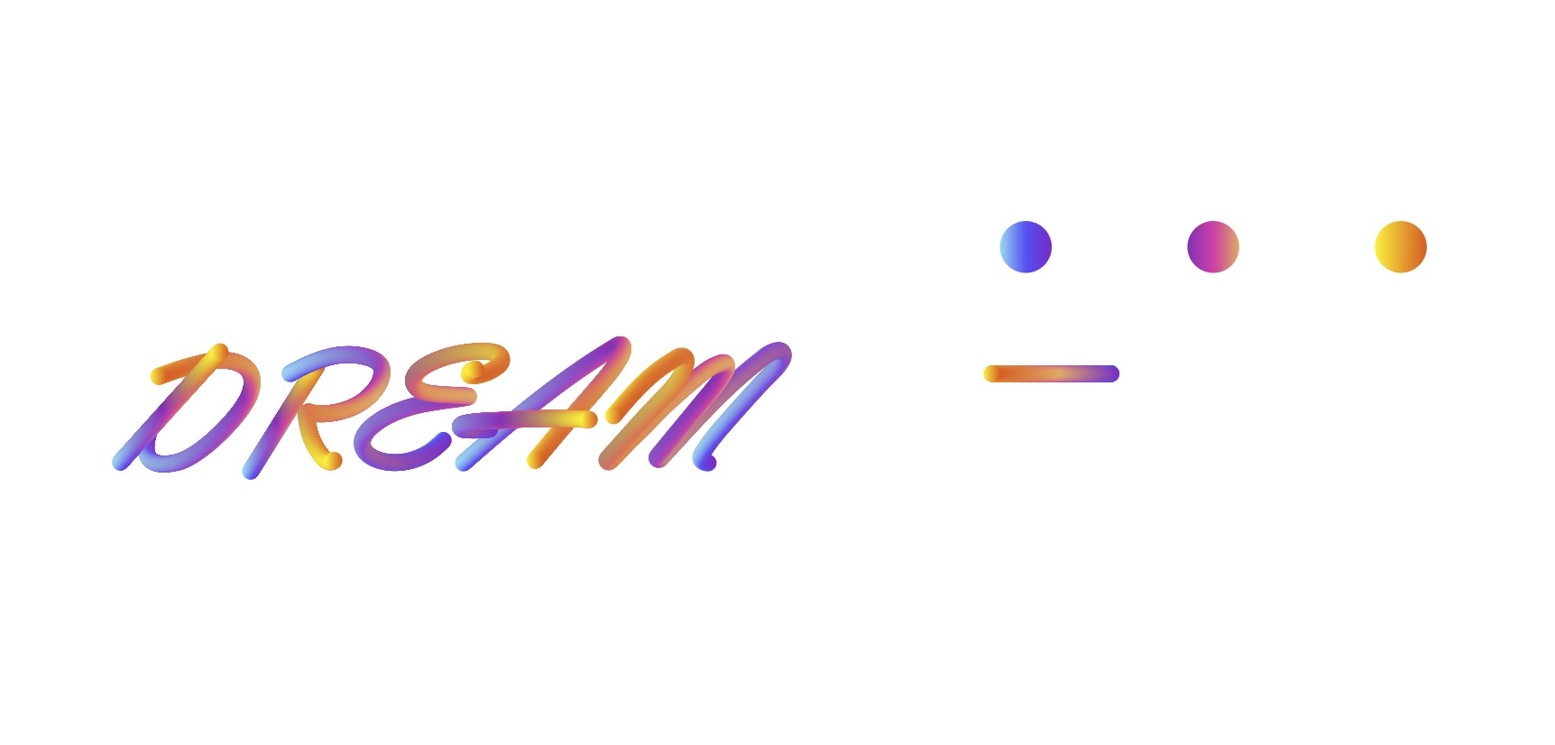
Let’s take a look at the renderings first
Note: Most of the fonts you see on the Internet are only applicable to English, Chinese can be done but the effect will be much worse than English;
1. Next, create a new canvas with any size (just as you like):
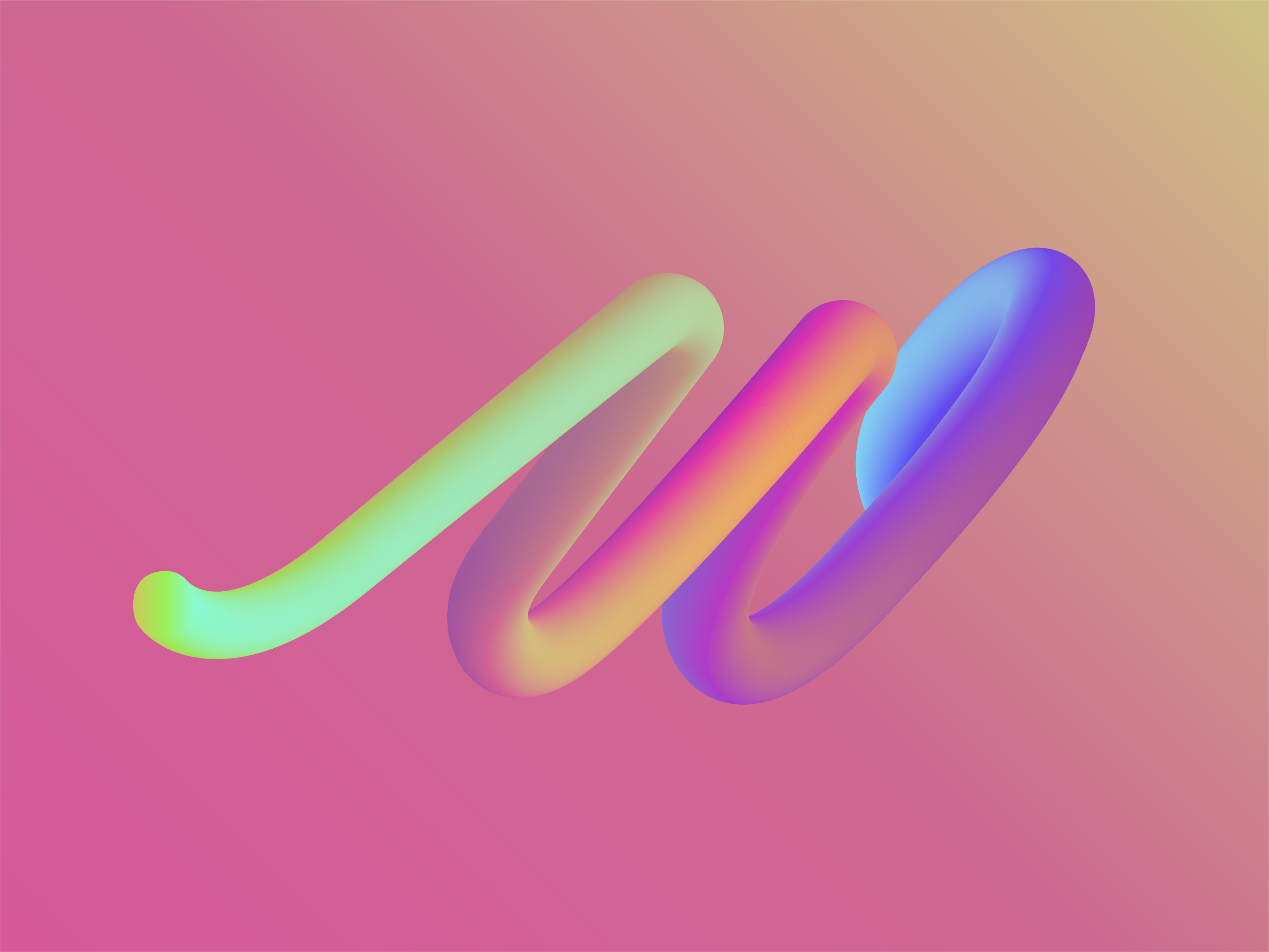
2.Find an elegant font, the lines should be round enough, if your handwriting English is good enough, you can write one directly (this step is to find a font for reference); write a Dream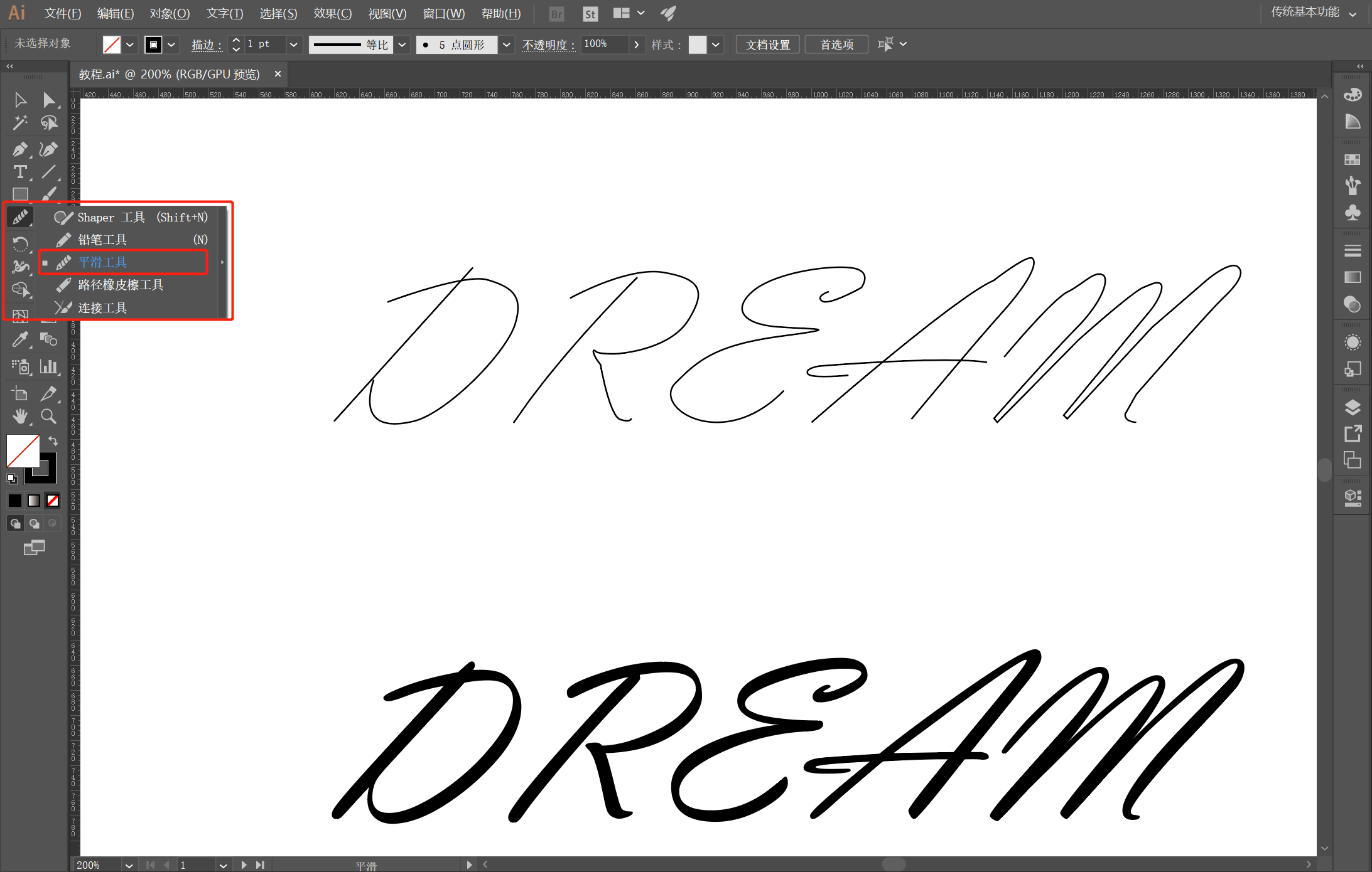 3. Now use the most basic pen tool to draw this with a line. The line must be round, round, round! ! !
Use the smoothing tool to make the lines more rounded after hooking, there must be no abrupt points, and the inflection points must be smooth;
If the path hook has a right angle, you can directly drag an anchor point to make a rounded corner
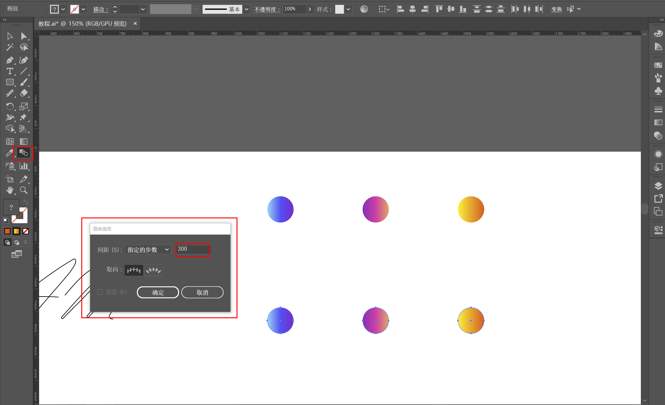
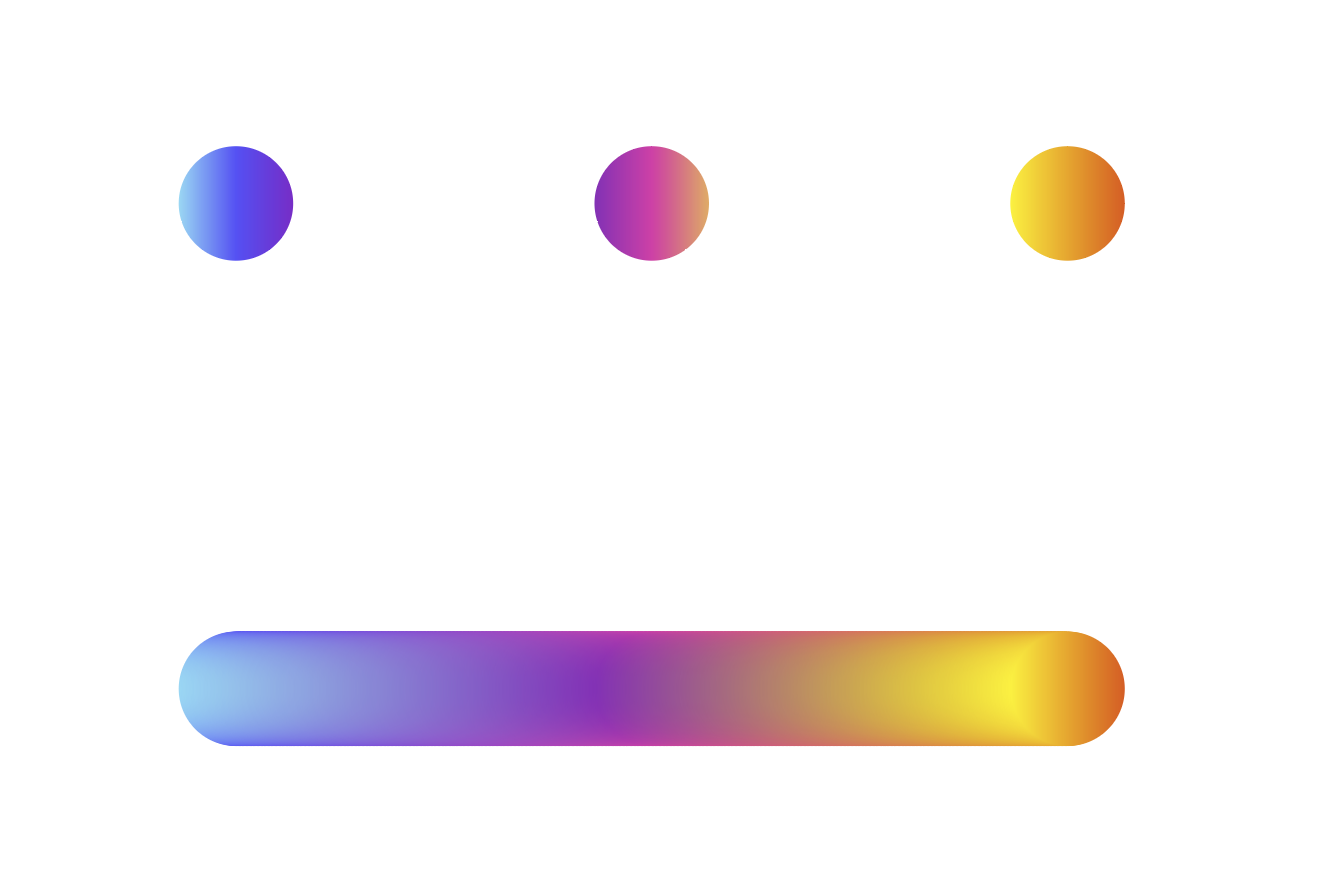
4. After the lines are processed, it is time to color them, so let's color the color first, and do a few gradients first (You can try a lot of gradient shapes), and then use the blending tool - specify The number of steps, enter the value, two or three hundred is almost the same, you can also try different values, there will be different effects (smirk)! ! ! !
If the number of steps is too small, the line will be choppy
If there are too many steps, it will eat up computer memory and be easy to jump. You can try more
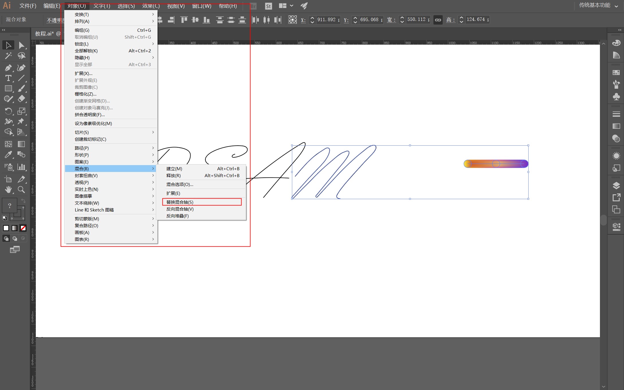
5. The following will be more important, boys! Select a path and gradient axis at the same time, then Object - Blend - Replace Blend Axis. You can see the effect. If there is an uneven inflection point in the path, this step will fail and it will look discordant (hahaha)
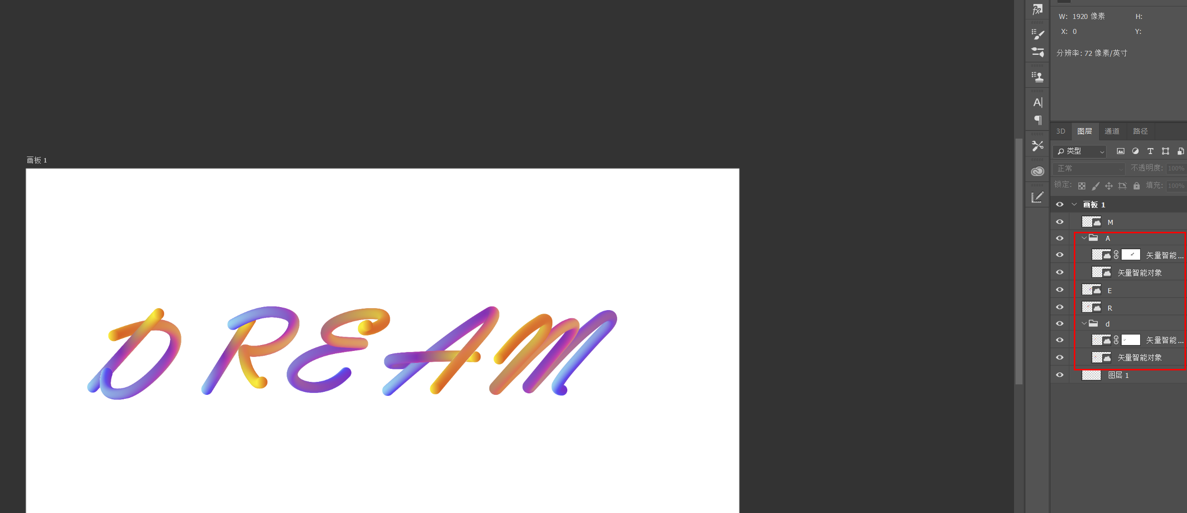 6. Now it seems that the stroke order of some letters feels inconsistent (D and A in Dream), so now we put it in PS and use a mask to deal with it!

7, the last thing is to line up one by one, let it go and you're done!
Summarize:
1. When choosing a font, try to choose a font with rounded lines
2. Try not to have abrupt inflection points when outlining the path. Even if the outlined lines are relatively smooth, use the smoothing tool to scan again
3. Select a highly saturated color for the gradient color, and a low-conservation gradient color will appear dirty
4. Mentality, mentality, mentality is very important, don't give up halfway, come on!
Articles are uploaded by users and are for non-commercial browsing only. Posted by: Lomu, please indicate the source: https://www.daogebangong.com/en/articles/detail/Font%20tutorial%20%20Gradient%20Q%20cute%20font%20the%20effect%20is%20amazing.html
 支付宝扫一扫
评论列表(196条)
测试