
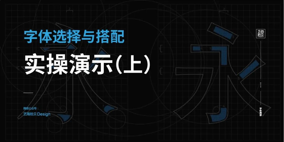
The previous article explained the style characteristics of various fonts and their use effects in various design cases; we can determine fonts according to "target audience", "project tone", "industry attributes" and other methods during design Type, so that the font and the layout style fit; after the font is determined, the font matching is carried out through the principles of "limiting the number of fonts", "establishing a visual hierarchy", and "unifying the style and temperament". In this issue, we will continue to conduct practical demonstrations through cases to help you deepen your understanding.
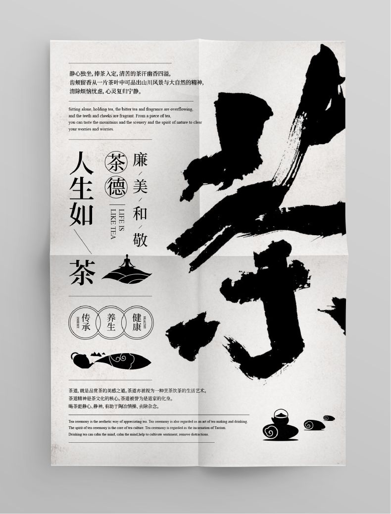
The first case is a poster about tea culture,
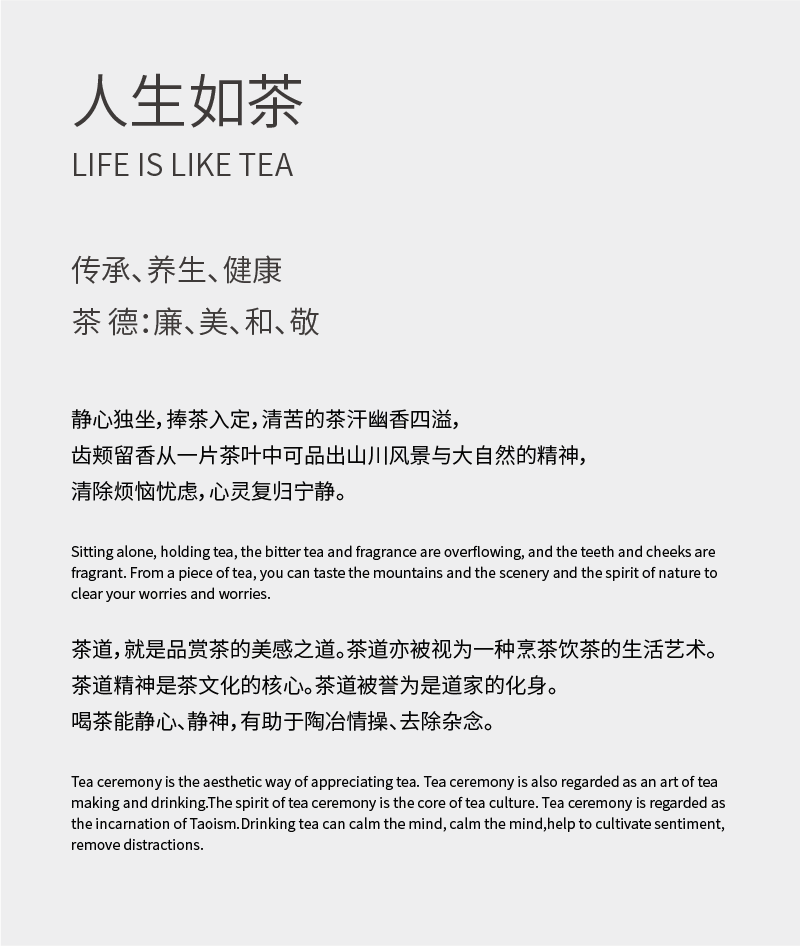
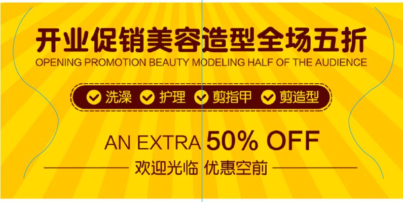
The following is the text information:
Case Study
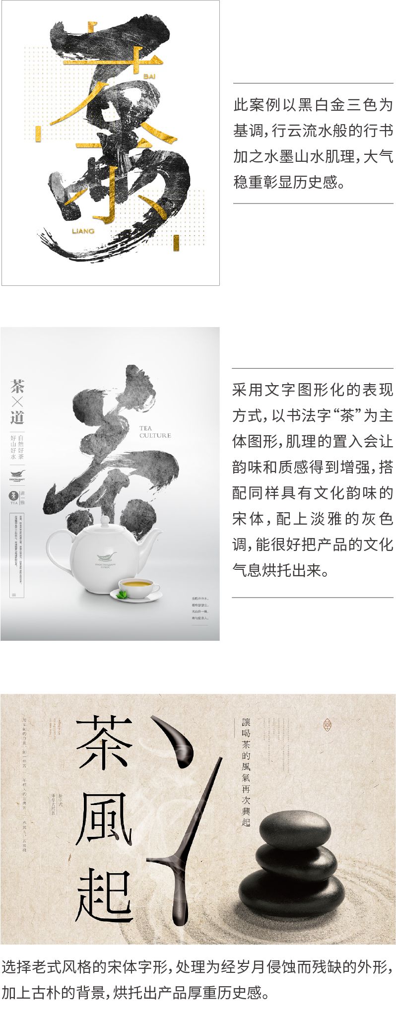
Before designing, you can look for excellent design works about tea culture for reference, and understand how their fonts are selected and matched through analysis, and you can also refer to various design expressions.
Font selection and matching
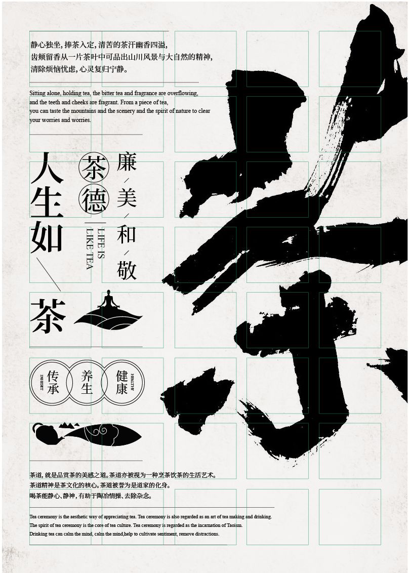
Tea culture is a cultural feature formed in the process of drinking tea, reflecting the long-standing civilization and etiquette of the Chinese nation. Therefore, the font should give priority to calligraphy and Song Dynasty with a strong sense of history and strong cultural atmosphere.
Main description
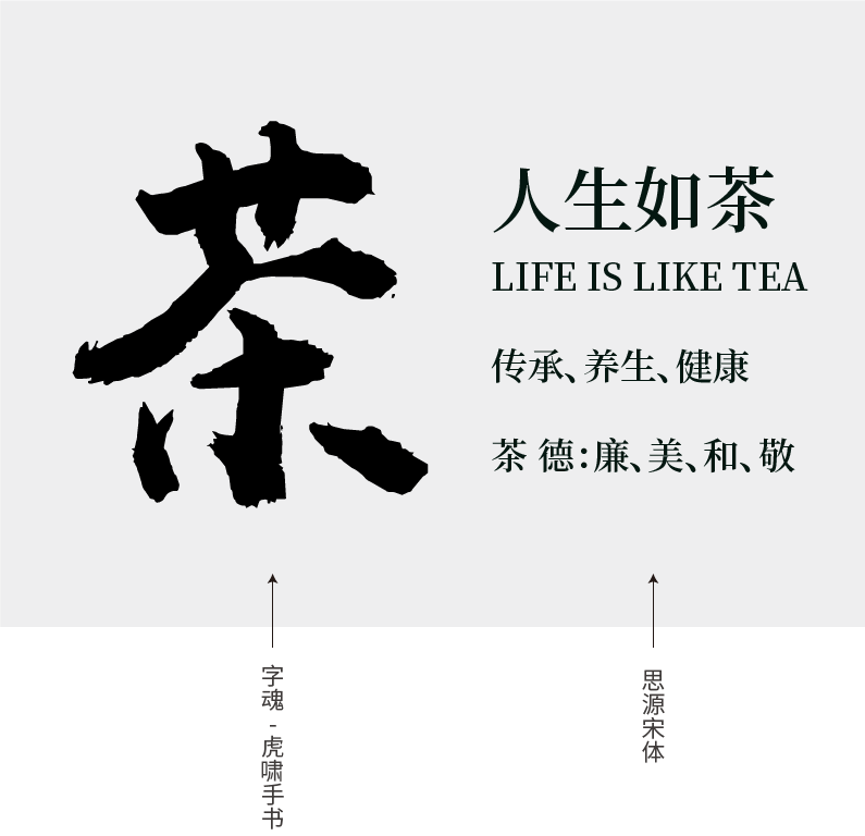
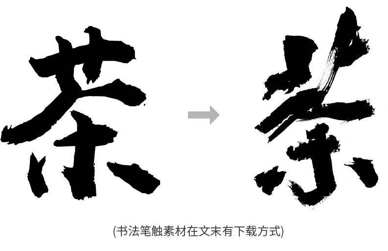
The calligraphy fonts in the font library are generally not beautiful enough. The big problem is that the details are too serious, and it is difficult to reflect the elegant atmosphere of calligraphy, so it has to be reprocessed. Based on "Zihun No. 96 Huxiao Handwriting" as the basic font, carry out secondary processing, add stroke materials based on the existing calligraphy fonts, add appropriate strokes at the beginning and end of the main stroke, and add some dry strokes Flying effect.
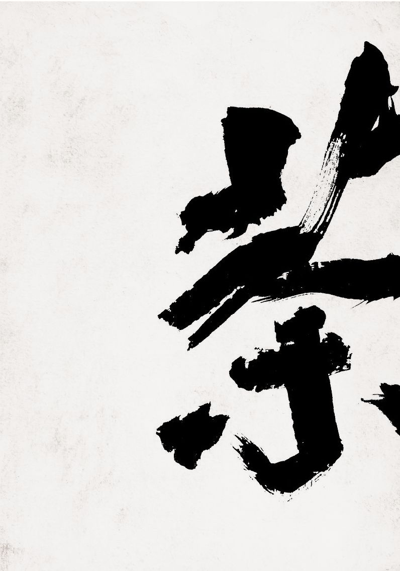
Enlarge the calligraphic character "tea" as the main graphic, place it on the right side of the screen, and leave space on the left side for text arrangement. Add mottled and simple background pictures to create a cultural and historical atmosphere.

Text information portrayal
Carry out the description of the text information, through the size of the font, according to the primary and secondary distinctions, and establish three visual levels;
"Life is like tea" and "Tea Virtue: Integrity, Beauty, Harmony, and Respect" are two information groups, and the principle of intimacy should be paid attention to when typesetting, and the distance between the same information group should reflect "kinship". The distance between information groups should reflect "sparse";
Pay attention to the length of the end of the text to present the rhythm of "length" arrangement, (English is an embellished text, which can be placed under "Cha De" to fill in the blank);
"Inheritance, health preservation, health" is arranged horizontally to form a contrast in direction.
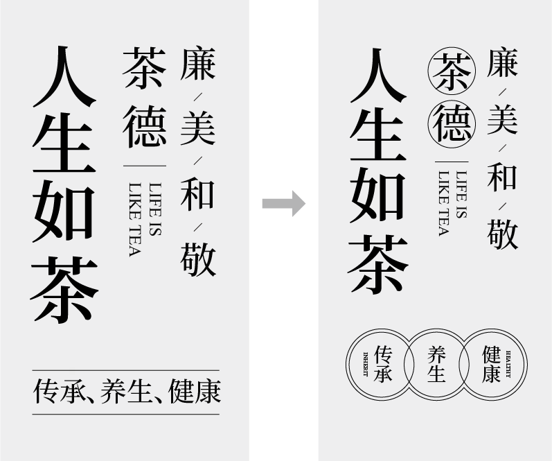
Although the intimacy of the information group has been adjusted, the difference in the level of information is not obvious because of the small difference in font shape and size. Therefore, a round frame is added to the second-level title "Cha De" to distinguish it. "Inheritance, health, health" is also added to the round frame decoration, so that the design elements can be reused to form a unified style
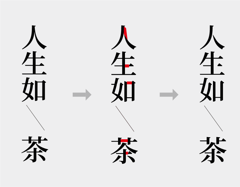
Cut off part of the strokes of the title "Life is like tea" to simulate the shape that has been incomplete due to years of erosion, adding a sense of simplicity. The text forms a sense of strangeness and adds interest.
Re-typesetting the well-described title and adding decorative graphics can not only fill the gaps in typesetting, but also increase the sense of art and beauty.
Space Division
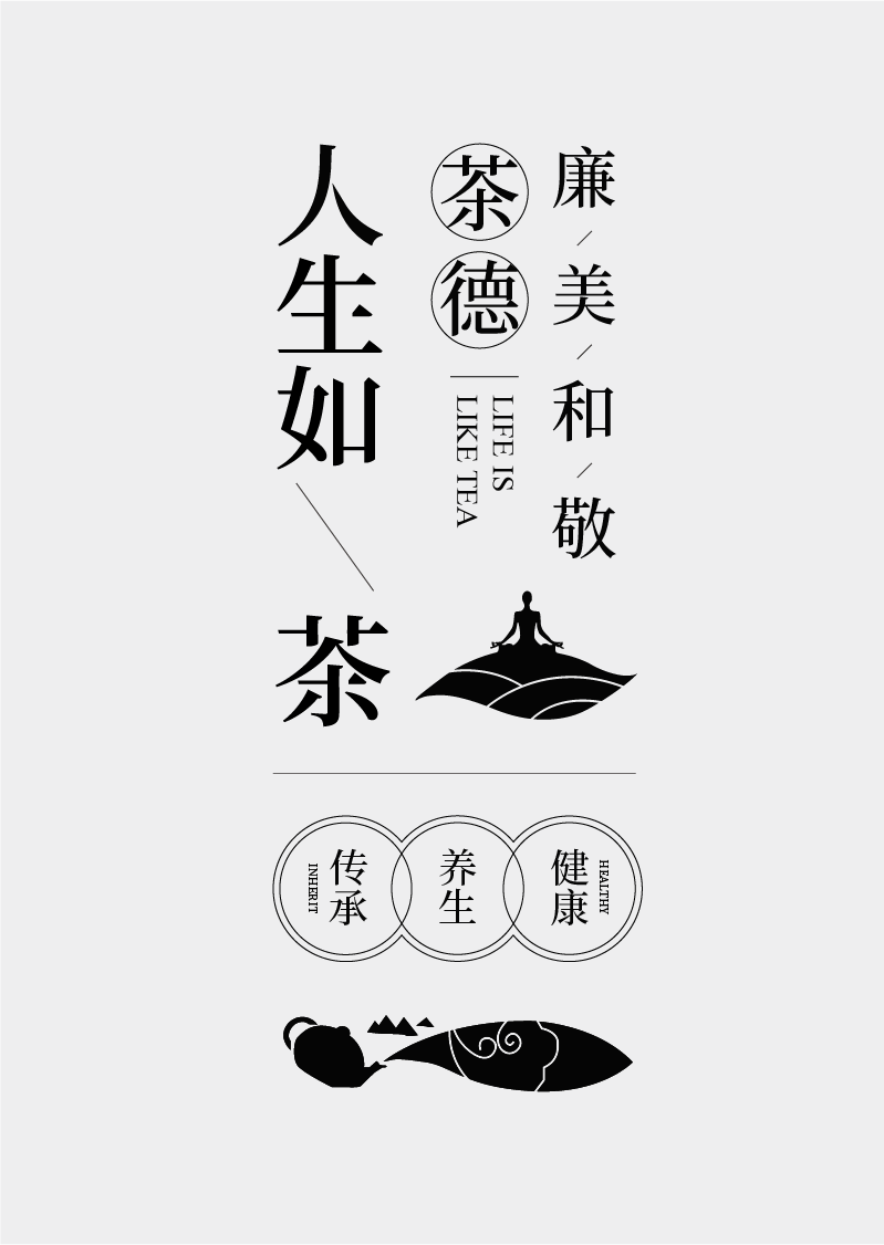
Distribute the text into the screen, place the main body of information in the left middle of the screen, and place other text information above and below the main body information. According to the outer outline of the calligraphy character "tea", adopt left-aligned arrangement, pay attention to the change of layout length and staggered rhythm and corresponding relationships. Use grids for scaling and alignment aids.
Finally add a small decoration to fill the right blank,
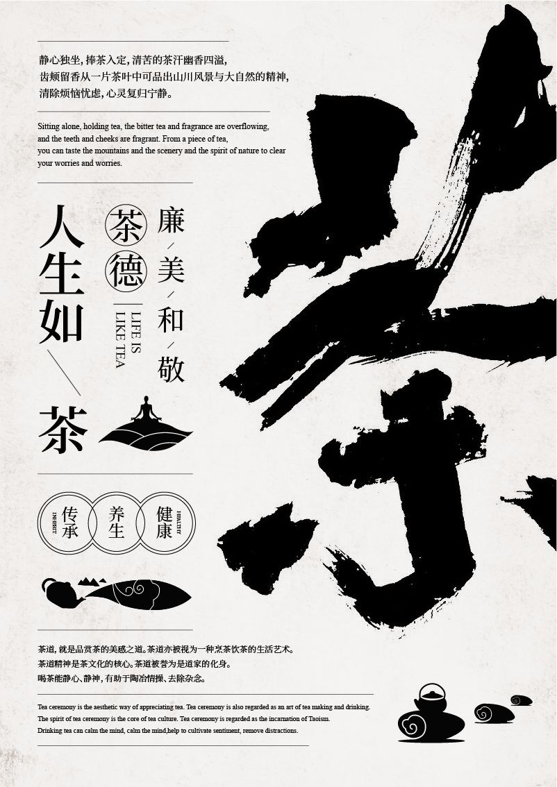
Design complete:
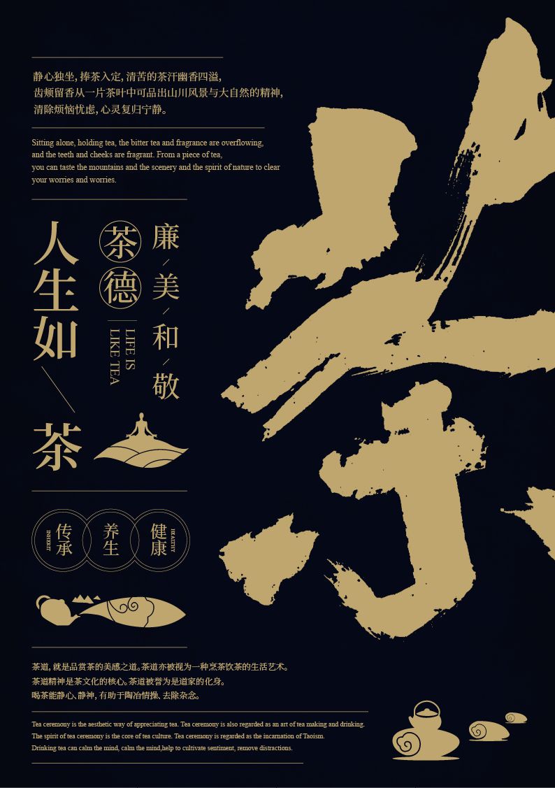
Try other color schemes, dark tones and golden characters, which are more simple and thick.

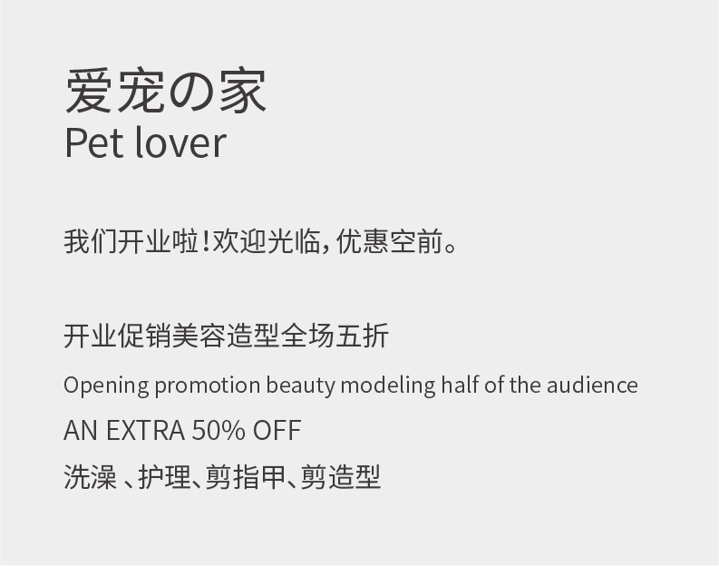
The second case is about the flyer design for the opening of a pet shop,
The following is the text information:
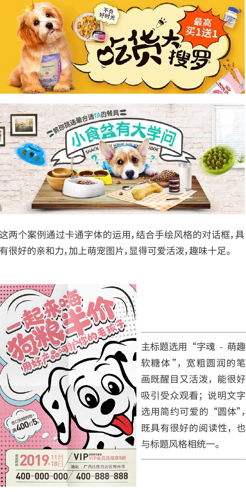
Case Study
Look for excellent design works about pets for reference, analyze commonly used font selection and collocation, and refer to other design expression methods.
Font selection and matching
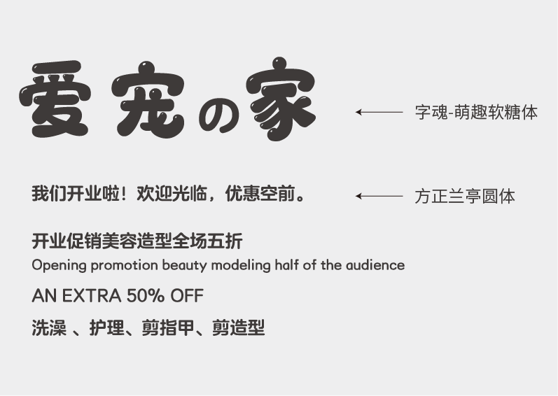
The design of pets should reflect affinity and lively and cute feeling, so the main title should give priority to decorative cartoon fonts, so as to quickly attract the attention of the audience. The main title of this demonstration chooses the wide, thick and round "Character Soul-Cute Gummy Body"; for other information, choose the "Founder Lanting Round Body" with clear structure and concise strokes to facilitate reading.
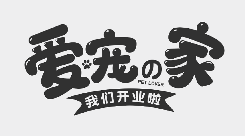
Main description
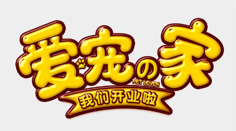
The title is misplaced and size-compared, and the "cat's paw" element is added to fill in the blanks to increase the fun. Add the "We're Open" label basemap to distinguish it from the main title.
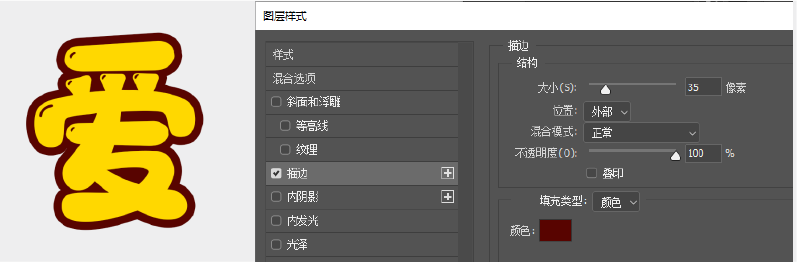
Font effects production
Fill the text with yellow, bright yellow has the attributes of youth and vitality, and can create a childlike, dreamy, and energetic atmosphere. Next, make font effects, execute "Layer Style" - "Stroke" in PS, and the color of the stroke is brown:
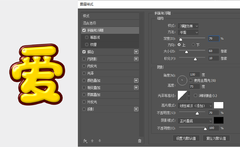
Add the "bevel and emboss" effect, and the font effect is ready,
Reference values are as follows:
Copy the same layer style effect and paste it to other layers:
In-depth description
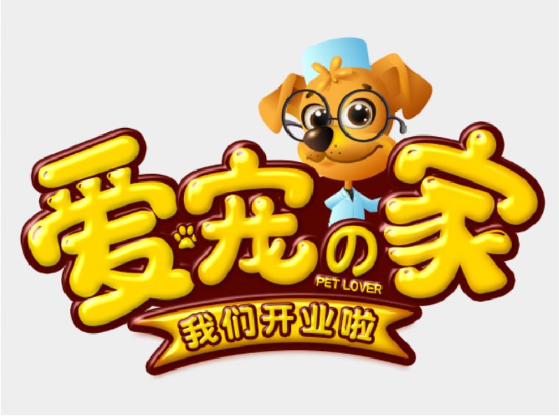
Fill brown in the blank space of the font to make the main title a whole, and add a cartoon dog doctor image to emphasize the theme and increase interest.
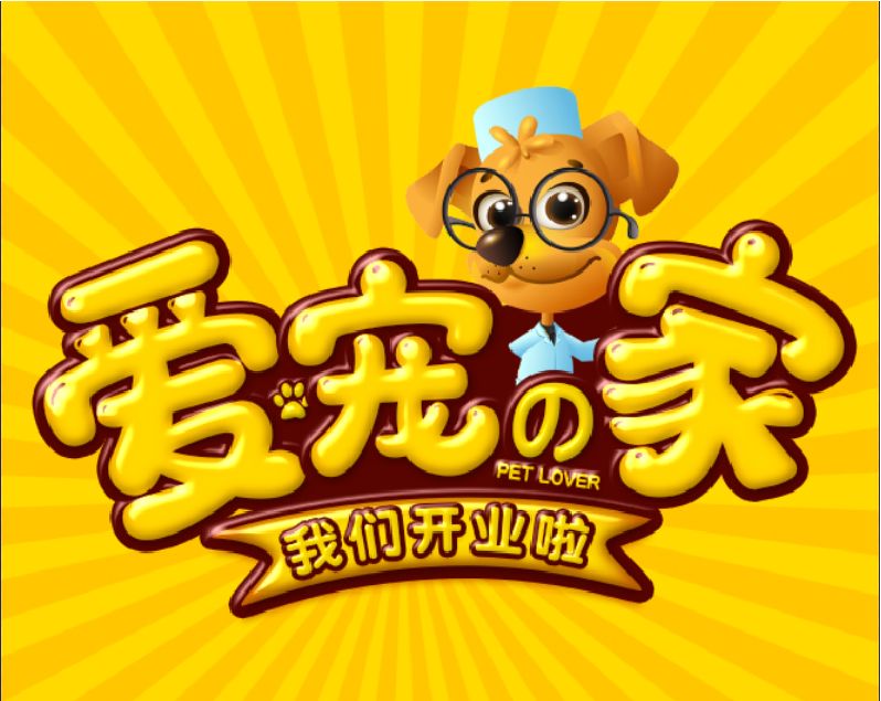
Add a divergent background, color selection and text uniform orange-yellow:
Text Formatting
Other information is typesetting in the center, and all information is distributed on both sides of the central axis,
Pay attention to the rhythm of typography:
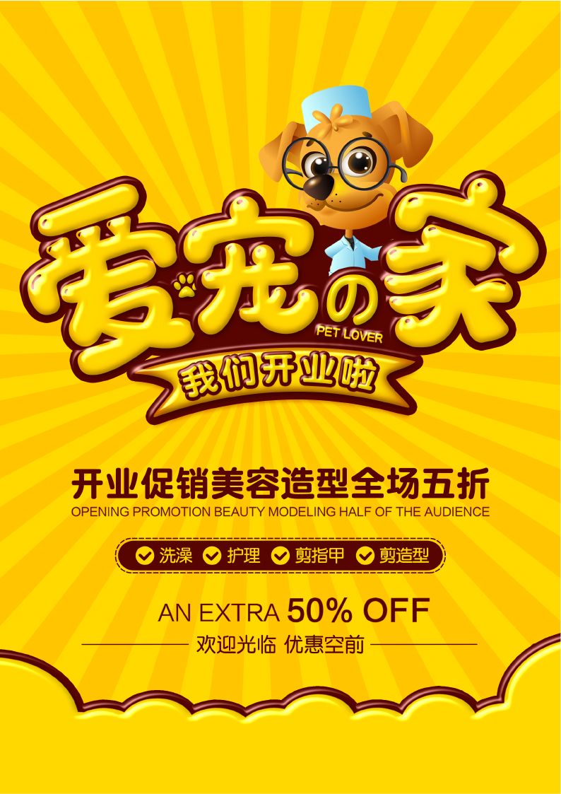
Place the organized information on the screen, and the design is complete:
END
In this issue, through the practical demonstrations of poster design for tea culture and pet shop opening, explain how to determine the font type according to the layout style and choose a reasonable font for matching, helping you to deepen your understanding of the selection and matching skills of calligraphy and round fonts , I hope you gain something.
If you don't know enough about fonts, you can check out previous font recommendation articles. Follow the WeChat public account: Yihai Shibei Design (ID: YHSBds) , reply "Font Practice" in the background of the official account to get practice materials and design source files.

Past Review:

Teach you to get rid of font selection difficulties
Quickly grasp the idea of font collocation
Practical demonstration of font selection and collocation (Part 1)
Chinese font recommendation
The Beauty of Chinese Characters (Part 1)—Font Recommendation Series 1
The Beauty of Chinese Characters (Chinese) - Song Ti Hei Ti Recommendation
The Beauty of Chinese Characters (Part 2)—Recommended Calligraphy Fonts
Eye-catching weapon! Title font recommendation (on)
beautiful! Title font recommendation (below)
Recommended English fonts and digital fonts
Design essential! English font recommendation (Part 1)
Plenty of personality! English font recommendation (below)
Super practical price font recommendation!
Free commercial font recommendation
Zhanku font family
Siyuan font family
Pangmen Zhengdao font family
Hu Xiaobo font family
Free commercial fonts for designers (collection)
Articles are uploaded by users and are for non-commercial browsing only. Posted by: Lomu, please indicate the source: https://www.daogebangong.com/en/articles/detail/Font%20selection%20and%20collocation%20practical%20demonstration%20below.html
 支付宝扫一扫
评论列表(196条)
测试