▵Excellently set up a brand account, its new products and internal test invitation code qualifications are all on this account, follow the push to grasp the dynamics, the first time you have the opportunity Get
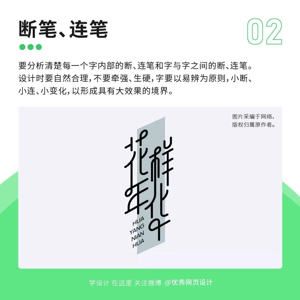
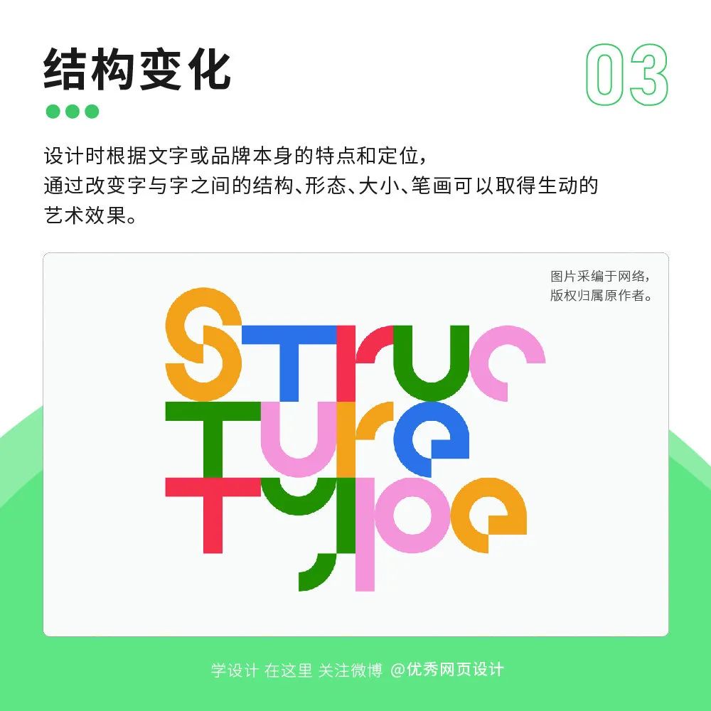
I have to draw pictures every day, and I can’t use the same typeface to spread all over the world, and the company doesn’t buy so many commercial typeface licenses. At this time, it’s time to test your typeface design ability. Using the right typeface in the right environment can make the design more vivid and rigorous. Afraid that the font lacks a sense of design? These 9 methods take you to understand the design methods of common font forms!


Articles are uploaded by users and are for non-commercial browsing only. Posted by: Lomu, please indicate the source: https://www.daogebangong.com/en/articles/detail/Font%20lacks%20sense%20of%20design%209%20ways%20to%20take%20you%20to%20understand%20common%20font%20shape%20design.html

 支付宝扫一扫
评论列表(196条)
测试