:Font design|Japanese brand-Font Tutorial免费ppt模版下载-道格办公

Font design|Japanese brand

With industry technology and brand reputation, the company has gradually developed into an international brand with high popularity and influence. In order to reflect the Japanese style and traditional culture of the brand, the font design needs to consid

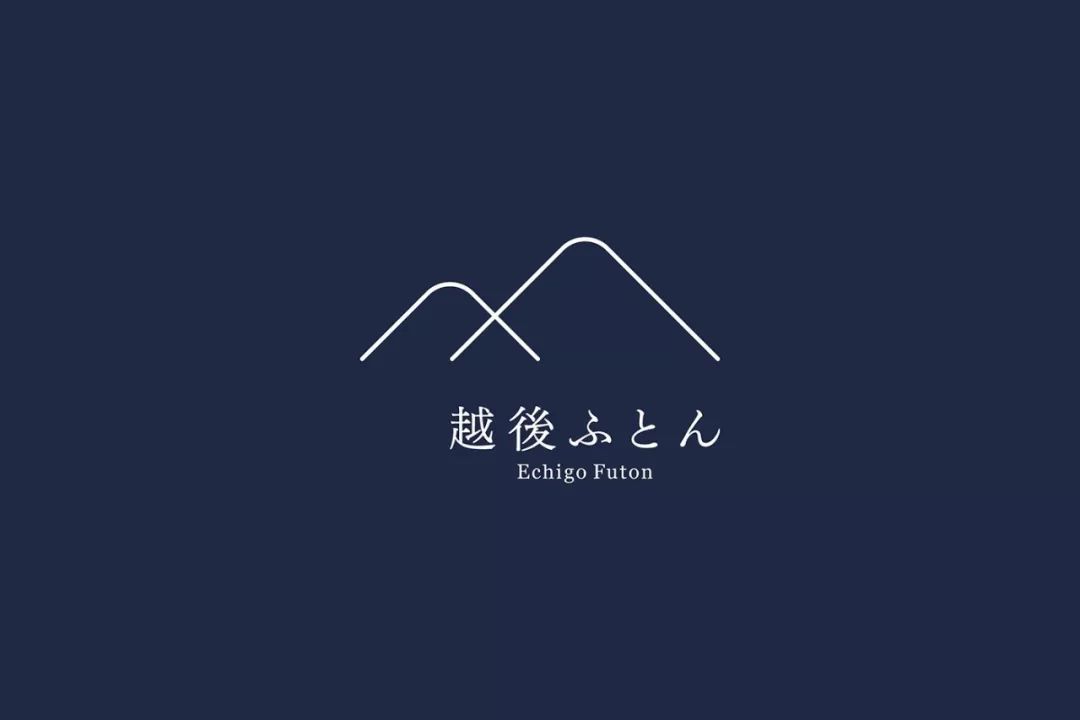
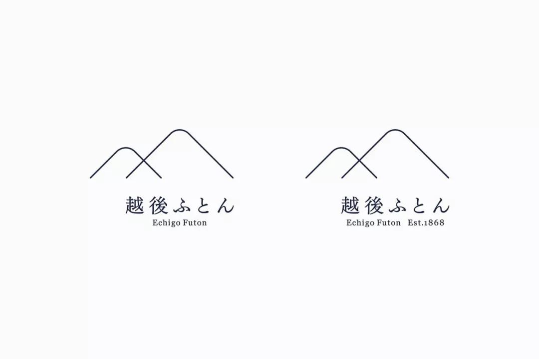
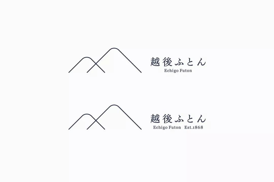
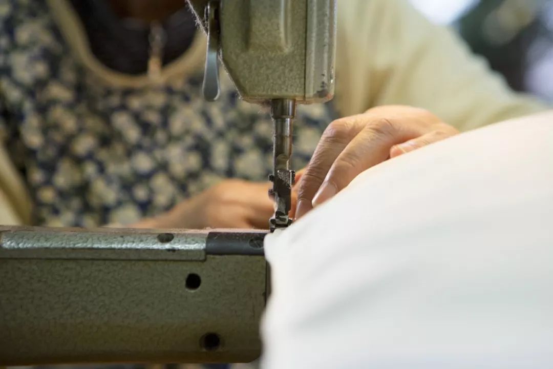
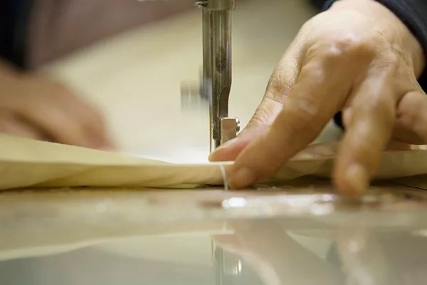
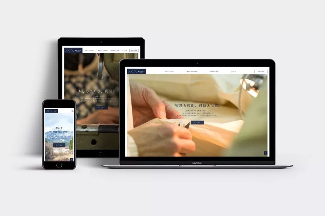
In 1868 (Meiji), Echigo Futon Co., Ltd. (former company name stock company ITO) was established in Woodland Tainai, Niigata Prefecture as a company expanding its business at the heart of manufacturing and wholesale bedding.

Based on the professional knowledge and technical skills accumulated from the establishment to the present, we will continue to provide customers with high-quality products to achieve high-quality sleep.

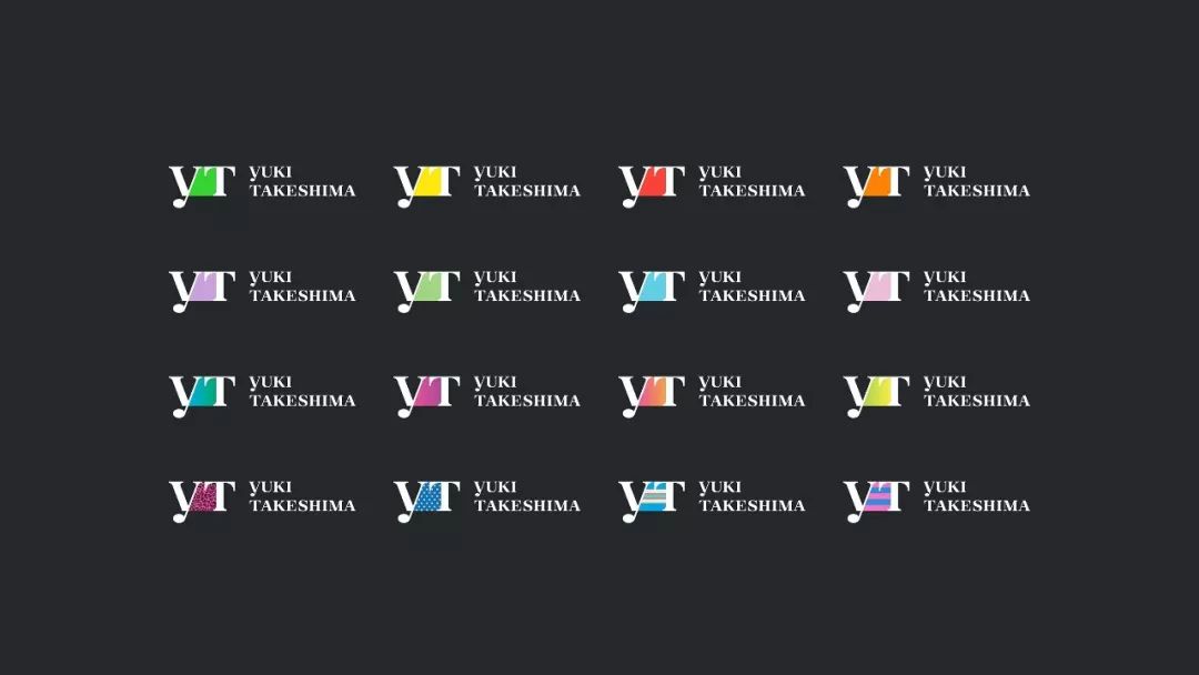
EnhancedInc. has been working with BrilliantColorInternational to rebrand EchigoFuton since 2016.
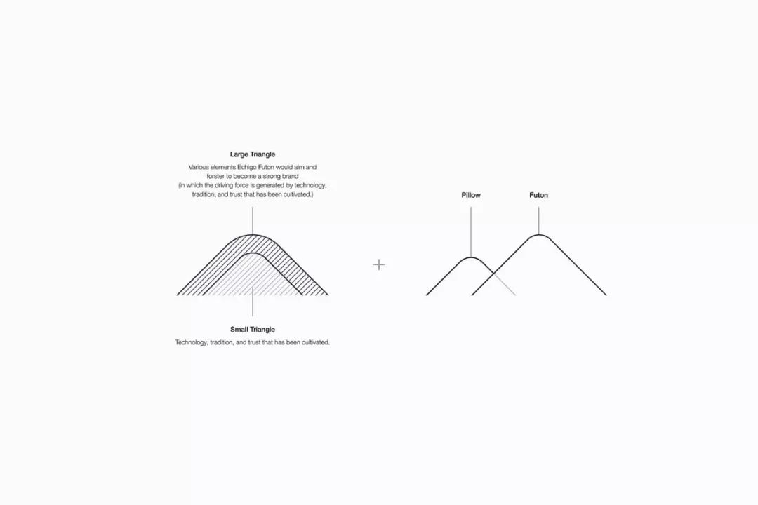
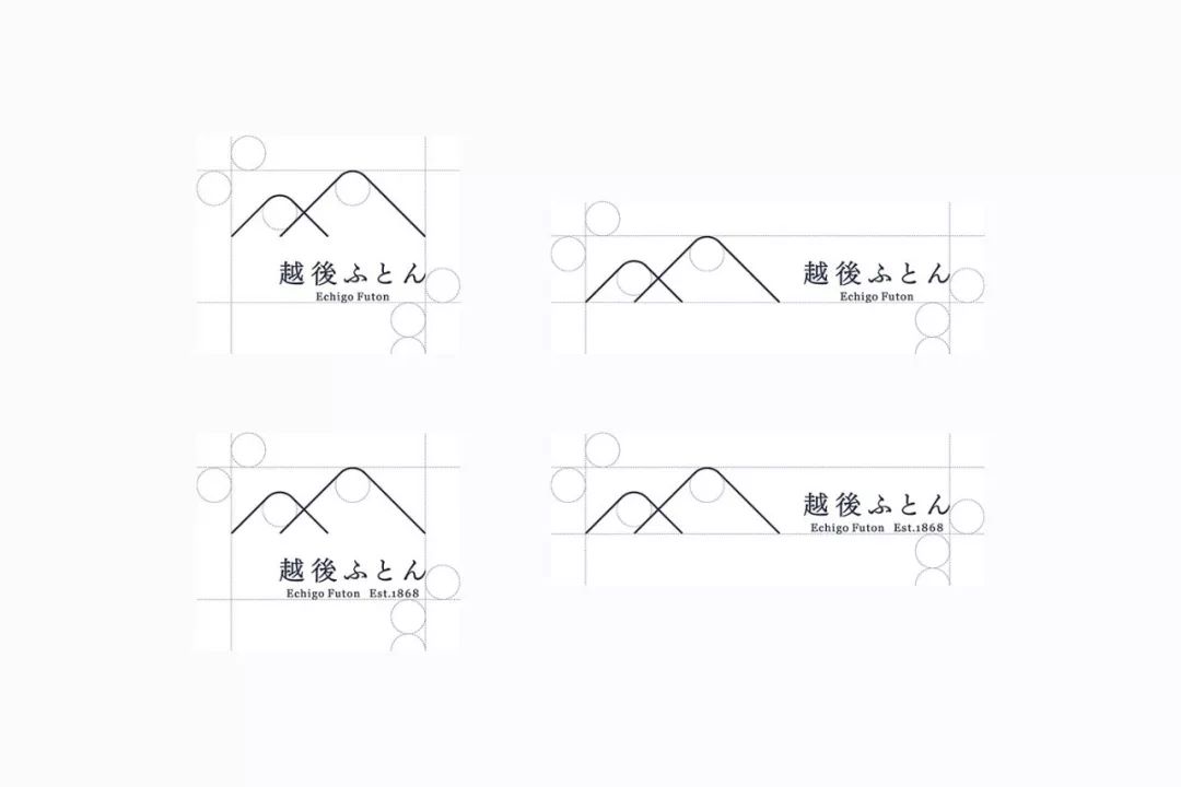
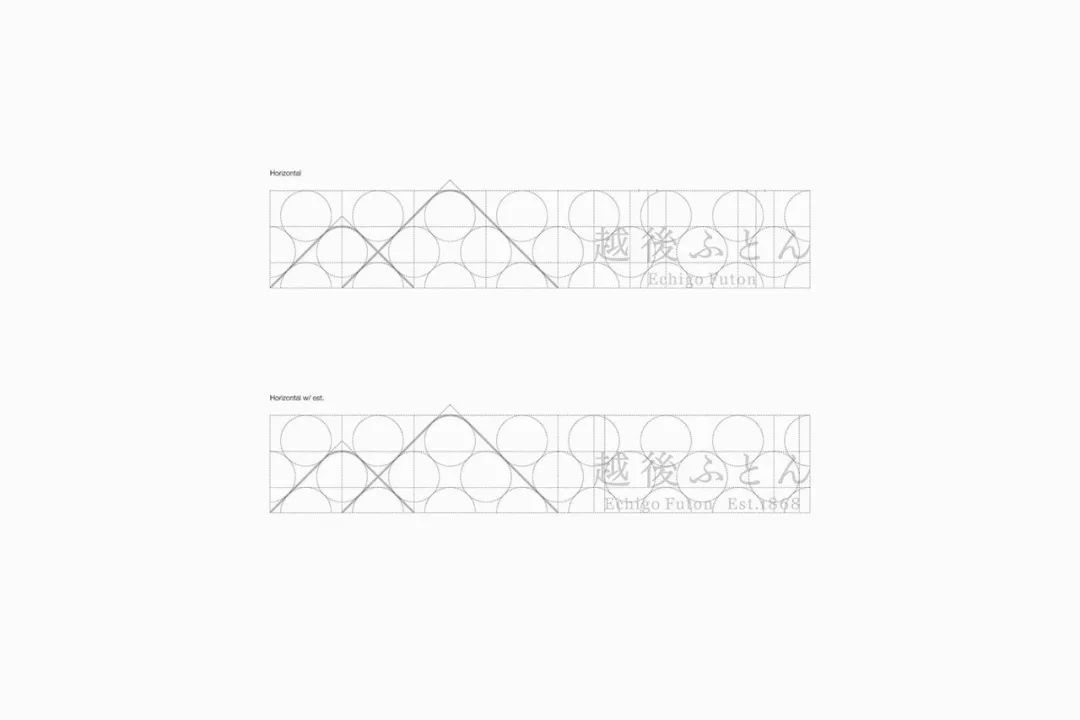
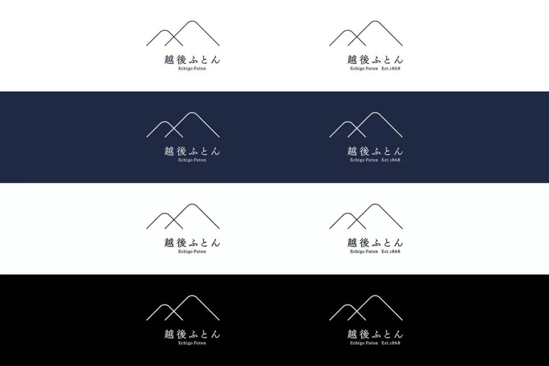
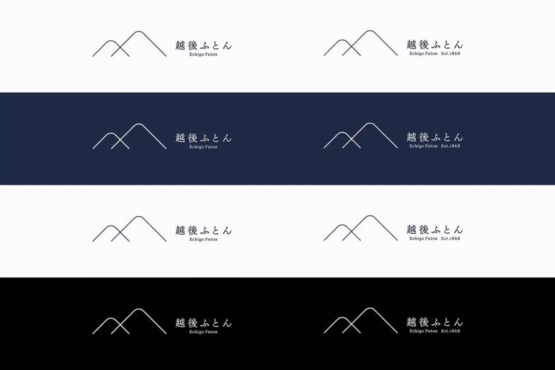
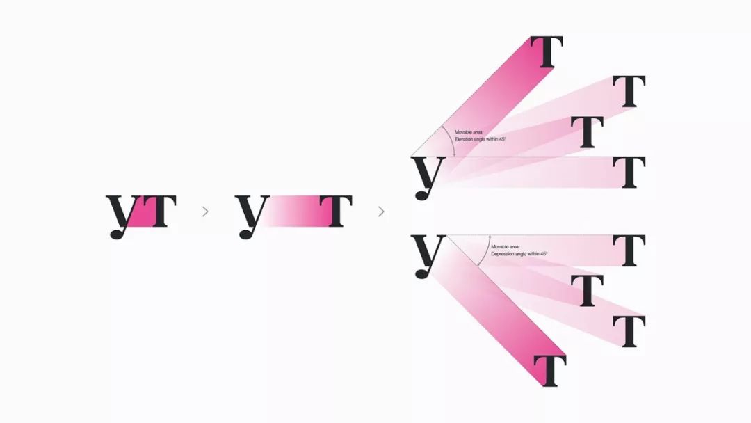
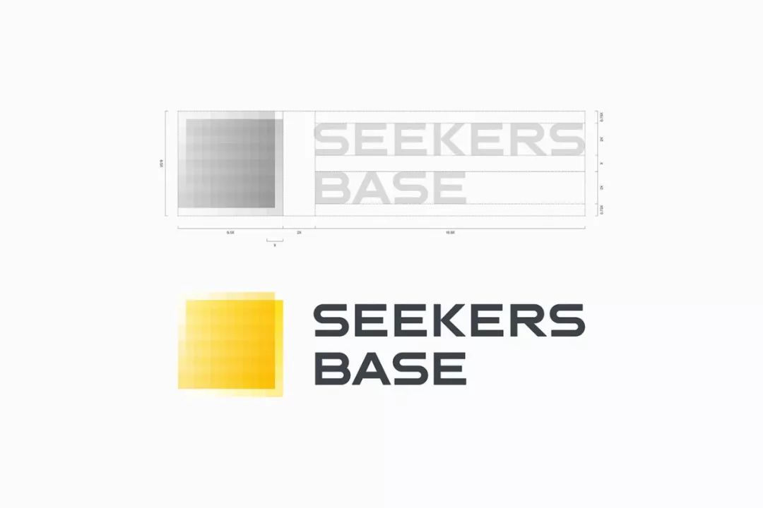
New Symbol Design

The new symbol of Echigo futon consists of two triangles and includes the following meanings.

Answer: The company takes pride in technology, tradition and the trust of customers, and this trust is cultivated internally by all employees, so the company is reborn. Thus, we visualized what a company should target and nurture to become a strong brand.

B. The overlapping triangles represent pillows and comforters, which is the company's business as a bedding manufacturer
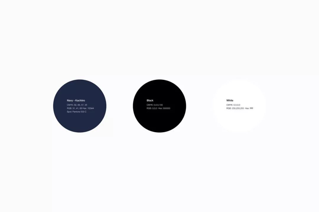
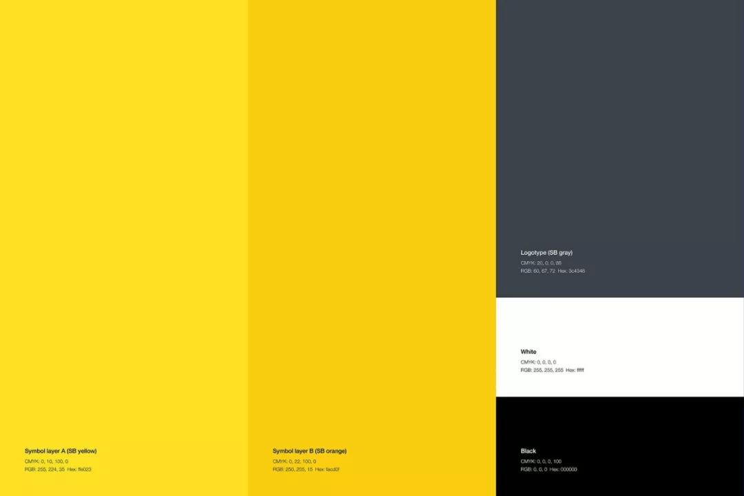
New colors

As the new company color, we chose katsu-iro, a traditional Japanese color, which means "victory color".

Katsu-iro is a darker indigo than dark blue and dates back to the Heian period around the 9th century. During the Heian period, there were clothes in indigo and navy called dyed kachie (brown clothes) and were often called Daisheren (舎人).

Given the luster by having the linen dyed deep indigo, the kachie is enlarged and beaten cloth is made on top of the board. This process and the way of dyeing is called katsu (打つ) or kachi-zome (押染め), which give the color the final color called kachi-iro (brown). Then during the Kamakura period, the kanji for 力 (打つ) was replaced 力 (兵つ) meaning "victory", and the auspicious color representing victory became a favorite color by a variety of people, including samurai.

We chose this winning color as the auspicious color for newborn Echigo futons to represent the victory of their enterprise. Indigo is a color that demonstrates honesty and trust, and is also a color that confers images of calm, rest and sleep. It also has a psychological effect of promoting sleep. That being said, it's the best color for the company to handle bedding.

Jorgen Grodalhiromimaeo

Brand Design Works BrandDesignWorks


Tokyo,Japan

< span>Hiromi Maeo is a Japanese graphic designer with over 20 years of experience. He has designed products for many famous Japanese companies and has recently started designing products for global corporations. At the same time, his designs are increasingly recognized by the international design community. In order to gain new sales channels for potential customers, we also support EchigoFuton development Products that hadn't been developed until then. Acquiring new sales channels and developing new products that meet customer needs are the most important elements for a company to become a strong brand. As the large triangles of the new symbol suggest, they feature a high percentage of what the new EchigoFuton brand has to do. 1. with graphic artists" span> KahoriMaki ”, which has many collaborations with domestic and foreign fashion brands as well as clothing designers and companies. Developed a collection of colorful, sophisticated and sophisticated graphic covers that the company hadn't done before. 2. Use casual and stylish denim Fabric development product line. 3. Developed the use of organic cotton A product range that is friendly not only to the user but also to the manufacturer and the environment. Customer: Echigo futonProduction and management: TsuchiyaKayoko(BrilliantColorInternational)Creative Art Direction, Logo Concept: Yu Hirosaki (enhancedInc.)< span>Graphic Design: Yumi Hiroo (enhancedInc.), Koji Terao Web Design: Hirofumi OkayamaFilm Direction: Seiji KitaharaMovies & Photos: Yosuke OmoriPortfolio Photos: Emoto Yoshihisa ( Yoshitsugu Enomoto)

Artist: Maki Kali

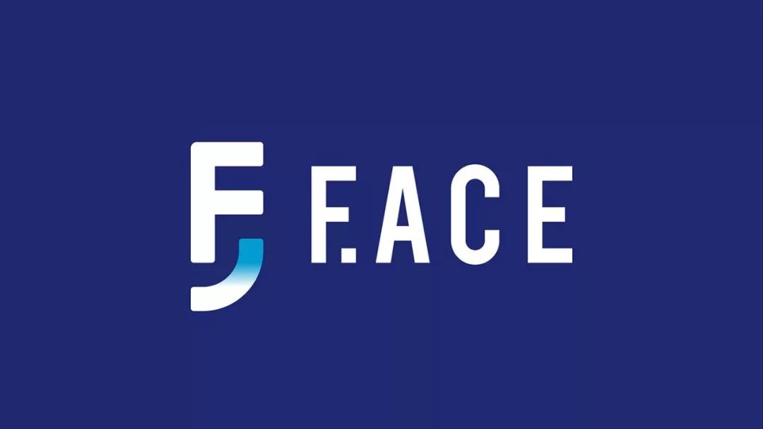
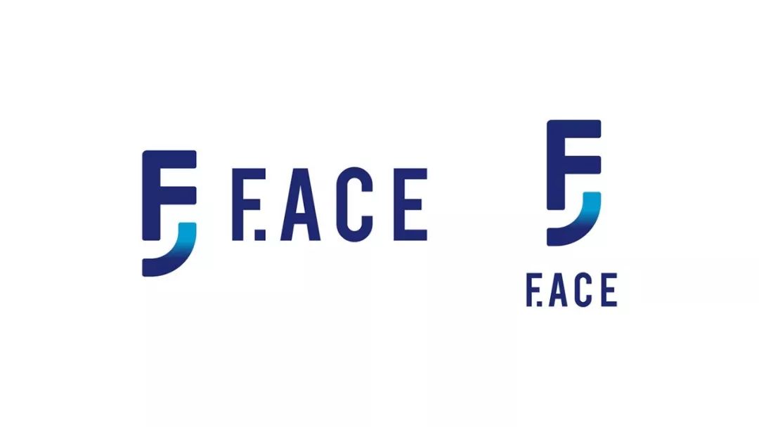
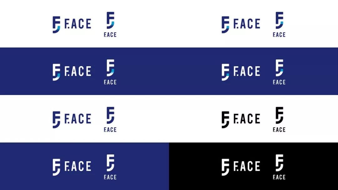
F.ACE is SCSK Group - SCSK Prescend Corporation and DiamondHeadCo., Ltd. The newly released clothing-specific EC platform (SaaS).

Name F. ACE consists of "F". and "ACE". In addition to fashion, "F" represents the advanced nature of F.ACE (future), easy-to-extend functions and flexible omni-channel expansion (flexibility), high-function (function), SaaS (fast) Automatic and fast update function), and take the lead in proposing new plans in the clothing e-commerce platform, and open up new areas (Frontier).

"ACE" means "best, great stuff, ace, easy success". Having said that, F.ACE represents "the best platform to lead the apparel EC industry, which responds flexibly and quickly with its advanced features".

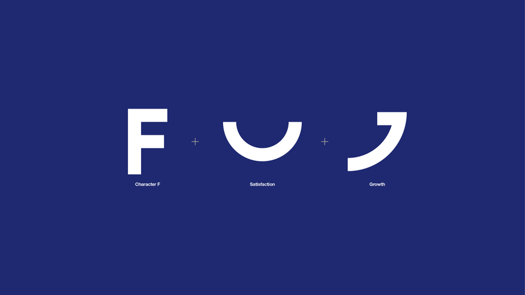
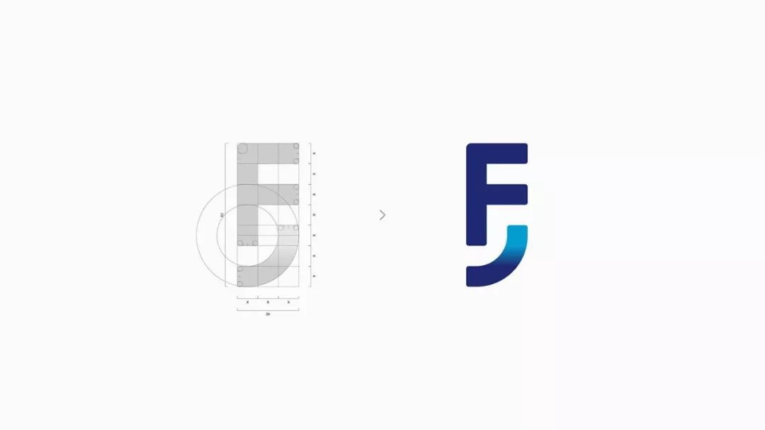
The various functions and features of F.ACE, as well as the experience brought by customers and end users using F.ACE will directly lead to their higher satisfaction. Such high levels of satisfaction represent a "smile from the heart" of customers and end users, which can also be found in the F.ACE symbol for the smile itself. In addition, the quarter circle below the symbol represents a smile on the mouth, which represents the growth of the customer's business brought about by the adoption of F.ACE, as well as the change in the positioning of the apparel industry itself resulting from the advanced initiatives of F.ACE. Client: SCSK Prescend Corporation/Diamond Head LtdLogo Concept And Design: Yu Hirosaki (enhancedInc.) DiamondHead Co., Ltd.)

BISOU
BISOU means "casual greeting" in French. Just like Casual Kiss, which is borderless and genderless, it is a new cosmetic brand from yUKITAKESHIMA for people who are free to try new things regardless of gender.
BISOU-Enhancement Stick is BISOU's first product based on the concept of "enhancement", which means enhancing one's own innate characteristics. Global makeup artist yUKITAKESHIMA works with numerous celebrity clients, collaborates with renowned cosmetics and fashion brands, and plays an active role backstage at domestic and international fashion shows, including Paris Collection. This product has enriched her makeup experience and ideas.
BISOU-Enhancing Stick was announced/pre-ordered at a special talk show held in March 2019 at Cosme Kitchen, a cosmetics specialty store in Omotesando Hills, Tokyo. Initially, only a few stores and an online store are planned. However, according to the product announcement, the product will be sold in about 60 locations, including CosmeKitchen and related stores throughout Japan. EnhancedInc. partnered with SeekersBaseJapanCorp to design the brand's logo, packaging design, flyers and store displays.

Tamashima Yuki
 
yUKITAKESHIMA is a global makeup artist who provides make-up for visiting celebrities such as Lady Gaga and Miranda Kerr in Japan, and works with famous cosmetic and fashion brands as well as Paris Fashion Week at home and abroad Play an active role in the cooperation of the fashion show. This is also a cosmetic brand offering original products derived from her experience.
Strengthening company and candidate base Japanese companies have undergone a comprehensive rebranding (naming/logo/updated sales channels including webpage and social networks/product development, etc.).
We start by looking for the following elements that will form the backbone of the new brand. Derived from polarity< span>Beauty: A new beauty created by multiplying related elements-elegant x punk/traditional x innovative/chic x pop / Formal x Casual / Japanese x Global / Sophisticated x Bold etc. Out of the status quo: Infinite possibilities of choice and access - you can Change(YouTransform) / Intrinsic Infinity. ●Development of personality: Promoting the change of customer awareness - breaking through the status quo span>We then worked on developing a logo and visual identity that incorporated these elements.
We found a solution in a dynamic logo using an abbreviation of the name. Various highlighting colors and patterns can be used in the mark, and the shape of the symbol can also change. The contrast created by the highlight color (or pattern) and the base color represents "relative The beauty created by the elements (polarity)". Character "YT" (initial of "yUKITAKESHIMA" and "YouTransform (can be changed)" and its connected conversion areas constitute the change in color and shape of the symbol, representing "the change in color and shape symbolizes the possibility of infinite choices that each customer has, and represents diversification The customer's own "identity" itself. Products that help customers find their own selves. The new logo will be used accordingly for product sales channels such as website and new products.Existing product logos will be replaced accordingly.
The base color of the logo is dark gray/white, which becomes the standard color and the highlight color is pink. The highlight color can be replaced by various styles of popular or fluorescent colors.
The basic color of the logo is dark grey/white, combined with an accent of pink as standard. Highlights can be replaced by colors such as trendy or neon colors or various patterns. A symbol consisting of the character YT and a transforming area can change its shape as well as its color.
Client: LOOP.IncManagement & Branding: SeekersBaseJapanCorpCreative art direction, logo concept and design, logo guidelines, support for new product development, web, stickers, etc. : HiromiMaeo (enhancedInc.)Portrait photo: AkinoriIto (aosora)Product photo: Yoshitsuki Enomoto

Every task uses fonts. Seeker Base
SeekersBaseCorp was established in 2018 to foster entrepreneurship among social entrepreneurs, especially women community leaders, who bring social impact by leveraging O2O platforms (currently under development). Seekers is the company name for Truth Seekers, as do the social entrepreneurs and community leaders mentioned above. The Job Seeker Foundation platform is expected to become a base where job seekers with a social mission meet across borders and promote co-creation to solve social problems around the world.
Symbols
SeekersBase's symbol has the structure of two squares overlapping each other. Each square is composed of multiple cells, and the difference in color density between the cells produces a gradient. The two squares represent seekers with a social mission, and each gradient represents the direction of the field sought by the seeker. The overlapping of these squares means that the SeekersBase platform is the gateway for Seekers encounters. Moreover, the appearance of the symbol produced by overlapping the two types of gradients represents newly created items encountered by the searcher.
Color
Yellow and orange representing the yolk signify "future energy birth". The combination of yellow and orange is the basic color of SeekersBase and is also used as a highlighting color.
Symbol Generation System
The encounters of seekers create projects that are never one form, but rich and varied. Therefore, we rotate the two squares that are the constituent elements of the symbol and generate various appearances to express this variety. In addition, each Seeker's project may be in line with the United Nations Sustainable Development Goals (SDGs) adopted by United Nations Member States in accordance with resolution A/RES/70/1 of September 25, 2015. In this case, 17 colors based on SDG guidelines will be used in symbol layer B.
Exception 1 (both SDGs): Apply SDG colors to symbol layer A/B without using base colors.
Exception 2 (three or more SDGs): Select two primary SDGs and apply SDG colors to symbol layer A/B.
business card
SeekersBase business cards use the two SDG colors that members want to achieve, so the business cards also represent diversity.
Client: SeekersBaseJapanCorpCreative Art Direction, Logo Concept, Design : HiromiMaeo (Enhanced Company)

Articles are uploaded by users and are for non-commercial browsing only. Posted by: Lomu, please indicate the source: https://www.daogebangong.com/en/articles/detail/Font%20designJapanese%20brand.html

Like (810)
Reward 支付宝扫一扫 支付宝扫一扫
single-end

Related Suggestion