
Have you read a lot of font tutorials, but still don't know where to start?
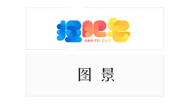
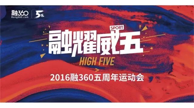
fonts, as the basis of information transmission, are widely used in the entire design field at present, such as LOGO, creative advertisements, TV packaging, H5 titles, posters, etc. It can be said that where there are titles, there are font designs. As a designer, this can be said to be one of the necessary skills. Even if you have no design theory or drawing foundation, I think everyone can do font design.
Today's software and technology are developing rapidly, and the software applications of C4D and AE animation effects are becoming more and more extensive. We can use various materials or forms to display fonts,But follow the font design< /span>The design principles remain unchanged, so the basics of font design are particularly important.
1. Design principles
Start from needs, start from the meaning of words, and combine form and meaning.
This is the basic principle that determines the direction of glyph design. The essence of art is to try more and more possibilities. The essence of design is to determine the possibility of less. By determining the principle, we eliminate some wrong options. The same font can be changed into countless possibilities through design, which is the process from meaning to shape.
Easy to identify
The design should also be well grasped. When the glyphs cannot be recognized, no matter how good the design is, others will not be able to understand it.

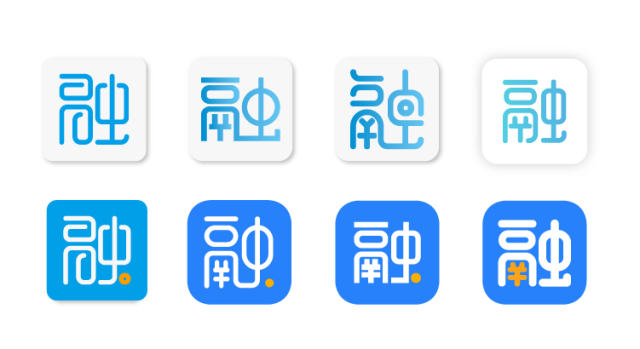
(The same Rong character can change into countless glyphs, and different glyphs give people different meanings. I have tried dozens of directions for this character, and I have been overthrowing it again and again. Please give me this character. The shadow area left in the heart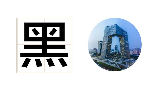 )
)
2. Center of gravity and structure
Knock on the blackboard! This is the focus and difficulty of font design.
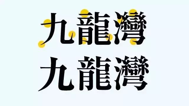
German font design masterErik Spiekermann once said: "The important thing is not to design the black part, but to design the white part", the white here refers to The most important thing is the negative space. Only the balance of the negative space can achieve a comfortable visual experience. Chinese and Western languages are also interlinked, and the fonts and graphics are the same.
The center of gravity and structure are the distribution of the visual center and spatial structure of the font. Find out where the visual center of the font is, and determine the contrast between the positive and negative spaces of the strokes. The strokes can be regarded as positive spaces, and the blank spaces can be regarded as negative spaces. The visual center will determine whether the structure of the character looks stable and offset, and the positive and negative spaces will determine the position of the strokes and the character of the font.
Regarding this content, there are countless tutorial methods and theories on the Internet, which are not easy for everyone to understand and learn. Seeing half-understanding will discourage learning enthusiasm. Here we will make a simplified and easy-to-understand understanding.
Let’s first get to know two basic fonts, black font and Song font, which can also be called sans-serif and serif.
黑体
The strokes of the black body are simple, consistent in thickness, and the starting and ending strokes are square, so it is also called square head body or isolinear body. The bold characters have the characteristics of rigorous structure, solemn and powerful, simple and generous. In Chinese, fonts without serifs are usually called Hei Ti. The style of Hei Ti is not as lively as Song Ti, but the visual effect is stronger. It is suitable for titles and other positions that need to be highlighted. (The black body looks like a more modern CCTV underpants)
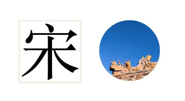
Arial
Song typeface is characterized by square fonts, horizontal and vertical strokes, horizontal thin and vertical thick, sharp edges and corners, rigorous structure, neat and uniform, and strong regularity of strokes, which can make people feel comfortable and eye-catching when reading. In modern printing, it is mainly used for the body part of books or newspapers. (Arial style like the more traditional Forbidden City)
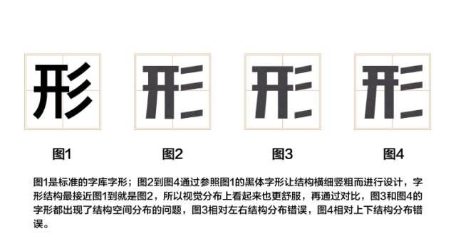
The easiest way to understand is to find the center of gravity and structure of the font by comparing the basic glyphs, and compare the glyphs designed by yourself with commonly used boldface characters. (This method is more widely used, but not all glyphs)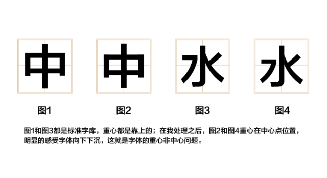
In addition, there are several basic laws of the structure of the center of gravity: (The laws are only for reference, do not rigidly apply, it should be determined according to the design situation)
Font Gravity
is not the center of the font, but the center of vision, because the center of human vision is on the top. All the fonts in the standard font library are compared. The center of gravity of the font is higher than the center of the font, so that the font is visually appealing. Feel the most stable.
Up and down comparison
When making some slender and elegant fonts, the center of gravity of the fonts is often placed on the top, and the lower part of the font is elongated. This can be regarded as looking at a nine-headed beauty or Oppa’s long legs, making the lines look like It is more refined and increases the vertical space, which makes the positive and negative space of the font larger and easier to design and identify.
Comparison of thickness
When making black typefaces, when encountering a strong sense of oppression between positive and negative spaces, we often compare the thickness of the strokes or the thickness of the positive and negative spaces. This structure is more stable, and at the same time, the font is in negative In the case of extreme compression of space, the sense of design and recognition are guaranteed by means of comparison.
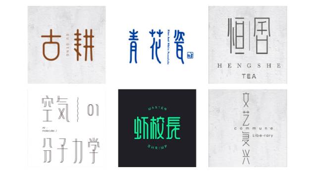
3. Font character
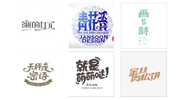
The glyphs are ever-changing and have different personalities.
A sense of power: Lanting special black, super gang black and other black fonts with small negative space, keywords: men, games, sports ,emphasize.
Lightness: Lanting thin black and other black fonts with large negative space, keywords: women, literature, text, lightness.
Children's sense of fun:Youngyuan, Ding Ding hand-painted fonts and other children's hand-painted fonts, keywords: children, lively, childish, childish, casual.
Sense of Solemnity:Fang Zheng Feng Ya Song, Kai Ti and other calligraphy traditional fonts, keywords: rigorous, solemn, official, ancient, Chinese, traditional festivals.
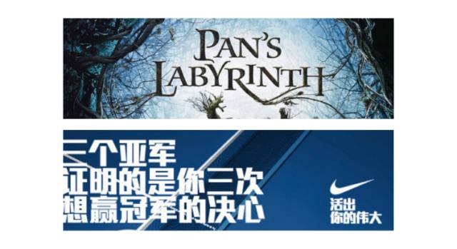
Classical and modern:Serif and sans-serif, modern and classical, modern English LOGO of many international brands is based on sans-serif design, And some retro movie posters still use serif fonts.
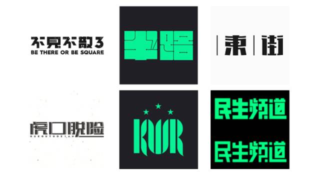
4. The method of making characters
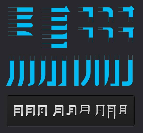
Rectangular Formation
The method of rectangular character creation is the same as the name. In the software, fonts are piled up by rectangular graphics. You can modify the standard font library, or split the strokes into horizontal folds, horizontal, vertical, vertical hooks, apostrophes, and dots through rectangles. To extend the design style of the font.
Recommended for beginners, the easiest to use
The most widely used and commonly used (logo\ad title\poster design, etc.)
Rectangular shape specification, flexible method: when the basic glyph is ready, you can increase or decrease anchor points, design edges and corners, inclined strokes, etc.)
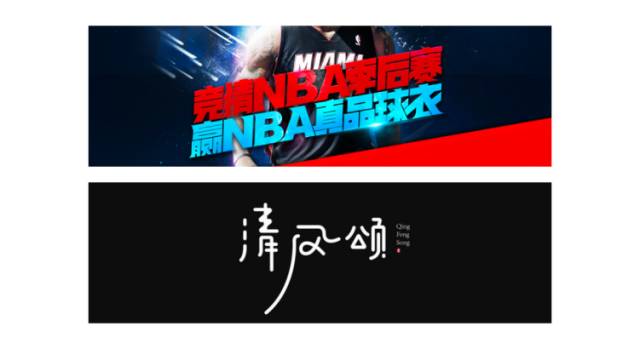
pen writing method
is relatively interesting. Through the outline of the lines, the font is unified by combining different lines. The thickness of the strokes can be uniformly adjusted according to the needs, and the effects can be used according to different themes, such as rounded corners and brush effects.
Fun and flexible, you can creatively improve the strokes according to the characteristics of the strokes and the surrounding environment of the strokes: the complexity of strokes, the simplification of strokes, the replacement of graphics, as long as you think of it, you can try boldly.
Combinations
In most cases, the combined character-making method is a combination of the rectangle method and the pen method. Generally, the main character is composed of a rectangle, and the extension part is composed of curved strokes or lines. On the one hand, the "rectangular character-making method" is used to make the font correct Orderly, on the other hand, use the "curved character method" to express the emotion of the font and exaggerate the atmosphere.
has the most workload and difficulty, and often needs repeated adjustments and attempts to ensure the natural, smooth, and integrity of the connection. You can first draw the basic shape with a brush or on paper, and then adjust the thickness, aiming point, and direction. After performing the expansion Adjust repeatedly.

Do you think the content I shared is not detailed enough, but if the above content is explained in detail Three lives and three generations can’t be finished, so we only do basic system cognition, so that everyone can sort out and study in depth according to this system later, so I won’t go into it here. A certain degree is a good thing, and I believe you will definitely use it.
But you can't escape a practice character when you do anything, and the font design will have more personal understanding and style in it, more like a kind of painting method is ever-changing, and it can be completely learned from the same software Different, so this skill is not a three-to-five-minute quick skill, otherwise the excellent works of font design websites will surely multiply.
Then I will recommend some learning paths to everyone, so that you can learn from others and practice without blindness. Sao Nian, please take my Amway post, there are too many good things in it Our RUX is not only about theory, the dry goods are below (high-energy warning ahead).
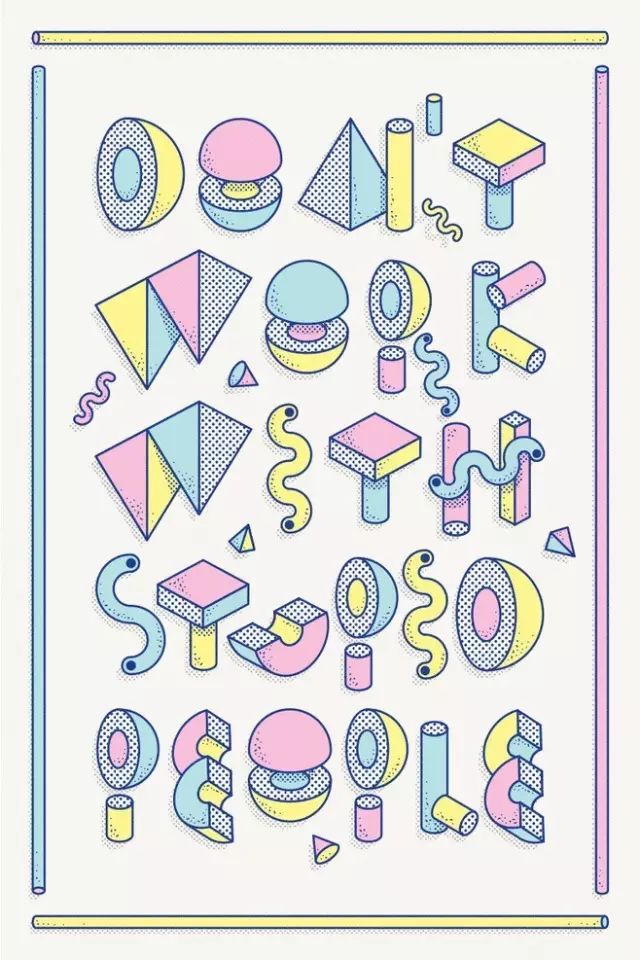
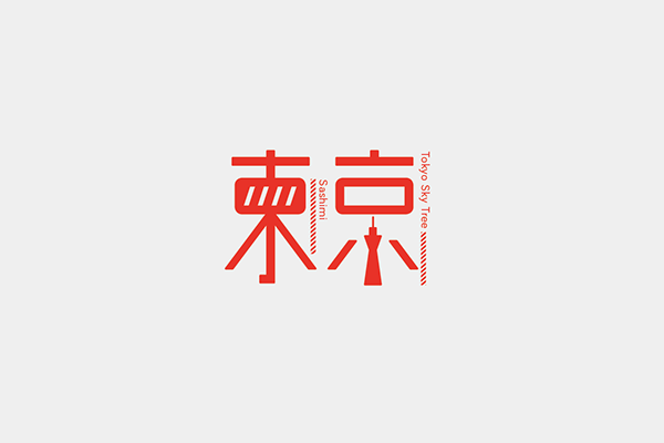
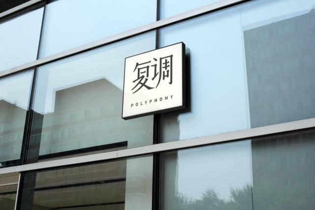
Here are some excellent font design works:
kwkm-daiki's font diary series:
AD&D Studio:
"Landmark&Food"/Dingshang-chin
Hong Kong designer Ke Chijian-Hong Kong Metro "Li Song Style"
Domestic designer Zuo Zuo ArcherZuo/ https://www.behance.net/archerzuo
Milkxhake/Hong Kong:
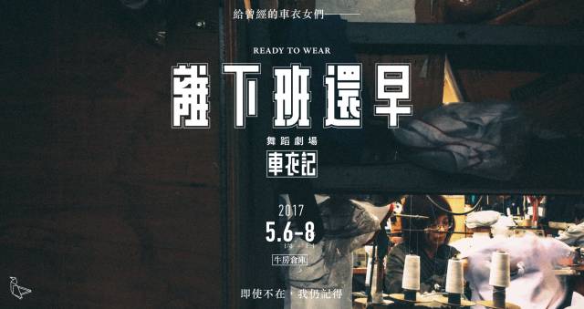
 Designer MoreTong:

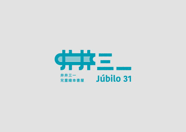
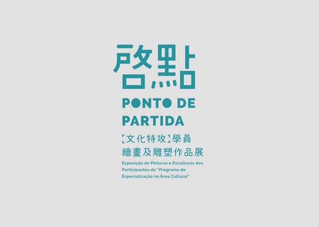
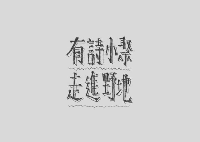
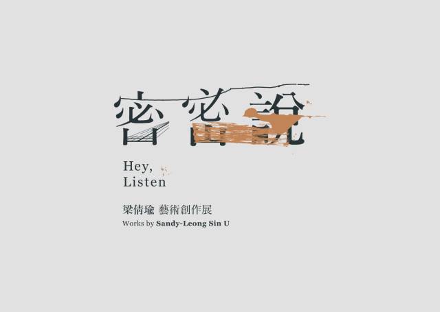
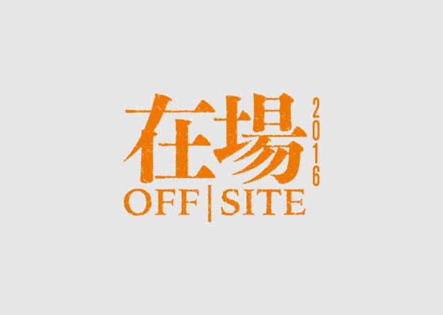
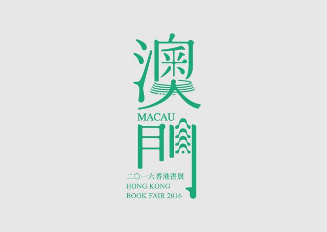
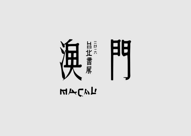
Chinese character design by Macao designer CkChiwaiCheang


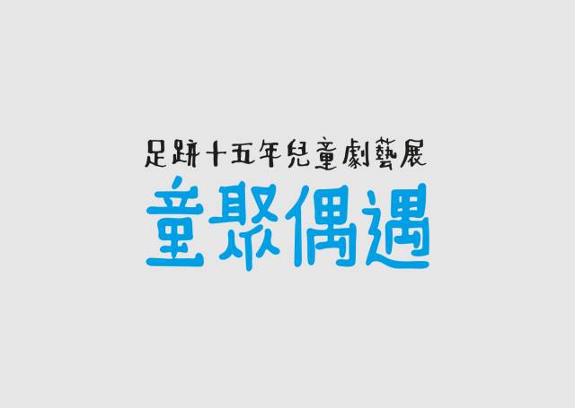

Little Elephant Love Design (ID: xiaoxiangaisheji)

Keyword Reply:
Printing, business cards, posters, logo design, tea packaging, color spectrum, folding
BANNER, Tucao video, takeaway food, AV, quotation, Japanese poster
Layout, Republic of China, software, Olympics, welfare, resume, moon cake, Tmall
Double Eleven, recipes, red envelopes
(see the corresponding knowledge article)

Creative | Material | Product |Service
A WeChat shop for sharing design resources

Discover |Share | Grow
Designer's home, communication design problems
Share the latest industry information
Subscription number: SJ-QUAN

Share/Contribute/Product Entry
 sj-quan1 719155723
Articles are uploaded by users and are for non-commercial browsing only. Posted by: Lomu, please indicate the source: https://www.daogebangong.com/en/articles/detail/Font%20design%20this%20one%20is%20enough.html
 支付宝扫一扫
评论列表(196条)
测试