
LOGO master editor (ID: logods)
Original Zhongan ZED, WeChat account: zhongan_zed
Some legends come from the Internet, the copyright belongs to the original author, infringed and deleted
Foreword:In visual design work, almost all fonts are used. Font design is different from font library fonts. It is a font that has been artistically processed and sublimated. So today, Dajun wants to share a dry article about fonts, so that everyone can break through the shackles of fonts in the font library, and inspire everyone to make fonts.
Font representation type
So, as a font novice, how to systematically learn font design from the basics? The following will mainly analyze Chinese fonts. According to popular font design cases, we roughly divide font performance types into five types: HeiTi, SongTi, Calligraphy, Three-Dimensional, Dynamic font.
boldface
The black typeface is also called isoline typeface, also known as "square typeface", which belongs to sans serif typeface. The character frame absorbs the advantages of the structure of the Song typeface, and removes the serif decoration. The whole is simple and elegant, with a sense of fashion and modernity.
Black font can be said to be a all-match font with strong plasticity, which can express the rigorous temperament of business, as well as youthful passion and Dynamic, slender black body can also reflect femininity.
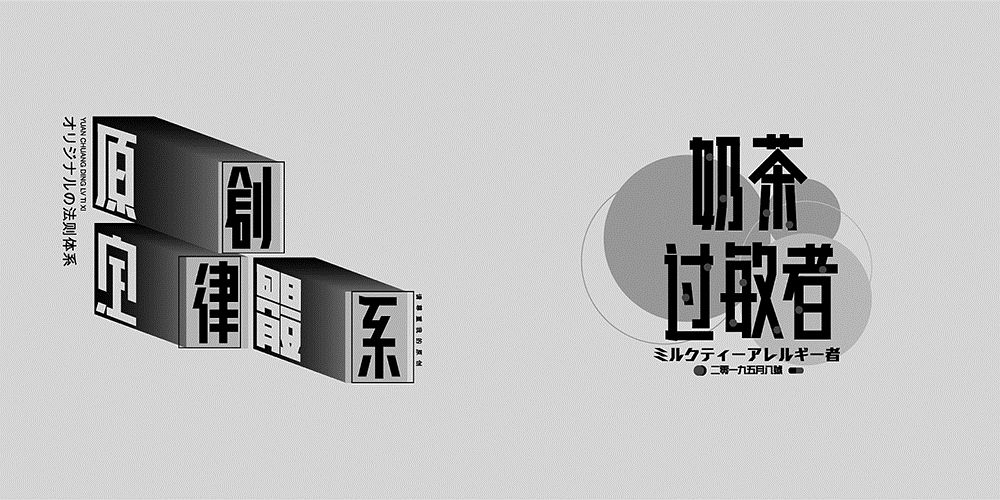
via network
via Wah Kee,
Times New Roman
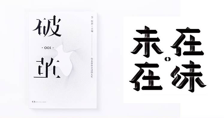
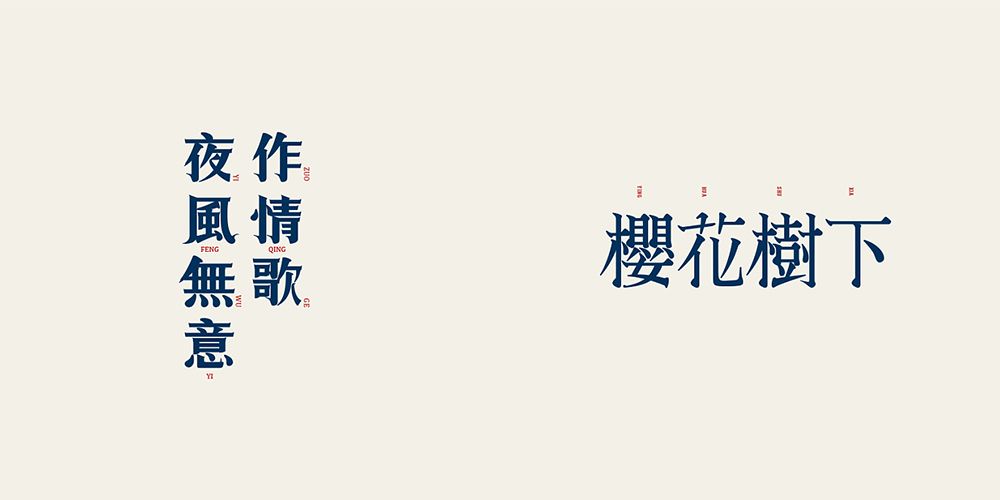
Song typeface was born for printing, and its strokes vary in thickness, generally horizontally thin and vertically thick, and the end of the stroke is similar to a triangle node serif decoration. Song typeface belongs to serif typeface.
Song typeface is much more decorative than Hei typeface, and Song typeface conveys more accurate temperament than Hei typeface in the fields of culture, art, life, women, food, health care, fashion, etc. /strong>.
via "Broken Cocoon"
via non-salted fish
Calligraphy
Chinese calligraphy pays attention to the flow of Qi, which refers to the echo relationship between characters and characters, lines and lines in calligraphy works. Generally, it is required to break the meaning of the pen, connect the lines to form a line, and accumulate the lines to form a text. In the writing of the top and bottom, left and right, and the beginning and the end of the text, there are changes and harmony. Calligraphy characters are bred with grandeur and grandeur, which can carry unlimited design energy.
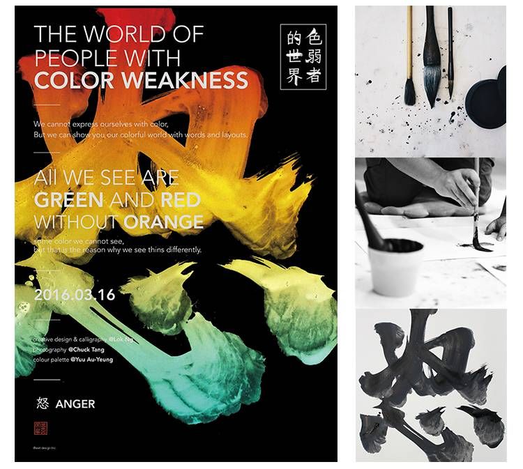
There are two ways to realize conventional calligraphy font design:
①Font Library Calligraphy:
According to the calligraphy fonts in the font library, combine brush strokes to realize reprocessing of fonts.
②Handwritten calligraphy font:
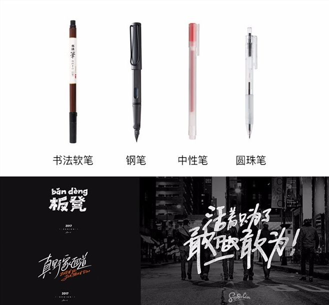
a.Write with brushes and other tools, and then scan them into the computer for reprocessing. When you are bored, you can use other writing tools to find the feeling of brush strokes.
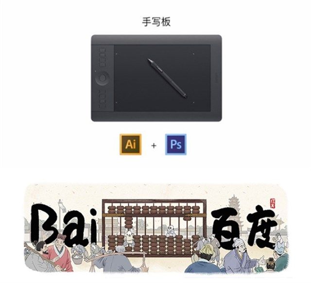
b. Write directly on the computer with a hand-painted pen, write the shape first, and then fill and process (there is also a brush stroke matte and smooth, I want to compare the matte similar to the brush strokes You can use a freehand pen to match the material.)
Brush writing implementation case
▼
via lokngs
Other writing tools
▼
three-dimensional font
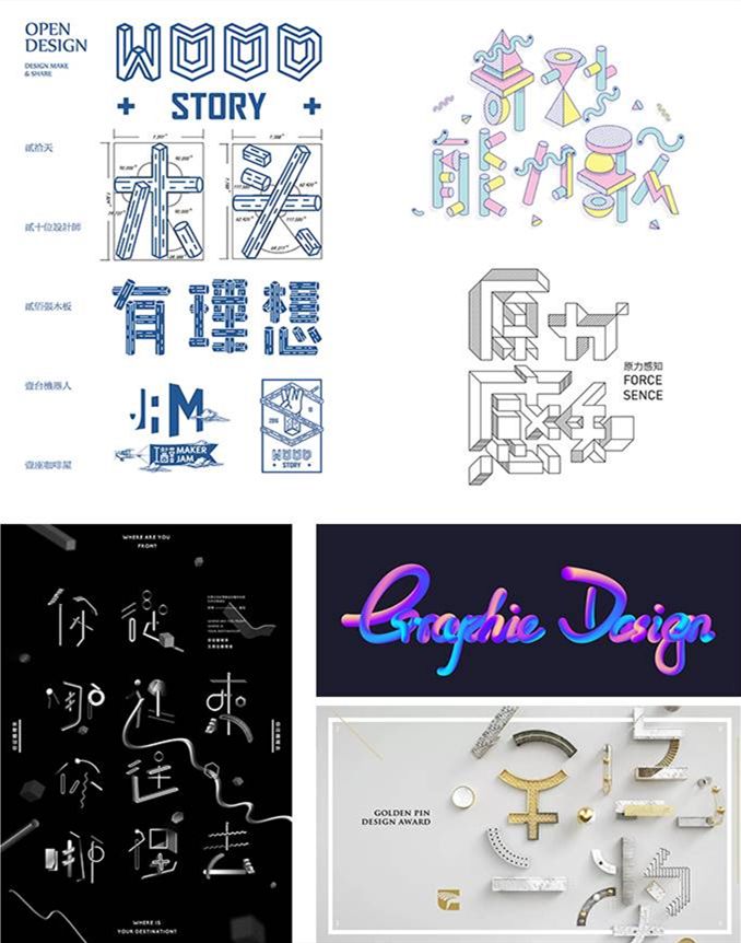
Three-dimensional body refers to a font with 3D effect, three-dimensional effect, and strong spatiality. Commonly, assisted 60°, 45° grid drawing, each perspective set , built according to the combination of basic glyphs.
Horizontal, flat and vertical structures are relatively easy to realize, while skimming, dotting, and pressing require the designer's rich creative ability to realize. Ordismantle font strokes, replace regular strokes with cubes, cylinders or other geometric shapes , any combination can create endless font possibilities. Of course, you can also directly use 3D software such as C4D to model and render according to fonts.
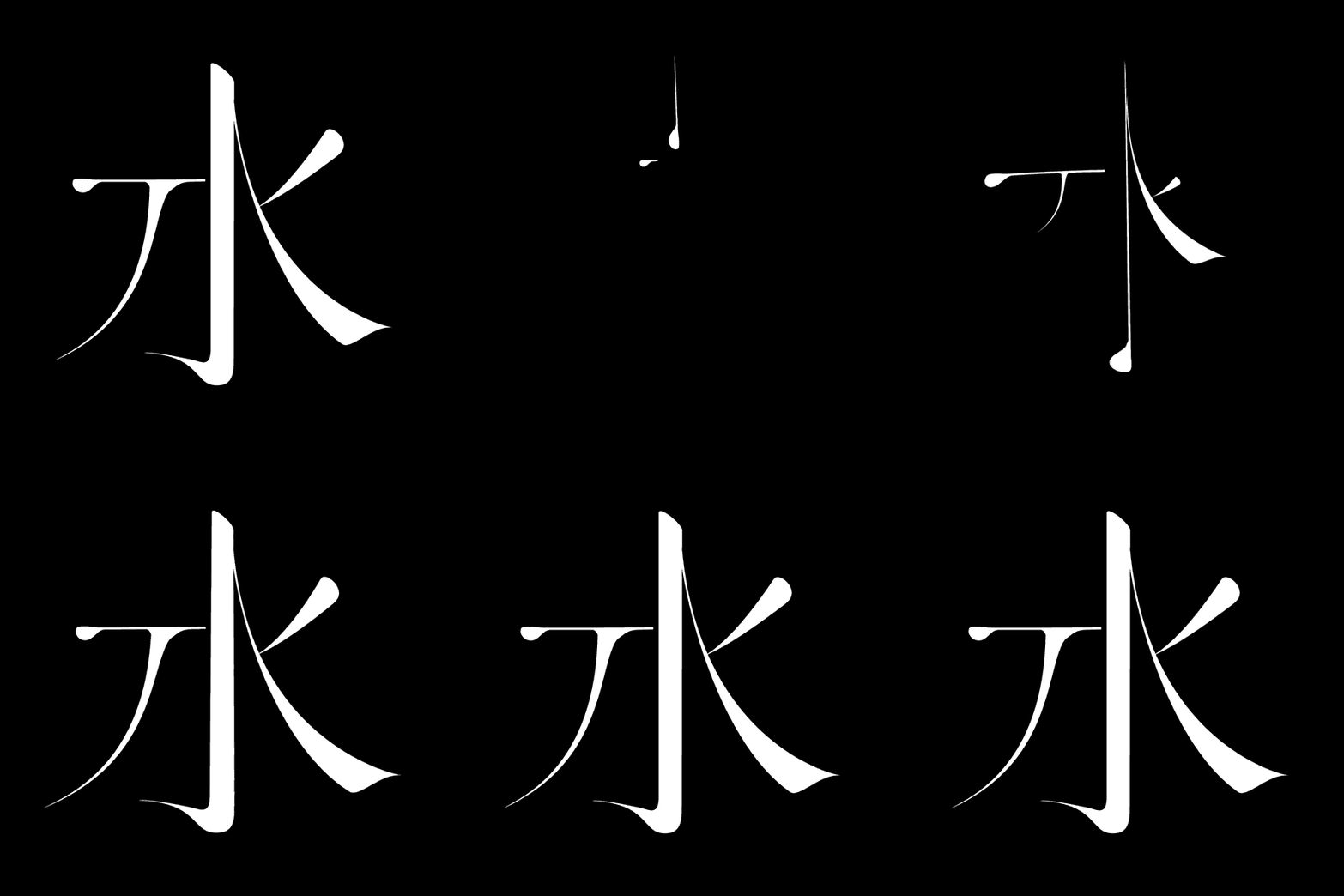
Picture (left→right, top→bottom) via wood has idealswork camp, Qian Hao Hawking
Netease Future Technology Summit, movie "Dunhuang Man", main visual of 2016 Golden Pin Design Award
dynamic font
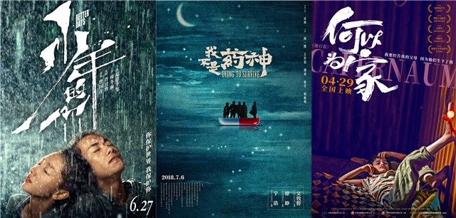
Static fonts have their own limitations of expression. If you add dynamic effects, you can enhance the sensory experience and express the meaning of the words in place, which is impressive.

viaHe Tingan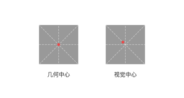
viaQian Hao Hawking
Basic font transformation method
Chinese characters are square characters. In order to achieve visual sensory balance, there are some basic rules to follow in the font space. The simple and rough summary is Three structural expressions: above Tight and loose at the bottom, thin horizontally and thick vertically, narrow at the left and wide at the right. But the most important thing is the font weight.
The center of gravity of Chinese characters is different from the geometric center of gravity we understand. The font center of gravity is the most eye-catching center of a word, also known as the visual center of gravity. In simple terms, the center of vision is a little bit above and to the left of the geometric center. For exampleIn the Mizi grid, the intersection of diagonal lines is the geometric center, and the upper left point of the intersection is the visual center.
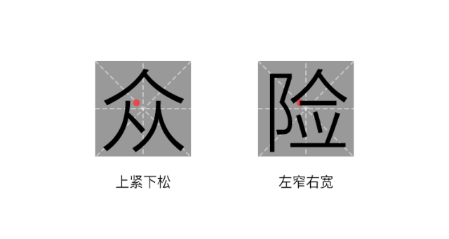
In order to achieve the overall balance of the font in the design,the heavier part of a word should be close to the center of gravity of the font The lighter part should be a little farther away from the center of gravity, so that the words can achieve a visual aesthetic balance . Generally speaking, if the main part and secondary parts of a character are arranged in a golden ratio, then the character will be visually balanced, and it will look more comfortable and beautiful.
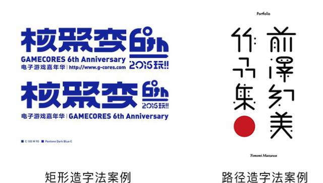
HeiTi and SongTi are the foundation of all Chinese characters. They have a rigorous font structure, so practicing font design starts with HeiTi and SongTi.
There are two basic implementation methods:rectangle and path construction
Rectangular character creation method:Draw a rectangle in AI, according to the basic shape of the font, put it together one by one, which is simple and easy.
Path character creation method:Use a pen to draw the path in AI, after confirming the shape of the font, stroke it.
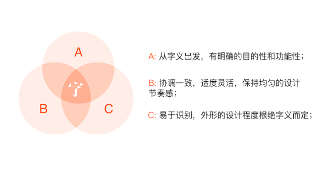
Left via Taiwan TsengGreen, right via TomomiMaezawa
With the glyph, we also needto deform according to the meaning of the word. The design process from word meaning to font shape is a thinking process from the inside to the outside, from the virtual to the real. Starting from the core meaning of the word and the content of the font, we can have an accurate starting point for design, and finally design a font that is both internal and external.
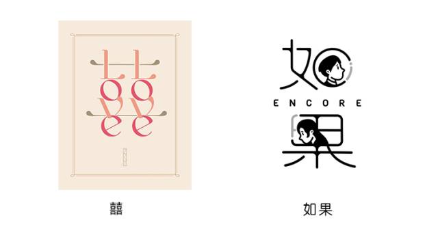
Here are 8 simple ways to make a basic typeface a good typeface both internally and externally.
On the basis of the original font, delete a certain place or add more strokes, and then replace it with other forms, you can use other font strokes to connect, you can also add graphics and images, the way is very flexible.
OrUse symbolic visual graphic symbols to evoke people's memory of an abstract meaning, concept or emotion. Can correctly convey and understand the meaning of symbols, and express the meaning and temperament of fonts.
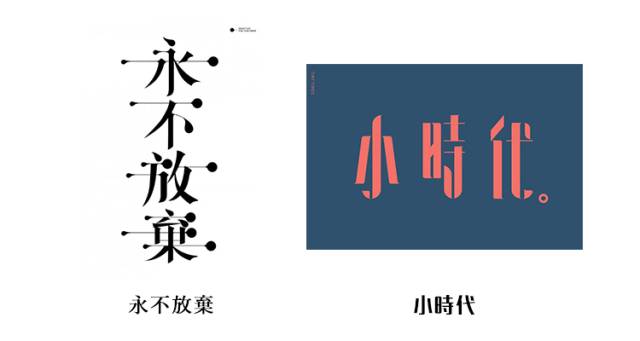
Targeted design modification according to font theme, often adding anchor points at the endpoints of horizontal and vertical strokes, or processing breakpoints.
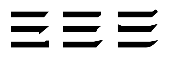
Strokes have Kuaishou combinations. For example, too many strokes are too complicated. For a simple and rough expression, let’s demonstrate with horizontal lines first.
Male charactersIn addition to making the strokes thicker, you can also do this:

Female charactersIn addition to making the strokes thinner, you can also do this:
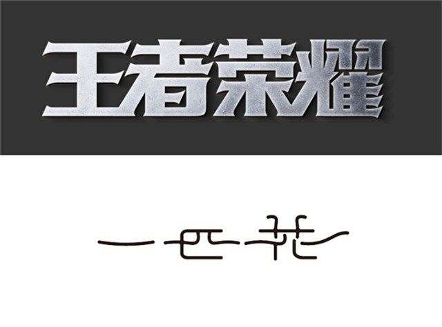
Comparison of male characters and female characters
(upper male lower female)
▼
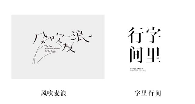
On the premise of ensuring the recognition of fonts, the strokes are subtracted and left blank, because the human brain can use its own visual experience Automatically complete the hidden or omitted parts in your mind. The fonts processed by this method are morehas the charm of oriental painting, and has a strong literary and artistic temperament.
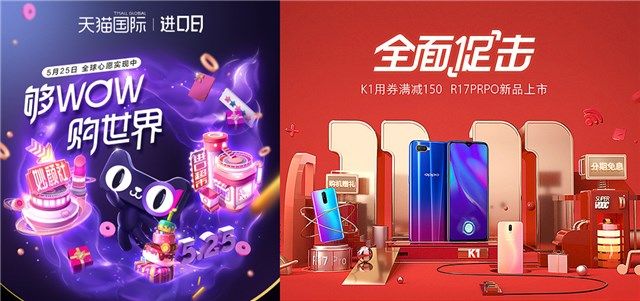
Use a series of tools such as rounded corners, strokes, and tilts to significantly change the shape of the original font strokes. The round corner tool can straighten the turning point of the stroke into a curve, the stroke tool can make the font thicker or thinner, and the tilt tool can enhance the strength and dynamics of the font.
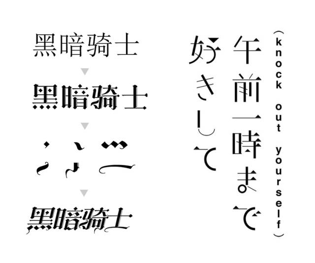
Left via Qi Tian Da Song Right via Jiuzuo Culture
Disassemble the unique stroke decoration of foreign languages or punctuation marks, and combine them according to the font structure of Chinese characters. Generally, Gothic fonts, Tibetan scripts, and medieval cursive fonts are commonly used.
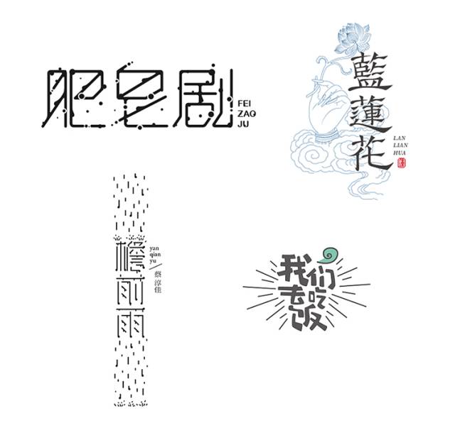
Add geometric shapes such as radiation, polka dots, or flower patterns around the designed basic fonts,to enhance the atmosphere, yes The expression of font meaning plays an auxiliary role.
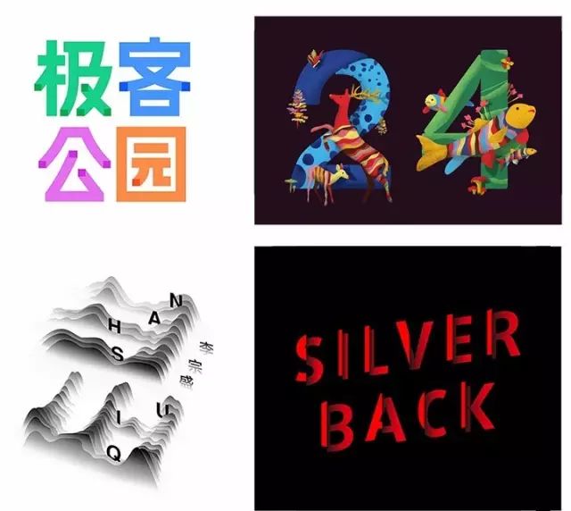
By rich colors, light and shadow, texture overlays, figurative or abstract patterns and textures make fonts come alive.
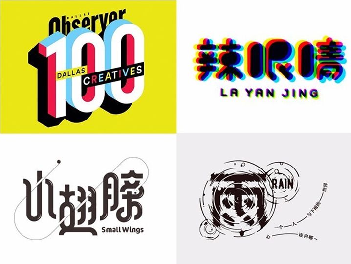
Perspective, virtual and real (depth of field), feathering blur, visual illusion, dotted clusters, overlapping occlusion, projection, positive and negative reverse, etc.Shaping the richness of font space strong>.

Summary
It can be called"advanced sense"The font generally has the following characteristics:
No decoration
simple
pure
Looking good
Structured well
stands scrutiny
The font has beauty and tension
Designers need to do a lot of practice before they can truly understand the essence of font design, and integrate font design into their daily design work with ease according to needs.
Finally, share the following good font learning books, and learn together with everyone:
Akira Kobayashi "Western Fonts, Background and Usage of Fonts" (2005) / "Western Fonts 2: Conventional Fonts and Expression Techniques" (2008) / "Unbelievable Fonts" (2011)< /span>
Zuo Zuo's "Basic Cultivation of Designers" "Hundreds of Prescriptions for Curing Words"
Kohei Sugiura "Book Text and Design in Asia"
Zhang Guangyu "Zhang Guangyu Collection - Modern Design"
Liao Jielian "Chinese Typeface Designer: One Character for Life"
Li Mingjun "Illustrated History of Chinese Calligraphy"
Today's Topic:
What do you think of font design
Is it a must-have skill for designers?
Welcome to leave a comment
"The font end is a disgraceful thing."
【Click on the links for some cases: LOGO for the 90th anniversary of China Travel Service Group, LOGO for the 91st anniversary of China Travel Service Group, By-health Hirun, Congee Congee To , Aibida, Three Peppers, Dehua Building, Le Island, Qiaoxiguan, Liuji Sunburnt Roast Meat, Sanlis , Zhigan, Coconut Chicken in summer, Jimu, Shu Chong, Panda Rabbit,Buquan Tea Dew, Water Bear Biotechnology, Fun Fruit Technology, Lixiang Home, Xiaoyinghe Community Cinema, He Beishu, Anita Tire , Laien Media, Anwo, Shallow , Explore Plus, isSikangMore works are replying to "case "]
【WeChat cooperation: logodashi/logodashi200/logodashi1124】
Articles are uploaded by users and are for non-commercial browsing only. Posted by: Lomu, please indicate the source: https://www.daogebangong.com/en/articles/detail/Font%20design%20rely%20on%20this%20dry%20goods.html

 支付宝扫一扫
评论列表(196条)
测试