From the perspective of font design, we will discuss how the brand can rise to the C position. Ok, I see. You want to share with me some examples of brand upgrades, focusing on typography, right? Please go ahead, I'm interested.
I believe you are familiar with the brand Durex(yes, it’s you), so I won’t repeat the introduction of the brand here .
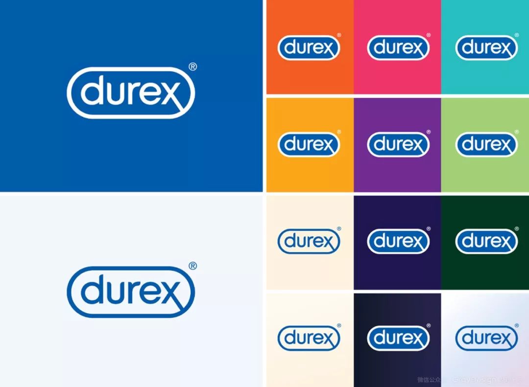
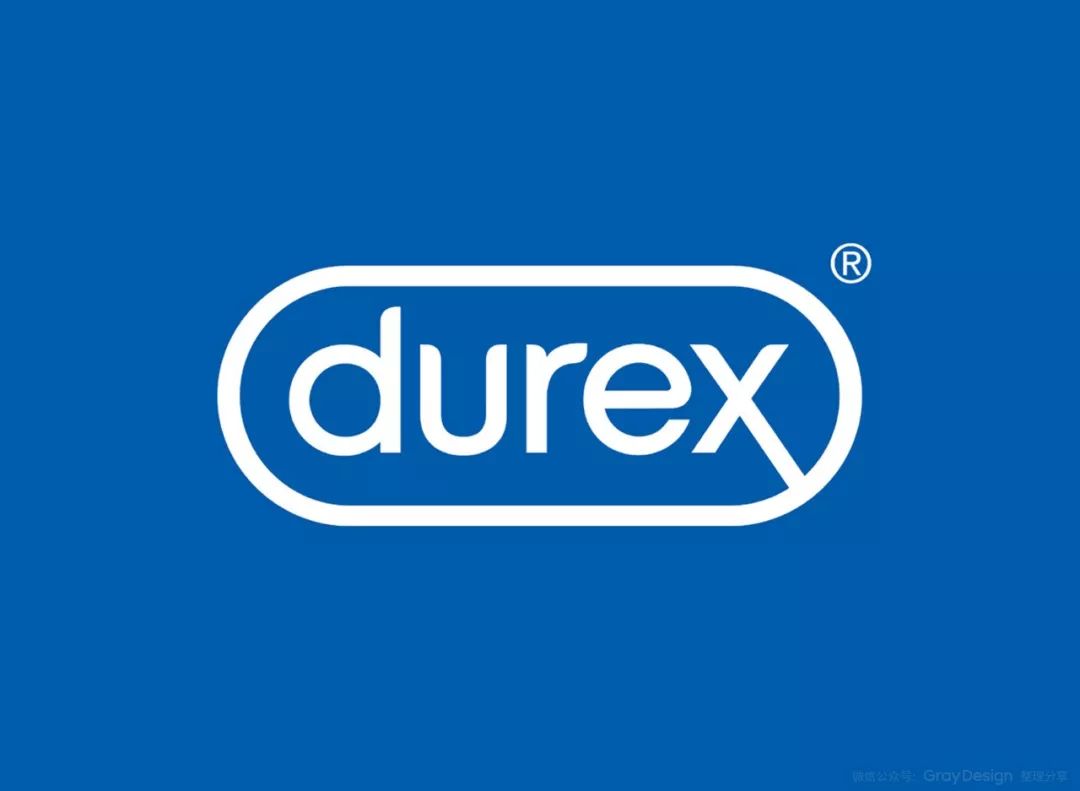
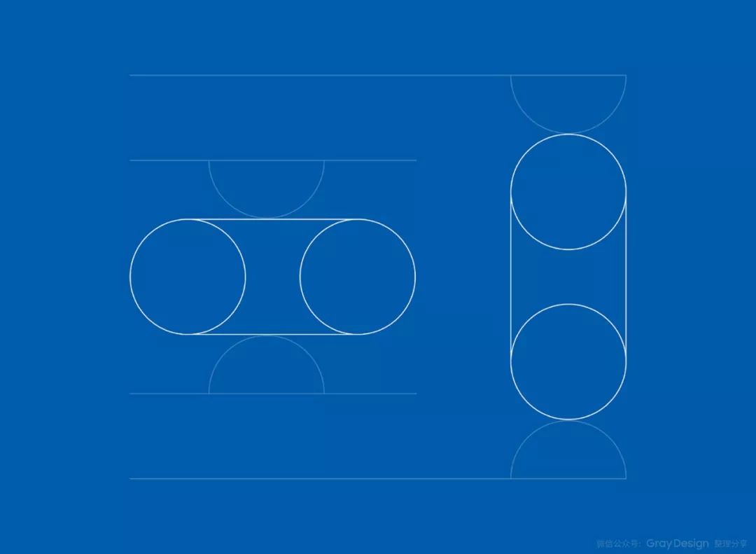
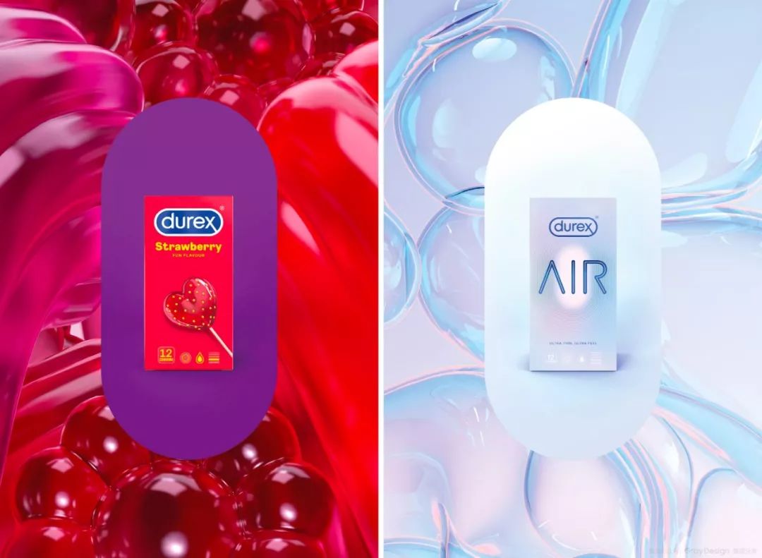
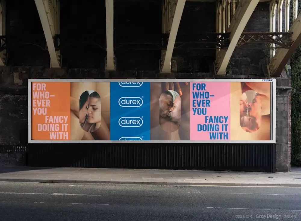
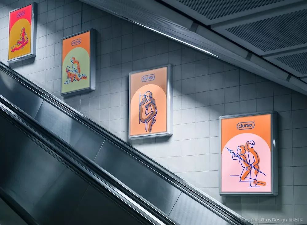
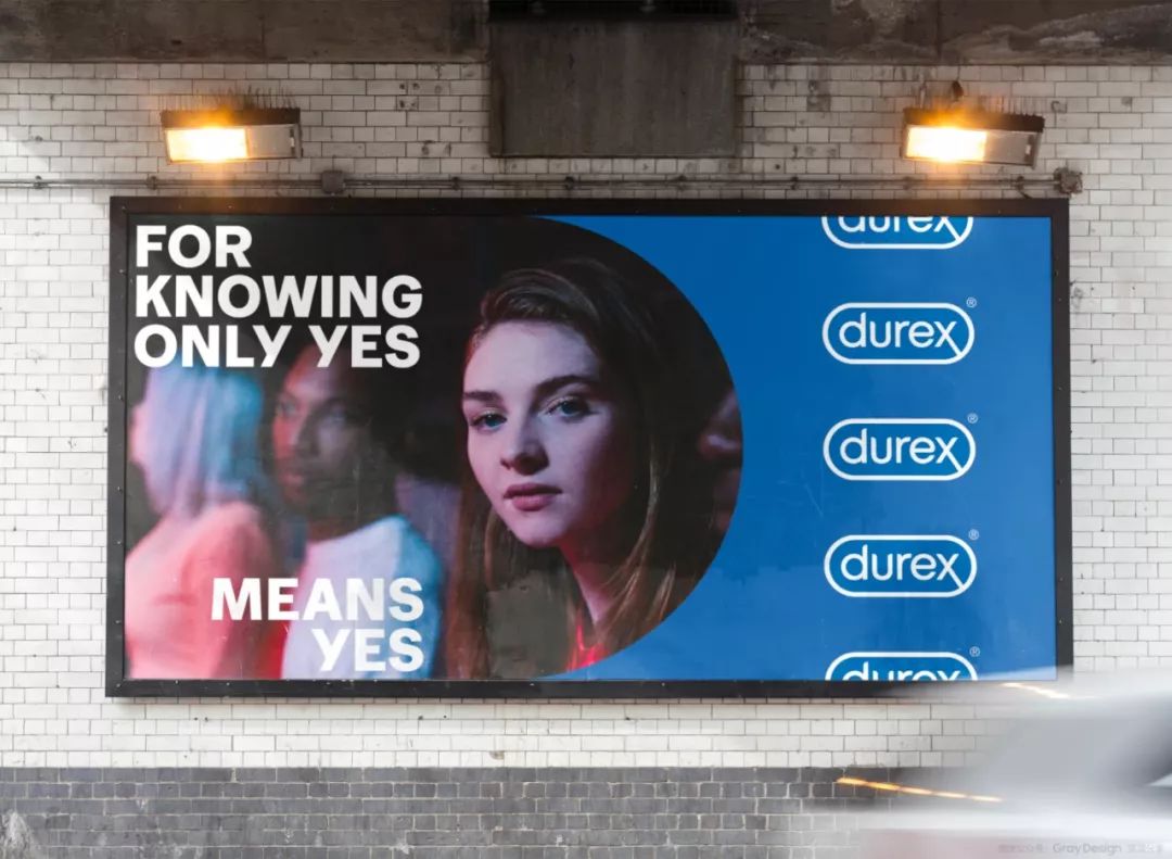
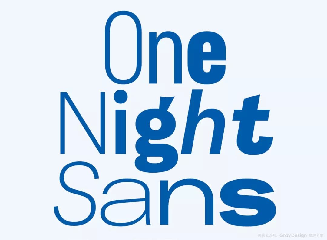
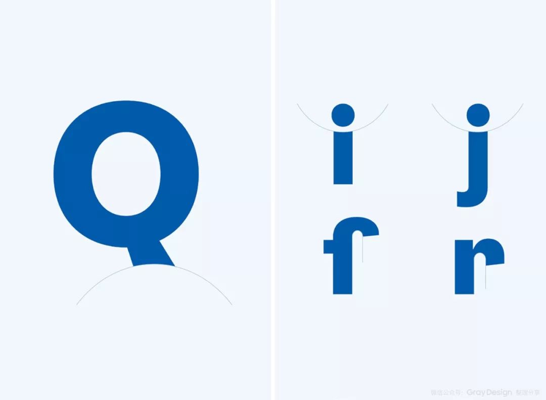
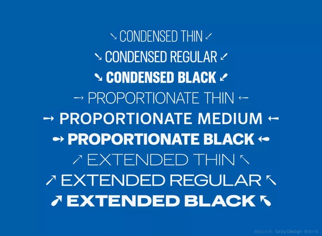
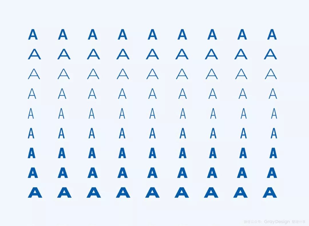
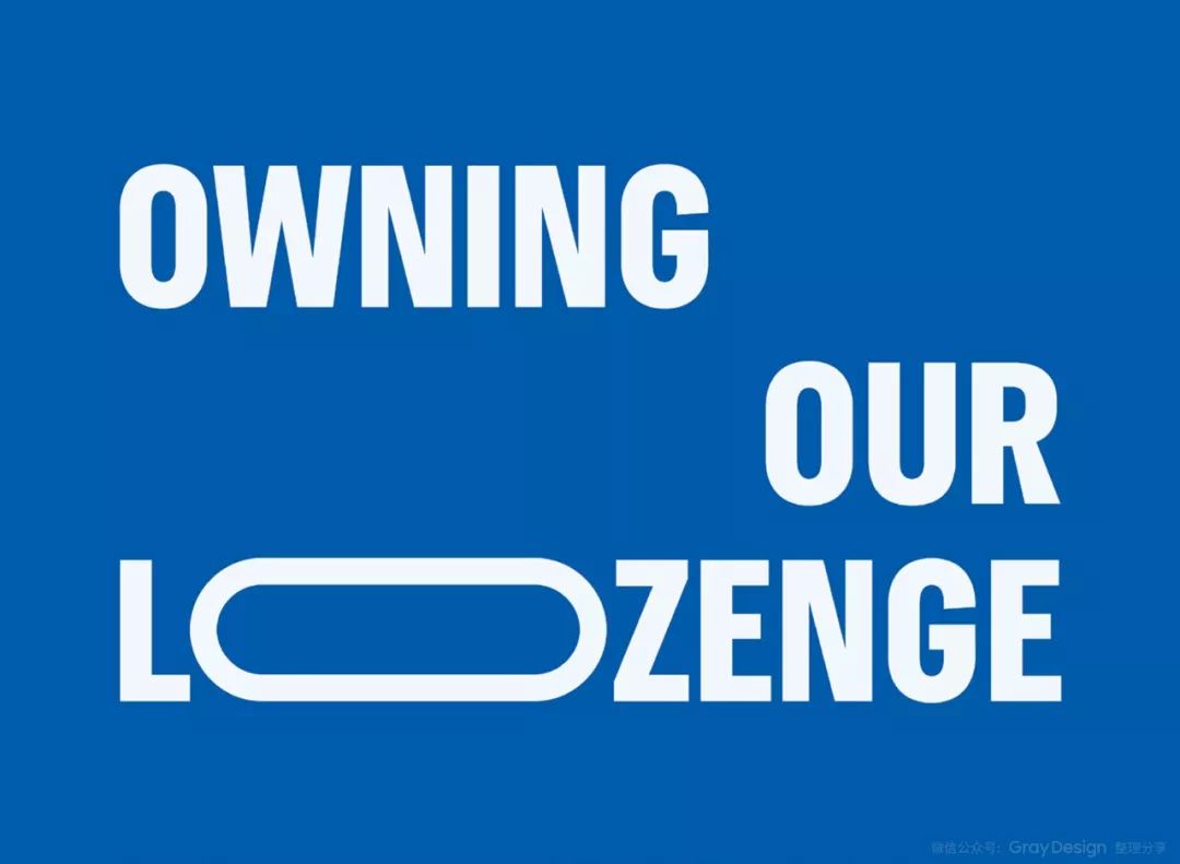
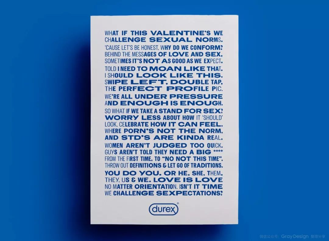
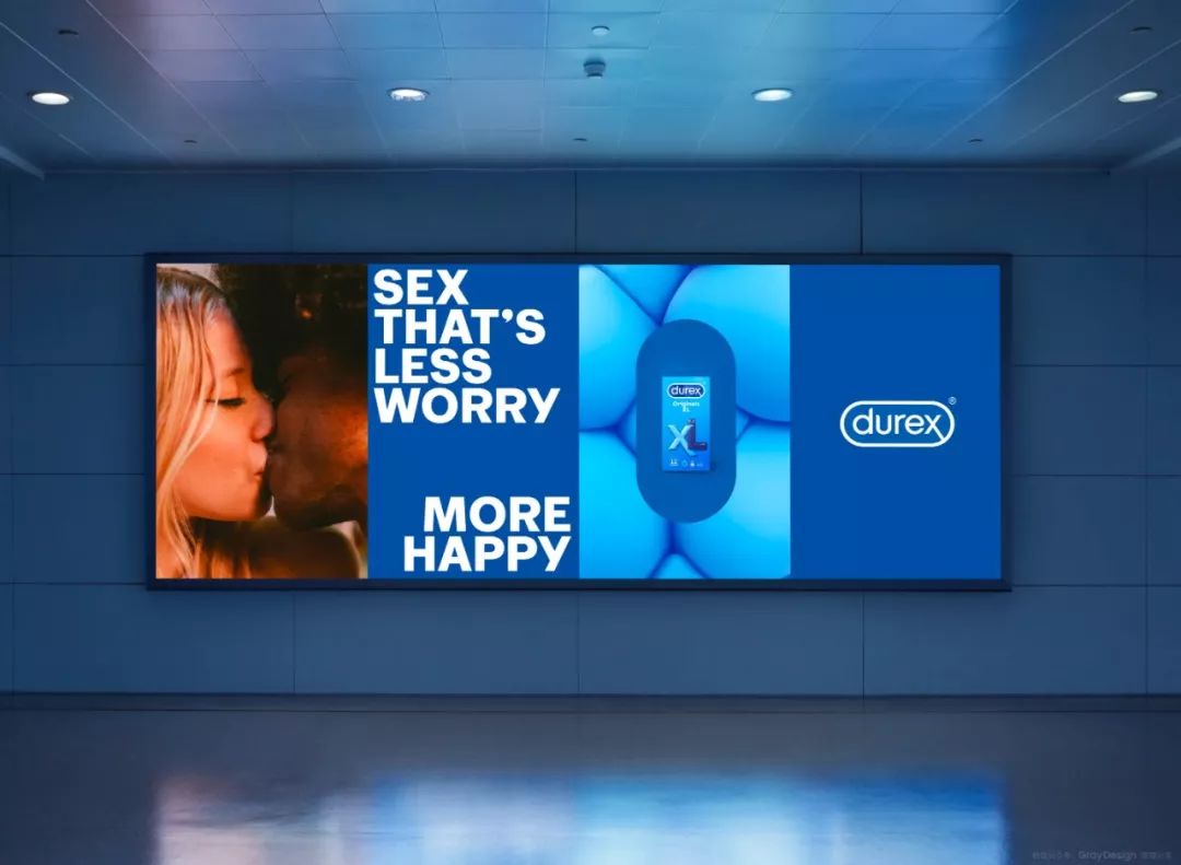
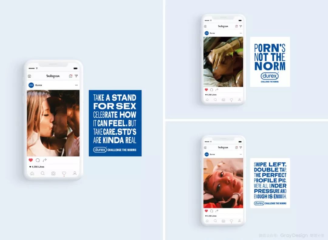
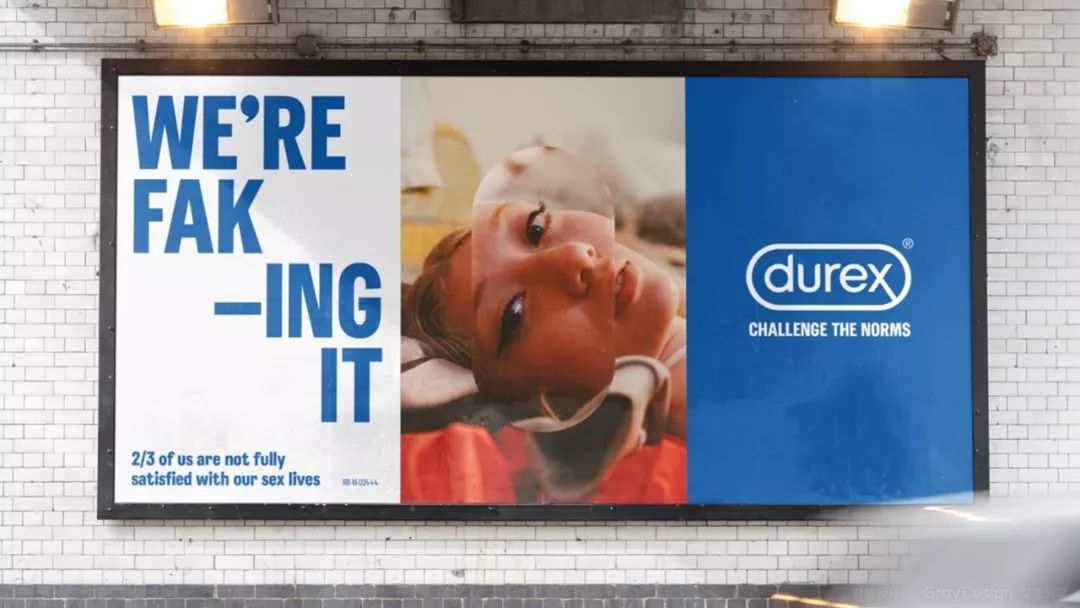
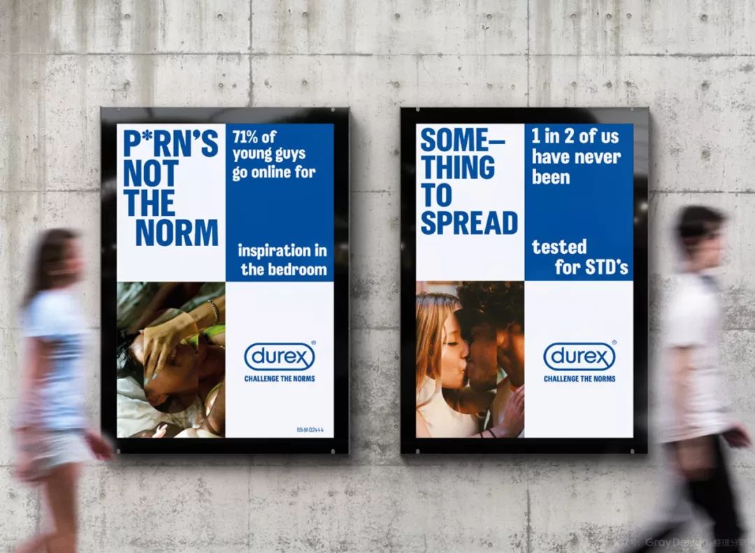
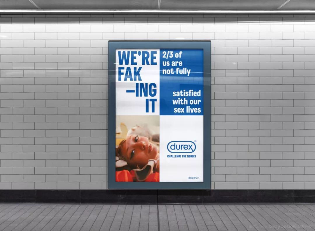
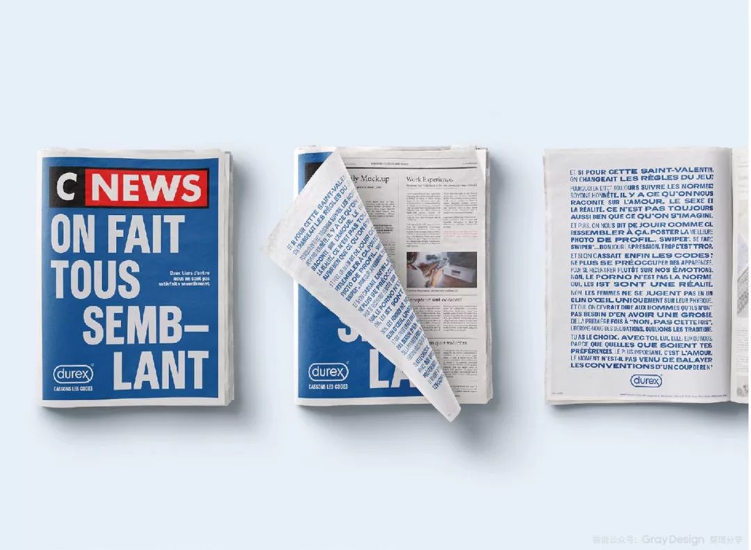
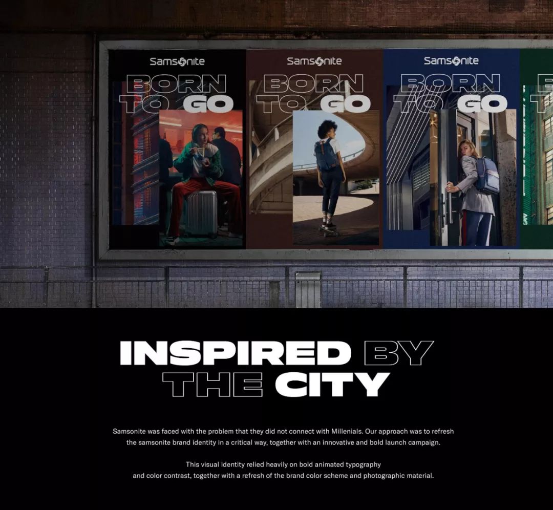
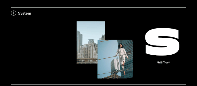
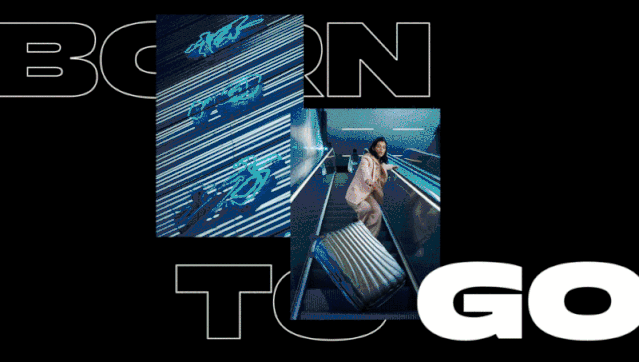
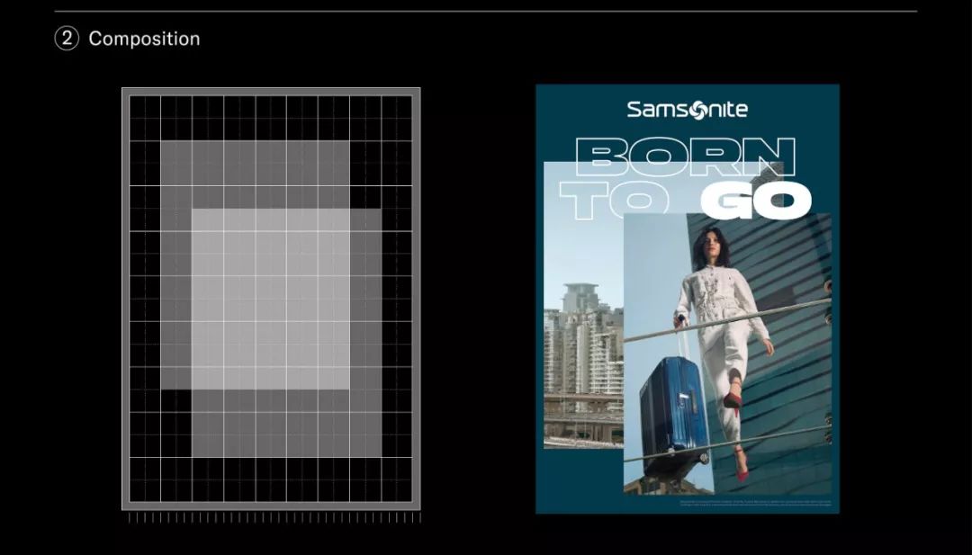
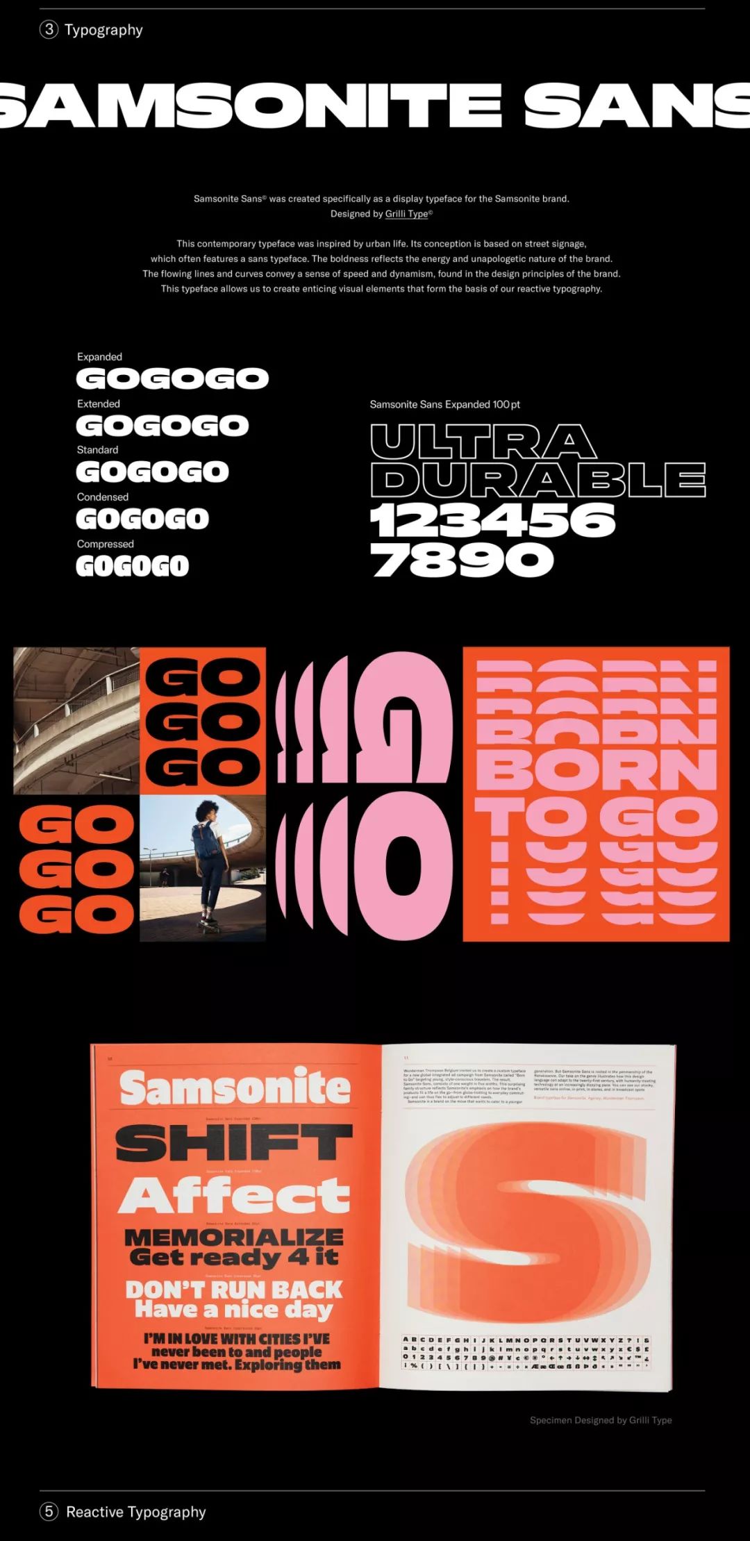
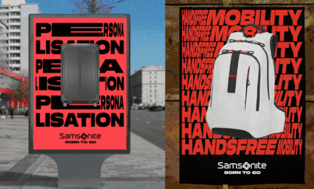
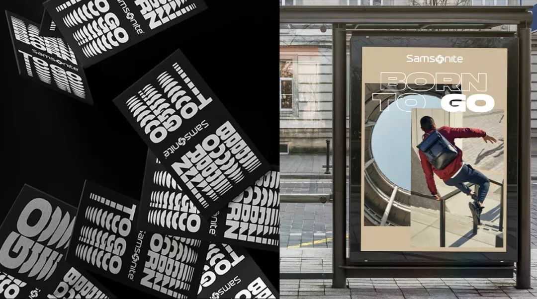
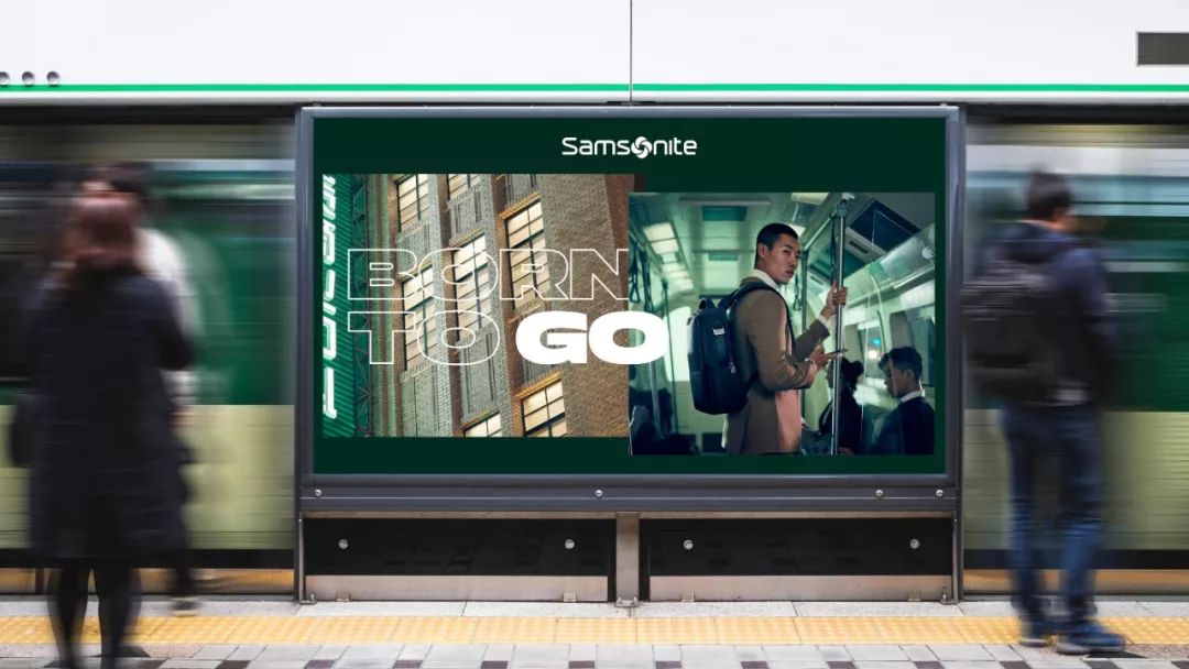
What we mainly share with you today are some subtle changes we have observed through the following brand upgrade cases. Among them, the first case is Durex's new brand LOGO and visual positioning released on Valentine's Day on February 14th, which was completed by HavasLondon and DesignBridge. by extracting The iconic rounded frame of the LOGO serves as an auxiliary graphic of the Durex brand image. At the same time, this core visual asset of the brand is also used in all aspects of the brand's visual image, such as: product packaging, promotional posters, outdoor advertisements, etc., and even runs through Durex's brand custom fonts. The biggest highlight of the sub-brand upgrade is this set of fonts custom-designed by ColophonFoundry for the Durex brand——One> (As for whether the name has other meanings, I am not very sure understand). The brand's iconic rounded corners run through the font details:A total of 9 different font widths and font weights are included, which can be used freely:At this time you may say, what's so strange about brand custom fonts? As early asa few years ago, a large number of brand upgrades and customized fonts were released at the same time, and even among the Chinese fonts with a large number of characters, there are many who released customized fonts: Tencent, Ali, OPPO and VIVO and other major manufacturers. Through the mainstream brand upgrade cases and the application cases of Durex "OneNightSans" in recent years, it is not difficult to find that in recent years, fonts have become more important in brand vision The proportion of the system is becoming more and more important, and there is even a tendency to jump from the auxiliary elements in traditional information communication to the "C position". In addition to Durex, another brand vision that also focuses on font application is the "Born to Go" brand visual remodeling case released by the internationally renowned travel luggage brand Samsonite last year, designed by WundermanThompson Antwerp Studio in Belgium. in typography In addition to the specifications of photographs, the most eye-catching thing is this set of brand custom fonts. This is a set of fonts custom-designed by GrilliType—SamsoniteSans. The fonts are inspired by street signs on city streets, and 5 different font widths are specially designed to combine the characteristics of the Samsonite brand. Intuitively express the selling point of the bag (high-strength anti-extrusion performance) through flexible character width changes:No matter how squeezed you are, it keeps you moving forward:Durex conveys the subtle continuity of brand vision through customized fonts, while Samsonite expresses the selling points of products through flexible font width changes. In addition, what brand font cases have you seen that impressed you? Welcome to leave a message to share! The above is all the content shared with you today, thank you for reading. ·TheEnd·
First-line designers are paying attention:< strong>GrayDesignArticles are uploaded by users and are for non-commercial browsing only. Posted by: Lomu, please indicate the source: https://www.daogebangong.com/en/articles/detail/Font%20design%20leaps%20to%20the%20C%20position.html


 支付宝扫一扫
评论列表(196条)
测试