
Colgate transferred from: The Right Way
Address: http://tgideas.qq.com/webplat/info/news_version3/804/7104/7105/m5723/201506/354416.shtml
1. Serif features
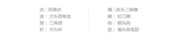
In the first issue, we mentioned that Arial is the most typical serif font. The serif strengthening method is a design method to strengthen and adjust on the basis of understanding the stroke characteristics of serif fonts. First of all, let’s look at the characteristics of serif fonts (take Song typeface as an example):
After understanding the characteristics of the Serif serifs, we will find that the strokes of the serif fonts have many common decorative elements, but some of them still have individual changes. So when we make fonts with different themes, we can add decorative elements and designs according to the font characteristics generally at the beginning of the stroke(A), corner(B) or end(C) (as shown in the picture above), which makes the font more personalized and more design.
2. Case analysis
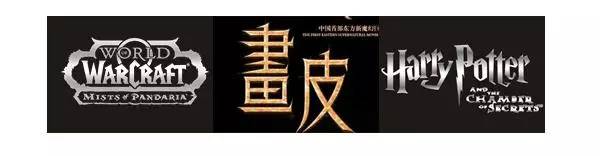
Let's take a look at the full draft of the design "The Temptation of Magic". This font is a reclassification of the DNF female magician. 1. At the beginning of the design, based on the game characters, I found the font designs of World of Warcraft (game), Painted Skin (magic movie), and Harry Potter (magic movie) for reference.
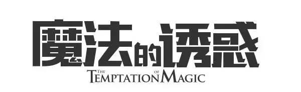
2. Selected the sans-serif version of the black font of the character workshop as the prototype for design. Choosing a suitable basic font for deformation is an important step in font design. Of course, it is also possible to draw on the draft and scan it into the computer for drawing.
In this step, a lot of adjustments and deformations have been made to the structure and center of gravity of the font. For specific adjustment methods, please refer to Font Story 1. The next thing to talk about is the focus of this episode, the serif reinforcement method.
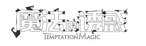
Adjusting the font structure and center of gravity obviously cannot meet our requirements visually. At this time, it is necessary to add decorative elements according to the fonts of the games and movies mentioned earlier.
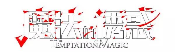
We chose the witch-like hat of the wizard, the curly branch-like form, and some thorny elements like vines. Add decorative elements and designs at the beginning(A), corner(B) or end(C) of the stroke.
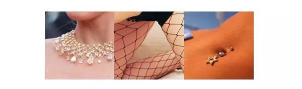
In fact, some students may be a little confused about where to adjust the strokes and add decorative elements. Here I will give a simple example to make it clear. I will still use women as an example. How do women dress themselves up in order to be fashionable and look individual?
In fact, some students may be a little confused about where to adjust the strokes and add decorative elements. Here I will give a simple example to make it clear. I will still use women as an example. How do women dress themselves up in order to be fashionable and look individual?
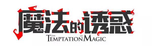
Look at the end result at the end. Using the same lining-first strengthening method, I also made a second draft of this version of the font. However, the second draft is to elevate the font and raise the center of gravity slightly. I think this is more in line with the magical characteristics and atmosphere of women. However, the final confirmation is still the effect of the previous version.
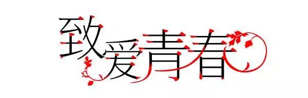
3. Classification analysis"To Love Youth" is the slogan of a game when the "To Youth" movie first came out. To avoid unifying the original font, I chose a very thin serif body as a prototype here. Then, leaves are added around "love" and "spring" to reflect the clear, youthful and campus flavor.
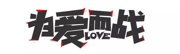
"Fight for Love" is a font that was adjusted and modified for colleagues. Relatively casual and entertaining. So a slightly more flexible arrangement makes it look more relaxed and lively. The sharp serif effect is added to many positions of the strokes of the font to enhance the personality and visual impact.
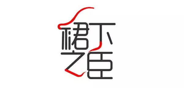
"The minister under the skirt" is a game title design made before, and the font and name are female. Reminiscent of seductive women, I chose a thinner font for deformation, combined with the skirt, the elegant and dancing shape has repeated and analogized the strokes of the characters "skirt", "zhi" and "xia".
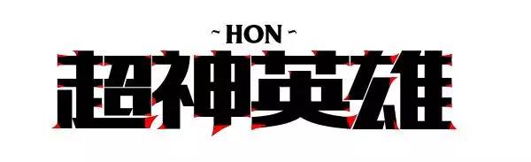
"Super God Heroes" is a Tencent game similar to LOL's magic competition. It was originally made to participate in a Chinese-sinicized logo competition. It also adjusted the structure and center of gravity and added a lining similar to LOL font elements. line elements.
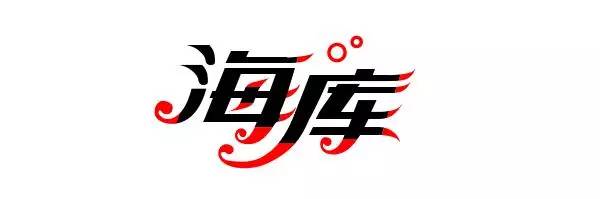
"Haiku" needs the feeling of the ocean, waves and waves, so choose soft curves, elements similar to water bubbles and spray strokes to decorate the font.
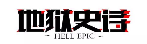
A version of the theme slogan of "Hell Epic" DNF. The homepage also adjusted the font structure and center of gravity, and finally added a small amount of decorative elements to the different strokes of the four characters to make it more personalized.
LOGO keyword reply
[coffee, catering, popular, fish, Japanese style, cat, plant, color, pepper, travel, hand, art gallery, similar, orangutan, Wukong, flat, compass, golden ratio, tea, experience, sister Paper, lion, chain, VI, business card, fake big name, TV station, blue feather, menu board, signboard, calendar, fashion, animal, Taiwan, aviation, barber shop, mobile phone logo, baby, Lu Zhisheng, Chinese style, Lenovo, door head, tea vi, monthly salary, clothing, food, restaurant, rooster, club]
Director WeChat:logodashiWeibo:@logomaster
LOGO and Brand Creation Lab|www.logodashi.com
Articles are uploaded by users and are for non-commercial browsing only. Posted by: Lomu, please indicate the source: https://www.daogebangong.com/en/articles/detail/Font%20design%20do%20you%20really%20know.html
 支付宝扫一扫
评论列表(196条)
测试