Everyone Friends, good afternoon everyone, last time we passed 4 small cases to teach the method of fat body, so today we can continue to share with you the tutorials about fat body!
Case #05
Look at the final rendering first

First step :
First in AI Use the pen tool to outline the basic glyphs. The font can be big or small, which can highlight the personality and creativity of the font, and also have a sense of rhythm.


Second step :
Make the stroke Bold processing, in order to facilitate the observation of the font structure, you can first adjust the font strokes to different colors. Then adjust the stacking order of the strokes before and after to ensure the recognition of the font.

Step 3 :
If the stroke is If the thickness of the words are the same, then the characters "日" and "恋" will have some negative space, and the whole will be out of harmony. Therefore, according to the situation of each character, some strokes should be thickened appropriately without leaving gaps, so that the font tends to be full.


Step 4 :
will be adjusted Extend the font of the font, and then convert the expanded font into a stroke form. Here, first change the color of the stroke to black to facilitate subsequent modification.

Step 5 :
Then according to the font For the stacking order of the strokes, use the "pen tool" to disconnect and delete the strokes of the font to form a corresponding interspersed and stacked effect, making the font compact and full. Pay attention to the context between strokes to ensure the recognition of fonts.

Step 6 :
In "love "In the word, select a point and replace it with a heart shape to increase the fun of the font. Then select all fonts, select "Variable Width Profile" in AI, click the second one, the adjusted stroke lines will have thickness changes, and will become softer and more loving~

The font at this time It's a little thin, and then bold it appropriately:

Finally, Jane Simple typesetting of fonts!
Mission accomplished!


Case #06
Look at the final rendering first

First step :
use first" Text Tool" to type this group of characters. Here we use Siyuan HeiTi, and then split the strokes of this group of characters. For the convenience of observation, we can temporarily reduce its transparency.

Second step :
will split The stroke font is filled with black, and then a certain degree of stroke is added to the font to cover the negative space of the font as much as possible.

Step 3 :
Then add The stroked font expands, and a white stroke is added. After adding the white stroke, the stroke shape of each character comes out.
Step 4 :
The font at this time The distribution of strokes is relatively messy, the arc of the strokes is not smooth, and the character "fen" is not full enough. Therefore, first correct the overlapping relationship of the strokes before and after, and then adjust the entire group of characters to make the strokes smoother and more natural, and make each character compact and full, with the same visual size.

Step 5 :
The most critical The first step is to remove the white stroke of the font, refer to the front and back stacking order of the font with white stroke in the previous step.
Then use " Pen tool”, draw a white line on the word without stroke, draw the interspersed and overlapping effect of the strokes of the font through the white line, and the fat body effect of the black body will come out!

Step 6 :
Select all fonts , select "Variable Width Configuration File" in AI, click on the second one (same as the previous case operation), this way, the font has more personality!

Add 3 The distance between the two characters is shortened, so that some strokes of the three characters are blended together, and the design sense of the font is stronger.

Finally, give Typesetting the font, done!


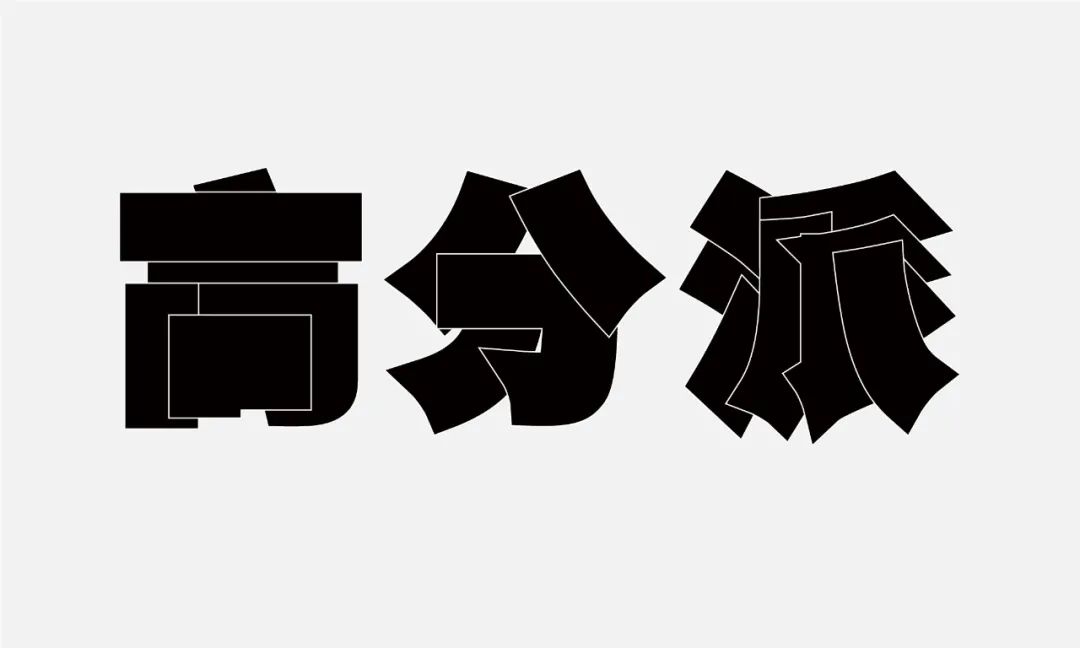
Case #07
Look at the final rendering first
First step :
use first" Text tool" to type out the set of characters to be made, here we use Siyuan Song typeface.

Second step :
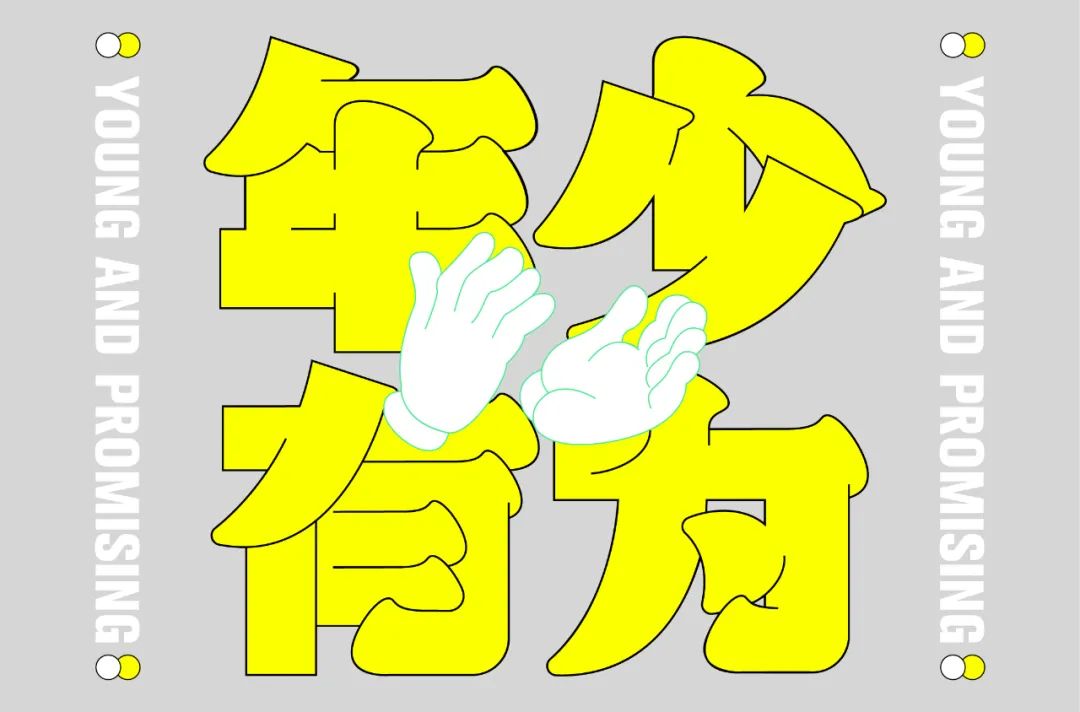
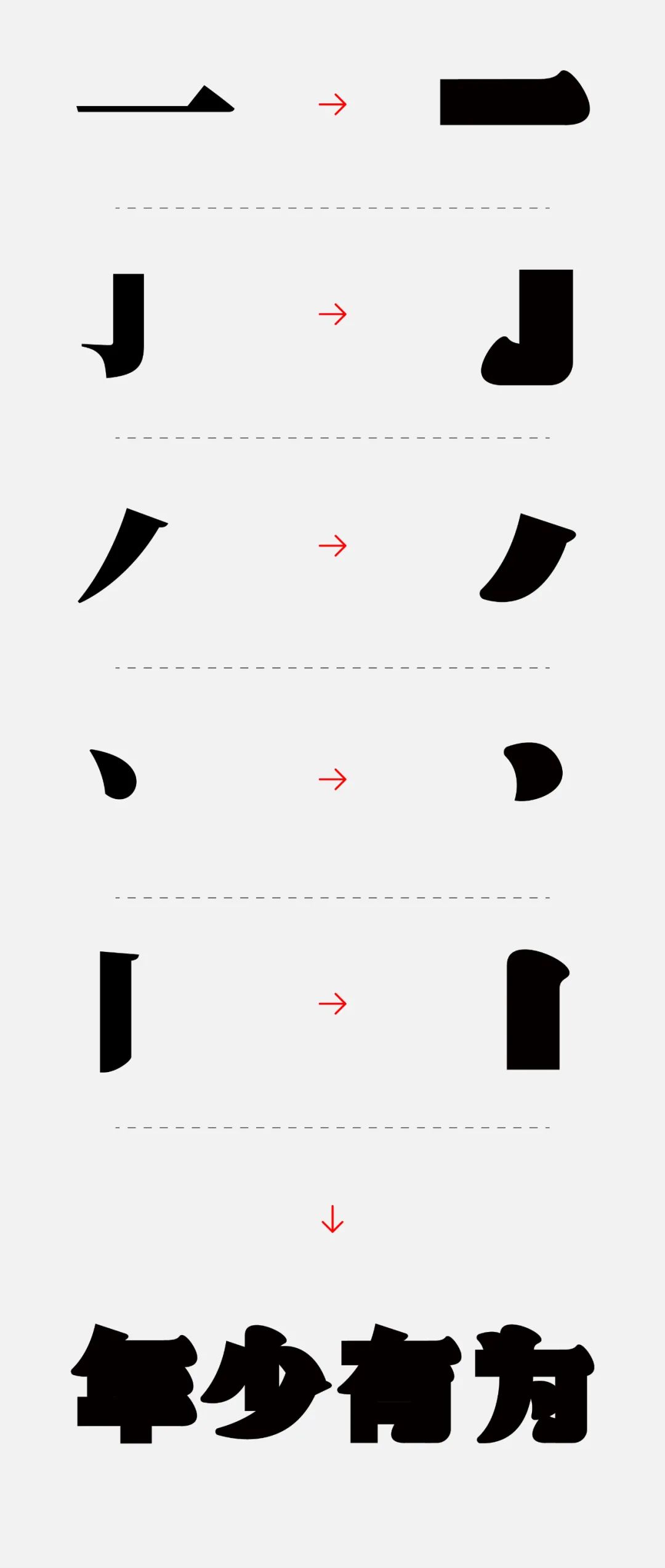
Then extract this Draw part of the strokes of the font, and design the required strokes with reference to the characteristics of the strokes. The strokes of the design can be fuller and rounder, which is also in line with the characteristics of fat fonts. Then, using the designed strokes, I, who was young and promising, easily spelled out the four words "young and promising".

Step 3 :
Stitching at this time A good font is blurry. Add a white stroke to the font so that it is easy to observe the glyph structure. Then adjust the stacking order of the font strokes to ensure the recognition of the font.

Step 4 :
According to the previous step Operation, and then turn the font into a black stroke, refer to the overlapping relationship of the font in the previous step.
Use the "pen Tool", to "disconnect" and "connect" the black stroke fonts, and make the front and back overlapping and interspersed relationships between the strokes, so that the fat font that feels like Song typeface also comes out!

Then, Appropriately thicken the stroke:

Finally, give Color the font and add copywriting and graphic elements, typesetting, and you're done!

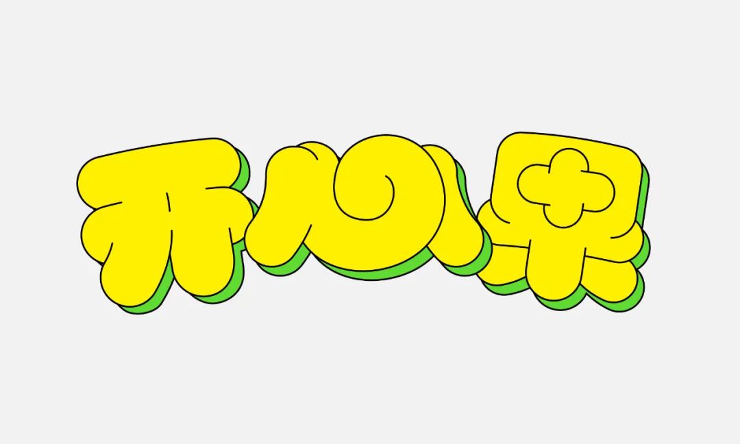
Case #08
Look at the final rendering first

First step :
First in AI Use the pen tool to outline the basic glyph structure. Here, instead of following the conventional font structure design, such as the word "heart", I made a curly continuous stroke design. My purpose is very simple, which is to increase the fun and uniqueness of the font.
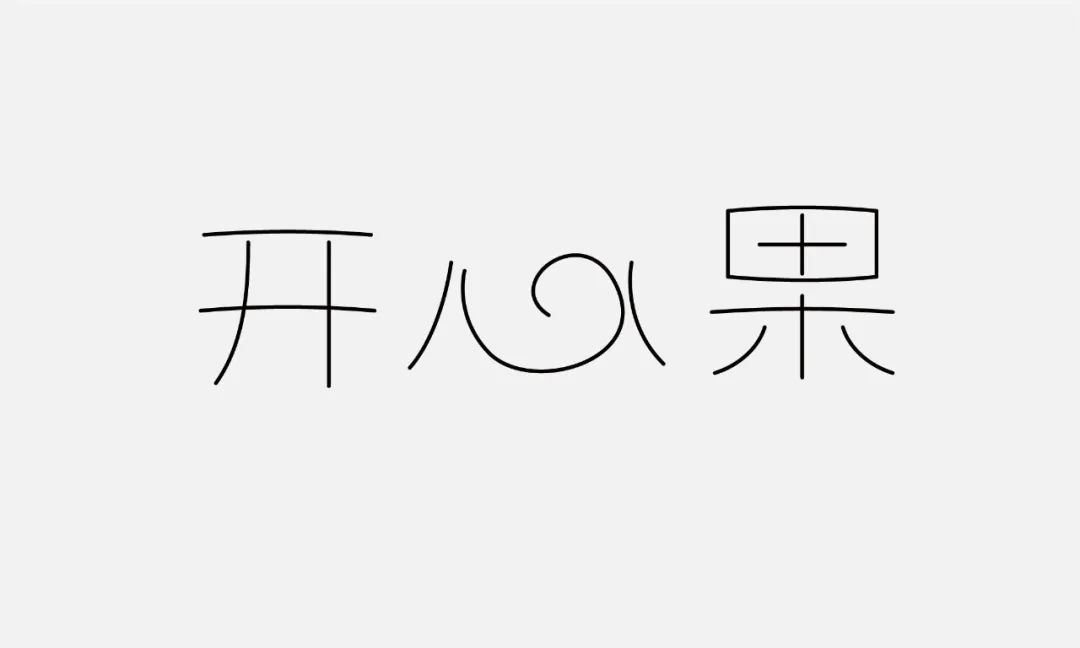
This draft, Seems to have a trace of scribbled.

Second step :
Then place the stroke For bolding, you can first adjust the strokes of the font to different colors, so as to facilitate the observation of the glyph structure. It is not necessary to follow a uniform value when bolding, as long as the internal space of each word is filled, and it is visually unified and full. The stacking order of the font strokes before and after is also adjusted to ensure the degree of recognition.

Step 3 :
will be adjusted Extend the font of the font, and then convert the expanded font into a stroke form. Here, first change the color of the stroke to black to facilitate subsequent modification.

Step 4 :
Stroke by font Use the "pen tool" to do some disconnection and connection processing on the strokes of the font to form a corresponding interspersed and overlapping effect, making the font compact and full.

Step 5 :
As the font On the right color, this time, I chose yellow, which is both happy and warm.

Then place the Copy the font layer, add another color, place it under the original font, and move it to the right and down to add a slight three-dimensional effect to the font.

Step 6 :
and then the font The arrangement position of the font can be adjusted flexibly, the word "heart" is enlarged, and the characters "kai" and "fruit" are reduced to form a certain contrast effect and increase the fun of the font.
The font at this time It will still be a bit monotonous, let's add some strokes to the edges of the font, and then make all the strokes of the font thicker to enrich the details of the font.

Old habit , do a proper typesetting, and it's done la la la la la la!

Finally finished , so happy!

8 fat The design case of the fat body is shared here. As long as you carefully read this tutorial, I guarantee that when you make a fat body next time, you can also achieve a fat head and big ears, round and smooth!

Thanks for reading , make an appointment next time~
Articles are uploaded by users and are for non-commercial browsing only. Posted by: Lomu, please indicate the source: https://www.daogebangong.com/en/articles/detail/Font%20Tutorial%20Part%202%20A%20few%20small%20cases%20teach%20you%20how%20to%20make%20cute%20chubby%20fonts%202022.html
 支付宝扫一扫
评论列表(196条)
测试