
 >>-->
>>--> >>
>>
A song "White" by Tsai Chin is dedicated to everyone
Write in front
After the recent font design works were posted on the Internet, many friends asked me how to make fonts and how to add font effects. I am ready>
This article is divided into two parts. The first part talks about the basic method of creating characters, mainly to help friends who have not yet started, want to learn font design but don’t know how to do it, and don’t know how to start; the second part is the addition and production of effects.
I will share with you one after another articles about the creative ideas of font design. After all, I always feel that if you want to make progress quickly, you must use >
In the last four characters, deeds speak louder than words, and I have a deep understanding of this, so >
Basic word making
In fact, there are many masters who have written the basic word-making method on the platform of Zakuol. I feel a bit old-fashioned when I write it again, but I think it should be done>
1.1 Rectangular character making method
The so-called rectangular character-making method is to use rectangles to spell characters. After spelling the characters, you can make some changes to the rectangles to highlight your personality. Here use>
Roll out the font with a rectangle, from>
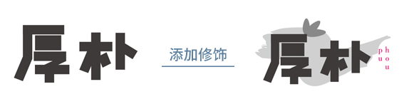
The shape of the font is finished, but it is too common and quite satisfactory, and it does not have the artistic conception of "honesty and simplicity" expressed by the two characters of "Hopu", so>
I personally think that words that express artistic conception like this can be presented in a rhythmic way, so that the charm can be expressed. The picture below is the adjustment>
Finally, add decorations to highlight the theme, so that the meaning of the words can be reflected, and the shape of the strokes behind Magnolia is as follows>
Some friends may ask me what is rhythm?
Rhythm is like the ups and downs in music, a good piece of music must have rhythm >
1.2 Fountain pen writing method
The so-called pen-making method is to use the pen tool to draw the characters. The lines drawn by the pen can be straight or curved, which is very convenient. There are two ways to create characters with a pen. One way is to directly use the lines drawn by the pen to make strokes such as horizontal and vertical, as in the case of "The Most Beautiful You" below;
another>
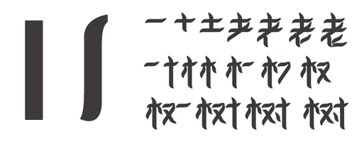
First we create a rectangle and use the pen tool to add an anchor point to change the shape of the stroke, as shown in the left picture below >
This shape can represent the trunk, and it can also represent the leaves after shrinking, so it is made like this.
I think thinking is based on production techniques. Font design cannot be deformed for the sake of deformation. Ideas are very important.
Design is originally thinking-oriented, and software skills are only auxiliary

1.3 Curved character making method
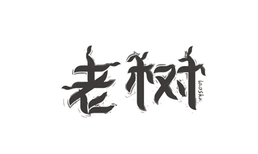
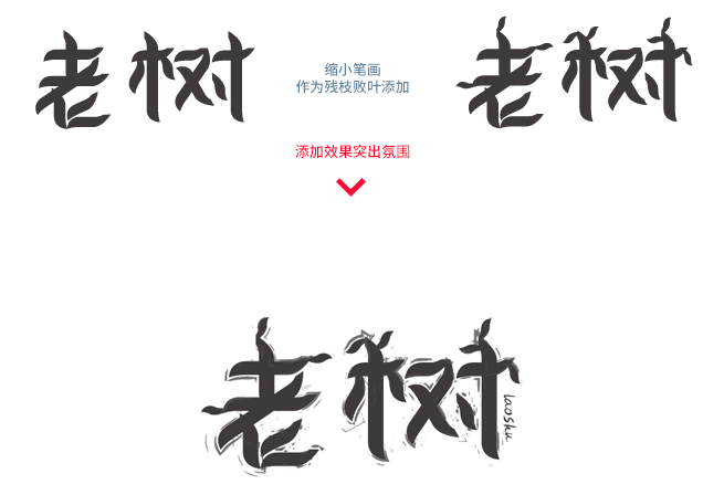
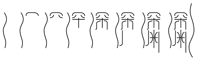
The curvilinear character-making method is inseparable from the fountain-pen character-making method. What is the curvilinear character-making method? In fact, the curve-making method is that the font contains curves, or the strokes are outlined with curves. The details at the end of the "old tree" strokes above are changed by the pen tool and the anchor point is adjusted. >
There are many kinds of abysses, but what I want to express is not the abyss in the general sense, but the abyss based on the spirit, the depth of suffering>
The design is thinking-oriented, and this set of words is also thought out before making the feeling to express, Zen, sin, and boundless sea of suffering>
First of all, we use the pen tool to draw out the word abyss. Here, the two characters share three radicals of water, and the big arc on the far right is >
 At this point, don’t rush to expand the appearance, let’s choose the strokes in the brush tool to make the pen lines into more artistic strokes>
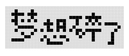
1.4 pixel word making method
It is faster to use bitmap tools such as PS for the pixel-based character-making method. Simply speaking, it is to draw pixels to make characters.
First create a new document in PS, and then use the magnifying glass to maximize it, 3200%. Then we choose the pencil tool, so that each point>
In order to let everyone see the grid clearly, I>
The word "dream is broken" expresses the feeling of loss, sadness, hesitation, and the feeling that there is no light in life, then I>
We use the pencil tool to spell out the words, and if it feels wrong, use the eraser tool to erase the wrong pixels and start again. The following is my finished spelling>
Of course, you don’t have to imitate me. Everyone’s thinking mode is different, and the things they make are different. I’m just here>
Here you can make a little more pixels and a little more detail, or you can make fewer pixels and be more streamlined, as long as the basic recognition can be maintained>
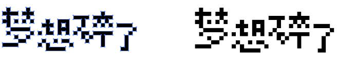
Now we can zoom in and cut a picture into AI to make it with the rectangle tool (remember CTRL+H to remove the pixel grid). Of course, image tracing is also possible, but I personally don’t recommend using image tracing. This will cause some distortion at the edge of the pixel. In PS, the method of changing the image into a selection area, the selection area into a path, and the path into a vector shape will also cause certain deformation, so I don’t recommend it here. Using PS to make pixel characters is to quickly find the feeling.
Although I don’t recommend it, I’m using AI image drawing here (ouch, who’s beating me), I’m doing it to save time. If it’s a commercial project, you must seriously use rectangles to spell it out. Well, it is a matter of minutes to spell with rectangles, >
Tell me why you need to use screenshots. If you don’t use screenshots, no matter how you save the picture, it will be the size of those few pixels, and the enlarged image will be distorted, so you can’t use the automatic tracing in AI, so we will enlarge the picture. After taking a screenshot. If you plan to use a rectangle to trace by yourself, you can directly drag the pixel layer into AI, and then use a rectangle to spell it out, but then you won’t be able to use automatic tracing.>
Summary of the first part
The above four character-making methods are not all. Others such as the three-point curve-making method, the blending or mixed-tool character-making method, >
In fact, you don’t have to stick to the method of making characters. As the saying goes, “It doesn’t matter whether a cat is black or white, as long as it catches mice, it’s a good cat.” When it’s used here, it doesn’t matter what method you use, as long as you can make characters, the important thing is to reflect you. idea. But there are a few things to note
1. The method of making characters is just a name, and it cannot be generalized. For example, the method of making characters with rectangles. In fact, we are not limited to rectangles. We can also use triangles, trapezoids and even circles to make characters. Don't be trapped by names and tools.
2. Various methods can be used in combination, and multiple methods may be used in a group of words.
3.—Problems that are attributed to software are not considered problems, no matter what tools, as long as they can realize your ideas.
Add effects
This part can be understood by looking at the picture, so I won’t repeat it, just look at the picture
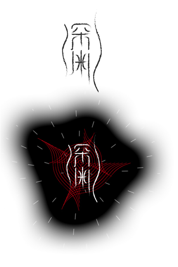
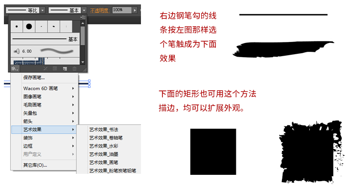
2.1 Using the AI brush tool skillfully
Regardless of whether it is a rectangle or a line drawn by a pen, we can use the effect of the AI brush to enhance the expression of the wording, provided that >
Example of this method:
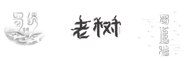
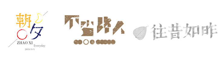
The calligraphy strokes behind the above "Magnolia" are actually done in this way>
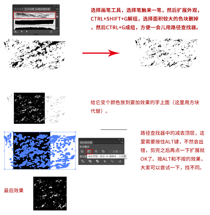
2.2>
Mainly use the chalk pencil charcoal strokes in the brush art effect.
A sample application of this method:
Write in front
After the recent font design works were posted on the Internet, many friends asked me how to make fonts and how to add font effects. I am ready>
This article is divided into two parts. The first part talks about the basic method of creating characters, mainly to help friends who have not yet started, want to learn font design but don’t know how to do it, and don’t know how to start; the second part is the addition and production of effects.
I will share with you one after another articles about the creative ideas of font design. After all, I always feel that if you want to make progress quickly, you must use >
In the last four characters, deeds speak louder than words, and I have a deep understanding of this, so >
Basic word making
In fact, there are many masters who have written the basic word-making method on the platform of Zakuol. I feel a bit old-fashioned when I write it again, but I think it should be done>
1.1 Rectangular character making method
The so-called rectangular character-making method is to use rectangles to spell characters. After spelling the characters, you can make some changes to the rectangles to highlight your personality. Here use>
Roll out the font with a rectangle, from>
The shape of the font is finished, but it is too common and quite satisfactory, and it does not have the artistic conception of "honesty and simplicity" expressed by the two characters of "Hopu", so>
I personally think that words that express artistic conception like this can be presented in a rhythmic way, so that the charm can be expressed. The picture below is the adjustment>
Finally, add decorations to highlight the theme, so that the meaning of the words can be reflected, and the shape of the strokes behind Magnolia is as follows>
Some friends may ask me what is rhythm?
Rhythm is like the ups and downs in music, a good piece of music must have rhythm >
1.2 Fountain pen writing method
The so-called pen-making method is to use the pen tool to draw the characters. The lines drawn by the pen can be straight or curved, which is very convenient. There are two ways to create characters with a pen. One way is to directly use the lines drawn by the pen to make strokes such as horizontal and vertical, as in the case of "The Most Beautiful You" below;
another>
First we create a rectangle and use the pen tool to add an anchor point to change the shape of the stroke, as shown in the left picture below >
This shape can represent the trunk, and it can also represent the leaves after shrinking, so it is made like this.
I think thinking is based on production techniques. Font design cannot be deformed for the sake of deformation. Ideas are very important.
Design is originally thinking-oriented, and software skills are only auxiliary
1.3 Curved character making method
The curvilinear character-making method is inseparable from the fountain-pen character-making method. What is the curvilinear character-making method? In fact, the curve-making method is that the font contains curves, or the strokes are outlined with curves. The details at the end of the "old tree" strokes above are changed by the pen tool and the anchor point is adjusted. >
There are many kinds of abysses, but what I want to express is not the abyss in the general sense, but the abyss based on the spirit, the depth of suffering>
The design is thinking-oriented, and this set of words is also thought out before making the feeling to express, Zen, sin, and boundless sea of suffering>
First of all, we use the pen tool to draw out the word abyss. Here, the two characters share three radicals of water, and the big arc on the far right is >
At this point, don’t rush to expand the appearance, let’s choose the strokes in the brush tool to make the pen lines into more artistic strokes>
1.4 pixel word making method
It is faster to use bitmap tools such as PS for the pixel-based character-making method. Simply speaking, it is to draw pixels to make characters.
First create a new document in PS, and then use the magnifying glass to maximize it, 3200%. Then we choose the pencil tool, so that each point>
In order to let everyone see the grid clearly, I>
The word "dream is broken" expresses the feeling of loss, sadness, hesitation, and the feeling that there is no light in life, then I>
We use the pencil tool to spell out the words, and if it feels wrong, use the eraser tool to erase the wrong pixels and start again. The following is my finished spelling>
Of course, you don’t have to imitate me. Everyone’s thinking mode is different, and the things they make are different. I’m just here>
Here you can make a little more pixels and a little more detail, or you can make fewer pixels and be more streamlined, as long as the basic recognition can be maintained>
Now we can zoom in and cut a picture into AI to make it with the rectangle tool (remember CTRL+H to remove the pixel grid). Of course, image tracing is also possible, but I personally don’t recommend using image tracing. This will cause some distortion at the edge of the pixel. In PS, the method of changing the image into a selection area, the selection area into a path, and the path into a vector shape will also cause certain deformation, so I don’t recommend it here. Using PS to make pixel characters is to quickly find the feeling.
Although I don’t recommend it, I’m using AI image drawing here (ouch, who’s beating me), I’m doing it to save time. If it’s a commercial project, you must seriously use rectangles to spell it out. Well, it is a matter of minutes to spell with rectangles, >
Tell me why you need to use screenshots. If you don’t use screenshots, no matter how you save the picture, it will be the size of those few pixels, and the enlarged image will be distorted, so you can’t use the automatic tracing in AI, so we will enlarge the picture. After taking a screenshot. If you plan to use a rectangle to trace by yourself, you can directly drag the pixel layer into AI, and then use a rectangle to spell it out, but then you won’t be able to use automatic tracing.>
Summary of the first part
The above four character-making methods are not all. Others such as the three-point curve-making method, the blending or mixed-tool character-making method, >
In fact, you don’t have to stick to the method of making characters. As the saying goes, “It doesn’t matter whether a cat is black or white, as long as it catches mice, it’s a good cat.” When it’s used here, it doesn’t matter what method you use, as long as you can make characters, the important thing is to reflect you. idea. But there are a few things to note
1. The method of making characters is just a name, and it cannot be generalized. For example, the method of making characters with rectangles. In fact, we are not limited to rectangles. We can also use triangles, trapezoids and even circles to make characters. Don't be trapped by names and tools.
2. Various methods can be used in combination, and multiple methods may be used in a group of words.
3.—Problems that are attributed to software are not considered problems, no matter what tools, as long as they can realize your ideas.
Add effects
This part can be understood by looking at the picture, so I won’t repeat it, just look at the picture
2.1 Using the AI brush tool skillfully
Regardless of whether it is a rectangle or a line drawn by a pen, we can use the effect of the AI brush to enhance the expression of the wording, provided that >
Example of this method:

The calligraphy strokes behind the above "Magnolia" are actually done in this way>
2.2>
Mainly use the chalk pencil charcoal strokes in the brush art effect.
A sample application of this method:
Summary of PS font tutorial
I have written so much before I know it, so I will stop here first. Have you gained something after reading it? Rest of the effects added >
The following articles focus on the source of creativity, the meaning of words and the temperament of fonts, which can be regarded as the process of our thinking collision!
So let’s go here first, let me say one last thing, I’m a big cat, I feed myself a bag of salt!
Be happy to share, let us grow each other!
Contribution email: wx@cgvoo.com
Communication group: 376034708 (long press to copy)
(The article comes from the Internet and the copyright belongs to the original author)
Articles are uploaded by users and are for non-commercial browsing only. Posted by: Lomu, please indicate the source: https://www.daogebangong.com/en/articles/detail/Font%20Tutorial%20%20Principles%20and%20Methods%20of%20PS%20Character%20Creation.html
 支付宝扫一扫
评论列表(196条)
测试