
The choice of fonts for e-books is a big proposition. It involves font design in depth, but it doesn’t go too far. It mainly lists the characteristics of various fonts in readers from the perspective of e-books. Also recommend the recommended fonts and setting methods for the e-books here. (If you don’t want to read the common sense of fonts, you can quickly skip to the bottom to see the last section)
Some basic concepts
No matter what kind of software, to display text, you need to read the unicode code of the text first, then find the glyph corresponding to this unicode in the font file, and then Print the glyphs to the screen. If the font file does not have the unicode code of this word, the software will request the operating system to provide a default font, and then find the unicode in this font. Generally speaking, the operating system will set a relatively complete font file or several font files (corresponding to different languages) as the font library to prevent the software from displaying fonts. We call the behavior that this software cannot find the unicode of its own font and requests the system default font library as fallback (the font name before android was called sans fallback).
Since the popularity of retina screens, font display can be said to have opened a new era. In the past, one pixel on the PC display screen displayed one glyph pixel, but on the retina, four pixels were used to display one glyph pixel. Therefore, many fonts that must be large to look good have a new life, and because more pixels can be used to display the font, small fonts can also be displayed smoothly.
Before the retina, the fonts printed on the screen were very different from the fonts printed by the printer. Due to the limited pixels on the screen, the small fonts displayed could only show the backbone of the strokes, and the jaggedness was serious; while the printed fonts Because the ink particles are extremely small and there is no pixel limit, small fonts can also be displayed smoothly. In short, the display effect of the retina is basically the same as that of the print (strictly speaking, of course it is different, but the human eye can't distinguish it so finely, it looks almost the same).
Another thing related to font display is the rendering engine. At present, there are mainly two schools of font rendering, the cleartype of windows and the pdf standard of adobe. Windows is mainly for the sharp display effect on low-resolution screens. The strokes of the fonts are all along the pixels, and only vertical smoothing is done, so it looks very sharp. The pdf is mainly to be completely consistent with the printing effect, so there is smoothing in both directions. Later, mac adopted the pdf rendering standard, and linux created a freetype to imitate mac's rendering. Android font display is the same. Judging from the final effect, windows display fonts are clearer on low-resolution screens, and pdf standard display is more comfortable on high-resolution screens.
Large font classification
According to Western standards, fonts are basically serif (serif) and sans serif (sans serif). The so-called serif is to add decorations similar to strokes on the starting and ending positions of strokes. This point is actually the same in both Chinese and Western languages.
There are historical reasons for the appearance of serifs, but from the perspective of display effect, serif fonts with the same font size have these small decorations, so the fonts displayed will be smaller than sans serif fonts. In the case of layout, the serif font is easier to recognize, and in the case of small font size, a single sans serif font is easier to recognize.
There are many choices of Western fonts. Here are a few examples, mainly talking about the characteristics of Chinese fonts.
1
Arial/Imitation Song
Zhongyi Songli is the default serif font before windows xp, because windows has done special processing (small font size is embedded with dot matrix) , only it can be displayed very sharply and clearly under low-resolution screens, and other Chinese fonts that come with windows are not good. But put it under mac or linux and it will show its original shape (linux can modify the configuration to call out the dot matrix). Zhongyi Song typeface was the most suitable text font for reading at that time.
It is also worth mentioning that the font library of Song typeface is the most. For those very rare characters, only Song typeface may have related glyphs.
Similar to it is imitation Song typeface. The font style of imitation Song is between Song typeface and Kai typeface. Its serifs are also at the beginning and end of the strokes, and the strokes themselves are also of equal width, but most of the strokes are slanted, so it is more suitable for high-resolution screens.
2
黑体
Zhongyi Heibody is also the default Heibody of Windows. It doesn’t have too many features. It’s just a typical sans-serif font, with no font weight and so on. What an advantage.
In addition, non-serif fonts can also be divided into two types: fixed width and non-uniform width. However, this distinction is meaningful for the Latin alphabet, but it is not obvious for Chinese, because Chinese itself is a square character. Monospaced fonts are mainly used for programming, so serif fonts are not divided into monospaced fonts.
Similar to it are isolines, small circles and so on.
3
italics
Strictly speaking, italic script belongs to the evolution of handwritten fonts (both Song and Hei are printed), and the difference between it and Song is mainly Song The serifs are at the beginning and end of the strokes, and the strokes themselves are of equal width; while the regular script evolved from calligraphy, the strokes themselves have thickness. Under the same font size, italic fonts will be smaller than other fonts.
Similar calligraphy evolution fonts include Lishu, Xingkai and so on.
About Duokan's own fonts
See more The default font packages are as follows:
Fang Zhengshu Song
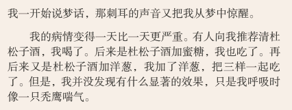
Look more at the default body font of publications. The strokes of the font are thicker than that of Zhongyi Song, which is very suitable for long-term reading from the visual effect. The Zhongyi Song typeface looks weak because it is too thin.
Books can be used in any type of book, although programming languages are not suitable for presentation in books. However, Shu Song is mainly used for body text, and it is not very good-looking for titles or decorations. All built-in fonts in Duokanzhi are from GBK, that is to say, there are no rare characters in the extended B area.
Founder Lanting Black
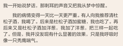
Look at the default body font of web texts. Lanting black is an adjustment and upgrade of Microsoft Yahei. Compared with Zhongyi black body, the strokes are more balanced and the middle palace is wider. So it is also very suitable for long reading. After looking at Zhongyi Heibody for a long time, I feel uncomfortable looking at it with shoulders hunched.
Lantinghei can be used in any type of book, but it is generally not used in ancient books. Lanting Black is very suitable as a body font or as a title decoration. Although Lanting Hei is also a font of GBK, the miui system font is also Xiao Milan Ting Hei, which includes the font of the extended B area. Therefore, if there are rare words in the B area in the book, if you read more, it will fall back to the system's Little Milan Pavilion. If the text is Lantinghei, you can't see any difference in fallback.
Founder imitates Song Dynasty
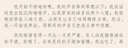
Compared with Zhongyi's imitation Song style, the overall font is slightly thinner and longer, especially the English part. The fonts imitating the Song Dynasty have relatively thin strokes, and some people also like to use it as the main text font for reading. However, ultra-fine fonts will reduce legibility in direct sunlight, even on a sunny screen.
Due to the thinner characteristics of imitation song typeface, it is mainly suitable for relatively independent small chapters such as preface and postscript, while the main text uses fonts of moderate thickness such as Shusong. In addition, Fangsong not only looks small, but also smaller than other fonts at the same font size (about 0.9 times), so using Fangsong to typeset a large paragraph of text will be more compact as a whole (each page can display more lines of characters) ).
Founder Lanting Magazine Black

Just as Fangsong is a thin version of Song typeface (in fact, there are also italic changes), Publication Hei is a thin black version of Lanting Hei, which is also suitable for long-term text reading. Of course, the disadvantages of thin typeface are the same.
The scope of application of Published Hei is similar to that of Song Dynasty, but due to the high recognizability of the small size of the sans serif font, the scope of application is wider.
Founder's new script
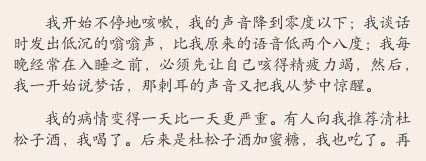
This italic font is not much different from Zhongyi's italic font. From the font point of view, it is smaller than other fonts of the same font size. The English serif font used in Xinkai is much more beautiful than the Zhongyi font, but it may not be as good as Shusong and other body fonts in displaying special symbols. Generally, italic script is used to display the content of letters and quotations. It is rarely used as a title, mainly because the font is too small and well-regulated, and its expressiveness as a title is lacklustre. The new Kai typeface is the same as the imitation Song Dynasty, and the font size is about 0.9 times the display.
Founder Xiaobiao Song
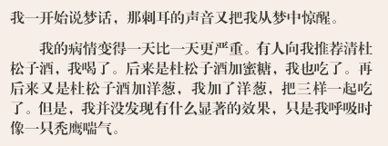
Biaosong has multiple font sizes, and this small Biaosong can be regarded as a bold version of Shusong. Not only the simple stroke thickness, but also the serif decoration is strengthened. Therefore, this font is not suitable for text, and it will be tiring after a long time.
On the contrary, this font is very suitable as a chapter or sub-volume title, even if it is enlarged several times, the font is very full.
Founder medium line
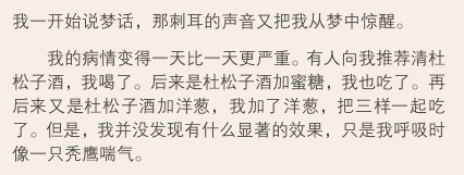
Look more at the original font package that did not include this font. It has been added since version 4.x (office2016 has also started to be used as the default font, and it was Zhongyi Song typeface before), but in fact the use of this font Not much, firstly, it has a similar structure to that of a black body, and secondly, compared with Lantinghei, the middle palace is too cramped (that is, the feeling of shrunken shoulders and hunchback mentioned earlier), so it is basically useless.
Gentium Book Basic(Palatino)

This is the default serif English font in the Duokan font package. It is actually a match made in heaven to match Shu Song. why would you say so? Because the English part of Shusong is not perfect, you can see from the picture above that the width of Shusong's default English arrangement is uneven, especially the width of Latin letters with consonants is much wider than that of English letters. Let's take a look at the display of other fonts.

Full Founder Lanting Black

Full Founder Lanting Journal Black

Quan Fang is imitating Song Dynasty

Full Founder Xiaobiao Song

All Founder's new regular script

full square median line
When you can see all Chinese, the consonant Latin letters are basically of uneven width or fallback to the default Shusong English font, and only Palatino can perfectly render it. But the disadvantage of this font is that the hyphen of the name is very narrow. Compared with the full-width hyphen of Shusong, it is simply to kill the obsessive-compulsive disorder.

Shu Song + Palatino

Book Song + Iconsolata
Look more at the official solution. When encountering such Latin letters, use the span method to uniformly set the Palatino font, which is actually very troublesome to maintain.
In addition, there is a bug in Duokan. This font actually contains Cyrillic letters (Russian letters), but Duokan cannot call it. Only the font times newroman can be called. If the system does not have this font, read more Only DK-CODE dedicated symbol monospaced fonts can be called to display Cyrillic letters.
Iconsolata
This is the default sans-serif English font in the Duokan font package. It is also a well-known monospace for programming Fonts are generally used in conjunction with Lanting Black or Public Hei small font size to display text such as programming languages or copyright statements. It does not contain Cyrillic characters.
New Yousong font
Yousong font is one of the fonts of the You series of Founder fonts (the font that came out before was Youhei fonts), and the You series is strictly speaking the new font of Founder A generation of main fonts (inherited from Founder Song/Hei Ti, to Founder Shu Song/Lanting Hei, and then to Founder You Song/You Hei), which is characterized by incorporating the characteristics of Hei Ti and reducing the serif decoration as much as possible, but in In the case of small font size, the recognition can be preserved. The difference between Shusong and Shusong is not very big on the PC, but the difference is obvious on the retina:
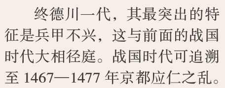
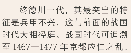
The one above is Shu Song, and the one below is You Song. I personally feel that You Song will look much more comfortable, and the recognition is also maintained well.
Duokan has pushed this Yousong font since version 5.7 (different platform versions), and Yousong has many font sizes, as in the picture above, it is the default Yusong 507R font size pushed by Duokan, which is better than Shusong It is thinner, and there is also a Yousong 509R font size (see more and it is not provided), this font size is almost the same as the thickness of the Song Dynasty font in the book.
Look at the Yousong 507R font available for download. The size is only about 5M. Many of them are a little uncommon, but there are no characters in the GBK range. That is to say, this font is very incomplete. Our Wang Mengmeng specially purchased these two fonts on the official website of Founder. The font library is complete, the size is about 9M, and the GBK font library is all available. I recommend readers to use it. My future books may gradually set the default font to Yusong. , but in order to display the font normally, it is recommended that you set it according to the following method:
Download the package of the two fonts in the original text below, and after decompression, put the fonts under the folder of more fonts.
The Android platform is under SD/Resource/Font, as shown in the figure:
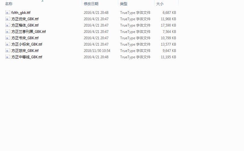
Name the ttf file of 507R as the file with the same name, and overwrite the Yousong font that was originally downloaded by Duokan.
iOS platform, because there is no access to the open font directory, you can open a book in Duokan, open the option, select the font, and you can transfer the font via WiFI in the upper right corner:
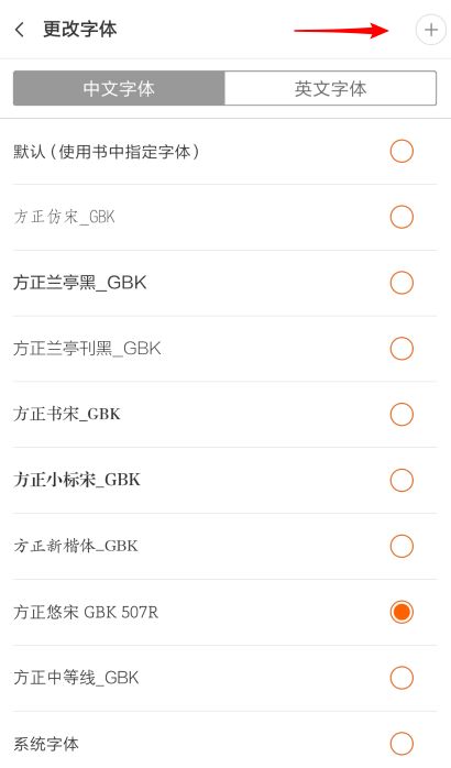
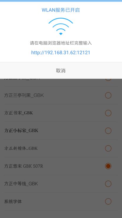
After uploading the font, you can choose the font of Yusong. By default, the text of my later books will be set in the font of Yusong. After the font is uploaded, you can choose the default font. (The choice of default font will affect the mixed arrangement of Chinese and Western characters)
After experimenting, on the iPad, there will be a little difference in line height between the default Yosong and the Yosong I provided. The Yosong I provided may display an extra line of text, and sometimes the layout is messy Sometimes, you can try to set the Yousong font I provided, maybe the problem can be solved.
i46g46b
Articles are uploaded by users and are for non-commercial browsing only. Posted by: Lomu, please indicate the source: https://www.daogebangong.com/en/articles/detail/Font%20Setting%20Guide.html

 支付宝扫一扫
评论列表(196条)
测试