
Click above“Graphic Design Ps Tutorial Learning”One-click certificationGraphic design PS tutorial learning, PS is under control.

This is a font learning class for yourself.
The original intention at the beginning was to solve some questions about fonts in the work (such as typography, LOGO design, etc.), and at the same time I wanted to improve myself by reviewing the basic knowledge of design.
So I gave myself this topic. As a beginner, I only got a little bit of fur, so I sorted it out and shared it. If there are any deficiencies, please correct me.
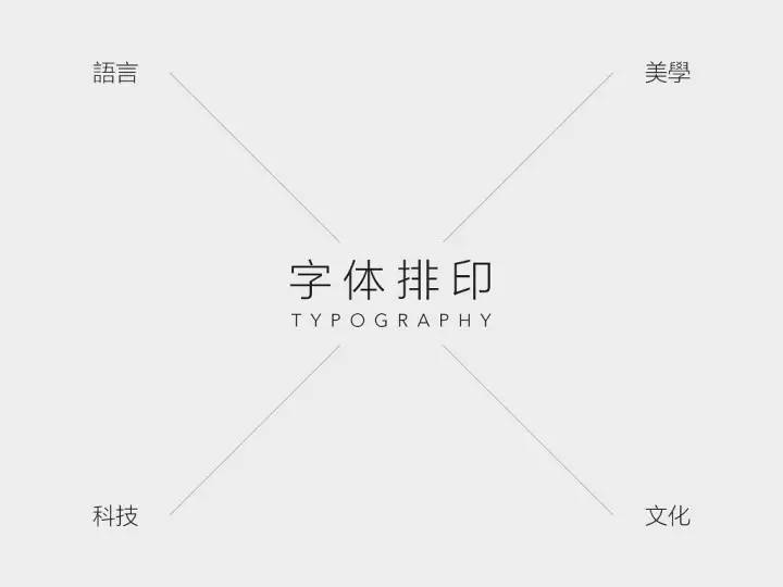
"Typography" is located at the intersection of language, culture, technology, and aesthetics. It is a big topic with rich connotations and extensions. This sharing only selects some basic useful knowledge.


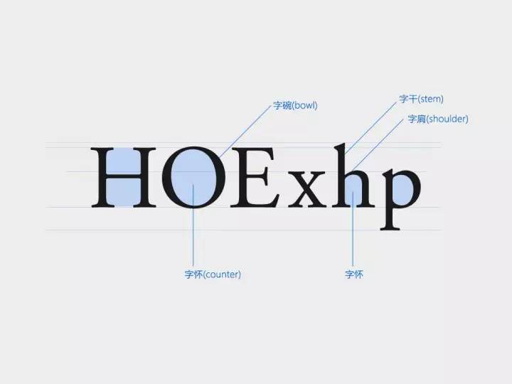


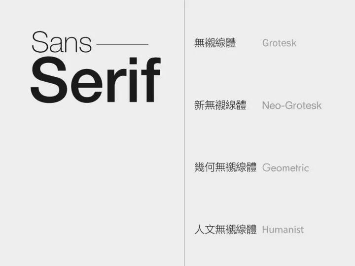
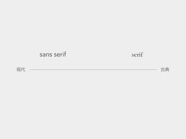
The most simplified classification of English fonts: serif and sans serif. The difference between the two is that the serif body has claw-shaped serifs and the stroke thickness varies.
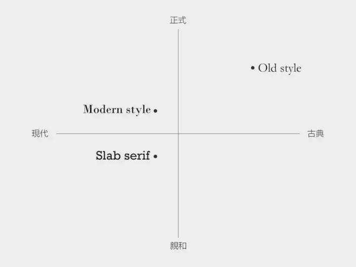
Very old, with inscriptions on the pillars dating back to Roman times. It is classical, formal, with historical tradition and significance.
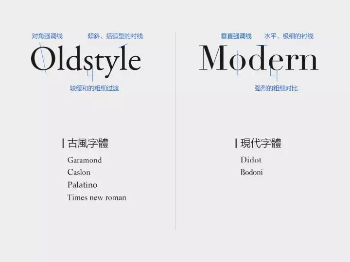
According to the order of historical development, serifs can be classified into: Old Roman, Oldstyle, Transional, and Modern. We select two of the nodes—Oldstyle and Modern fonts. By comparing the characteristics of the two, we can understand the development of the entire serif body.

Oldstyle font (Oldstyle):
Features: Diagonal accent lines, slanted, bracketed serifs, moderate thickness transitions.
Style: Traditional, common in the typesetting of books, newspapers and magazines.
Modern:
Features: vertical accent lines, horizontal, ultra-thin serifs, strong contrast of thickness.
Style: Horizontal and vertical, modern, cool.
To sum up, throughout the development of the serif body, the stroke contrast becomes more and more intense, the serif becomes sharper and thinner, and the stroke thickness and serif radian of the transitional font are just between Oldstyle and Modern. One of the main reasons is that the technology of engraving masters is getting more and more advanced, and the engraving has become more delicate, making it possible to have precise lines and finer thickness contrast. The angle of inclination of the emphasized line is also gradually "straightened", which is a manifestation of the transformation from handwriting to modern typography.
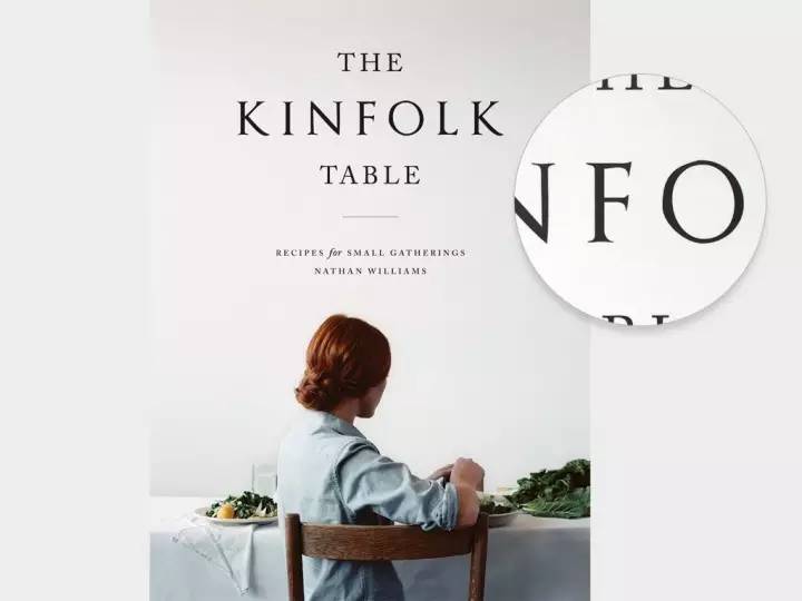
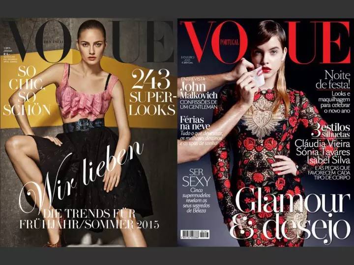
Example of Oldroman, Oldstyle serif fonts:
"Kinfolk" is a magazine that advocates slow life. It often introduces food, travel, and stylish home design, and appreciates the beauty of small, plain, and back to nature. In this context, its title uses an ancient Roman font (Old>


Modern font (Modern) case:
Because modern font (Modern) >

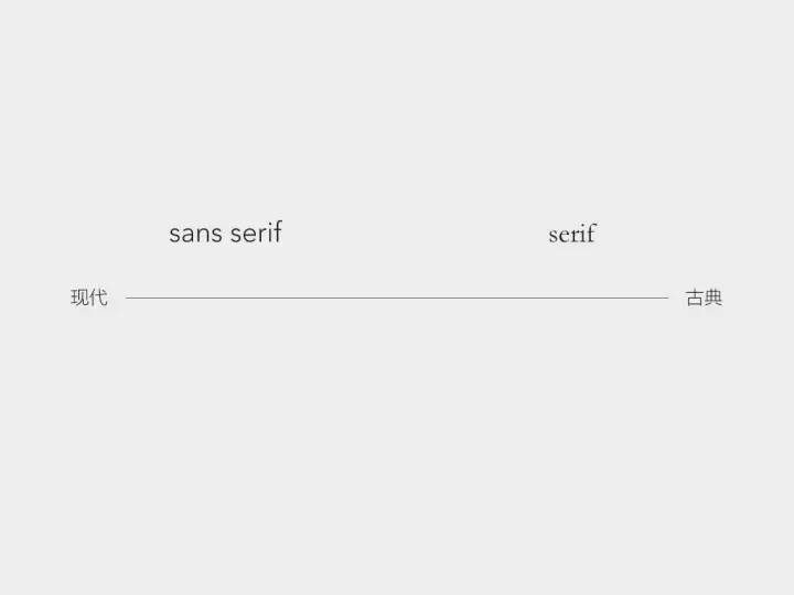
It is often assumed that serifs represent classic formality and sans serifs represent modern affinity. But can the serif font really convey modernity and people-friendliness?
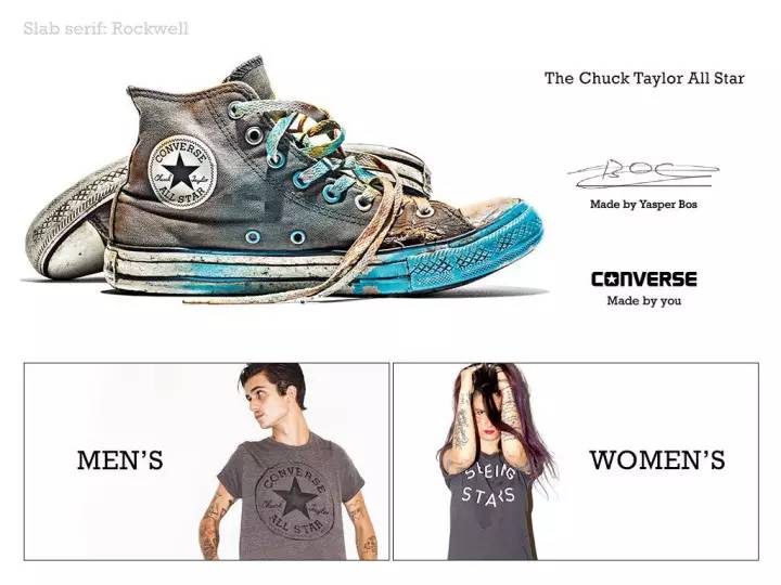
the answer is negative. The font Rockwell used by Converse belongs to the slab serif (Slab>
Therefore, the emotions of fonts are actually relative. Only inside the serif body, there are also different emotions.
2. Sans-serif
Sans-serif features and styles:
(1) Completely abandon the decorative serifs, leaving only the trunk, with a concise and powerful shape, more modern
(2) Suitable for titles and advertisements, with high instant recognition
(3) The stroke thickness contrast is small, and the visual appearance is basically the same
(4) Higher x height
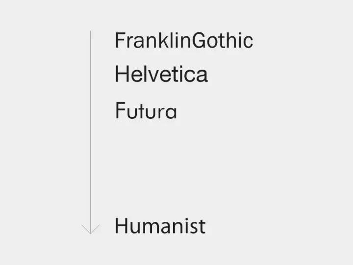
Sans-serifs can also be divided into four categories: early sans-serifs (Grotesk), new sans-serifs (Neo-Grotesk), geometric sans-serifs (Geometric), humanistic sans-serifs (Humanist) ). In the following, a representative font is selected for each category for introduction, starting with Neo-Grotesk.
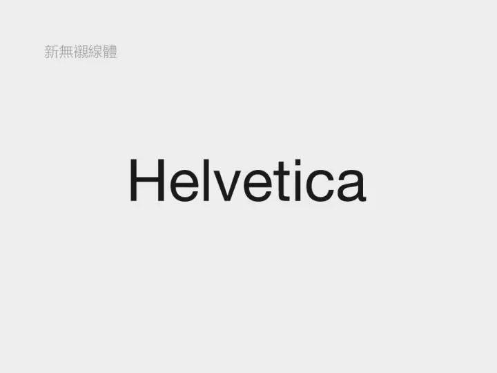
1. New sans-serif (Neo-Grotesk):Title
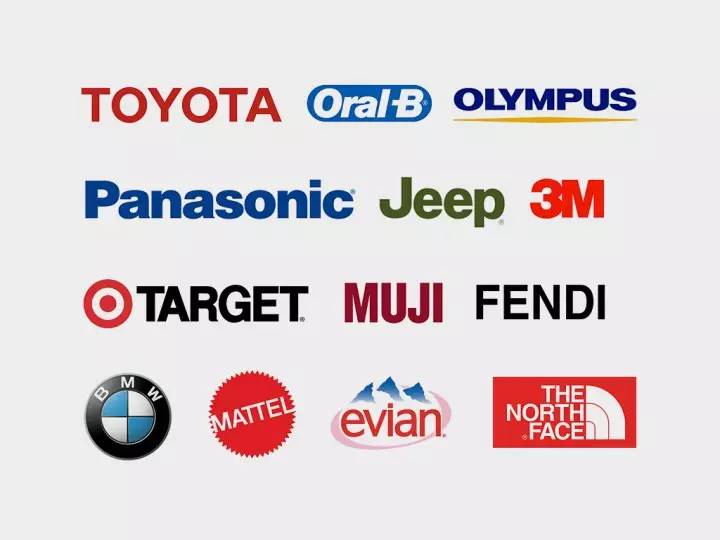
The representative font is the well-known Helvetica. There are countless brands that use Helvetica as their logo font. On the 50th anniversary of the font's birth, there was a documentary "Helvetica" that objectively recorded its birth background, popular influence, and designers of all ages' comments on it. I believe many designers have already seen it.
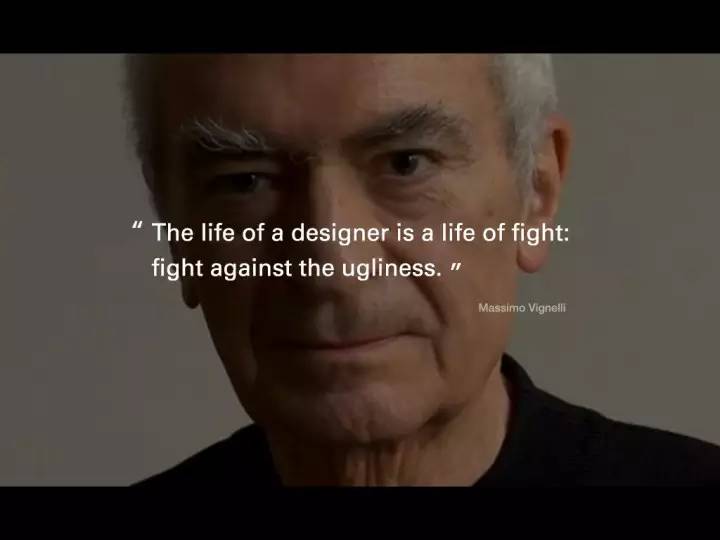
"The life of a designer is a life of battle, a battle against ugliness." - Massimo Vignelli, "Helvetica"
Let’s talk about the advantages of helvetica first:
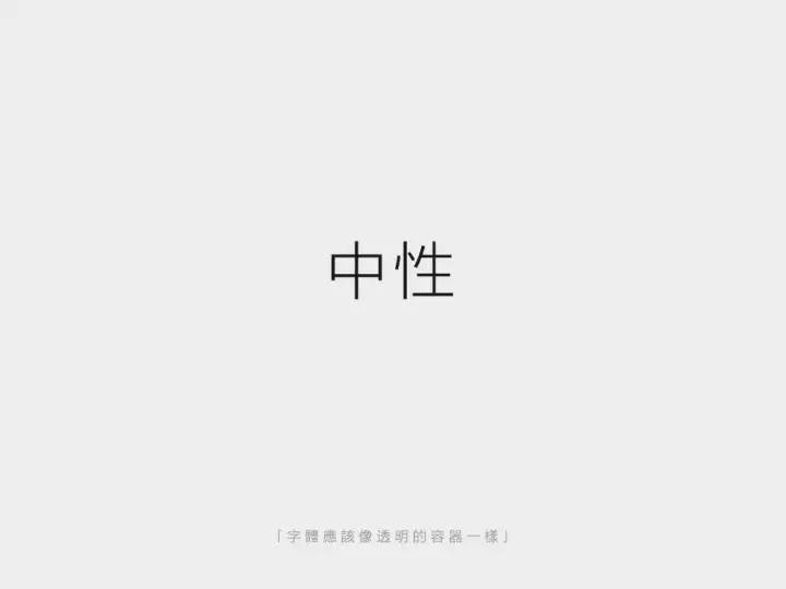
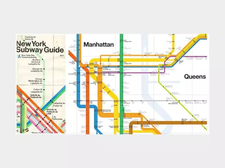
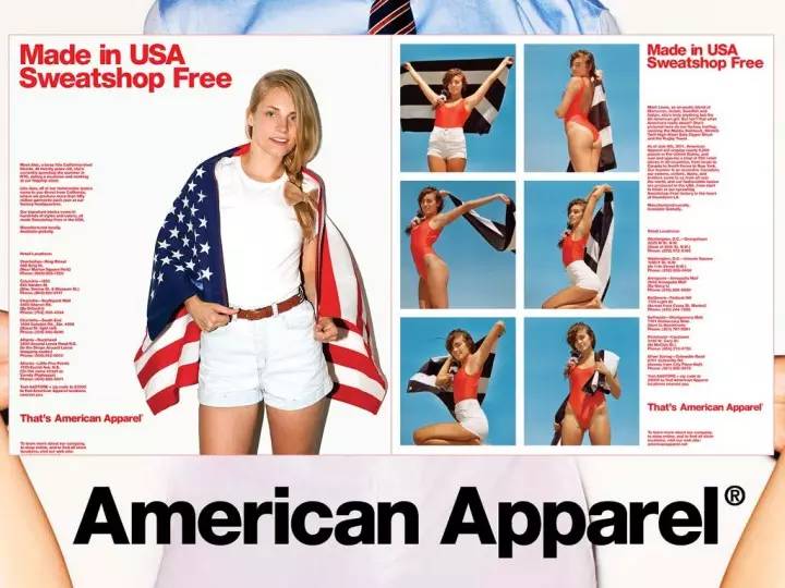
(1) Neutral
Modernism believes that the font itself is only a medium for conveying information, and concise fonts can convey information faster, which is more important than visual expression and style. So Helvetica followed this design concept at the beginning of the design, keeping it neutral, just as the metaphor says "the font should be like a transparent container". Because of its neutral features, Helvetica can be applied to the subway guide system, giving people a modern, efficient and clear feeling, and it can also be applied to fashion brands such as AA. Because of neutrality, there is a wider application space and a more open way of interpretation.

(2) have a solid form
I say "solid form" here instead of "good readability" because its readability is challenging, but Helvetica has indeed been carefully considered in font design. Before Helvetica, the fonts in advertisements and magazines were full of flamboyant handwriting. The appearance of Helvetica is like a clear stream. It removes redundant designs, focuses on the structure of the font itself, and brings better options to the design industry. .
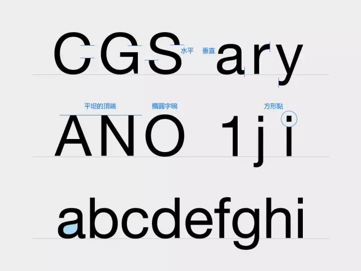
The overall impression is that it is a simple, clear, non-handmade, very calm font. Details:
a.>
b.>
c.>
d.>
e.>
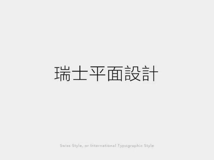
(3) closely related to Swiss graphic design
The success of Helvetica is not something that can be accomplished by a single font. It is inseparable from the emergence of a series of new sans-serif fonts (Neo-Grotesk) and the integration with the entire Swiss graphic design, which has swept the world. Together, they form a complete set of concepts: advocating absolute rationality, objectivity, and systematization. As we are familiar with, the grid system is a visual embodiment that advocates systematization and mathematics.
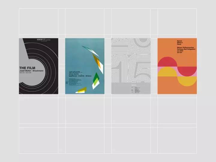
The typical technique of Swiss graphic design is to make a minimalist communication with pure text arrangement. It became popular in the world after 1960 because of its concise and direct performance, and its easy standardization and systematization in operation. At that time, American companies were seeking a fast-spreading and unified visual solution for global expansion. The emergence of Swiss graphic design, Helvetica, and the successful use of various masters pushed them to the top together.
However, Helvetica is not perfect, here are three shortcomings:
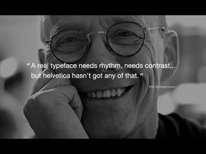
(1) Lack of rhythm. The design concept of Helvetica is consistent and depersonalized. The overall shape of the letters is round, so it lacks reading rhythm and is not optimized for small print reading. Today, when excellent fonts and subdivisions are abundant, the advantages of Helvetica have weakened.
(2) Neutrality is also a double-edged sword. While calm and objective, it also obliterates emotion and vitality, ignoring the emotional experience that the form may bring to readers.
(3) Abuse. You can refer to today's Flat>

If you like neutral and sexy fonts and want to correct Helvetica’s readability flaws, you can try Univers, which has a more refined shape than Helvetica and has a complete font weight.
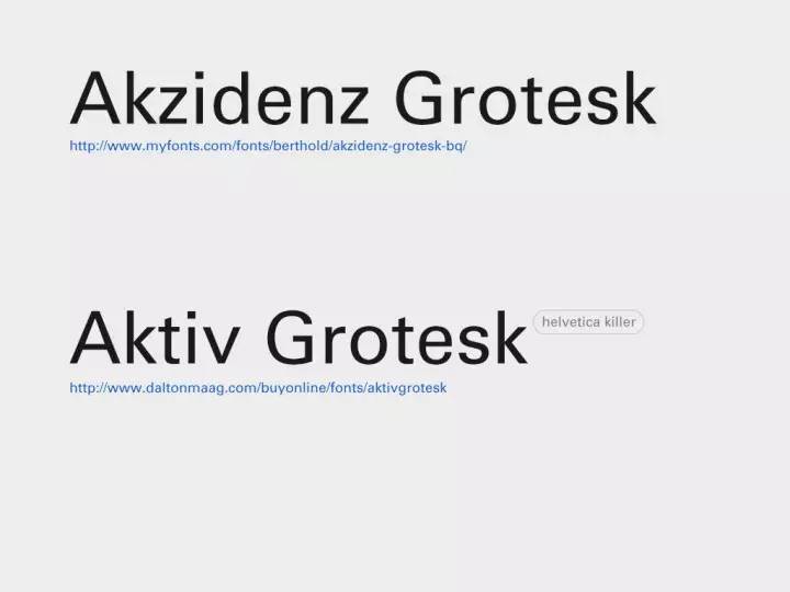
The other two new sans serifs (Neo-Grotesk) are the predecessor of Helvetica and the font known as Helveticakiller.
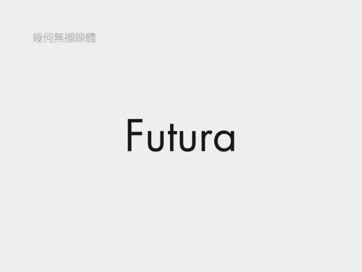
2. Geometric sans serif (Geometric):
The representative font is Futura. The so-called "geometry" is a font that summarizes letters into geometric shapes such as circles, squares, and triangles.
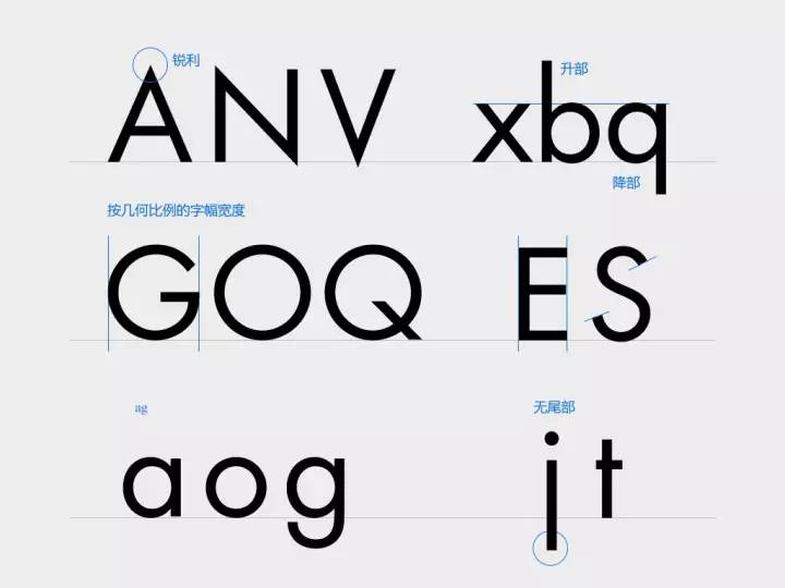
Futura is influenced by Bauhaus, and its shape has a sense of design. The strokes are mainly vertical and horizontal tough strokes. detail:
(1) The top and bottom corners are very sharp
(2) letter perfect circle treatment
(3) The ascending and descending parts are long and elegant
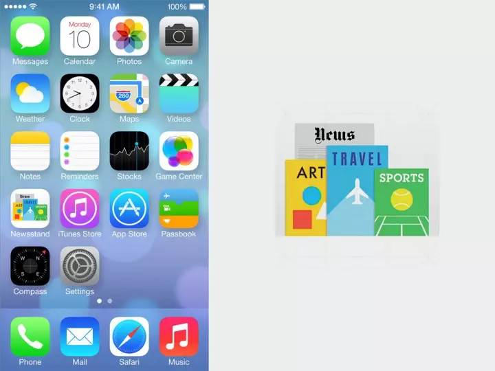
The iPhone's newspaper and magazine icon, the three letters "ART" are Futura.
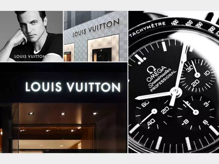
Futura means "future" in German, so it is not only common in design products, such as LV and Omega, but also often used in the theme of "future".

In the previous figure, you can see that in order to maintain the sense of design, Futura omitted the tail of j and t, and used a single-layer structure for a and g, so there are some problems in readability and are not suitable for text layout. And it has a distinctive personality and is a bit "eye-catching". If you like the geometric sans-serif look, but want to go for something softer and more readable, try Avenir. Although Avenir is also a geometric sans-serif, it is not limited to geometric forms when it is designed, but it is based on vision, which looks humane and soft, such as the tail of a with a little warped small details.
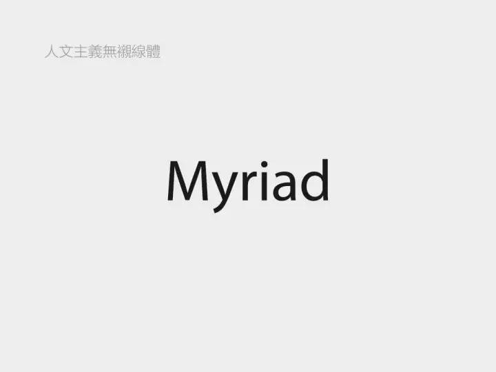
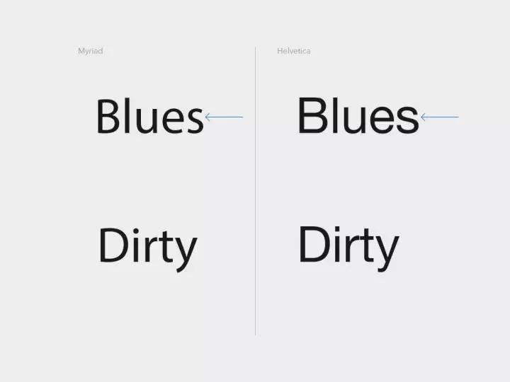
3.>
The representative font is Myriad. The humanistic sans-serif font has a better sense of rhythm, and its temperament is open and friendly, not rigid or cold. By comparing the picture below with Helvetica, you can intuitively feel what is the "humanistic" feature.

(1)>
(2)>
(3)>
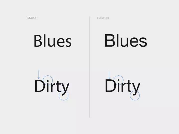
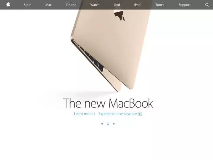
Case: Apple's VI font, used for publicity: advertisements, websites, product inscriptions, etc. Some fonts of the MTR map.


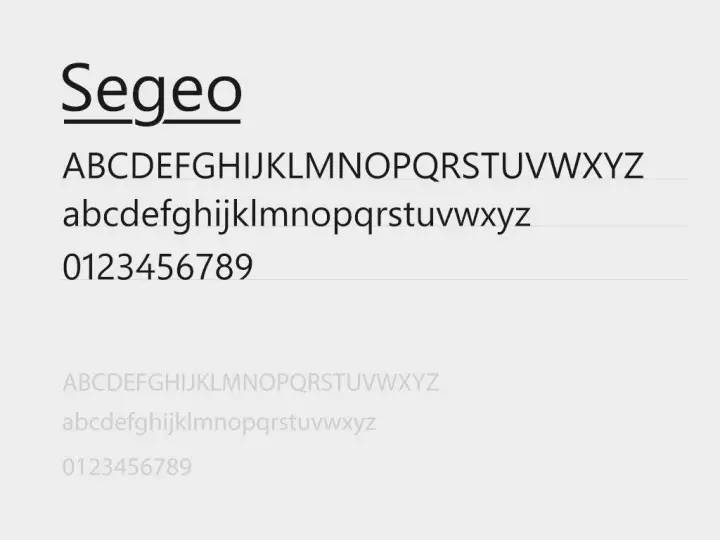
Fonts that also belong to the humanistic sans-serif font include: Frutiger, Segeo
It is often assumed that serifs represent classic formality and sans serifs represent modern affinity. So can't sans serifs be elegant and classic?

the answer is negative. The sans-serif font Optima incorporates the serif gene. Although there is no serif, the change in thickness is relatively obvious, and the end of the gesture is thickened, which is very elegant and charming. (If you want to be elegant and classic when dealing with logos without looking old-fashioned, you can refer to this idea.)

Sentiment axis in sans serif font.


1. Visual balance

(1) For lines of the same thickness, horizontal lines appear thicker than vertical lines due to visual errors. Therefore, when designing English letters, parallax should be fully considered.

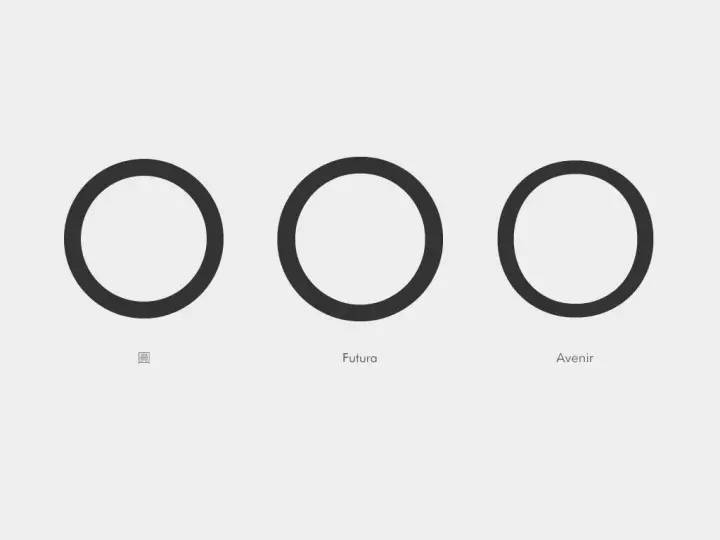
(2) Futura is a geometric sans-serif body, and its O looks like a perfect circle. When we compare it with the real perfect circle, we will find that the geometric shape of Futura is also optimized, and the strokes in the horizontal direction are fine-tuned and refined. Compared with the three "circles", although Avenir is the least like a perfect circle, as the letter O, it looks the most comfortable and stable in space.

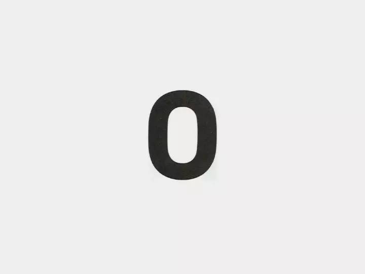
(3) This is an O spliced with arcs and straight lines. However, due to parallax, it looks like the illusion that both sides are sunken. Therefore, when processing, the two sides will be slightly raised outwards, and the horizontal lines will be fine-tuned, so that the stiff and unrounded circle can be transformed into a visually soft O letter.
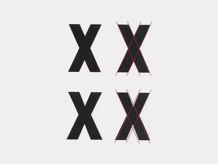
(4) The shape of the X is not the result of the direct intersection of the diagonal lines, but the diagonal lines are slightly staggered so that it looks like a connected state. And in order to avoid the dense black part in the middle caused by the intersection of four oblique lines, the stroke in the center is slightly thinner.
(5) Although the thickness of strokes in sans-serif fonts is basically the same, there are still slight gaps in reality. The A (pictured on the left) seen from the front is very normal, but when A is flipped horizontally (pictured on the right), it immediately feels slightly weird and unstable. The stroke on the right side of A is thicker than the left side, which is influenced by the habit of writing in flat pen and serif in history. Over the wall to watch the video "How are Roman capital letters formed?" "

(6) We all have experience in drawing icons. Due to the difference in the outline and internal complexity of icons, the sense of visual volume is different. It cannot be judged entirely by the size but by the visual experience. Typography has something in common. For text of the same font size, the circular O and the triangular A should be higher than the reference line. You can pay attention to this point when making LOGO, refer to the case of NIVEA.


2. Negative space
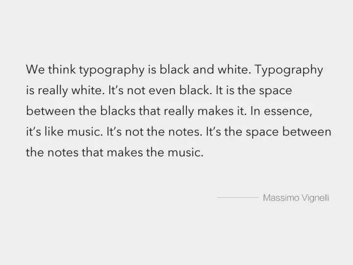

Negative space refers to the space inside letters and the space between letters. In the font design process, the designer should not only design the stroke structure of the letters, but more importantly, consider the design of the negative space to make it balanced and coordinated. To quote Massimo, the typist: "We usually think of typography as black and white. Typography is actually white, not black. Because fonts are defined by the spaces between shapes. It's a bit Like music, music is defined not by notes but by the pauses between notes." It is said that English font designers may spend about 1/3 of the overall font design content on the negative space relationship.
(1) Space inside a single letter: >

(2) The mutual balance between the letters: the visual consistency of the negative space should also be achieved between the letters.
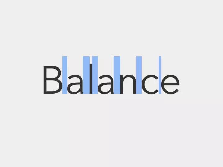
(3) The spacing between words: adjust the space between letters, and pursue a visually even distribution rather than numerically uniform, in order to achieve a sense of visual rhythm and balance. For example, the distance between I and lowercase l in the font should be larger, because the space between the two vertical lines is the smallest; >


1. How information should be designed
Rather than saying that we are learning font design and typography, it is better to say that we use fonts to think about the issue of "how to design information".
On this issue, "font design" at least provides us with two reference paths.
(1) Form follows function
English fonts have always been a model of "form follows function" design. What function, what scene, what problem to solve, what kind of font will be produced to suit it, and even the subdivision is very clear. Historically, there was Times designed for newspapers; there was Bell designed for the yellow pages of the telephone book>
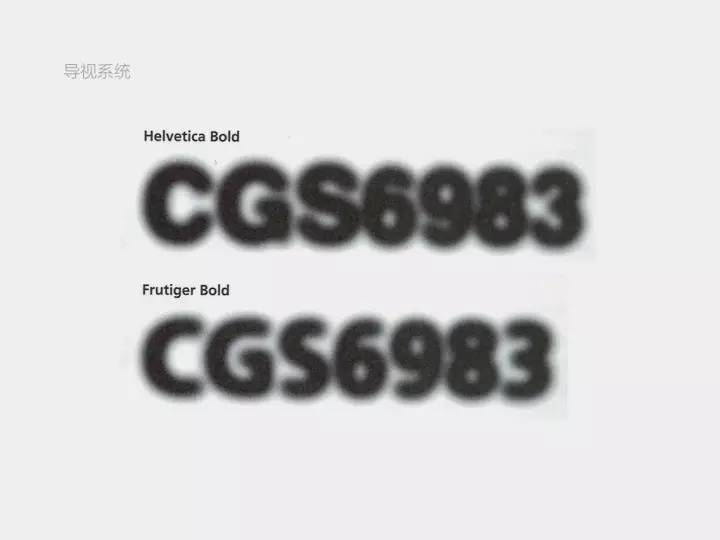
In 1913, Frank, director of the London Underground>
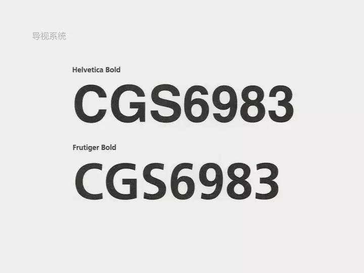
The following is the Frutiger font designed for Charles de Gaulle Airport in France. Due to its large font bowl, large opening, and moderate thickness, the text can remain relatively clear and not sticky under the interference of halos.
(2) Transparent container
The concept of modernism believes that an excellent font is like a "transparent container", and the font only plays the role of carrying, and the important thing is the transmission of information.
Another interesting metaphor from the master Frutiger is, "If you can still remember the shape of the spoon after drinking the soup, the design of the spoon is a failure." The metaphor is a bit extreme, but in fact information and design are not mutually exclusive. It is a perfect match that is completely integrated and integrated. Design can exist as air, indispensable, but users will not obviously perceive it.
2.>

Matthew Carter, who has designed famous fonts such as Georgia, Tahoma, Verdana, Meiryo, etc., gave a speech on TED - "My>
Font design is actually very closely related to technology. Writing tools, paper, books, electronic screens, and the Internet, every innovation in media and printing technology changes the presentation of fonts, and also affects the ideas and methods of designers. However, in that era of technological innovation, designers did not avoid technology, but wanted to be influenced by unknown ideas, to respond to the unknown, and to push themselves to explore the unknown world. In the process of exploring technology and design, there are bound to be contradictions and doubts: Will the design made to alleviate technical problems completely disappear due to the change of technology? Does a design that is "imperfect" because of technology lack value?
Matthew's design responded: the value of a font depends on whether it can work effectively in the application scenario, and the quality of a font determines whether it can exist independently of technology. Matthew said in his speech: "All designers have limitations in their work. Design is not art. The question is, will limitations lead to compromise? Will it reduce the quality of design? There is a very subtle relationship between limitations and compromise. difference, but that difference is at the heart of my approach to work.”
3.>
(1) The world is getting softer
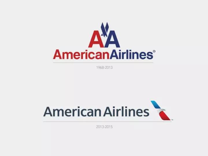
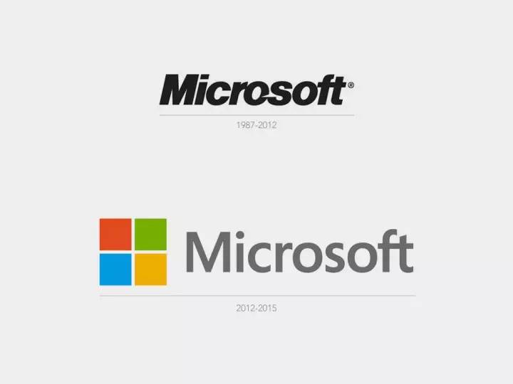
Perhaps after two industrial revolutions and two world wars, everyone has calmed down a lot. From government public relations, to corporate management, to personal life interests, they are gradually humanized. The propaganda method of holding up big banners and shouting slogans is no longer so effective, and it may even cause a backlash from the hearts of the people. It's no longer a time when the volume is loud enough to be listened to.
The revisions of the two LOGOs in the above picture, whether it is fonts, graphic shapes, or colors, have become softer. From the LOGO, American>
(2) Traditional revival
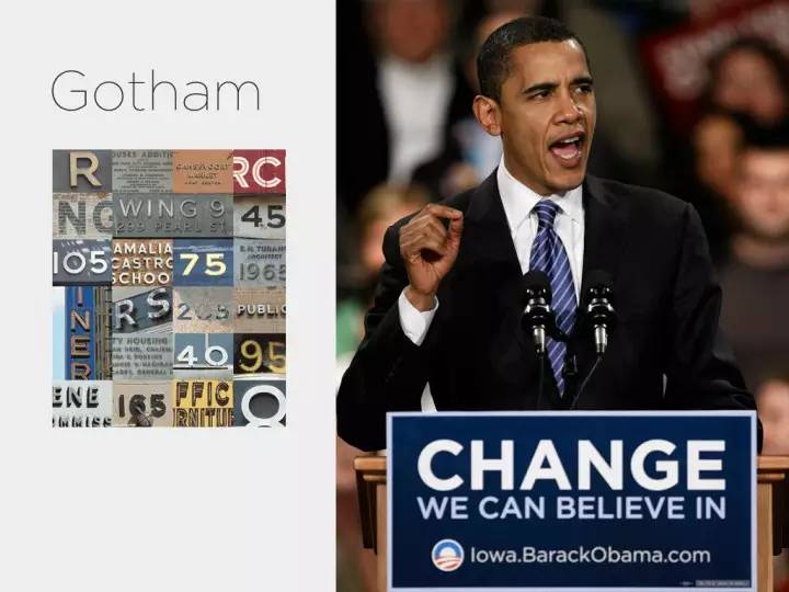
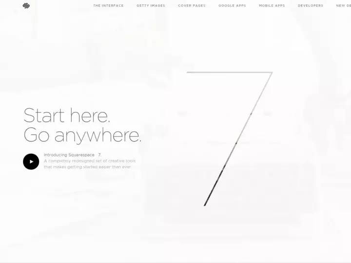
Gotham's designer Frere-Jones lamented the end of traditional hand-made cards with the advent of mechanical technology. He was inspired by old building signs, store signs, and storefront advertisements in New York from 1930 to 1940. He believes that these words hand-painted by ordinary Americans represent New York's "straightforward, sincere, tenacious, and full of personality." Therefore, the Gotham font not only makes the American people feel familiar, but also has the modern sense of the new font, not only has a reliable and stable shape, but also is very simple and friendly. This font became a hot font after the Obama election. The website Squarespace, Tesla all use Gotham.
Many generations of artists and designers in history have experienced dissatisfaction with the current society, admired classical classics, and pursued the revival of traditions, such as the Renaissance and the Handicraft Movement. However, like font design, while these fields are constantly reincarnated, they are also constantly injecting fresh vitality into them, thus spiraling up and developing.


at last:
Look back at our UI design, Windows>


Articles are uploaded by users and are for non-commercial browsing only. Posted by: Lomu, please indicate the source: https://www.daogebangong.com/en/articles/detail/Font%20Lessons%20for%20Yourself%201%20%20Basics%20of%20English%20Fonts.html
 支付宝扫一扫
评论列表(196条)
测试