Editor: Green Onion Author: I am Design Wet
Many beginners cannot correctly establish professional font design knowledge, and even designers who have learned fonts for several years, because the way is too wild, they still cannot correctly understand the details. So this time we decided to have a thorough professional literacy and establish the correct method of writing.

Font bones are relatively not easy to master, because in this item, it contains more content. Of course, there is no need to talk about the center of gravity in the Chinese palace. Many tutorials and books will talk about these concepts. Although you have read it many times, you are still confused. This is because most of the concepts of fonts are vague and need to be explored in practice for a long time. is a product of experience.
Then we are talking about font bones here, but in fact it is still vague. When talking about concepts in general, it is inevitable to fall into a situation where the brain understands, but the hands do not. And beginners may have a simple structure that can be barely mastered, such as the basic black body, which is the most boring and common structure, and you should be able to control such a structure.
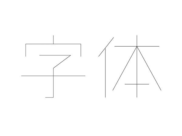
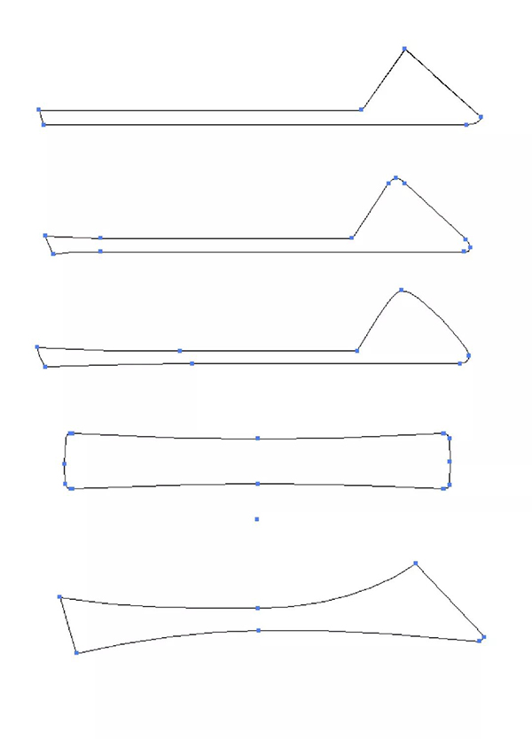
Such a structure tends to make people get tired of watching it for a long time, and there is no unique structure. Let's take a look at other structures.
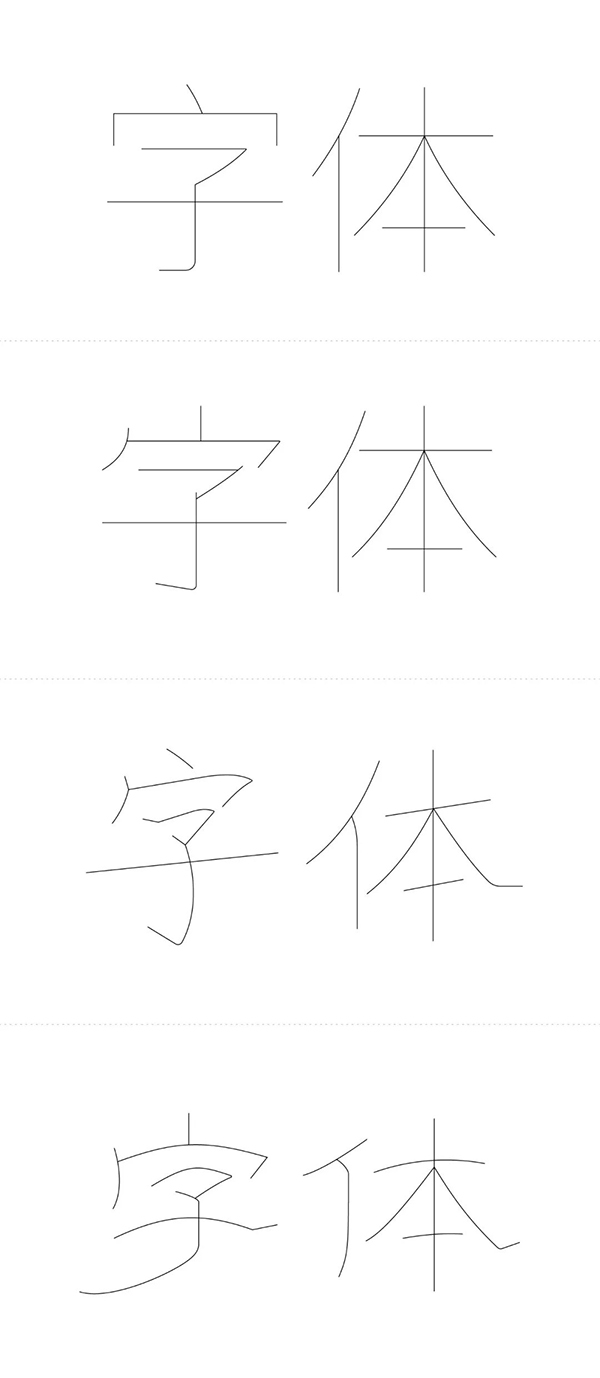
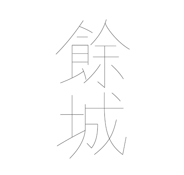
Then the above four structures do not look at the specific characteristics of stroke thickness and so on. We can also roughly see which types they belong to. It may be difficult to guess the first two, but the latter two are easy to guess, respectively. Italic script and official script.
What is called classic, you can tell what glyph it belongs to just by looking at the bones of the font. This is the power of classics. Then here comes the problem. Many students have no calligraphy experience, and the writing experience is only the skill level of copying homework in school before. The structure is not easy to do, so I will provide a method here to find the bones of characters from ancient books. Coincidentally, Here I have an ancient book about Jin Ping Na Han Mei. Don’t think about it, let’s just take a look at the style of the book.
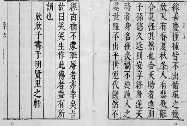
Students who can't help but want to ask me for the full book hold back, I won't give it.
Extract the words you need from it, the features may not necessarily be the same as it, but the structure can be borrowed, and there is no infringement.

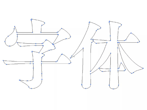
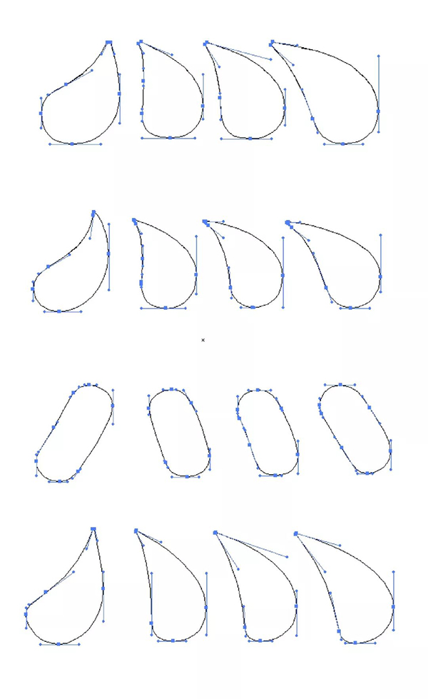
Let's take a look at the structure of other glyphs. Let's outline it again.


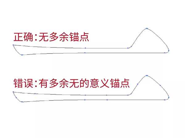
The arrangement of anchor points is often ignored by many students in actual operation, and they do not pay enough attention to it, so I will write it specifically. The first principle we follow for the arrangement of anchor points is "the number of anchor points is minimized", that is, to use the fewest anchor points to complete the expected strokes or curves. Let's take a look at the presentation of anchor points in the font library, pay attention to observation.
The role of the anchor point is nothing more than two.
First, two points form a line segment, the anchor point controls the line, the start and end of the stroke.
Second, the anchor point is often used at the turning point of a straight line or curve, that is, to control the direction of the line.
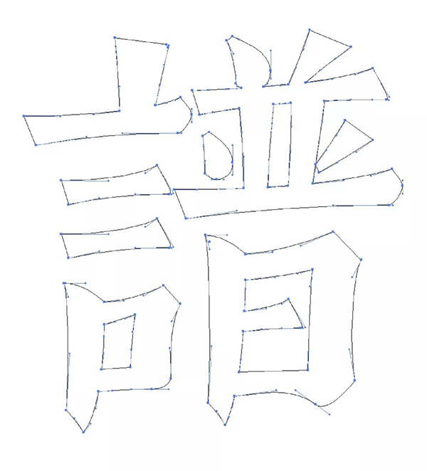
The most frequent mistakes are actually not the above mistakes. Many students can avoid such mistakes spontaneously. In fact, the more challenging part often lies in more complicated strokes, because you often don’t know how many anchor points are correct answer.
For example:
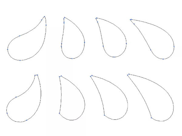
The above are all correct answers. Different shapes will have different requirements for the number of anchor points. If you still don’t know what the correct answer is, you have to try to draw it, compare it carefully, and sum up your experience.
Let’s talk about the position of the anchor point. Most of the time, the position of the anchor point is the first thing we need to consider. Even for experienced designers, once the position of the anchor point is formed, the shape of the stroke will naturally form an outline in the heart. .
Therefore, the position of the anchor point must be tried repeatedly. Let's take a look at how the position of the anchor point changes in different stroke features, and which ones have not changed.
In a word, the position of the anchor point is determined according to the needs of the strokes. The position determines whether you can make the least anchor point or have several more anchor points.

Anchors and anchor points complement each other functionally, with the difference that anchors are basically dedicated to controlling curves. So what should we pay attention to the angle of the anchor? The angle is not set properly.
The first rule of thumb for anchors is, level or vertical. Of course not all strokes are suitable for these two angle directions, but these two directions often control the backbone of the curve, the position is visual, and the horizontal or vertical anchor can make the curve flexible. Carefully observe the angles of the anchor rods below, you can try to do this, this is standard practice.
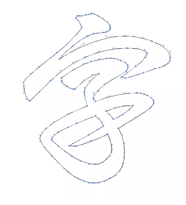
The following demonstrates a relatively complex glyph, so you can take a closer look at the angles of some anchors. For some more specific stroke features, it is not necessary to make the anchor angle horizontal or vertical, so don't force it. These are just a means to help you standardize your operations. Going back to the purpose of the design, try to restore the stroke shape you want.
Just like some excellent calligraphy fonts we have seen, it rarely uses horizontal or vertical anchors, because the shape of calligraphy is very complicated, and the first thing to do is to ensure the shape of the strokes.

The reason why we want to specifically talk about following the visual principle is because I have encountered many students who have such confusion. I don't understand the difference between keeping the thickness uniform and keeping the thickness consistent. I don't understand how to control the thickness of the horizontal stroke when the horizontal stroke is very thin in Song typeface. I don't understand how to deal with some characters with a lot of horizontal strokes. Wait for a lot of questions like this. In fact, the answer is very simple, which is based on vision (students with poor eyesight will automatically close this article).
For example, the difference between uniform thickness and consistent thickness, this is a way to maintain uniform thickness, pay attention to the thickness of the horizontal strokes. But keeping the thickness uniform often has a contextual understanding, that is, you need to keep this word visually consistent with other words, which is the hidden meaning behind it.

As for the following, I adjusted the thickness of the horizontal pen to be consistent. This is not a wrong approach, but if you compare it with the above, you will find that the details are not clear enough, and it is difficult to adjust the thickness of this horizontal pen to be thicker, and the thickness has limitations.

Is there any trick to the first approach? There are two principles, the principle of primary and secondary writing. The principle of the roughest periphery. Let me talk about the main and auxiliary strokes first, it is easy to understand, the main strokes and the secondary strokes, that is, the main strokes can be highlighted, and the secondary strokes can be weakened. The remaining problem is how to distinguish the main and secondary pens. In general, note that it is only a general situation. The longest stroke in a character is the main stroke, which can be emphasized.


Let me talk about the principle of the thickest periphery, that is, the strokes on the periphery of each component of the font or the font as a whole are the thickest. The shape of the outline is first received by the human eye, so the periphery determines how thick the character is.


The content of this issue is more theoretical. Generally speaking, to develop good design habits, although some places are very subtle, in the long run, I am afraid that you are not serious enough and get used to everything.
I saw a sentence earlier, moral literacy is that even if there are no cars or people on the road, you can wait quietly for a red light for tens of seconds. It's really a pity that I haven't reached it yet.
And professionalism means that even if the customer can't see the difference before and after the adjustment, you still take all the details into account very seriously. This is a pity, and you are still working hard. After all, when the client's father said that the word "final draft" is easier to get into... he lost his mind in an instant...
That's it for this issue, I'm going to pack my luggage and prepare to go back to Nanchang, the boss said that if I don't go back to work, I will find a good-looking girl to replace me... Then let me go...
Articles are uploaded by users and are for non-commercial browsing only. Posted by: Lomu, please indicate the source: https://www.daogebangong.com/en/articles/detail/Font%20Hiding%20Tricks%20Revealed.html
 支付宝扫一扫
评论列表(196条)
测试